Scatter chart
A scatter chart consists of the x-axis and y-axis variables. Scatter charts show the correlation and distribution of data. In a scatter chart, the y-axis variable changes in relation to the x-axis variable. The scatter chart shows the overall trend of your data. You can configure the color dimension and category dimension to visualize data distribution. This topic describes how to add data to a scatter chart and how to configure the style of a scatter chart.
Prerequisites
A dashboard is created. For more information, see Create a dashboard.
Overview
Use cases
Use a scatter chart to plot data points from two variables and examine their distribution. This helps you determine if a correlation exists between variables and identify their distribution patterns.
Purpose: A scatter chart provides key insights, such as:
Whether a quantitative trend exists between variables.
Whether an existing trend is linear or curved.
Whether any data points deviate significantly from the rest of the data. These points, known as outliers, are easy to spot in a scatter chart. You can then analyze these outliers to determine if they might heavily influence your overall model.
Benefits
Calculation capabilities: Automatic calculations.
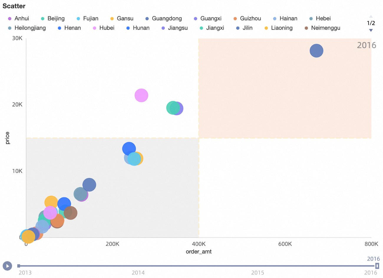
Visualization effects: Dynamic playback using the playback timeline.
Example
Limits
A scatter chart is configured with the following fields: X axis (Dim. or Mea.), Y axis (Mea.), Category (Dim.), Color (Dim. or Mea.), Shape/Dimension, and Playback Timeline/Time Dimension.
The x-axis accepts a maximum of one dimension or one measure.
The y-axis accepts a maximum of one measure.
The category accepts a maximum of one dimension.
The Color field accepts a maximum of one dimension or one measure.
The color field can use the same field as the x-axis, y-axis, or category, and is only available when a field is added to Category (Dim.).
The Shape field accepts a maximum of one dimension and is only available when a field is added to Category (Dim.).
The playback timeline accepts a maximum of one dimension, which must be a date field.
NoteYou can enable the playback timeline only when both axes are configured with measure fields.
Configure chart data
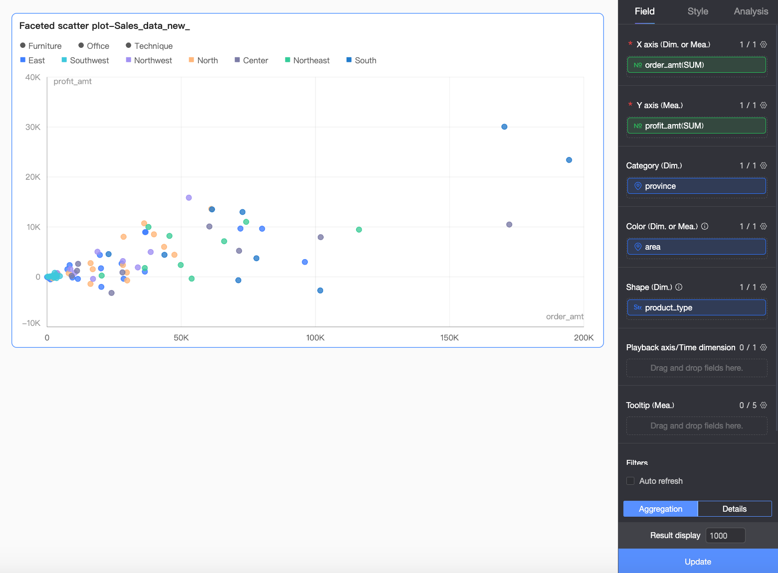
On the Data tab, select the required dimension and measure fields.
From the measure list, double-click or drag
Profit Amountto the Y axis (Mea.) field.From the measure list, double-click or drag
Order Amountto the X axis (Dim. or Mea.) field.From the Dimension list, double-click or drag
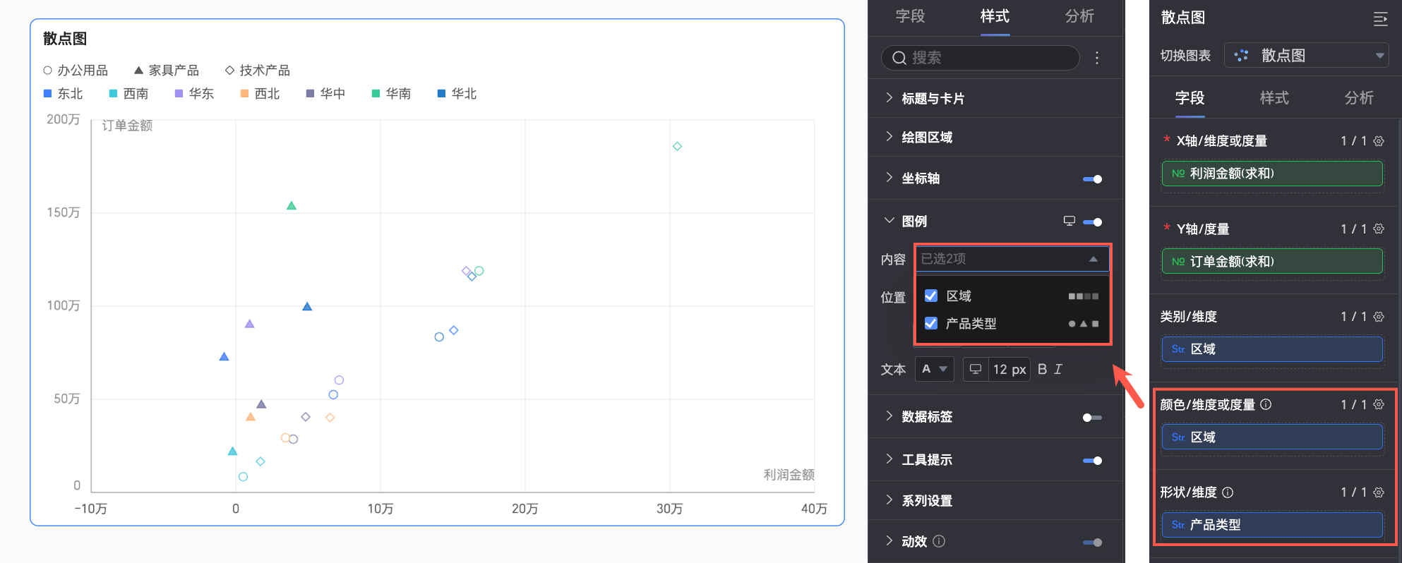
Regionto the Category (Dim.) and Color (Dim. or Mea.) fields.If you need to configure a unique shape for each dimension value, drag a field into the Shape/Dimension field. You can then customize the shape for each dimension value in the style settings. In this example, drag the Product Type field to assign a shape to each product type.
NoteThis configuration is available only when a field is added to the Category (Dim.) field.
From the Dimension list, double-click or drag
Order Date (Year)to the Playback Timeline/Time Dimension field.
Click Update. The chart is automatically updated.
Configure the style of a scatter chart
This section describes how to configure the style of a scatter chart. For information about common style settings, see Configure the title bar.
Use the search box at the top of the configuration pane to quickly find parameters. You can also click the  icon to Expand/collapse all categories.
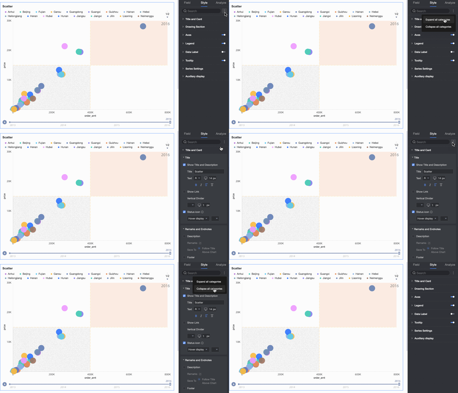
Chart style
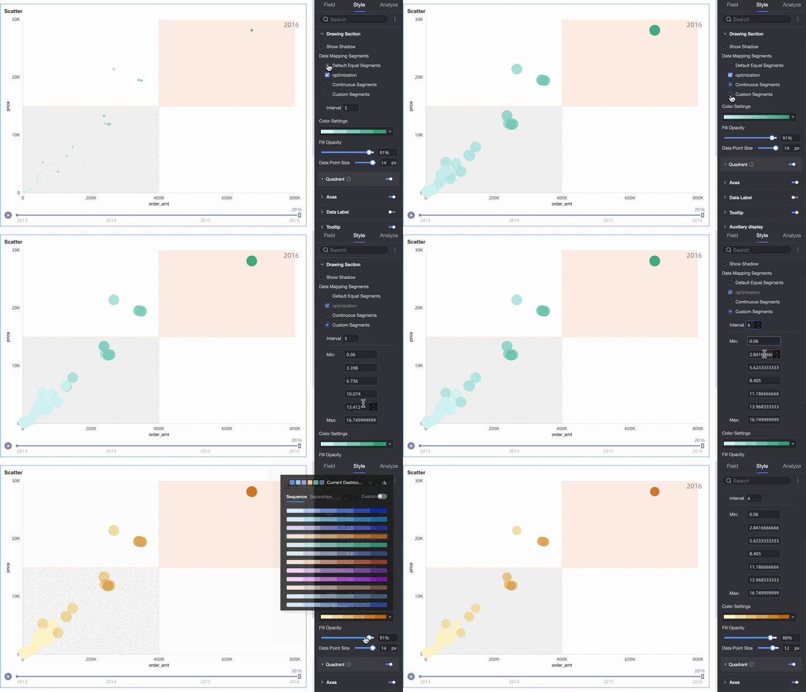
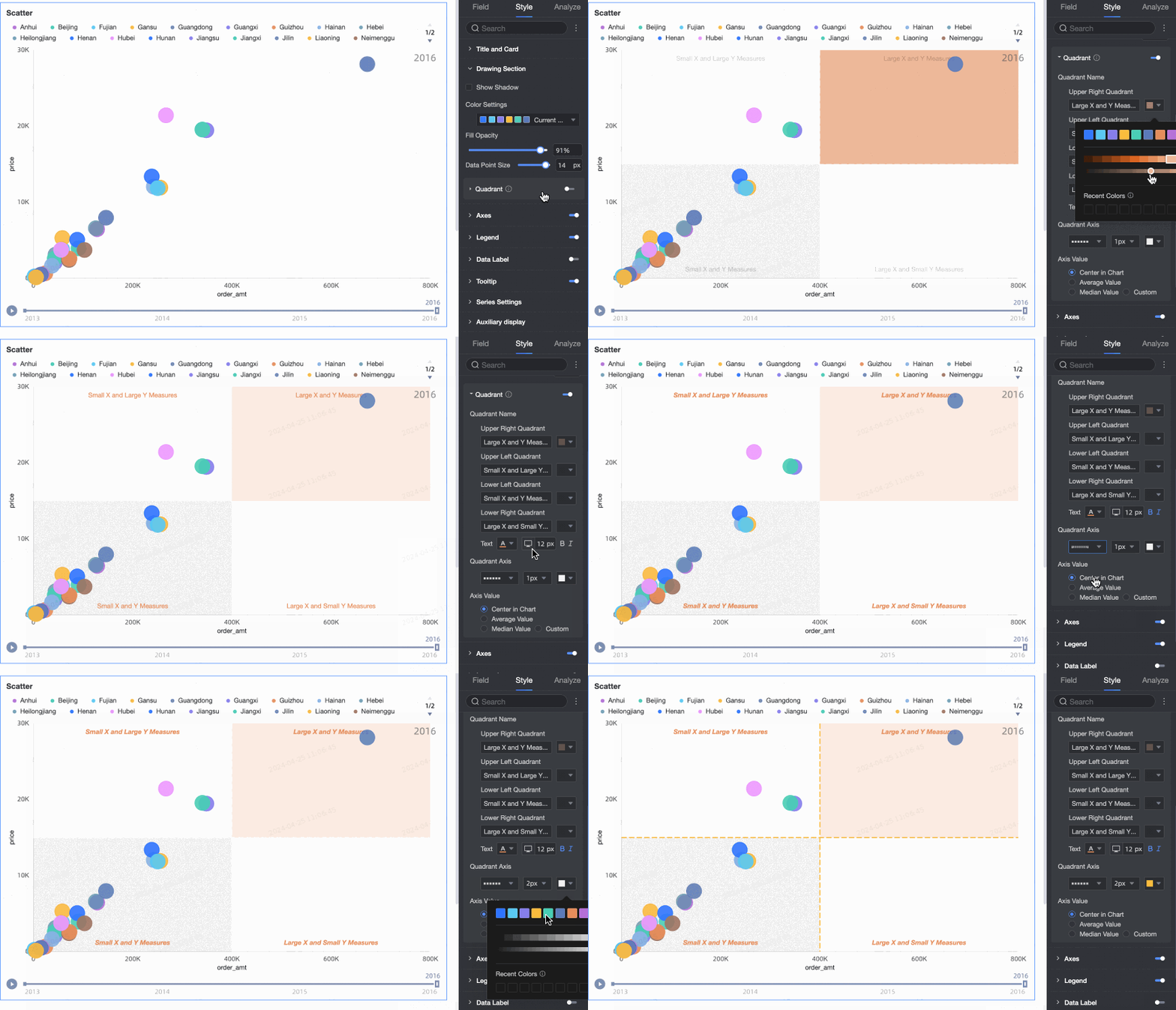
In the Chart style section, configure settings for Color, data point size, and Four-quadrant.
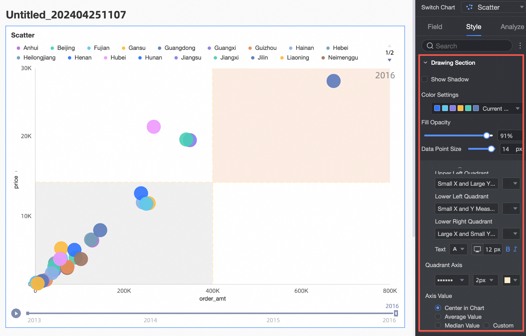
When a measure field is added to Color (Dim. or Mea.), you must set the Data mapping segments for the measure.

You can enable the Four-quadrant function when both axes are configured with measure fields.
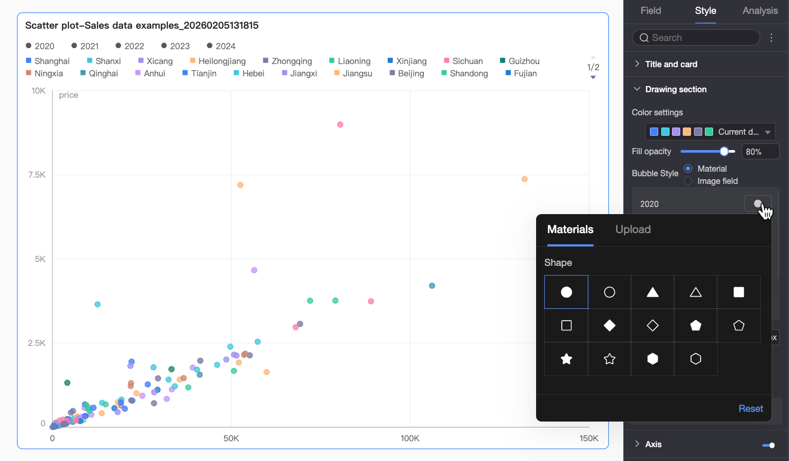
When a field is added to Shape/Dimension, you can specify a unique shape for each value of that field.
Axes
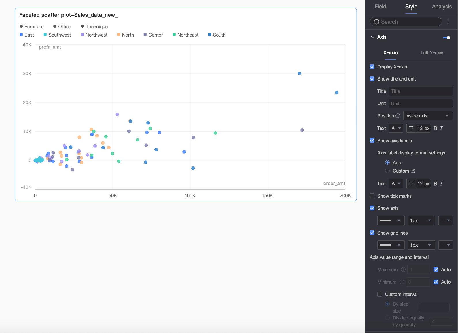
In the Axes section, configure the style of the axes.
Section | Parameter | Description |
x-axis | Show axis | Shows or hides the x-axis. |
Show title and unit | Shows or hides the axis title and unit on the x-axis. You can also configure their names, positions, and text styles. | |
Show value | Shows or hides the axis labels on the x-axis. If you show the labels, you can configure the following settings:
| |
Show tick marks | Shows or hides the tick marks on the x-axis. | |
Show axis line | Shows or hides the axis line. You can configure the line style, width, and color. | |
Gridlines | Shows or hides the gridlines for the x-axis. You can configure the line style, width, and color. | |
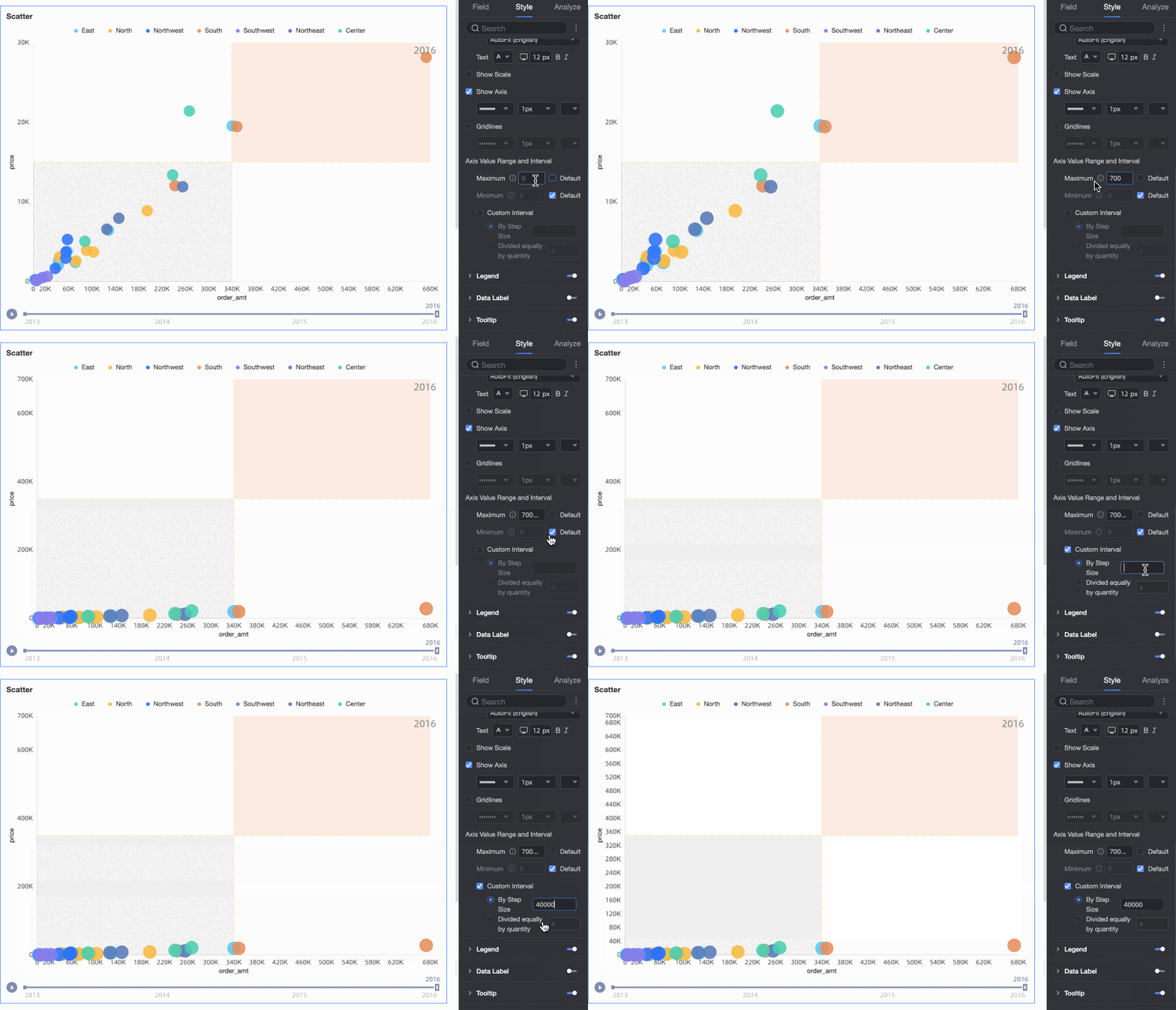
Axis range and interval |
| |
Left y-axis | Show axis | Shows or hides the left y-axis. |
Show title and unit | Shows or hides the axis title and unit on the left y-axis. You can also configure their names, positions, and text styles. | |
Show value | Shows or hides the axis labels on the left y-axis. If you show the labels, you can configure the axis label display format and text style. The display format can be set to Default or Custom.
| |
Show tick marks | Shows or hides the tick marks on the axis. | |
Show axis line | Shows or hides the axis line. You can configure the line style, width, and color. | |
Gridlines | Shows or hides the gridlines for the axis. You can configure the line style, width, and color. | |
Axis range and interval |
|
 icon to open the Data Display Format Settings dialog box and configure the format as needed. For more information about the parameters, see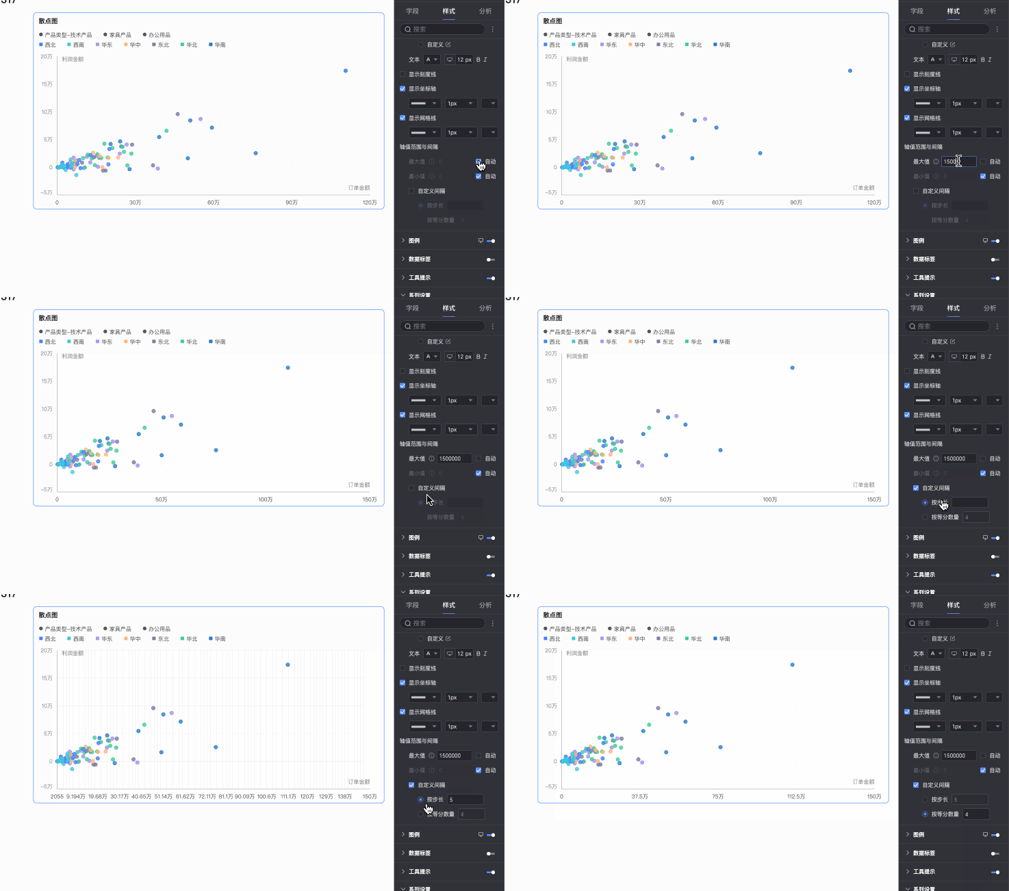
Legend
In the Legend section, click the  icon to enable the chart legend and configure its style.
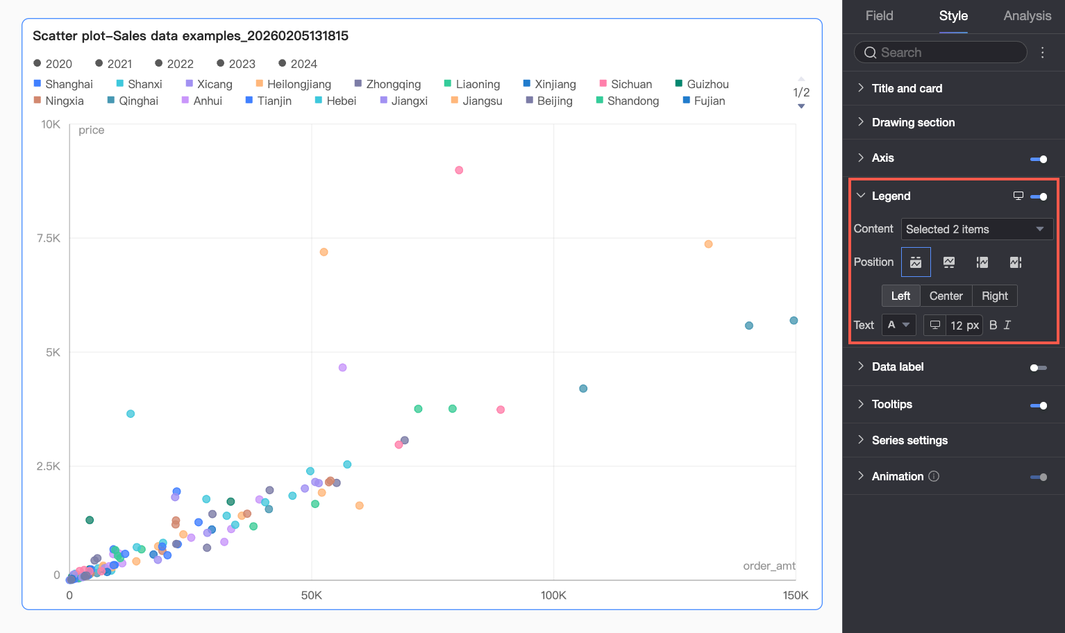
Parameter | Description |
Content | Click the content box to display a dropdown list of the dimension fields currently used for color and shape. You can select the checkboxes to show or hide the legend item for a specific field.
|
Position | Sets the display position and alignment of the legend.
Note When a field is added to the playback timeline, the legend can only be positioned at the Top. |
Text | Sets the text style of the legend, including font color, size, weight, and style (italic). |
Mobile legend | You can configure legend settings for PC and mobile devices independently. Click the PC/Mobile toggle ( |
 ) at the top of the dashboard editor to switch to the mobile editing view. You can then configure separate legend settings for mobile, including content, position, and text style.
Data label
In the Data label section, configure the visibility, position, and style of data labels.
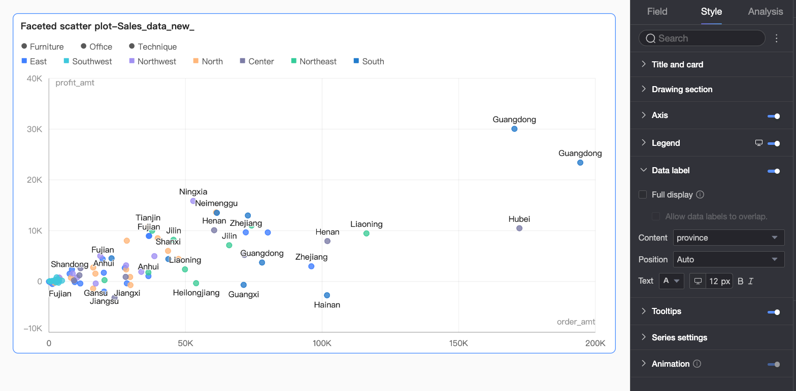
Parameter | Description |
Show all | When enabled, this option automatically adjusts the position of data labels to prevent them from overlapping. If there are too many labels, some labels that extend beyond the chart area may be hidden. You can also select Allow data labels to overlap. |
Content | Sets the content to be displayed in the labels. |
Position | Sets the display position of the labels. Note You cannot adjust the Position when a field is added to the playback timeline. |
Text | Sets the text style of the labels. |
Tooltip
In the Tooltip section, click the icon to enable tooltips and configure their style.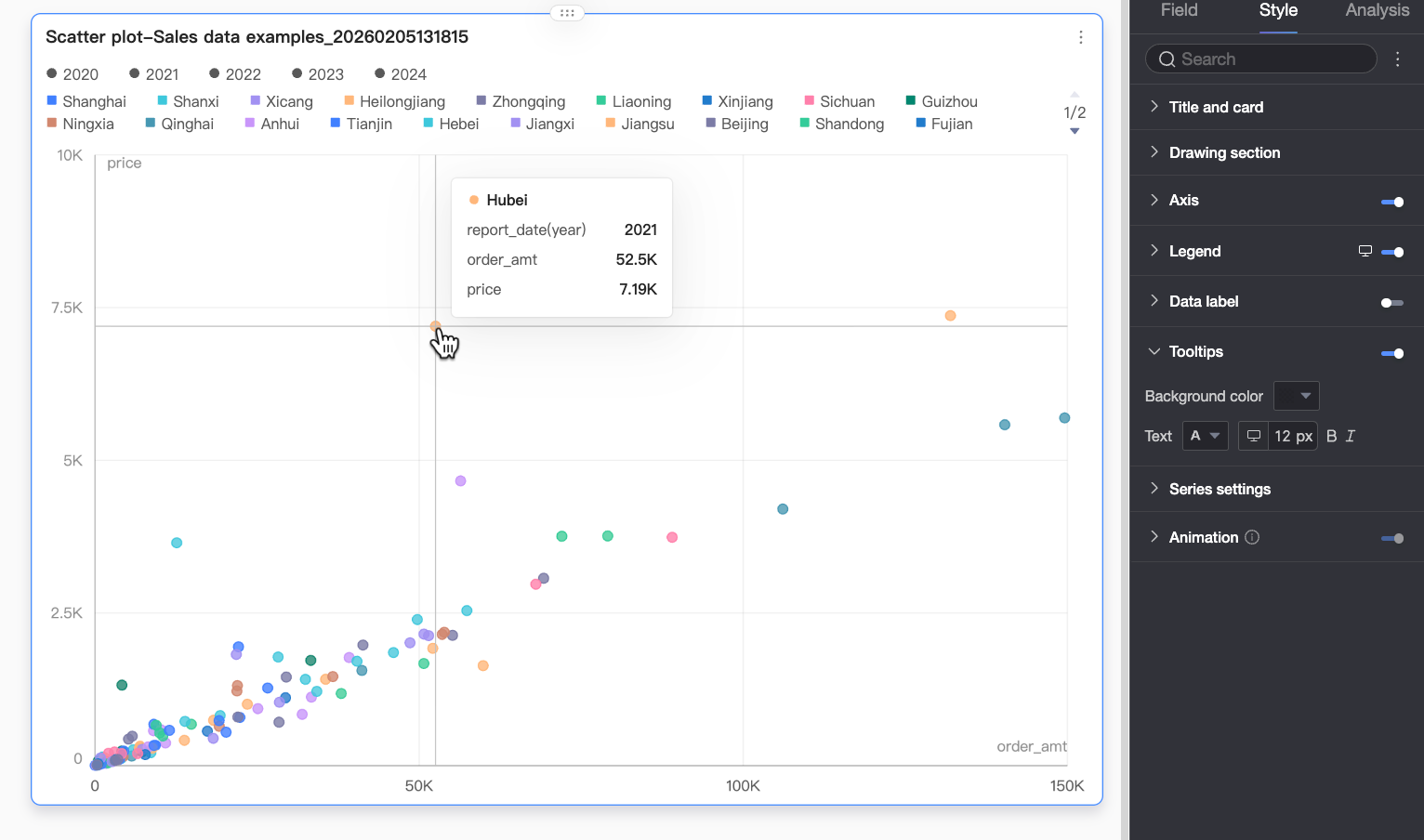
Parameter | Description |
Background color | Sets the background fill color for the tooltip box. |
Text | Sets the text style in the tooltip box, including font color, size, weight, and style (italic). |
Mobile tooltip | You can enable or disable tooltips for PC and mobile devices independently. Click the PC/Mobile toggle ( |

Series settings
In the Series settings section, configure the series style.
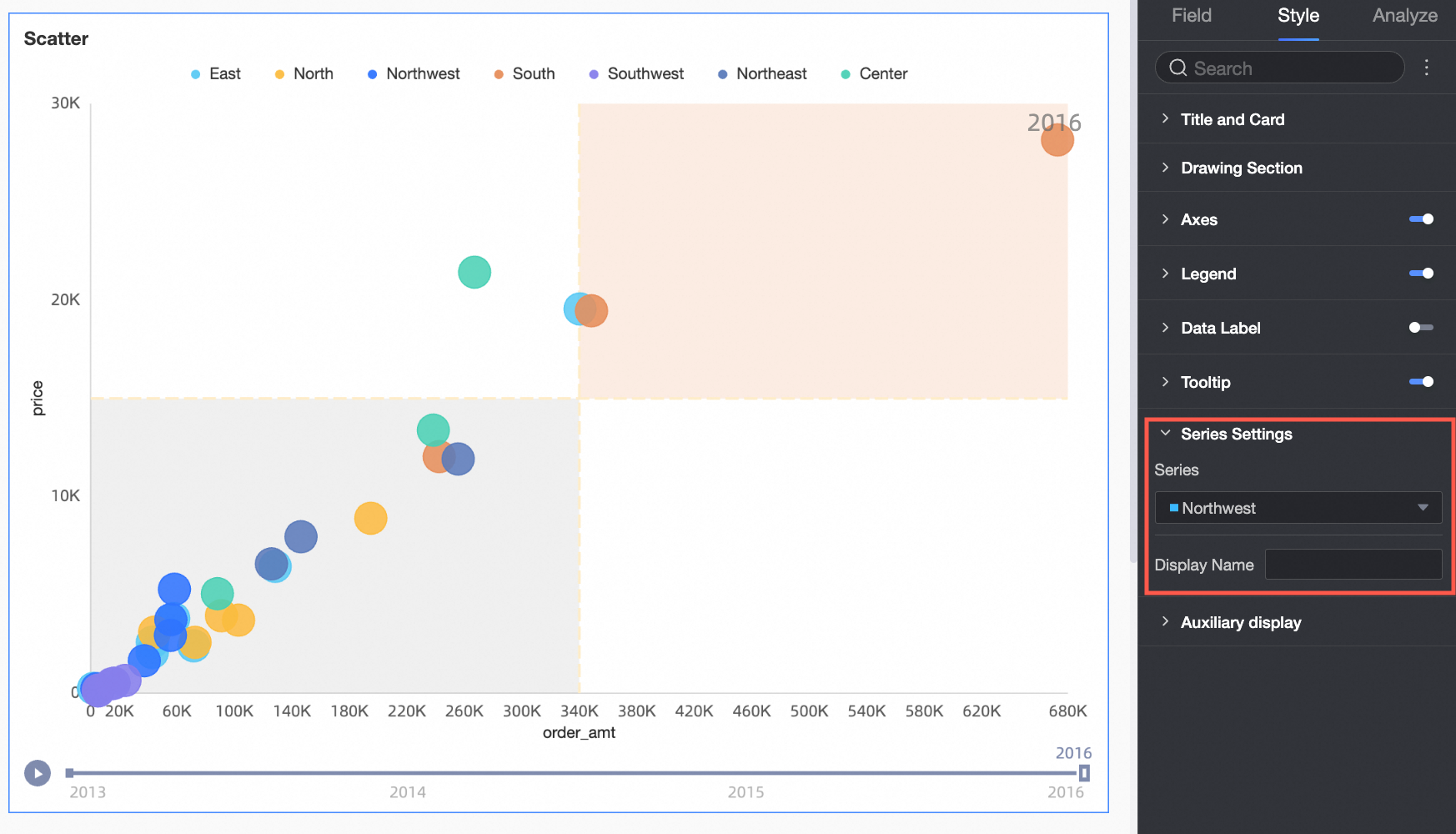
Functionality
In the Functionality section, configure the Playback timeline settings:
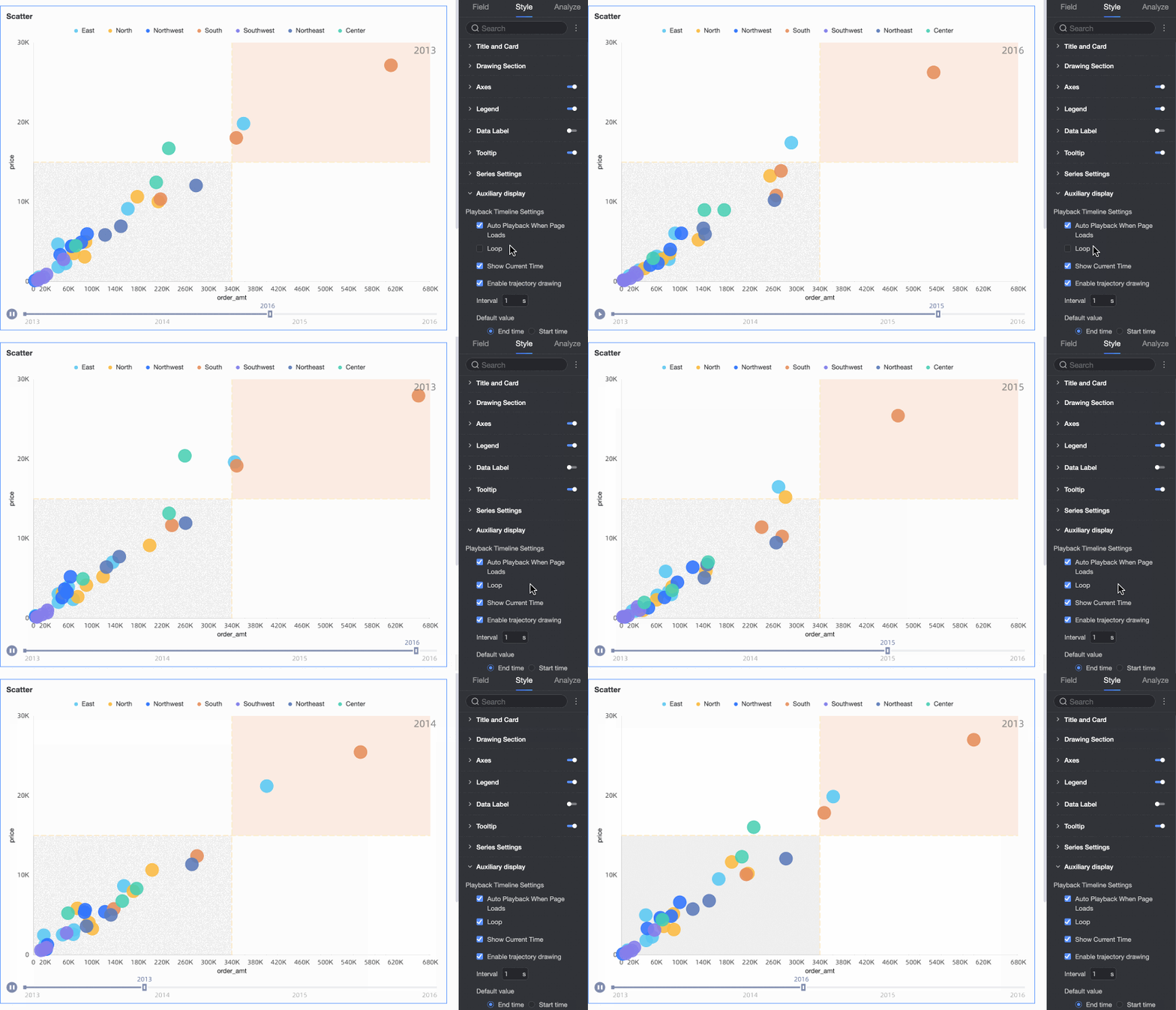
Select Auto playback when page loads to automatically play the chart animation once when the dashboard loads.
Select Loop to play the chart animation repeatedly.
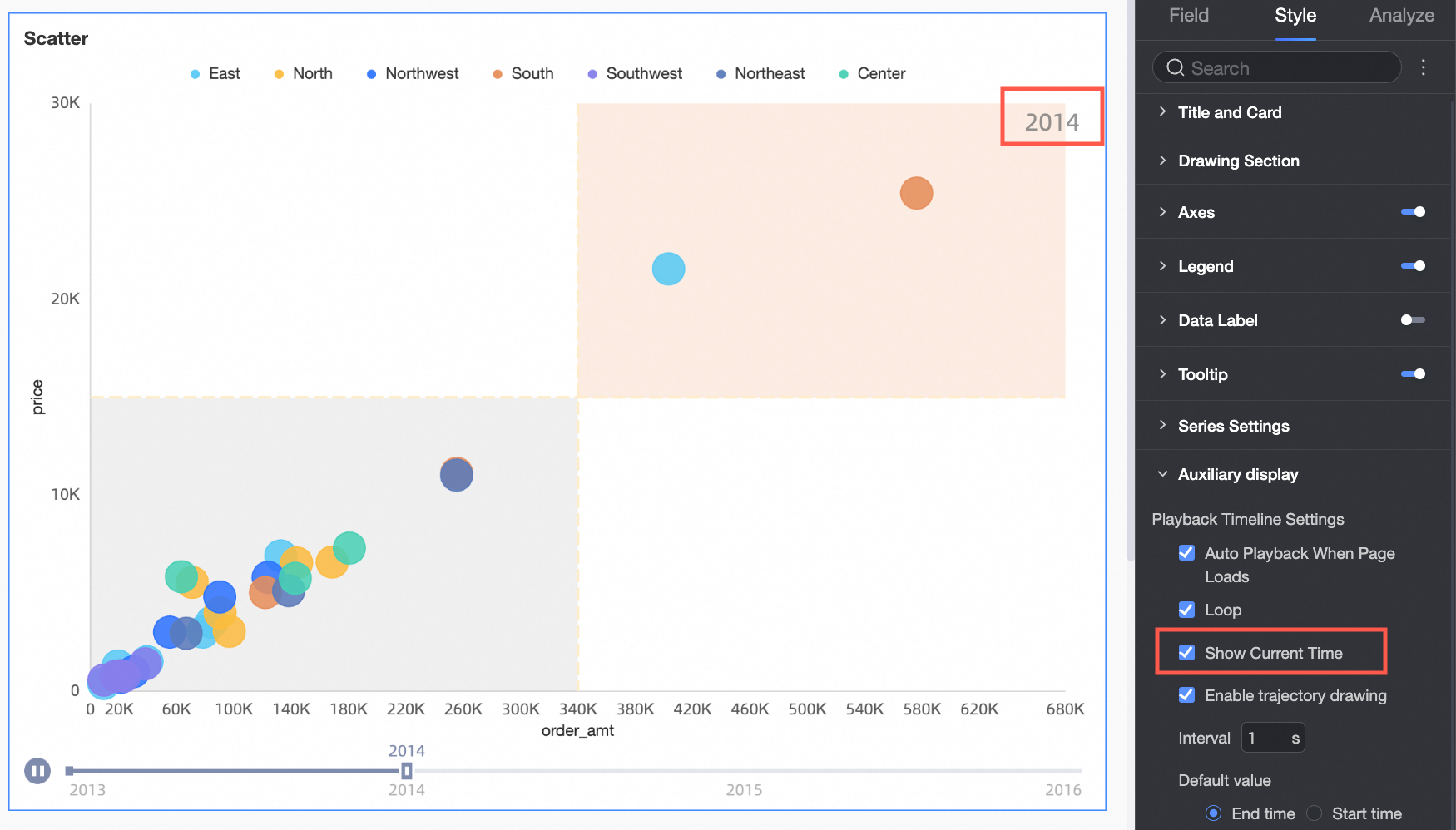
Select Show current time to display the corresponding time value during the animation.
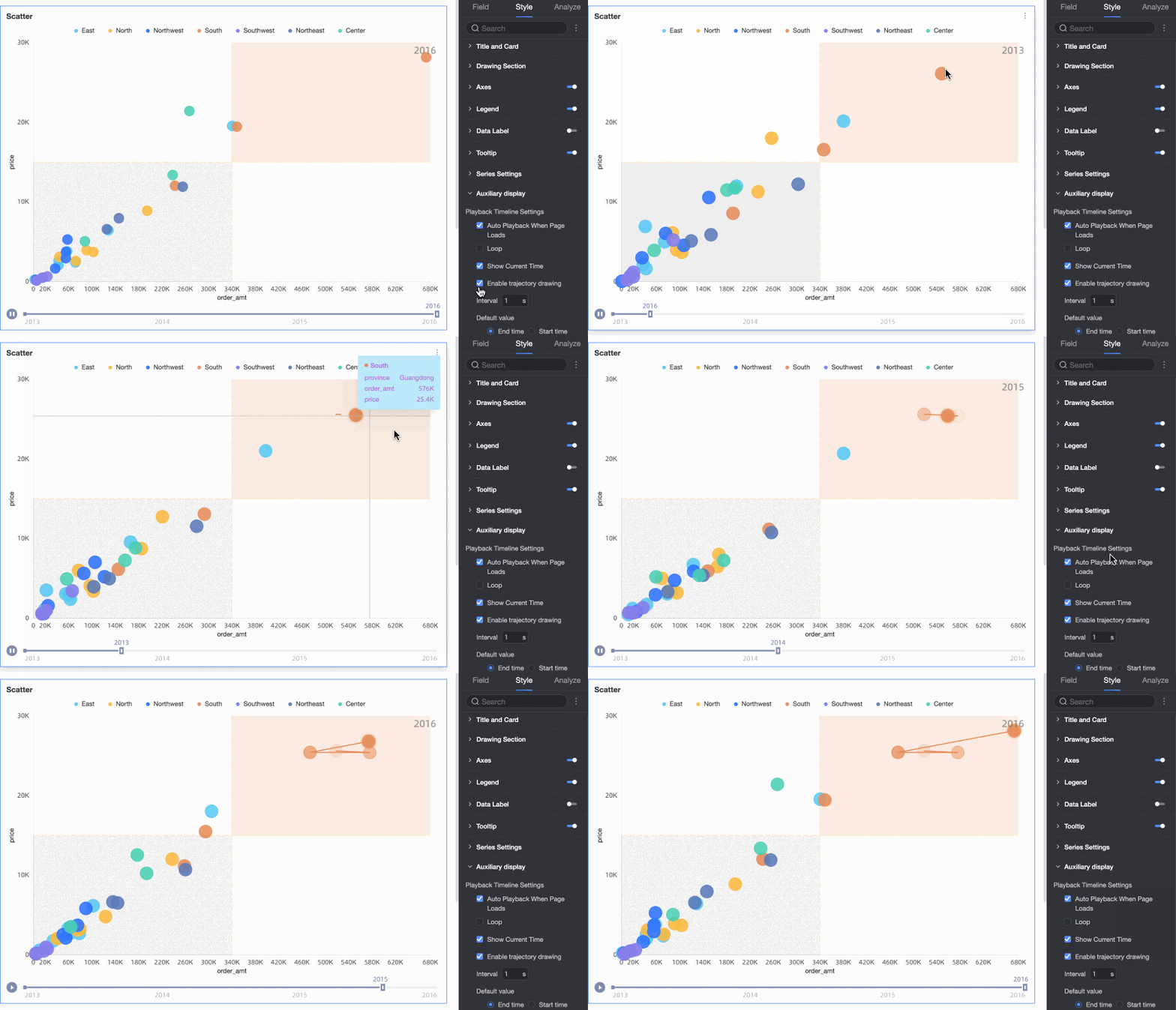
You can draw a trajectory for a specific data point. To do this, click the data point. During playback, the chart draws a trajectory that follows the playback timeline. For example, if you click the data point for the South China region, the chart draws a trajectory for the years 2013-2021. Click the data point again or a blank area to cancel the trajectory.
Configure analysis features
Section | Feature | Description |
Interaction analysis | Drill down | If you have configured drill down fields on the data pane, you can set the display style for the drill down levels here. |
Linkage | If the data that you want to analyze is in different charts, you can use chart linkage to associate multiple charts for data analysis. For more information, see Linkage. | |
Hyperlink | If the data that you want to analyze is in different dashboards, you can use dashboard hyperlinks to associate multiple dashboards for data analysis. For more information, see Hyperlink. | |
Metric analysis | Reference line | Use a reference line to compare the current measure value with a set value. The reference value can be a fixed value or a calculated value, such as average, maximum, minimum, or median. For more information, see Reference Line. |
Trendline | Use a trendline to show the overall trend of your data. Available types include Intelligent, Linear, Logarithmic, Exponential, Polynomial, and Power. For more information, see Trendline. Note Trendlines are supported only when the playback timeline is disabled and both axes are configured with measure fields. | |
Smart insights | Anomaly detection | Use anomaly detection to identify abnormal data points in your current data. For more information, see Anomaly Detection. Note The anomaly detection feature is currently in Beta. |
Clustering | Clustering analysis groups similar measures into clusters based on their distribution on the x-axis and y-axis, replacing the color field with clusters when enabled. Note The Clustering analysis feature is currently in Beta, and you can enable clustering analysis only when both the x-axis and y-axis are set to measures and a playback timeline is not configured. |
What to do next
If you need others to view your dashboard, you can share it with specific users. For more information, see Share a dashboard.
If you need to create a complex navigation menu for thematic analysis, you can add your created dashboards to a BI portal. For more information, see Create a BI portal for PCs.