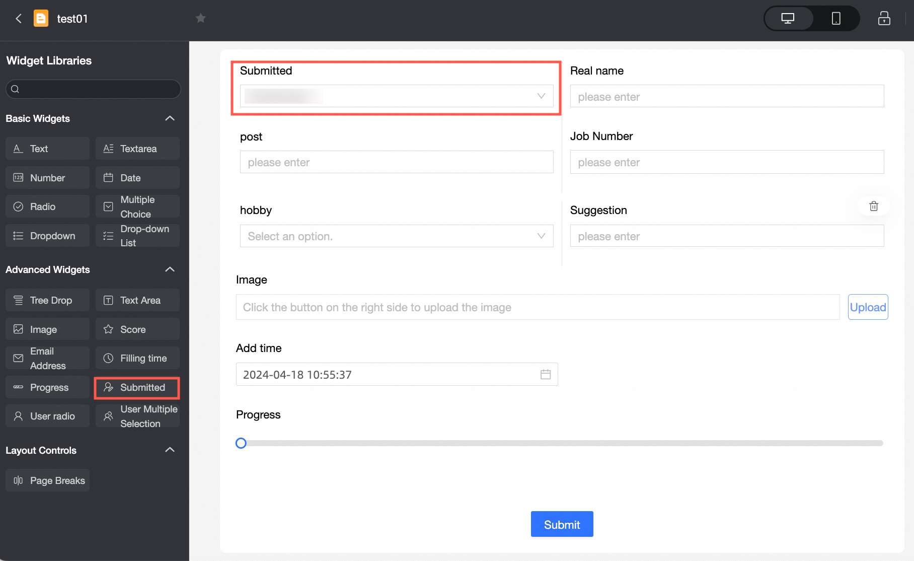
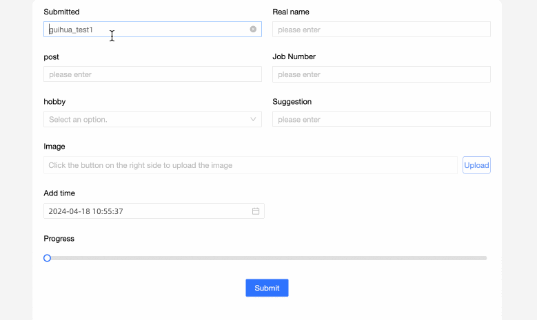
Submitter is an advanced control that lets the current user auto-fill their username or enter the username of another user in the same organization.
Scenarios
Use this control to record usernames during data entry. For example:
-
In a satisfaction survey, auto-fill the current logon username with one click.
-
In an event registration form, enter the username of the person who submits the form.
-
In a voting activity, count the usernames of participants.
TensorBoard
Control configuration
Basic parameters
|
Parameter |
Description |
|
|
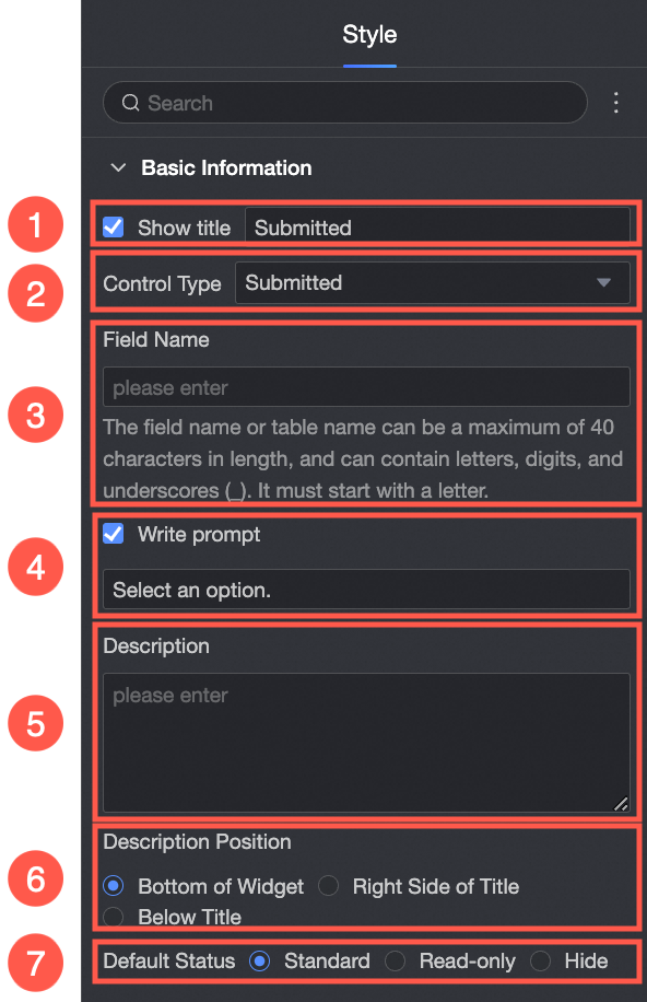
① Display Title: Specifies whether to display the control title. You can customize the display name, which is used as the column name in the data form. |
|
② Control type: After you select a control, you can change its type. The drop-down list provides other basic and advanced control types. |
|
|
③ Table Field Name: The name of the corresponding field in the database table generated from the data form. Note
The field or table name must start with a letter and can contain letters, digits, and underscores (_). The name can be up to 40 characters in length. |
|
|
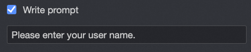
④ Prompt: The placeholder text displayed in the control. For example, "Enter your username".
|
|
|
⑤ Description: A custom description for the control. |
|
|
⑥ Description Information Location: The position where the description is displayed. Valid values: Control Bottom, Title Right, and Title Below. |
|
|
Default State: The initial state of the control. Valid values: Normal, Read-only, and Hidden. |
|
Define options for an extension
|
Parameter |
Description |
|
|
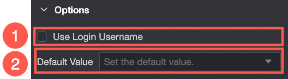
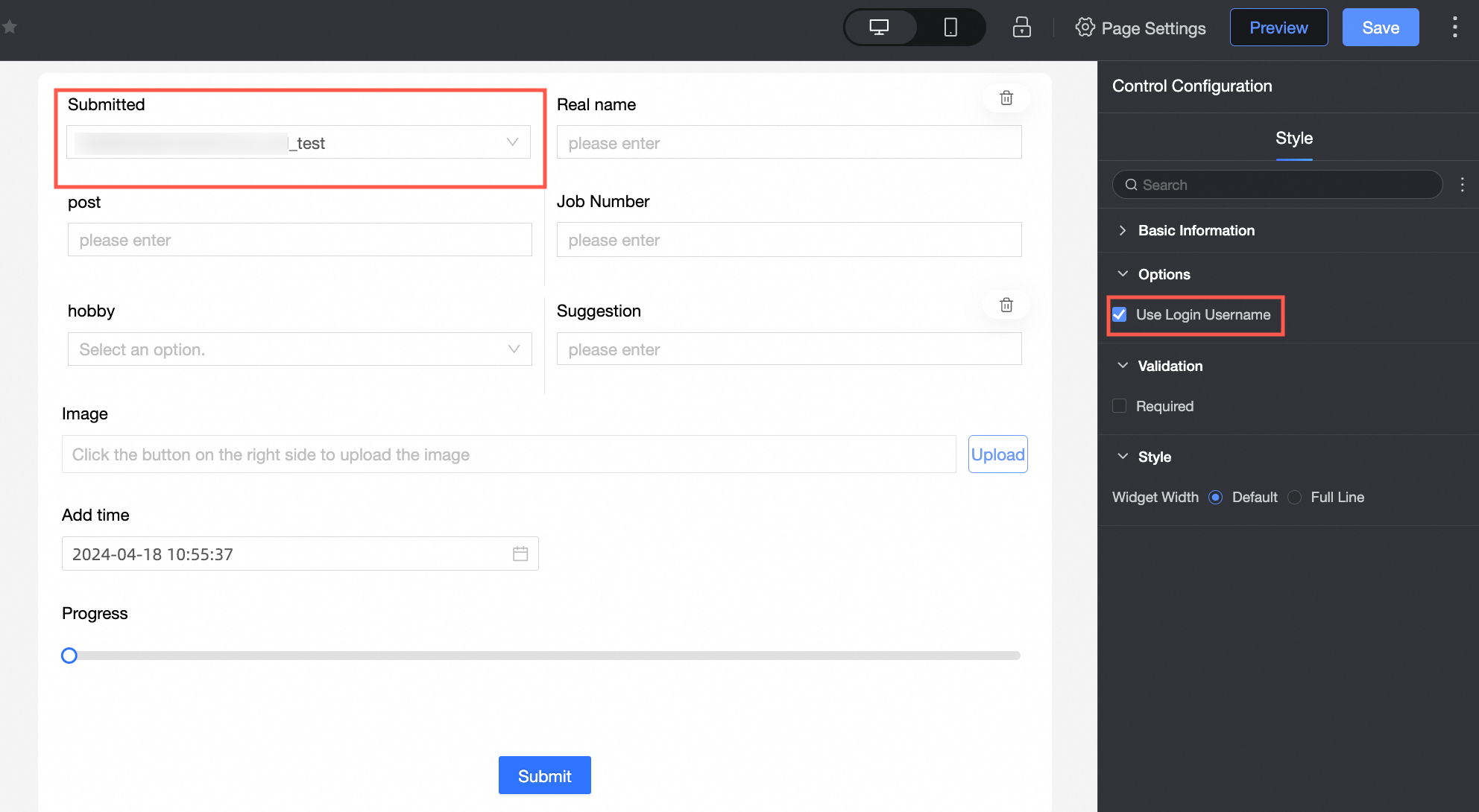
① Use Logon Username: If you select this check box, the current logon username is automatically populated. |
|
② Default Value: The default value displayed in the control.
|
Yes
|
Parameter |
Description |
|
|
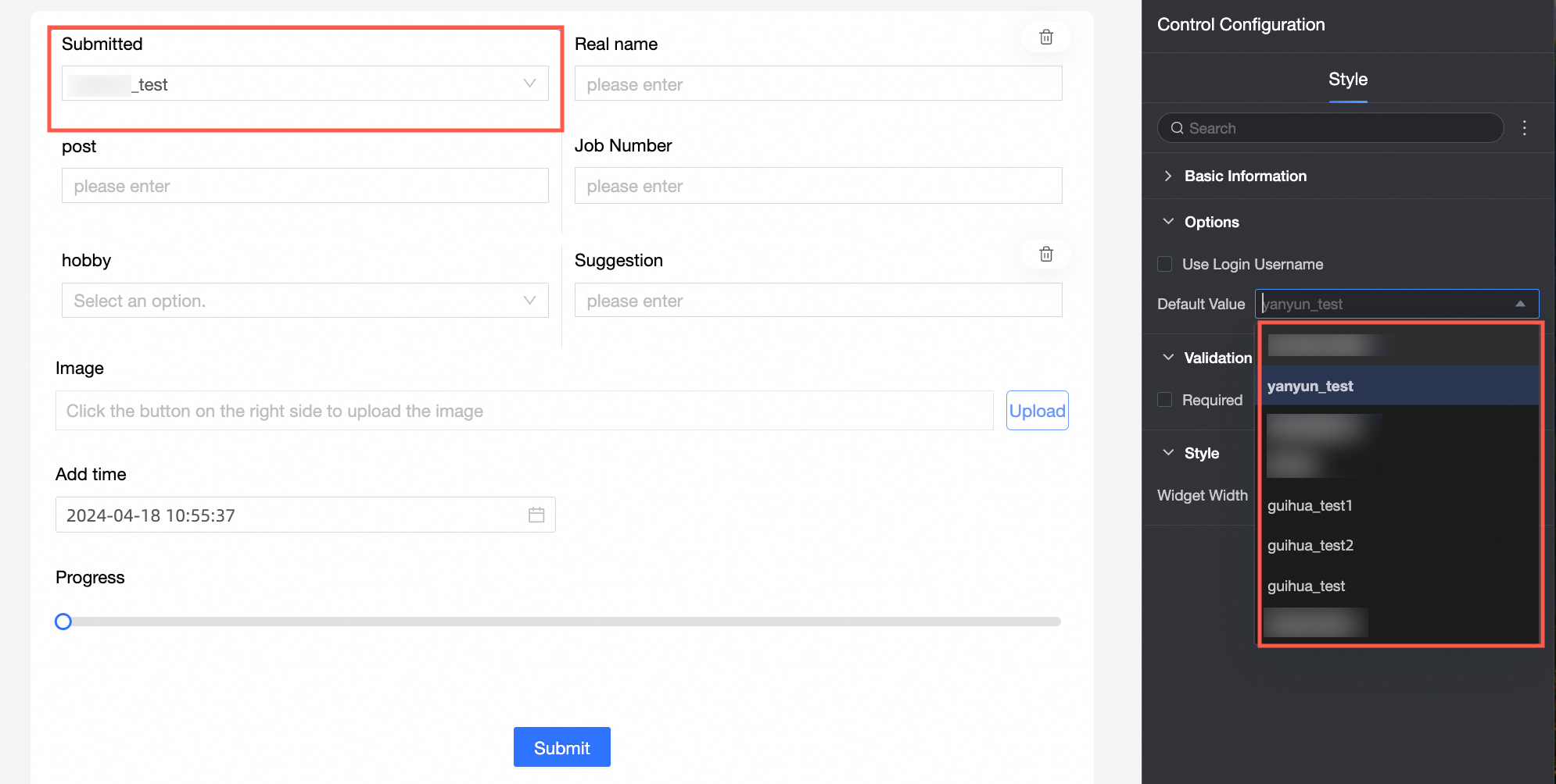
① Required: Specifies whether the control is required. If you select this option, the control is marked as Required. |
|
② Input data invalid prompt text: The error message displayed when a validation rule is triggered. For example, if Required is selected and no value is entered, this custom error message is displayed. |
styles
|
Parameter |
Description |
|
PC
|
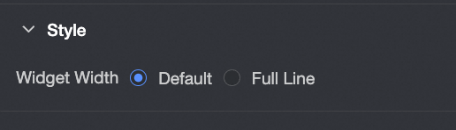
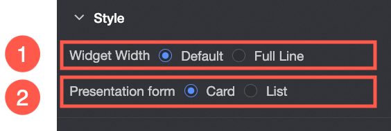
Widget Width: Select Default or Whole Line. Note
You can also use the Manual Drag Control widget to adjust the border width. |
|
Mobile platform
|
① Control width: Same as the PC-side setting. |
|
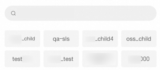
Display form: The display layout for the options list. Valid values: Card and List. Example of the Card layout:
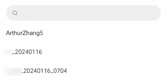
List:
|