Customize the HTML5 player error UI by modifying the default CSS or defining a new error UI.
Default error UI
The default error UI of ApsaraVideo Player: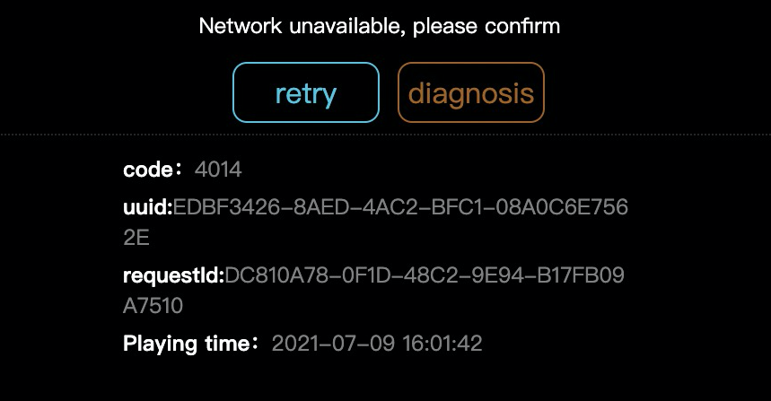 Enable the displayError UI component
In ApsaraVideo Player V2.1.0 or later with a custom skin, add the displayError UI component to the skinLayout configuration.
skinLayout:[
    ......
    {name: "errorDisplay", align: "tlabs", x: 0, y: 0},
    {name: "infoDisplay", align: "cc"},
    ......
  ]
Custom error UI
Use either of the following methods:
-
Modify the CSS file of the default error UI
Modify the CSS file to change the background color, font, position, or error message visibility.
Key CSS classes:
Class
Description
.prism-ErrorMessage
Outermost container.
.prism-error-content
Error message display area.
.prism-error-operation
Operation area.
.prism-detect-info
Diagnostic details such as UUID and request ID.
-
Define a new error UI
Subscribe to error events to intercept the default UI:
player.on('error',function(e){
      // Hide the error UI.
      $('.prism-ErrorMessage').hide();
      // Parse the data about the error.
      var errorData = e.paramData;
      console.dir(errorData);
    });
To define a new error UI:
-
Hide the default error UI as shown in the preceding code.
-
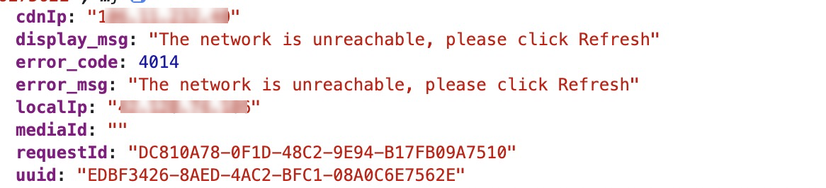
Parse error data from the paramData parameter. The following figure shows the error fields.
-
Use the parsed error codes and assign them to the parameters on your custom error UI.