
本文为您详细介绍自定义菜单API。
Lifecycle
自定义菜单本质是一个生命周期对象,请参见生命周期。
LifecycleProps
LifecycleProps 描述的是传入自定义菜单各个生命周期的 props 参数类型,包含了 customProps属性,其接口如下。详情参考LifecycleProps。
interface LifecycleProps {
  customProps?: MenuComponentProps;
}
例子
class MyComponent {
	mount(props: LifecycleProps) {...}// props 是 LifecycleProps 类型
  update(props: LifecycleProps) {...}
  unmount(props: LifecycleProps) {...}
}

const MyReactComponent: React.FC<LifecycleProps> = (props) => <div>...<div/> // props 是 LifecycleProps 类型
@quickbi/bi-open-Menu-sdk 提供了创建自定义菜单的 createBIComponent 函数, 并对LifecycleProps进行了封装,并通过 React 的 props 传入,以下统一称其为 menuComponentProps。
menuComponentProps
menuComponentProps 是自定义菜单运行时的一些信息,其接口为:
/**
 * 自定义菜单 props 接口
 */
export interface MenuComponentProps {
  /** 页面信息 */
  pageConfig: MenuPageConfig;
   /** 操作 */
  dispatch?: MenuComponentPropsDispatch;
  /** 自定义菜单展示模式 */
  menuMode?: CustomMenuMode;
}menuComponentProps.menuMode自定义菜单展示模式,可能有以下几种取值:
1- 平铺,直接展示在界面上2- 收起,隐藏至更多下拉框中
在 Quick BI 中, 所有的自定义菜单均会继承 MenuComponentProps
menuComponentProps.pageConfig
代表自定义菜单当前页面信息配置,其接口为:
interface MenuPageConfig {
  /** 页面工作空间 id */
  workspaceId: string;
  /** 页面 id */
  id: string;
  /** 当前设备 */
  device: 'pc' | 'mobile';
  /** 当前访问者 id */
  userId: string;
  /** 当前访问者 账号名称 */
  userName: string;
  /** 当前访问者 昵称 */
  nickName?: string;
  /** 页面创建者 id */
  ownerUserId: string;
  /** 页面创建者 id */
  ownerUserName: string;
  /** 页面标题 */
  title: string;
  /** 页面路由 key */
  routeKey?: RouteKey;
}workspaceId:当前工作空间idid:当前页面idmode:当前页面的模式
preview:查看态,例如仪表板的查看态edit:编辑态,例如仪表板的编辑页
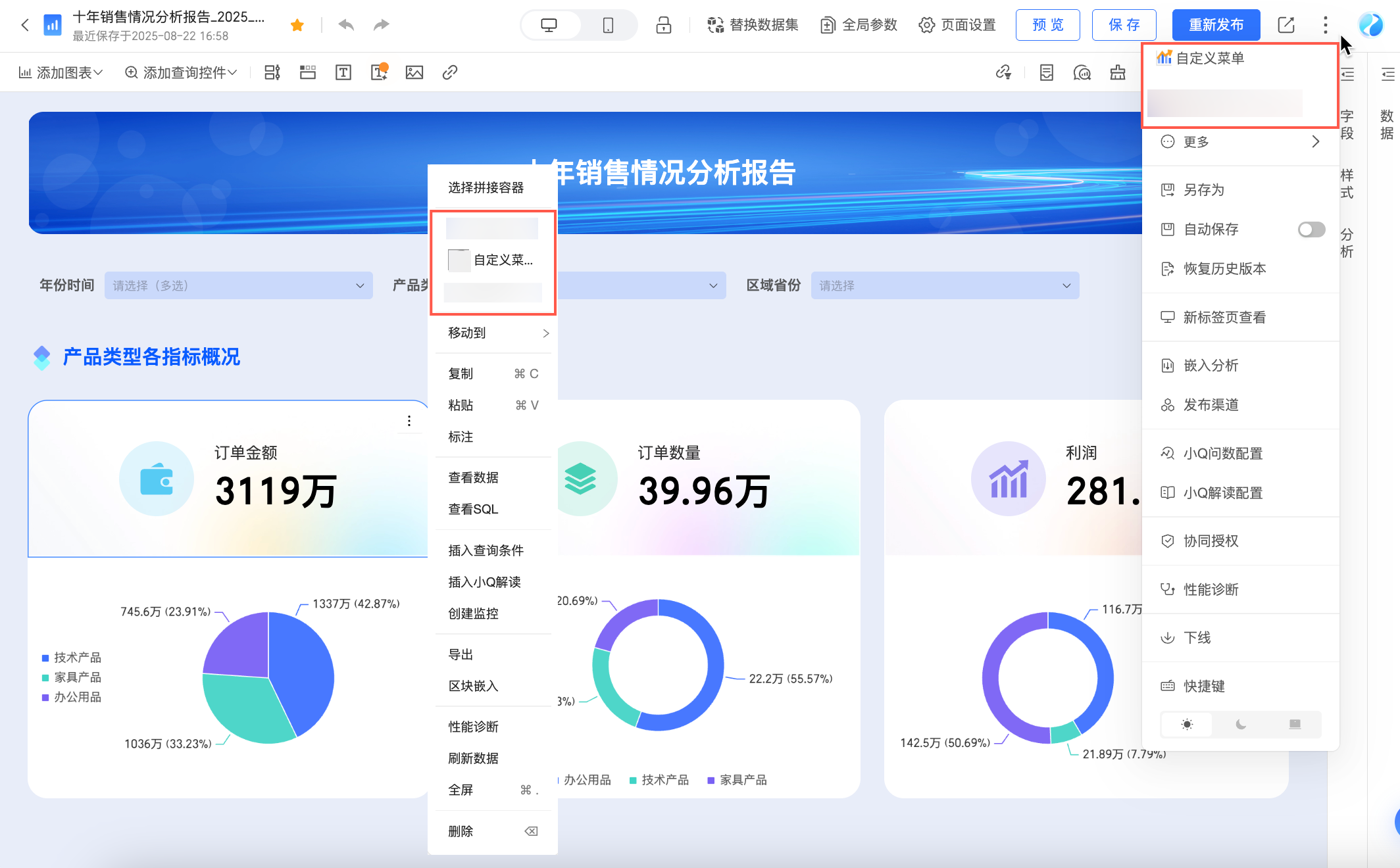
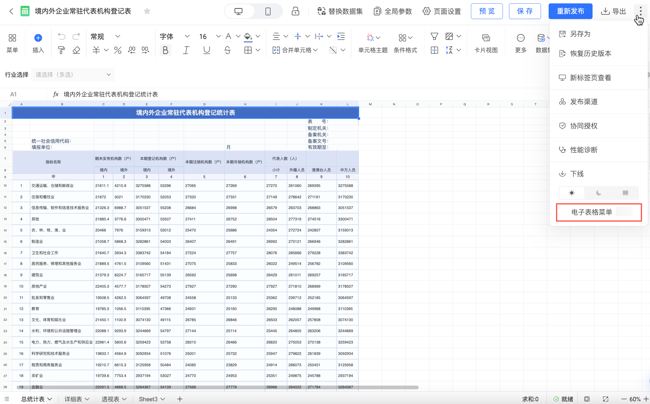
在不同页面中的实现效果示例如下:
名称 | 路由 key | 功能示例 |
仪表板编辑页(宿主页) | dashboardEdit |
|
仪表板预览页(宿主页) | dashboardView |
|
电子表格编辑页(宿主页) | workbookEdit |
|
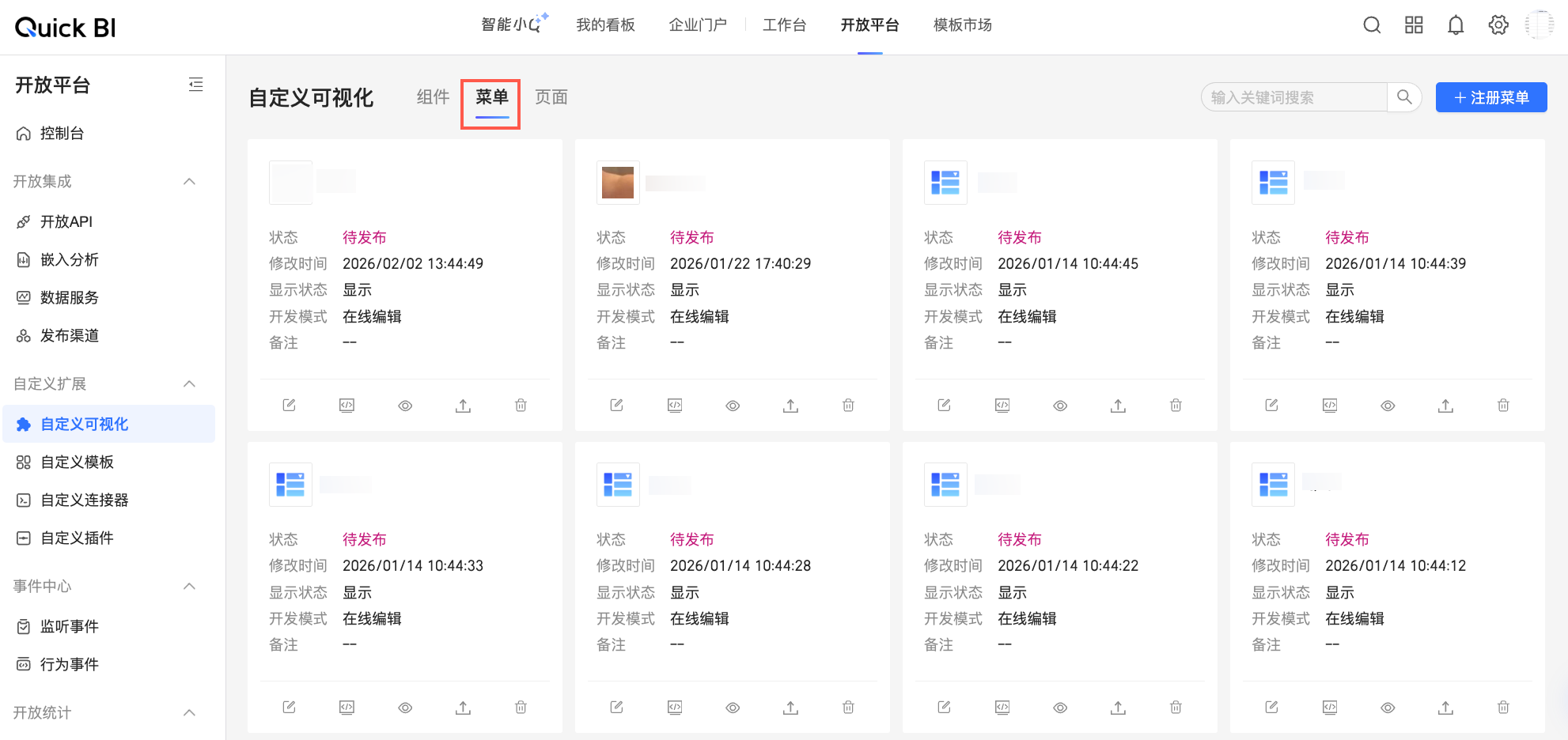
自定义菜单管理页 | customMenu |
|

menuComponentProps.dispatch
自定义菜单修改属性或触发行为的函数
(param: {
  type: 'openModal' | 'closeModal'
 	paylpad: any
}) => void
参数
param行为类型参数,
param.type共有以下类型:openModal自定义菜单的打开弹窗操作,调用后会唤起弹窗。
此时 =
payload的类型为payload: MenuModalFuncProps,其中MenuModalFuncProps接口定义为:export interface MenuModalFuncProps { /** PC端弹窗宽度 */ width?: string | number; /** PC端和移动端点击取消按钮时的回调 */ onCancel?: (...args: any[]) => any; /** 内容 */ content?: React.ReactNode; /** 标题 */ title?: string; /** PC端点击确定回调,返回 promise 可以延迟关闭。 */ onOk?: (...args: any[]) => any; /** PC端确认按钮文字 */ okText?: React.ReactNode; /** PC端取消按钮文字 */ cancelText?: React.ReactNode; /** PC端确认按钮属性 */ okButtonProps?: { style?: React.CSSProperties; disabled?: boolean | undefined; }; /** PC端取消按钮属性 */ cancelButtonProps?: { style?: React.CSSProperties; disabled?: boolean | undefined; }; }closeModal自定义菜单的手动关闭弹窗操作。调用后会关闭最近一次唤起的弹窗。
此时无需传入
payload。
menuComponentProps.chart
chart 属性只有在图表卡片下的菜单才会传入,图表的数据字段配置,其接口为:
export interface MenuComponentChartProps extends MenuComponentProps {
  /** 图表信息 */
  chart: MenuChart;
}
其中 MenuChart 与自定义组件的 customProps 完全相同,具体请参考customProps。
menuComponentProps.sheets
sheets 属性只有在电子表格的菜单才会传入,图表的数据字段配置,其接口为:
export interface MenuComponentExcelProps extends MenuComponentProps {
  sheets: MenuSheet[];
}其中MenuSheet是电子表格数据,其数据结构是一个数组。
interface MenuSheet {
   /** 标签 id */
  sheetId: string;
  /** 标签名称 */
  sheetName: string;
  /** 标签顺序 */
  sheetOrder: number;
}
@quickbi/bi-open-menu-sdk API
createBIComponent
创建 Quick BI 自定义菜单的函数,返回一个自定义组件对象。
(option: IOption) => Lifecycle参数
option
配置参数
interface IBiComponent {
  mount?: Interfaces.LifecycleMount<Interfaces.ComponentProps>;
  umount?: Interfaces.LifecycleUnmount<Interfaces.ComponentProps>;
  update?: Interfaces.LifecycleUpdate<Interfaces.ComponentProps>;
}

interface IBiComponentConstructor {
  new (): IBiComponent;
}

interface IOption {
	element: IBiComponentConstructor | React.ComponentType
}elementelement 的类型为React 组件
React.ComponentType。
例子
import { createBIComponent } from '@quickbi/bi-open-menu-sdk'

const MyComponent = (props) => <div>...</div>

const { bootstrap, mount, unmount, update } = createBIComponent({
  element: MyComponent,
})
MenuItem
@quickbi/bi-open-menu-sdk 提供了一个名为 MenuItem 的 React 组件,方便开发者开箱即用。
例子
import { Interfaces, MenuItem, createBIComponent } from '@quickbi/bi-open-menu-sdk';

// 自定义菜单
const MyCardMenu: React.FC<Interfaces.MenuComponentChartProps> = React.memo(props => {

  // 点击事件
  const handleClick = React.useCallback(() => {
    console.log('click');
    console.log('props', props);
    props.dispatch({
      type: 'openModal',
      payload: {
        title: '我是标题',
        content: <iframe src="https://www.yuque.com/u2227425/ia1pn8/nvg5q6" width="100%"></iframe>,
        onCancel: () => {
          console.log('关闭事件');
        },
        onOk: () => {
          console.log('确认事件');
          return new Promise((resolve, reject) => {
            setTimeout(Math.random() > 0.5 ? resolve : reject, 1000);
          }).catch(() => console.log('Oops errors!'));
        },
        cancelText: '点我取消',
        okText: '前往',
        cancelButtonProps: {
          style: { display: 'none' },
        },
        okButtonProps: {
          disabled: true,
        },
      },
    });
  }, [props]);

  return (
    <MenuItem
      title="自定义菜单"
      onClick={handleClick}
    />
  );
});

// 导出自定义菜单
export const { bootstrap, mount, unmount, update } = createBIComponent<Interfaces.MenuComponentChartProps>({
  element: MyCardMenu,
});
其接收属性如下:
interface MenuItemProps {
  /** 根元素 className */
  className?: string;

  /** 根元素 style */
  style?: React.StyleHTMLAttributes<HTMLDivElement>['style'];

  /** 菜单标题 */
  title?: string | React.ReactNode;

  /** 菜单禁用 */
  disabled?: boolean;

  /** hover 提示 */
  hoverTip?: string;

  /** 是否加载中 */
  loading?: boolean;

  /** 点击事件 */
  onClick?: (e: React.MouseEvent<HTMLDivElement>) => void;

}
MenuItem.title
自定义菜单标题
例子
// ...
<MenuItem
	title="自定义菜单"
/>
效果如下

MenuItem.disabled
自定义菜单是否禁用
例子
// ...
<MenuItem
	title="自定义菜单"
	disabled={true}
/>
效果如下

MenuItem.loading
自定义菜单是否在 loading 状态
例子
// ...
<MenuItem
	title="自定义菜单"
	loading={true}
/>
效果如下

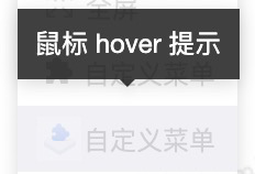
MenuItem.hoverTip
自定义菜单hover文本信息提示
例子
// ...
<MenuItem
	title="自定义菜单"
	disabled={true}
	hoverTip="鼠标 hover 提示"
/>
MenuSchemaItem.onClick
自定义菜单点击时触发事件
例子
// ...
<MenuItem
	title="自定义菜单"
	onClick={() => {}}
/>
MenuItem.showTitle
自定义菜单标题是否展示
例子
// ...
<MenuItem
	showTitle={false}
/>
MenuItem.showIcon
自定义菜单图标是否展示
例子
// ...
<MenuItem
	showIcon={false}
/>