Rectangle widget
This topic describes the attributes and rendering effects of a rectangle widget.
Left margin and top margin
You can click the up or down arrow in the spin box for the left or top margin to fine-tune the margin. You can also drag and drop the widget on the canvas to adjust the left and top margins. After the left and top margins are modified, the widget is moved to the location specified by the margins.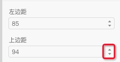

Height and width
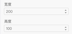
The height and width of the widget determine the size of the widget on the canvas.

Chamfer
The chamfer determines how rounded the four corners of the rectangle widget are on the canvas.
Background color
You can change the background color of the widget. The available colors vary based on the device on which the widget is displayed. For example, if the widget is displayed on a tricolored electronic paper display (EPD), the available colors are black, white, and red.