Best practices
Quickly adjust the style of a visualization application by using five chart widgets as an example: a vertical stacked column chart, an area chart, a basic scatter chart, a doughnut chart, and a common title. The procedure covers the One-click Beautify and Smart Theme features in the Beautify Toolbox and the Filter Configuration feature on the toolbar.
Procedure
Log on to the DataV console.
-
On the My Visualizations page, click Edit for the desired visualization application.
-
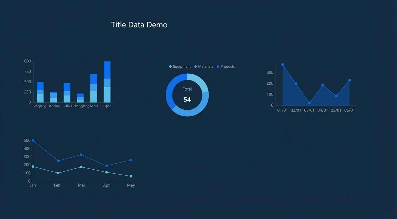
Click the Asset List icon, add the required widgets, and arrange them as shown in the following figure.
-
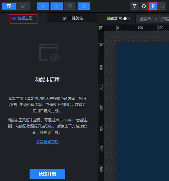
Click the Beautification Toolbox icon to open the Smart Theme feature.
-
Click the My Themes module. In the System Themes list, click a built-in system theme. You will see a real-time preview of its colors in the canvas editor on the right.
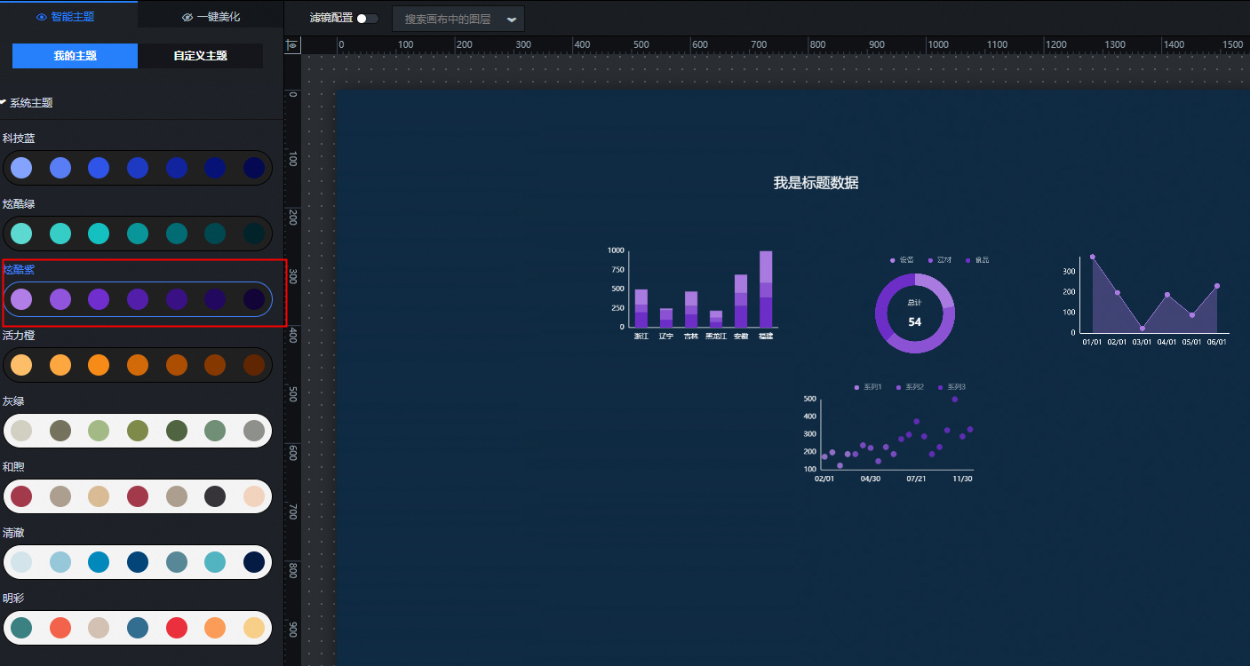
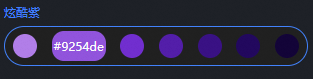
Hover over the color blocks of a system theme to view its color values.
-
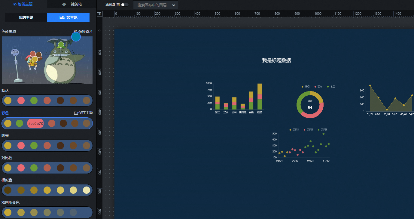
Click the Custom Theme module. Upload a custom style image to automatically generate multiple style themes.
-
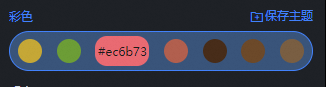
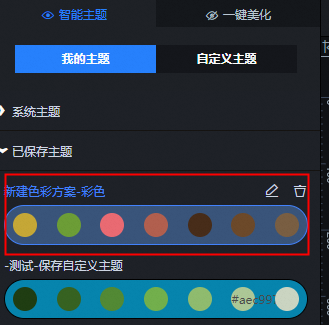
Use the color picker on the uploaded style image to select colors and update the automatically generated theme color values below. Click Save Theme. After saving, you can view the theme under My Themes > Saved Themes.

-
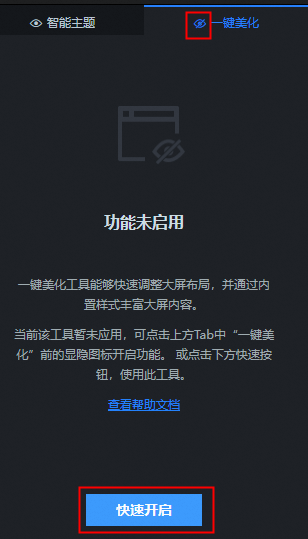
Switch to One-click Beautify and click the show/hide button or the Quick Start button to enable the feature.
-
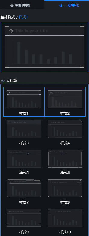
Click the global style configuration item to display over 20 built-in global styles. Style 1 is selected by default.
-
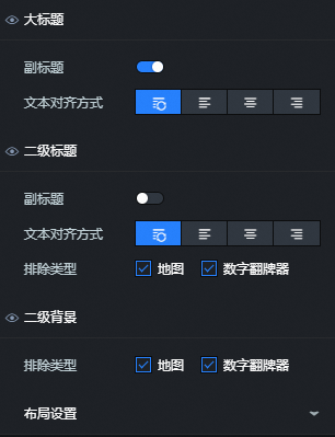
Configure the Main Title, Subtitle, Subtitle Background, and Layout Settings for the One-click Beautify style.
-
Main Title: Show or hide the subtitle and set the text alignment. Alignment options are default, align left, align center, and align right.
-
Subtitle: Show or hide the subtitle and set its text alignment. Alignment options include default, align left, align center, and align right. You can also choose to display the subtitle only for specific exception types, such as the Map and Ticker Board widgets.
-
Subtitle Background: Specifies the exception types that display a subtitle background. This setting is available for the Map and Ticker Board widgets.
-
Layout Settings: Customize the layout of visual groups.
Parameter
Description
Margin
-
Screen padding: Adjusts the margin between the visual group and the canvas edges.
-
Group margin: The margin between visual groups.
-
Widget padding: The padding from the widget to its border.
Alignment threshold
-
Area Range-X: Adjusts the horizontal guide of the visual group.
-
Area Range-Y: Adjusts the vertical guide of the visual group.
-
Snap Range-X: Adjusts the horizontal alignment of each widget.
-
Snap Range-X adjusts the vertical alignment of components.
Keep Original Group
One-click Beautify disrupts the layout of widgets within the original visual group. Turn on the Keep Original Group switch to preserve the original layout.
-
-
-
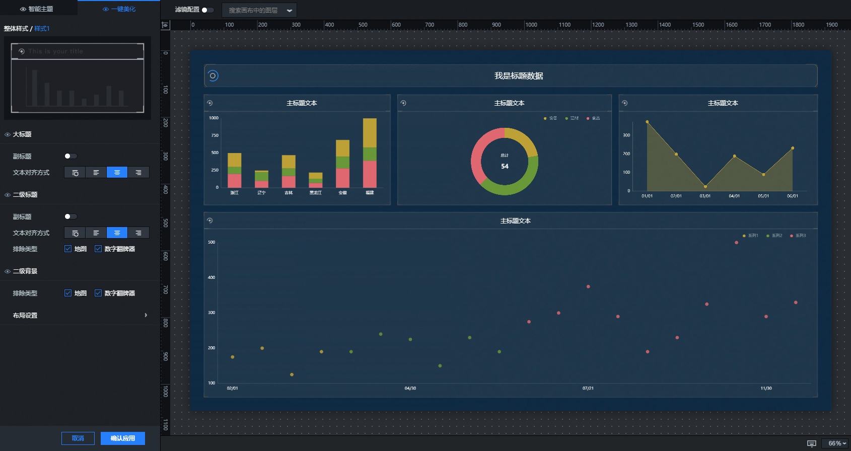
The following figure shows the result.
-
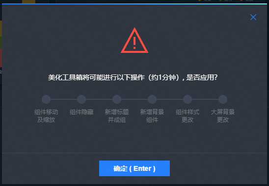
After you complete the configuration, click Apply. In the dialog box that appears, click OK to apply the configured color and layout to all widgets on the canvas.
-
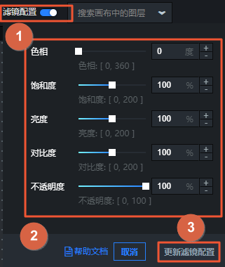
At the top of the canvas editor, click the Filter Configuration switch to enable this feature.
-
In the canvas editor, drag the sliders to adjust the Hue, Saturation, Brightness, and Opacity of the entire page.
-
After adjusting the settings, click Update Filter Configuration in the lower-right corner.
NoteYou can enable or disable the filter effect at any time.
-
Preview and publish the visualization application to display the new styles online.
Video link
For a video demonstration, see the DataV classroom tutorial: Beautify Toolbox live tutorial.