Color Mapper User Guide
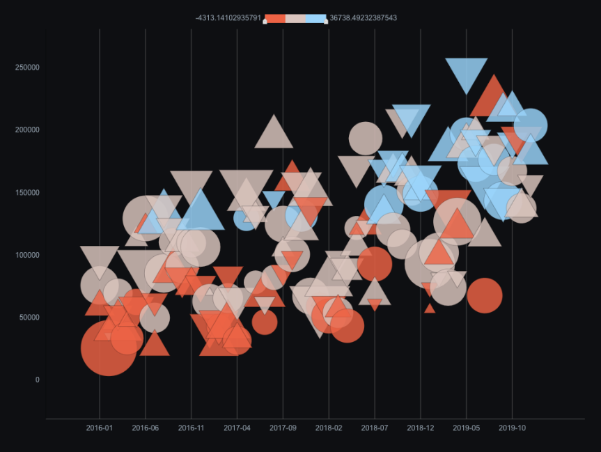
The color mapper lets you configure the mapping between colors and data values in a widget. It provides over ten built-in color templates and supports custom colors and values to meet your specific needs. This topic uses an example to demonstrate how to configure scatter point colors for the vector scatter layer of a Basic Plain Map 3.0 widget.
Configuration instructions
When you configure scatter point colors for a map sub-widget, you can adjust the colors using one of two methods.
Method 1: Click the
 icon to the left of the Scatter Color configuration item to disable color mapping. When the Enable Visual Mapping tooltip appears on hover, you can use the color picker to set a single custom color.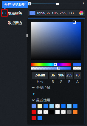
Method 2: Click the
 icon to the left of the Scatter Color configuration item to enable color mapping. When the Close Visual Mapping tooltip is displayed on hover, you can use the color mapper to configure multiple colors for the scatter points based on a data-driven mapping.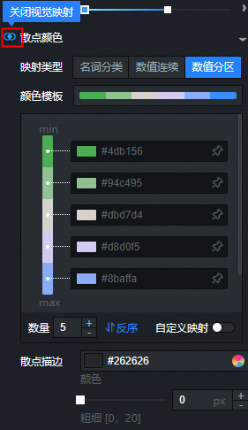
Features
Feature |
Description |
Switch mapping colors in the collapsed panel |
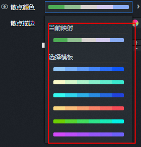
When the color mapper is collapsed, you can click the color display bar to open the multi-color template panel. The top row shows the current mapping result. Multiple color templates are displayed below it. You can click a color bar within a template to quickly switch the mapping colors. |
Configure mapping details in the expanded panel |
When the color mapper is expanded, the system automatically reads the data and maps it to colors. You can configure the following mapping details.
|
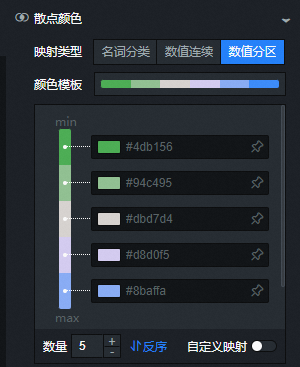
 icon to the right of a color in the template to pin its value. A pinned color does not change when you switch templates. Unpinned colors change when you switch templates.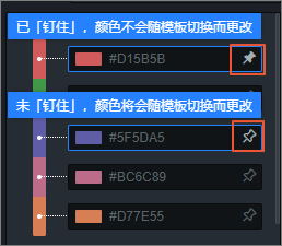
 icon to reverse the order of the color mapping list.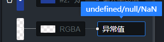
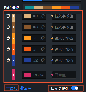
 icon to the left of a mapping entry to delete the entire row.
 icon below the color mapping list to add a new mapping entry.
Mapping types
There are three main color mapping types: Categorical, Continuous, and Quantized.
Type |
Description |
Term Classification |
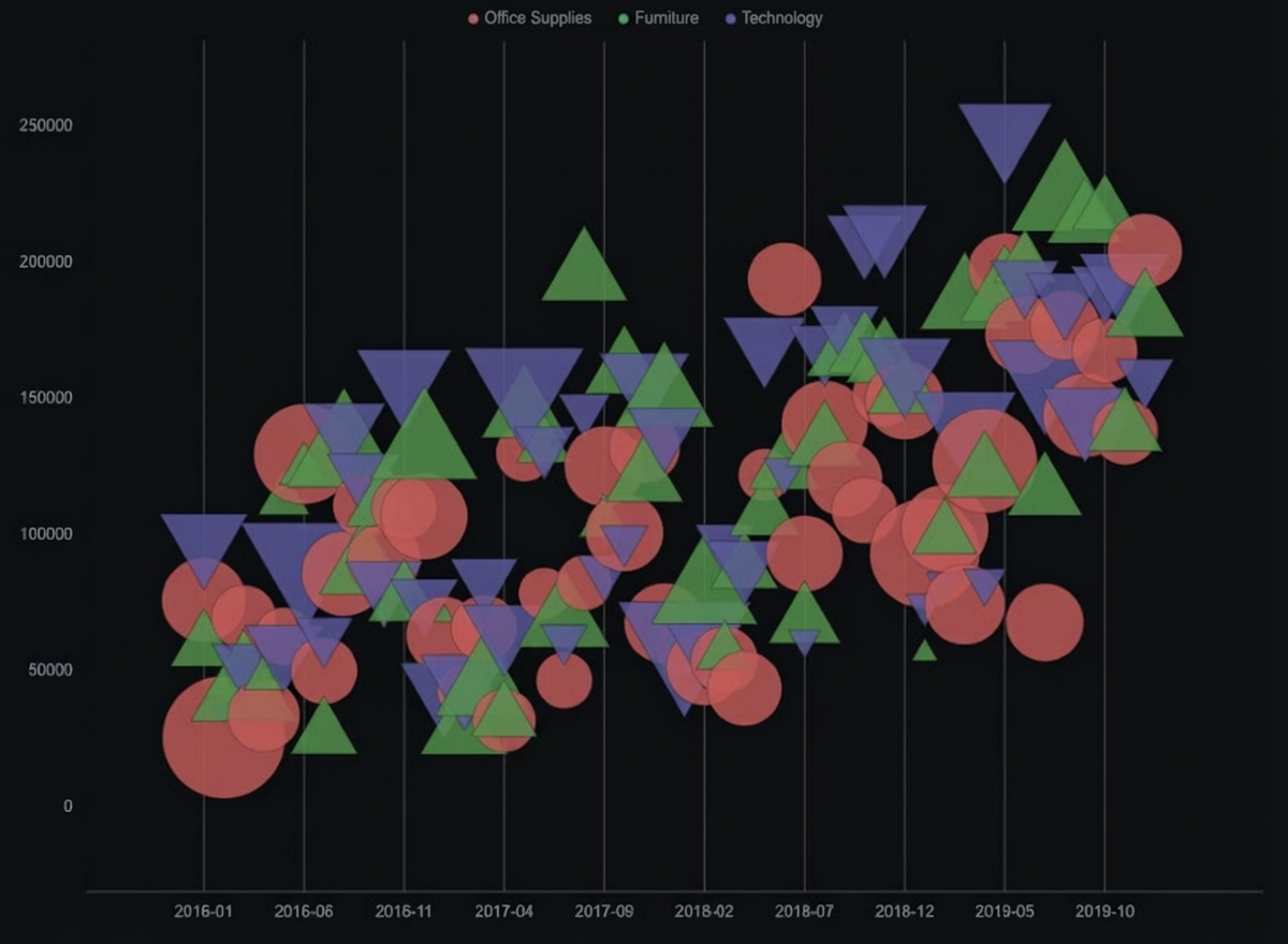
Use this for categorical data, such as names and types, to assign distinct colors. The colors in the palette are highly distinguishable. Figure 1. Categorical color template style Figure 2. Example of categorical data |
Continuous |
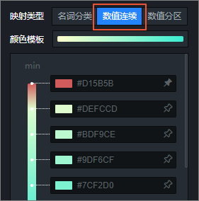
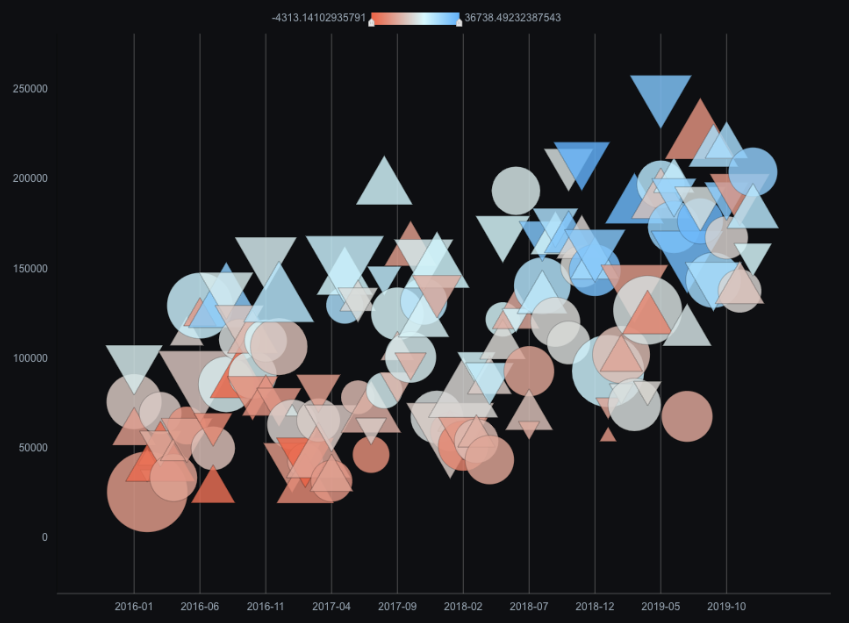
Use this to assign a continuous color gradient to numeric data. Each value has a one-to-one correspondence with a color in the mapping space. Figure 3. Continuous color template style Figure 4. Example of continuous data |
Numeric Partition |
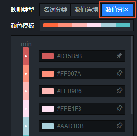
This type builds on continuous mapping. It partitions continuous numerical data into intervals. Data within the same interval is assigned the same color. Use quantized mapping to reduce the number of colors and avoid visual clutter. Figure 5. Quantized color template style Figure 6. Example of quantized data |