Learn about all configuration options available for the 3D line chart widget.
Chart style
A 3D line chart visualizes changes in different data within the same category in three-dimensional space, making it easier to identify trends compared to traditional 2D line charts.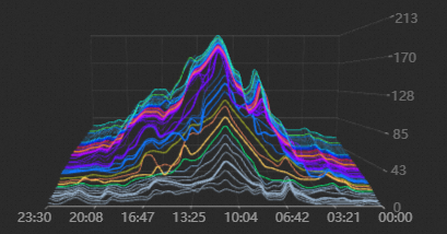
Style Panel 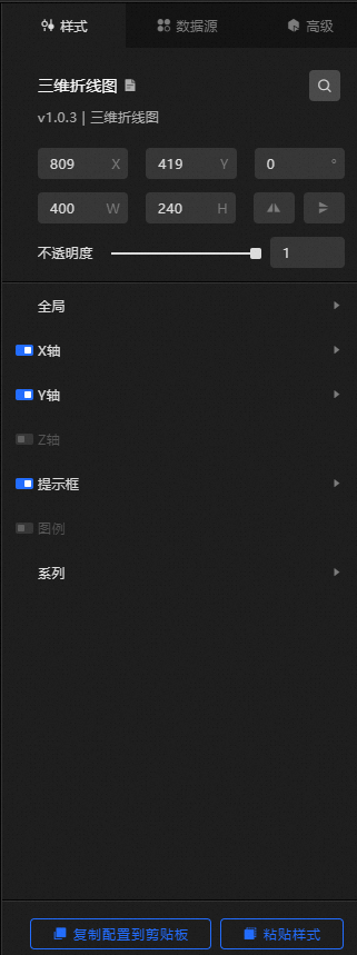
-
Search Configuration: Click the Search configuration items icon
 in the upper-right corner of the Style panel to search for a configuration item by name. Fuzzy match is supported. For more information, see Search configuration items.
 -
Size: the width and height of the widget. Unit: pixels.
-
Positioning: the x-axis and y-axis of the component. Unit: pixels. X-coordinate indicates the pixel distance between the upper-left corner of the widget and the left border of the canvas. Y-coordinate indicates the pixel distance between the upper-left corner of the widget and the upper border of the canvas.
-
Rotate: The widget is rotated around the center of the widget. Unit: degrees.
-
Enter a value in the Rotation Angle spin box, or click the plus (+) or minus (-) sign to adjust the angle.
-
Click the
 icon to flip the widget style.
 -
Click the
 icon to flip the widget style.
-
-
Opacity: Valid values: 0 to 1. A value of 0 hides the widget, and a value of 1 makes it fully visible. Default value: 1.
-
Global level
Parameter
Description
Scene Width
The width of the widget in 3D space.
Scene Height
The height of the widget in 3D space.
Scene Depth
The depth of the widget in 3D space.
Camera Position
The camera position is defined by three parameters: Vertical Direction, Horizontal Direction, and Distance. Adjust these parameters to control the size and viewing angle of the 3D line chart.
-
Vertical: the rotation angle of the camera in the vertical direction. Valid values: -90 to 90.
-
Horizontal: the rotation angle of the camera in the horizontal direction. Valid values: -180 to 180.
-
Distance: the distance between the camera and the 3D line chart. The greater the distance, the smaller the line chart displays.
Projection mode
The projection mode of the 3D scene. Valid values: Perspective Projection and Orthogonal Projection.
Automatic rotation
Turn on the switch to enable automatic rotation of the widget. Turn off the switch to disable it.
Rotation speed
The rotation speed of the widget. Takes effect only when Auto Rotate is enabled.
Performance monitoring
Turn on the switch to display performance metrics in the upper-right corner of the widget. Turn off the switch to hide them.
-
-
X Axis: Click the
 icon to display the x-axis.
 -
Text: the style of the text along the x-axis.
Parameter
Description
Font size
The font size of the text on the x-axis.
Color
The color of the text on the x-axis.
Font weight
The font weight of the text on the x-axis.
-
Axis Label: the style of the x-axis label. Click the
icon to control the x-axis label style. NoteIf the data format does not match the display format, the widget may not render correctly.
Parameter
Description
Data Format
Use time format specifiers such as
%m/%d%Y%H:%M:%S.Display Format
The output format for display. Use
%m/%d%Y%H:%M:%Sfor time,dfor integers, or.1ffor floating-point numbers.Quantity
The number of x-axis labels.
Label Offset
The vertical offset of x-axis labels. Unit: px.
-
Axis: the style of the x-axis. You can click the
icon to display the x-axis. Parameter
Description
Color
The color of the x axis.
Transparency
The transparency of the x-axis.
Width
The width of the x-axis.
-
Tick mark: the style of the tick mark on the x-axis. You can click the
icon to show or hide the tick mark on the x-axis. Parameter
Description
Length
The length value of the x-axis tick mark.
Color
The color of the x-axis tick marks.
Transparency
The transparency of the x-axis tick marks.
Width
The width of the x-axis tick mark.
-
Gridlines: the style of the x-axis gridlines. You can click the
icon to display or hide the x-axis gridlines. Parameter
Description
Color
The color of the x-axis grid lines.
Transparency
The transparency of the x-axis scale grid lines.
Width
The width of the x-axis grid lines.
-
Y-axis: The configuration is similar to that of the x-axis. For more information, see the X-axis section.
-
z-axis: The configuration is similar to that of the x-axis. For more information, see the x-axis section.
-
-
dialog box: The style of the dialog box that appears when you hover over or click a polyline on a preview or published page. Click the
icon to show or hide the dialog box.-
Background Box Style
Parameter
Description
Width
The width of the dialog box.
Height
The height of the dialog box.
Background color
The background color of the dialog box.
Interior Margin
The inner margin of the dialog box. Unit: px.
Horizontal Offset
The horizontal offset of the dialog box relative to the position of the mouse arrow. Unit: px.
Vertical Offset
The vertical offset of the dialog box relative to the position of the mouse arrow. Unit: px.
Border Color
The border color of the dialog box.
Border thickness
The border thickness of the dialog box. Unit: pixels.
-
Text Style: the style of the text in the dialog box, including the font style, weight, font size, and color.
-
-
Legend: the legend style of the chart. You can click the
icon to display or hide the legend. -
Text: Set the font size, font color, and font weight of the legend text. For more information, see color picker description.
-
Layout
Parameter
Description
Left Spacing
The distance between the legend and the left side of the widget.
Top Spacing
The distance between the legend and the top of the component.
Inner Spacing
The horizontal spacing between adjacent legend entries. Takes effect only when multiple series are present.
-
-
Edition
Click the
or icon on the right to add or remove a data series. Click or Graph to configure the arrangement style of multiple data series. Click the icon to copy the selected data series configuration and add a data series with the same configuration. Parameter
Description
Series Name
A custom name for the data series. If left empty, the value of the s field in the component data is used. If specified, ensure that the data is returned in the correct order.
Color
The color of this data series.
Transparency
The transparency of this data series.
Approximate curve
Turn on the switch to render polylines in this series as smooth curves. Turn off the switch to use straight-line segments.
Interpolation factor
The number of interpolation points for this data series. A higher value produces smoother polylines. Takes effect only when Approximate Curve is enabled.
Width
The line width of the polyline in this data series.
 icon to display the x-axis.
  or
or  icon on the right to add or remove a data series. Click
  or
or  Graph to configure the arrangement style of multiple data series. Click the
  icon to copy the selected data series configuration and add a data series with the same configuration.
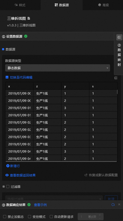
 Data Sources panel
|
Column |
Description |
|
|
The x-axis value. The field type and format must match the x-axis label settings in the style configuration. |
|
|
The z-axis value. The field type and format must match the z-axis label settings in the style configuration. |
|
|
The value of the y-axis in a line chart. |
|
|
The series value. If the content of the series name in the configuration items series is empty, this field value is used. |
|
Configure data items |
Description |
|
Data sources |
Use the code editor or visual editor to view the data fields of the widget. You can also modify the data type to adjust the component data. |
|
Data Mapping |
To customize field configurations, set up mappings in the Data Mapping module to map data fields to the corresponding widget fields without modifying the data source. You can also click the |
|
Configure a filter |
Turn on Filter, select an existing data filter or create a data filter, and configure a data filter script to filter data. For more information, see Manage data filters. |
|
Data Response Result |
Displays widget data in real time. When the data source changes, this section shows the latest data. Click the |
|
Forbid Loading |
Select this check box to hide loading content during component initialization when you update or preview the dashboard. Cleared by default. |
|
Controlled Mode |
Select this check box to prevent the component from requesting data on initialization. Data is then requested only through global variables or methods configured in Blueprint Editor. Cleared by default. |
|
Auto Data Request |
Select this check box and enter a polling interval to enable automatic data refresh. If cleared, the page does not update automatically. You must manually refresh the page or use Blueprint Editor and global variable events to trigger a data update. |
 icon to configure the field style.
 icon to view the data response result, or click the
  icon to fetch the latest data. You can also click View Example to view a sample response.
Advanced Panel
This widget does not support interaction events.
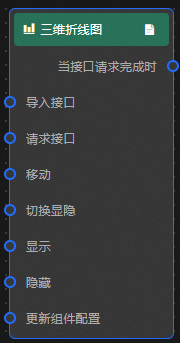
Blueprint Interaction
-
Click the
icon in the upper-left corner to go to the Blueprint page. -
On the Layer Nodes tab, add the widget to the main canvas.
-
View blueprint configuration parameters.
-
Event
Event
Description
When the interface description request is completed
Triggered after a data interface request is completed and processed by a filter. The processed JSON data is passed with the event. For specific data examples, see the Data Response Result section on the Data Source tab in the right-side configuration panel of the canvas editor.
-
Action
Action
Description
Import Interface
Redraws the widget using locally processed data without requesting server data again. For specific data examples, see the Data Response Result section on the Data Source tab in the right-side configuration panel of the canvas editor.
Request Interface
Requests server data again, using data from an upstream data processing node or layer node as parameters. For example, if the API data source is
https://api.testand the data passed to the request interface to describe action is{ id: '1'}, the final request URL ishttps://api.test?id=1.Move
Move a widget to a specified location. For more information, see the data example.
    {
      // The positioning type. to indicates absolute positioning, whereas by indicates relative positioning. The default value is to.
        "positionType": "to",
      // The location, which is indicated by the x and y coordinates.
      "attr": {
        "x": 0,
        "y": 0
      },
      // The animation type.
      "animation": {
        "enable": false,
        // The animation delay. Unit: milliseconds.
        "animationDuration": 1000,
        // The animation curve, which can be set to linear|easeInOutQuad|easeInOutExpo.
        "animationEasing": "linear"
      }
    }
Toggle Display
Specifies whether to show or hide a widget. No parameters are required.
Display
Display the widget. For more information, see Data example.
{
  "animationType": "",// The animation method. Valid value: fade. If you do not specify this parameter, no animation is generated.
  "animationDuration": 1000,// The animation delay. Unit: ms.
  "animationEasing": ""// animation curve
}
Hide
Hide the component. For more information, see Data example.
{
  "animationType": "",// The animation method. Valid value: fade. If you do not specify this parameter, no animation is generated.
  "animationDuration": 1000,// The animation delay. Unit: ms.
  "animationEasing": ""// animation curve
}
Update component configurations
Dynamically updates the style configuration of the widget. In the Style panel, click Copy Configuration to Clipboard to obtain the widget configuration data, and then modify the style field in the data processing node of Blueprint Editor.
-
 icon in the upper-left corner to go to the Blueprint page.