Configure the area chart with ticker board widget by using the Full Select option.
Chart style
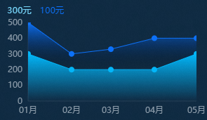
An area chart with ticker board is a type of line chart that supports multiple series of digital ticker boards, custom y-axis intervals, and multi-series data configuration. It combines lines and areas to display change trends in multi-dimensional real-time data.
Style Panel 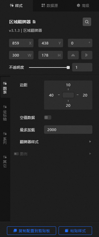
-
Search Configuration: Click the Search configuration items icon
 in the upper-right corner of the Style panel to search for a configuration item by name. Fuzzy match is supported. For more information, see Search configuration items.
-
Size: the width and height of the widget, in pixels.
-
Positioning: the x-axis and y-axis coordinates of the component, in pixels. X-coordinate is the pixel distance between the upper-left corner of the widget and the left border of the canvas. Y-coordinate is the pixel distance between the upper-left corner of the widget and the upper border of the canvas.
-
Rotate: the rotation angle of the widget, in degrees.
-
Enter a value in the Rotation Angle spin box or click the plus sign (+) or minus sign (-) to adjust the value.
-
Click the
 icon to flip the widget.
 -
Click the
 icon to flip the widget.
-
-
Opacity: Valid values: 0 to 1. If this parameter is set to 0, the widget is hidden. If this parameter is set to 1, the widget is completely displayed. Default value: 1.
-
-
Chart name
-
Margin: the distance between the chart area and the four boundaries of the widget, in pixels.
-
Empty Data: If you turn on the switch, the line passes through the point whose y-axis value is 0.
-
Maximum Load: the maximum number of input data records to load. The system loads up to this number of records for layout, drawing, and computing to ensure visualization performance.
-
Flip Style: the style of the flip at various distances.
State
Description
Left Margin
The distance between the ticker board and the left edge of the chart.
Right Margin
The distance between the ticker board and the right edge of the chart.
Spacing
The spacing between adjacent ticker boards.
-
Legend: the style of the legend. You can click the
 icon to display or hide the legend.
 State
Description
Text
Set the style of the legend text, including the text font style, font size, font color, and font weight. For more information, see color picker instructions.
Layout
The positional arrangement of the legends.
-
Spacing
-
Left and Right Spacing: the horizontal distance between adjacent legends. Valid only when multiple series exist.
-
Distance: the distance between the legend and the upper and lower boundaries of the widget.
-
-
Position: the position of the legend relative to the start coordinates of the widget. You can select Top Left, Top Center, Top Right, Bottom Left, Bottom Center, or Bottom Right.
-
-
-
Coordinate Axis: The component coordinate axes can be x-axis or y-axis.
-
X Axis
-
X Axis Visible: turn on the switch to display the x-axis and its style configuration. Turn off the switch to hide the x-axis.
-
Data Type: the type of the x-axis label data. Valid values: Number, Category, and Time.
State
Description
Numerical Type
Supports numeric data such as integers and floating-point numbers.
Category Type
Supports category data such as characters and strings.
Time Type
Time data that requires a configured data format.
-
data format: the data display format, valid only for time type data. Configure the format by referring to
%Y/%m/%d %H:%M:%S. -
Both Ends: the distance between the two ends of the space. Valid values: 0 to 1.
-
interval: the percentage of the interval between two categories on the x-axis. A larger value indicates a larger percentage. Valid values: 0 to 1. This function is valid only for data of the Category type.
-
Range: the range of the minimum and maximum values on the x-axis.
State
Description
Maximum value
The maximum value of the x-axis. You can enter a custom value. The default value is auto, which automatically calculates the value based on the maximum value, minimum value, and number of labels.
Minimum value
The minimum value of the x-axis. You can enter a custom value. The default value is auto, which automatically calculates the value based on the maximum value, minimum value, and number of labels.
-
Axis Label: the style of the x-axis label. You can click the
icon to display or hide the axis label. NoteIf the data format and the configured display format are inconsistent, the widget will not display correctly.
State
Description
Display Format
The display format of the data. Valid only for time-based and numeric data. For time data, refer to
%m/%d%Y%H:%M:%S. For integers, refer tod. For floating-point numbers, refer to.1f.Text
The text style of the x-axis label, including font style, font size, font color, and font weight. For more information, see color picker instructions.
Axis Label Display
The display style of the x-axis label:
-
Offset: the distance between labels on the x-axis, in pixels.
-
Angle: the angle of the x-axis label. Valic values: Horizontal, Oblique, and Vertical.
-
Quantity: the number of labels on the x-axis.
-
Axis Unit: the unit of the x-axis label.
-
-
Axis: the style of the x-axis. You can click the
icon to display the x-axis. Color: the color of the x-axis.
-
Gridlines: the style of the x-axis gridlines. You can click an icon
to display or hide the x-axis gridlines. Color: the color of the x-axis grid lines.
-
-
Y-axis
-
Y Axis Visible: turn on the switch to display the y-axis. Turn off the switch to hide the y-axis.
-
Range: the range of the minimum and maximum values of the y-axis.
State
Description
Minimum value
The minimum value of the y-axis. You can customize the value or select the value.
-
0; the system default minimum value is 0.
-
Automatic Rounding: The system automatically calculates the value based on the maximum value, minimum value, and number of axis labels.
-
Minimum Data Value: the minimum value in the data.
Maximum value
The maximum value of the y-axis. You can customize the value or select the value.
-
Automatic Rounding: The system automatically calculates the value based on the maximum value, minimum value, and number of axis labels.
-
Maximum Data Value: the maximum value in the data.
-
-
Display Format: the display format of the y-axis label value. You can select Default, 11 (integer), 11.1 (floating point), 11.11 (floating point), 11%, 11.1%, or 11.11%.
-
Axis Label: the style of the y-axis label. You can click the
icon to display or hide the y-axis label. State
Description
Text
The font style, text weight, font size, and color of the y-axis label text.
Axis Label Display
The number of labels, units, and the label arrangement angle. Valid values: Horizontal, Oblique, and Vertical.
-
Axis: the style of the y-axis. You can click the
icon to display the y-axis. Color: the color of the y-axis.
-
Gridlines: the style of the y-axis gridlines. You can click the
icon to display or hide the gridlines. Color: the color of the grid lines on the y-axis.
-
-
-
Series: the style settings for data series.
data series: Click the
or icon on the right to add or delete a data series. Click the or icon to configure the arrangement style of multiple data series. Click the icon to copy the selected data series configurations and add a data series with the same configurations. -
Series Name: the name of the data series, which can be customized. If the field is empty, the system displays the
sfield value in the component data as the series name. If this parameter is not empty, you must ensure the order in which data is returned. -
Line: the style of the line in the series.
State
Description
thickness
The line thickness value.
Curve Type
The type of the curve. The type can be Smooth Curve or Line.
Type
The type of the polyline. Valid values: Solid, Dotted, and Dashed.
Color
The color of the polyline.
-
Dot: the radius and color of the dots on the line. Click the
icon to show or hide the dots. -
Area: the fill color of the area under the line. Click the
icon to show or hide the area fill. -
Value Label: the style of the value label for the current series. Click the
icon to show or hide the value label.State
Description
Text
The text style of the value label under this series, including the text font, text weight, font size, and color.
-
Card Flip: the ticker board style for this series. A ticker board displays dynamic changes in numeric data and consists of three parts: a prefix, a number, and a suffix.
NoteThe number displayed on the ticker board is the y-axis value corresponding to the last data point in the series. You can modify the displayed number by configuring the data.
-
Prefix and Suffix: the prefix and suffix of the tag. You can customize the prefix and suffix of the tag.
-
Prefix: the style of the text with the prefix, including the text font, text weight, font size, and color.
-
Number: the style of the number part in the flip board.
-
Text: the text style of the number, including the text font, text weight, font size, and color.
-
Display: the distance between the digits and the background color.
-
Default Digits: the number of digits.
-
thousands separator: when the number has more than 4 digits, the system uses a default delimiter to separate the digits. You can customize the separator.
-
Decimal Processing: turn on the switch to round the number to an integer. Turn off the switch to display the original decimal value.
-
-
Suffix: the style of the text with the suffix, including the text font, text weight, font size, and color.
NoteThe number in the upper-left corner of the ticker board does not support explicit/implicit conversion. To hide it, leave the prefix and suffix content empty and set the text font size to 0.
-
-
-
Remarks
-
Emotion Animation: the animation effect style of the chart. You can click the
icon to enable or disable the animation effect. State
Description
Animation Settings
-
Eating Effect: the easing effect of the animation. The system provides a variety of common easing effects for you to choose from.
-
Sequential Animation: If you turn on the switch, the animation of each series is played in sequence. If you turn off the switch, the animation of all series is played together.
Admission Animation
The duration of the initial animation when the component first renders, in ms.
Update Animation
-
Update Animation Duration: the animation duration when widget data is updated, in ms.
-
Start From Previous Position: If you turn on the switch, the animation starts from the previous position when the widget data is updated. If you turn off the switch, the animation starts from the initial position when the widget data is updated.
-
-
dialog box: the style of the dialog box that appears when you hover over or click a dot on a polyline during preview or after publishing. Click
the icon to enable or disable the dialog box.State
Description
Trigger
-
Trigger Type: dialog box the type of the target to be triggered. This field is optional, including Data Item and Axis.
-
Trigger Action: dialog box the action to be triggered. This field is optional, including Hover and Click.
Text Style
The style of the text in the dialog box, including the font style, weight, font size, and color.
Disappearing Delay Time
When the trigger condition is no longer met, the dialog box disappears after this delay, in ms.
Background Box Style
The background box style of the dialog box.
-
Background Color: the background color of the dialog box.
-
Custom: the width and height of the dialog box, in pixels. Click the
icon to enable or disable custom sizing. -
Pin: the inner margin of the dialog box, in pixels.
-
Offset
-
Horizontal Offset: the horizontal offset of the dialog box relative to the mouse arrow. Unit: px.
-
Vertical Offset: the vertical offset of the dialog box relative to the mouse arrow. Unit: px.
-
-
Borders
-
Border: the border thickness of the dialog box, in pixels.
-
Border Color: The border color of the dialog box.
-
-
-
 icon to display or hide the legend.
  or
or  icon on the right to add or delete a data series. Click the
  or
or  icon to configure the arrangement style of multiple data series. Click the
  icon to copy the selected data series configurations and add a data series with the same configurations.
 Data Sources panel
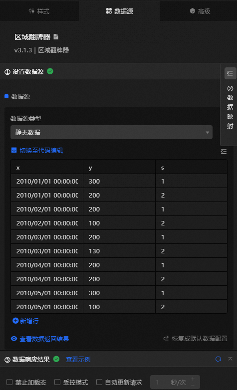
|
Column |
Description |
|
|
The category of each dot on the polyline, which corresponds to the x-axis value. The field type and format must match the data type and format configured for the x-axis. |
|
|
The value of each dot on the polyline, which corresponds to the y-axis value. |
|
|
Optional. The series value. This field value is used when the series name in the configuration items data series is empty. |
|
Configure data items |
Description |
|
DataSource |
Use the code editor or visual editor to view the data fields of the widget. You can also change the Data Type parameter to configure the component data. |
|
Data Mapping |
To customize chart field configurations, set field mappings in the Data Mapping module to map data to the corresponding widget fields. This lets you match data without modifying the data source fields. Click the |
|
Configure a filter |
Turn on Filter, select an existing data filter or create a data filter, and configure a data filter script to filter data. For more information, see Manage data filters. |
|
Data Response Result |
Displays the widget data in real time. When the data source changes, this section shows the latest data. If the response is delayed, click the |
|
Forbid Loading |
Select this check box to prevent loaded content from appearing during component initialization when you update the component or preview the data dashboard. Clear the check box to show the loading content. This check box is cleared by default. |
|
Controlled Mode |
Select this check box to prevent the component from requesting data during initialization. Data can only be requested through global variables or methods configured in Blueprint Editor. Clear the check box to allow automatic data requests. This check box is cleared by default. |
|
Auto Data Request |
Select this check box and enter a polling interval to enable dynamic data polling. If you clear the check box, the page does not update automatically. You must manually refresh the page or use Blueprint Editor and global variable events to trigger data updates. |
 icon to configure the field style.
 icon to view the response result, or click the
  icon to fetch the latest data. You can also click View Example to see a sample response.
Advanced Panel
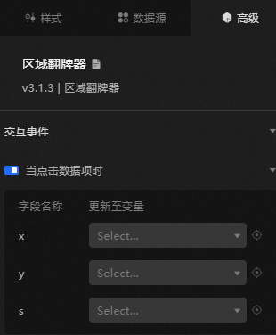
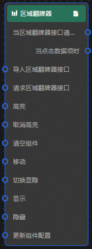
When you click a data item: Turn on the switch to enable widget interaction. When a dot on the area chart with ticker board is clicked, a data request is triggered and a callback value is returned to dynamically load data for the clicked dot. By default, the x, y, and s values are returned. For more information, see Component interaction configuration.
Blueprint Interaction
-
Click the
icon in the upper-left corner to go to the Blueprint page. -
On the Layer Nodes tab, add the widget to the main canvas.
-
View blueprint configuration parameters.
-
Event
Event
Description
When the area chart with ticker board interface request is completed
Triggered with the processed JSON data after a data interface request is responded to and processed by a filter. For specific data examples, see the Data Response Result section of the Data Source tab in the right-side configuration panel of the canvas editor.
When a data item is clicked
Triggered when a dot on the area chart with ticker board is clicked, along with the data item corresponding to the dot.
-
Action
Action
Description
Request area chart with ticker board Interface
Requests server data again, using data from an upstream data processing node or layer node as the parameter. For example, if the area chart with ticker board API data source is
https://api.testand the data passed to the request area chart with ticker board interface is{ id: '1'}, the final request URL ishttps://api.test?id=1.Import area chart with ticker board Interface
Imports pre-processed data in the widget's drawing format for redrawing, without requesting server data again. For body data examples, see the Data Response Result section of the Data Source tab in the right-side configuration panel of the canvas editor.
Highlight
data: the data item to be highlighted.
{
  x: '2010/01/01 00:00:00'
}
Reference data example
{
  "data": {},
  "options": {}
}
Unhighlight
data: the data item that needs to be unhighlighted. If the
datafield is not specified, all highlighted data is unhighlighted.{ x: '2010/01/01 00:00:00' }Reference data example
{
  "data": {},
  "options": {}
}
Clear components
Clear the component configuration. No parameters are required.
Move
Move a widget to a specified location. For more information, see the data example.
    {
      // The positioning type. to indicates absolute positioning, whereas by indicates relative positioning. The default value is to.
        "positionType": "to",
      // The location, which is indicated by the x and y coordinates.
      "attr": {
        "x": 0,
        "y": 0
      },
      // The animation type.
      "animation": {
        "enable": false,
        // The animation delay. Unit: milliseconds.
        "animationDuration": 1000,
        // The animation curve, which can be set to linear|easeInOutQuad|easeInOutExpo.
        "animationEasing": "linear"
      }
    }
Switch Display /Display
Toggles whether the widget is displayed or hidden. No parameters are required.
Display
Display the widget. For more information, see Data example.
{
  "animationType": "",// The animation method. Valid value: fade. If you do not set this parameter, no animation is available.
  "animationDuration": 1000,// The animation delay. Unit: ms.
  "animationEasing": ""// animation curve
}
Hide
Hide the component. For more information, see Data example.
{
  "animationType": "",// The animation method. Valid value: fade. If you do not set this parameter, no animation is available.
  "animationDuration": 1000,// The animation delay. Unit: ms.
  "animationEasing": ""// animation curve
}
Update component configurations
Dynamically updates the style configurations of the widget. In the Style panel, click Copy Configuration to Clipboard to obtain the widget configuration data, then modify the style field for the data processing node in Blueprint Editor.
-
 icon in the upper-left corner to go to the Blueprint page.