This topic describes the chart style and configuration panel of a basic scatter chart in a mobile widget.
Chart style
A basic scatter chart is a chart that uses scatter points to display data. It supports custom x-axis, y-axis, and scatter points. It supports multi-series data configuration, dialog box interaction, and animation display. It is suitable for showing the differences of discrete data at different times. 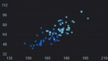
Configuration Panel 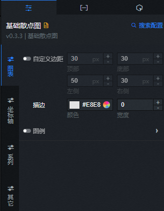
Search Configuration: Click Search Configuration in the upper-right corner of the Configuration panel. In the Search Configuration panel, enter the name of the configuration items that you want to search for to quickly locate the configuration items. Fuzzy match is supported. For more information, see Search for asset configurations.
Chart name
Custom Margins: the distance between the scatter plot area and the upper, lower, left, and right borders of the widget. The default unit is px. You can click the
 icon to specify the custom margins.
 Stroke: the color and width of the dot.
Legend: the legend style of the scatter chart. You can click the
icon to display the legend. Parameter
Description
Click to filter
If you turn on the switch, when the widget is configured with multiple series data, use a mobile device in the preview or publish state of the widget, and click a legend of a series in the widget to switch the current series to the selected or unselected state, thus filtering and displaying data of different series in the visualization application. If you turn off the switch, data of different series cannot be filtered and displayed, and legend data of all series is displayed at the same time.
No Color Selected
The legend color of each series when it is not selected.
Layout
The layout style of the legend. You can adjust the position and alignment of the legend layout.
Marker shape
The shape of the legend. Valid values: Circle and Square.
Text
The text style of the legend.
Font Size: the size of the legend text.
Text Width: the weight of the legend text.
Color: the color of the legend text.
Alignment: the alignment of the legend text. Valid values: Center, Left, and Right.
Axis: You can select x-axis or y-axis.
X Axis
Show: If you turn on the switch, the x-axis style in the widget is visible. If you turn off the switch, the x-axis style in the widget is invisible.
Type: the type of the x-axis label data. Valid values: Number, Category, and Time.
NoteIf the data format and specified data types are not consistent, the widget is displayed abnormally.
Parameter
Description
Numerical Type
Supports numeric data such as integers and floating-point numbers.
Category Type
Data of category types such as character and string is supported.
Time Type
The data of the time type needs to be configured data format.
Number of Scales: the number of scales displayed on the x-axis of the widget.
Scale Optimization: If you turn on the switch, the scale on the x-axis of the widget is automatically optimized. If you turn off the switch, you need to customize the maximum and minimum values of the scale on the x-axis of the widget.
Leave White: the ratio of white space between the two sides of the x-axis. Valid values: 0 to 1.
Axis Label: the style of the x-axis label in the scatter chart. You can click the
icon to display or hide the axis label. Parameter
Description
Display Format
The display format of the x-axis label content. If the x-axis type is numeric, you can select Original, 11 (integer), 11.1 (floating point), or 11.11 (floating point). If the x-axis type is time, you can select different time display styles. This parameter is displayed only when you set the X-Axis Type parameter to Numerical or Time.
Label Offset
The up-down displacement distance of the x-axis labels. Unit: px.
Text
The font size, text weight, color, and alignment style of the x-axis label text.
Grid: the style of the x-axis gridlines. You can click the
 icon to display or hide the x-axis gridlines.
 Parameter
Description
Color
The color of the x-axis grid lines.
Width
The width value of the x-axis grid lines.
Linetype
The shape of the x-axis grid line. Valid values: Solid, Dashed, and Dotted.
Axis: the style of the x-axis. You can click the
icon to display the x-axis. Parameter
Description
Color
The color of the x axis.
Width
The width value of the x-axis.
Linetype
The shape of the x-axis line. Valid values: Solid, Dashed, and Dotted.
Tick Mark: the style of the tick marks on the x-axis. You can click the
icon to show or hide the tick marks on the x-axis. Parameter
Description
Color
The color of the x-axis tick marks.
Linetype
The shape of the x-axis tick mark. Valid values: Solid, Dashed, and Dotted.
Width
The width value of the x-axis tick mark.
Length
The length value of the x-axis tick mark.
Y-axis
Display: If you turn on the switch, the y-axis style in the widget is visible. If you turn off the switch, the y-axis style in the widget is invisible.
Type: the type of the y-axis tag. Valid values: Number, Category, and Time.
NoteIf the data format and specified data types are not consistent, the widget is displayed abnormally.
Parameter
Description
Numerical Type
Supports numeric data such as integers and floating-point numbers.
Category Type
Data of category types such as character and string is supported.
Time Type
The data of the time type needs to be configured data format.
Number of ticks: the number of ticks on the y-axis of the widget.
Scale Optimization: If you turn on the switch, the scale in the y-axis of the widget is automatically optimized. If you turn off the switch, you need to customize the maximum and minimum values of the scale in the y-axis of the widget.
Leave White: the ratio of white space between the two ends of the y-axis. Valid values: 0 to 1.
Axis Label: the style of the y-axis label. You can click the
icon to display or hide the y-axis label. Parameter
Description
Display Format
The style of the content display format of the y-axis label. If the y-axis type is numeric, you can select Original, 11 (integer), 11.1 (floating point), or 11.11 (floating point). If the y-axis type is time, you can select different time display styles. This parameter is displayed only when you set the Y-Axis Type parameter to Numerical or Time.
Label Offset
The up-down displacement distance of the y-axis label. Unit: px.
Text
The font size, text weight, color, and alignment style of the y-axis label text.
Grid: the style of the grid lines in the y-axis. You can click the
icon to display or hide the grid lines in the y-axis. Parameter
Description
Color
The color of the y-axis grid lines.
Width
The width value of the y-axis gridlines.
Linetype
The shape of the y-axis grid line. Valid values: Solid, Dashed, and Dotted.
Axis: the style of the y-axis. You can click the
icon to display or hide the y-axis. Parameter
Description
Color
The color of the y-axis.
Width
The width value of the y-axis.
Linetype
The shape of the y-axis line. Valid values: Solid, Dashed, and Dotted.
Tick Mark: the style of the tick mark in the y-axis. You can click the
icon to display the tick mark. Parameter
Description
Color
The color of the tick marks on the y-axis.
Linetype
The shape of the y-axis tick mark. Valid values: Solid, Dashed, and Dotted.
Width
The width value of the y-axis tick mark.
Length
The length value of the y-axis tick mark.
Edition
data series: Click the
or icon on the right to add or delete a data series. Click the or icon on the right to configure the arrangement style of multiple data series. Click the icon to copy the selected data series configuration and add a data series with the same configuration. Point Style: the style of the scattered points in the series.
Parameter
Description
Color
The color of the scatter.
Shape
The shape of the scatter. Valid values: Circle and Square.
Size
The size of the scatter.
Remarks
Easing Animation: the animation effect style of the chart. You can click the
icon to enable or disable the animation effect. Parameter
Description
Easing Effect
The easing effect of animation. The system provides a variety of common easing effects for you to choose from.
Entry Animation Duration
The duration of the first animation rendered by the component. Unit: ms.
Update the animation duration
The duration of the animation when the component data is updated. Unit: ms.
dialog box: The style of the dialog box that appears when you move the mouse over or click the hash when you preview or publish the page. You can click
the icon to turn the dialog box effect on or off. Parameter
Description
Series Name
dialog box the font size and name color of the displayed series names.
Value
dialog box the font size and color of the displayed values.
Gridlines
You can click
the icon to turn on or off the dialog box guide line effect. Width: dialog box a value for the width of the guide line.
Line Type: dialog box the line shape of the auxiliary line, which can be solid, dotted, or dotted.
Color: dialog box the color of the auxiliary line.
Background Box
The background box style of the dialog box.
Fillet: the fillet size of the dialog box background frame. Unit: pixels. When the value is 0, there is no rounded corner, and the background box is square. The larger the setting value, the larger the radian value of the rounded corner.
Color: The background color of the dialog box.
 or
or  icon on the right to add or delete a data series. Click the
  or
or  icon on the right to configure the arrangement style of multiple data series. Click the
  icon to copy the selected data series configuration and add a data series with the same configuration.
 Data dashboard
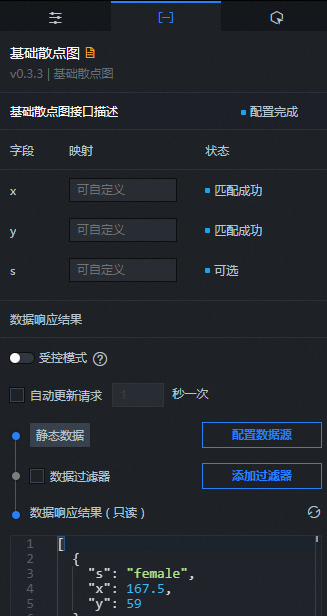
Column | Description |
| The x-axis data for each point in the base scatter plot. The field type and format must be consistent with the label data type and format on the x-axis in the configuration items. |
| The y-axis data for each point in the base scatter chart. The field type and format must be consistent with the type and format of the label data on the y-axis in the configuration items. |
| Optional. The series values of the base scatter chart. |
Parameter | Description |
Controlled Mode | If you turn on the switch, data is not requested when a widget is initialized. Data requests are triggered only based on callback IDs or the method configured in Blueprint Editor. If you turn off the switch, data requests are automatically triggered. By default, the switch is turned off. |
Auto Data Request | After you select the Auto Data Request check box, you can enable dynamic polling, and manually specify the polling interval. If you clear the check box, the data is not automatically updated. You must manually refresh the page or use the Blueprint Editor and callback ID events to trigger a request to update the data. |
Data source | Click Configure Data Source. In the Configure Data Source panel, modify the data source type and query code, preview the response of the data source, and view the response results. For more information, see Configure a component data source. |
Data Filter | If you select the Data Filter check box, you can convert the data structure, filter data, and perform simple calculations. Click Add Filter. In the Set Data Source panel, configure a data filter script. For more information, see Use a data filter. |
Data Response Result | The response to a data request. If the data source changes, you can click the |
 icon on the right to view the response results in real time.
 Interactive Panel
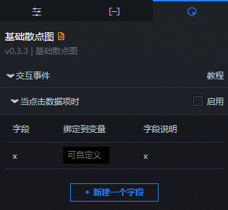
Select the Enable check box to enable interactions between widgets. When you click a dot in the basic scatter chart, a data request is triggered, a callback value is thrown, and data of different dots is dynamically loaded. By default, the x value in the data is displayed. For more information, see Component interaction configuration.
Blueprint Interaction
In the canvas editor, right-click a widget in the layer pane and select Export to Blueprint Editor.
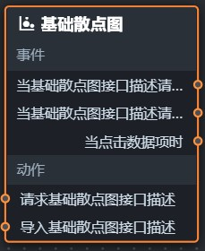
Click the
icon in the upper-left corner of the page. In Blueprint Editor, click the Basic Scatter Chart component in the Import Nodes pane. You can view the basic scatter chart configuration parameters in the canvas, as shown in the following figure.
Event
Event
Description
When the Basic Scatter Chart API Description Request is Completed
The event is triggered with the processed JSON data after a data interface request is responded and processed by a filter. For more information about specific data examples, see the Data Response Result section of the Data tab in the right-side configuration panel of the canvas editor.
When the Basic Scatter Chart API Description Request Fails
The event that is returned when a data interface request fails (such as network problems or interface errors) and is processed by the filter. The event also throws the processed JSON data. For more information about specific data examples, see the Data Response Result section of the Data tab in the right-side configuration panel of the canvas editor.
When a data item is clicked
The event that is raised when a dot in a scatter chart is clicked, and the data item corresponding to the dot is also raised.
Action
Action
Description
Request Basic Scatter Chart API Description
This action is performed to request the server data again. The data sent by an upstream data processing node or layer node is used as a parameter. For example, if the API data source is
https://api.testand the data passed to the Request Basic Scatter Chart API Description action is{ id: '1'}, the final request interface ishttps://api.test?id=1.Import Basic Scatter Chart Description
After data of a widget is processed in accordance with its drawing format, the widget is imported for redrawing. You do not need to request server data again. For more information about specific data examples, see the Data Response Result section of the Data tab in the right-side configuration panel of the canvas editor.
 icon in the upper-left corner of the page.