Configure all available settings for the countdown widget, including chart style, data sources, and blueprint interactions.
Chart style
The countdown widget displays remaining days, minutes, and seconds until a specified time. 
Style Panel 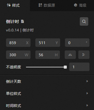
-
Search Configuration: Click the Search configuration items icon
 in the upper-right corner of the Style panel to search for a configuration item by name. Fuzzy match is supported. For more information, see Search configuration items.
 -
Size: the width and height of the widget, in pixels.
-
Positioning: the x-axis and y-axis coordinates of the widget, in pixels. X-coordinate is the pixel distance between the upper-left corner of the widget and the left border of the canvas. Y-coordinate is the pixel distance between the upper-left corner of the widget and the upper border of the canvas.
-
Rotate: The widget is rotated around the center of the widget. Unit: degrees.
-
Enter the rotation angle directly in the spin box, or click the plus sign (+) or minus sign (-) to adjust the value.
-
Click the
 icon to flip the widget style.
 -
Click the
 icon to flip the widget style.
-
-
Opacity: valid values: 0 to 1. A value of 0 hides the widget. A value of 1 fully displays the widget. Default value: 1.
-
-
Countdown Days: the text style of the countdown days, including font size, color, weight, and style.
-
Unit Style: the style of the unit in the countdown widget.
Metric
description
Text Style
The text style of the unit, including font size, color, weight, and style.
Left Interval
Drag the slider to set the spacing between the unit and the days content on the left.
Right Interval
Drag the slider to set the spacing between the unit and the time content on the right.
-
Time Style: the style of the time part in the countdown widget.
Metric
description
Text Style
The text style of the time content, including font size, color, weight, and style.
Spaces
Drag the slider to set the spacing between time values. You can select 0 or 1 space.
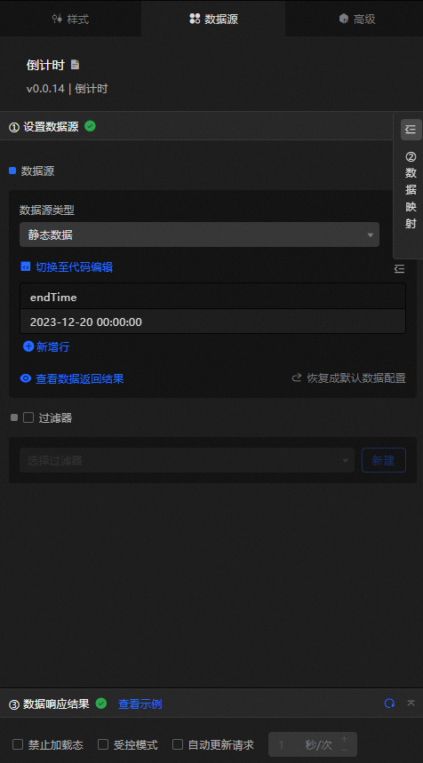
Data Sources panel 
|
Column |
Description |
|
endTime |
Set the countdown time as a timestamp. |
|
Configure data items |
Description |
|
Data sources |
Use the code editor or visual editor to view the data fields of the widget. You can also modify the data type to configure the component data. |
|
Data Mapping |
To customize field configurations, set field mappings in the Data Mapping module to map content to the corresponding widget fields. This allows you to match data without modifying the data source fields. You can also click the |
|
Configure a filter |
Turn on Filter, select an existing data filter or create a data filter, and configure a data filter script to filter data. For more information, see Manage data filters. |
|
Data Response Result |
Displays widget data in real time. When the data source changes, this section shows the latest data. If the response is delayed, click the |
|
Forbid Loading |
If selected, loading indicators are hidden during component initialization when you update and preview the data dashboard. By default, the check box is cleared. |
|
Controlled Mode |
If selected, the widget does not request data during initialization and only requests data through global variables or methods configured in Blueprint Editor. If cleared, automatic data updates are used. By default, the check box is cleared. |
|
Auto Data Request |
Select the check box and enter a polling interval to enable dynamic data polling. If cleared, the page does not update automatically. You must manually refresh the page or use Blueprint Editor and global variable events to trigger data updates. |
 icon to configure the field style.
  icon to view the data response result, or click the
  icon to fetch the latest data. You can also click View Example to view a sample response.
 Advanced Panel
No event configuration is available for this widget.
Blueprint Interaction
-
Click the
icon in the upper-left corner to go to the Blueprint page. -
On the Layer Nodes tab, add the widget to the main canvas.
-
View blueprint configuration parameters.
-
Event
Event
Description
When the data request is completed
Triggered after a data interface request is responded and processed by a filter, with the processed JSON data. For specific data examples, see the Data Response Result section of the Data Source tab in the right-side configuration panel of the canvas editor.
-
Action
Action
Description
Import task
Imports pre-processed data in the widget's drawing format for redrawing without requesting server data again. See the following data example.
[
  {
    "endTime": "2024-3-20 00:00:00"
  }
]
Requests
Requests server data again, using data from an upstream data processing node or layer node as parameters. For example, if the API data source is
https://api.testand the data passed to the request data action is{ id: '1'}, the final request URL ishttps://api.test?id=1.Move
Moves a widget to a specified location. See the following data example.
    {
      // The positioning type. to indicates absolute positioning, whereas by indicates relative positioning. The default value is to.
        "positionType": "to",
      // The location, which is indicated by the x and y coordinates.
      "attr": {
        "x": 0,
        "y": 0
      },
      // The animation type.
      "animation": {
        "enable": false,
        // The duration in which animation is displayed.
        "animationDuration": 1000,
        // The animation curve, which can be set to linear|easeInOutQuad|easeInOutExpo.
        "animationEasing": "linear"
      }
    }
Switch Display /Hide
Toggles the visibility of a widget. No parameters are required.
Display
Displays the widget. See the following data example.
{
  "animationType": "",// The animation method. Valid value: fade. If you do not specify this parameter, no animation is generated.
  "animationDuration": 1000,// The animation delay. Unit: ms.
  "animationEasing": ""// animation curve
}
Hide
Hides the widget. See the following data example.
{
  "animationType": "",// The animation method. Valid value: fade. If you do not specify this parameter, no animation is generated.
  "animationDuration": 1000,// The animation delay. Unit: ms.
  "animationEasing": ""// animation curve
}
Update component configurations
Dynamically updates widget style configurations. In the Style panel, click Copy Configuration to Clipboard to obtain the widget's configuration data. Then modify the style field in the data processing node in Blueprint Editor.
-
 icon in the upper-left corner to go to the Blueprint page.
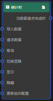
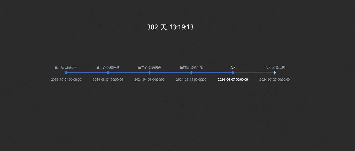
Case demonstration
This example uses the timeline rotation feature to create a dynamic countdown display for each stage of a college entrance examination.
-
Log on to the DataV console.
-
Select a dashboard and click Edit to go to the Canvas Editor page.
-
Add the Timeline and Countdown widgets to the canvas.
-
Click Timeline. In the Data Source panel, modify the static data.
[ { "name": "2023-10-01 00:00:00", "value": 20231001, "text": "First round-Foundation consolidation" }, { "name": "2024-03-01 00:00:00", "value": 20240301, "text": "Second round-Answer skills" }, { "name": "2024-04-01 00:00:00", "value": 20240401, "text": "Third round-Summary promotion" }, { "name": "2024-05-15 00:00:00", "value": 20240515, "text": "The fourth round-self-transcendence" }, { "name": "2024-06-07 00:00:00", "value": 20240607, "text": "College Entrance Examination" }, { "name": "2024-06-25 00:00:00", "value": 20240625, "text": "College Entrance Examination-Application" } ] -
In the Style panel, set Global Style> Left and Right Spacing to complete the timeline. Change Event Node Type to Category.
-
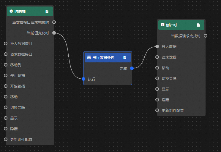
Click the
icon in the upper-left corner to go to the Blueprint page. -
On the Layer Nodes tab, add all components to the main canvas.
-
On the Logical Nodes tab, add a serial data processing node to the main canvas.
-
Connect components.
-
Configure the processing method of the Serial Data Processing node.
return [{"endTime": data.name}] -
Click Preview in the upper-right corner to preview the results.