Learn about the configuration items of the Lucky Draw widget.
Chart style
The Lucky Draw widget simulates a prize wheel that randomly selects a prize.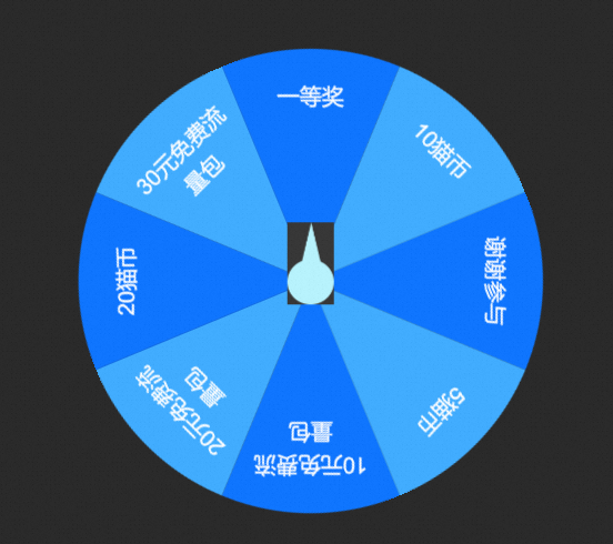
Style Panel 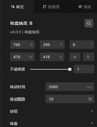
-
Search Configuration: Click the Search configuration items icon
 in the upper-right corner of the Style panel. In the Search Configuration panel, enter the name of the configuration item to locate it. Fuzzy match is supported. For more information, see Search configuration items.
-
Size: the width and height of the widget. Unit: pixels.
-
Positioning: the x-axis and y-axis coordinates of the widget. Unit: pixels. X-coordinate is the pixel distance between the upper-left corner of the widget and the left border of the canvas. Y-coordinate is the pixel distance between the upper-left corner of the widget and the upper border of the canvas.
-
Rotate: the rotation angle of the widget around its center. Unit: degrees.
-
Enter a value in the Rotation Angle spin box, or click the plus sign (+) or minus sign (-) to adjust the value.
-
Click the
 icon to flip the widget style.
 -
Click the
 icon to flip the widget style.
-
-
Opacity: valid values: 0 to 1. A value of 0 hides the widget. A value of 1 fully displays the widget. Default value: 1.
-
-
Rotation Time: the duration of the wheel spin. Unit: milliseconds.
-
Rings: the number of full rotations the wheel completes within the specified rotation time. Unit: cycles.
-
Buttons: the button style of the Lucky Draw widget.
Metric
description
Button Size
The width and height of the button. Unit: px.
Vertical Spacing
The vertical distance between the button and the center point of the wheel. Unit: px.
Button Image
The custom button image. To use a remote image, enter the image URL in the upper-right corner. Click Preview in the image box to preview the image. Click Change in the dashed box below the image box to replace it. For more information, see Use the interface.
-
Turntable: the style of the wheel content.
Metric
description
Text Style
The text style in the wheel, including font family, font weight, font size, and text color.
Text Spacing
The spacing between text items in the wheel. Unit: pixels.
Row Height
The line height for text wrapping. Unit: px.
Line break
The maximum number of characters per line before the text wraps. Unit: bytes. If the character count in a line exceeds this value, the text wraps to the next line.
Fan Color
The fill color for each sector in the wheel. Click the
 or icon on the right to add or delete a color series. Click the or icon to adjust the order of color series. Click the icon to duplicate the current color series.
Color: the fill color of the sector in the current series.
Is the prize image displayed
When turned on, the prize image for each sector is displayed on the wheel. When turned off, prize images are hidden.
-
Image Size: the width and height of the prize image. Unit: pixels.
-
Image Spacing: the horizontal spacing and vertical spacing between images. Unit: pixels.
The color of the font outline. For more information, see Color setting parameters.
The color of the stroke lines inside the wheel.
Background image
The custom background image for the wheel. To use a remote image, enter the image URL in the upper-right corner. Click Preview in the image box to preview the background image. Click Change in the dashed box below the image box to replace it. For more information, see Use the interface.
-
 or
or  icon on the right to add or delete a color series. Click the
  or
or  icon to adjust the order of color series. Click the
  icon to duplicate the current color series.
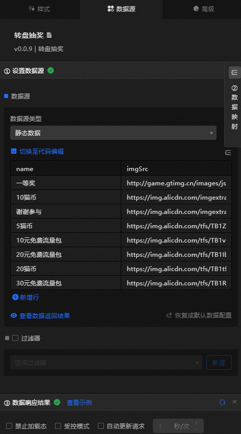
Data Sources panel
|
Column |
Description |
|
|
The name of the prize. |
|
|
The image of the prize. |
|
Configure data items |
Description |
|
Data sources |
Use the code editor or visual editor to view the data fields of the widget. You can also change the data type to flexibly configure the widget data. |
|
Data Mapping |
To customize field configurations, set field mappings in the Data Mapping module to map your data to the corresponding widget fields. This lets you match data without modifying the data source fields. You can also click the |
|
Configure a filter |
Turn on Filter, select an existing data filter or create a data filter, and configure a data filter script to filter data. For more information, see Manage data filters. |
|
Data Response Result |
Displays the widget data in real time. If the data source changes, the latest data is shown. If the response is delayed, click the |
|
Forbid Loading |
If selected, loading animations are not displayed during widget initialization when you update or preview the data dashboard. This check box is cleared by default. |
|
Controlled Mode |
If selected, the widget does not request data during initialization. Data is requested only through global variables or methods configured in Blueprint Editor. If cleared, automatic data requests are used. This check box is cleared by default. |
|
Auto Data Request |
If selected, enter the polling interval to enable dynamic data polling. If cleared, data is not automatically updated. You must manually refresh the page or use Blueprint Editor and global variable events to trigger data updates. |
 icon to configure the field style.
 icon on the right to view the data response result, or click the
  icon to fetch the latest data. You can also click View Example to view a sample response result.
Advanced Panel
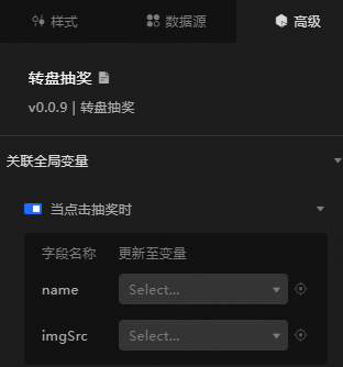
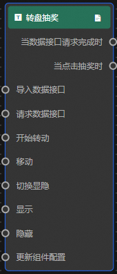
Turn on the switch to enable the associated global variable feature. When the draw button is clicked, a data request is triggered and a temporary variable is emitted to dynamically load data in the Lucky Draw widget. By default, the name and imgSrc values from the data are emitted. For more information, see Component interaction configuration.
Blueprint Interaction
-
Click the
icon in the upper-left corner to go to the Blueprint page. -
On the Layer Nodes tab, add the widget to the main canvas.
-
View blueprint configuration parameters.
-
Event
Event
Description
When the data interface request is completed
The event is triggered with the processed JSON data after a data interface request is responded to and processed by a filter. For specific data examples, see the Data Response Result section on the Data Source tab in the right-side configuration panel of the canvas editor.
When you click Draw
The event triggered when the draw button is clicked. The event also emits the data item corresponding to the button. See the following sample data.
{ "name": "First prize", "imgSrc": "https://img.alicdn.com/tfs/TB1R1zRrQL0gK0jSZFxXXXWHVXa-281-200.svg" } -
Action
Action
Description
Import data
After widget data is processed into its drawing format, it is imported for redrawing without requesting server data again. See the following data example.
[
  {
  "name": "First prize",
  "imgSrc": "https://img.alicdn.com/tfs/TB1R1zRrQL0gK0jSZFxXXXWHVXa-281-200.svg"
  }
]
Request Data Interface
Requests server data again. Data from an upstream data processing node or layer node is used as a parameter. For example, if the API data source is
https://api.testand the data passed to the request data interface is{ id: '1'}, the final request interface ishttps://api.test?id=1.Start turning
Starts spinning the wheel. No parameters are required.
Move
Moves the widget to a specified location. See the following data example.
    {
      // The positioning type. to indicates absolute positioning, whereas by indicates relative positioning. The default value is to.
        "positionType": "to",
      // The location, which is indicated by the x and y coordinates.
      "attr": {
        "x": 0,
        "y": 0
      },
      // The animation type.
      "animation": {
        "enable": false,
        // The animation delay. Unit: milliseconds.
        "animationDuration": 1000,
        // The animation curve, which can be set to linear|easeInOutQuad|easeInOutExpo.
        "animationEasing": "linear"
      }
    }
Switch Display /Display
Shows or hides the widget. No parameters are required.
Display
Shows the widget. See the following data example.
{
  "animationType": "",// The animation method. Valid value: fade. If you do not specify this parameter, no animation is generated.
  "animationDuration": 1000,// The animation delay. Unit: ms.
  "animationEasing": ""// animation curve
}
Hide
Hides the widget. See the following data example.
{
  "animationType": "",// The animation method. Valid value: fade. If you do not specify this parameter, no animation is generated.
  "animationDuration": 1000,// The animation delay. Unit: ms.
  "animationEasing": ""// animation curve
}
Update component configurations
Dynamically updates the widget style configurations. In the Style panel, click Copy Configuration to Clipboard to obtain the widget configuration data. Then modify the style field for the data processing node in Blueprint Editor.
-
 icon in the upper-left corner to go to the Blueprint page.