decoration
Configure decoration widgets to add visual elements to your dashboards.
Chart style
Decoration is a media widget that lets you add custom visual elements to a dashboard or a specific module, enhancing the overall appearance.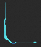
Style Panel 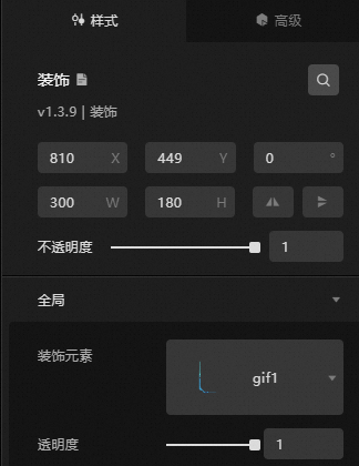
-
Search Configuration: Click the Search configuration items icon
 in the upper-right corner of the Style panel. In the Search Configuration panel, enter the name of the configuration items that you want to search for and locate the configuration items. Fuzzy match is supported. For more information, see Search configuration items.
 -
Size: the width and height of the widget. Unit: pixels.
-
Positioning: the x-axis and y-axis of the component. Unit: pixels. X-coordinate is the pixel distance from the upper-left corner of the widget to the left border of the canvas. Y-coordinate is the pixel distance from the upper-left corner of the widget to the upper border of the canvas.
-
Rotate: Rotates the widget around its center. Unit: degrees.
-
Enter the degrees in the Rotation Angle spin box, or click the plus sign (+) or minus sign (-) to adjust the value.
-
Click the
 icon to flip the widget style.
 -
Click the
 icon to flip the widget style.
-
-
Opacity: Valid values: 0 to 1. A value of 0 hides the widget. A value of 1 fully displays the widget. Default value: 1.
-
-
Global level
Parameter
Description
Decorative elements
The type of decorative element. 55 types are available. Thumbnails are displayed in the drop-down list.
Transparency
The transparency of the decorative element.
Data Sources panel
This component does not support data configuration.
Advanced Panel
This widget does not support interaction events.
Blueprint Interaction
-
Click the
 icon in the upper-left corner to go to the Blueprint page.
 -
On the Layer Nodes tab, add the widget to the main canvas.
-
View blueprint configuration parameters.
-
Event: The decoration widget does not support events.
-
Action
Action
Notes
Move
Moves a widget to a specified location. See the following data example.
    {
      // The positioning type. to indicates absolute positioning, whereas by indicates relative positioning. The default value is to.
        "positionType": "to",
      // The location, which is indicated by the x and y coordinates.
      "attr": {
        "x": 0,
        "y": 0
      },
      // The animation type.
      "animation": {
        "enable": false,
        // The duration in which animation is displayed.
        "animationDuration": 1000,
        // The animation curve, which can be set to linear|easeInOutQuad|easeInOutExpo.
        "animationEasing": "linear"
      }
    }
Switch Display /Display
Toggles widget visibility. No parameters are required.
Display
Displays the widget. See the following data example.
{
  "animationType": "",// The animation method. Valid value: fade. If you do not set this parameter, no animation is available.
  "animationDuration": 1000,// The animation delay. Unit: ms.
  "animationEasing": ""// animation curve
}
Hide
Hides the widget. See the following data example.
{
  "animationType": "",// The animation method. Valid value: fade. If you do not set this parameter, no animation is available.
  "animationDuration": 1000,// The animation delay. Unit: ms.
  "animationEasing": ""// animation curve
}
Update component configurations
Dynamically updates widget style configurations. In the Style panel, click Copy Configuration to Clipboard to obtain the widget configuration data. Then, modify the style field for the data processing node in Blueprint Editor.
-
 icon in the upper-left corner to go to the Blueprint page.