When you build a large-screen dashboard from multiple templates, assets from different templates often clash visually—inconsistent colors, typography, and layouts that require manual style adjustments. The design library provides themed visualization kits with pre-matched assets so you can assemble a consistent, professional dashboard without fixing style mismatches.
The design library is available in DataV 7.0 and later. Use the DataV console.
What is a design library
The design library is a curated collection of visualization kits for building large-screen dashboards. Each element in the design library—titles, panels, maps—has been tuned by designers to share a unified visual language within a kit. You can drag any element onto the canvas and combine assets freely, and they will look consistent without manual style adjustments.
This differs from a standard component library, where components ship with generic default styles that rarely fit together across different templates.
Visualization kit types
The design library groups all assets into five themed visualization kits, each with a consistent color palette, typography, and layout:
Sunny Mountain Blue
Danxia Orange
Twilight Mountain Purple
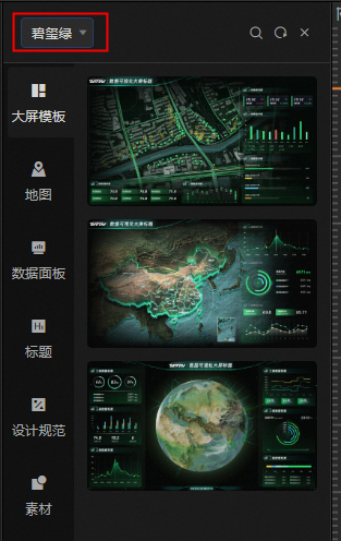
Tourmaline Green
Yunfeng White
To switch kits, click the All drop-down list in the upper-left corner and select a kit. 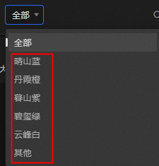
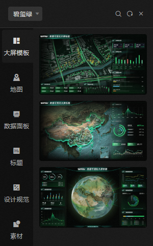
Visualization kit contents
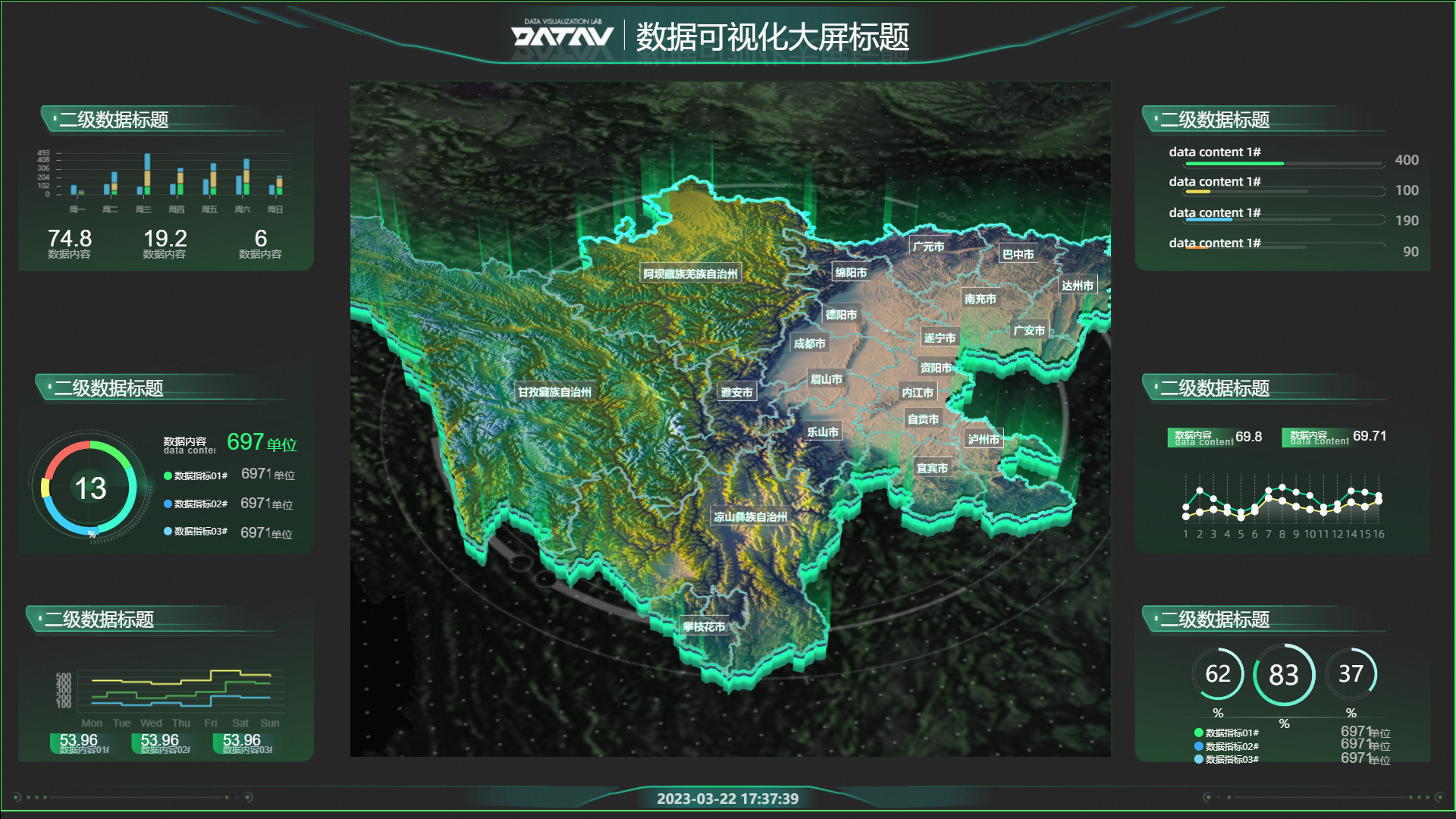
Each visualization kit includes the following asset categories. The examples below use the Tourmaline Green kit.
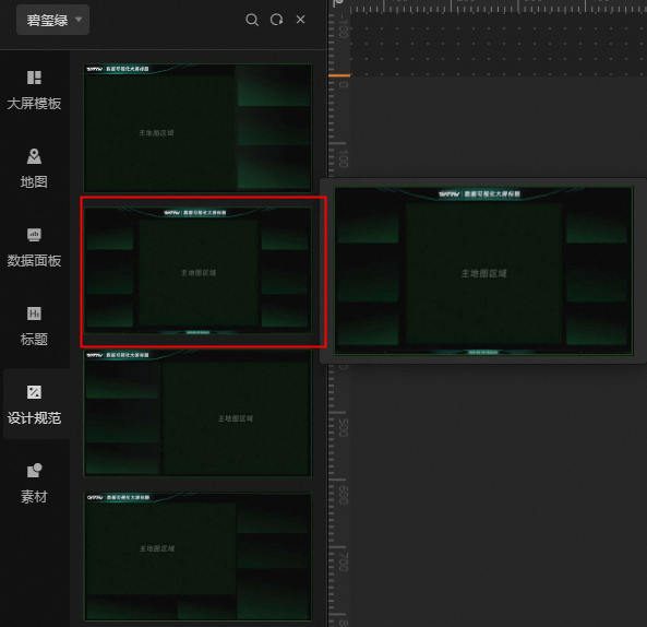
Dashboards: regional map templates, China map templates, and 3D globe templates for different display scenarios.
-
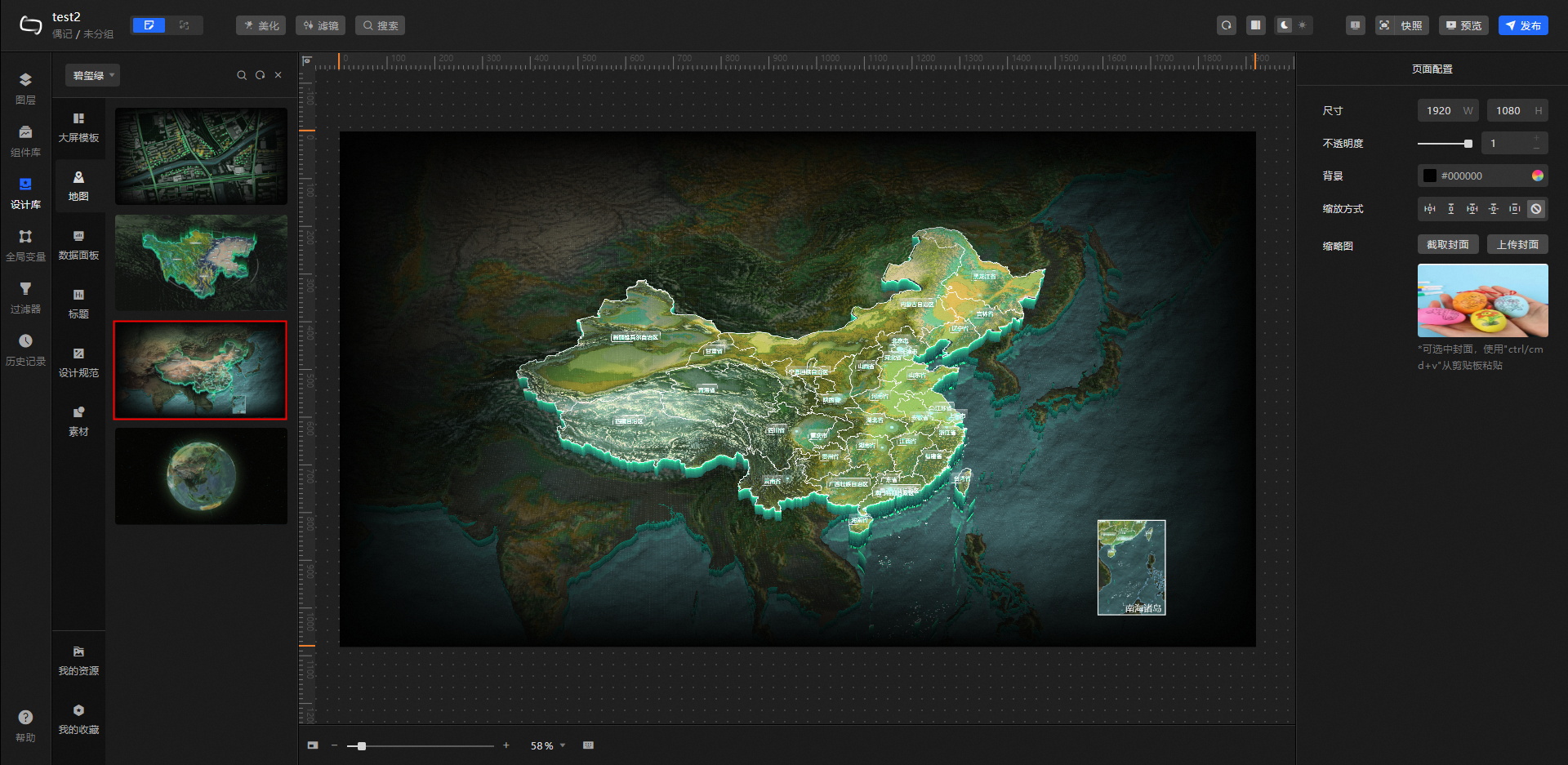
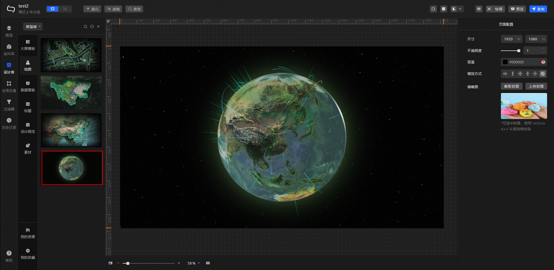
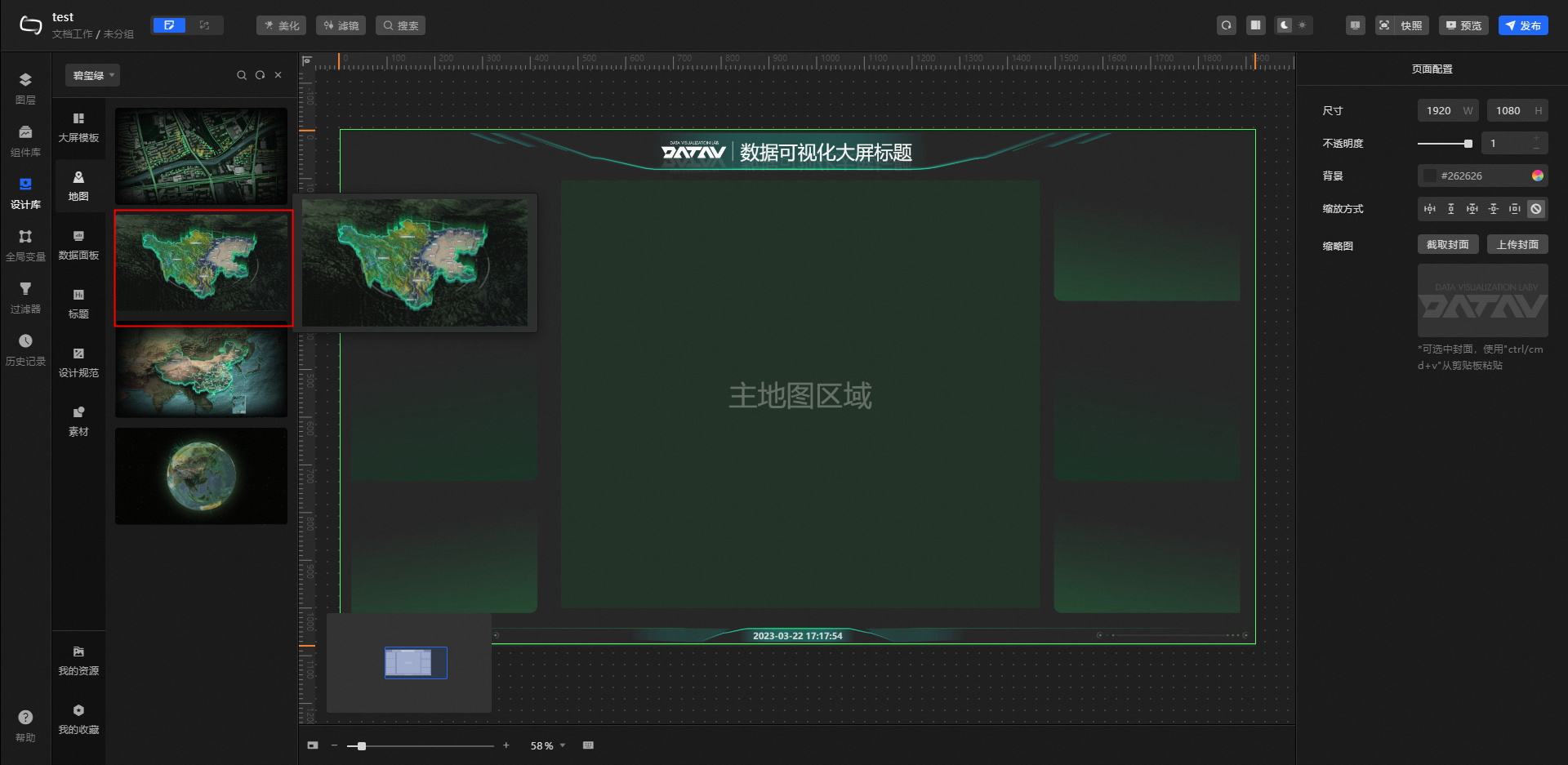
Map: a variety of map styles, including flat area maps, 3D province maps, 3D China maps, and 3D earth maps. Select a map to replace the default map in your template.
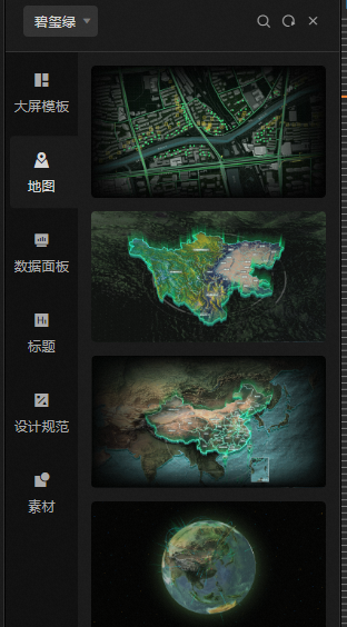
Flat area map
3D province map
3D China map

3D earth
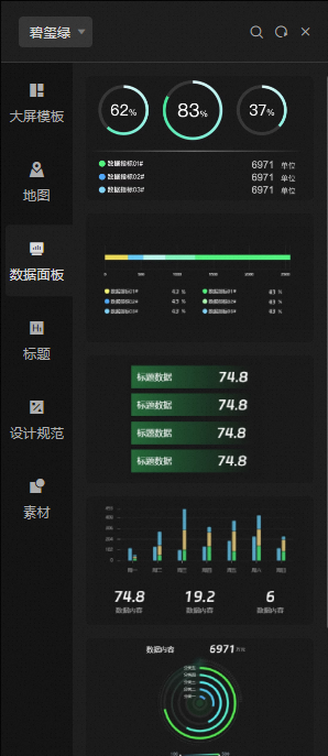
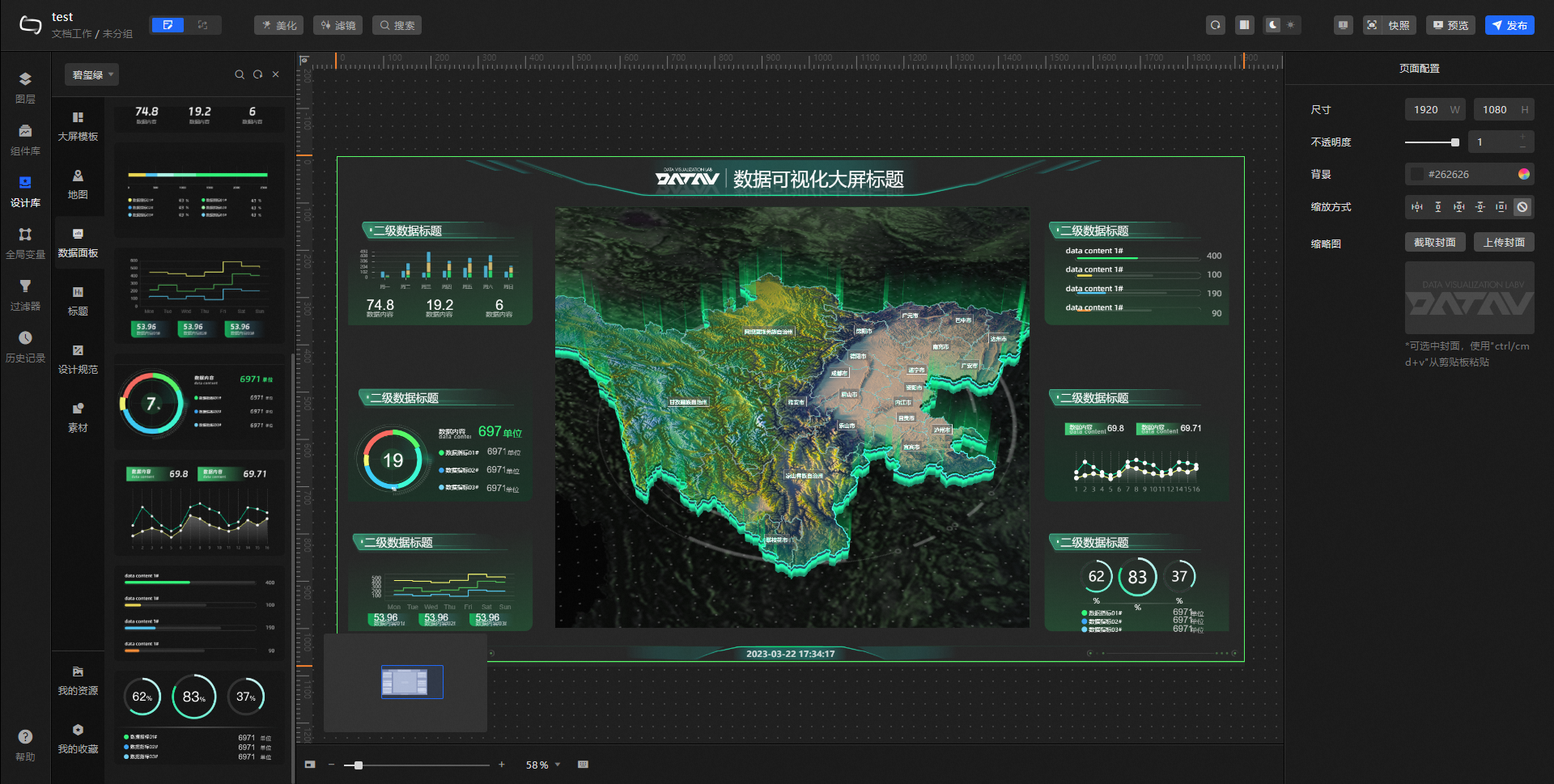
Data Panel: common data panel widgets, including ticker boards, pie charts, line bar charts, and progress bar charts. Select items to add to your large screen and customize their style, color, and other settings.
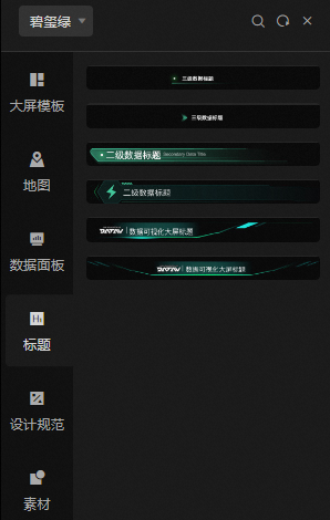
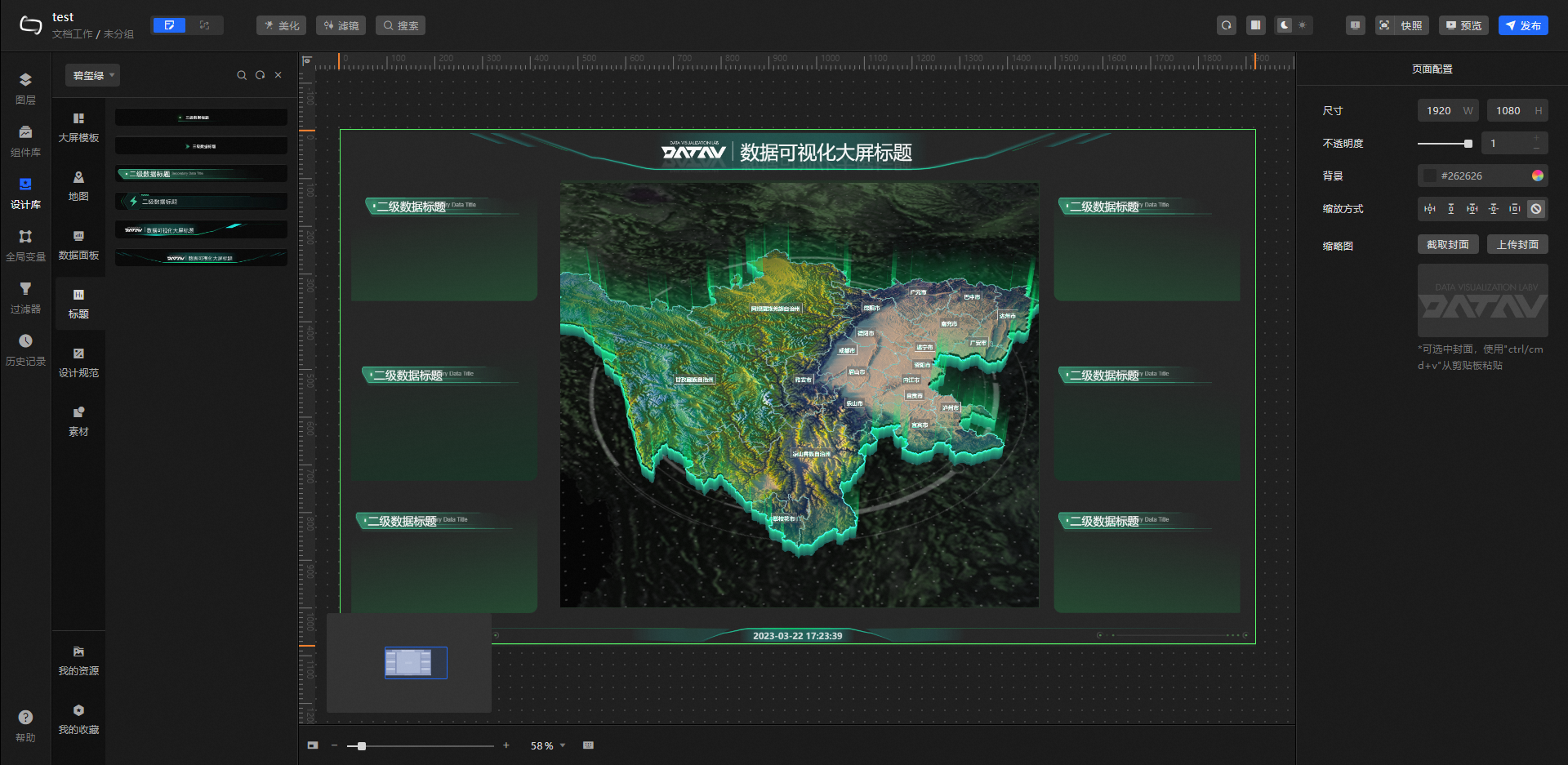
Title: title widget styles at three hierarchy levels (level 1, level 2, and level 3). Select a title style and apply it directly to your large screen.
-
Design Specifications: the Main Visual Layout, Text Specifications, and Color Specifications for the current kit. Use these as a reference when selecting assets to add to the canvas.
Main visual layout
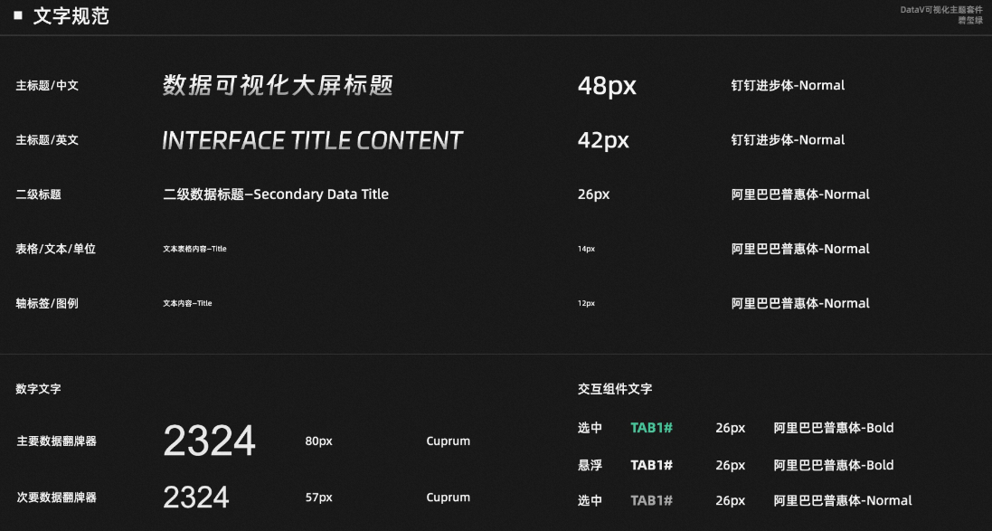
Text specifications
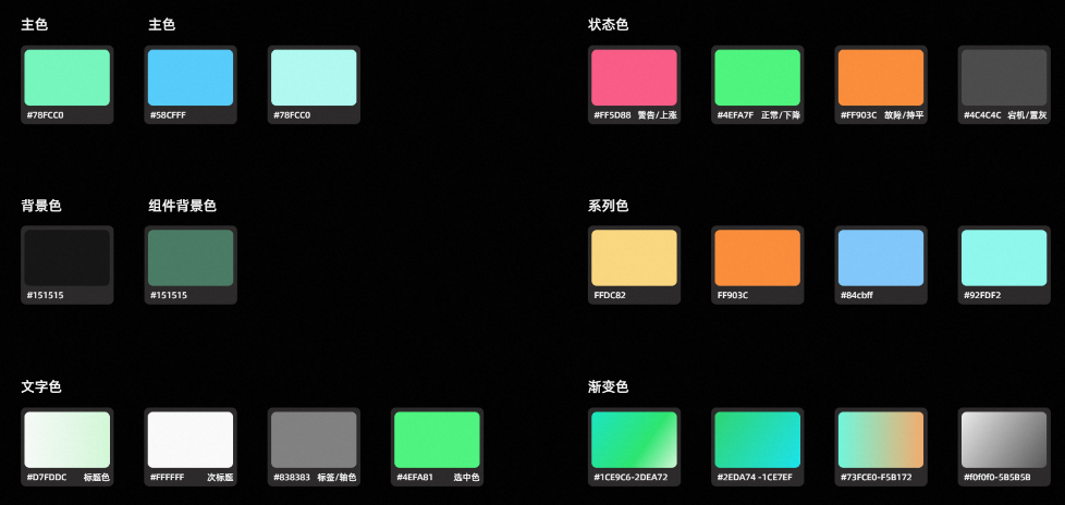
Color specifications
-
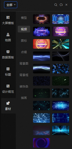
Materials: decorative assets commonly used in large-screen visualizations, including models, videos, icons, embellishments, background images, background frames, decorative strips, and illustrations.
NoteMaterial types are not filtered by visualization kit. To browse all material types, select All from the drop-down list in the upper-left corner.
-
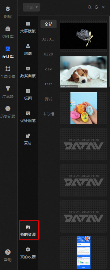
My Resources: design resources saved in the console. Click or drag a resource onto the canvas to use it.
NoteThe content in this category is not affected by the selected visualization kit.
-
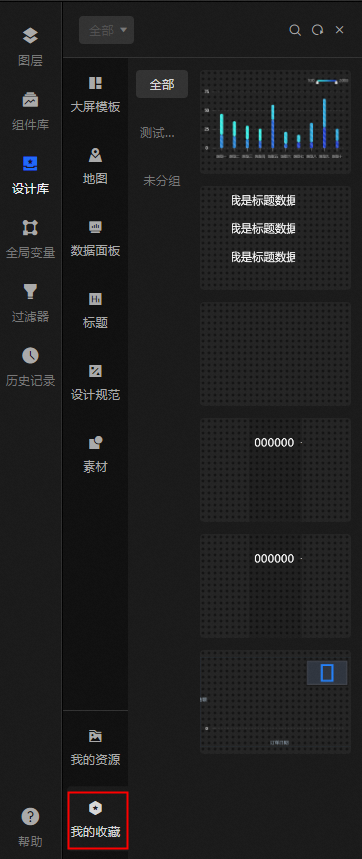
My Favorites: widgets you have saved in the console. Click or drag a widget onto the canvas to reuse it.
NoteThe content in this category is not affected by the selected visualization kit.
Build a dashboard with a visualization kit
The following steps show how to build a data dashboard using the Tourmaline Green visualization kit.
Log on to the DataV console.
On the console page, move the pointer over Create PC Kanban Board and click Select Template.
On the Create Kanban Board page, select Blank Kanban Board and click Create Kanban Board.
Enter a name and click Create kanban.
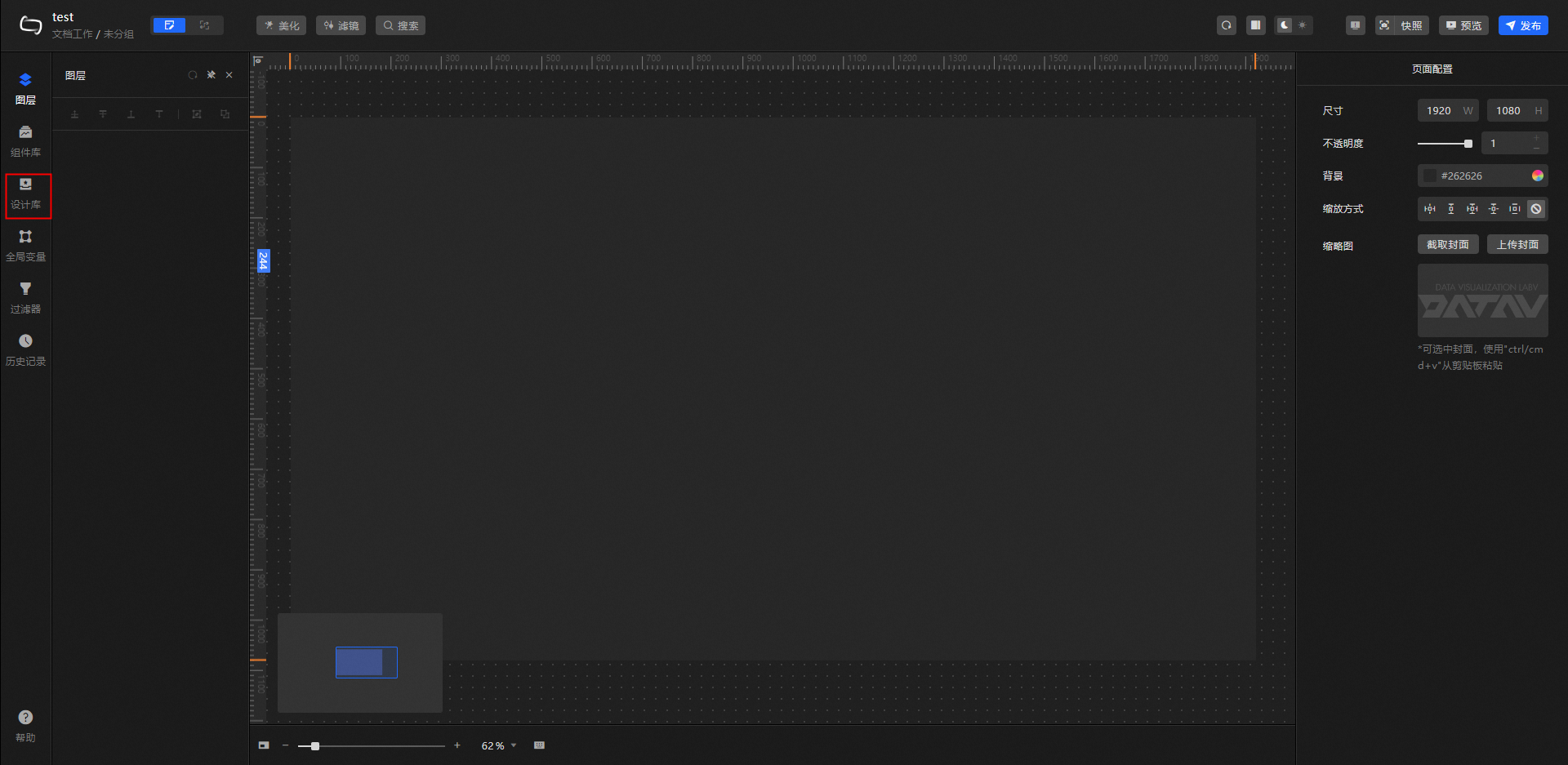
In the left-side navigation pane, click Design Libraries.
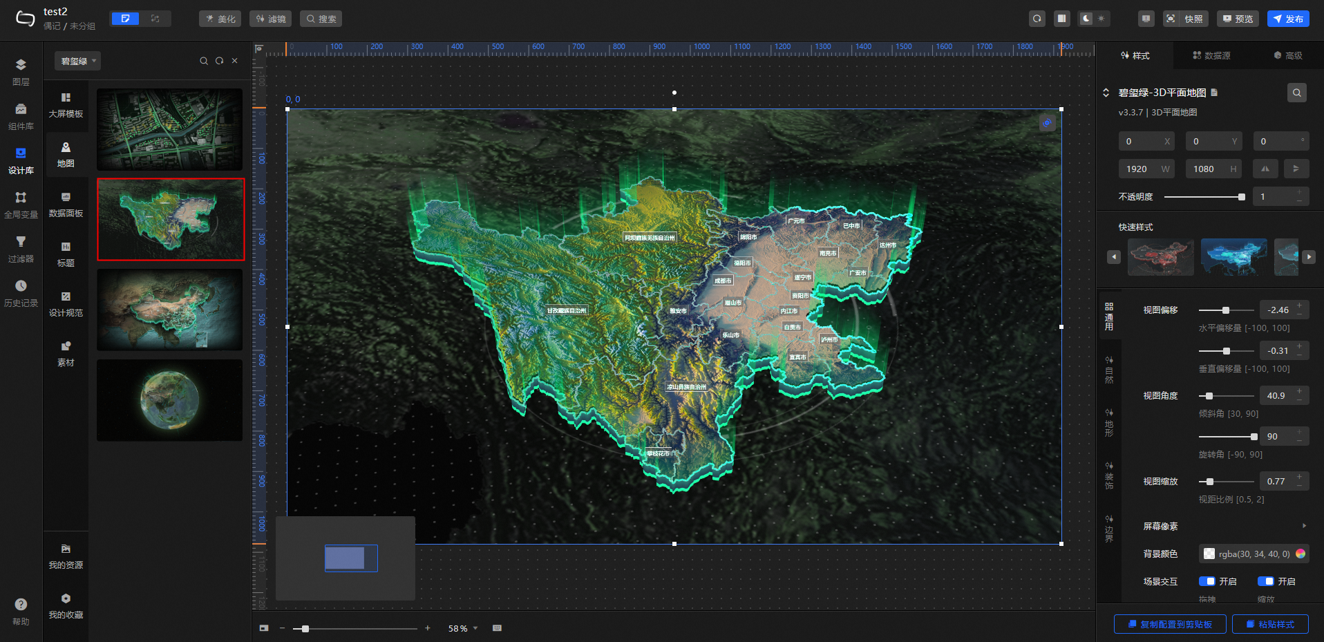
Click All in the upper-left corner of the Design Library panel and select Tourmaline Green from the drop-down list.
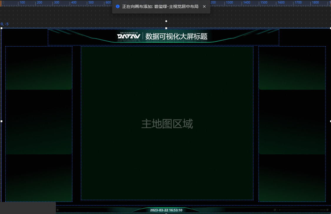
Click Design Specifications and select Main Visual Center Layout.
Click Map and select a 3D province map. Drag and resize it to fit the main map area on the canvas.
Click Title and drag a title widget onto the background block. Resize the title widget to fit above the background block.
Click Data Dashboard and select the assets to add. Resize and adjust the style of each asset to fit above the background block.
(Optional) Add decorative assets from Materials to enhance the visual appearance of the large screen.
After completing the design, click Preview in the upper-right corner of the canvas editor to preview the large screen.
Video demo
The following video demonstrates building a large map screen end to end. The assets used are for reference only—use any combination of elements from the kit that suits your workflow.
Design Library panel
The toolbar at the top of the Design Library panel provides the following actions:
Click
to refresh the Design Library panel.Click
to open the Shortcut Search panel and search for a design component by name.Click
to close the Design Library panel.
 to refresh the Design Library panel.
 to open the Shortcut Search panel and search for a design component by name.
 to close the Design Library panel.