Flying routes layer (v4.x)
Configure the flying routes layer to display origin-destination (OD) data as animated lines between geographical points on a basic flat map.
Chart style
The flying routes layer is a sub-widget of Basic Flat Map 4.0 that supports independent style and data configurations. It displays origin-destination (OD) data between two geographical points as animated flying routes, ideal for visualizing relationships such as logistics or transactions.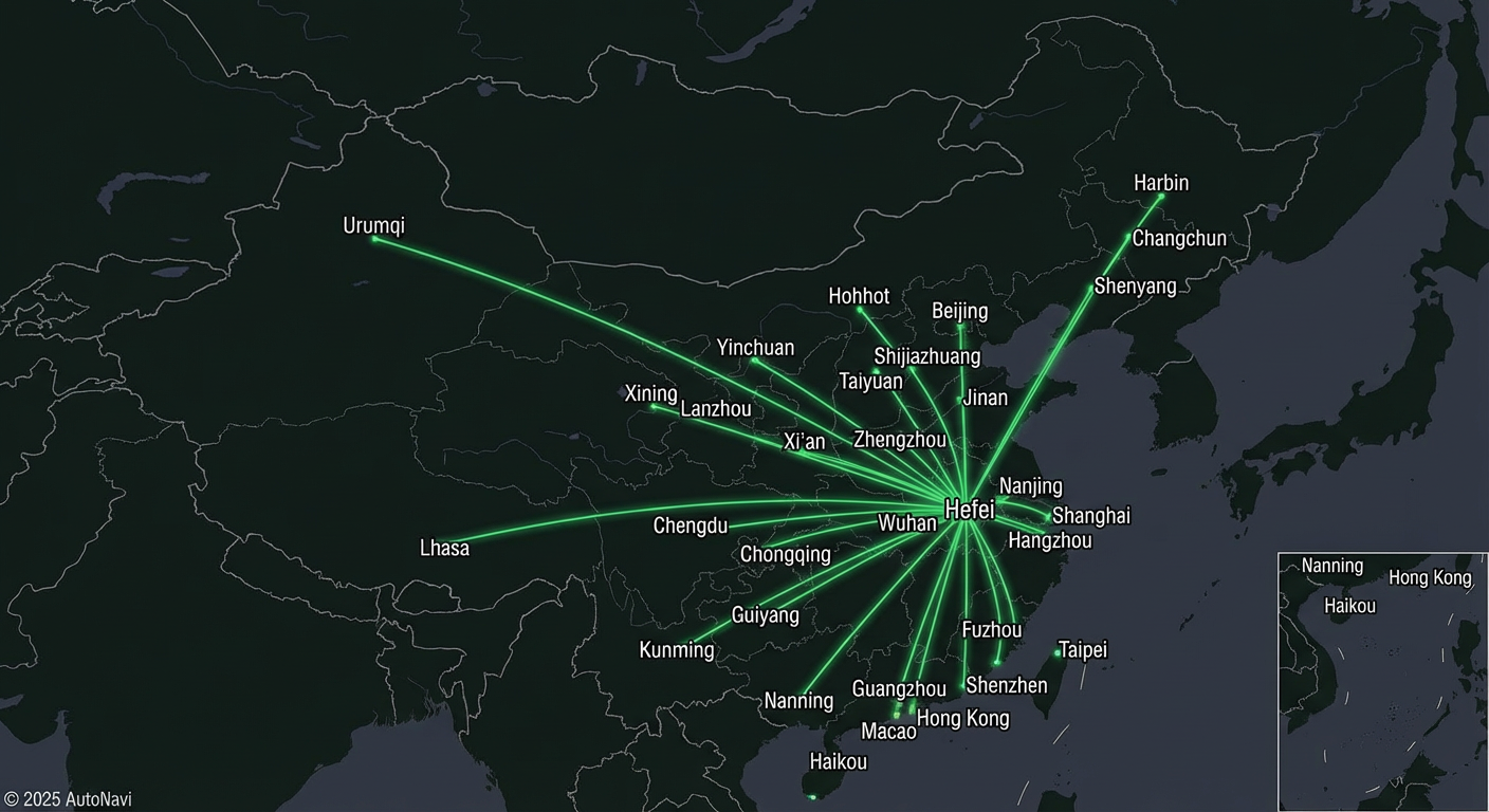
Style pane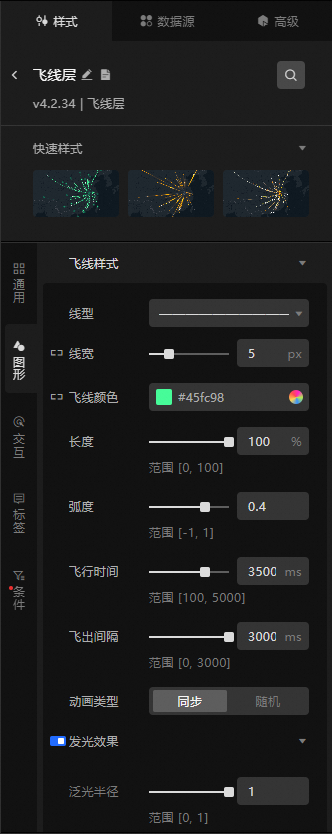
When you configure interaction effects, the configurations for click and hover display modes are visible only in preview, publish, or interaction mode.
-
Search Configuration: Click the
 icon in the upper-right corner of the Style panel to search for configuration items by name. Fuzzy matching is supported. Search for a configuration item.
 -
Quick styles: Predefined quick styles for the flying routes layer. Select a style to apply it.
-
General: General configurations for the flying routes layer.
Parameter
Description
Visibility level
The visibility level of the flying routes layer. The layer is visible only within the specified level range.
Opacity
The opacity of the flying routes layer, ranging from 0 to 100. A larger value indicates higher opacity.
-
Graphic: Graphic configurations for the flying routes layer, including flying route style, line head style, start point bubble style, and end point bubble style.
Parameter
Description
Flying route style
Set the style of the flying route lines.
-
Line type: Click the drop-down list to select a line type for the flying route.
-
Line width: For more information, see Size Mapper Guide to configure the line width of the flying route.
-
Flying route color: For more information, see Color Mapper Guide to configure the mapped color style of the flying route.
-
Length: The display length ratio of the flying line, specified as a percentage from 0 to 100. The final displayed length is this percentage of a base length that is determined by the Take-off Interval and Flight Duration.
-
Curvature: Drag the slider to set the curvature of the flying route. The value ranges from -1 to 1.
-
Travel time: The time it takes for the line head to travel from the start point to the end point. The value ranges from 100 to 5000 ms.
-
Fly-out Interval: The time between when the tail of the previous fly line leaves the start point and when the next fly line departs from the start point. The length of the fly line is determined by Flight Time and Fly-out Interval. The larger the value of Fly-out Interval/Flight Time, the shorter the fly line.
-
Animation Type: Select the animation type for the flying lines, including Sync and Random.
-
Glow effect: Set the glow effect for the flying route, including glow radius and glow intensity.
-
Leader Line Style: Specifies the line type, width, and color of the leader lines for fly-lines.
Line head style
Set the fly line start style. Click the
 icon to the left of Line Start Style to control the visibility of Line Start Style.
 -
Line End Type: The type for the end of the fly-line. The options are Vector and Icon.
-
Vector Shape: The vector shape of the line cap. This option is available only when Line Cap Type is set to Vector.
-
Color: Specifies the color of the current vector shape. This setting is configurable only when Line Cap Type is set to Vector.
-
Radius: Set the radius of the vector shape.
-
Outline Color: Sets the outline color for the current vector shape. This setting is configurable only when Line Cap Type is set to Vector.
-
Outline Thickness: Sets the outline thickness for the current vector shape. The value can range from 0 to 5 px. This setting is available only when Line Cap Style is set to Vector.
-
Icon Shape: Select an icon shape for the line end style. You can click the dropdown list to the right of the style to select a built-in icon style, enter the URL of an image from a remote server in the input box of the dropdown panel, or click the
 icon to the right of the input box to upload a local image. This option is available only when Line End Type is set to Icon.
Start point bubble
Configure the style of the start point bubble for the fly line. Click the
 icon on the left to show or hide the Start Point Bubble.
-
Bubble radius: Set the radius of the start point bubble. For more information, see Size Mapper Guide to configure the mapped radius for different bubbles.
-
Icon avoidance: Click the
icon to enable or disable icon avoidance to prevent icons from overlapping. -
Bubble Style: Click the
or icon to the right of Bubble Style to add or delete a bubble style. Click the or icon to configure the page layout for multiple bubble styles. Click the icon to duplicate the currently selected style.-
Shape: The icon style of the start point bubble. You can click the drop-down list to select a built-in icon. You can also enter an image URL in the input box to use an image from a remote server, or click the
icon to upload a local image. -
Color: Set the color style of the bubble. For more information, see Color Mapper Guide to configure the mapped color style for different bubbles.
-
Size Ratio: Specifies the scaling ratio (from 0 to 1) of the bubble relative to the icon that is generated based on the Bubble Radius configuration item.
-
Animation: Set the bubble's breathing animation.
-
Type: Set the animation type. Options include Rotate, Breathing, Fade in, Glow, and Diffusion.
-
Speed: Sets the animation type for the bubbles, including Sync and Custom. Sync keeps the bubble breathing animation synchronized with the fly-line animation. When you select Custom, you can set a custom speed from 500 to 5000 ms.
-
Delay: Set the animation delay. The value ranges from 0 to 1000 ms.
-
Scaling Range: Specifies the scaling range for the bubble breathing animation. The valid range is 1 to 5. This parameter is available only when the animation type is set to Breathing.
-
Transparency Range: Drag the slider to set the transparency range for the bubble's fade-in animation. The value can range from 0 to 100. This setting is configurable when the animation type is set to Fade In.
-
Glow Color: Sets the glow color of the bubble. You can configure this setting when the animation type is set to Glow.
-
Glow Intensity: Sets the glow intensity of the bubble. The valid range is 1 to 5. This parameter can be configured only when Animation Type is set to Glow.
-
Glow Radius: Sets the glow radius of the bubbles to a value from 0 to 20. This setting is available only when the animation type is set to Glow.
-
Size Correction: Adjust this parameter to calibrate the size when the glowing edges of an image are misaligned. The value range is from -1 to 1. This parameter is available when the animation type is set to Glow.
-
Diffusion Multiplier: Specifies the diffusion multiplier for the bubble relative to the icon generated from the Bubble Radius configuration item. The value ranges from 1 to 5. You can configure this option when the animation type is set to Diffusion.
-
-
End point bubble
Set the style for the destination point bubble. Click the
icon on the left to show or hide the Destination Point Bubble.-
Bubble radius: Set the radius of the end point bubble. For more information, see Size Mapper Guide to configure the mapped radius for different bubbles.
-
Icon avoidance: Click the
icon to enable or disable icon avoidance to prevent icons from overlapping. -
Bubble Style: Click the
or icon to the right of Bubble Style to add or delete a bubble style. Click the or icon to configure the page layout for multiple bubble styles. Click the icon to copy the configuration of the currently selected style and add a new bubble style with the same configuration.-
Shape: The icon style of the end point bubble. You can click the drop-down list to select a built-in icon. You can also enter an image URL in the input box to use an image from a remote server, or click the
icon to upload a local image. -
Color: Set the color style of the bubble. For more information, see Color Mapper Guide to configure the mapped color style for different bubbles.
-
Size Ratio: Sets the scaling ratio of the bubble relative to the icon generated from the Bubble Radius configuration item, with a range of 0 to 1.
-
Animation: Set the bubble's breathing animation.
-
Type: Set the animation type. Options include Rotate, Breathing, Fade in, Glow, and Diffusion.
-
Speed: Sets the animation type for the bubbles, including Sync and Custom. Sync means that the bubble breathing animation is synchronized with the fly-line animation. When you select Custom, you can set a custom speed with a value in the range of 500 to 5,000 ms.
-
Delay: Set the animation delay. The value ranges from 0 to 1000 ms.
-
Scaling Range: Sets the scaling range of the bubble breathing animation. The valid range is 1 to 5. This setting is available only when the animation type is set to Breathing.
-
Transparency Range: Drag the slider to set the transparency range for the bubble fade-in effect. The value can be set from 0 to 100. This option is available only when the animation type is set to Fade In.
-
Glow Color: Sets the glow color of the bubble, configurable when the animation type is set to Glow.
-
Glow Intensity: Sets the glow intensity of the bubbles. The value ranges from 1 to 5. This parameter is available when Animation type is set to Glow.
-
Glow Radius: Sets the glow radius of the bubble. The value can range from 0 to 20. This setting is available only when the animation type is set to Glow.
-
Size Correction: If the glowing edges of an image are not correctly aligned, adjust this parameter to calibrate the size. The value can be set from -1 to 1. This parameter is available when the animation type is set to Glow.
-
Diffusion Multiple: Sets the diffusion multiple of the bubble relative to the icon generated based on the Bubble Radius configuration item. The value range is 1 to 5. This option is available only when the animation type is set to Diffusion.
-
-
-
-
Interaction: Interaction configurations for the flying routes layer.
Graphic interaction: In preview or publish mode, interactive styles are displayed when a user clicks or hovers over map elements. Click the
icon to the left of Graphic interaction to enable this feature.Parameter
Description
Click state
Configures the graph. Use the
icon to toggle the click state in the Graphic Interaction panel.-
Graph: Configures the graph style of the flying routes layer for the Clicked State, including Flying Route Style, Line Head Style, Start Point Bubble, and End Point Bubble.
Hover state
Configures the graph. Use the
icon to toggle the hover state for Graph Interaction.-
Graphic: Sets the graphic style of the flying routes layer for the Hover state, including Flying Route Style, Line Head Style, Start Point Bubble, and End Point Bubble.
-
-
Label: Style parameters for labels in the flying routes layer.
Parameter
Description
Show labels
Turn on the switch to show labels for the flying routes layer.
Display mode
Sets the display mode for the labels of the flying routes layer. Options include Click and Hover.
Leader line
Set the style of the label's leader line, including settings based on the flying route's end point, horizontal line ratio, and line style.
-
Endpoint offset: Set the horizontal and vertical offset of the leader line from the flying route's end point. The value ranges from -500 to 500 px.
-
Horizontal line ratio: Set the ratio of the horizontal part of the leader line. The value ranges from 0 to 100%.
-
Line style: Set the leader line's type, width, and color.
Background style
Configure the background style parameters for labels in the flying routes layer. Click the
icon to the left of Background Style to show or hide the Background Style section.-
Background Type: The type of background for the label, which can be Vector or Image.
-
Background Color: Sets the background color of the label. This setting is configurable only when Background Type is set to Vector.
-
Border Style: Sets the style of the label border, including the line type, line width, and color. This parameter is available only when Background Type is set to Vector.
-
Border Radius: Sets the border radius for the four corners of the label, in pixels (px). This setting is available only when Background Type is set to Vector.
-
Image Template: Specifies the template style for the background image. This option is available only when Image Template is set to Image.
-
Opacity: Sets the opacity of the background image. The valid range is 0 to 100. This parameter is available only when you set Image Template to Image.
-
Background Shadow: Sets the style for the label's background shadow, including its color, blur value, and offset values on the x and y axes. Click the
icon to the left of Background Shadow to show or hide the Background Shadow options. -
Content margin: Set the margin for the content within the label on all four sides.
Start point label
Set the content style for the start point label.
-
Row Style: Click the
or icon to the right of Row Style to add or delete a row content style. Click the or icon to configure the arrangement of multiple row content styles. Click the icon to duplicate the selected row content style.-
Line field: The field name for the line's content. This must match a field name in the geographic data.
-
Field style: Set the style for the line field, including font, font size, color, and weight.
-
Field Prefix: Set the content, spacing, font, font size, color, and weight. Click the
icon to the left of Field Prefix to show or hide the Field Prefix style. -
Field Suffix: Set the content, spacing, font, font size, color, and weight of the field suffix. Click the
icon to the left of Field Suffix to control the visibility of the Field Suffix style.
-
-
Maximum Width: Specifies the maximum width of a single-line label in pixels. The text overflow configuration item determines how to display content that exceeds this width.
-
Text Overflow: Sets how to handle text overflow in the label, including Truncate and Line Break.
-
Line height ratio: The line height ratio for the label. The value ranges from 1 to 5.
-
Content Outline: Specifies the outline style for the label's content, including the color and thickness. Click the
icon to the left of Content Outline to control the visibility of Content Outline. -
Content Shadow: The content shadow style for the label, which includes settings for the shadow color, blur value, and offsets in the x and y directions. Click the
icon to the left of Content Shadow to show or hide these settings.
End point label
Set the content style for the end point label.
-
Row Style: Click the
or icon to the right of Row Style to add or delete a row content style. Click the or icon to configure the arrangement of multiple row content styles. Click the icon to copy the configuration of the currently selected content style and add a new row content with the same configuration.-
Line field: The field name for the line's content. This must match a field name in the geographic data.
-
Field style: Set the style for the line field, including font, font size, color, and weight.
-
Field Prefix: Set the content, spacing, font, font size, color, and weight for the field prefix. You can click the
icon to the left of Field Prefix to show or hide the Field Prefix style. -
Field Suffix: Set the content, spacing, font, font size, color, and weight. Click the
icon to the left of Field Suffix to show or hide the Field Suffix style.
-
-
Maximum Width: Specifies the maximum width of a single-line label in pixels. The display of overflowing content is determined by the text overflow configuration item.
-
Text Overflow: Specifies how to handle text that overflows a label, including Truncate and Line Break.
-
Line height ratio: The line height ratio for the label. The value ranges from 1 to 2.
-
Content Outline: Sets the outline style for the label content, including the color and thickness of the outline. Click the
icon to the left of Content Outline to toggle the visibility of Content Outline. -
Content Shadow: The style of the label's content shadow, including the shadow color, blur value, and x and y offsets. Click the
icon to the left of Content Shadow to show or hide the settings.
-
-
Condition: Conditional style settings.
Conditional style: Click the
or icon to add or delete a conditional style. Click the or icon to configure the arrangement of multiple conditional styles. Click the icon to copy the current conditional style configuration and create a new one with the same settings. For more information about style configurations, see Conditional Tree Guide.Graphic: Turn on the switch to configure graphic items for this style. Turn off the switch to disable graphic configuration for this style.
Parameter
Description
Flying route style
Set the flying route style, including line type, width, color, and length. Click the
icon to specify whether to apply this style when the condition is met.Serif Style
Set the base line style, including line type, width, and color. Click the
icon to specify whether to apply this style when the condition is met.Line head style
Set the line head style, including vector shape, color, radius, outline color, and outline width. Click the
icon to specify whether to apply this style when the condition is met.
 or
or  icon to the right of Bubble Style to add or delete a bubble style. Click the
  or
or  icon to configure the page layout for multiple bubble styles. Click the
  icon to duplicate the currently selected style.
 icon to the left of Graphic interaction to enable this feature.
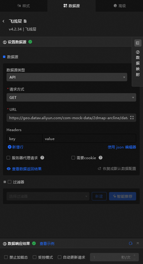
Data Source pane
|
Field |
Description |
|
|
The spatial coordinate data for the flying route. |
|
|
Optional. The field for color mapping of the flying route. |
|
|
Optional. The field for line width mapping of the flying route. |
|
Data Item Configuration |
Description |
|
Data Source |
The component's data source displays the data fields contained within the component using code editing or visual editor. You can also modify the data type to flexibly configure the component's data. |
|
Data Mapping |
When you need to customize chart field configurations, you can set different field mappings in the Data Mapping module to map these fields to the corresponding fields of the component. This allows for real-time data matching without altering the data source fields. Additionally, click the |
|
Filter |
Open the Filter to select an existing data filter or create a new one, and configure the data filter script to achieve data filtering capabilities. For more information, see manage data filters. |
|
Data Response Result |
This feature displays the component's data in real-time. When the component's data source changes, the data response result will display the latest data accordingly. In case of a delayed system response, you can click the |
|
Disable Loading State |
Check the check box to hide the loading content during component updates and data dashboard previews. Unchecking will display the loading content. The default setting is unchecked. |
|
Controlled Mode |
Check the check box to prevent data requests upon the component's initialization. Data requests will only be initiated through global variables or methods configured in the blueprint editor. Unchecking allows for automatic update requests. The default setting is unchecked. |
|
Automatic Update Request |
Check the check box to manually set the polling frequency for dynamic polling. Clearing this option disables automatic updates, requiring manual page refreshes or data request triggers through the blueprint editor and global variable events for updates. |
 icon to configure field styles individually.
 icon on the right to check the current data response result, or click the
  icon on the right to obtain the most recent data for the component. You can also click to view examples to see sample response results for the current component.
Advanced pane
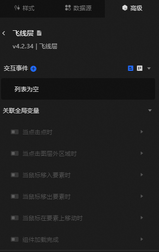
Configure interaction events or associate global variables for filter interactions between widgets. Configure widget interactions.
Blueprint interaction
-
Click the
icon in the top-left corner of the page to go to the Blueprint page. -
On the Layer Node tab, add the current widget to the main canvas.
-
You can view the blueprint configuration parameters.
NoteClick the
icon in the anchor point area on the right to view event and action parameter tooltips.-
Events
Event
Description
On data update
Triggered when the data response changes. The new data is passed as an event argument.
On request status change
Triggered when the data request status changes (for example, success or failure). The status is passed as an event argument.
On point click
Triggered when a scatter point in the layer is clicked. The point data is passed as an event argument.
On click outside layer
Triggered when an area outside the layer is clicked. The event data is passed as an argument.
On mouse enter feature
Triggered when the mouse pointer enters a feature area of the layer. The feature data is passed as an event argument.
On mouse leave feature
Triggered when the mouse pointer leaves a feature area of the layer. The feature data is passed as an event argument.
On mouse move over feature
Triggered when the mouse pointer moves over a feature area of the layer. The event data is passed as an event argument.
Component Loaded
Triggered after the data API request returns and the data is processed by the filter. The processed data is passed as a JSON object. For a data example, see the Data response section on the Data Source tab in the widget's configuration pane in the canvas editor.
-
Actions
Action
Description
Import data
Processes data in the widget's drawing format and imports it to redraw the widget without sending a new server request. For a data example, see the Data response section on the Data Source tab in the widget's configuration pane in the canvas editor.
Request data
Requests data from the server again. The data output from upstream data processing nodes or layer nodes is used as parameters. For example, if a basic scatter layer is configured with the API data source
https://api.testand the data passed to the Request Data action is{ id: '1'}, the final request URL ishttps://api.test?id=1.Toggle visibility
The Toggle Visibility, Show, and Hide actions do not require parameters by default. You can add animation configurations as needed. See the data example.
{
  // Animation type. Optional values: appear|fade|slideToUp. The default is fade. If left blank, there is no animation.
  "animationType": "fade",
  // Animation duration. The default is 1000 ms.
  "animationDuration": 1000,
  // Animation curve. Optional values: linear|easeInOutQuad|easeInOutExpo. The default is linear.
  "animationEasing": "linear"
}
Show
Hide
Update widget configuration
Dynamically updates the style configuration of a component. In the component's Style panel, click Copy Configuration To Clipboard to obtain the configuration data. Then modify the field values for the corresponding styles in the data processing node on the Blueprint Editor page as needed.
-
 icon in the top-left corner of the page to go to the Blueprint page.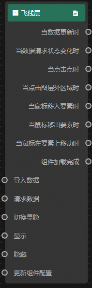
 icon in the anchor point area on the right to view event and action parameter tooltips.