Configure the flying routes layer to visualize origin-destination data on a 3D globe.
Chart style
The flying routes layer is a 3D globe subcomponent with independent style and data configuration. It represents linear relationships between two locations, such as logistics and transactions, through settings like radius, arc, type, and start/end coordinates. 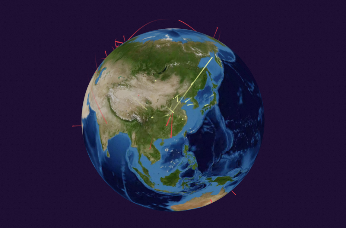
Style panel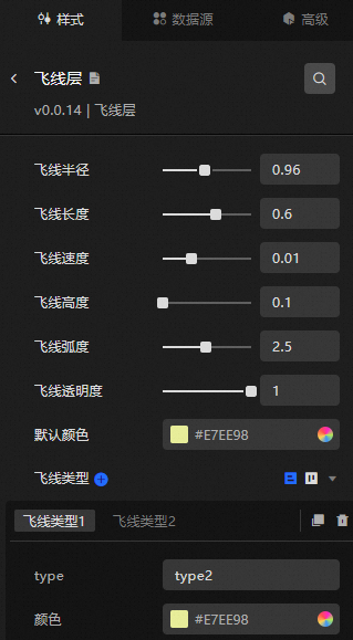
-
Search Configuration: Click the Style icon
 in the upper right corner of the panel to enter the name of the configuration item you wish to locate in the search field. The system supports fuzzy matching. For more information, see Search configuration item.
 -
Flying Routes Radius: The radius of the flying routes.
-
Flying Routes Length: The length of the flying routes.
-
Flying Routes Speed: The animation speed of the flying routes.
-
Flying Routes Height: The height of the flying routes above the globe surface.
-
Flying Routes Arc: The curvature of the flying routes.
-
Flying Routes Transparency: The transparency of the flying routes.
-
Default Color: The color applied to flying routes when the type field in the data does not match any configured type. To adjust the default color, see Color Picker Description.
-
Flying Routes Type: An array of items for setting the type and Color. The type field in the data source must match the type in the configuration to apply the specified color. Otherwise, the Default Color is used.
Data source panel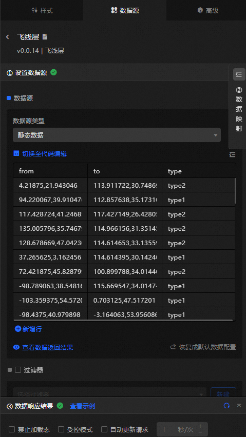
|
Field |
Description |
|
|
The latitude and longitude of the starting position, separated by a comma. |
|
|
The latitude and longitude of the endpoint, separated by a comma. |
|
|
The color type of the flying routes. This value is matched against Flying Routes Type>type in the style configuration to determine the route color. |
|
Data Item Configuration |
Description |
|
Data Source |
The component's data source displays the data fields contained within the component using code editing or visual editor. You can also modify the data type to flexibly configure the component's data. |
|
Data Mapping |
When you need to customize chart field configurations, you can set different field mappings in the Data Mapping module to map these fields to the corresponding fields of the component. This allows for real-time data matching without altering the data source fields. Additionally, click the |
|
Filter |
Open the Filter to select an existing data filter or create a new one, and configure the data filter script to achieve data filtering capabilities. For more information, see manage data filters. |
|
Data Response Result |
This feature displays the component's data in real-time. When the component's data source changes, the data response result will display the latest data accordingly. In case of a delayed system response, you can click the |
|
Disable Loading State |
Check the check box to hide the loading content during component updates and data dashboard previews. Unchecking will display the loading content. The default setting is unchecked. |
|
Controlled Mode |
Check the check box to prevent data requests upon the component's initialization. Data requests will only be initiated through global variables or methods configured in the blueprint editor. Unchecking allows for automatic update requests. The default setting is unchecked. |
|
Automatic Update Request |
Check the check box to manually set the polling frequency for dynamic polling. Clearing this option disables automatic updates, requiring manual page refreshes or data request triggers through the blueprint editor and global variable events for updates. |
 icon to configure field styles individually.
 icon on the right to check the current data response result, or click the
  icon on the right to obtain the most recent data for the component. You can also click to view examples to see sample response results for the current component.
Advanced panel
No interaction events are available for this component.
Blueprint interaction
-
Click the
 icon in the upper left corner of the page to access the Blueprint page.
 -
In the Layer Node tab, add the current component to the main canvas.
-
Review the blueprint configuration parameters.
-
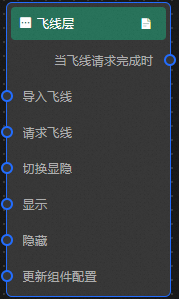
Event
Event
Description
When The Flying Routes Request Is Completed
Triggered after the data interface request is returned and processed by the filter. The event provides the processed JSON data. For data examples, see the Data Source tab in the configuration panel on the right side of the canvas editor, under the Data Response Result section.
-
Action
Action
Description
Request Flying Routes
Re-requests server data. Data from the input data processing node or layer node is passed as parameters. For example, if the flying routes layer uses an API data source such as
https://api.test, and the data passed to the Request Flying Routes action is{ id: '1'}, the final request URL becomeshttps://api.test?id=1.Import Flying Routes
Imports data directly in the rendering format without re-requesting the server. For data examples, see the Data Source tab in the configuration panel on the right side of the canvas editor, under the Data Response Result section.
Switch Visibility
Toggles the visibility of the component. No parameters are required.
Show
Shows the component. Example data:
{
  "animationType": "",//Animation method. Optional value: fade. No animation if not filled.
  "animationDuration": 1000,//Animation latency in ms.
  "animationEasing": ""//Animation curve
}
Hide
Hides the component. Example data:
{
  "animationType": "",//Animation method. Optional value: fade. No animation if not filled.
  "animationDuration": 1000,//Animation latency in ms.
  "animationEasing": ""//Animation curve
}
Update Component Configuration
Dynamically updates the component style configuration. To obtain the configuration data, click Copy Configuration To Clipboard in the Style panel of the component. Then modify the corresponding style field values in the data processing node on the blueprint editor page.
-
 icon in the upper left corner of the page to access the Blueprint page.