List carousel
Configure and use the list carousel widget to display scrolling data lists on your data dashboard.
Overview
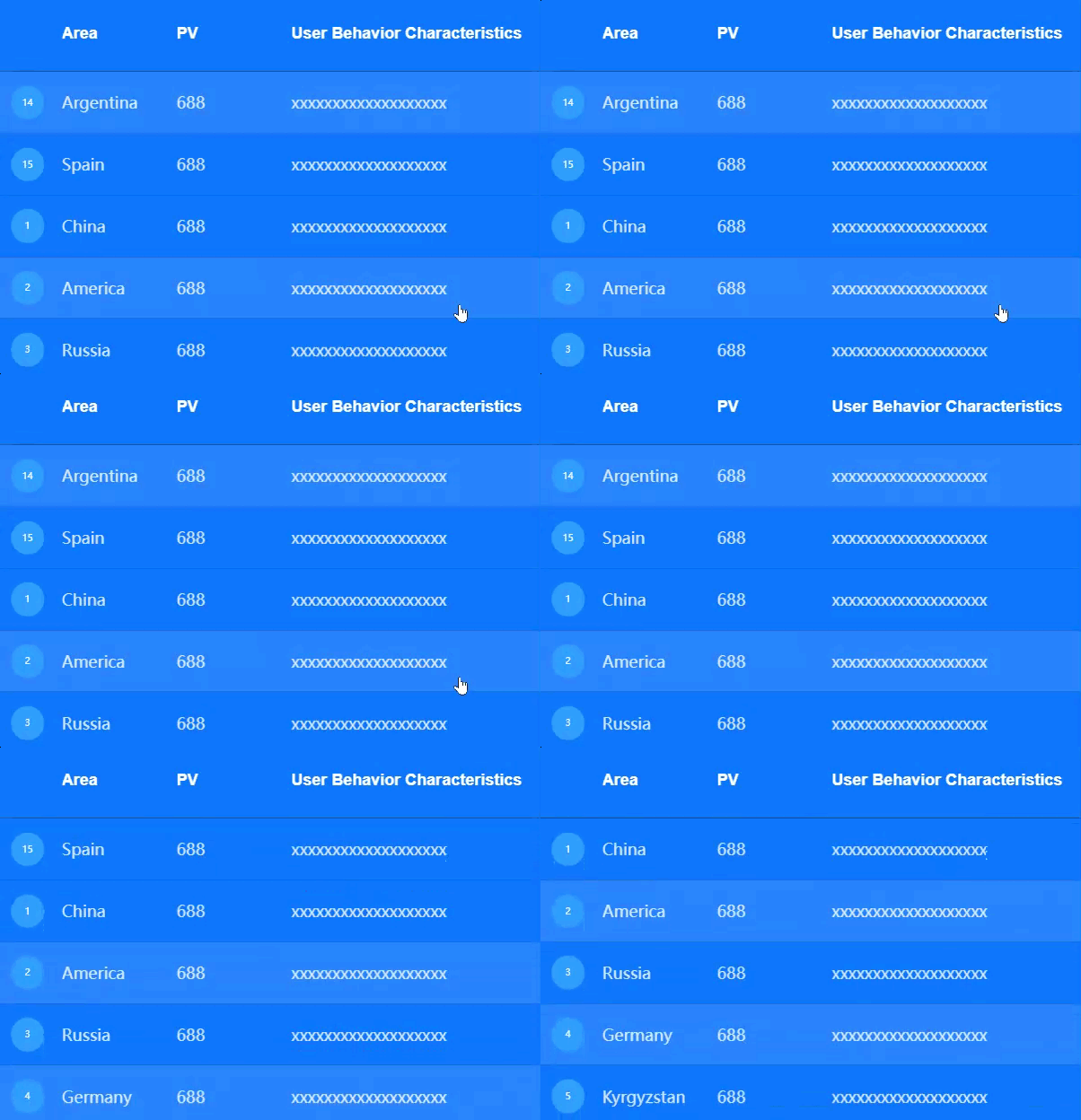
The list carousel is a table-like widget that uses carousel animation to display data in an orderly list on a data dashboard. You can customize the style and content of rows and columns, and configure list content to include hyperlinks and images.
Scenarios
Use a list carousel when you need to display a large amount of information in a limited area, with content switching automatically or manually. For example, an e-commerce website can use a list carousel to showcase popular products and promotional activities.
Demonstration
Prerequisites
-
Create a data dashboard. You can use a template, use a blank canvas, or use AI to generate one.
-
Your business data is prepared. For more information, see Data Source.
Add a list carousel
-
Access the DataV console.
-
On the Workbench page, in the Data Dashboards area, hover over the target dashboard and click Edit. The canvas editor opens.
-
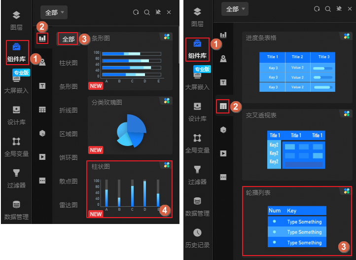
In the navigation pane on the left, add the List Carousel widget to the canvas as shown in the following figure.
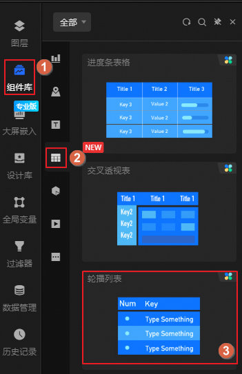
You can also use the global search feature to add the widget.
Connect to business data
After you add the widget, connect it to your business data. Click the list carousel, and then on the Data tab on the right, select the data to display in the widget.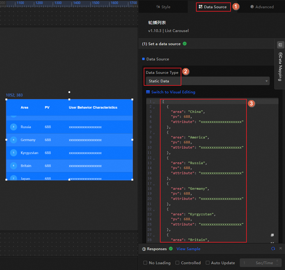
-
The following table describes the data fields accepted by the list carousel widget.
Field
Description
Custom parameters
The content of the list carousel table. You can customize multiple field values. These values must match the Column Field Name that you set in the section.
NoteThe field content can use HTML tags. For example, the following code shows how to use the <a> tag to create a hyperlink:
"DataV": "<a href='https://www.aliyun.com/product/bigdata/datav?'>DataV Official Website</a>". -
This section describes the core configuration items for the data source.
Configuration
Description
Select Data Source
Supports various data types, such as CSV files, APIs, and different databases. For more information, see Supported data source types. Edit data fields in a visual table or in code.
Configure Filter (Optional)
Customize filter code to transform, filter, display, and perform simple calculations on data. For more information, see Manage data filters.
Configure Data Mapping
Map fields from the selected data source to the widget's fields. This enables real-time data matching. Click the
 icon to configure field styles.
View Response Result
Displays the data connected to the widget in real time. When the widget's data source changes, this section shows the latest data.
-
Click the data response result to view the data field code.
-
Click View Example to see the array type and sample code that the data source accepts. You can write your fields based on the example.
Other data request configurations:
-
Disable Loading State: If you check this box, the widget's initial loading content does not appear when the widget updates or when you preview the data dashboard.
-
Controlled Mode: If you check this box, the widget does not request data when it initializes. Data requests can only be started by the blueprint editor or by global variable events.
-
Auto Update Request: If you check this box, the platform polls for data updates at the interval you set. If you do not check this box, you must refresh the page manually or use the blueprint editor or global variable events to trigger data updates.
-
Configure the list carousel
Click the list carousel widget to configure its settings in the panel on the right. You can configure basic styles, advanced settings such as global variables and interaction events, and Blueprint interactions.
Configure styles
In the Style panel, configure styles for the list carousel, such as font, color, and carousel animation. The following table describes the configuration items.
You can also click the  icon to quickly find a configuration item by searching for keywords. The search feature supports fuzzy matching. For more information, see Search for configuration items.
|
Configuration Item |
Description |
Illustration |
|
Global Configuration |
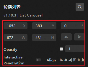
Defines the widget's position, transparency, and interaction passthrough in the data dashboard.
|
|
|
Quick Styles |
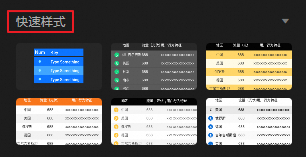
Multiple built-in styles are available for the list carousel. You can quickly switch between them as needed. |
|
|
Global Style Configuration |
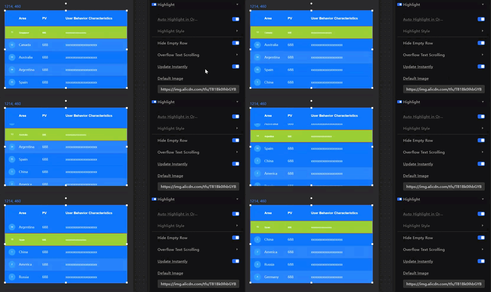
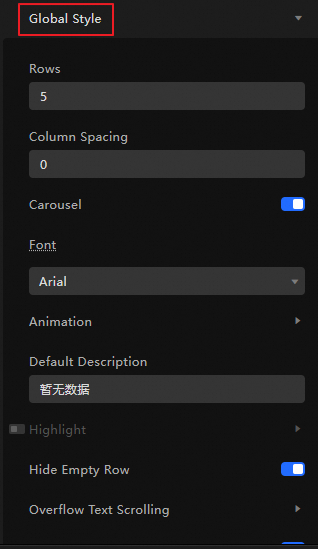
Defines the number of table rows, column spacing, font style, carousel control, animation style, and highlight settings for the list carousel.
|
|
|
Table Header Configuration |
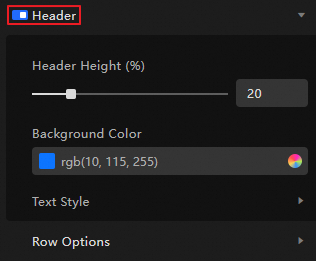
Defines whether to add a table header to the list carousel and sets the header's row height (as a percentage of the total list carousel height), background color, and text style (font size, color, weight, etc.). If disabled, the list carousel does not have a header. |
|
|
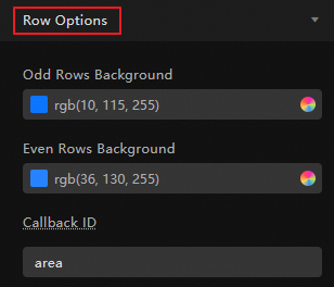
Row Configuration |
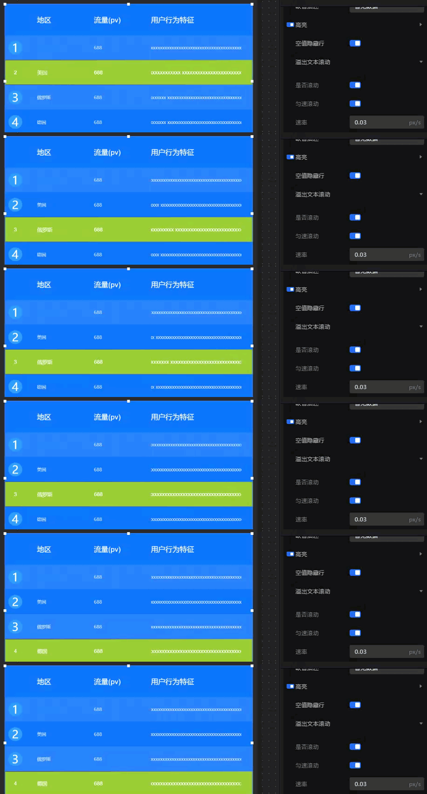
You can set the background colors for odd and even rows separately, and the callback field for all rows (this field is used as the value field for callback parameters). Note
The Callback ID has been moved to the Interaction panel in the new version. The interaction feature in the Style panel will be deprecated. Upgrade as soon as possible. |
|
|
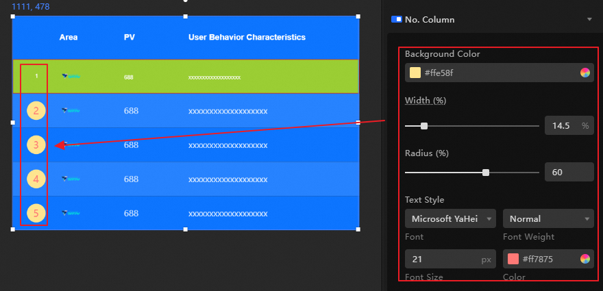
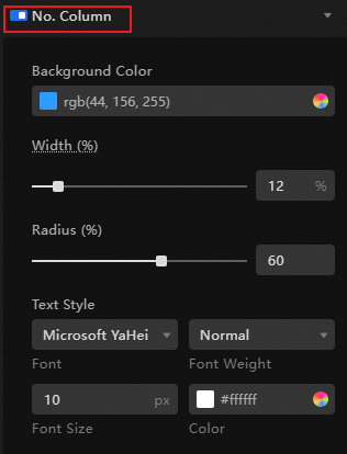
Ordinal Number Column Configuration |
If you enable this feature, an ordinal number column is generated on the far left of the list carousel. You can set the background color, column width, ordinal icon (circle) radius, and text style such as font, size, and color for the ordinal number column. |
|
|
Custom Column Configuration |
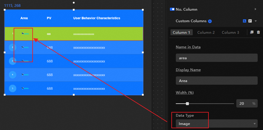
Defines the content and style of list carousel columns. This configuration item is an array where you can configure multiple labels (one label per column). The editor traverses the data and renders it in a loop based on the custom column configuration. The label order determines the column display order, which you can adjust as needed.
|
|
 or
or  icon to add or delete a label column. Click the
  or
or  icon to change the arrangement style of the custom column configuration area. Click the
  icon to copy the currently selected label column.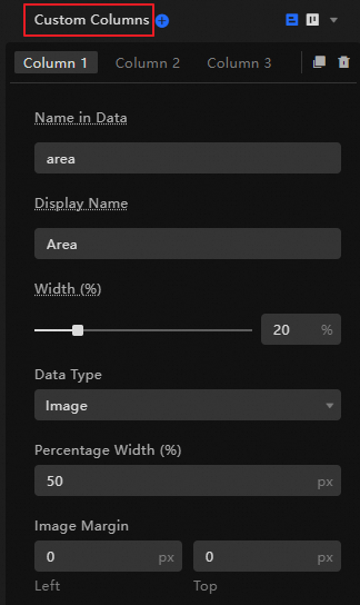
Advanced configuration
Define interactions and data transfer relationships between the list carousel and other widgets. The following table describes the configuration items.
|
Configuration Item |
Description |
Example |
|
Interaction Events |
Defines interaction behaviors with other widgets to enable widget linkage. Click the |
|
|
Associate Global Variables |
You can associate global parameters in the widget to pass parameters between widgets for interaction. Click the
For more information about the configuration, see Configure widget interactions. |
|
 icon to define interaction events and actions.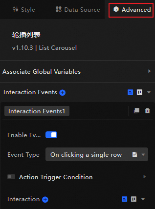
 icon to enable the corresponding instruction and associate it with the required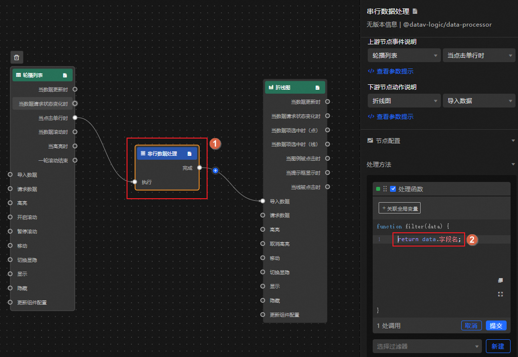
Blueprint interaction
Use the Blueprint editor to define interaction relationships and behavioral logic between widgets through visual connections.
Procedure
-
On the canvas editor page, click the
 icon in the upper-left corner of the top menu bar to open the Blueprint editor.
 -
In the layer node list, hover over the list carousel widget and click the
icon to add the widget to the main canvas. -
Connect the widgets to configure the Blueprint interaction effects as required.
The following figure shows an example.
 icon in the upper-left corner of the top menu bar to open the Blueprint editor.
 icon to add the widget to the main canvas.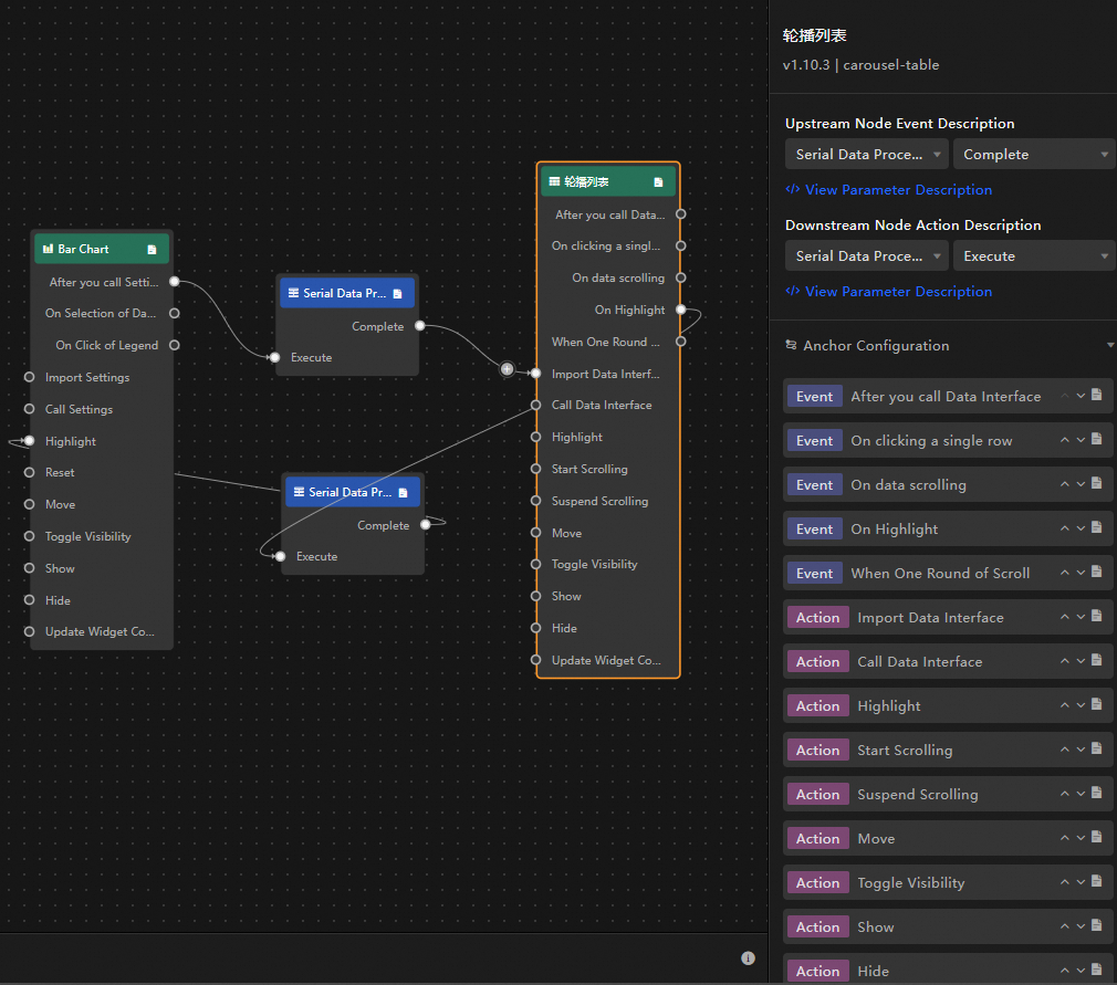
Configuration items
The following describes the interaction events and their corresponding actions.
You can also click the  icon next to an event or action on the right side of the Blueprint configuration interface to view detailed parameter descriptions.
|
Category |
Subcategory |
Description |
|
Event |
When data is updated |
This event is exposed when the widget data is updated. |
|
When the data request status changes |
This event is exposed when the data request status changes. The status values include Void, Loading, Success, and Error. |
|
|
When a single row is clicked |
When you click a row in the list carousel, the data of the current row is exposed. The content varies based on the data response result. The following code shows a data example. |
|
|
When data scrolls |
When the data rows of the list carousel scroll, this event is triggered and exposes the data and index value of the current page. The following code shows a data example. |
|
|
When highlighted |
When a data row in the list carousel is highlighted, this event is triggered and exposes the data and index value of the current page. The following code shows a data example. Important
Before you use this event, enable the option. |
|
|
When one scroll loop ends |
When the list carousel finishes one scroll loop, this event is triggered, exposes a description that the loop has ended, and stops the scrolling. The following code shows a data example. |
|
|
Action |
Import Data |
Processes data in the format required for widget rendering, imports the data into the widget, and re-renders the widget. You do not need to request data from the server again. The following code shows a data example. |
|
Request Data |
Re-requests data from the server. The data exposed by an upstream data processing node or layer node is used as a parameter. For example, if the API data source configured for the list carousel is |
|
|
Highlight |
Highlights the data row content of the list carousel. The following code shows a data example. |
|
|
Start Scrolling |
Starts the carousel scrolling. The data passed to the action is of the Object type. The following code shows a data example. |
|
|
Pause Scrolling |
Pauses the scrolling. No parameters are required. |
|
|
Move |
Moves the widget to a specified position. The following code shows a data example. |
|
|
Toggle Visibility |
Toggles the widget's visibility between show and hide. The following code shows a data example.
|
|
|
Show |
||
|
Hide |
||
|
Update Widget Configuration |
Dynamically updates the style configuration of the widget.
|
Demo
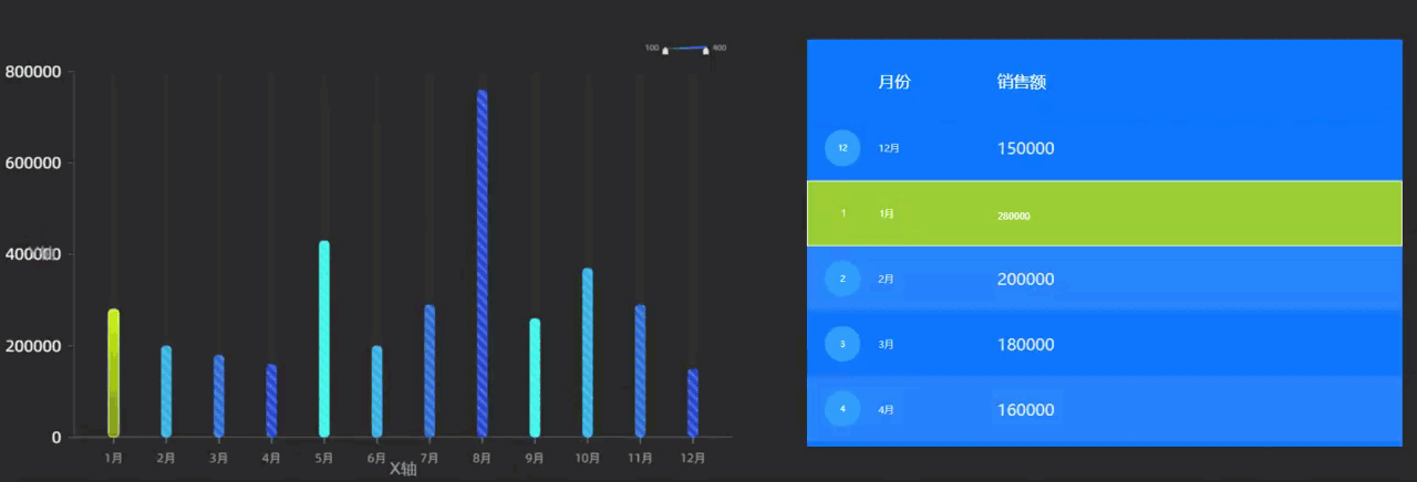
This demo shows how to combine a column chart with a list carousel to display annual sales by month in a carousel.
-
Add widgets to the canvas.
Access the DataV console.
-
Select a data dashboard and click Edit to open the canvas editor.
-
From the widget library in the navigation pane on the left, add the Column Chart and List Carousel widgets to the canvas as shown in the following figure.
-
Configure the column chart.
-
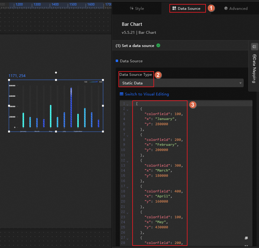
Connect to a data source.
Click the column chart widget, click the Data panel, and then modify the static data.
-
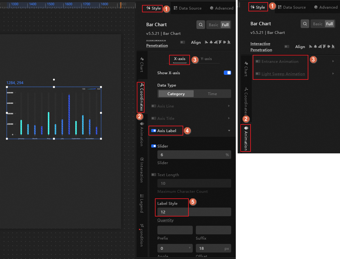
Configure the widget style.
Click the Style panel, set Label Display on the x-axis to 12, and then disable Animation Effect.
-
-
Configure the list carousel.
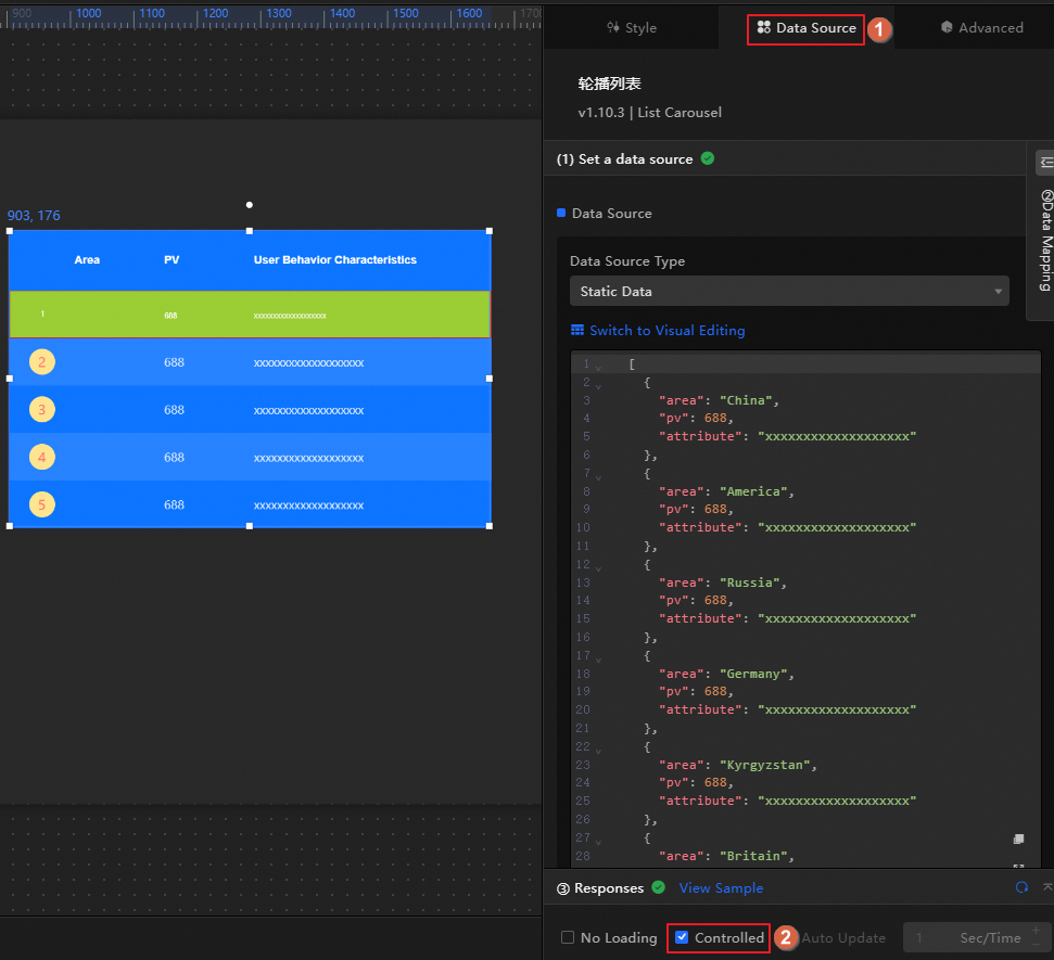
-
Click the Data tab and enable Controlled Mode. This prevents the widget from requesting its own static data during initialization. Data requests can be initiated only through the Blueprint editor, which retrieves the data output after an interaction with the column chart.
-
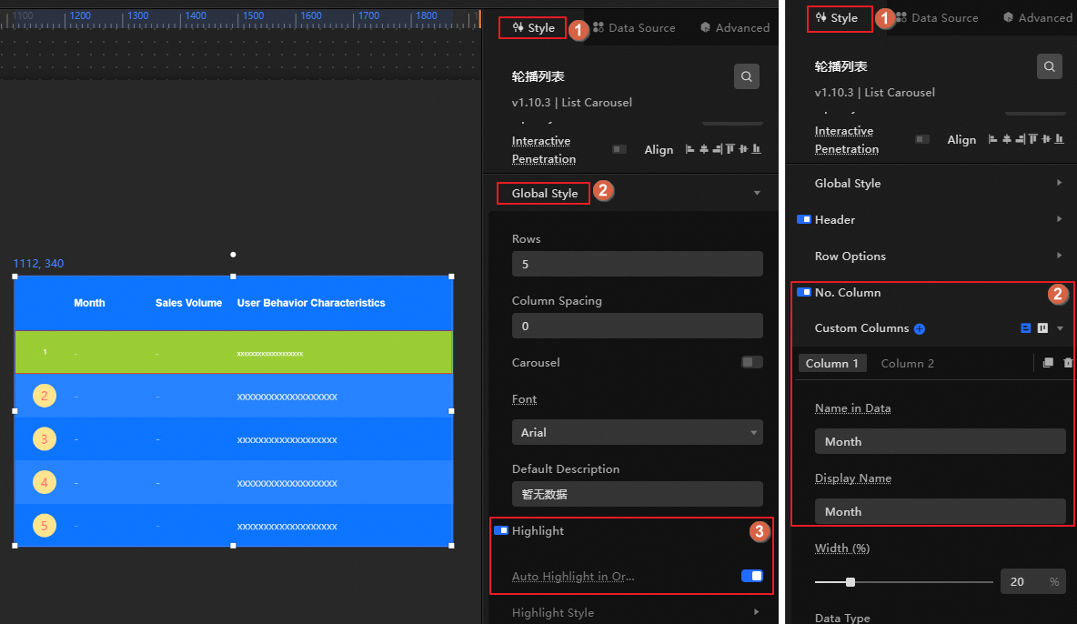
Click the list carousel widget, click the Style panel, enable the global highlight effect, keep two label columns in the custom columns, and then modify the Column Field Name and Column Display Name.
-
Column Field Name: Set to Month and Total in that order.
-
Column Display Name: Set to Month and Sales in that order.
-
-
Configure the Blueprint interaction.
Use the Blueprint editor to display annual sales by month in a carousel.
-
Click the
icon in the upper-left corner of the page to open the Blueprint editor. -
On the Layer Node tab on the left, hover over a widget and click the
icon to add the widget to the main canvas.Perform this step for both the column chart and list carousel widgets.
-
On the Logic Node tab on the left, hover over the Serial Data Processing node and click the
icon to add the node to the main canvas. Repeat this step to add two Serial Data Processing nodes. -
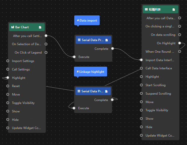
Connect the widgets and configure the Serial Data Processing nodes as shown in the following figure.
Configure the processing methods for the Serial Data Processing nodes.
-
Import data
return data.map(i => { return { Month: i.x, Total: i.y } }) -
Interactive highlighting
return {
  "data": {
    "x": data.data[0].Month,
    "y": data.data[0].Total
  },
  "style": {
    "fillStyle": "#f00"
  }
}
-
-
-
In the upper-right corner of the page, click Preview to view the result.
 icon in the upper-left corner of the page to open the Blueprint editor.
 icon to add the widget to the main canvas.
 icon to add the node to the main canvas. Repeat this step to add two Serial Data Processing nodes.