Configure the pivot table widget to perform cross-tabulation analysis across multiple dimensions and metrics.
Chart style
The pivot table is a data analytics widget built on the AntV S2 table engine. It performs cross-tabulation analysis on flat data across multiple dimensions and metrics, and displays results in an interactive table. Key features:
-
Multidimensional analysis: Configure data fields as row dimensions, column dimensions, and metrics for pivot analysis.
-
Rich style options: Fine-grained style control over cells, text, borders, and backgrounds.
-
Powerful interactivity: Cell highlighting, sorting, marquee selection, tooltips, data export, and row/column resizing by dragging.
-
Conditional formatting: Apply dynamic styles based on data values, such as background colors, text styles, or specific icons.
-
Data formatting: Built-in formatting for numbers, currency, percentages, and dates.
-
Hyperlinks: Configure dynamic hyperlinks for cells to open new pages.
-
Pagination: Frontend pagination to handle large volumes of data.
Style panel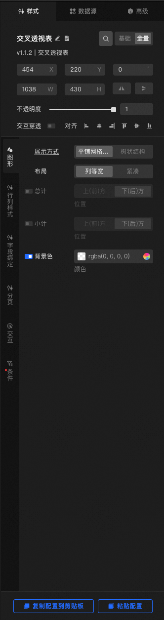
-
Search Configuration: Click the Style icon
 in the upper right corner of the panel to enter the name of the configuration item you wish to locate in the search field. The system supports fuzzy matching. For more information, see Search configuration item.
-
General
Parameter
Description
Size
The width and height of the widget in pixels (px).
Position
The X-coordinate and Y-coordinate of the widget in pixels (px). The X-coordinate is the distance from the top-left corner of the widget to the left edge of the page. The Y-coordinate is the distance from the top-left corner of the widget to the top edge of the page.
Rotation
Rotates the widget around its center point. The unit is degrees (°).
-
Manually enter an angle value to control the rotation angle of the widget.
-
Click the
 icon to flip the widget horizontally.
 -
Click the
 icon to flip the widget vertically.
Opacity
A value from 0 to 1. At 0, the chart is hidden. At 1, the chart is fully visible. The default value is 1.
Click-through
When you enable this feature, mouse clicks pass through this widget, preventing it from blocking interactions with underlying widgets on a crowded dashboard.
Alignment
The alignment of the widget in the editor.
-
-
Quick Styles: You can choose from a variety of predefined styles for different application scenarios.
-
Chart Colors: Sets the color scheme for the pivot table.
-
Chart Text: Sets the text style for the chart, including the font, font weight, and options to adjust text boldness and color brightness.
-
Chart: Sets the overall layout and structure of the table.
Parameter
Description
Display Mode
Sets the display mode for the table's row headers. Options include Tiled grid structure and Tree structure.
Note-
Tiled grid structure: Row headers are displayed in a tiled format, with each dimension occupying one column.
-
Tree structure: Row headers are displayed in a more compact tree structure, which is suitable for dimensions with strong hierarchical relationships.
Layout
Sets the layout of the table. Options include Equal column width and Compact.
Note-
Equal column width: All columns automatically adjust their width based on the content.
-
Compact: Uses a more compact layout.
Grand Total
Sets the grand totals for rows and columns. Click the
 icon to show or hide the grand totals. You can display them at the Top (Before) or Bottom (After).
Subtotal
Sets the subtotals for each dimension. Click the
icon to show or hide the subtotals. You can display them at the Top (Before) or Bottom (After).Background Color
Overall Background: Sets the background color for grand total and subtotal cells. Click the
icon to enable or disable this feature. -
-
Row and Column Styles: Sets the visual style for different types of cells in the table.
 icon to show or hide the grand totals. You can display them at the Top (Before) or Bottom (After).
|
Parameter |
Description |
|
Cell Size |
Sets the width and height of cells. Click the
Note
You can also drag the table lines to adjust the row height and column width. |
|
Data Cell |
Configures the alignment, text style, and line style for data in cells.
|
|
Row Header Cell |
Sets the style for row dimension headers.
|
|
Column Header Cell |
Sets the style for column dimension headers.
|
|
Corner Cell |
Sets the style of the corner header in the top-left.
|
|
Separator Line |
Sets the style of the separator line between the data area and the headers, including Line Width and Color. |
|
Drag Hotspot Line |
Sets the style of the guide line that appears when you drag to resize. The settings include Line Style, Thickness, Color, Length, and Spacing. Note
When the line style for the guide line is set to solid, the length and spacing settings are not available. |
 or
or  icon on the right to add or delete a width or height setting. Click the
  or
or  icon to configure the arrangement of multiple width or height settings. Click the
  icon to copy the current style configuration and create a new one with the same settings.
 icon to enable or disable this feature.
-
Field Binding: The core configuration for the widget. Assign fields from the data source to different areas of the table and configure their properties.
Parameter
Description
Metric Dimension
Maps data fields to the metric dimension, which serves as the measure for the table. Click the
or icon on the right to add or delete a metric dimension. Click the or icon to configure the arrangement of multiple metric dimensions. Click the icon to copy the current metric dimension style configuration and create a new one with the same settings.-
Field Name: Sets the corresponding field from the data source.
-
Display Name: Sets the name that is actually displayed in the table.
-
Format: Sets the data format.
-
Note
-
General: Default display.
-
Currency: Formats with a thousands separator. You can set the precision.
-
Percentage: Multiplies the value by 100 and displays it as a percentage. You can set the precision.
-
Date: Formats a valid date string as
YYYY/MM/DD.
-
-
-
Precision: Sets the decimal precision. This is configurable only when Format is set to Currency or Percentage.
-
Hyperlink: Click the
icon to enable this feature. After enabling, specify a field name. The widget reads the value of this field as the link URL. -
Specific Styles: Sets exclusive styles for the current metric column.
-
Fill Color: Enable color mapping to automatically apply a gradient color based on the numeric value.
-
Alignment: Overrides the global style to set a unique alignment for the current column, including left, center, and right.
-
Text: Sets the text style, including font, font weight, font size, and color.
-
Icon: Click the
icon to enable this feature. After enabling, you can display an icon (such as an up/down arrow) in the cell. You can configure the icon shape, color, and position (left/right). -
In-cell Column Chart: Click the
icon to enable this feature. If you enable this feature, a background bar is drawn inside the cell based on its value, creating an in-cell column chart effect. This is configurable only when Format is set to Currency or Percentage. -
Custom Marker Range: Click the
icon to enable this feature. After enabling, you can set a maximum and minimum value range for the in-cell column chart. This is configurable only when Format is set to Currency or Percentage.
-
Row Dimension
Sets the data fields for the table's row headers. Click the
or icon on the right to add or delete a row dimension. Click the or icon to configure the arrangement of multiple row dimensions. Click the icon to copy the current row dimension style configuration and create a new one with the same settings.-
Field Name: Sets the field for the table's row headers.
-
Display Name: Sets the display alias for the field name.
-
Hyperlink: Click the
icon to enable this feature and set the field name for the hyperlink.
Column Dimension
Sets the data fields for the table's column headers. Click the
or icon on the right to add or delete a column dimension. Click the or icon to configure the arrangement of multiple column dimensions. Click the icon to copy the current column dimension style configuration and create a new one with the same settings.-
Field Name: Sets the field for the table's column headers.
-
Display Name: Sets the display alias for the field name.
-
Hyperlink: Click the
icon to enable this feature and set the field name for the hyperlink.
-
-
Paging: Enable pagination for handling large data volumes.
Parameter
Description
Enable
Click the
icon to enable the paging feature.General
Sets the general style for the paging feature, including size, alignment, and whether to use basic mode.
-
Size: Sets the size of the pager. Options include Small and Default.
-
Alignment: Sets the position of the pager, including Align Left, Align Center, and Align Right.
-
Simple Paging: Click the
icon to enable the simple paging feature.
Items per page
Sets the number of data items to display on each page.
Hide on single page
Click the
icon to enable this feature. When there is only one page of data, the pager is automatically hidden.Style Configuration
Sets the symbol style, default/hover/current page number style, total style, and margin.
Symbol Style: Sets the symbol style, including Default Color, Hover Color, and Disabled Color.
Page Number Style: Sets the style for the Current Page, Default Page, and Hovered Page, including Text Color and Background Color.
Total Style: Sets the Text Color for the total.
Margin: Sets the margin values for the top, bottom, left, and right sides of the pager.
-
-
Interaction: Configures user interaction behaviors and related styles.
Parameter
Description
Tooltip
Sets the interaction information for the tooltip. Click the
icon to show or hide this feature.-
Trigger Method: Sets how the tooltip is triggered. Options include Hover and Click.
-
Content Display: Sets the content of the tooltip. Click the
or icon on the right to add or delete a content item. Click the or icon to configure the arrangement of multiple content items. Click the icon to copy the current content style configuration and create a new one with the same settings. -
Content Spacing: Sets the spacing for the tooltip content in pixels (px).
-
Content Text: Sets the text style for the content, including font style, color, font size, and font weight.
-
Pop-up Background: Sets the background for the tooltip pop-up.
-
Background Margin: Sets the horizontal and vertical margins in pixels (px).
-
Fill Color: Sets the background color.
-
Border Style: Sets the border style, including line style, border radius, line width, and color.
-
-
Marker: Sets the marker for the tooltip.
-
Shape: Sets the shape of the marker.
-
Size: Sets the size of the marker in pixels (px).
-
Custom Color: Sets the color of the marker. Click the
icon to show or hide the Custom Color setting.
-
Export Data
When you enable this feature, an export button appears in the upper-right corner of the table. Click it to download the current table data as a
.csvfile. Click the icon to enable this feature.-
Icon: Sets the chart color and font size.
Cell Interaction
Configures interaction settings for the table.
-
Mouse Operations: Sets the type of mouse operation.
-
Merge Cells: If you enable this feature, hold down
CtrlorCommandand select multiple cells to see a merge prompt. -
Cross-highlighting: When you hover over a cell, the corresponding row and column are highlighted.
-
Click to Highlight: When you click or marquee-select cells, the selected cells are highlighted.
-
Deselect Highlight: When the mouse moves out of the table area, the highlight is removed.
-
In-group Sorting: If you enable this feature, you can click a column header to sort within that group.
-
-
Hover Style: Sets the Cell Background and Column Header Background for when the mouse hovers.
-
Marquee Selection Style: Sets the cell background color for when you marquee-select cells.
-
-
Conditions: Configures conditional formatting to apply specific styles when data meets certain conditions.
Conditional Style: Click the
or icon on the right to add or delete a conditional style. Click the or icon to configure the arrangement of multiple conditional styles. Click the icon to copy the current conditional style configuration and create a new one with the same settings. For more information, see Condition Tree Instructions.Parameter
Description
Condition Name
Sets the name for the conditional style. Double-click to modify the name. Click the
icon to confirm whether to apply the current style when the condition is met.Target Column
Sets the column field name for the target column of the condition. Click the
icon to confirm whether to apply the current style when the condition is met.Text
Sets the font size, font weight, and color for the current conditional style. Click the
icon to confirm whether to apply the current style when the condition is met.Fill Color
Sets the background color for the current conditional style. Click the
icon to confirm whether to apply the current style when the condition is met.Icon
Sets the icon shape and color for the current conditional style. Click the
icon to confirm whether to apply the current style when the condition is met.
Data Source panel
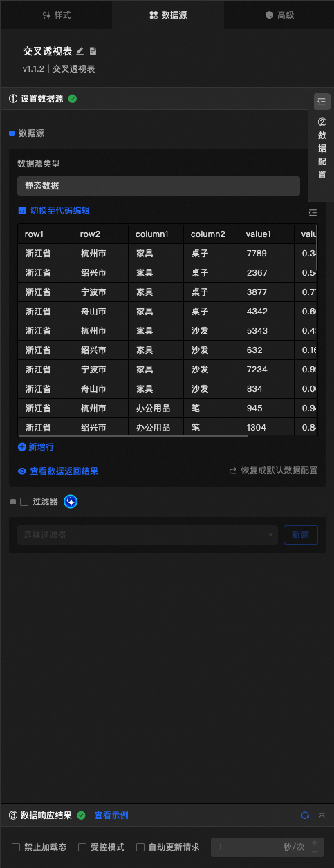
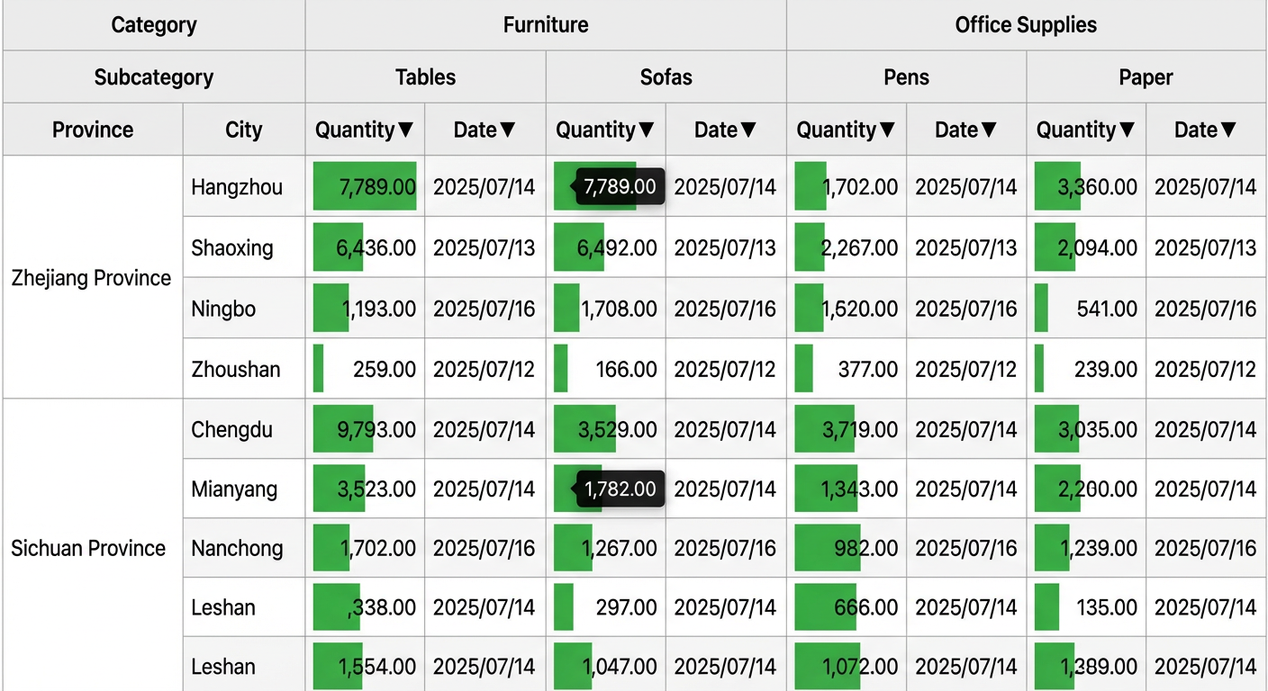
This widget uses a pivot table interface as its data source. The data must be an array of flat JSON objects.
|
Field |
Type |
Required |
Description |
|
|
|
Yes |
The first field for the row dimension. |
|
|
|
No |
The second field for the row dimension. |
|
|
|
Yes |
The first field for the column dimension. |
|
|
|
No |
The second field for the column dimension. |
|
|
|
Yes |
The field for the data metric. |
|
|
|
No |
Other custom fields, which can be used for hyperlinks, conditional formatting, and more. |
Note: The field names above (such as row1 and value1) are examples. You can use any field names and map them to rows, columns, or metrics in the widget configuration. The following is a data sample:
[
  {
    "row1": "Zhejiang Province",
    "row2": "Hangzhou City",
    "column1": "Furniture",
    "column2": "Tables",
    "value1": 7789,
    "value2": 0.34,
    "link1": "https://www.aliyun.com"
  },
  {
    "row1": "Zhejiang Province",
    "row2": "Shaoxing City",
    "column1": "Furniture",
    "column2": "Tables",
    "value1": 2367,
    "value2": 0.54
  },
  {
    "row1": "Sichuan Province",
    "row2": "Chengdu City",
    "column1": "Office Supplies",
    "column2": "Pens",
    "value1": 2335,
    "value2": 0.10
  }
]|
Data Item Configuration |
Description |
|
Data Source |
The component's data source displays the data fields contained within the component using code editing or visual editor. You can also modify the data type to flexibly configure the component's data. |
|
Data Mapping |
When you need to customize chart field configurations, you can set different field mappings in the Data Mapping module to map these fields to the corresponding fields of the component. This allows for real-time data matching without altering the data source fields. Additionally, click the |
|
Filter |
Open the Filter to select an existing data filter or create a new one, and configure the data filter script to achieve data filtering capabilities. For more information, see manage data filters. |
|
Data Response Result |
This feature displays the component's data in real-time. When the component's data source changes, the data response result will display the latest data accordingly. In case of a delayed system response, you can click the |
|
Disable Loading State |
Check the check box to hide the loading content during component updates and data dashboard previews. Unchecking will display the loading content. The default setting is unchecked. |
|
Controlled Mode |
Check the check box to prevent data requests upon the component's initialization. Data requests will only be initiated through global variables or methods configured in the blueprint editor. Unchecking allows for automatic update requests. The default setting is unchecked. |
|
Automatic Update Request |
Check the check box to manually set the polling frequency for dynamic polling. Clearing this option disables automatic updates, requiring manual page refreshes or data request triggers through the blueprint editor and global variable events for updates. |
 icon to configure field styles individually.
 icon on the right to check the current data response result, or click the
  icon on the right to obtain the most recent data for the component. You can also click to view examples to see sample response results for the current component.
Advanced panel
|
Interaction Events |
Description |
|
On data update |
Triggers an event and outputs data when the data response changes. |
|
On data request status change |
Triggers an event when the data request status changes. The callback parameter is the current status. |
|
On data cell selection |
Triggered when a user clicks or marquee-selects one or more data cells. It returns an object or an array of objects. Each object contains the entire row of raw data corresponding to the selected cell. If only one cell is selected, a single object is returned. If multiple cells are selected, an array of objects is returned. |
|
On page change |
When the paging feature is enabled, this event is triggered when a user clicks a page number to navigate. It returns an object containing the current page number and the number of items per page. |
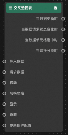
Blueprint interaction
-
Click the
icon in the upper-left corner of the page to open the Blueprint page. -
On the Layer Nodes tab, you can add the current widget to the main canvas.
-
View the Blueprint configuration parameters.
-
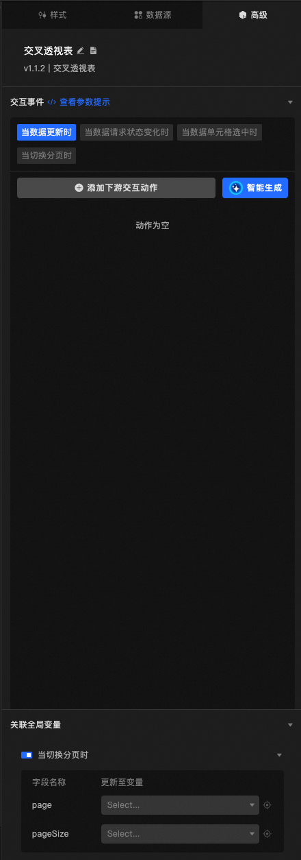
Events
Event
Description
On data update
Triggers an event and outputs data when the data response changes.
On data request status change
Triggers an event when the data request status changes. The callback parameter is the current status.
On data cell selection
Triggered when a user clicks or marquee-selects one or more data cells. It returns an object or an array of objects. Each object contains the entire row of raw data corresponding to the selected cell. If only one cell is selected, a single object is returned. If multiple cells are selected, an array of objects is returned. See the data sample.
[
  {
  "value1": 632,
  "row1": "Zhejiang Province",
  "row2": "Shaoxing City",
  "column1": "Furniture",
  "column2": "Sofa"
  }
]
On page change
When the paging feature is enabled, this event is triggered when a user clicks a page number to navigate. It returns an object containing the current page number and the number of items per page. See the data sample.
{ "page": 2, // Current page number "pageSize": 50 // Items per page } -
Actions
Action
Description
Request Data
Requests data from the server again. Data from upstream data processing nodes or layer nodes is used as parameters. For example, if the API data source is
https://api.testand the data passed to the Request Pivot Table Interface action is{ id: '1'}, the final request URL ishttps://api.test?id=1.Import Data
This event is triggered when a pivot table interface request fails (due to network issues, API errors, or similar causes). The event data is the response after it has been processed by a filter. For an example, see the Data response area on the Data Source tab in the widget's configuration panel.
Move
Moves the widget to a specified position. See the data sample.
{
      // Movement method. Absolute positioning: to, Relative positioning: by. Default: to.
        "positionType": "to",
      // Specified position. x-coordinate, y-coordinate.
      "attr": {
        "x": 0,
        "y": 0
      },
      // Animation method.
      "animation": {
        "enable": false,
        // Animation delay in ms.
        "animationDuration": 1000,
        // Animation curve. Options: linear|easeInOutQuad|easeInOutExpo.
        "animationEasing": "linear"
      }
}
Toggle Visibility
Toggles the visibility of the widget. No parameters required.
Show
Shows the widget. See the data sample.
{
  "animationType": "",//Animation method. Optional value: fade. No animation if left blank.
  "animationDuration": 1000,//Animation delay in ms.
  "animationEasing": ""//Animation curve
}
Hide
Hides the widget. See the data sample.
{
  "animationType": "",//Animation method. Optional value: fade. No animation if left blank.
  "animationDuration": 1000,//Animation delay in ms.
  "animationEasing": ""//Animation curve
}
Update Widget Configuration
Dynamically updates the widget style configuration. In the widget's Style panel, click Copy Configuration to Clipboard to get the configuration data. Then, in the Blueprint editor, modify the field values for the desired styles within a data processing node.
-
 icon in the upper-left corner of the page to open the Blueprint page.