Move The Icon layer
Configure the style, data sources, and blueprint interactions of the moving icon layer on a 3D globe.
Chart style
The moving icon layer is a subcomponent of the 3D globe and supports independent style configuration, including the appearance, height, and size of the moving icon. 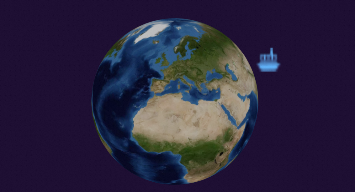
Style Panel 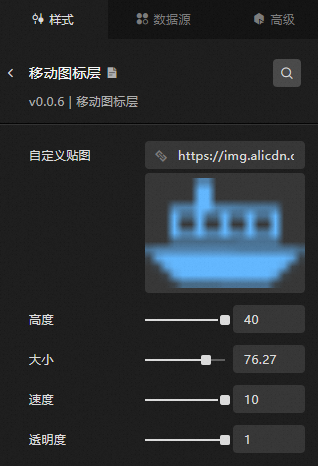
-
Search Configuration: Click the Search configuration items icon
 in the upper-right corner of the Style panel. In the Search Configuration panel, enter the name of the configuration items that you want to search for and locate the configuration items. Fuzzy match is supported. For more information, see Search configuration items.
 -
Custom Map: The custom texture image for the moving icon layer.
-
Hover over the image and click Delete to remove it. Then, click the image area or drag a local image to the area to add a new texture.
-
Hover over the image and click Change to replace it with a new local image.
-
You can also enter an image URL to use a remote image as a custom texture.
-
-
Height: The height of the moving icon above the ground plane.
-
Size: The display size of the icon.
-
Speed: The movement speed of the icon.
-
Transparency: The opacity level of the moving icon.
Data Sources panel 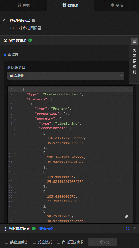
Configure the position of the moving icon in the coordinates field.
|
Configure data items |
Description |
|
Data sources |
Use the code editor or visual editor to view the data fields of the widget. You can also modify the data type to configure the component data. |
|
Data Mapping |
To customize chart field configurations, set field mappings in the Data Mapping module to map fields to the corresponding widget fields. This allows you to match data without modifying the data source fields. You can also click the |
|
Configure a filter |
Turn on Filter, select an existing data filter or create a data filter, and configure a data filter script to filter data. For more information, see Manage data filters. |
|
Data Response Result |
Displays the widget data in real time. When the data source changes, this section shows the latest data. If the response is delayed, click the |
|
Forbid Loading |
Select this check box to hide loaded content during component initialization when you update the component and preview the dashboard. This check box is cleared by default. |
|
Controlled Mode |
Select this check box to prevent the component from requesting data during initialization. In this mode, data is requested only through global variables or methods configured in Blueprint Editor. This check box is cleared by default. |
|
Auto Data Request |
Select this check box and specify a polling interval to enable dynamic data polling. If this check box is cleared, the page does not automatically update. You must manually refresh the page or use Blueprint Editor and global variable events to trigger a data update. |
 icon to configure the field style.
  icon to view the data response result, or click the
  icon to refresh the data. You can also click View Example to view a sample response.
 Advanced Panel
This widget does not support interaction events.
Blueprint Interaction
-
Click the
 icon in the upper-left corner to go to the Blueprint page.
 -
On the Layer Nodes tab, add the widget to the main canvas.
-
View blueprint configuration parameters.
-
Event
Event
Description
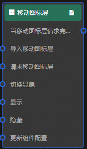
When the move icon layer request completes
Triggered with the processed JSON data after a data interface request is returned and processed by a filter. For specific data examples, see the Data Response Result section of the Data Source tab in the right-side configuration panel of the canvas editor.
-
Action
Action
Description
Request to move an icon layer
Re-requests server data. Data from an upstream data processing node or layer node is used as parameters. For example, if the API data source for the moving icon layer is
https://api.testand the data passed to request to move the icon layer is{ id: '1'}, the final request URL ishttps://api.test?id=1.Import a mobile icon layer
Imports pre-processed data in the widget drawing format and redraws the widget without re-requesting server data. For specific data examples, see the Data Response Result section of the Data Source tab in the right-side configuration panel of the canvas editor.
Switch Display /Hide
Toggles the visibility of the widget. No parameters are required.
Display
Shows the widget. For more information, see the following data example.
{
  "animationType": "",// The animation method. Valid value: fade. If you do not specify this parameter, no animation is generated.
  "animationDuration": 1000,// The animation delay. Unit: ms.
  "animationEasing": ""// animation curve
}
Hide
Hides the widget. For more information, see the following data example.
{
  "animationType": "",// The animation method. Valid value: fade. If you do not specify this parameter, no animation is generated.
  "animationDuration": 1000,// The animation delay. Unit: ms.
  "animationEasing": ""// animation curve
}
Update component configurations
Dynamically updates the style configuration of the widget. In the Style panel, click Copy Configuration to Clipboard to obtain the configuration data. Then, modify the style field for the data processing node in Blueprint Editor.
-
 icon in the upper-left corner to go to the Blueprint page.