Learn about each configuration item available when all options are selected in the navigation menu bar.
The navigation menu bar is not supported on mobile devices. For updates, see the DataV official website.
Chart style
The navigation menu bar is an advanced control widget that lets you customize the menu layout, submenu styles, option icons, background colors, and text styles, and submit user input to the backend for processing. 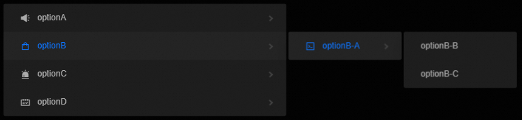
Style Panel 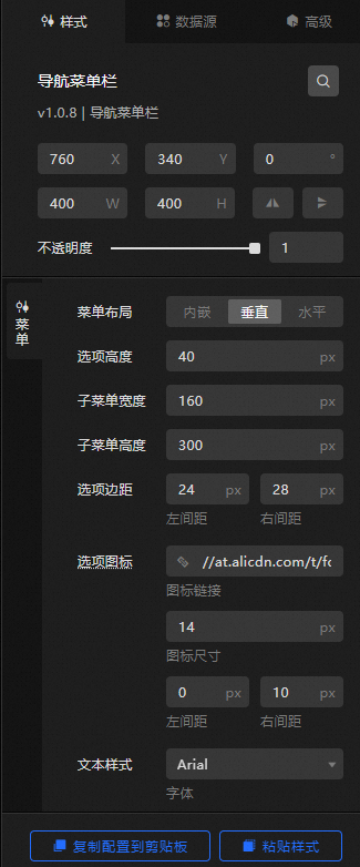
-
Search Configuration: Click the
 icon in the upper-right corner of the Style panel to search for a configuration item by name. Fuzzy match is supported. For more information, see Search configuration items.
 -
Size: the width and height of the widget. Unit: pixels.
-
Positioning: the x-axis and y-axis position of the widget. Unit: pixels. X-coordinate is the pixel distance from the upper-left corner of the widget to the left border of the canvas. Y-coordinate is the pixel distance from the upper-left corner of the widget to the upper border of the canvas.
-
Rotate: Rotates the widget around its center. Unit: degrees.
-
Enter a value in the Rotation Angle spin box, or click the plus sign (+) or minus sign (-) to adjust the value.
-
Click the
 icon to flip the widget style.
 -
Click the
 icon to flip the widget style.
-
-
Opacity: Valid values: 0 to 1. A value of 0 hides the widget. A value of 1 fully displays the widget. Default value: 1.
-
-
Menu
Menu Layout: the menu layout style of the navigation bar. You can select Inline, Vertical, or Horizontal.
Metric
description
Default Display
The number of navigation menu bar options displayed by default. Uses the value of the id field in the data. Available only when Menu Layout is set to Embedded.
Option Height
The height of each option in the navigation bar. Unit: pixels. Available only when Menu Layout is set to Embedded or Vertical.
Submenu Width
The width of the navigation bar submenu. Unit: pixels. Available only when Menu Layout is set to Vertical or Horizontal.
Submenu Height
The height of the navigation bar submenu. Unit: pixels. Available only when Menu Layout is set to Vertical or Horizontal.
Option Right Spacing
The right-side spacing of the option. Unit: px. Available only when Menu Layout is set to Embedded.
Option Margins
The left and right margins of the option. Unit: px. Available only when Menu Layout is set to Vertical or Horizontal.
Options icon
Custom icons for navigation bar options, including the icon URL, icon size, and left and right spacing. Unit: px.
Text Style
The font style, weight, size, and color of option text. Color settings include the default color, hover color, and selected color.
Background Color
The background color of options, including the default, hover, and selected background colors.
Right Arrow
The right margin, size, and color of the right arrow. Available only when Menu Layout is set to Embedded or Vertical.
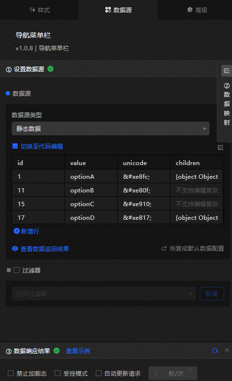
Data Sources panel 
|
Column |
Description |
|
|
The unique identifier of a navigation bar option. |
|
|
The display value of the navigation bar option. |
|
|
The icon for a navigation bar option. |
|
|
Nested data for submenu items. |
|
Configure data items |
Description |
|
Data sources |
Use the code editor or visual editor to view and manage the data fields of the widget. You can also change the data type to configure component data. |
|
Data Mapping |
Map custom fields to the corresponding widget fields in the Data Mapping module, allowing you to match data without modifying fields in the data source. You can also click the |
|
Configure a filter |
Turn on Filter, select or create a data filter, and configure a filter script to process data. For more information, see Manage data filters. |
|
Data Response Result |
Displays widget data in real time. When the data source changes, the latest data is shown. Click the |
|
Forbid Loading |
When selected, the loading animation is hidden during component initialization when you update the component and preview the dashboard. By default, this option is deselected. |
|
Controlled Mode |
When selected, the component does not request data during initialization and only requests data through global variables or methods configured in Blueprint Editor. When deselected, automatic data requests are enabled. By default, this option is deselected. |
|
Auto Data Request |
When selected, you can set a polling interval for dynamic data updates. When deselected, the page does not update automatically. You must manually refresh the page or use Blueprint Editor and global variable events to trigger data updates. |
 icon to configure the field style.
  icon to view the data response result, or click the
  icon to refresh the data. You can also click View Example to view a sample response.
 Advanced Panel
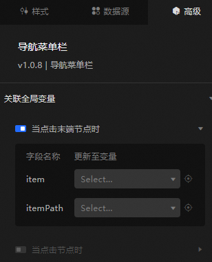
Turn on the switch to enable the global variable feature. When you click a node or terminal node, a data request is triggered and a temporary variable is generated for use in other components. By default, the item and itemPath values configured in the Data Source panel are displayed. For more information, see Component interaction configuration.
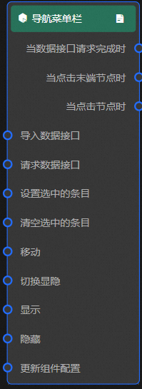
Blueprint Interaction
-
Click the
icon in the upper-left corner to go to the Blueprint page. -
On the Layer Nodes tab, add the widget to the main canvas.
-
View blueprint configuration parameters.
-
Event
Event
Description
When the data interface request is completed
Triggered after a data interface request is completed and the response is processed by a filter. Returns the processed JSON data. For specific data examples, see the Data Response Result section of the Data Source tab in the canvas editor configuration panel.
When the terminal node is clicked
Triggered when a terminal node is clicked. Returns the data item corresponding to the clicked value. For more information, see the data example.
{
  "item": {
    "id": "4",
    "value": "optionA-I"
  },
  "itemPath": [
    "4",
    "3",
    "2",
    "1"
  ],
  "key": {
    "id": "4",
    "value": "optionA-I"
  },
  "keyPath": [
    "4",
    "3",
    "2",
    "1"
  ]
}
When a node is clicked
Triggered when a node is clicked. Returns the data item corresponding to the clicked value. For more information, see the data example.
{ "item": { "id": "12", "value": "optionB-A", "unicode": "" }, "itemPath": [ "11" ] } -
Action
Action
Description
Import data
Imports pre-processed data to redraw the widget without re-requesting server data. For more information, see the data example.
[
  {
    "id": "15",
    "value": "optionC",
    "unicode": "",
    "children": [
      {
        "id": "16",
        "value": "optionC-A"
      }
    ]
  }
]
Request Data Interface
Re-requests server data, using data from an upstream data processing node or layer node as parameters. For example, if the API data source is
https://api.testand the data passed to the request data interface is{ id: '1'}, the final request URL ishttps://api.test?id=1.Set Selected Entries
Specifies the entries to select in the navigation menu bar. For more information, see the data example.
{
  "value": "optionA-C"
}
Clear selected entries
Clears the selected entry in the navigation menu bar. No parameters are required.
Move
Moves a widget to a specified location. For more information, see the data example.
    {
      // The positioning type. to indicates absolute positioning, whereas by indicates relative positioning. The default value is to.
        "positionType": "to",
      // The location, which is indicated by the x and y coordinates.
      "attr": {
        "x": 0,
        "y": 0
      },
      // The animation type.
      "animation": {
        "enable": false,
        // The duration in which animation is displayed.
        "animationDuration": 1000,
        // The animation curve, which can be set to linear|easeInOutQuad|easeInOutExpo.
        "animationEasing": "linear"
      }
    }
Switch Display /Display
Toggles the widget between visible and hidden states. No parameters are required.
Display
Displays the widget. For more information, see the data example.
{
  "animationType": "",// The animation method. Valid value: fade. If you do not specify this parameter, no animation is generated.
  "animationDuration": 1000,// The animation delay. Unit: ms.
  "animationEasing": ""// animation curve
}
Hide
Hides the widget. For more information, see the data example.
{
  "animationType": "",// The animation method. Valid value: fade. If you do not specify this parameter, no animation is generated.
  "animationDuration": 1000,// The animation delay. Unit: ms.
  "animationEasing": ""// animation curve
}
Update component configurations
Dynamically updates widget style configurations. In the Style panel, click Copy Configuration to Clipboard to obtain the widget configuration data, then modify the style field for the data processing node in Blueprint Editor.
-
 icon in the upper-left corner to go to the Blueprint page.