Use the line and column chart widget to display two data dimensions in a single composite chart.
Overview
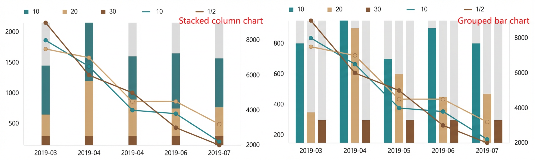
A line and column chart combines a line chart and a column chart to represent two dimensions of the same category in a single chart, allowing you to visually compare trends and specific values across datasets.
Scenarios
Commonly used to analyze quantities alongside trends. The columns show specific values at each time point, while the lines reveal how those values change over time.
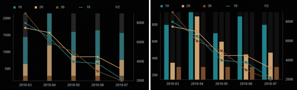
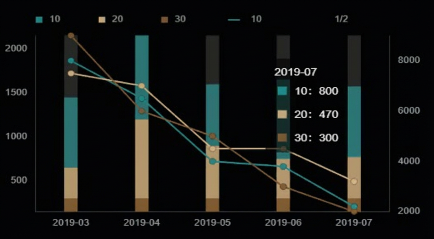
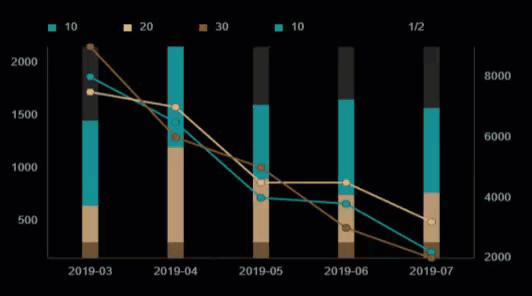
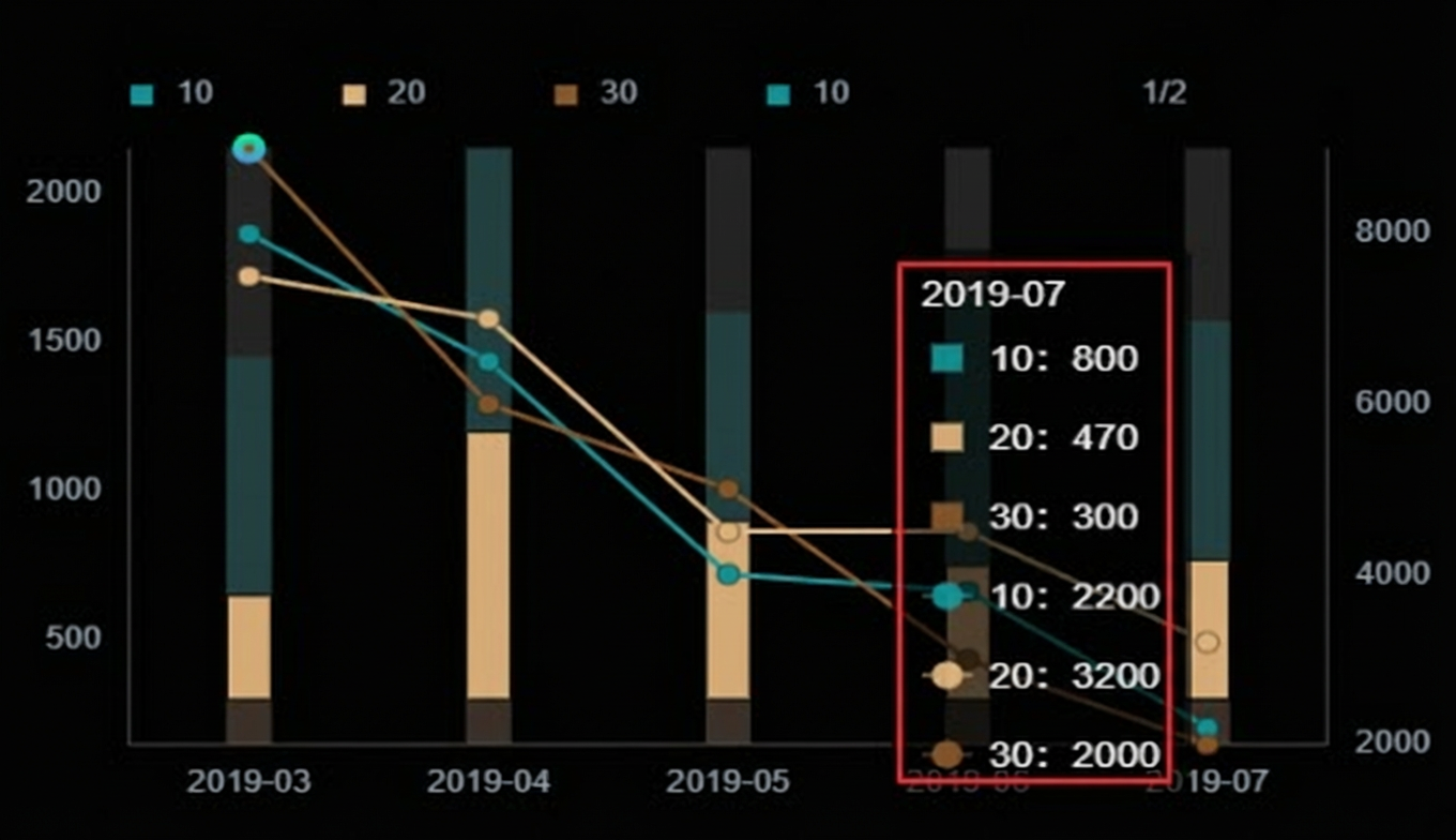
Preview
Prerequisites
-
Create a data dashboard. You can use a template, use a blank canvas, or use AI to generate one.
-
Your business data is prepared. For more information, see Data Source.
Add a line and column chart
-
Access the DataV console.
-
On the Workbench page, in the Data Dashboards area, hover over the target dashboard and click Edit. The canvas editor opens.
-
In the navigation pane on the left, under , click the Line and Column Chart widget to add it to the canvas.
You can also use the global search feature to add the widget.
Connect to business data
After you add the widget, connect it to your business data. Click the line and column chart, then on the Data Source tab on the right, select the data to display.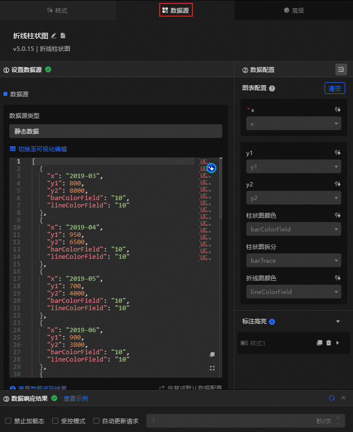
-
The following table describes the data fields accepted by this widget.
Field
Description
xThe category of the widget, such as time. This is the value of the x-axis.
y1The value for the column chart. This represents a specific numeric value for a dimension, such as sales quantity or number of visits.
y2The value for the line chart. This represents a numeric value for another dimension, such as growth rate, average value, or ratio.
barColorFieldThe color of the column chart. The same value indicates the same group of columns.
ineColorFieldThe color of the line chart. The same value indicates the same line.
[
  {
    "x": "2019-03",
    "y1": 800,
    "y2": 8000,
    "barColorField": "10",
    "lineColorField": "10"
  },
  {
    "x": "2019-04",
    "y1": 950,
    "y2": 6500,
    "barColorField": "10",
    "lineColorField": "10"
  },
  {
    "x": "2019-05",
    "y1": 700,
    "y2": 4000,
    "barColorField": "10",
    "lineColorField": "10"
  },
  {
    "x": "2019-06",
    "y1": 900,
    "y2": 3800,
    "barColorField": "10",
    "lineColorField": "10"
  },
  {
    "x": "2019-07",
    "y1": 800,
    "y2": 2200,
    "barColorField": "10",
    "lineColorField": "10"
  },
  {
    "x": "2019-03",
    "y1": 350,
    "y2": 7500,
    "barColorField": "20",
    "lineColorField": "20"
  },
  {
    "x": "2019-04",
    "y1": 900,
    "y2": 7000,
    "barColorField": "20",
    "lineColorField": "20"
  },
  {
    "x": "2019-05",
    "y1": 600,
    "y2": 4500,
    "barColorField": "20",
    "lineColorField": "20"
  },
  {
    "x": "2019-06",
    "y1": 450,
    "y2": 4500,
    "barColorField": "20",
    "lineColorField": "20"
  },
  {
    "x": "2019-07",
    "y1": 470,
    "y2": 3200,
    "barColorField": "20",
    "lineColorField": "20"
  },
  {
    "x": "2019-03",
    "y1": 300,
    "y2": 9000,
    "barColorField": "30",
    "lineColorField": "30"
  },
  {
    "x": "2019-04",
    "y1": 300,
    "y2": 6000,
    "barColorField": "30",
    "lineColorField": "30"
  },
  {
    "x": "2019-05",
    "y1": 300,
    "y2": 5000,
    "barColorField": "30",
    "lineColorField": "30"
  },
  {
    "x": "2019-06",
    "y1": 300,
    "y2": 3000,
    "barColorField": "30",
    "lineColorField": "30"
  },
  {
    "x": "2019-07",
    "y1": 300,
    "y2": 2000,
    "barColorField": "30",
    "lineColorField": "30"
  }
]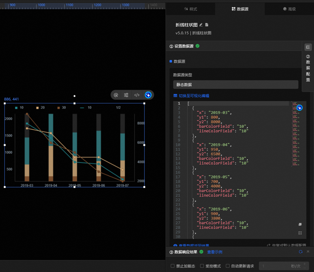
-
This section describes the core configuration items for the data source.
Configuration
Description
Select Data Source
Supports various data types, such as CSV files, APIs, and different databases. For more information, see Supported data source types. Edit data fields in a visual table or in code.
Configure Filter (Optional)
Customize filter code to transform, filter, display, and perform simple calculations on data. For more information, see Manage data filters.
Configure Data Mapping
Map fields from the selected data source to the widget's fields. This enables real-time data matching. Click the
 icon to configure field styles.
View Response Result
Displays the data connected to the widget in real time. When the widget's data source changes, this section shows the latest data.
-
Click the data response result to view the data field code.
-
Click View Example to see the array type and sample code that the data source accepts. You can write your fields based on the example.
Other data request configurations:
-
Disable Loading State: If you check this box, the widget's initial loading content does not appear when the widget updates or when you preview the data dashboard.
-
Controlled Mode: If you check this box, the widget does not request data when it initializes. Data requests can only be started by the blueprint editor or by global variable events.
-
Auto Update Request: If you check this box, the platform polls for data updates at the interval you set. If you do not check this box, you must refresh the page manually or use the blueprint editor or global variable events to trigger data updates.
-
Configure the line and column chart
Configure styles
Styles are divided into basic and full configurations, switchable at the top of the Style tab. Basic configurations cover only color and text settings; full configurations provide comprehensive options. The following describes full configuration items.
-
You can also click the
 icon and search for configuration items by keyword. Fuzzy matching is supported. For more information, see Search for configuration items.
 -
Click the line and column chart widget on the canvas and select the
 icon above the widget to use AI to generate style configurations.
 icon above the widget to use AI to generate style configurations.
The following describes the related configuration items.
|
Configuration item |
Description |
Illustration |
|
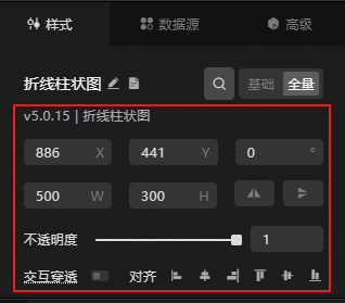
Global Configuration |
Defines the widget's position, transparency, and interaction passthrough in the data dashboard.
|
|
|
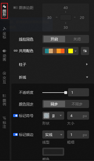
Chart Configuration |
Defines the chart margins, and the color and display style of the column chart and line chart.
|
|
|
Coordinate Configuration |
Defines the data type of the x-axis, y1-axis, and y2-axis, and the display style of the axes, axis titles, axis labels, tick marks, and gridlines. Note
|
|
|
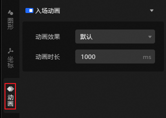
Animation Configuration |
Enable Entrance Animation to define the animation effect and duration (in |
|
|
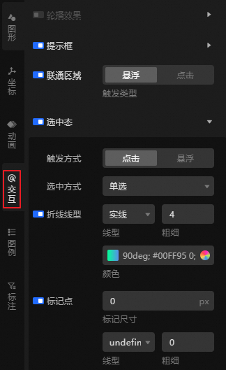
Interaction Configuration |
Defines the interactive display effect of the widget data, such as carousel display of column chart data.
|
|
|
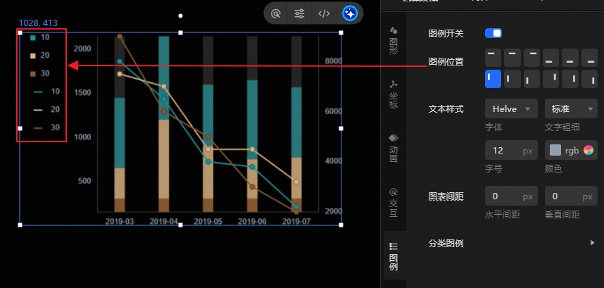
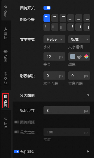
Legend Configuration |
Defines the legend style and the spacing between charts. Enable the Legend Switch to configure the position, spacing, width, and whether to allow page turning for the legend.
|
|
|
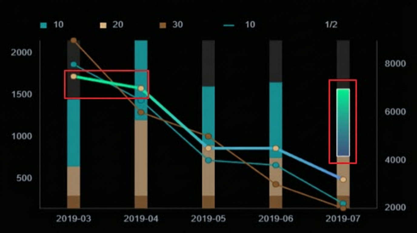
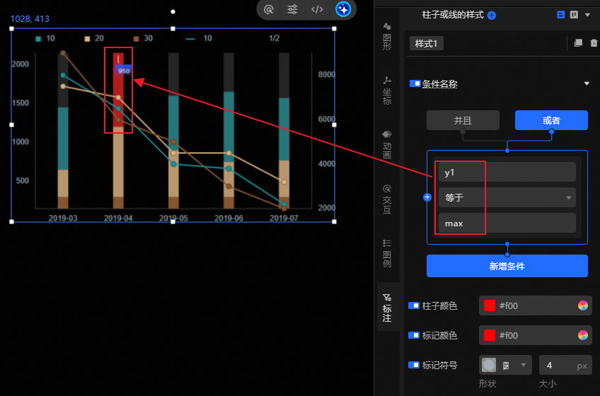
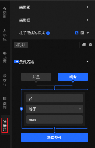
Annotation Configuration |
Filter columns or lines by condition and annotate them with custom styles. Supports auxiliary lines and auxiliary boxes. The example annotates the maximum value of
|
|

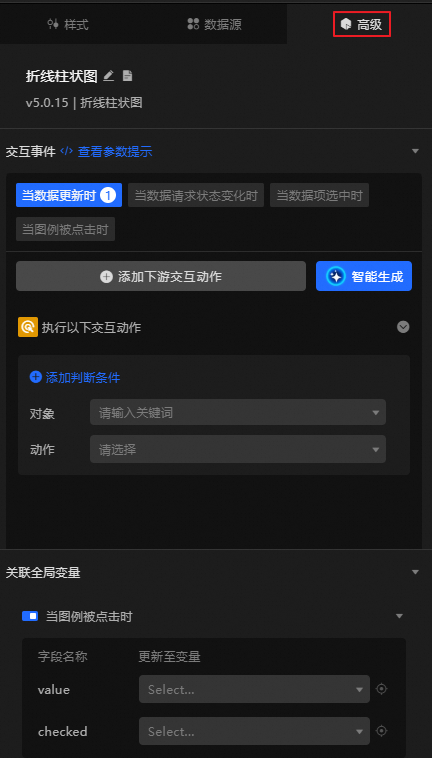
Advanced Configuration
Define interactions and data transfer relationships between the line and column chart and other widgets. The following table describes the configuration items.
|
Configuration item |
Description |
Illustration |
|
Interaction Occurrence |
Defines interactive behaviors with other widgets, global variables, and utility nodes to achieve widget interaction. For example, when data is updated, the line and column chart is highlighted. Click Add Downstream Interaction Action to define the interactive behavior as needed. Note
You can also click Smart Generate to use AI assistance to generate interaction occurrences through conversation. |
|
|
Associate Global Variables |
You can associate global parameters in the widget to pass parameters between widgets for interaction. Click the |
 icon to enable the corresponding instruction and associate the required
 Blueprint interaction
Use the Blueprint editor to define interaction logic between widgets through visual connections.
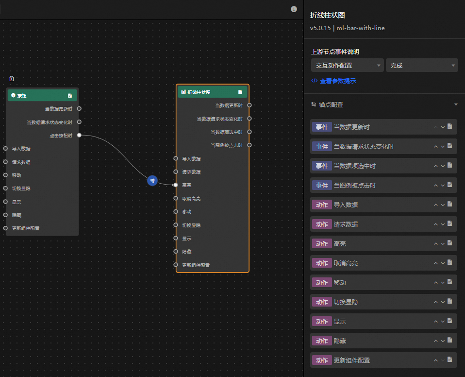
Procedure
-
On the canvas editor page, click the
icon on the left side of the top menu bar to open the Blueprint editor. -
In the layer node list, move the mouse pointer over the line and column chart widget and click the
icon to add the widget to the main canvas. -
Connect the relevant widgets as needed to configure the blueprint interaction.
The following figure shows an example.
 icon on the left side of the top menu bar to open the Blueprint editor.
 icon to add the widget to the main canvas.