Configuration items of the progress donut chart widget in full-selection mode.
Chart style
A progress donut chart is a type of pie chart that displays the proportion of a single data category to the total. Multi-data series configuration is not supported. 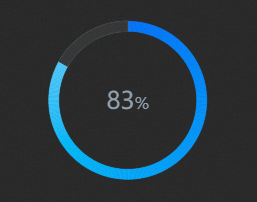
Style Panel 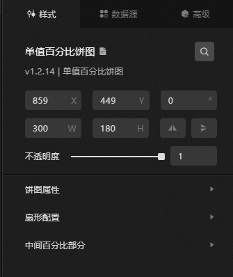
-
Search Configuration: Click the Search configuration items icon
 in the upper-right corner of the Style panel. In the Search Configuration panel, enter the name of the configuration items that you want to search for and locate the configuration items. Fuzzy match is supported. For more information, see Search configuration items.
 -
Size: the width and height of the widget. Unit: pixels.
-
Positioning: the x-axis and y-axis of the component. Unit: pixels. X-coordinate indicates the pixel distance between the upper-left corner of the widget and the left border of the canvas. Y-coordinate indicates the pixel distance between the upper-left corner of the widget and the upper border of the canvas.
-
Rotate: Rotate the widget by degrees.
-
Directly enter the degrees in the Rotation Angle spin box or click the plus sign (+) or minus sign (-) to increase or decrease the value in the Rotation Angle spin box.
-
Click the
 icon to flip the widget style.
 -
Click the
 icon to flip the widget style.
-
-
Opacity: Valid values: 0 to 1. If this parameter is set to 0, the widget is hidden. If this parameter is set to 1, the widget is completely displayed. Default value: 1.
-
-
Pie Chart Attributes: the basic attributes of a pie chart.
Parameter
Description
Inner radius
The inner radius of the pie chart. The value is a percentage of the widget height. Valid values: 0 to 1.
Outer radius
The outer radius of the pie chart. The value is a percentage of the widget height. Valid values: 0 to 1.
Pie Chart Fill Color
The background color of the pie chart. It is displayed as the sector that is not covered. For more information, see color picker.
-
Sector configuration
Parameter
Description
Start Color Value
The color at the starting point of the sector in the pie chart.
End color value
The color at the endpoint of the sector. The sector color is a gradient from the start color to the end color.
Animation Duration
The duration for the sector to animate from the starting point to the endpoint.
-
Middle Percentage Portion: the style of the middle percentage portion of the pie chart.
Parameter
Description
Text Style
The text style of the middle percentage part, including the text font, color, and weight.
Frame Proportion
The width of the middle percentage area, expressed as a percentage of the outer radius. Valid values: 0 to 1. A smaller value may cause numbers and symbols to wrap into two lines or overlap.
Digital Font Size
The size of the numeric text.
Number of decimal places
The number of decimal places of the number.
Percentage Sign
The unit symbol for the percentage value.
Percentage Font Size
The font size of the percentage sign.
Percentage Position
The position of the unit symbol for the percentage value. Valid values: Prepended and Postpended.
Percentage Offset Value
The offset distance between the percentage sign and the number.
Data Sources panel 
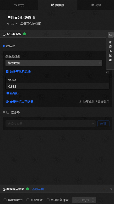
value: the percentage of the sector in the pie chart. The value is a decimal. 1 indicates 100%.
|
Configure data items |
Description |
|
DataSource |
Use the code editor or visual editor to view and edit the data fields of the widget. You can also change the Data Type parameter to configure the component data. |
|
Data Mapping |
To customize chart field configurations, set field mappings in the Data Mapping module to map your data to the corresponding widget fields without modifying the data source. You can also click the |
|
Configure a filter |
Turn on Filter, select an existing data filter or create a data filter, and configure a data filter script to filter data. For more information, see Manage data filters. |
|
Data Response Result |
Displays widget data in real time. When the data source changes, the latest data is shown. If the response is delayed, click the |
|
Forbid Loading |
If selected, loading animations are hidden during component initialization when you update the component and preview the data dashboard. Deselected by default. |
|
Controlled Mode |
If selected, the component does not request data on initialization. Data can only be requested through global variables or methods configured in Blueprint Editor. If deselected, automatic data updates are used. Deselected by default. |
|
Auto Data Request |
If selected, you can specify a polling interval for dynamic data updates. If deselected, the page does not update automatically. You must manually refresh the page or use Blueprint Editor and global variable events to trigger a data request. |
 icon to configure the field style.
 icon to view the data response result, or click the
  icon to refresh the data. You can also click View Example to view a sample response.
Advanced Panel
This widget does not support interaction events.
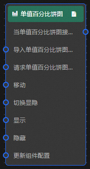
Blueprint Interaction
-
Click the
icon in the upper-left corner to go to the Blueprint page. -
On the Layer Nodes tab, add the widget to the main canvas.
-
View blueprint configuration parameters.
-
Event
Event
Description
When the progress donut chart interface request is completed
The event is triggered with the processed JSON data after a data interface request is responded to and processed by a filter. For specific data examples, see the Data Response Result section of the Data Source tab in the right-side configuration panel of the canvas editor.
-
Action
Action
Description
Import progress donut chart Interface
After widget data is processed into its drawing format, the widget is imported for redrawing without requesting server data again. For specific data examples, see the Data Response Result section of the Data Source tab in the right-side configuration panel of the canvas editor.
Request progress donut chart Interface
Requests server data again, using data from an upstream data processing node or layer node as parameters. For example, if the API data source is configured as
https://api.testand the data transferred to the request progress donut chart interface is{ id: '1'}, the final request interface ishttps://api.test?id=1.Move
Move a widget to a specified location. For more information, see the data example.
    {
      // The positioning type. to indicates absolute positioning, whereas by indicates relative positioning. The default value is to.
        "positionType": "to",
      // The location, which is indicated by the x and y coordinates.
      "attr": {
        "x": 0,
        "y": 0
      },
      // The animation type.
      "animation": {
        "enable": false,
        // The animation delay. Unit: milliseconds.
        "animationDuration": 1000,
        // The animation curve, which can be set to linear|easeInOutQuad|easeInOutExpo.
        "animationEasing": "linear"
      }
    }
Switch Display /Hide
Toggles the visibility of the widget. No parameters are required.
Display
Display the widget. For more information, see Data example.
{
  "animationType": "",// The animation method. Valid value: fade. If you do not set this parameter, no animation is available.
  "animationDuration": 1000,// The animation delay. Unit: ms.
  "animationEasing": ""// animation curve
}
Hide
Hide the component. For more information, see Data example.
{
  "animationType": "",// The animation method. Valid value: fade. If you do not set this parameter, no animation is available.
  "animationDuration": 1000,// The animation delay. Unit: ms.
  "animationEasing": ""// animation curve
}
Update component configurations
Dynamically updates the style configurations of the widget. In the Style panel, click Copy Configuration to Clipboard to obtain the widget configuration data. Then, modify the style field for the data processing node in Blueprint Editor.
-
 icon in the upper-left corner to go to the Blueprint page.