Configure the trajectory layer to visualize motion paths between geographic locations on the 3D Earth.
Chart style
The trajectory layer is a 3D Earth component with independent style and data configuration. It uses trajectory lines to display transition effects between two or more geographic locations, simulating motion paths.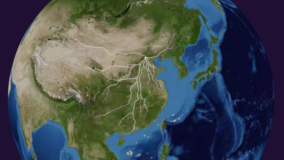
Style panel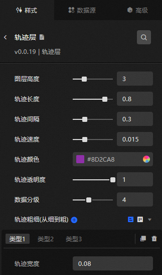
-
Search Configuration: Click the Style icon
 in the upper right corner of the panel to enter the name of the configuration item you wish to locate in the search field. The system supports fuzzy matching. For more information, see Search configuration item.
 -
Layer Height: The height of the trajectory layer above the Earth's surface. Valid values: 0.1 to 10.
-
Trajectory Length: The length of the motion trajectory line. Valid values: 0 to 1.
-
Trajectory Interval: The interval duration for the repeated motion of the trajectory line. Valid values: 0 to 1.
-
Trajectory Speed: The motion speed of the trajectory line. Valid values: 0 to 0.05.
-
Trajectory Color: The color of the trajectory line. For more information, see the color picker.
-
Trajectory Transparency: The transparency of the trajectory line. Valid values: 0 to 1.
-
Data Classification: Segments data into 2 to 7 levels based on the value field (natural segmentation) to handle rendering issues caused by large value disparities.
-
Trajectory Thickness (from Thin To Thick): Click the
 or
or  icons to add or remove a type. Use the
  or icons to rearrange types. Click the icon to duplicate the selected type.
Trajectory Width: The maximum width for the trajectory within this type.
ImportantThis configuration item is an array that works in tandem with data classification, set incrementally from type 1 to type n. For example, if type 1 is set to 10, data with a value from 0 to 10 appears as size 10. If type 2 is set to 20, data with a value from 11 to 20 appears as size 20. When data classification is set to 3 levels, the type 3 value represents the size for data values above 20.
 or
or  icons to rearrange types. Click the
  icon to duplicate the selected type.
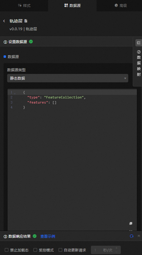
Data source panel
|
Field |
Description |
|
|
The type as "LineString". |
|
|
Two or more sets of latitude and longitude coordinates. |
|
|
|
|
Data Item Configuration |
Description |
|
Data Source |
The component's data source displays the data fields contained within the component using code editing or visual editor. You can also modify the data type to flexibly configure the component's data. |
|
Data Mapping |
When you need to customize chart field configurations, you can set different field mappings in the Data Mapping module to map these fields to the corresponding fields of the component. This allows for real-time data matching without altering the data source fields. Additionally, click the |
|
Filter |
Open the Filter to select an existing data filter or create a new one, and configure the data filter script to achieve data filtering capabilities. For more information, see manage data filters. |
|
Data Response Result |
This feature displays the component's data in real-time. When the component's data source changes, the data response result will display the latest data accordingly. In case of a delayed system response, you can click the |
|
Disable Loading State |
Check the check box to hide the loading content during component updates and data dashboard previews. Unchecking will display the loading content. The default setting is unchecked. |
|
Controlled Mode |
Check the check box to prevent data requests upon the component's initialization. Data requests will only be initiated through global variables or methods configured in the blueprint editor. Unchecking allows for automatic update requests. The default setting is unchecked. |
|
Automatic Update Request |
Check the check box to manually set the polling frequency for dynamic polling. Clearing this option disables automatic updates, requiring manual page refreshes or data request triggers through the blueprint editor and global variable events for updates. |
 icon to configure field styles individually.
 icon on the right to check the current data response result, or click the
  icon on the right to obtain the most recent data for the component. You can also click to view examples to see sample response results for the current component.
Advanced panel
This component does not support interaction events.
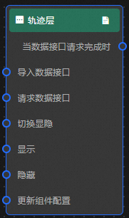
Blueprint interaction
-
To access the Blueprint page, click the
icon in the upper left corner. -
In the Layer Node tab, add the current component to the main canvas.
-
Review the blueprint configuration parameters.
-
Event
Event
Description
When The Data Interface Request Is Completed
Triggered when the trajectory layer data interface request is complete. The filter processes the data and outputs the result in JSON format.
-
Action
Action
Description
Request Data Interface
Re-requests server data, using data from the input data processing node or layer node as parameters. For example, if the trajectory layer uses an API data source such as
https://api.test, and the data passed to the Request Data Interface action is{ id: '1'}, the final request URL becomeshttps://api.test?id=1.Import Data Interface
Imports processed data in the rendering format and redraws the component without sending a new server data request.
Switch Visibility
Toggles the visibility of the component. No parameters required.
Show
Shows the component. See the following data example.
{
  "animationType": "",//Animation type. Optional value: fade. No animation if not filled.
  "animationDuration": 1000,//Animation latency in ms.
  "animationEasing": ""//Animation curve
}
Hide
Hides the component. See the following data example.
{
  "animationType": "",//Animation type. Optional value: fade. No animation if not filled.
  "animationDuration": 1000,//Animation latency in ms.
  "animationEasing": ""//Animation curve
}
Update Component Configuration
Dynamically updates the component style configuration. To obtain the configuration data, click Copy Configuration To Clipboard in the component's Style panel, then modify the corresponding style field values in the data processing node on the blueprint editor page.
-
 icon in the upper left corner.