Funnel chart
A funnel chart visualizes conversion rates across stages in a business process to help you analyze data and make decisions. This topic describes how to configure this component.
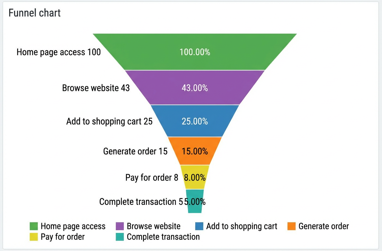
Example
The following figure shows a funnel chart that displays the conversion rates from website browsing to order completion.
Step 1: Add a component
-
Create a web application. For more information, see Create a web application.
In the Web application editor, click the component icon
 on the left.
-
Above the component list on the left of the canvas, enter funnel chart in the search box to find the component, then drag it to the center of the canvas.
For more information about adding components, see Add a component.
Step 2: Configure a data source
-
In the web editor, select the component. In the Style pane on the right, click Configure data source.
-
On the Data source configuration page, select a data source type and complete the configuration.
Available data source types include API, data table resource, static data, and application push.
-
Click OK.
On the Data display tab, the Data source section on the left shows the name of the configured data source. The Dimension and Measure sections list the attribute fields automatically parsed from the data source.
NoteData source attribute fields are matched based on the following rules:
-
Dimension: boolean, string, and time fields.
-
Measure: numeric fields.
-
-
Optional: Click Data table in the upper-left corner to view all data from the configured data source.
Step 3: Configure the data display
On the Data Display tab, configure the data and styles for the funnel chart.
-
Drag a dimension field to the Category well and a measure field to the Value well.
Note-
To change the default system colors, go to the Properties or Styles tab on the right of the Data Display page.
-
The funnel chart calculates the top-down conversion rate as follows: Conversion rate of a layer = (Value of the current layer / Value of the first layer) × 100%.
-
-
In the Category and Value wells, click the triangle icon next to a field to perform the following operations.
Actions
Description
Aggregation method
Options: Sum (default), Average, Maximum, Minimum, and Count.
This feature is available only for measure fields. The configured aggregation method appears before the field name.
After setting an aggregation method for a measure field, you can configure filter conditions to display specific data.
NoteThis feature is available only when the component's data source type is Data Table Resource.
Filter
Add a field to the Filter section to use it as a filter item. You can then configure conditions based on this field to filter the displayed data. A maximum of 10 filters is supported.
Alternatively, from the Dimension or Measure section on the left, you can click the triangle icon next to a field to add it to the Filter section.
NoteThis feature is available only when the component's data source is a data table resource. For more information, see Configure filters.
Set display name
Edit the display name of the field.
-
On the right of the Data Display tab, click Styles to configure the component's display styles.
Parameter
Description
Funnel chart style
Set the shape and orientation of the funnel chart.
Title
Shows or hides the item. If shown, you can configure its display style.
Legend
Label
Outer label
Background
Border
No data prompt
-
In the upper-right corner of the page, click Complete Configuration to return to the web application editor and view the configured component data.
-
Adjust the component's position on the page. For more information about general component style settings, see Configure styles.
Step 4: Configure interactions
-
In the Interaction panel on the right side of the web application editor, click Add Interaction, and then set an event and an action.
This component supports the Mouse In event. For example, you can set the Mouse In event to trigger a Show/Hide action that reveals a hidden component with additional information.
For more information, see Interaction configuration.
-
Click Preview in the upper-right corner of the page to view and debug the component's data and style.