Scatter chart
A scatter chart visualizes trends and correlations between variables by plotting their distribution as data points. This topic describes how to configure the scatter chart component.
Example
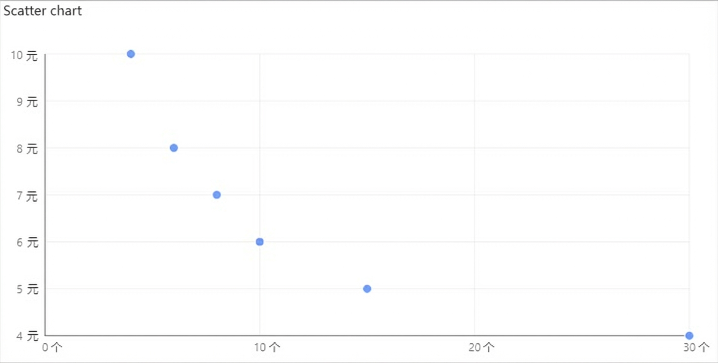
The following figure shows a scatter chart plotting a product's unit price against its sales quantity for a quarter.
Step 1: Add the component
Create a web application. For more information, see Create a web application.
In the Web application editor, click the component icon
 on the left.
-
At the top of the component list to the left of the canvas, enter scatter chart in the search box. Then, drag the component to the canvas.
For more information about adding components, see Add a component.
After the component is added, it appears on the canvas with the prompt Please configure data for the scatter chart. The panel on the right displays the component's properties, including position, size, and visibility. Click Configure Data Source.
Step 2: Configure the data source
In the web application editor, select the component. On the Style tab on the right, click Configure Data Source.
On the Data Source Configuration page, select a data source type and complete the configuration.
The available data types are API, Data Table Resource, Static Data, and Application Push.
Click OK.
On the Data tab, the name of the configured data source is displayed in the Data Source section on the left. The Dimensions and Measures sections display the property fields that are automatically parsed from the data source.
NoteData source property field matching rules:
Dimensions: Boolean, character, and time fields.
Measures: Numeric fields.
Optional: In the upper-left corner, click Data Table to view all data from the configured data source.
Step 3: Configure data display
On the Data Display tab, configure the data and style for the scatter chart.
-
Drag one measure field to the x-axis box and another to the y-axis box.
NoteYou can change the default system colors on the Property or Style tab on the right side of the Data page.
-
In the x-axis and y-axis boxes, click the triangle icon next to a field for the following options:
Actions
Description
Filter
Add a field to the Filter section. You can then configure conditions for this field to filter the displayed data. You can add up to 10 filters.
You can also click the triangle icon for a field in the Dimensions or Measures section on the left to add the field to the Filter section.
NoteThis feature is available only when the data source type for the component is Data Table Resource. For more information, see Configure a filter.
Set Display Name
Edit the display name of the field.
-
On the right side of the Data Display tab, click Style to configure the component's style.
Parameter
Description
Scatter chart style
Set the size and color of the points in the scatter chart.
Title
Show or hide the element. If shown, you can configure its style.
X-axis
Y-axis
Background
Border
No Data Prompt
-
In the upper-right corner of the page, click Complete Configuration to return to the Web Application Editor and view the configured component data.
Adjust the position of the component on the page. For more information about common component style configurations, see Style configuration.
Step 4: Configure interactive actions
On the Interaction tab in the right-side pane of the web application editor, click Add Interaction to configure the Event and Action.
This component supports the Mouseover event. For example, you can execute the Show/Hide action on mouseover to display a hidden component that provides more information about the data.
For more information, see Interaction configuration.
Click Preview in the upper-right corner of the page to preview and test the component's data and style.