After an application reports data to Managed Service for OpenTelemetry, the Overview page provides a unified view of application health: request volume, error counts, response times, day-over-day comparisons, and top-service rankings. Use this page as a starting point to detect regressions, identify traffic anomalies, and pinpoint services that need attention.
Prerequisites
Before you begin, make sure that you have:
An application that reports data to Managed Service for OpenTelemetry. For details, see Integration guide
View the application overview
Log on to the Managed Service for OpenTelemetry console.
In the left-side navigation pane, click Applications.
On the Applications page, select a region in the top navigation bar, then click the application name.
In the top navigation bar, click the Overview tab.
Interpret the dashboard
The dashboard is organized into three sections: summary tiles for headline numbers, trend charts for time-series analysis, and service rankings for identifying hotspots. Work through these sections top to bottom to triage application health.
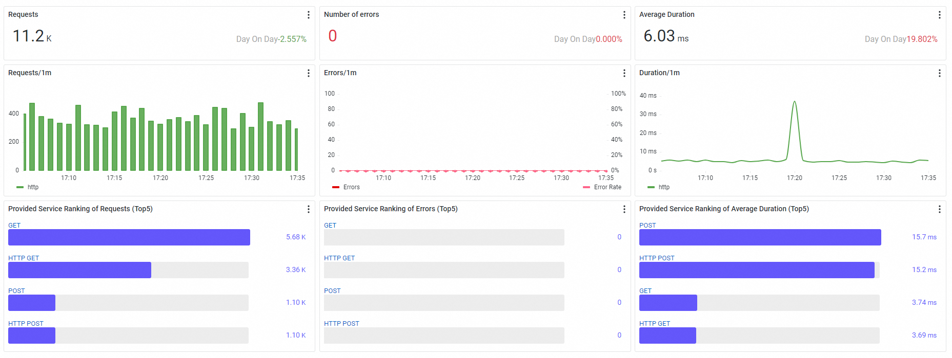
Summary tiles
Three ticker boards at the top of the page show headline metrics for the selected time range. Each tile includes a Day On Day percentage that compares the current value against the same time range on the previous day.
| Metric | Description |
|---|---|
| Requests | Total request count for the selected time range |
| Number of errors | Total error count for the selected time range |
| Average Duration | Average response time across all requests |
How to read Day On Day values:
A rising Day On Day on Number of errors or Average Duration typically signals a regression worth investigating.
A rising Day On Day on Requests alongside stable error and duration metrics is normal traffic growth.
A simultaneous spike in all three values often indicates an upstream traffic surge rather than a service-level problem.
Trend charts
Below the summary tiles, three charts show how the application performs over time. Use these charts to correlate changes in traffic, errors, and latency.
Request trends
A stacked column chart that breaks down request volume by call type. Use this chart to identify traffic patterns and spot unusual spikes or drops.
Error trends
A combined column chart and trend line. The columns (left y-axis) show the absolute error count, while the trend line (right y-axis) shows the Error Rate as a percentage. Compare the two to distinguish between a genuine increase in failures and a proportional rise that tracks higher traffic.
Interpretation tips:
If the error count rises but the Error Rate stays flat, the increase likely tracks higher traffic rather than a new failure.
If the Error Rate rises while request volume stays flat, investigate the affected call types for a root cause.
Duration trends
A trend chart that plots response-time percentiles:
| Percentile | What it reveals |
|---|---|
| Average | Overall response-time trend |
| P75 | Typical user experience |
| P90 | Experience for the majority of slower requests |
| P99 (tail latency) | Near-worst-case latency; often the first indicator of a performance problem |
If P99 spikes while the average stays flat, a subset of requests is hitting a slow path. Investigate the affected services and endpoints to identify the bottleneck.
Service rankings
Three TOP 5 rankings identify which services within the application deserve attention first.
| Ranking | Sorts by | Use it to |
|---|---|---|
| Provided Service Ranking of Requests | Highest request volume | Find the busiest services |
| Provided Service Ranking of Errors | Most operation errors | Pinpoint services with reliability issues |
| Provided Service Ranking of Average Duration | Longest response time | Locate latency bottlenecks |
Cross-reference the three rankings to prioritize effectively. A service that ranks high in both requests and errors has a wider blast radius than one that ranks high in errors alone.
All three rankings cover the following call types:
HTTP, Dubbo, HSF (High-Speed Service Framework), DSF (Distributed Service Framework), Message queue, Kafka, Server, Producer, gRPC, Thrift, Sofa, SchedulerX, Spring_Scheduled, JDK_Timer, XXL_Job, Quartz, Span
What to do next
Set up alert rules so that the system automatically notifies your O&M team when metrics cross a threshold. For example, create a rule that triggers when the error rate for a specific operation exceeds a baseline. See Create an alert rule.