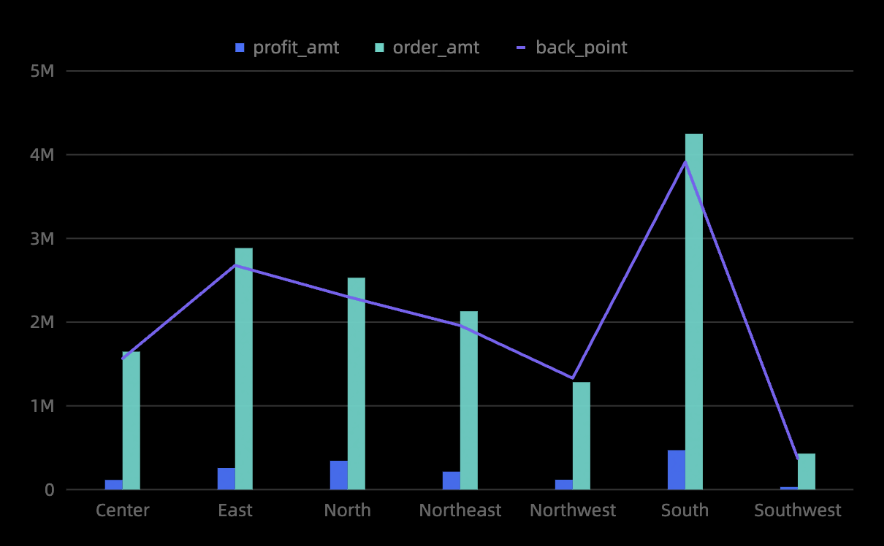
A combination chart uses dual axes to display data of different magnitudes. It combines line, column, and area charts, and supports complex visualizations such as stacked and 100% stacked charts. For example, you can show trends across different projects.
Example
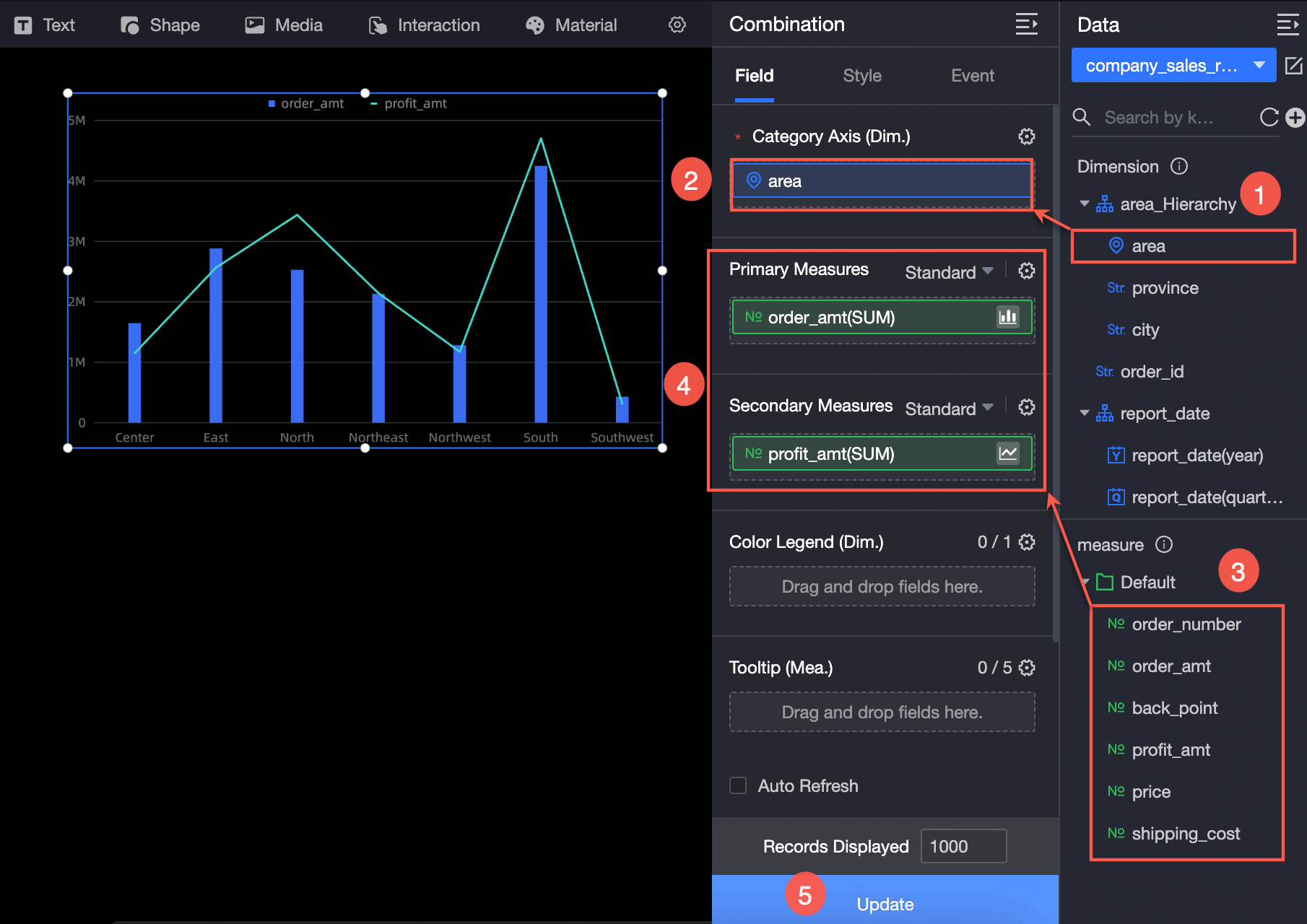
Configure Data
-
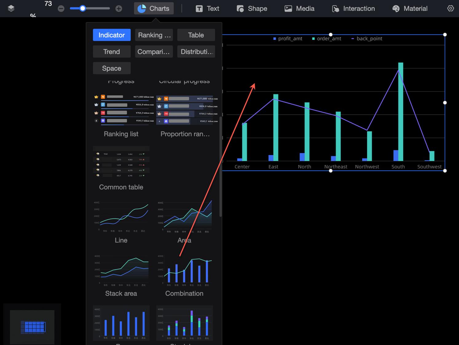
In the Charts section of the component library, find Combination chart and drag it onto the canvas.
-
Click Select a dataset and add data as shown in the figure below.
Configure Styles
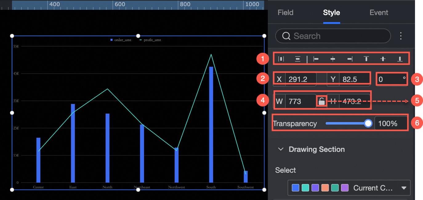
Position and Size
In the configuration pane, you can adjust the following settings for the component:
-
Adjust the component's alignment (①). Options include left, center, and right.
-
Adjust the component's position (②). Set its X and Y coordinates, relative to the top-left corner of the canvas.
-
Adjust the component's rotation (③). Set the rotation angle.
-
Adjust the component's size (④). Set its width (W) and height (H).
-
Lock the component (⑤). When locked, you cannot adjust its size or position.
-
Set the component's opacity (⑥).
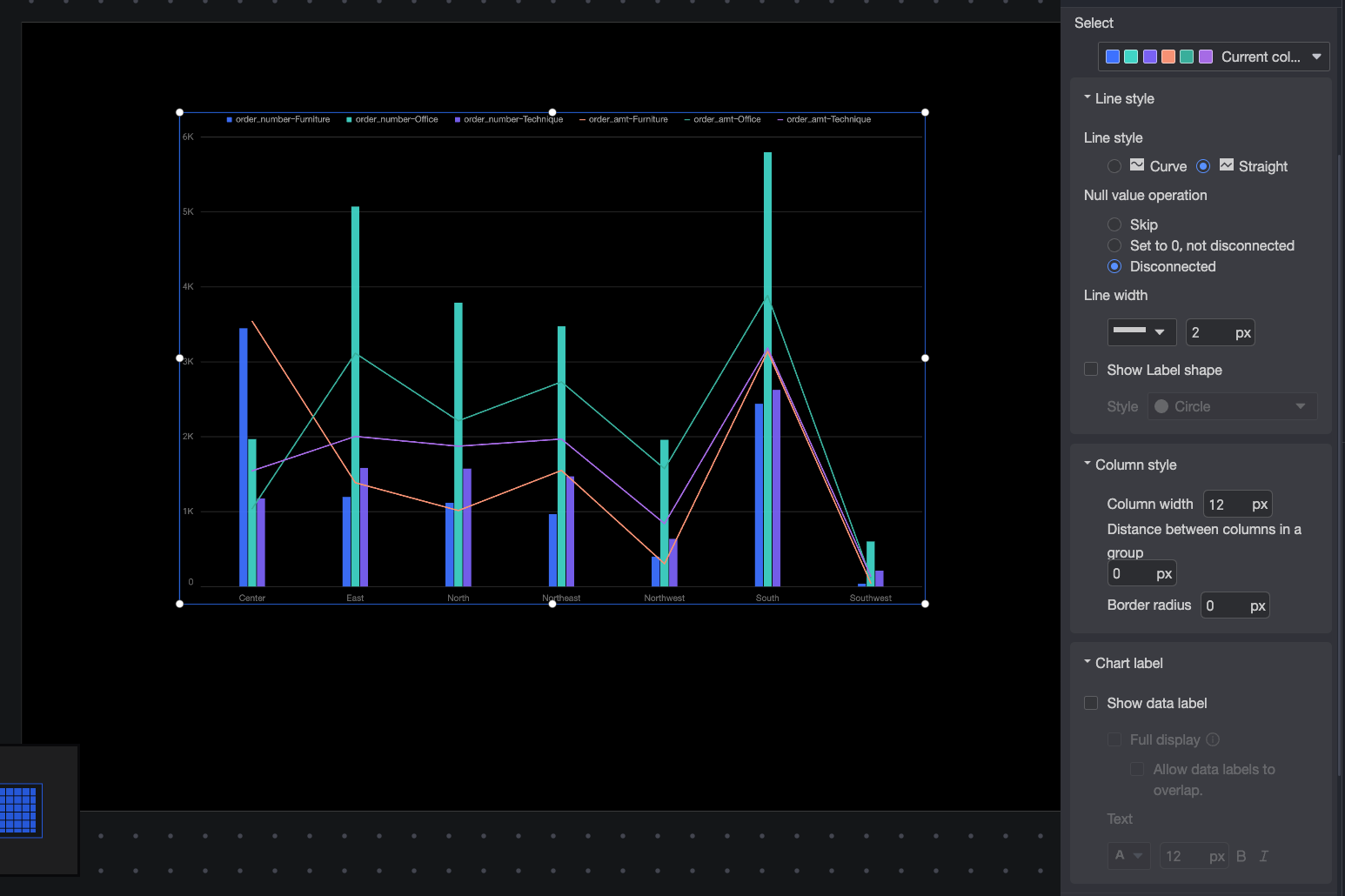
Plot Area
In the Plot area section, configure the style of the combination chart:
-
Color Palette: Sets the color scheme for the chart.
-
Line Type: Sets the line type. Options are Curve and Straight.
-
Null value handling: When data is null, you can choose to skip it, set it to 0 (the line remains continuous), or break the line.
-
Line Weight: Sets the thickness of the lines.
-
Show Markers: Sets the marker style. Supported styles are circle, hollow circle, diamond, and hollow diamond.
-
Bar Style: Configures the width of bars, the distance between bars in the same group, and the corner radius.
-
Chart Labels: Shows or hides data labels on the chart, with options to configure display and text style.
When you enable the option to show all data labels, the system adjusts their positions to prevent overlapping. If too many data labels exist, some may not appear when they extend beyond the axis area. You can also select Allow Data Labels to Overlap.
Legend
In the Legend section, set the position (top, bottom, left, or right) and text style for the legend.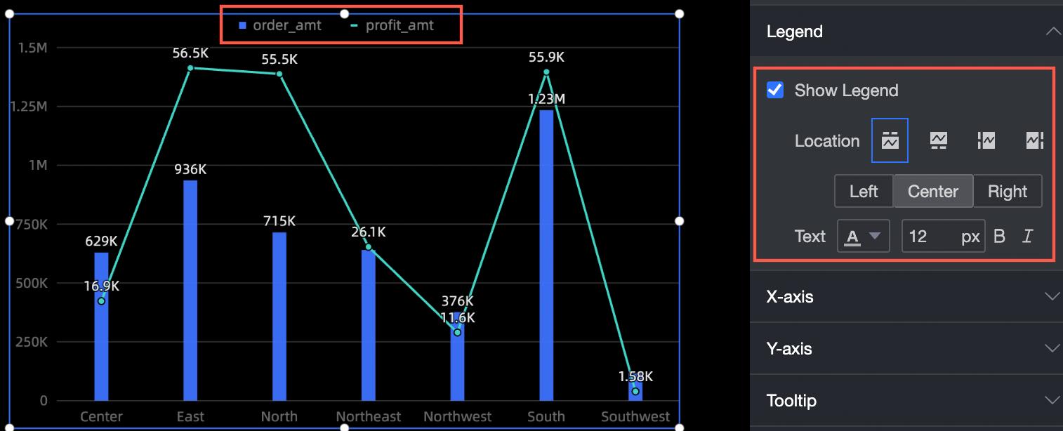
Axes
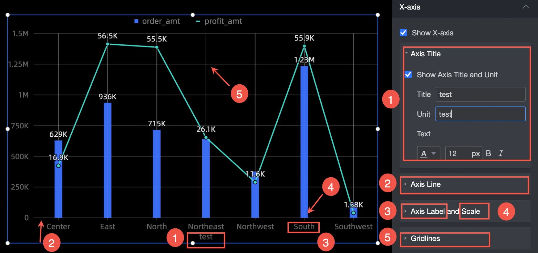
The X-axis section supports the following settings:
-
Show axis title and unit: Set the axis title, unit, and text style (①).
-
Axis line: Sets the type, thickness, and color of the axis line (②).
-
Axis Labels and Tick Marks: Sets the text style for the axis labels and the thickness and color for the tick marks (③ and ④).
-
Gridline: Sets the type, thickness, and color of the gridlines (⑤).
Tooltip
In the Tooltip section, configure the tooltip's display settings.
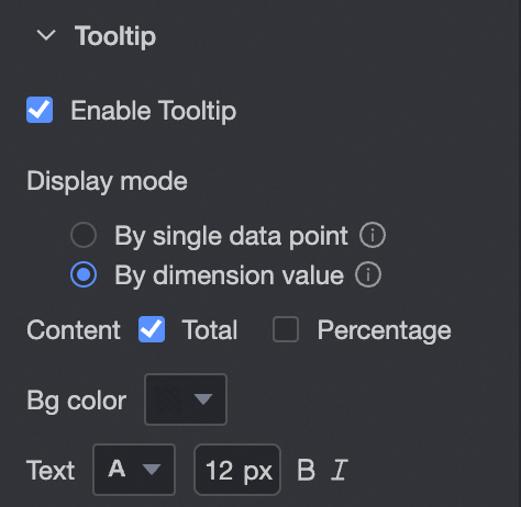
|
Parameter |
Description |
|
Display mode |
Sets how the tooltip is displayed. Options are By single data point and By dimension value. |
|
Content |
When Display mode is set to By single data point, you can show the Percentage. When Display mode is set to By dimension value, you can show the Total and Percentage. If a measure is assigned to the secondary Y-axis, you can configure the content for the primary and secondary Y-axes separately. |
|
Background color |
Sets the background color. |
|
Text |
Sets the text style for the tooltip. |
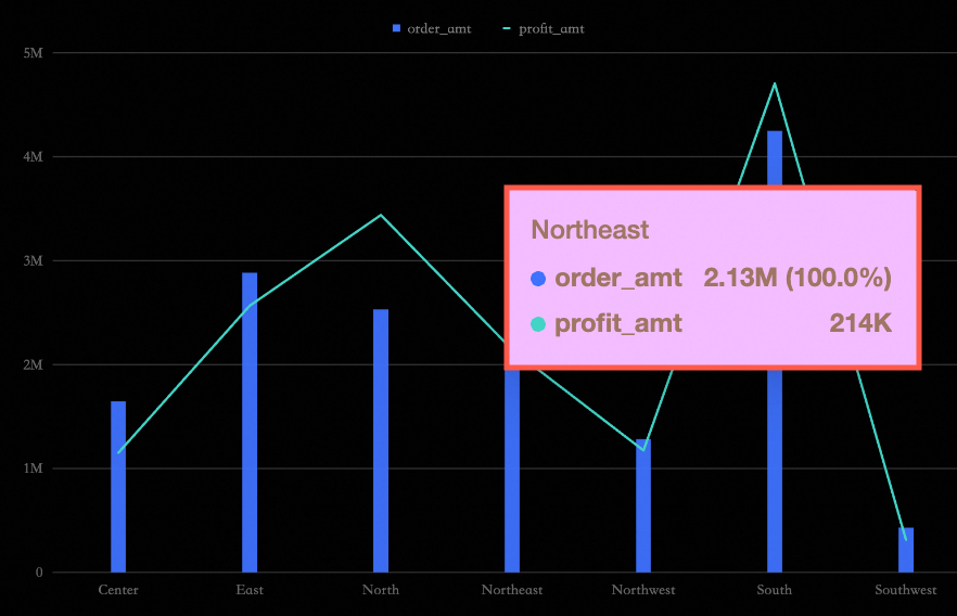
The following image shows an example:
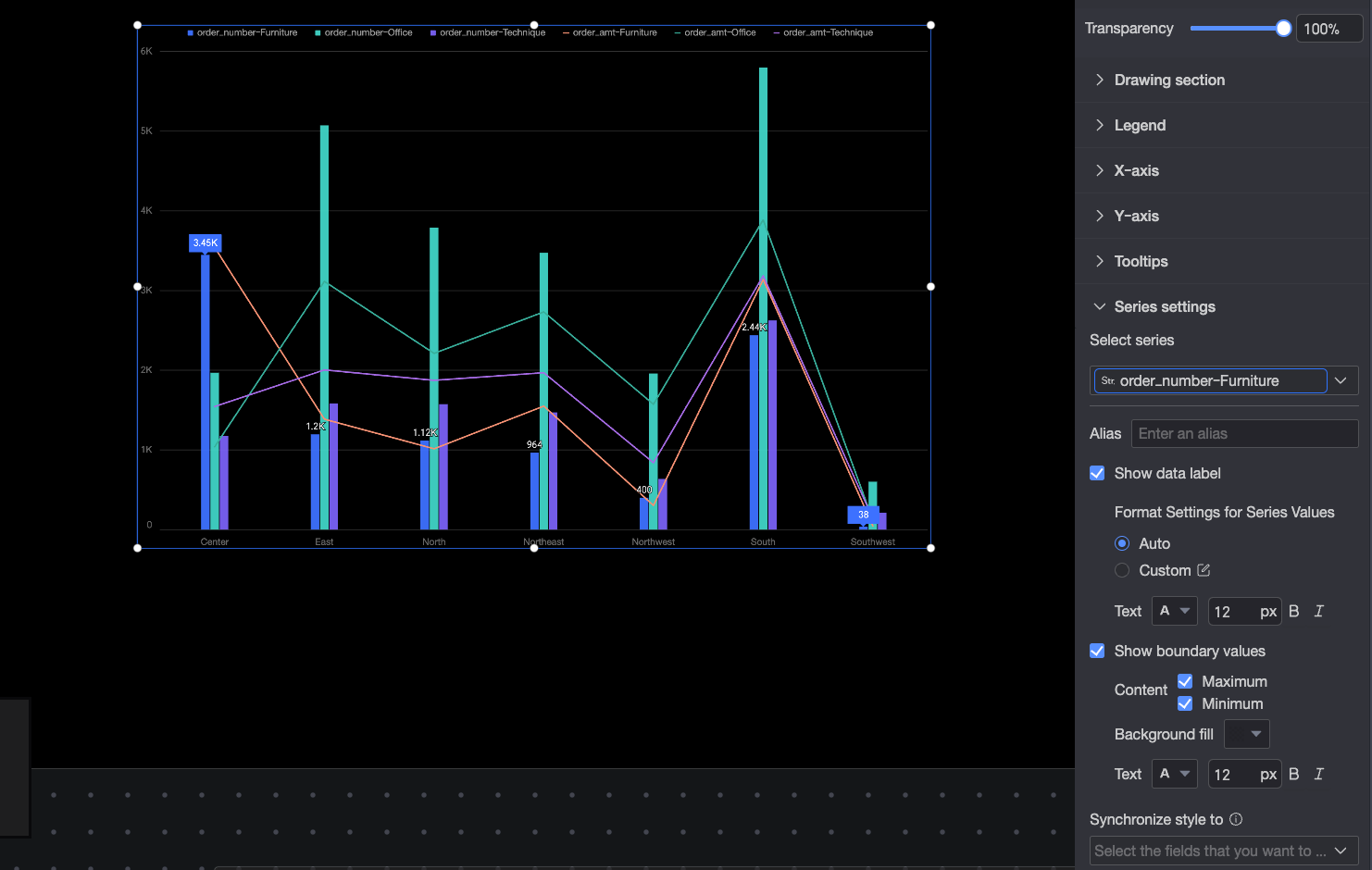
Series Settings
In the Series settings section, configure the series for the combination chart:
You can set an alias and a Series value display format in Series settings only if Color legend/Dimension is enabled on the Fields panel.
-
Select series: Select a measure from the metric/measure area.
-
Alias: Sets a custom display name for the field.
-
Show data labels: Configures the Value display format and Text style for data labels. Two modes are available: Auto and Custom.
-
Auto: (Default) Inherits the data display format settings of the corresponding measure field.
-
Custom: Click the
 icon to open the Data display format settings dialog box to customize the data format. For details, see Data display format > Custom.
-
-
Show min/max: Shows or hides the minimum and maximum values. You can configure the position, content, background color, and text style of the labels.
-
Sync style to: Applies the current series settings to other measures.
 icon to open the Data display format settings dialog box to customize the data format. For details, see