Stacked area chart
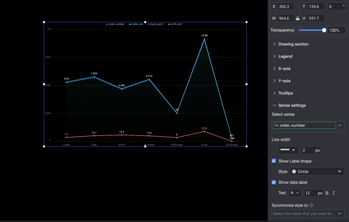
A stacked area chart shows trends in data over time and how each series contributes to the total. This topic describes how to add data to a stacked area chart and configure its styles.
Example
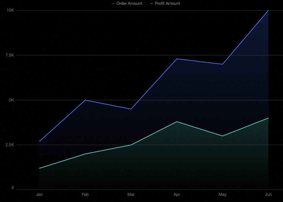
Configure data
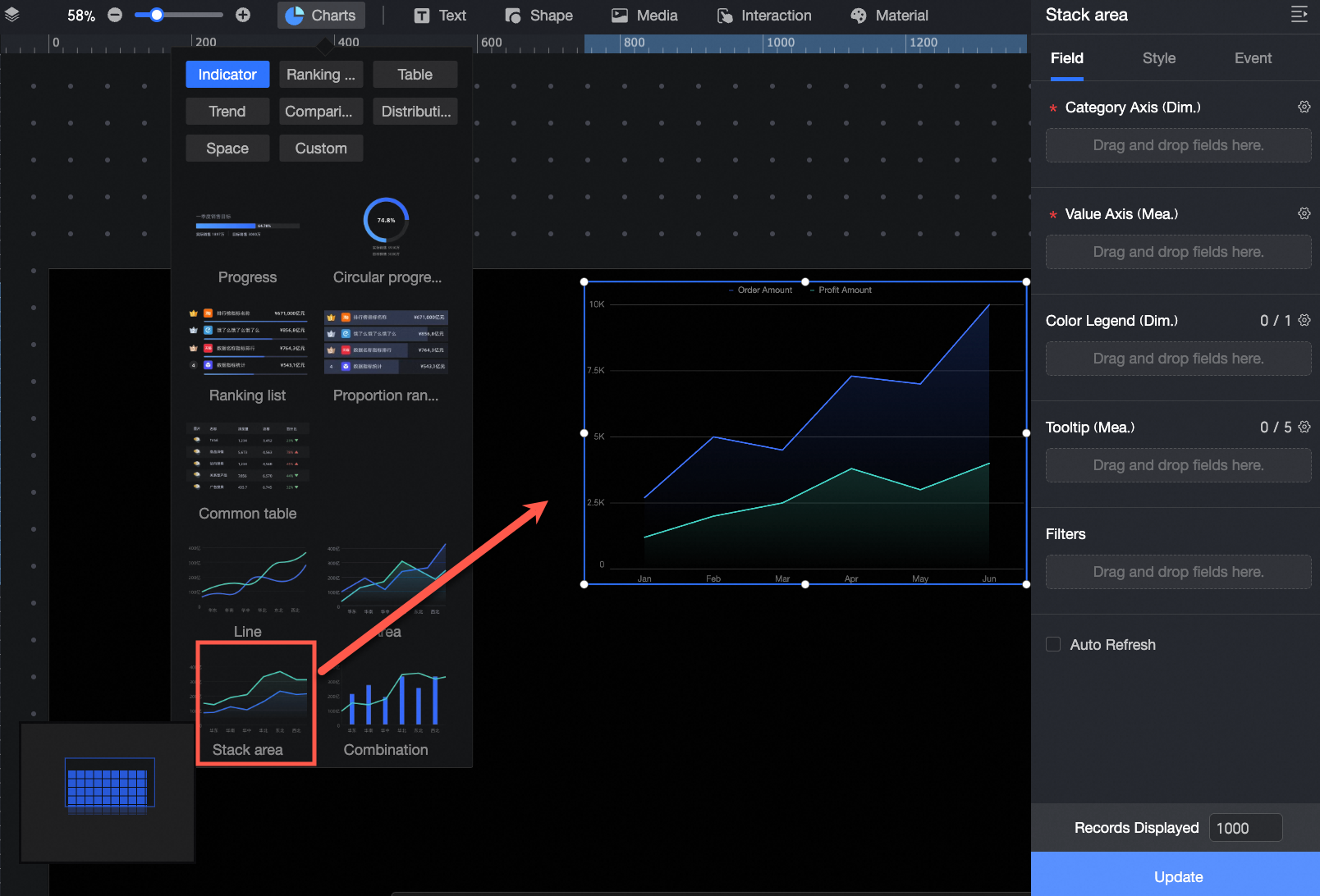
In the Charts section of the component library, find Stacked area chart and drag it to the canvas.
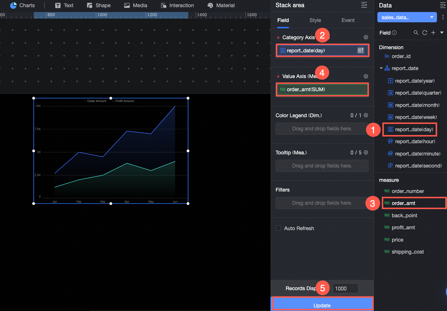
Click Select dataset and add data as shown in the following figure.
You can also do the following with the data: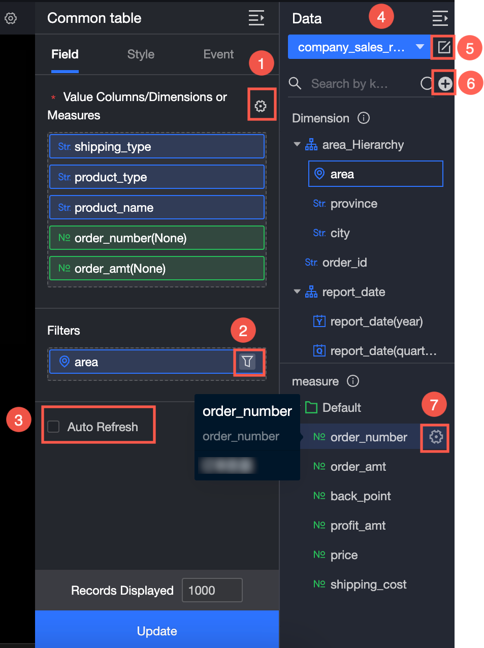
Set field formats in bulk (①). For details, see Configure field styles in batches.
Set a field filter (②). For details, see Filter data.
Set automatic data refresh (③). For details, see Refresh data on a schedule.
Switch datasets (④). For details, see Switch datasets.
Edit the dataset (⑤). For details, see Edit a dataset.
Transform data (⑥). For details, see Create a calculated field and Create a grouped dimension.
Duplicate a field (⑦). For details, see Duplicate a field as a dimension.
Configure styles
Position and size
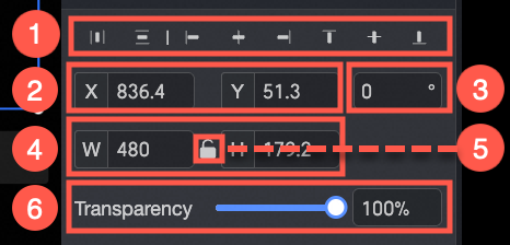
In the configuration pane, you can adjust the following settings for the component:
-
Adjust the component's alignment (①). Options include left, center, and right.
-
Adjust the component's position (②). Set its X and Y coordinates, relative to the top-left corner of the canvas.
-
Adjust the component's rotation (③). Set the rotation angle.
-
Adjust the component's size (④). Set its width (W) and height (H).
-
Lock the component (⑤). When locked, you cannot adjust its size or position.
-
Set the component's opacity (⑥).
Drawing area
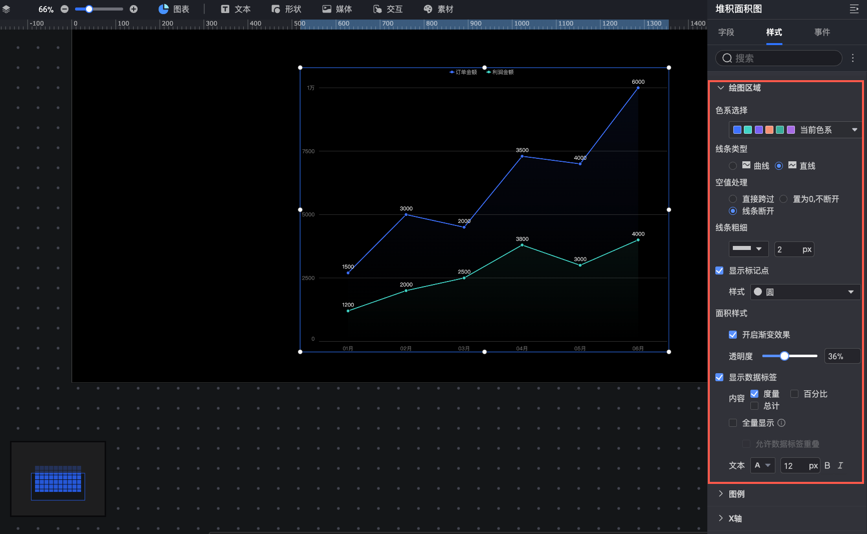
In the Drawing area section, you can configure the following style options for the stacked area chart:
Color scheme: Sets the chart's colors.
Line type: Sets the line type to Curve or Straight.
Null value processing: Sets how to handle null values. You can connect the line over the null point, treat the value as 0 (keeping the line continuous), or break the line.
Line thickness: Sets the line thickness.
Show markers: Sets the marker style. Supported styles include Circle, Hollow Circle, Diamond, and Hollow Diamond (①).
Area style: Enables a gradient effect for the area fill (②) and sets the opacity of the gradient.
Show data labels: Shows or hides data labels. You can configure their content (measure, Percentage, or Total), display method (whether to show all labels), and text style (③). When you select Percentage, you can set the Percentage decimal places, which defaults to 2.
If you enable showing all data labels, the system intelligently adjusts their positions to prevent overlap. However, labels that extend beyond the axis area are not displayed. You can also select Allow data labels to overlap to display all labels regardless of overlap.
NoteWhen you select Percentage, format settings in the Series settings section apply only to measure and Total values, not the percentage format.
Legend
In the Legend section, you can set the position (top, bottom, left, or right) and text style of the legend.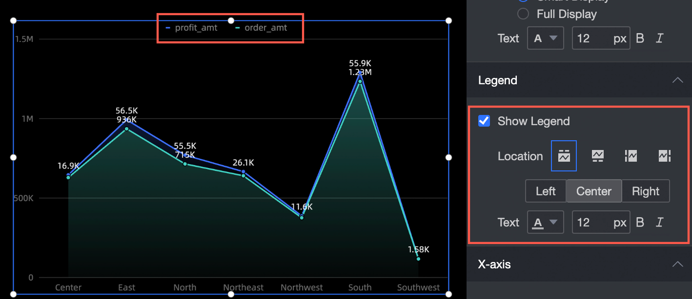
Axis
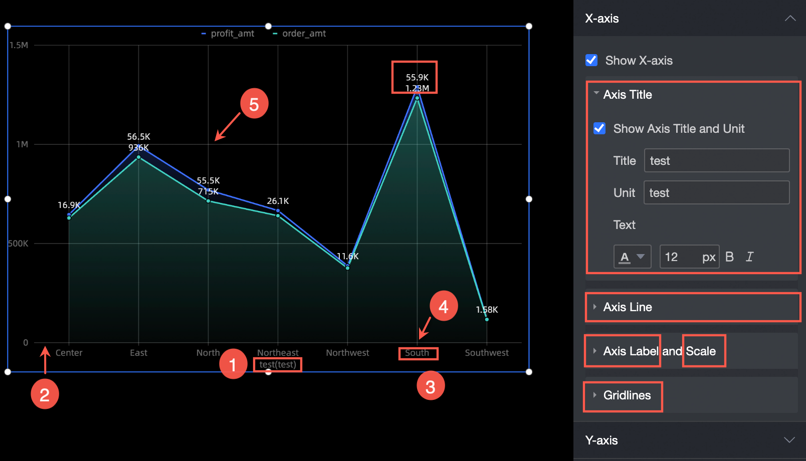
The X-axis section supports the following settings:
-
Show axis title and unit: Set the axis title, unit, and text style (①).
-
Axis line: Sets the type, thickness, and color of the axis line (②).
-
Axis Labels and Tick Marks: Sets the text style for the axis labels and the thickness and color for the tick marks (③ and ④).
-
Gridline: Sets the type, thickness, and color of the gridlines (⑤).
Tooltip
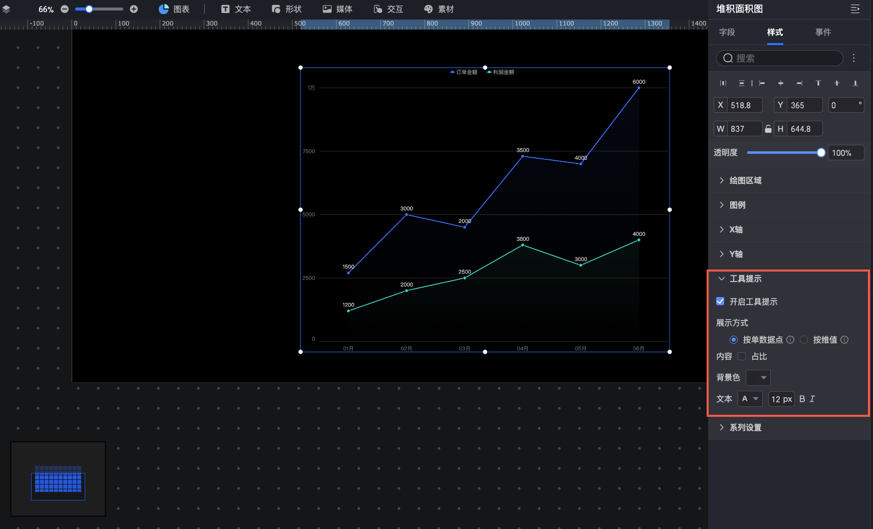
In the Tooltip section, you can configure the tooltip display settings.
Parameter | Description |
Display mode | Sets how the tooltip is displayed. Supported modes are By single data point and By dimension value. |
Content | If Display mode is By single data point, you can show the Ratio. If it is By dimension value, you can show the Total and Ratio. |
Background color | Sets the background color. |
Text | Sets the style of the tooltip text. |
Series settings
In the Series settings section, you can configure the series for the stacked area chart.
To set an Alias and Series value display format in Series settings, you must first enable Color legend/dimension in the Fields panel.
Select series: Select a measure from the Metrics/measures area.
Line thickness: Sets the thickness of the line for the selected measure.
Show markers: Sets the marker style for the selected measure. Supported styles include Circle, Hollow Circle, Diamond, and Hollow Diamond.
Show data labels: Sets the Value display format and Text style for data labels. The format can be Auto or Custom.
Auto: This is the default setting. The series values inherit the data display format settings of the corresponding measure field.
Custom: Click the
 icon to open the Data display format settings dialog box, where you can customize the data format. For descriptions of the options in this dialog box, see Data display format > Custom.
Sync style to: Applies the current series settings to other metrics.
 icon to open the Data display format settings dialog box, where you can customize the data format. For descriptions of the options in this dialog box, see