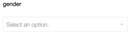
A basic control that lets users select a single option from a menu, suited for scenarios with many choices.
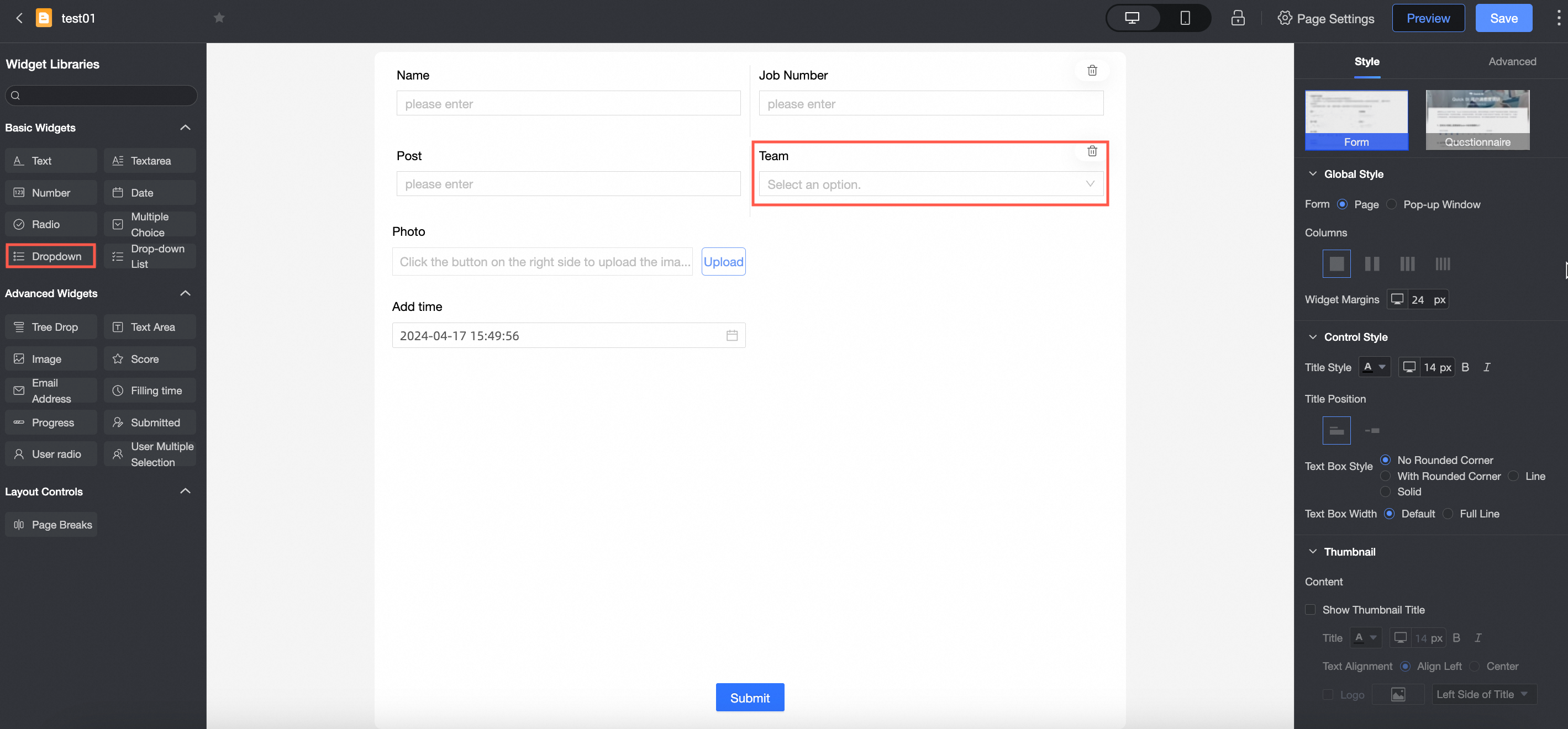
Use cases
Commonly used when there are many options to choose from, such as provinces, employee IDs, product types, and ethnic groups.
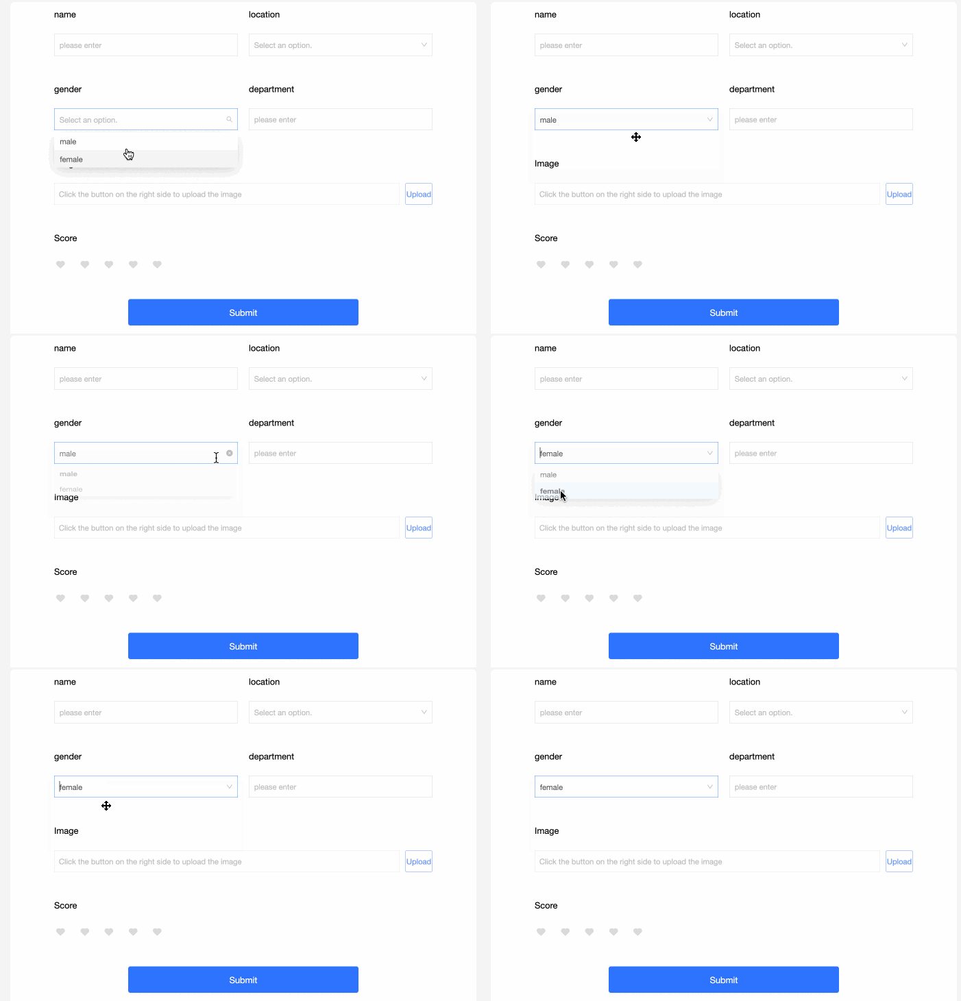
Preview
Control configuration
Basic configuration
|
Parameter |
Description |
|
|
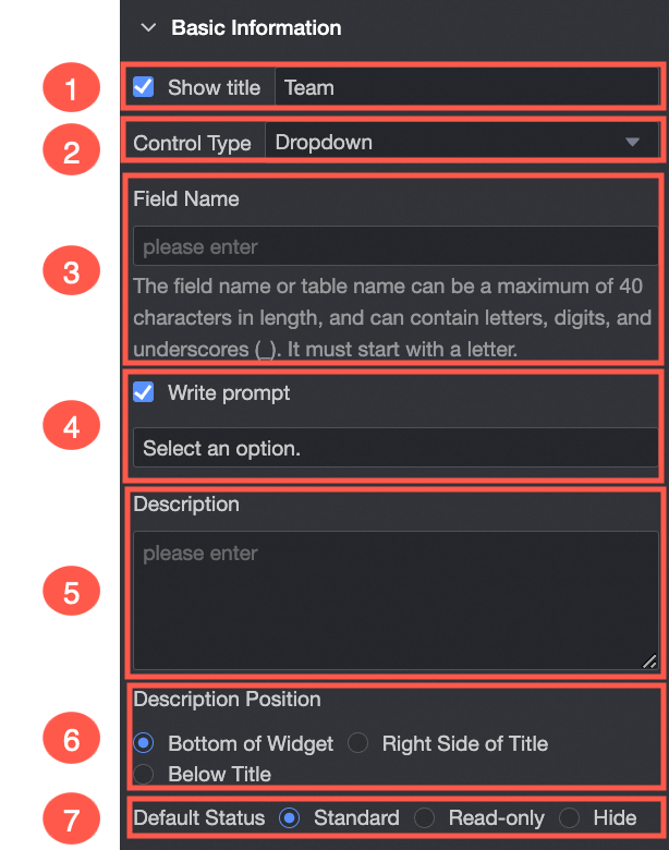
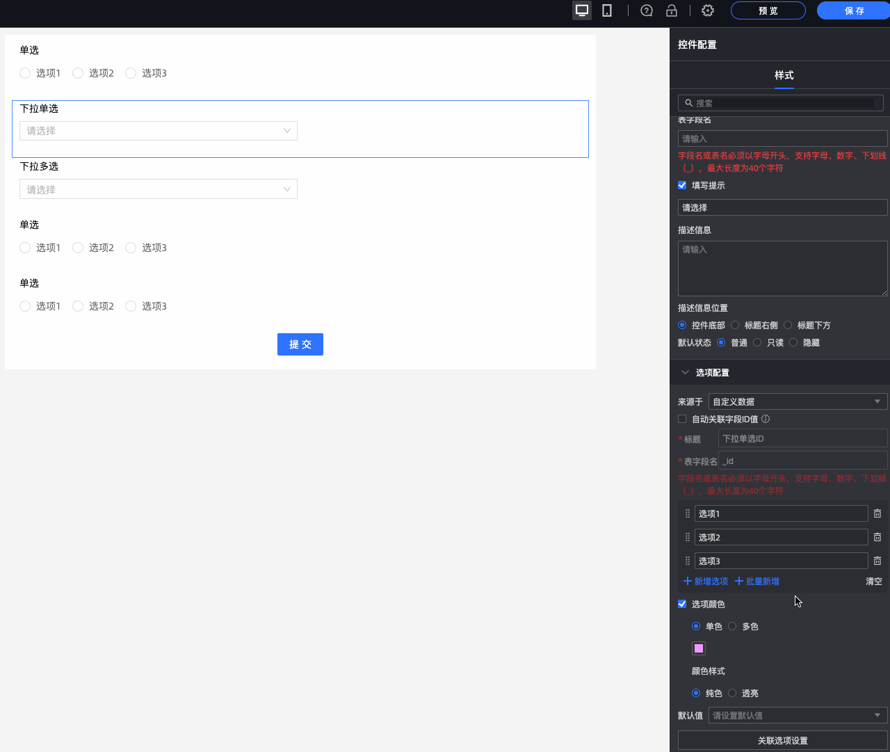
① Display title: Shows or hides the control title. The title serves as the column name for data entry. |
|
② Control type: Changes the control to another type, such as a different basic or advanced control. |
|
|
③ Field name: The corresponding field name in the data table created by this form. Note
A field name or data table name must start with a letter and can contain only letters, numbers, and underscores (_). The maximum length is 40 characters. |
|
|
④ Placeholder: The instructional text displayed before a user makes a selection. For example, please select a customer type.
|
|
|
⑤ Description: A custom description for the control. |
|
|
⑥ Description position: The position of the description. Options: Bottom of control, Right of title, and Below title. |
|
|
⑦ Default state: The initial state of the control. Options: normal, read-only, and hidden. |
Options
Source: Options can be populated from four sources: custom data, a data source, a dataset, or organization members.
|
Parameter |
Description |
|
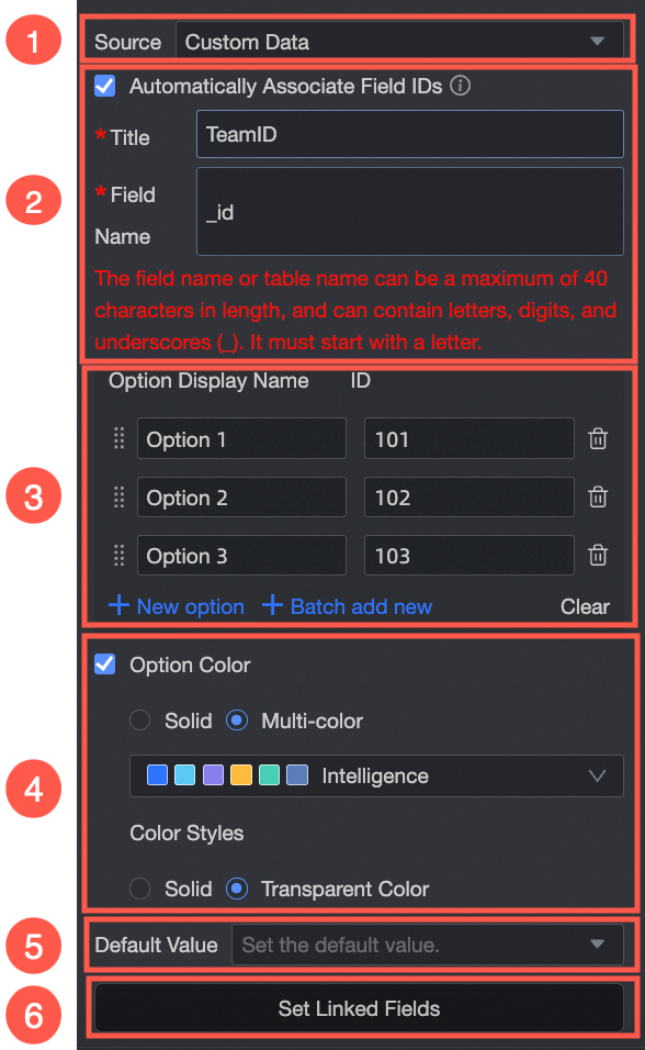
Set Source to custom data.
|
① Source: custom data: Define the display name and associated ID value for each option. |
|
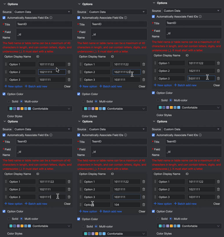
② Automatically associate field ID values: Defines a corresponding ID for each option. When a user submits the form, the associated ID value is written to the data table. You can then use this ID to query and join other data tables. Configure the Option Display Name and its Associated ID Value field. The system supports adding options, batch adding, editing, and deleting.
|
|
|
③ Option display name: The options that appear in the list. You can add options individually or in batches, edit their names, and delete them. |
|
|
④ Option color: Customizes the color of drop-down options. Choose a single color or multi-color scheme, and apply a solid or transparent style.
|
|
|
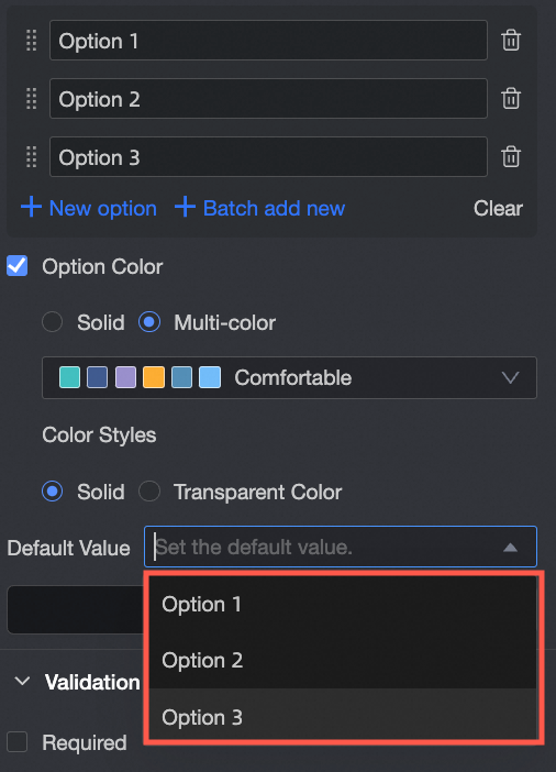
⑤ Default value: A default option selected from the configured options.
|
|
|
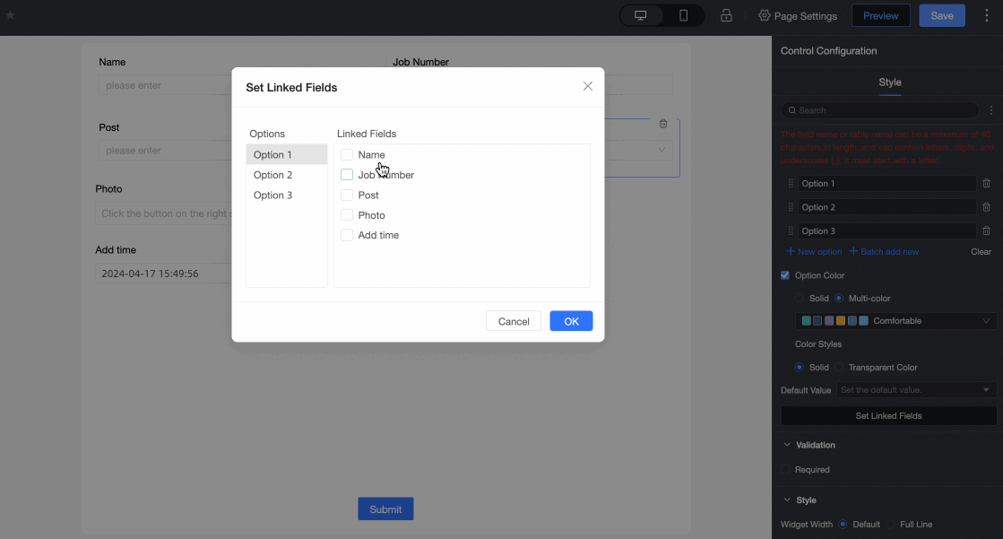
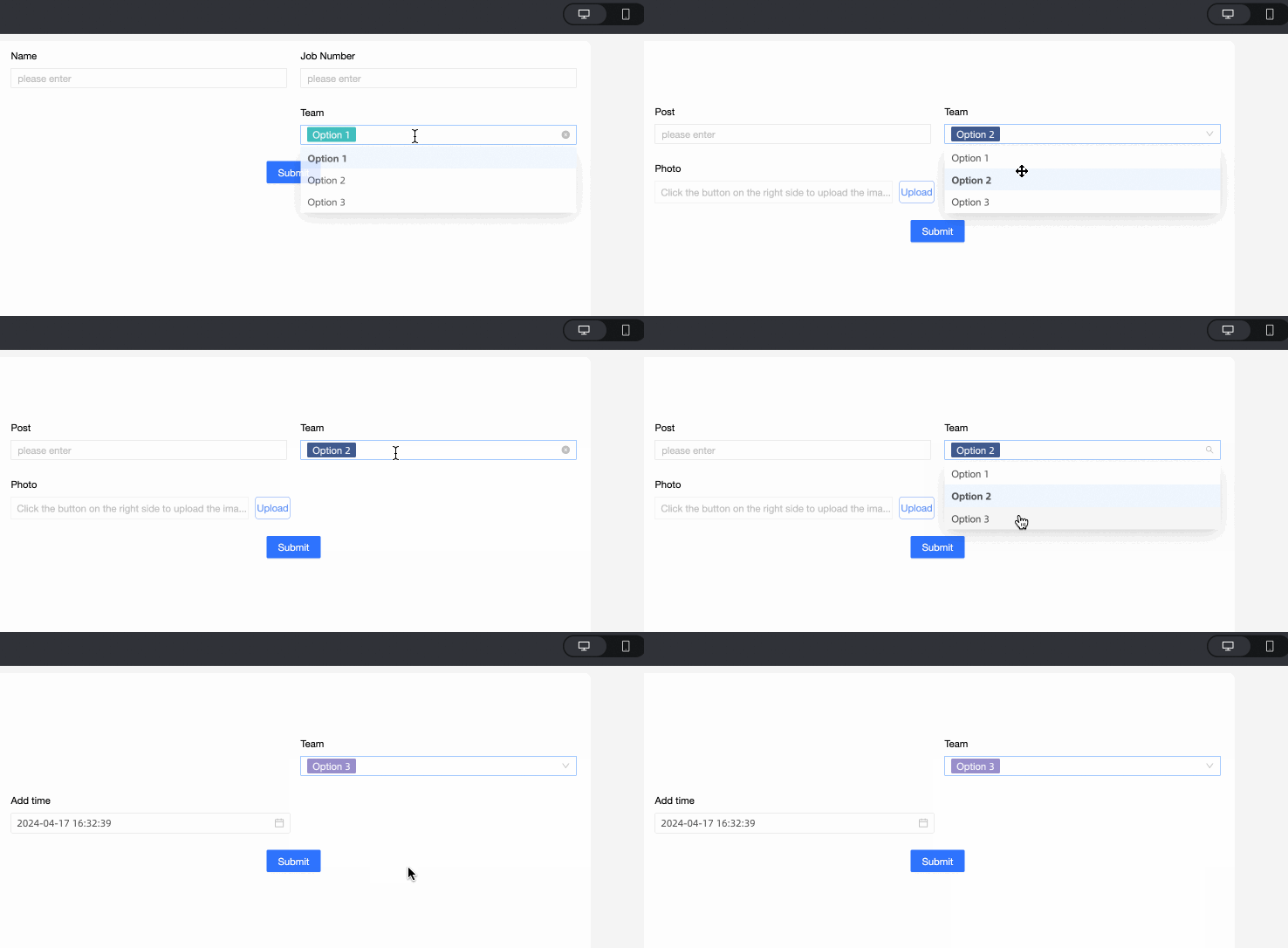
⑥ Associated option settings: If the form contains two or more radio button, drop-down list, or multi-select drop-down controls, you can configure dependent options. Note
You can only associate a field with other fields that appear after it in the form.
|
|
|
Set Source to a data source.
|
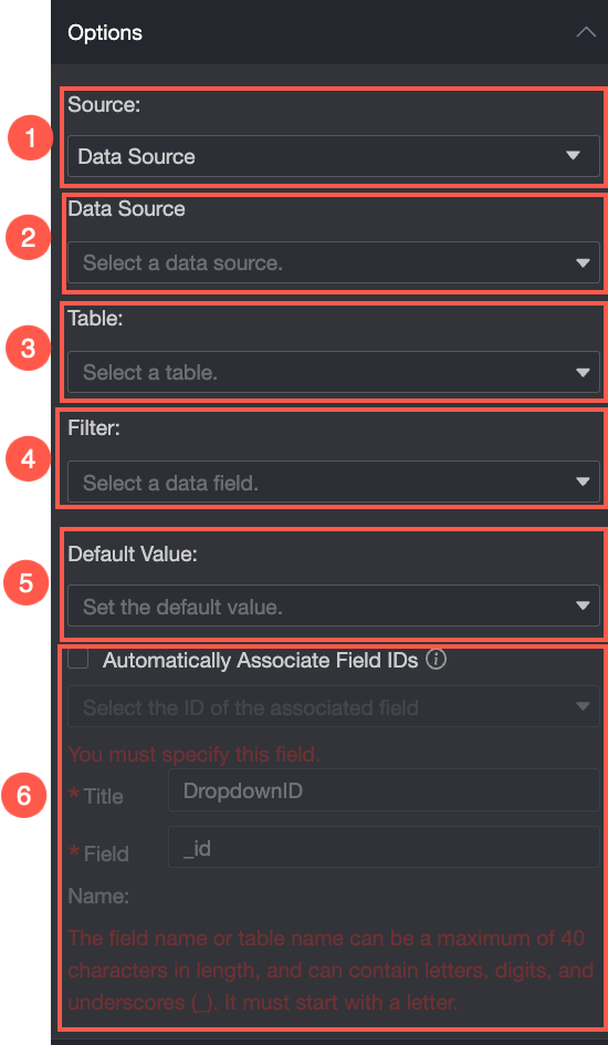
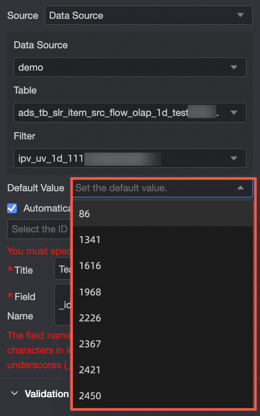
① Source: data source: Populates options from a data table within a selected data source. |
|
② Data source: Select a data source from the drop-down list of sources available in the current workspace. |
|
|
③ Data table: Select a data table from the chosen data source. |
|
|
④ Data field: Select a data field from the chosen data table. |
|
|
⑤ Default value: Select a default option from the values in the specified data field.
|
|
|
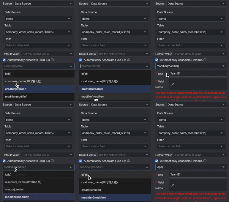
⑥ Automatically associate field ID values: Defines a corresponding ID for each option. When a user submits the form, the associated ID value is written to the data table. You can then use this ID to query and join other data tables. Associate the Option Display Name of the control with a corresponding ID value field.
|
|
|
Set Source to a dataset.
|
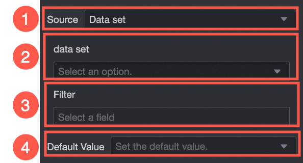
① Source: dataset: Populates options from a data field within a selected dataset. |
|
② Dataset: Select a dataset from the drop-down list of datasets available in the current workspace. |
|
|
③ Data field: Select a data field from the chosen dataset. |
|
|
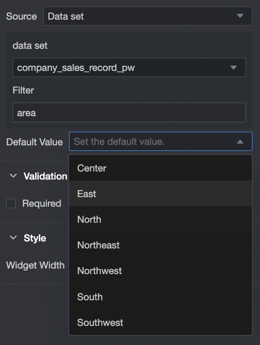
④ Default value: Select a default option from the values in the specified data field. |
|
|
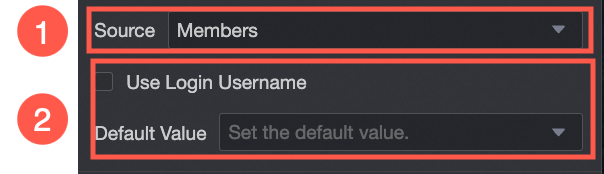
Set Source to organization members. |
① Source: organization members: Populates options with the names of users within the same organization. |
|
② Default value: Sets the default value for the control. If you select Use login username, the control automatically populates with the username of the currently logged-in account. |
Validation
|
Parameter |
Description |
|
|
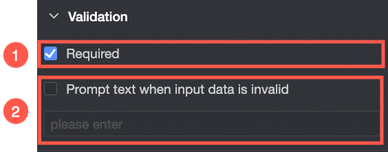
① Required: Makes this a required field. |
|
② Prompt text when input data is invalid: A custom error message displayed when a validation rule fails. For example, if Required is enabled and a user leaves the field empty, this message appears. |
Style
|
Parameter |
Description |
|
Desktop
|
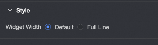
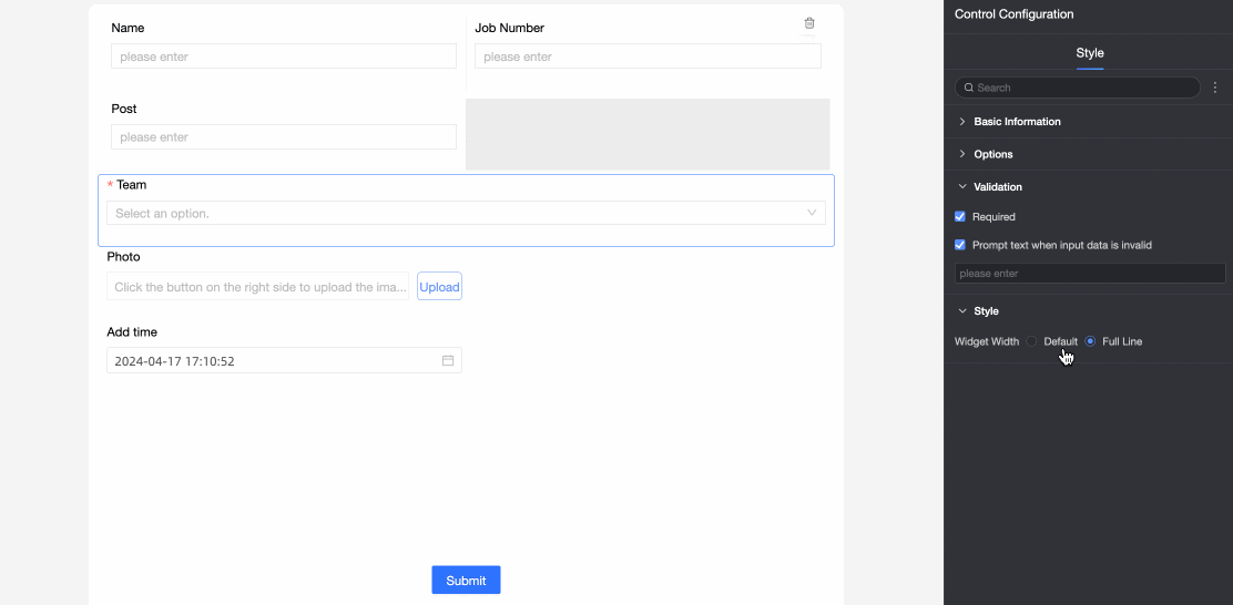
Control width: The width of the control. Options: Default and Full Row. Note
On the data entry page, you can also manually adjust the width by dragging the control's border.
|
|
Mobile
|
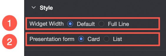
① Control width: Same as on desktop. |
|
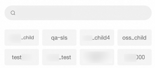
② Display format: The display format for the option list: card or list. Example of the card format:
Example of the list format:
|