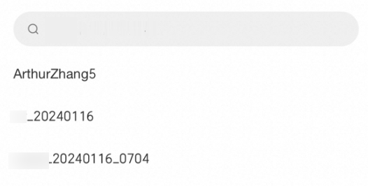
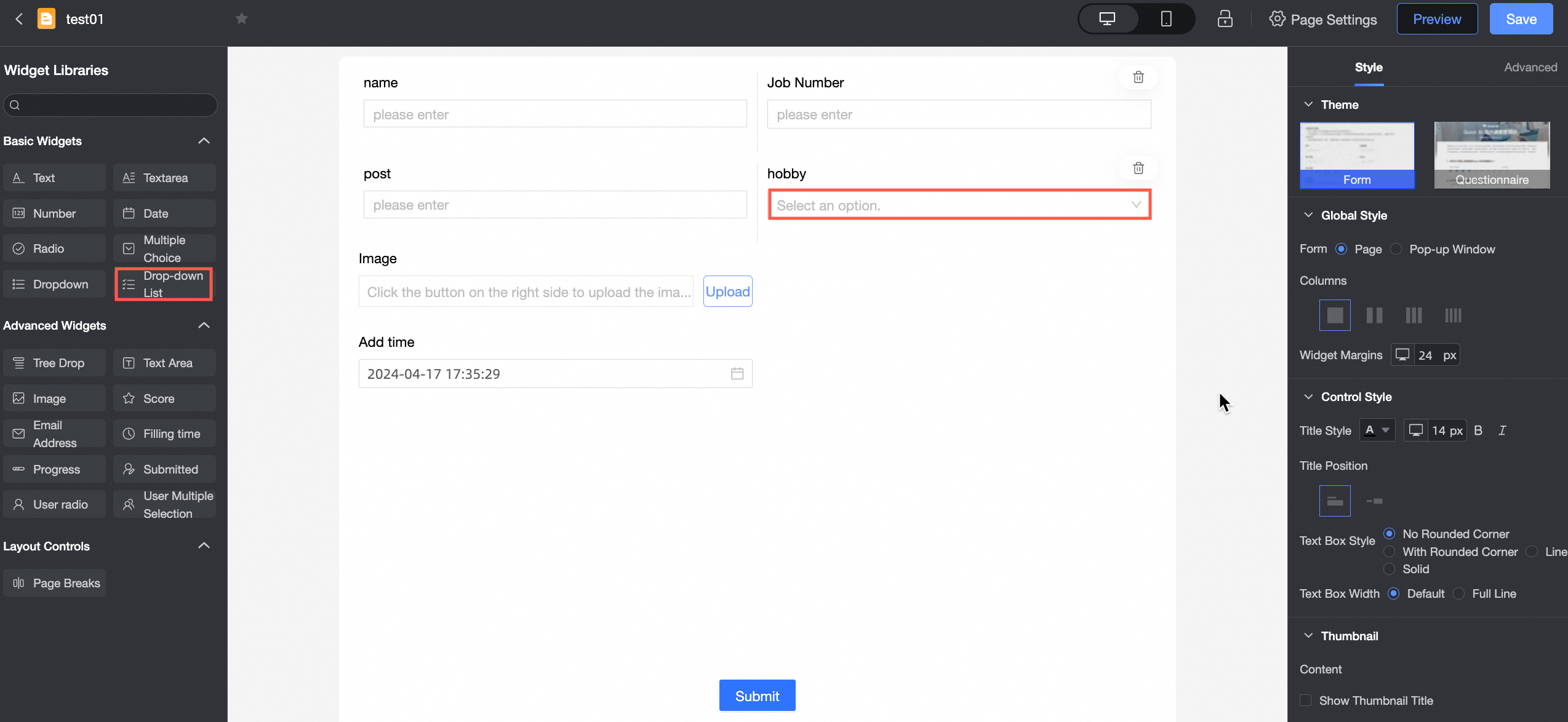
The multiple select control lets users select multiple items from a dropdown list. It is ideal for scenarios with many options that require multiple selections.
Use cases
This control is commonly used to select multiple items from a long list, such as product IDs.
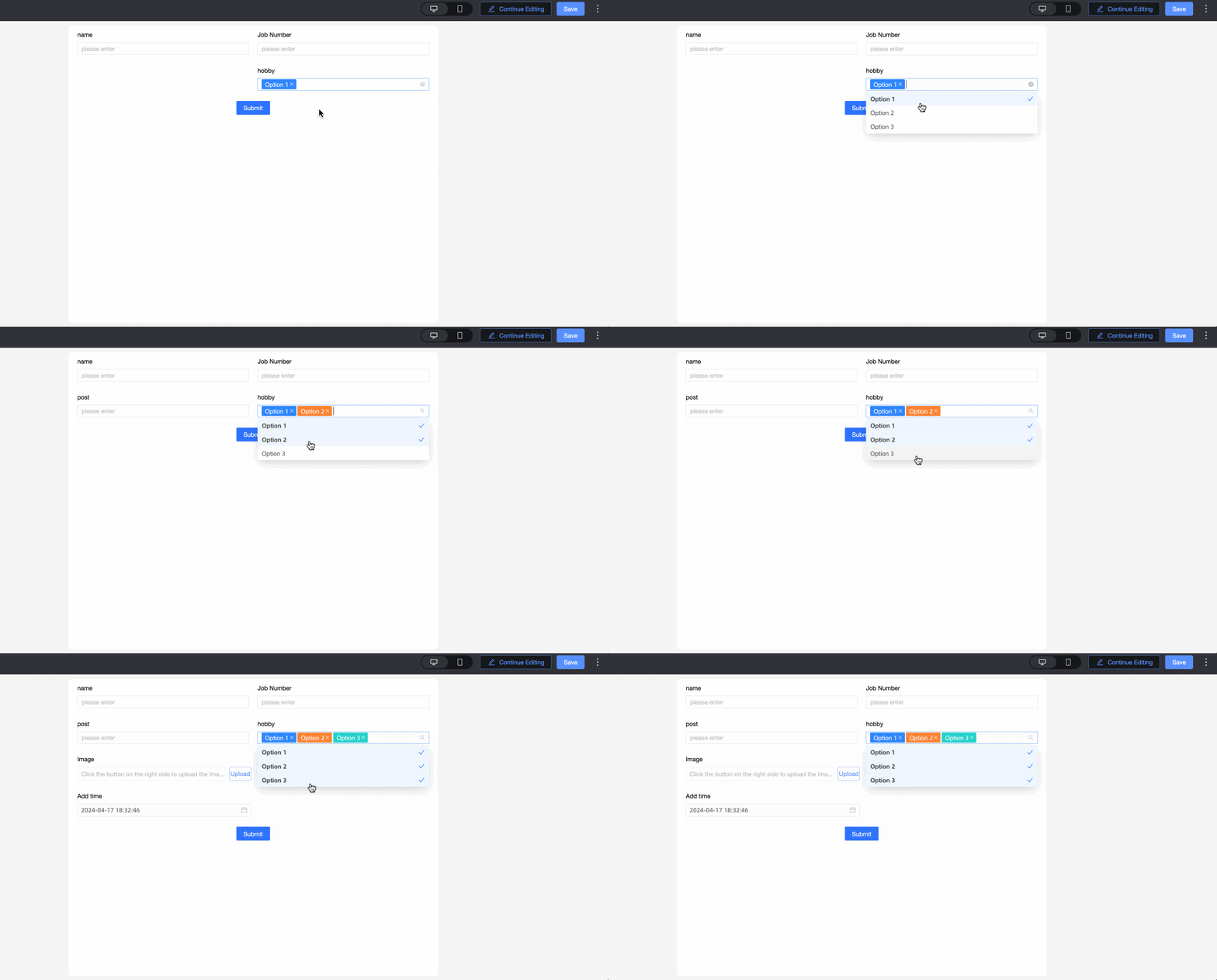
Preview

Control configuration
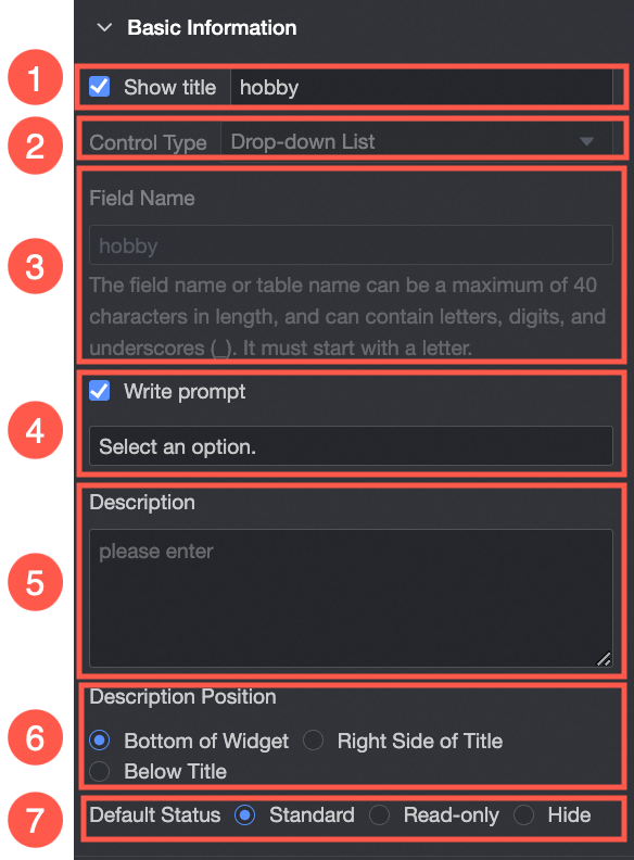
Basic settings
Parameter | Description |
| ① Display title: Specifies whether to show the title of the multiple select control. This customizable title is used as the column name for data entry. |
② Control type: Changes the control type. You can switch to other basic and advanced control types. | |
③ Field name: The name of the corresponding field in the data table generated from form submissions. Note A field name or table name must start with a letter and can contain only letters, numbers, and underscores (_). The maximum length is 40 characters. | |
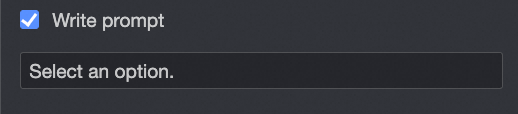
④ Placeholder: Sets the placeholder text that appears in the control before a user makes a selection. For example: Select customer type. | |
⑤ Description: Custom descriptive text for the control. | |
⑥ Description position: Sets the position of the description text. Options include Below the control, Right of the title, and Below the title. | |
⑦ Default state: Sets the default state of the control. Options include Normal, Read-only, and Hidden. |
Options
Source: You can populate the options from one of the following sources: Custom data, Data source, Dataset, or Organization members.
Parameter | Description |
When Source is Custom data.
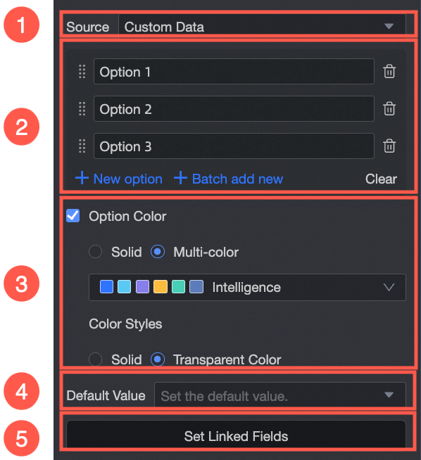
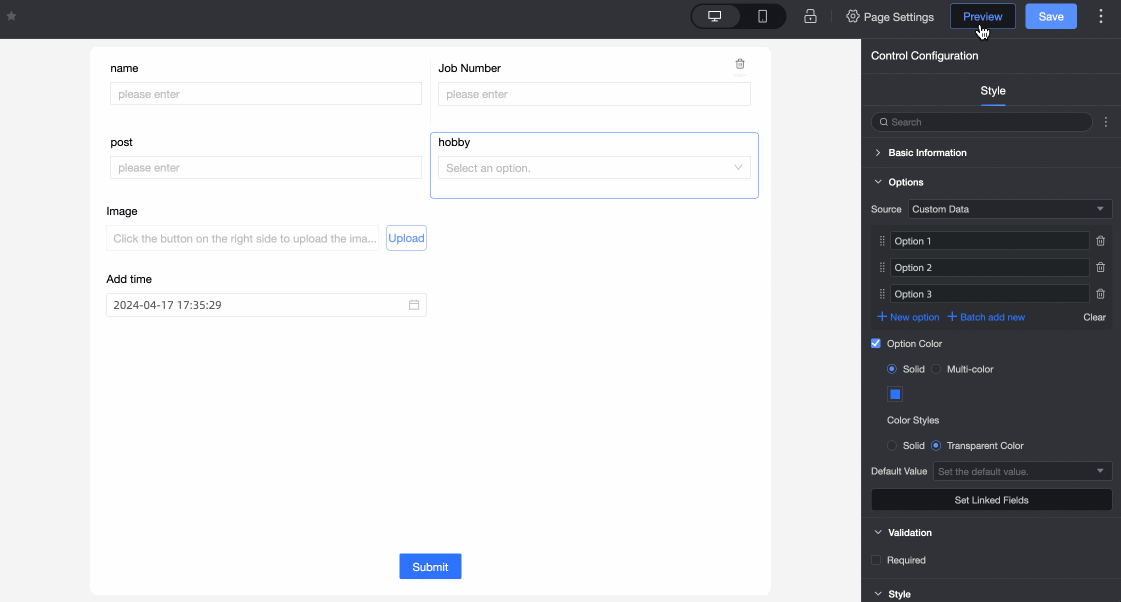
| ① Source: Custom data: Lets you manually define options by assigning a display name and an associated ID value to each. |
② Option display name: You can add options individually, add them in bulk, edit option names, and delete options. | |
③ Option color: Customize the color of the dropdown options. You can use a single color or multiple colors. Supported styles include Solid and Transparent.
| |
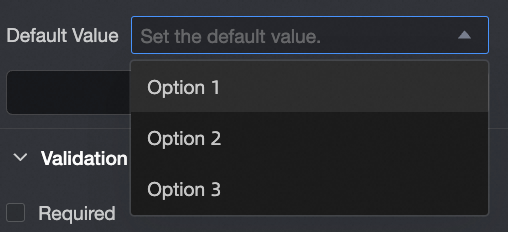
④ Default value: Select one or more default values from the list of options you configured.
| |
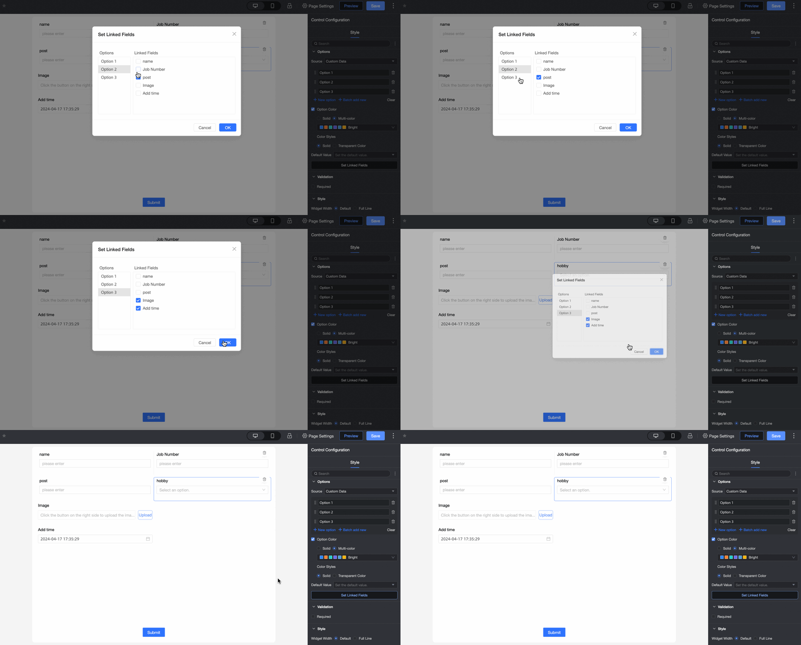
⑤ Cascading settings: You can configure cascading relationships between two or more single-select, single-select dropdown, or multiple select controls on the same form. Note You can only cascade to a control that appears later in the form.
| |
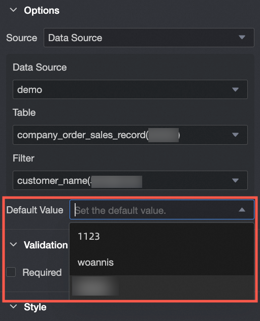
When Source is Data source.
| ① Source: Data source: When you select Data source, you can populate the options from a data table within that source. |
② Data source: Select a data source from the current workspace. | |
③ Data table: Select a data table from the chosen data source. | |
④ Data field: Select a data field from the chosen data table to populate the options. | |
⑤ Default value: Select one or more default values from the options provided by the selected data field.
| |
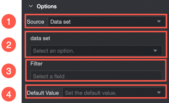
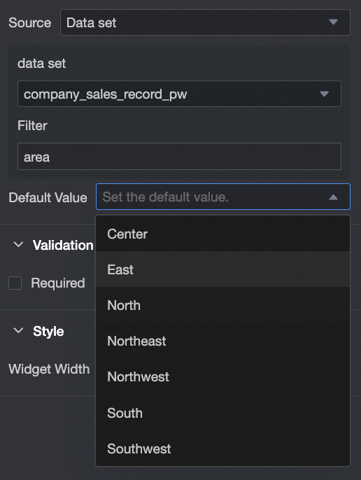
When Source is Dataset.
| ① Source: Dataset: When you select Dataset, you can populate the options from a data field within that dataset. |
② Dataset: Select a dataset from the current workspace. | |
③ Data field: Select a data field from the chosen dataset to populate the options. | |
④ Default value: Select one or more default values from the options provided by the selected data field. | |
When Source is Organization members.
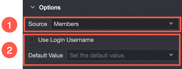
| ① Source: Organization members: When you select Organization members, the options are filled with the names of users in your organization. |
② Default value: Sets the default value for the control. If you select Use current user's name, the field is automatically filled with the username of the logged-in user. |

Validation
Parameter | Description |
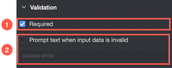
| ① Required: If selected, this control becomes a required field. |
② Custom validation message: This message is displayed when a validation rule fails. For example, if the control is marked as Required and left empty, this custom message appears. |
Style
Parameter | Description |
PC
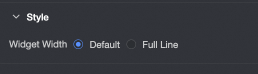
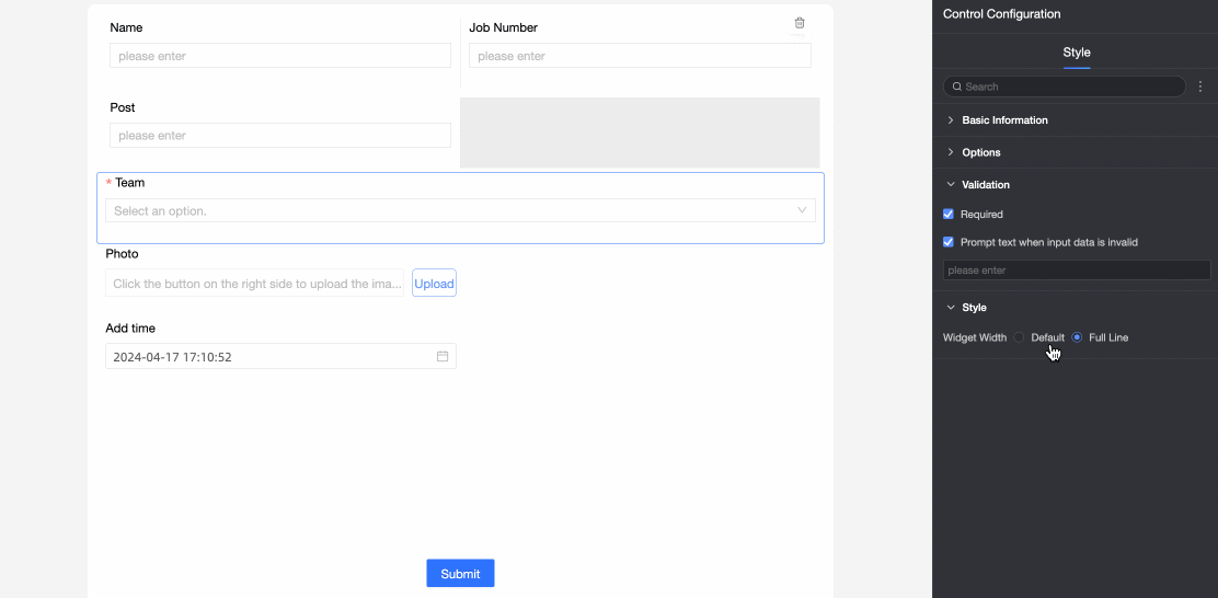
| Control width: Supports two width types: Default and Full width. Note On the form page, you can also manually adjust the control's width by dragging its border.
|
Mobile
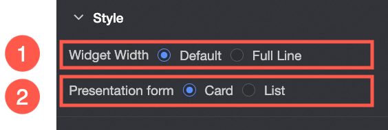
| ① Control width: This setting functions the same as it does on a PC. |
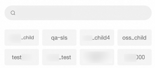
② Display style: The option list supports two display styles: Card and List. Example of the Card display style:
Example of the List display style:
|