A basic control for capturing short, single-line entries such as names, mobile phone numbers, or ID numbers in a form.
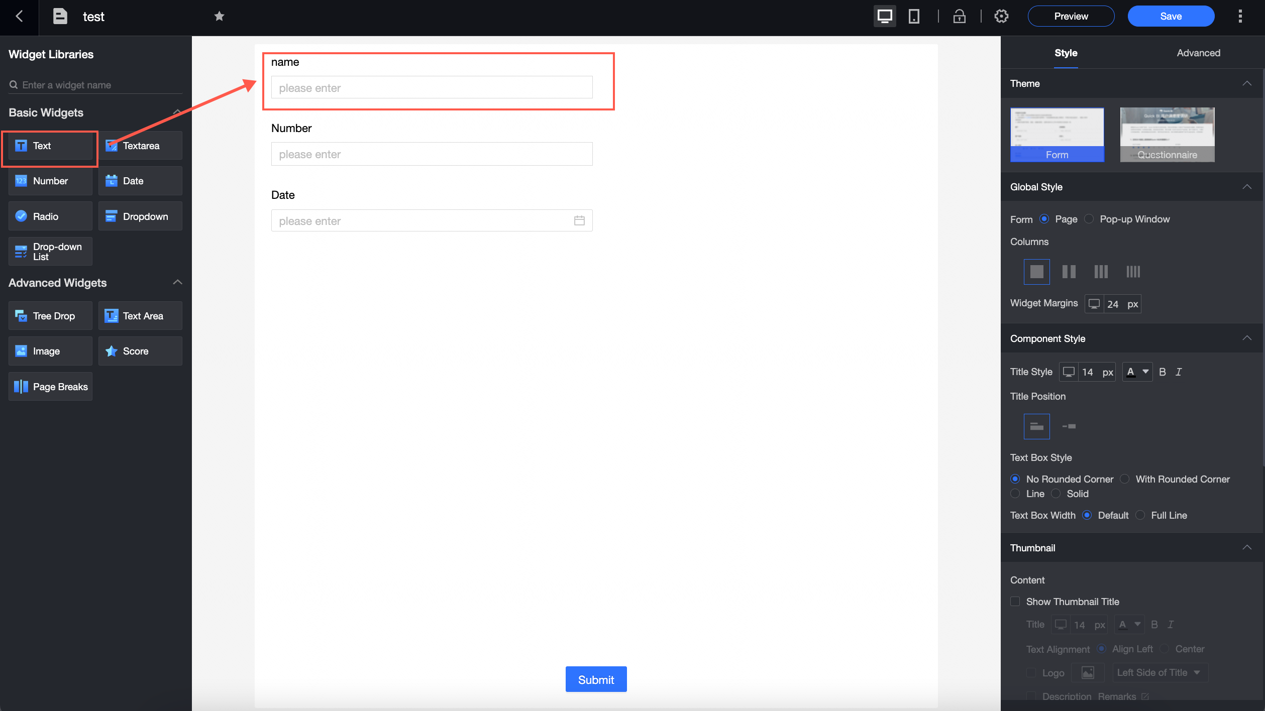
Use cases
-
Add brief, single-line text such as names, job titles, or company names.
-
Add fixed-format data such as mobile phone numbers or national ID numbers.
Example
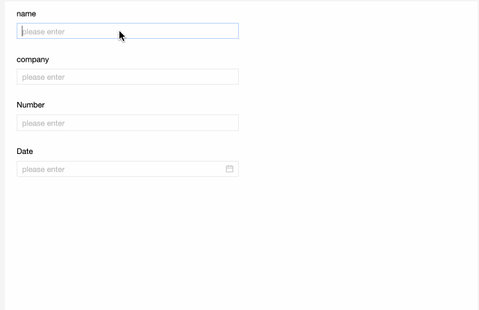
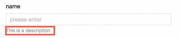
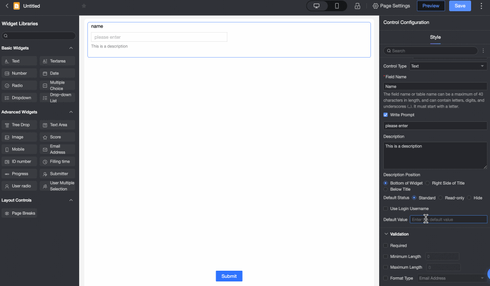
In this example, the single-line text controls Associated Opportunity and Person in Charge are filled with "xxx" and "John Smith," respectively.
Control configuration
Basic settings
|
Parameter |
Description |
|
|
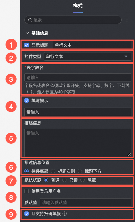
① Display title: Specifies whether to show the control title. You can customize the display name, which serves as the field label. |
|
② Control type: Changes the control to another type. Select a |
|
|
③ Table field name: The corresponding field name in the database table generated from this Note
The |
|
|
④ Input prompt: Sets the
|
|
|
⑤ Description: Adds a custom |
|
|
⑥ Description position: Controls where the
|
|
|
⑦ Default state: The initial state of the control. Options: Normal, |
|
|
⑧ Default value: Pre-fills the control with a
|
|
|
⑨ Enable code scanning for input: When enabled, users on a |

Validation
|
Parameter |
Description |
|
|
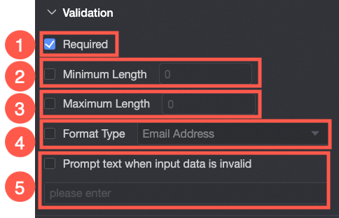
① Required: Marks this as a |
|
② Minimum character count: Sets the |
|
|
③ Maximum character count: Sets the |
|
|
④ Format type: Validates input against a specific format. Options: Email, ID Card Number, and Mobile Phone Number. |
|
|
⑤ Prompt for invalid data: Customizes the error message displayed when input fails validation. |
Style
|
Parameter |
Description |
|
|
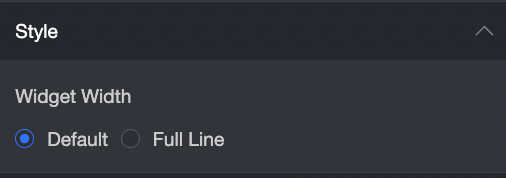
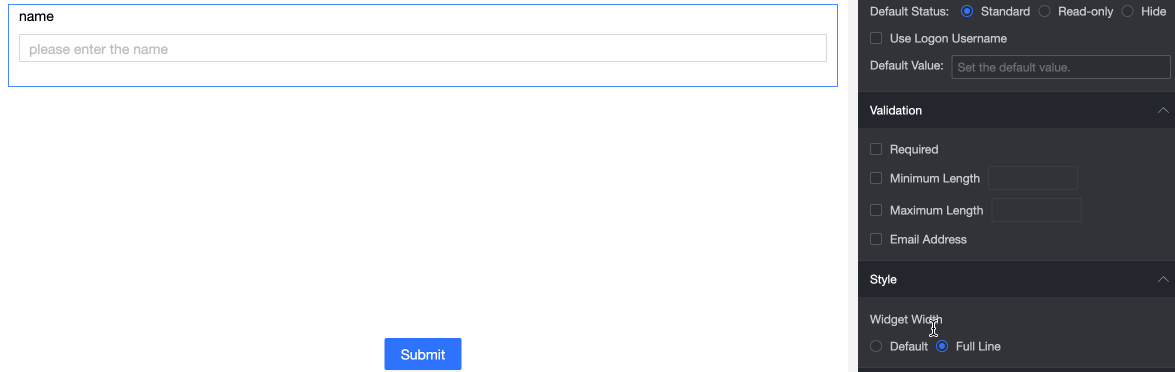
Control width: Sets the control width. Options: Note
On the
|