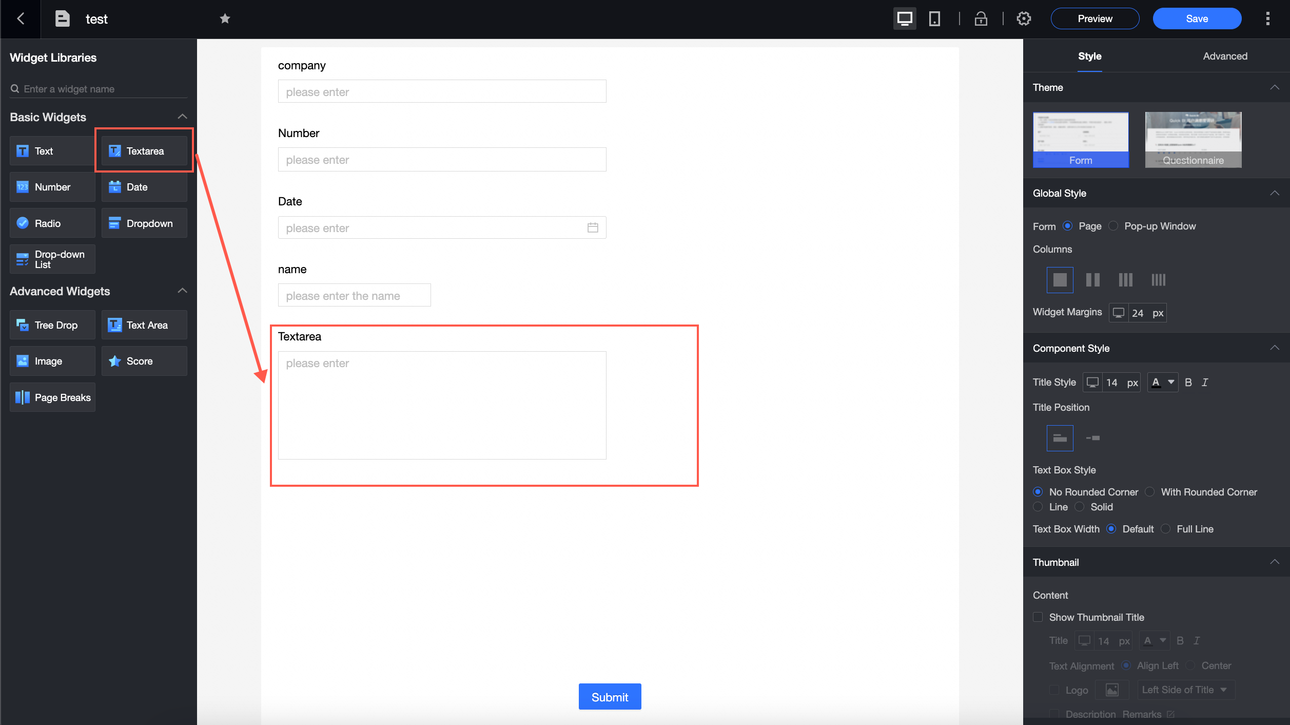
A basic form control for capturing complex or multi-line text input such as addresses and remarks.
Use cases
-
For entering complex or lengthy information, such as detailed addresses and remarks.
Preview
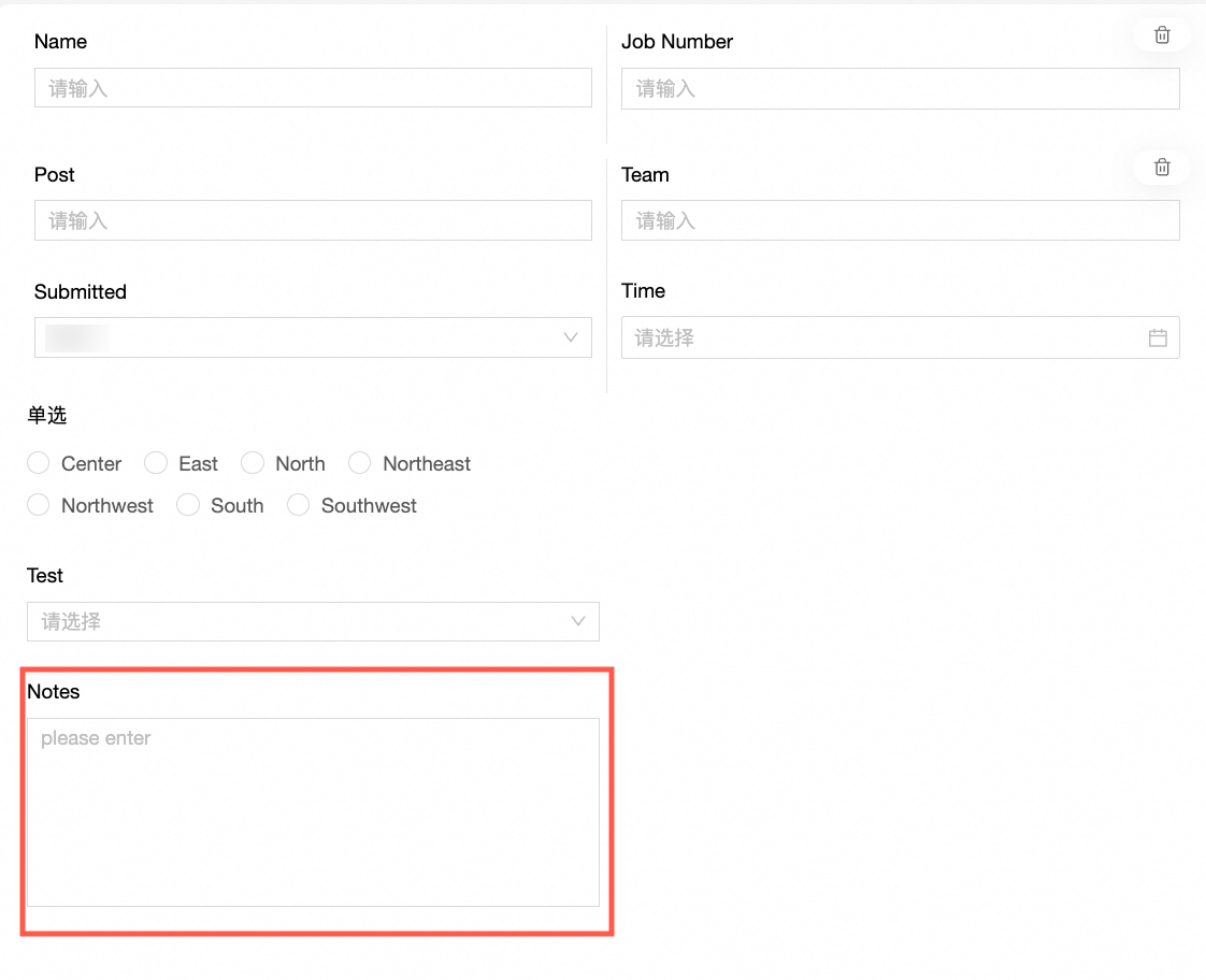
In this example, multiple lines of text are entered into the remarks control.
Control configuration
Basic settings
|
Parameter |
Description |
|
|
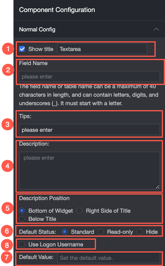
① Display title: Toggles the display of the control title. The title also serves as the column name for data entry. |
|
② Control type: Switches the control to another type. The drop-down list includes basic control and advanced control types. |
|
|
③ Field name: The corresponding field name in the database table created from the form. Note
A field name or table name must start with a letter and can only contain letters, digits, and underscores (_). The maximum length is 40 characters. |
|
|
④ Placeholder: The hint text displayed in the control before a user enters a value. For example: "Enter remarks here."
|
|
|
⑤ Description: Custom description text for the control. |
|
|
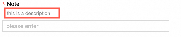
⑥ Description position: Specifies where the description text appears. Options: bottom of the control, right of the title, and below the title. The following example shows it below the title:
|
|
|
⑦ Default state: Sets the initial state of the control. Options: normal, read-only, and hidden. |
|
|
⑧ Default value: Sets the default value for the control. If you select Use logged-in username, the system automatically populates the control with the current user's login name. |

Validation
|
Parameter |
Description |
|
|
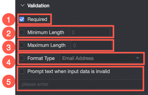
① Required: If selected, this control becomes a required field. |
|
② Minimum characters: When enabled, sets the minimum number of characters required. |
|
|
③ Maximum characters: When enabled, sets the maximum number of characters allowed. |
|
|
④ Format type: Sets a format type for input validation. Options: email address, ID card number, and mobile phone number. |
|
|
⑤ Invalid input message: A custom error message displayed when the entered data is invalid. |
Style
|
Parameter |
Description |
|
|
Control width: Sets the width of the control. Options: default and full width. Note
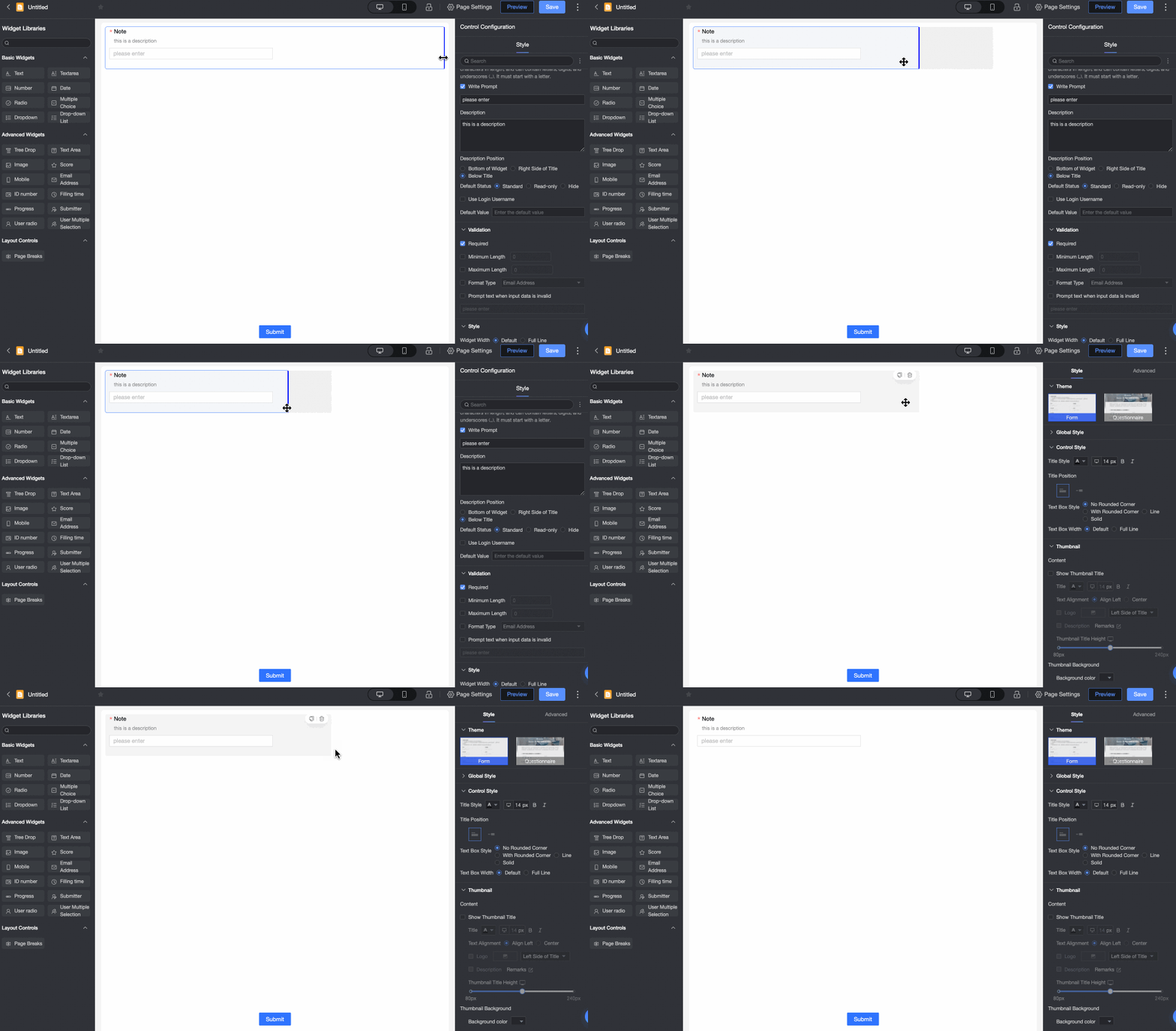
On the form, you can also adjust the width by dragging the control's border.
|