By adding a tab control to your dashboard, you can display multiple charts in separate tabs. This helps you:
-
Optimize layout: Consolidate more information within a single view to avoid long or crowded pages.
-
Improve organization: Group related charts and widgets under the same tab to create a clearer information structure.
-
Guide analysis: Arrange tabs in a specific order to guide users through a step-by-step data exploration process.
Create and configure a tab control to organize your dashboard layout.
Use cases
Use a tab control to organize dashboard content by logical categories, analytical themes, or business process steps. Users click tabs to view the relevant content. For example, in a sales dashboard, you can create tabs such as Sales Overview, Regional Performance, and Product Analysis, each containing its own charts and data.
Limitations
-
Prerequisites: You have created a dashboard. For more information, see Create a dashboard and Visualization Chart Overview.
-
When using a tab control, note the following:
-
Content in each tab is independent. By default, a filter affects only the charts within its own tab, not the content of other tabs.
-
To use the sticky filters within tab feature, you must first enable sticky tab title.
-
Procedure
In dashboard edit mode, follow these steps to add and configure a tab control.
-
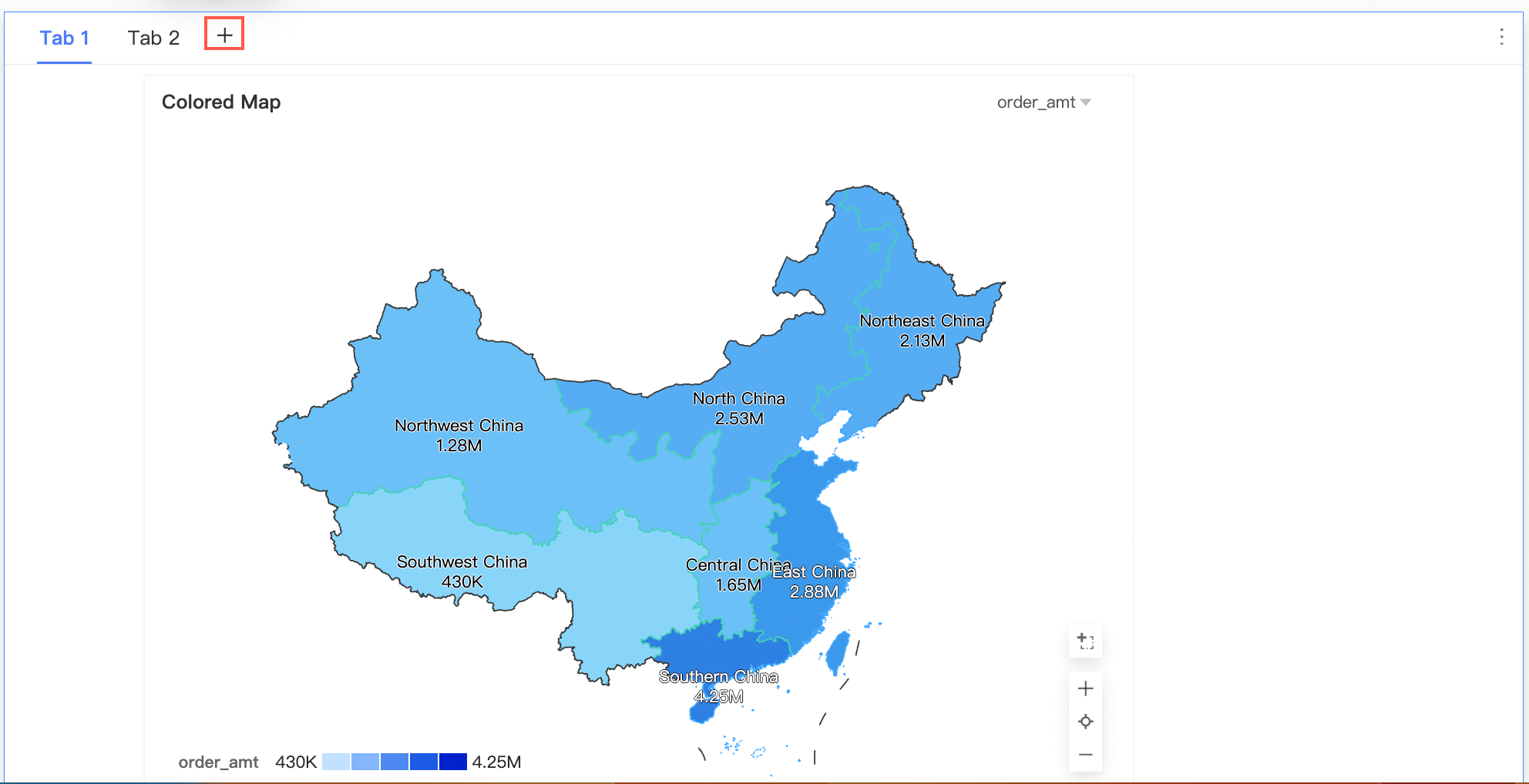
Add a tab control: In the top menu bar, click the
 icon to add a tab control.
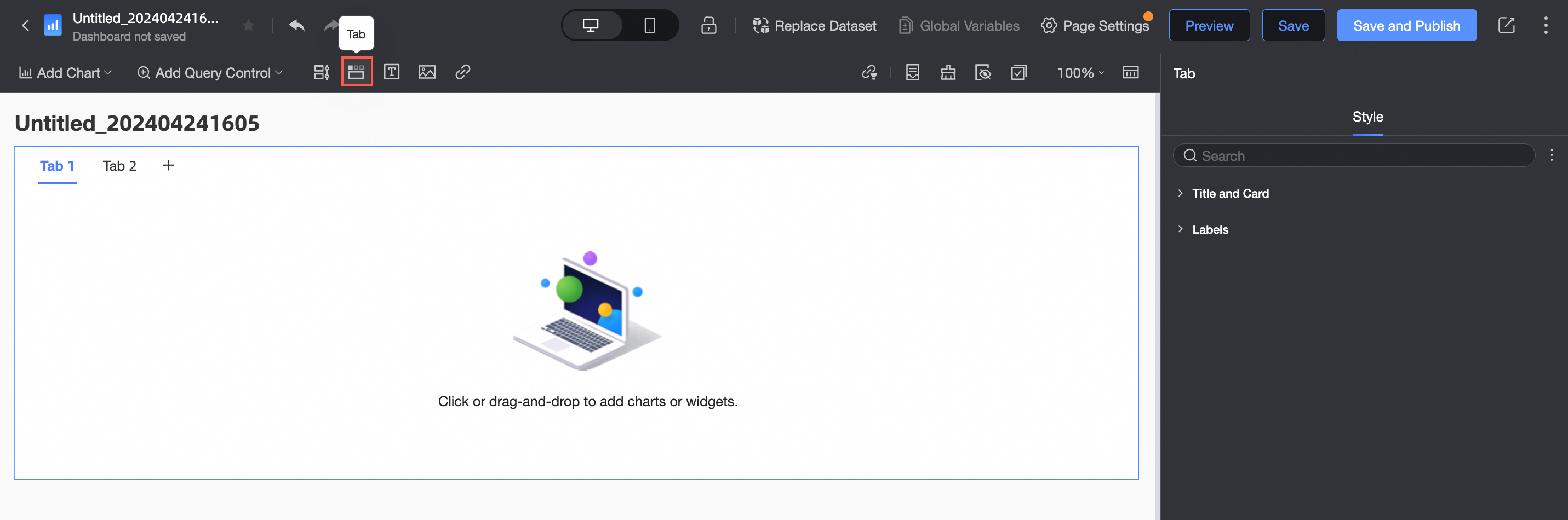
-
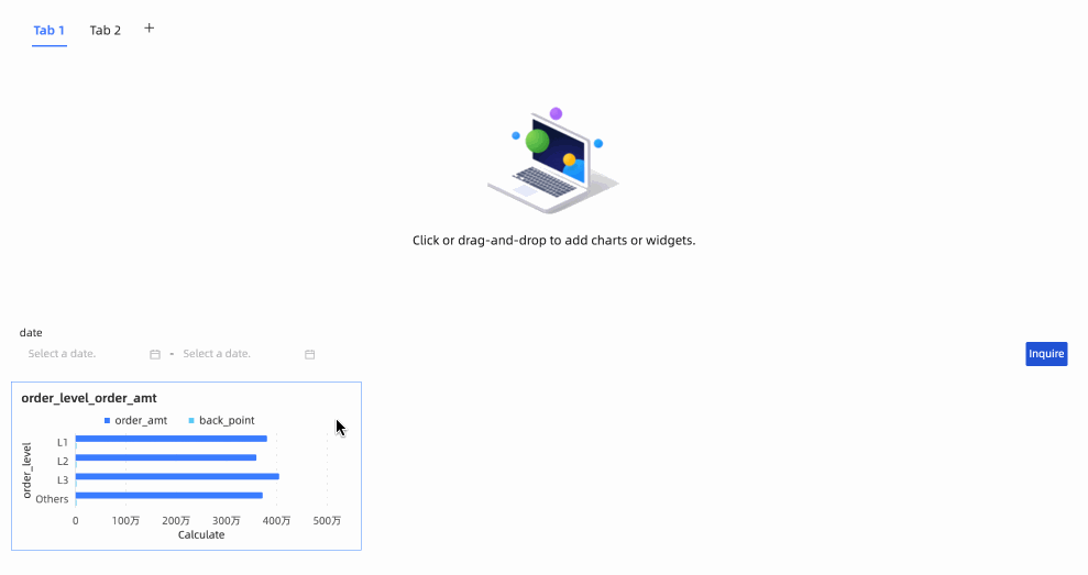
Add content to a tab: Drag existing charts, filters, or other widgets from the dashboard canvas and drop them into the selected tab. You can also drag widgets out of a tab.
-
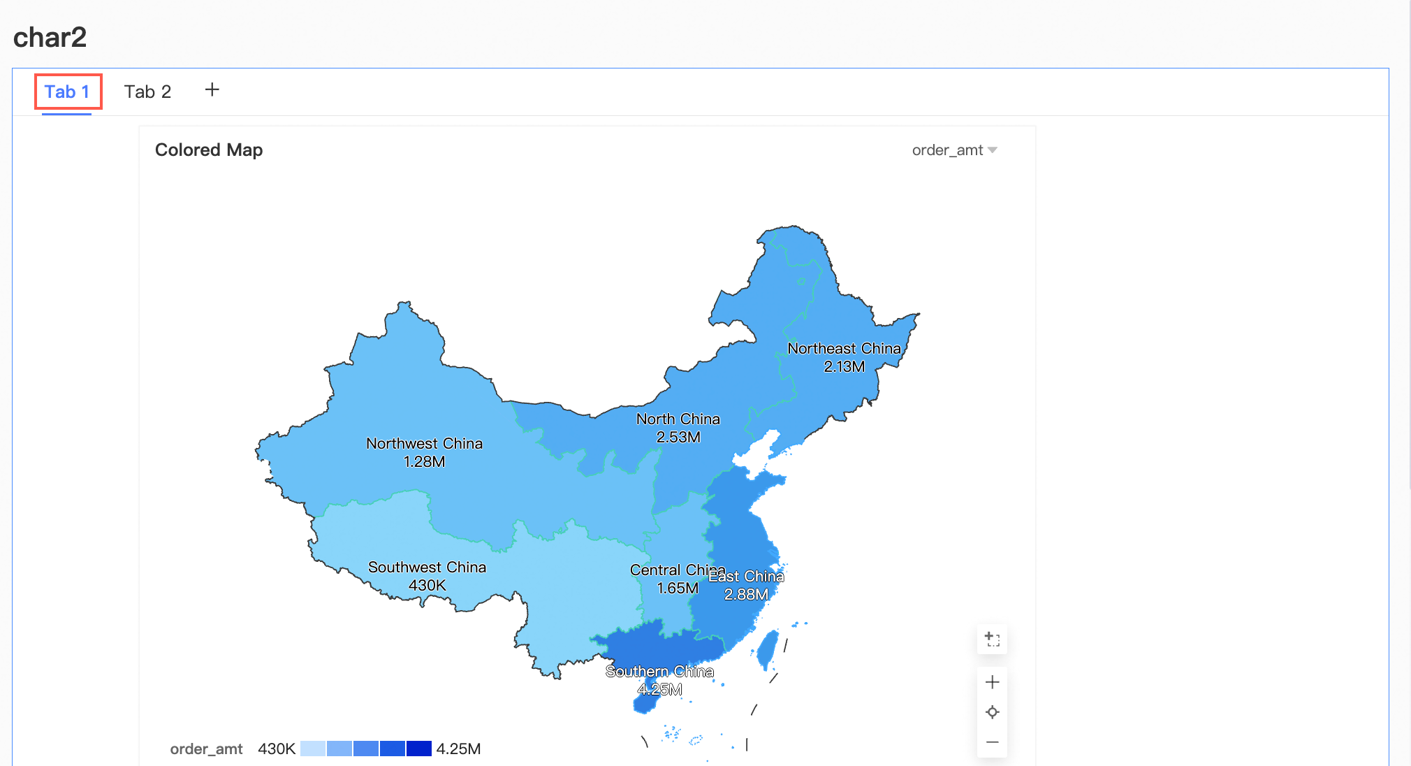
Edit tabs: You can perform the following operations on tabs.
Action
Description
Rename a tab
On the canvas, click a tab title and enter a new name.
Add a tab
Click the
 icon to add a new blank tab.
Reorder tabs
Hover over a tab. When the
icon appears on the left, drag the tab to a new position.Copy a tab
Hover over a tab, click the
icon on the right, and select Copy.Delete a tab
Hover over a tab, click the
icon on the right, and select Delete. -
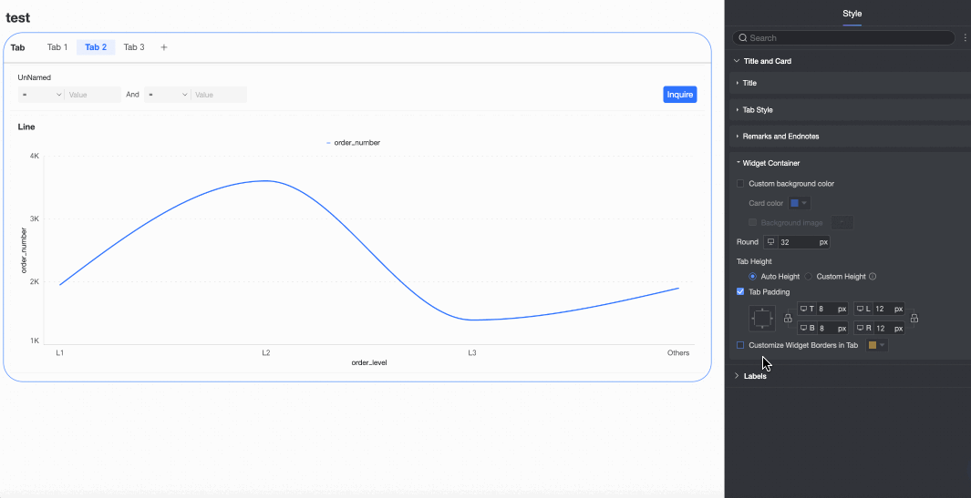
Configure the tab control style: In the style panel on the right, adjust the following settings.
-
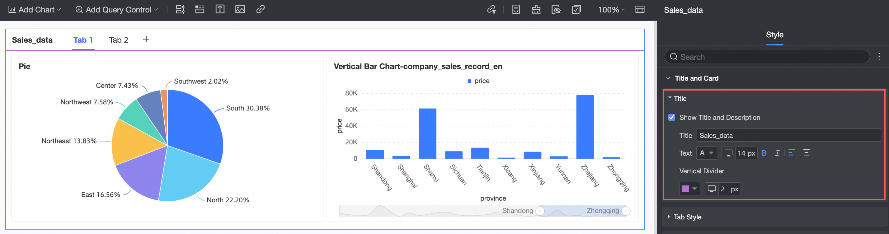
In the Title and card section, configure the Title, tab style, remark, and Footnote settings.
Property
Description
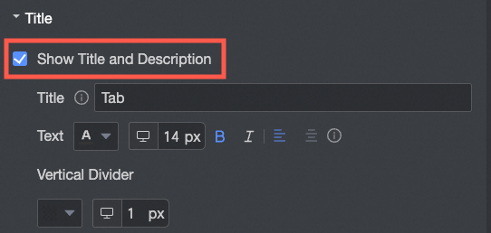
Title
Specify whether to Show Main Title, and configure the title content, text style, and divider.
NoteThe title can be up to 100 characters long.
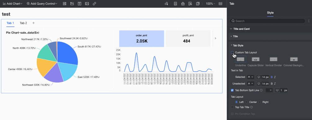
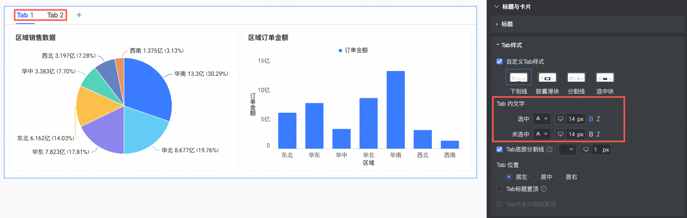
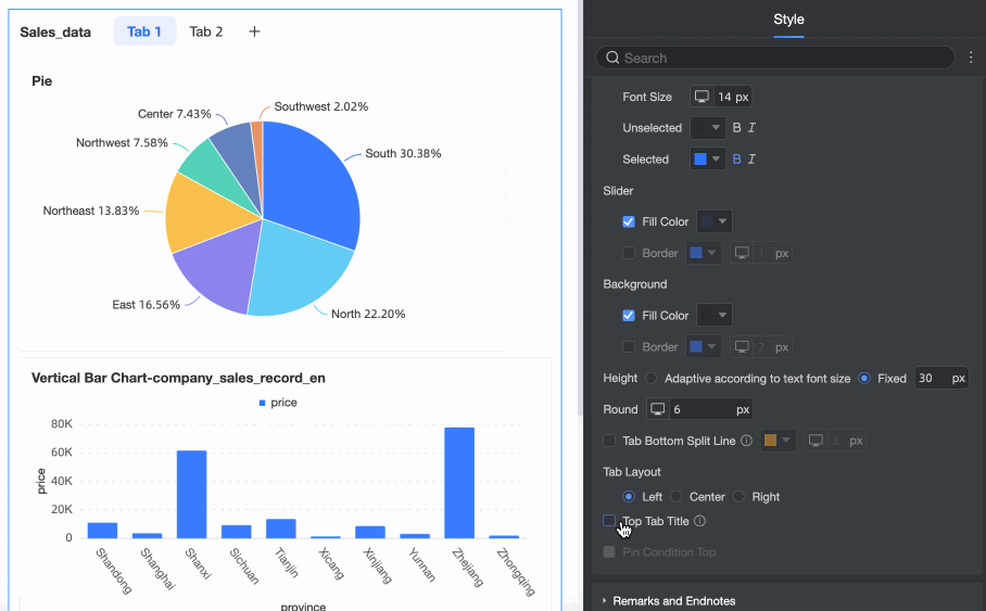
Tab style
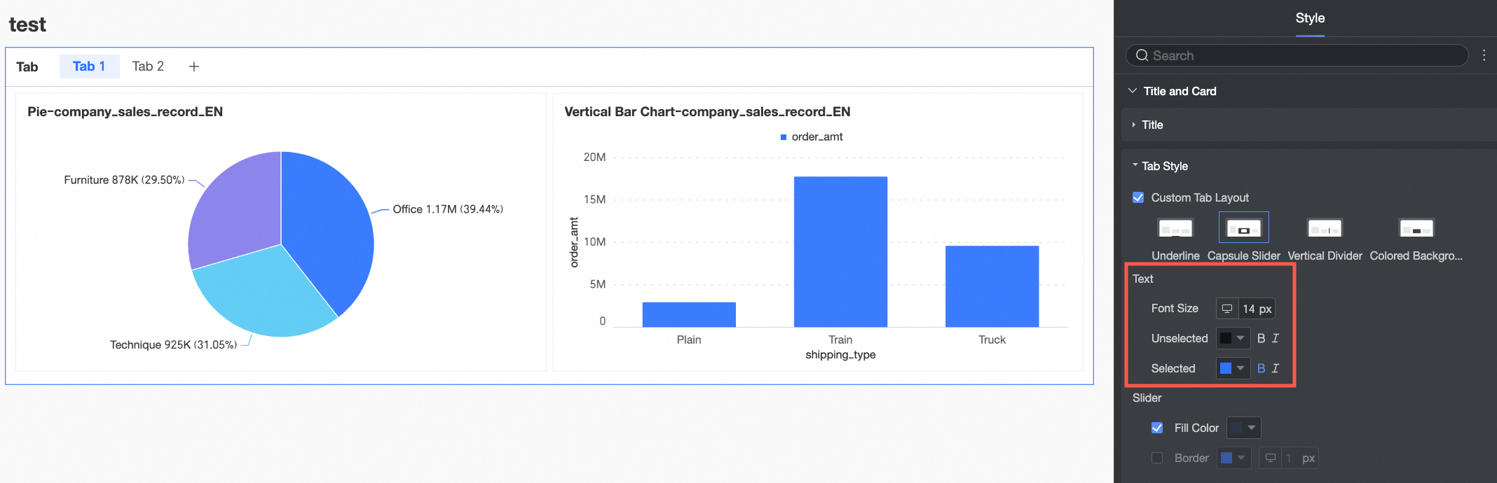
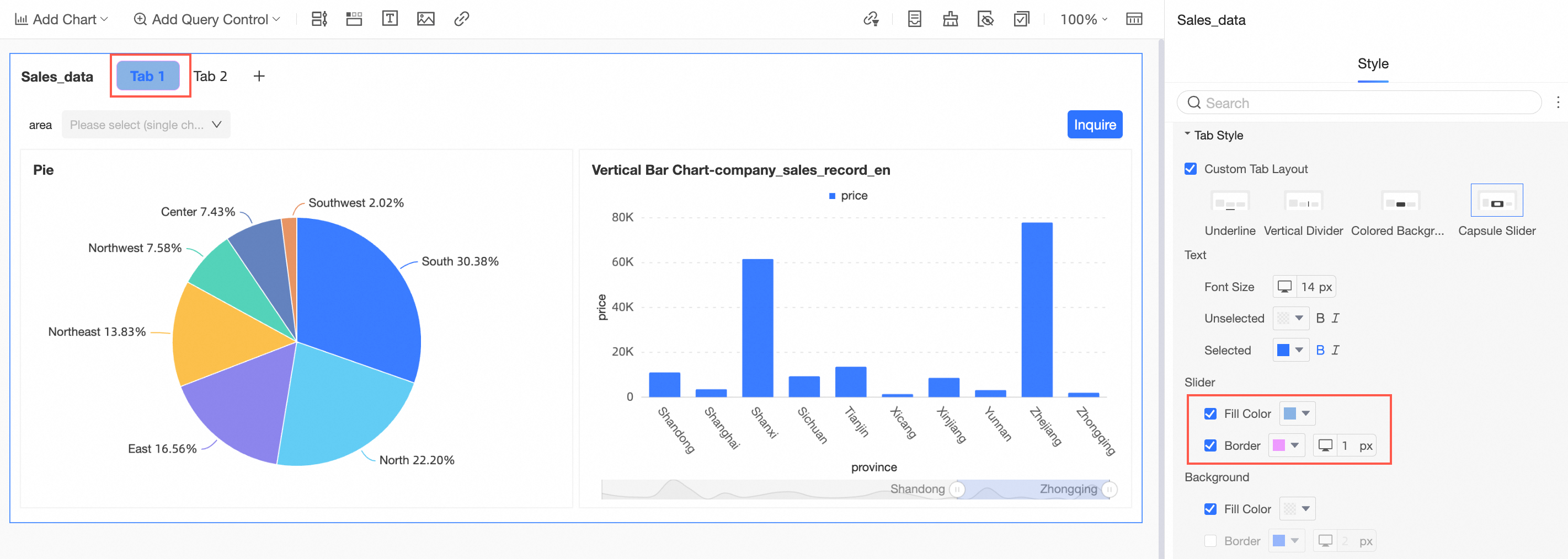
Custom tab style
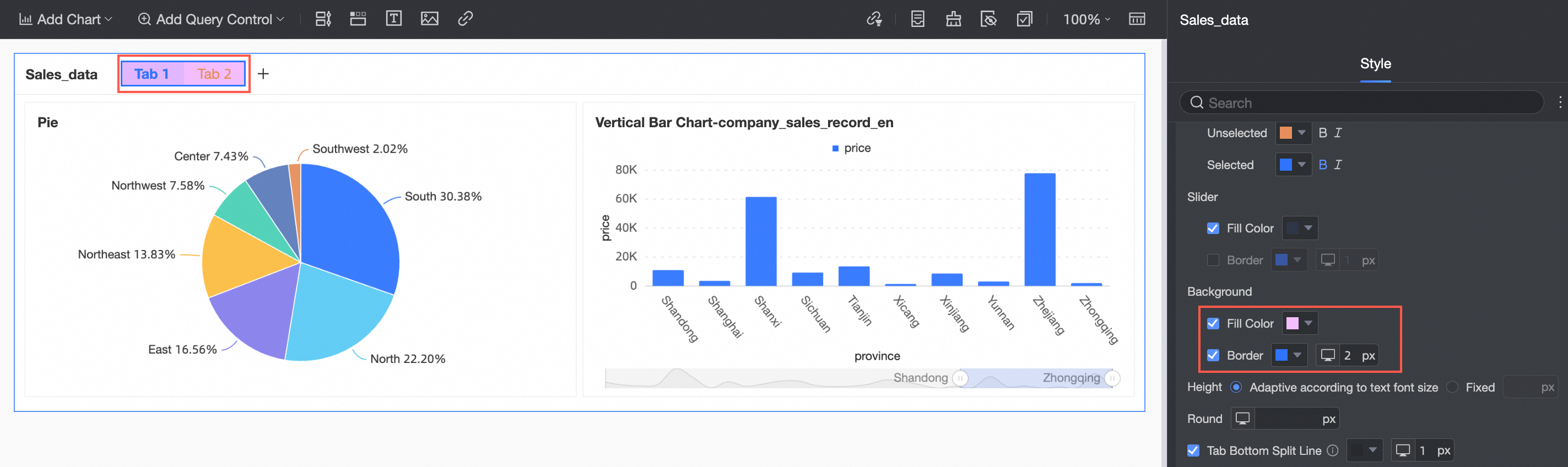
Set the Custom tab style to Underline, Vertical Divider, Colored Background, or capsule slider.
Tab text
When Custom tab style is set to Underline, Vertical Divider, or Colored Background, you can configure the selected font style and unselected font style.
Text
When Custom tab style is set to capsule slider, you can configure the text font size and the font styles for unselected and selected text.
Slider
When Custom tab style is set to capsule slider, you can configure the slider's fill and border colors.
Background
When Custom tab style is set to capsule slider, you can configure the background's fill and border colors.
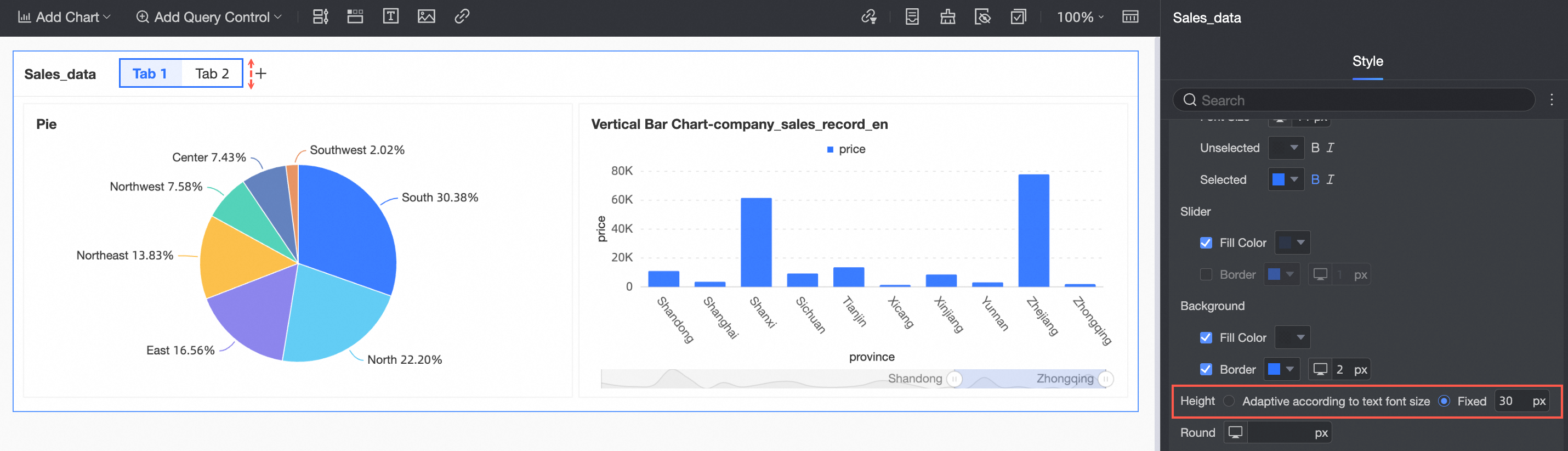
Height
When Custom tab style is set to capsule slider, you can set the tab height to adapt automatically to the font size or to a fixed value.
Border radius
When Custom tab style is set to capsule slider, you can configure the border radius of the tab.
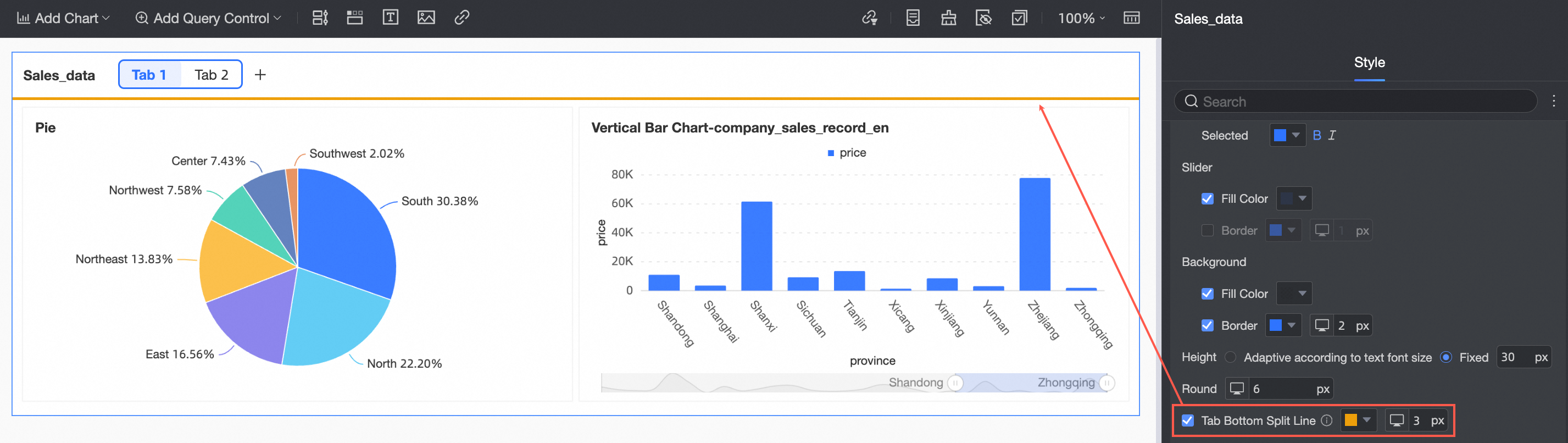
Tab bottom divider
Adds a divider line at the bottom of the tabs.
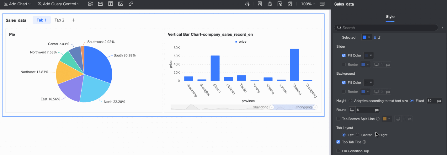
Tab position
Aligns the tabs to the Left, Center, or Right.
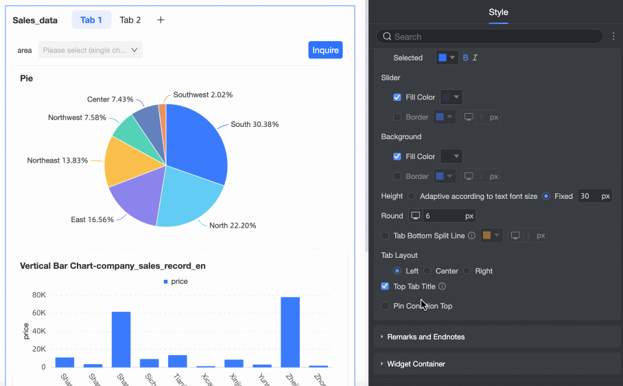
Sticky tab title
Enables the sticky tab title feature.
When enabled, the title area sticks to the top of the screen as you scroll.
Sticky filters within tab
Keeps filters within a tab fixed at the top.
NoteThis option is available only if sticky tab title is enabled.
Remark and footnote
Remark
Choose whether to display a remark next to the tab title, and specify its content.
NoteIn Title > style, select Show Main Title. Otherwise, the remark does not appear.
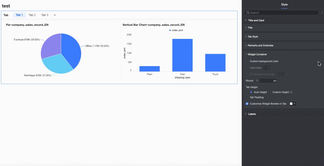
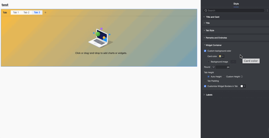
Widget container
Custom background fill
Set the background fill color and image style for the tab widget container.
-
Card color: Supports solid and gradient colors.
-
Background image: Supports using system assets or custom images.
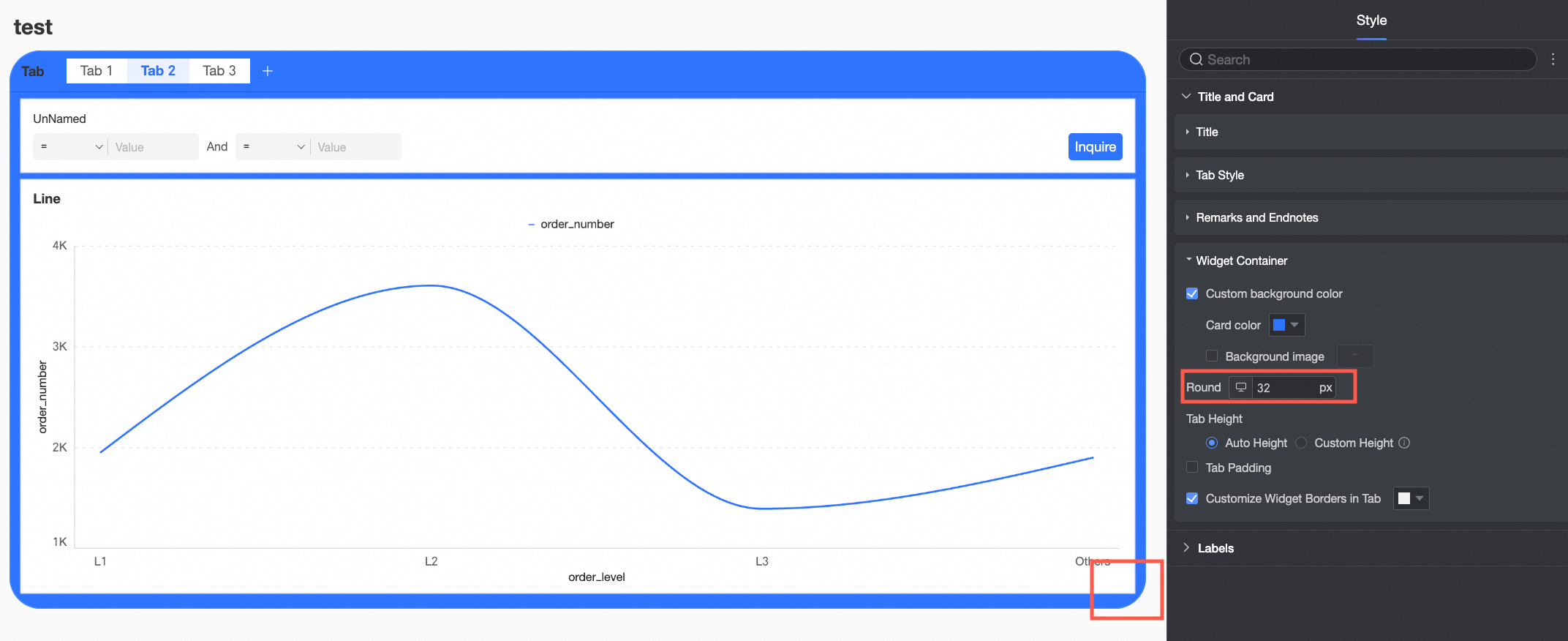
Border radius
Set the border radius for the tab widget container.
Tab height
Set the height of the tab widget container in one of the following ways.
-
auto height: The widget height adjusts automatically based on the dashboard layout.
-
Manual: The widget height is fixed and can be adjusted by dragging.
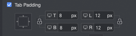
Custom tab padding
Sets the padding between the content and the border of the widget container.
Custom border for widgets in tab
Sets the border color for charts within the tab.
-
-
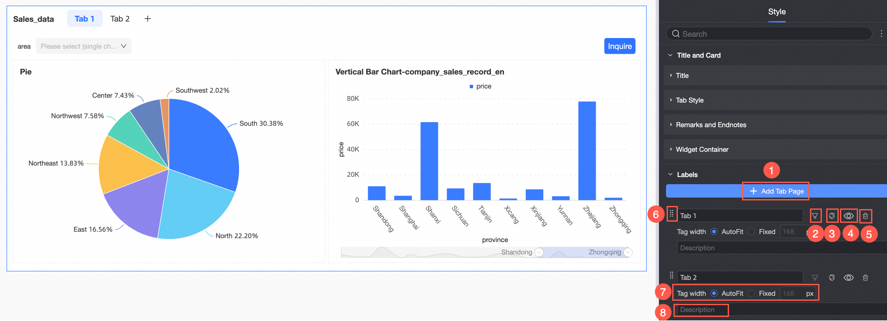
In the Labels section, configure the tabs.
-
Add a new tab (①): Adds a new tab.
-
Insert filters (②): Click the
icon to open the filter settings dialog for the tab. For details, see Create a filter within a tab. -
Copy (③): Click the
icon to copy the current tab. -
Hide (④): Click the
icon to hide the current tab. -
Delete (⑤): Click the
icon to delete the current tab page. -
Reorder tabs (⑥): Drag the
icon to change the tab order. -
Tab width (⑦): Set the tab width to auto or fixed.
-
Remark (⑧): Add a remark for the tab.
-
-
-
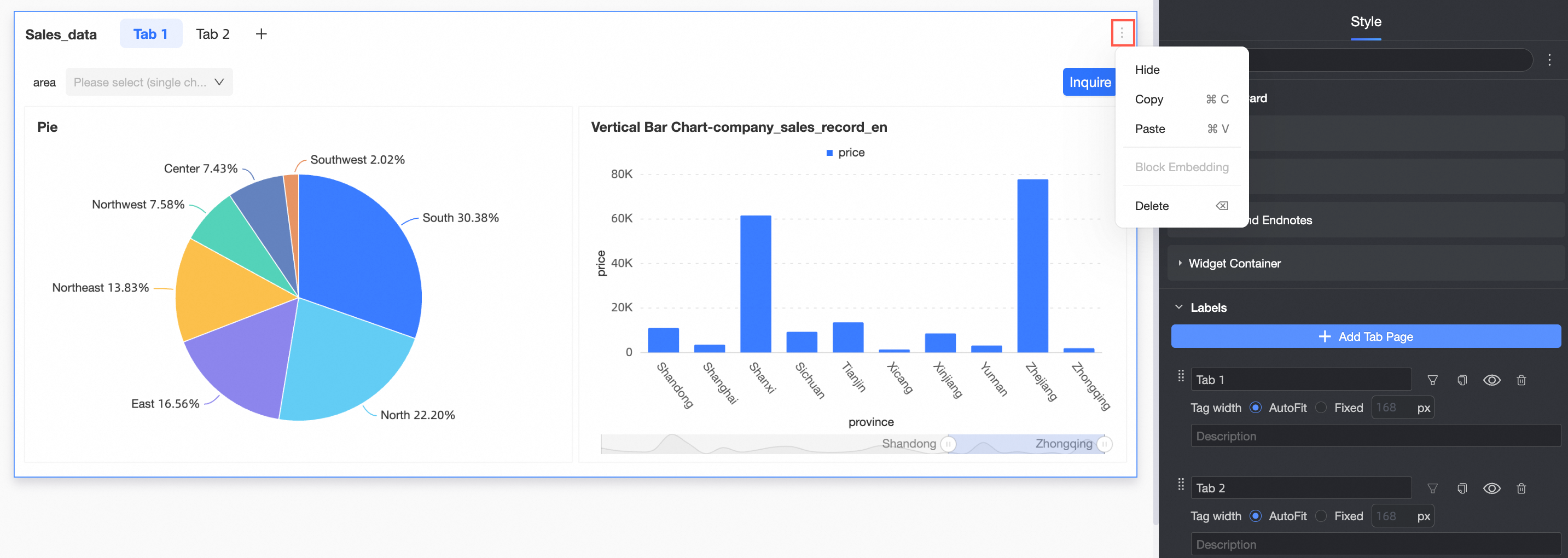
To manage the tab control, click the
icon in the upper-right corner to perform operations such as copying and pasting.Shortcuts differ depending on the operating system.
Function
Shortcut key (Windows)
Shortcut key (macOS)
Copy
Ctrl+C
Command (⌘)+C
Paste
Ctrl+V
Command (⌘)+V
Delete
Backspace (←), Delete
Delete (⌫)
 icon appears on the left, drag the tab to a new position.
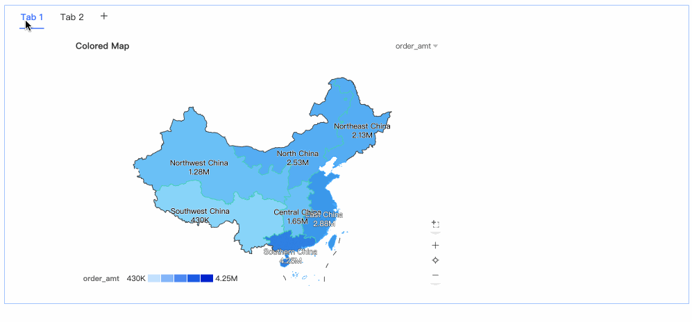
 icon on the right, and select Copy.
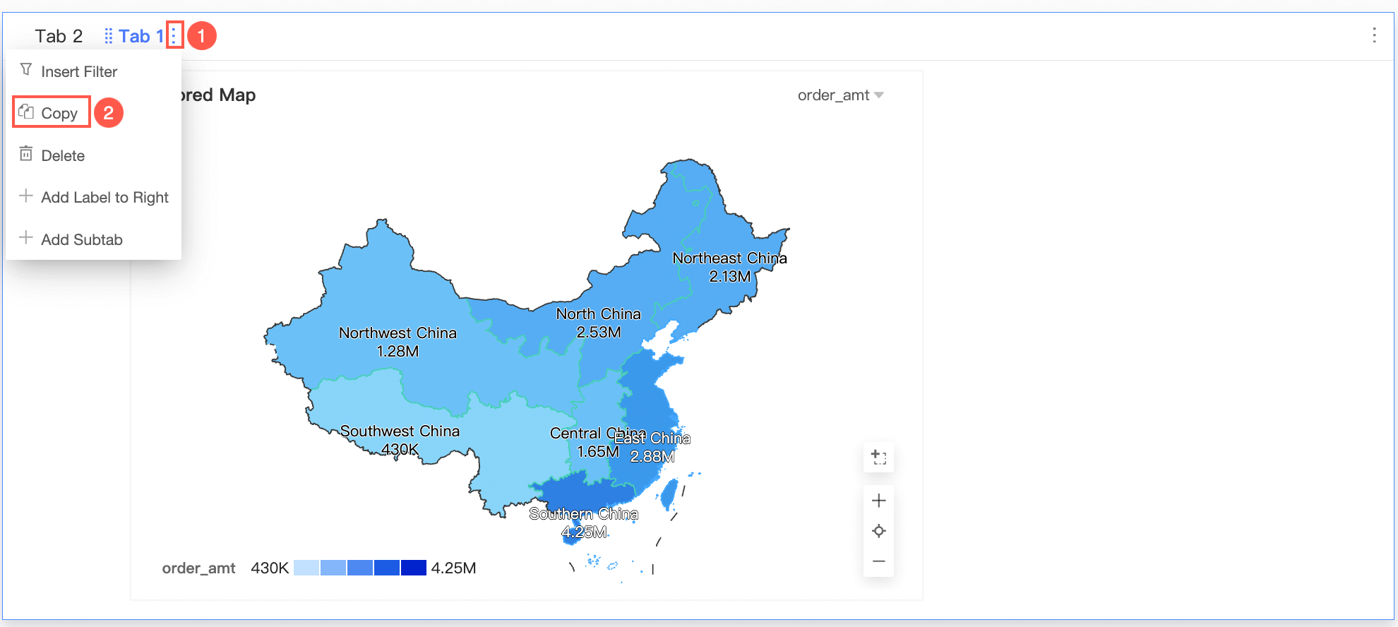


 icon to open the filter settings dialog for the tab. For details, see
  icon to copy the current tab.
 icon to hide the current tab.
 icon to delete the current tab page.
 icon to change the tab order.
 icon in the upper-right corner to perform operations such as copying and pasting.