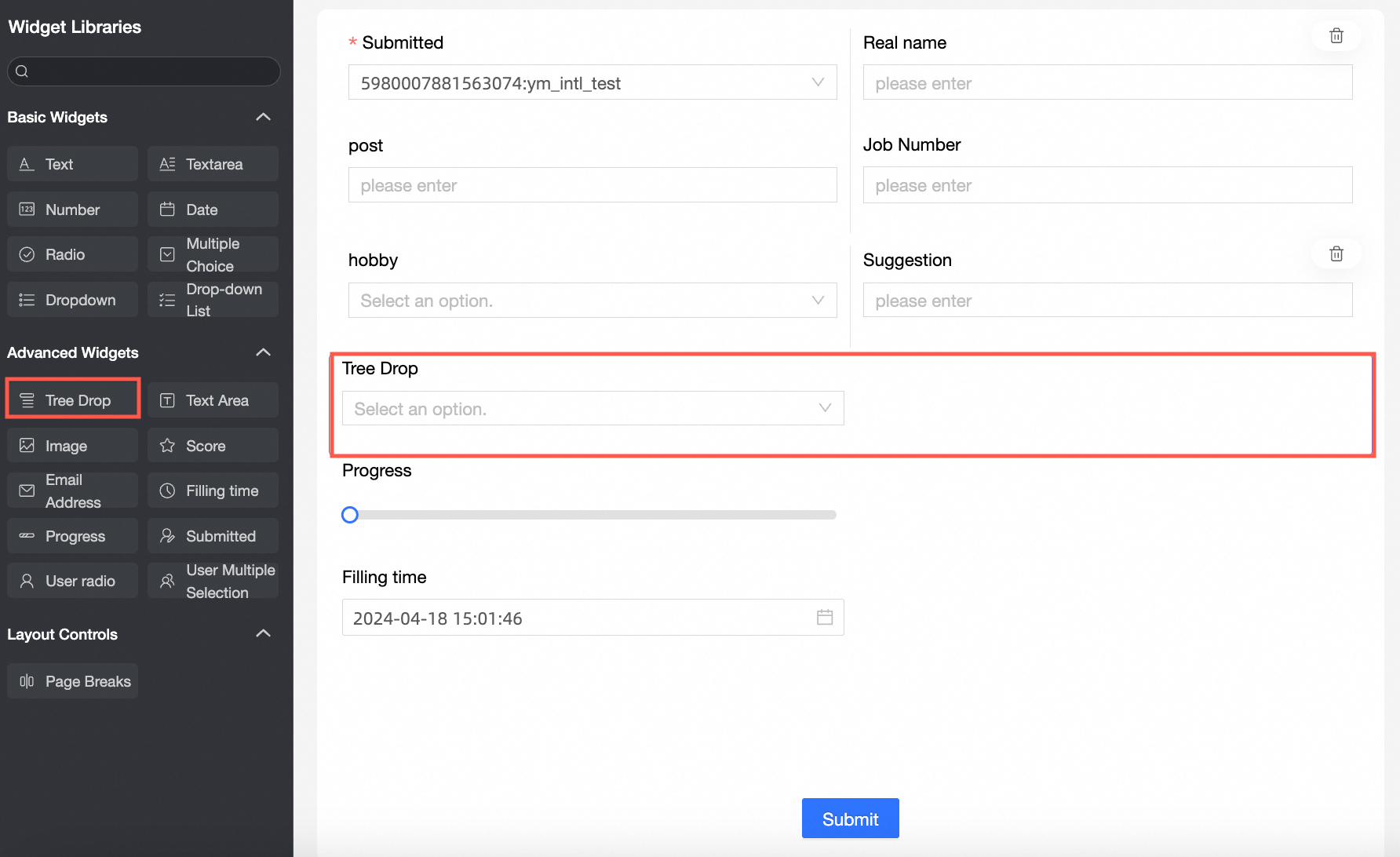
The tree select is an advanced control for complex data entry forms. It is typically used in a cascading scenario to select from a set of hierarchical options.
Use cases
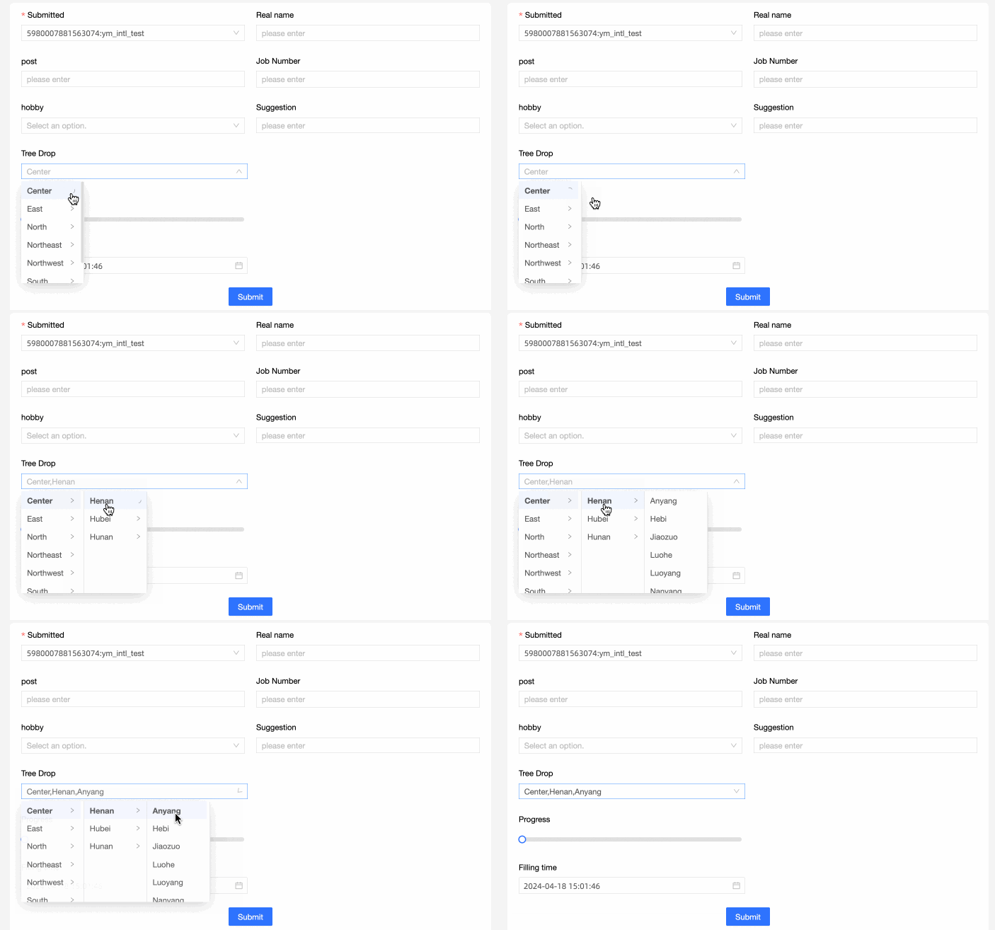
The tree select control is commonly used for selecting cascading options. For example, selecting a customer's region and the corresponding province and city within that region.
Preview
Control configuration
Basic settings
Parameter | Description |
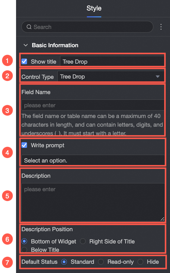
| ① Display title: Select whether to display the control title. You can customize the display name, which is used as the column name for the entered data. |
Change the control's type. You can switch to other basic or advanced controls. | |
The field name in the data table generated by the form. Note Table or field names must start with a letter and can contain letters, digits, and underscores (_). The maximum length is 40 characters. | |
The hint text displayed in the control before a user makes a selection. For example, Please select.
| |
⑤ Description: A custom description for the control. | |
The position of the description. | |
The control's default state. |

Options
Parameter | Description |
When Source is set to Data source.
| The source for the control's options: either a data source or a dataset. |
The data source from the current workspace. | |
The data table from the selected data source. | |
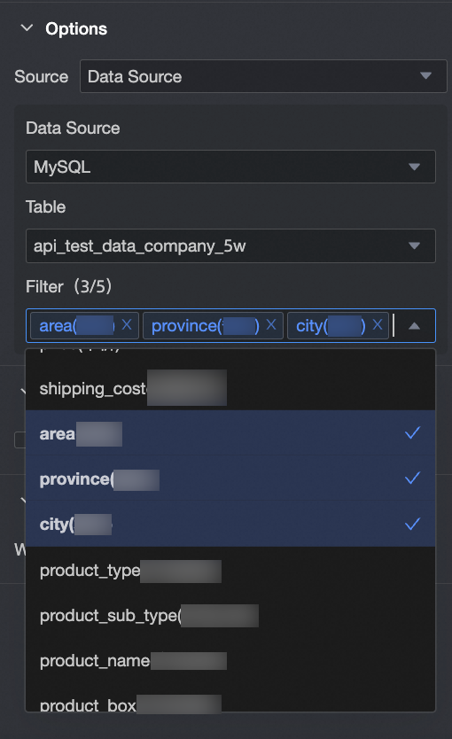
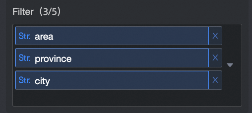
The fields from the data table that define the cascading hierarchy. Note The hierarchy of the tree select is determined by the order in which the data fields are added.
| |
When Source is set to Dataset.
| The source for the control's options: either a data source or a dataset. |
The dataset from the current workspace. | |
The data fields from the selected dataset.
|


Validation
Parameter | Description |
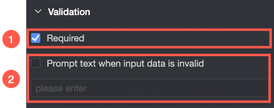
| If enabled, makes the control a required field. |
A custom error message displayed when validation fails. For example, if a user submits a required field without making a selection, this message is shown. |
Style
Parameter | Description |
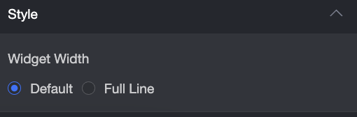
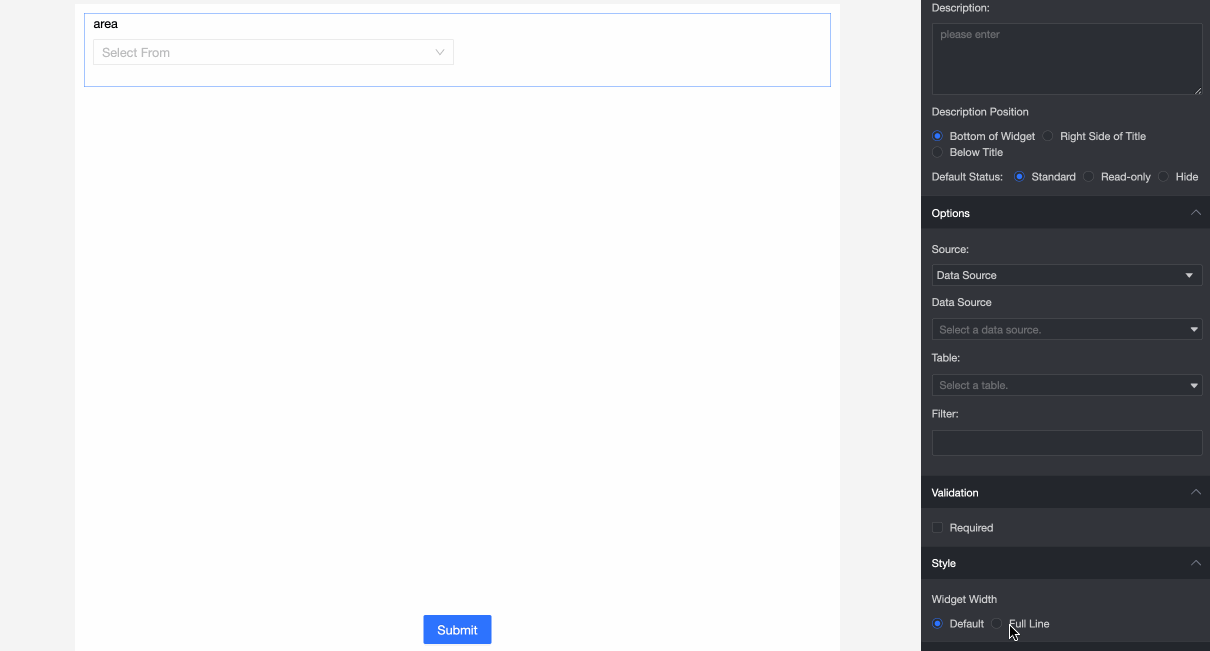
| The width of the control. Options include Default and full width. Note On the data entry form, you can also manually resize the control by dragging its border.
|