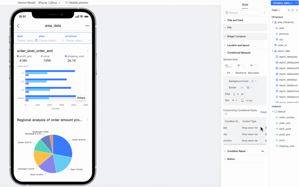
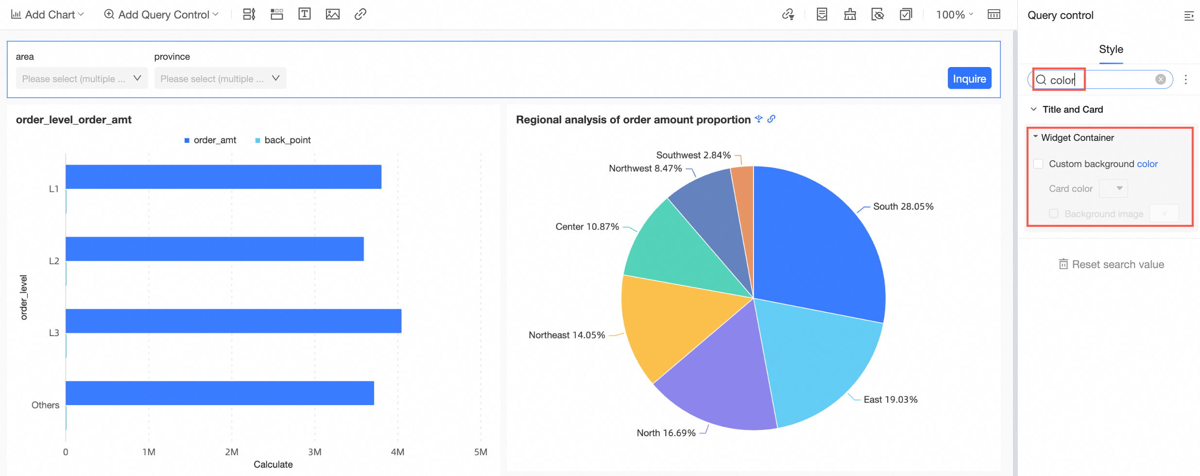
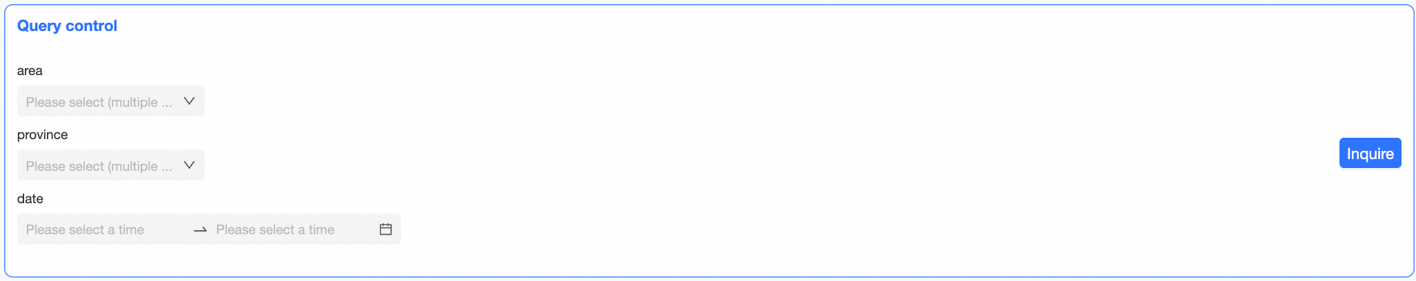
After you configure query conditions, you can customize the query control's appearance in the Style panel.
Enter keywords in the Search box at the top of the Style panel to quickly locate a configuration item.
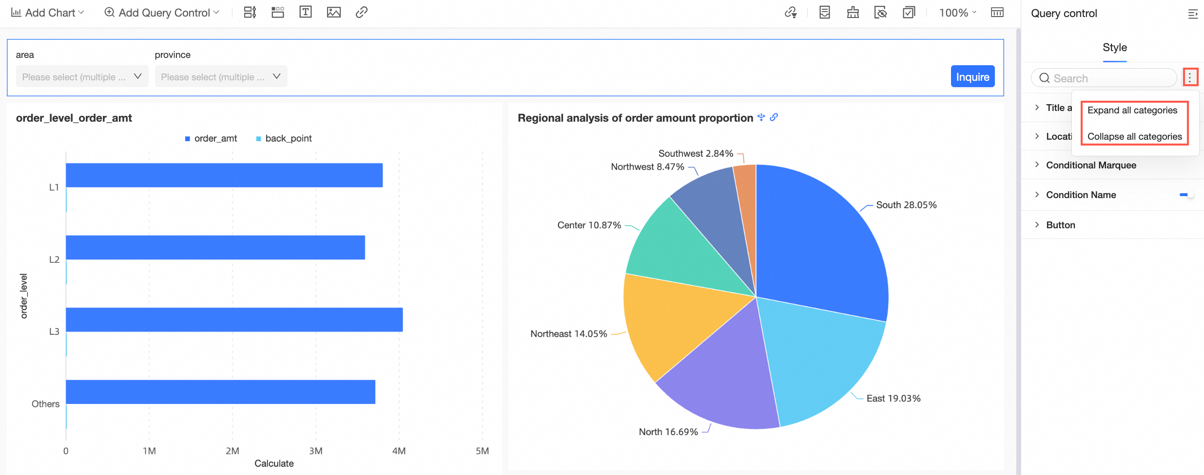
Click the  icon to Expand/Collapse All Categories.
PC style settings
Font, border, background color, and spacing settings are not supported in Internet Explorer 11.
-
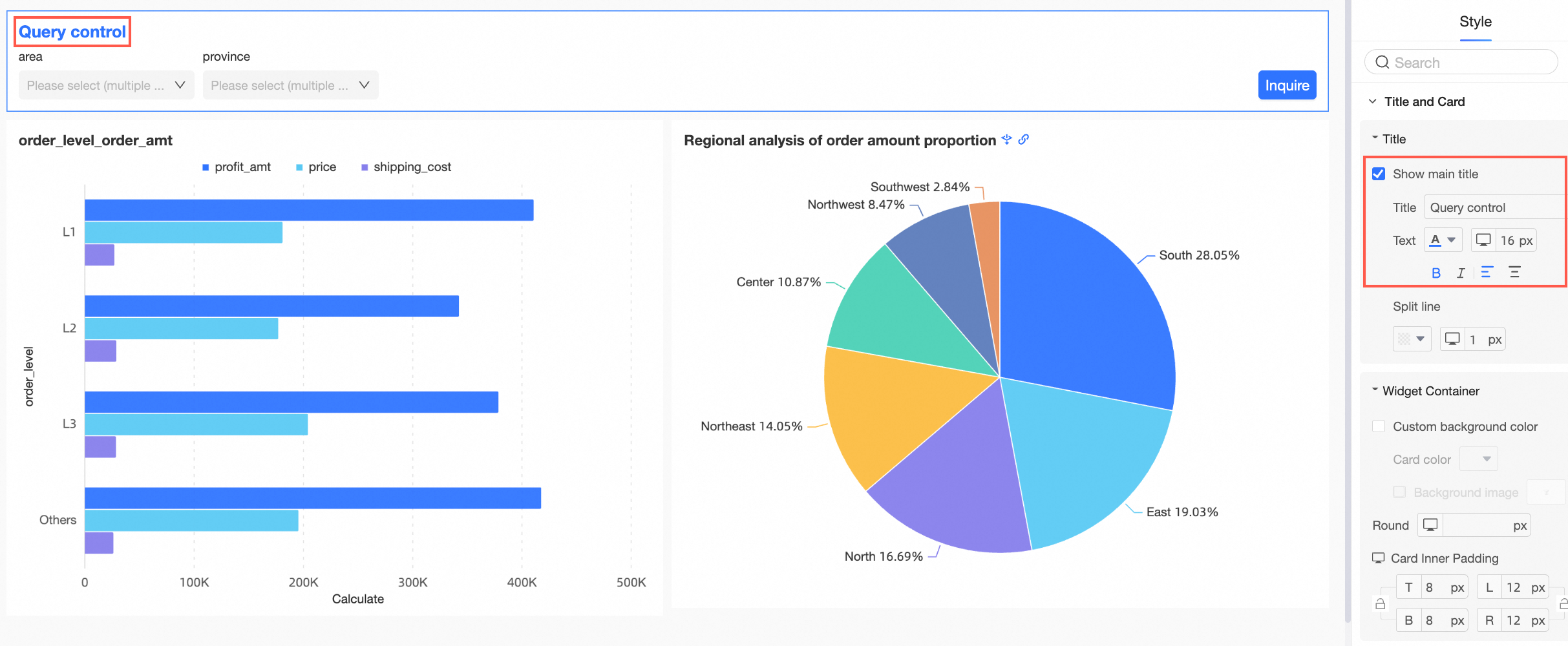
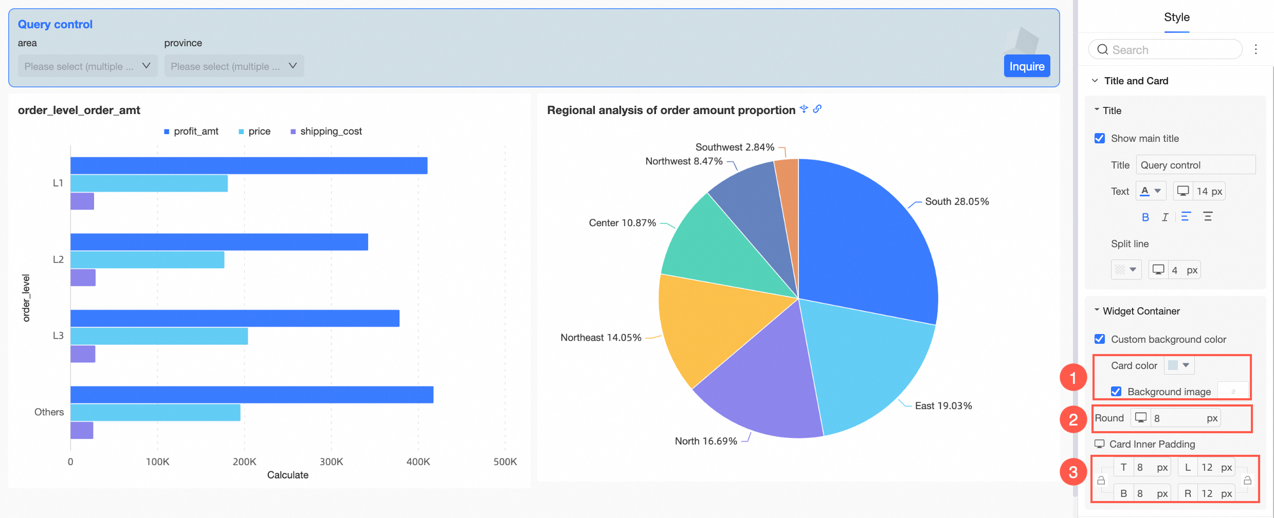
In Title and Card, configure the Title and Component Container.
Parameter
Description
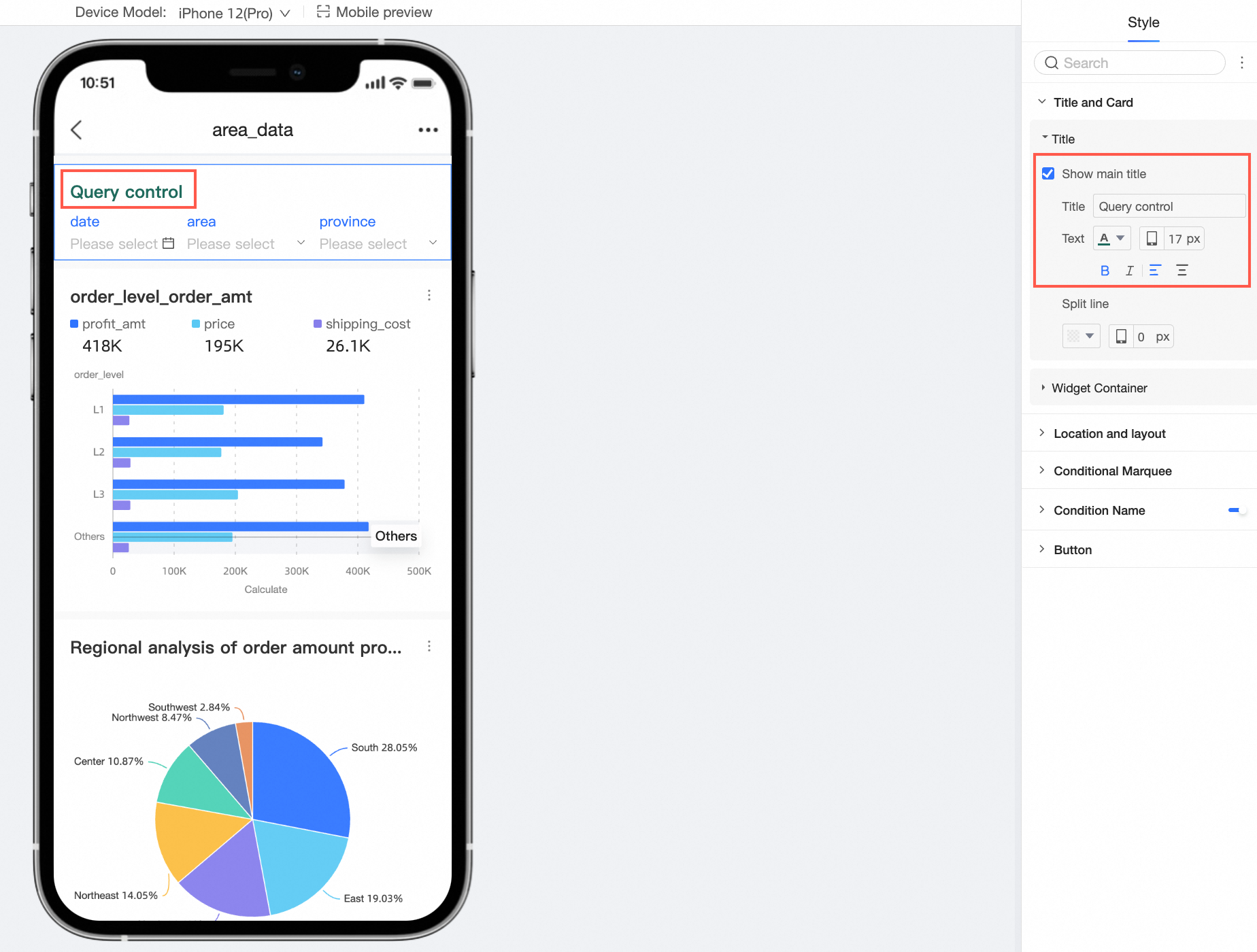
Title
-
You can show or hide the Title and configure its style.
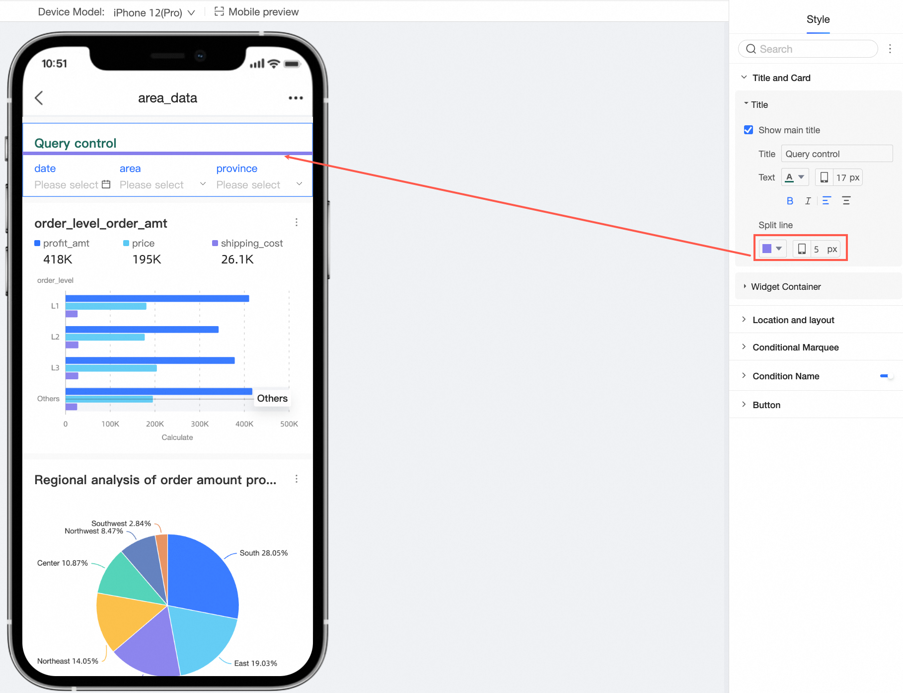
-
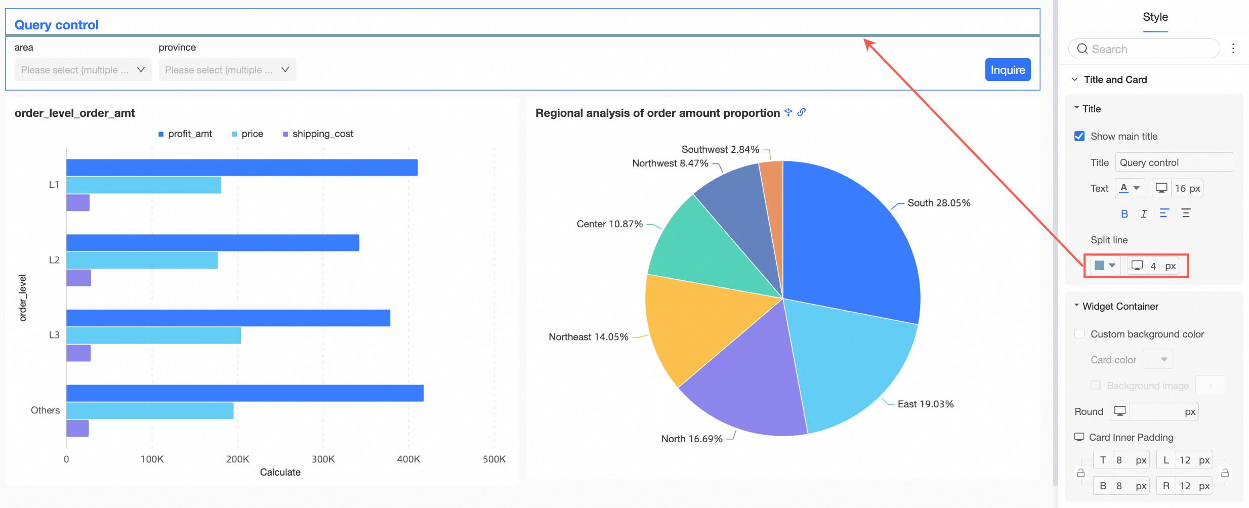
You can set a separator line.
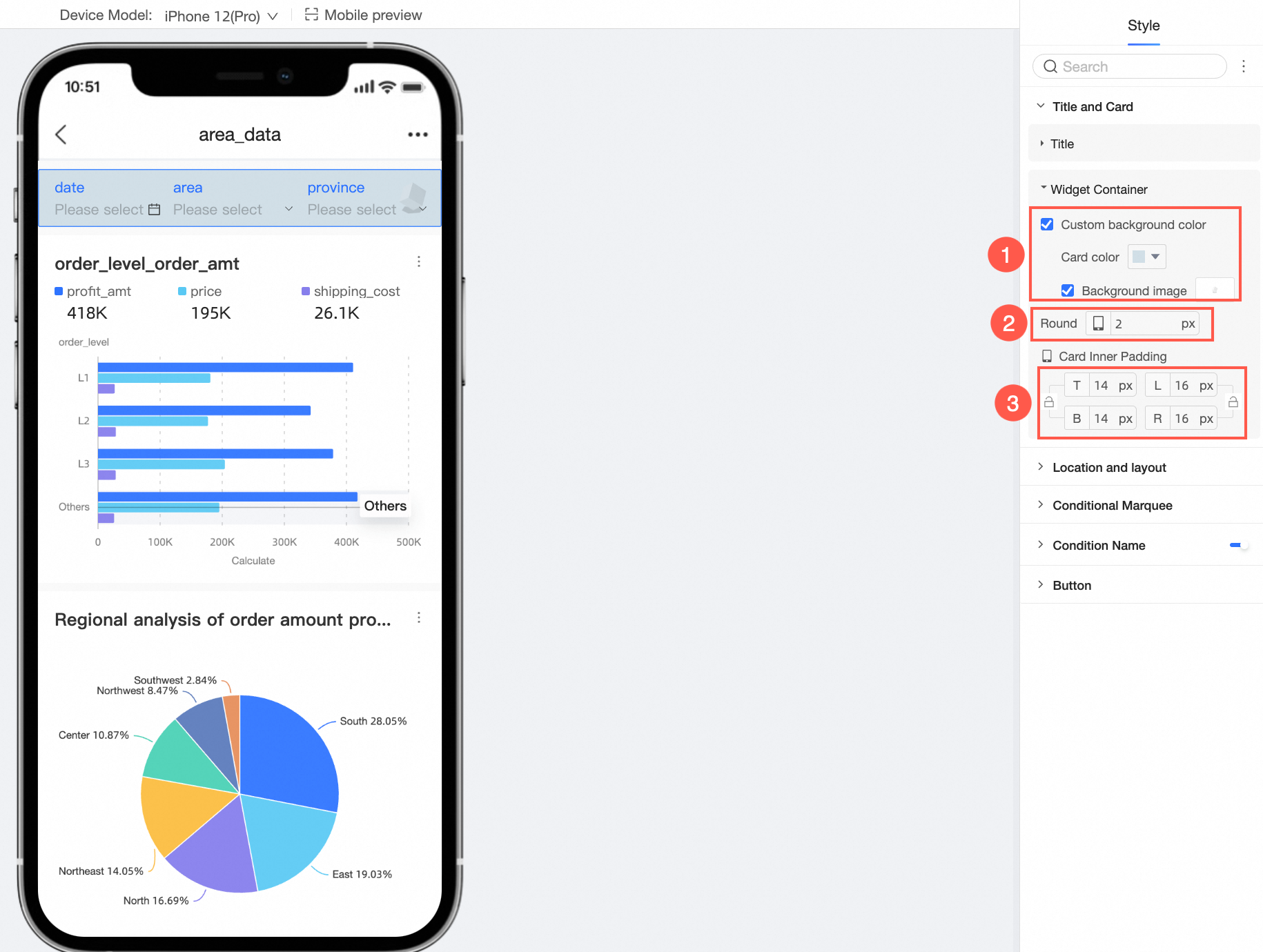
Component Container
You can configure Custom Background Fill (①), rounded corners (②), and card inner spacing (③).

-
-
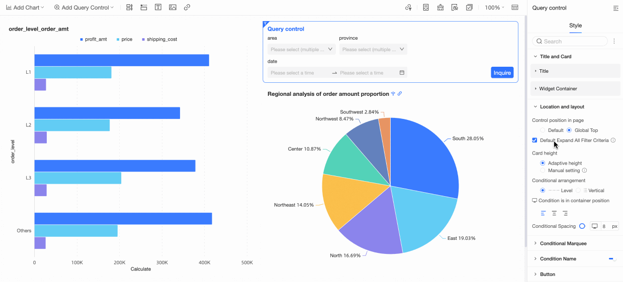
In Position and Layout, configure the following settings.
Parameter
Description
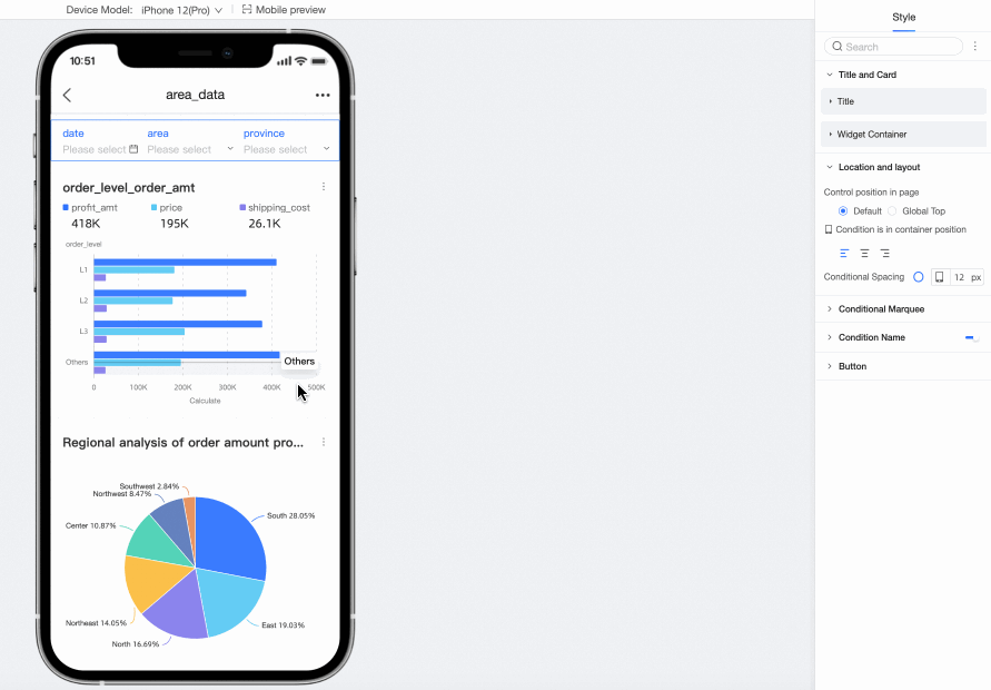
Position on page
You can choose Default or Pin to Top. When pinned, the control remains at the top of the page as you scroll.
Expand all filter conditions by default
When enabled, all filter conditions are expanded by default.
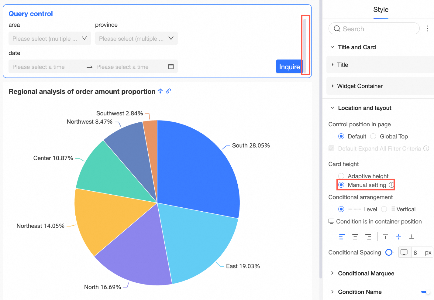
Card height
If Expand All Filter Conditions by Default is enabled, you can set the Card Height to adaptive height or Manual.
With Manual, drag to adjust the height. A vertical scrollbar appears if the content exceeds the set height. When a manual height is set, you cannot collapse the filter conditions.
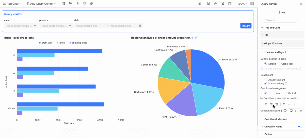
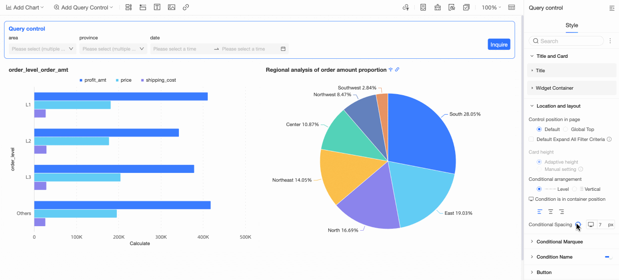
Condition arrangement
Arrange conditions in a Horizontal or Vertical layout.
-
Horizontal:
-
Vertical:
Condition position in container
Choose left-aligned, center-aligned, or right-aligned.
Condition spacing
Adjust the Condition Spacing.
-

-
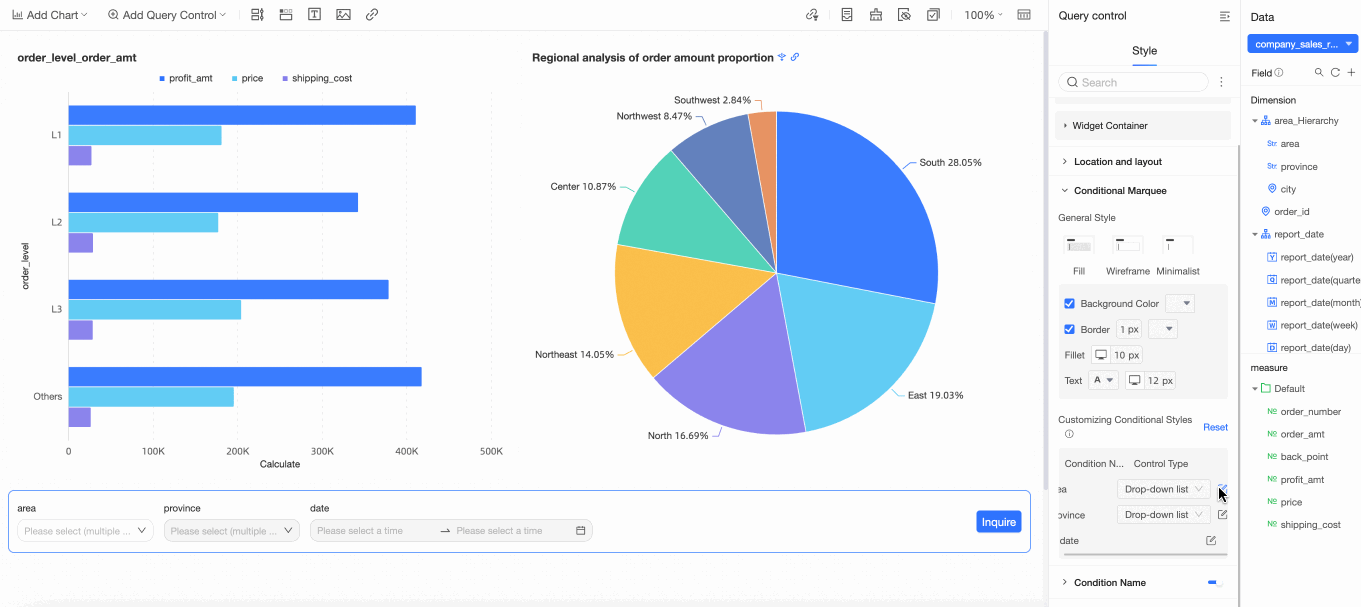
In Condition Box, configure the following settings.
Parameter
Description
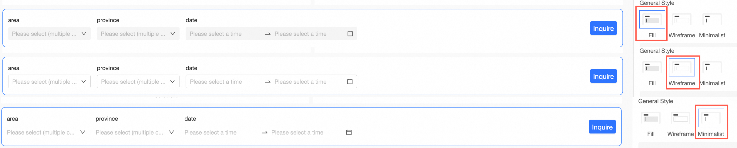
Box style
The available box styles are Fill, Line, and Minimal.
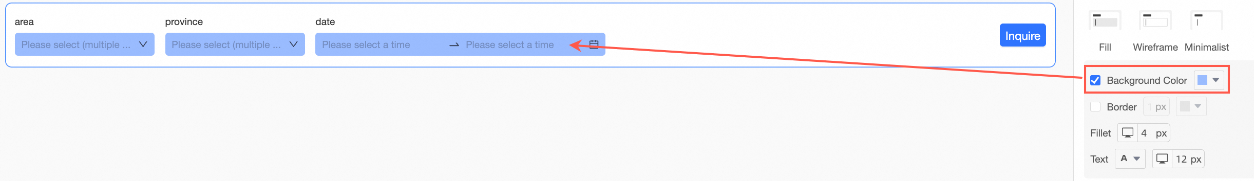
Background color
You can set the background color of the condition box.
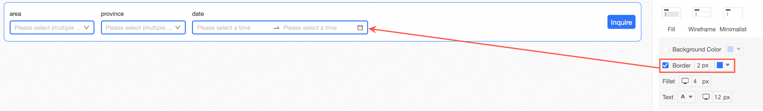
Border
You can set the width and color of the condition box border.
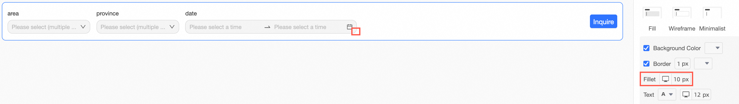
Rounded corners
You can adjust the rounded corners of the condition box.
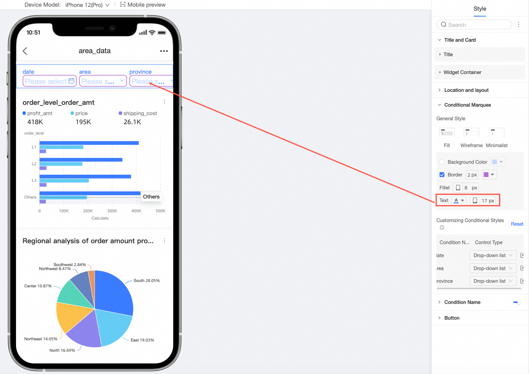
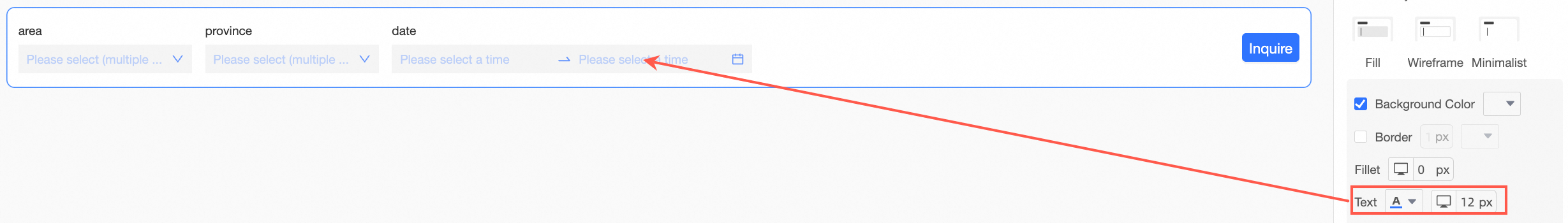
Text
You can set the text color and font size for the condition box.
Customize condition style
Apply more specific styles to individual query conditions based on their display type.
NoteIf a condition's style is customized, it overrides the general styles configured above. Select reset to restore the default styles.
-
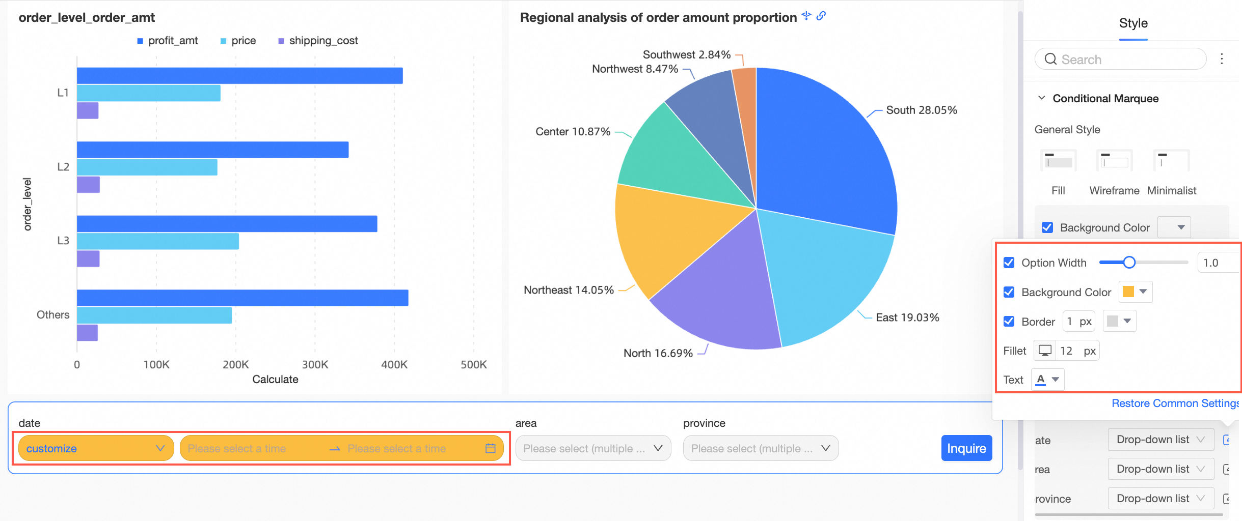
When the query control's display type is drop-down list, text input box, numeric input box, drop-down tree, or a standard date picker, you can set the Option Width, Background Color, Border, Rounded Corners, and Text Color for each condition.
-
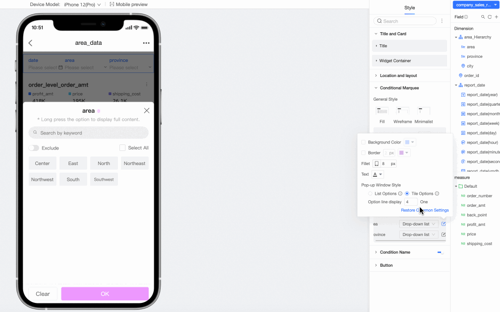
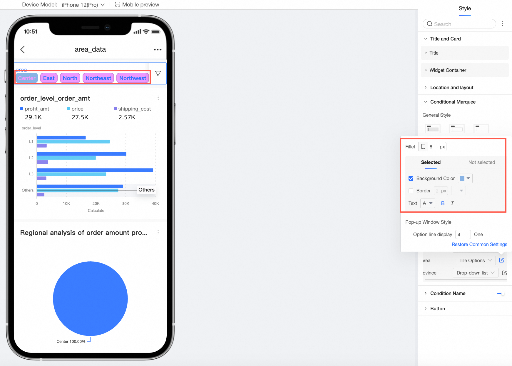
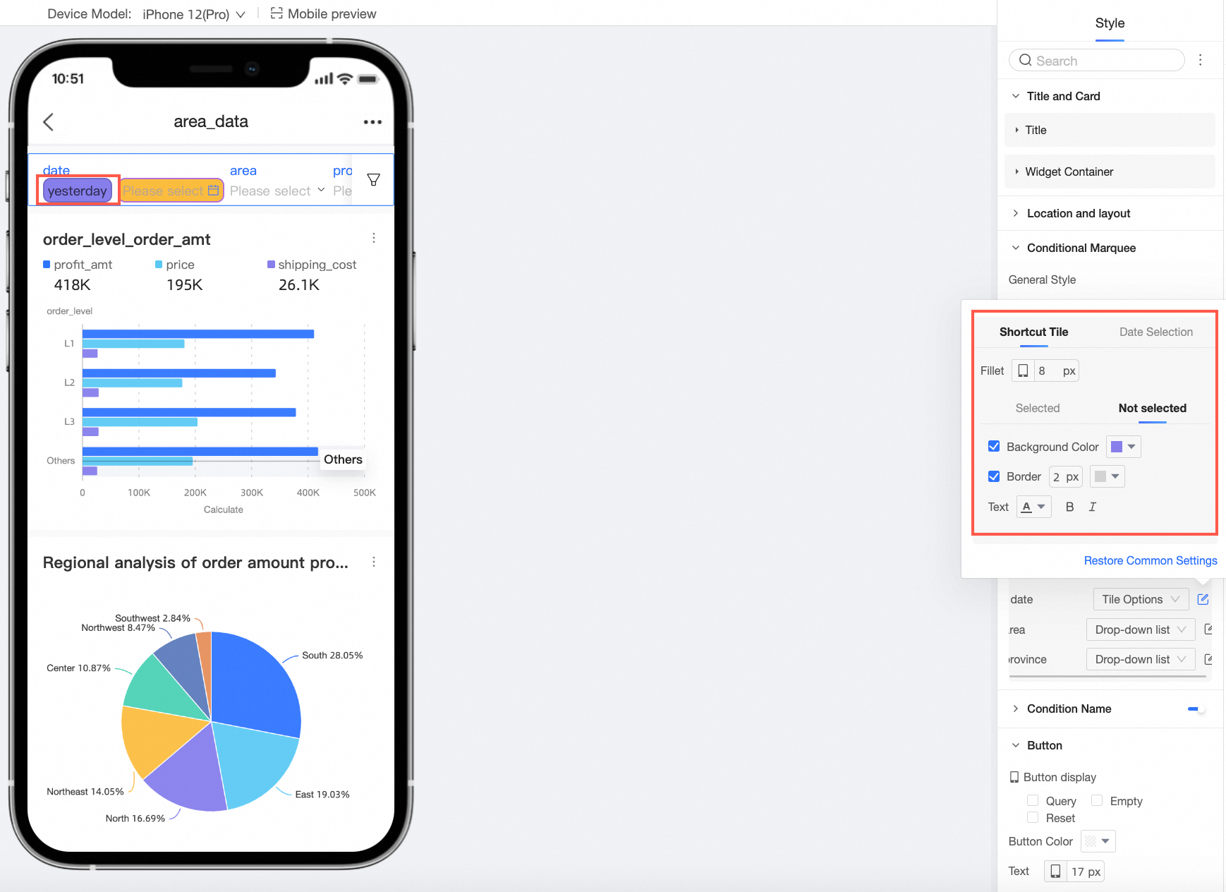
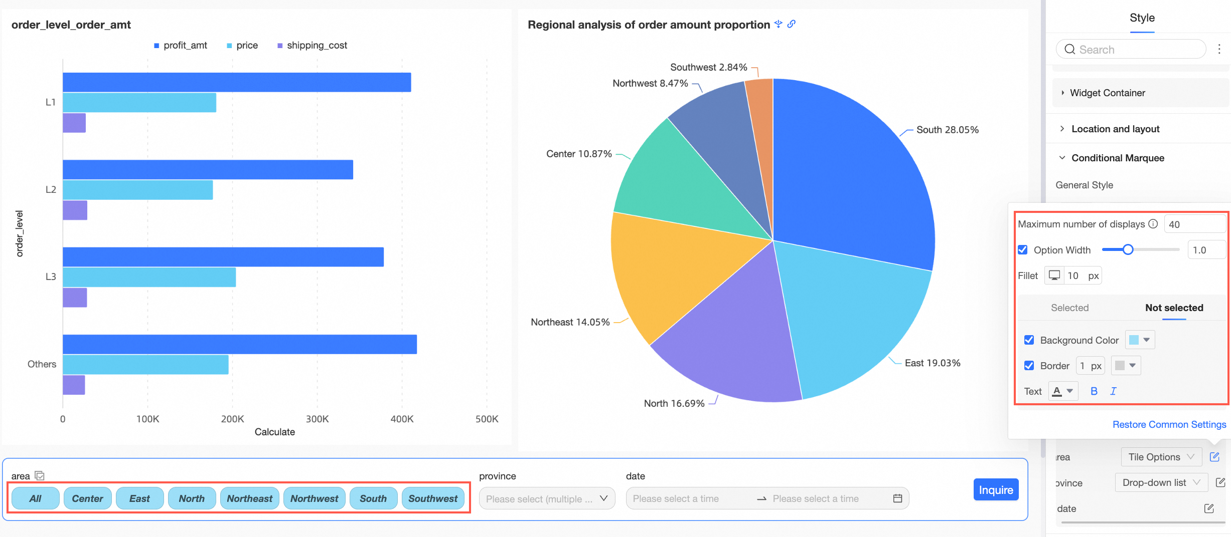
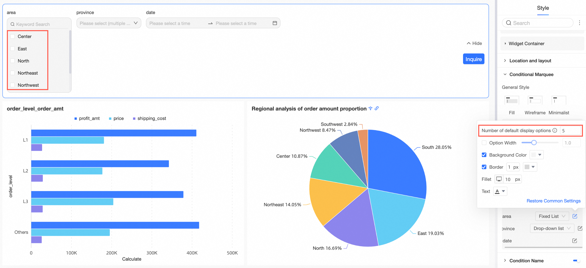
When the query control's display type is a drop-down list, you can display it as tiled options or a fixed list.
-
When the control type is tiled options, you can set the Max Items to Show and the styles for selected and unselected states.
-
When the control type is a fixed list, you can set the Default Number of Options to display.
-
-
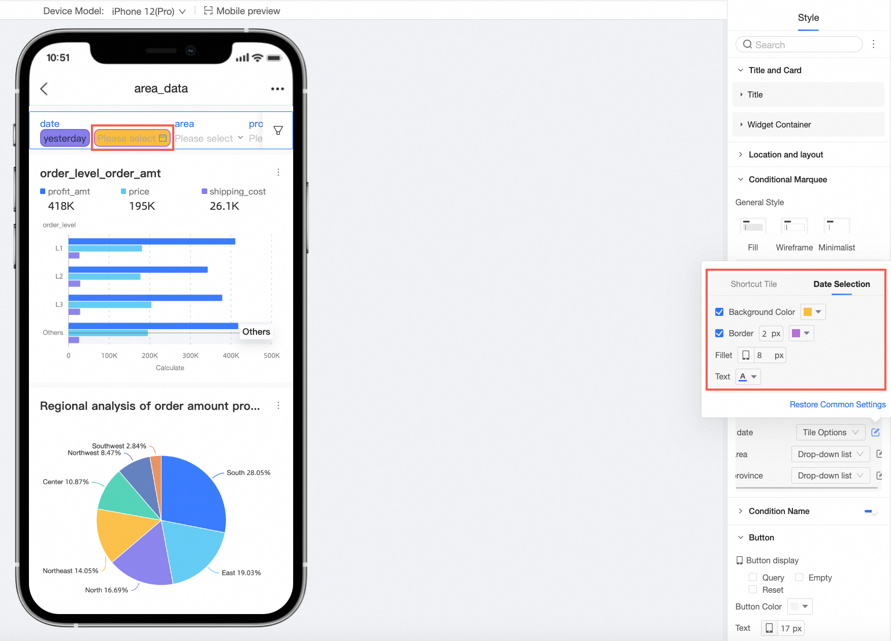
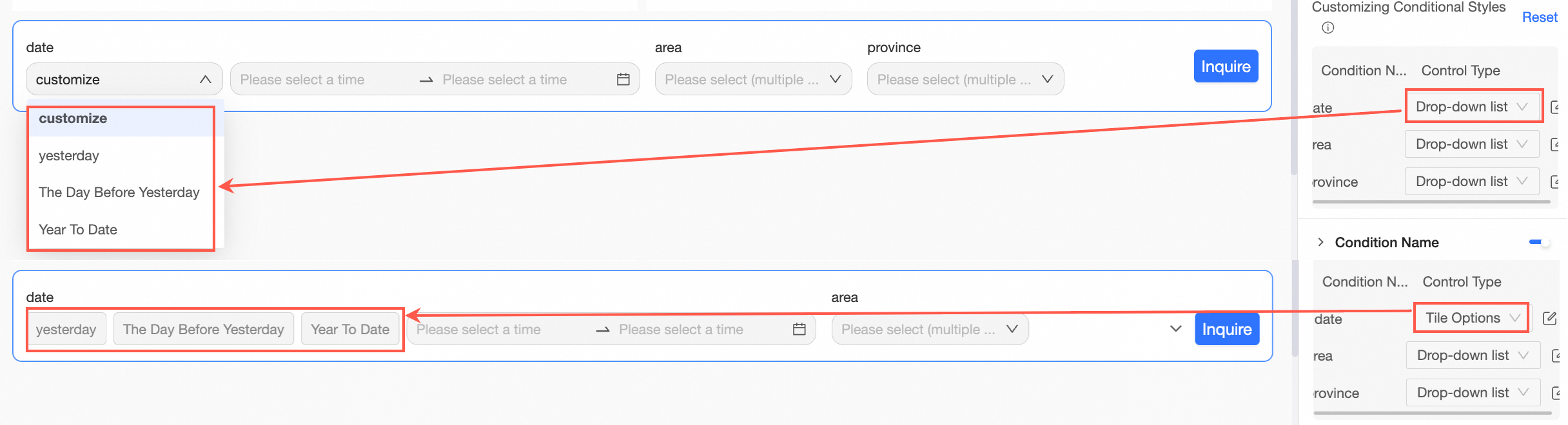
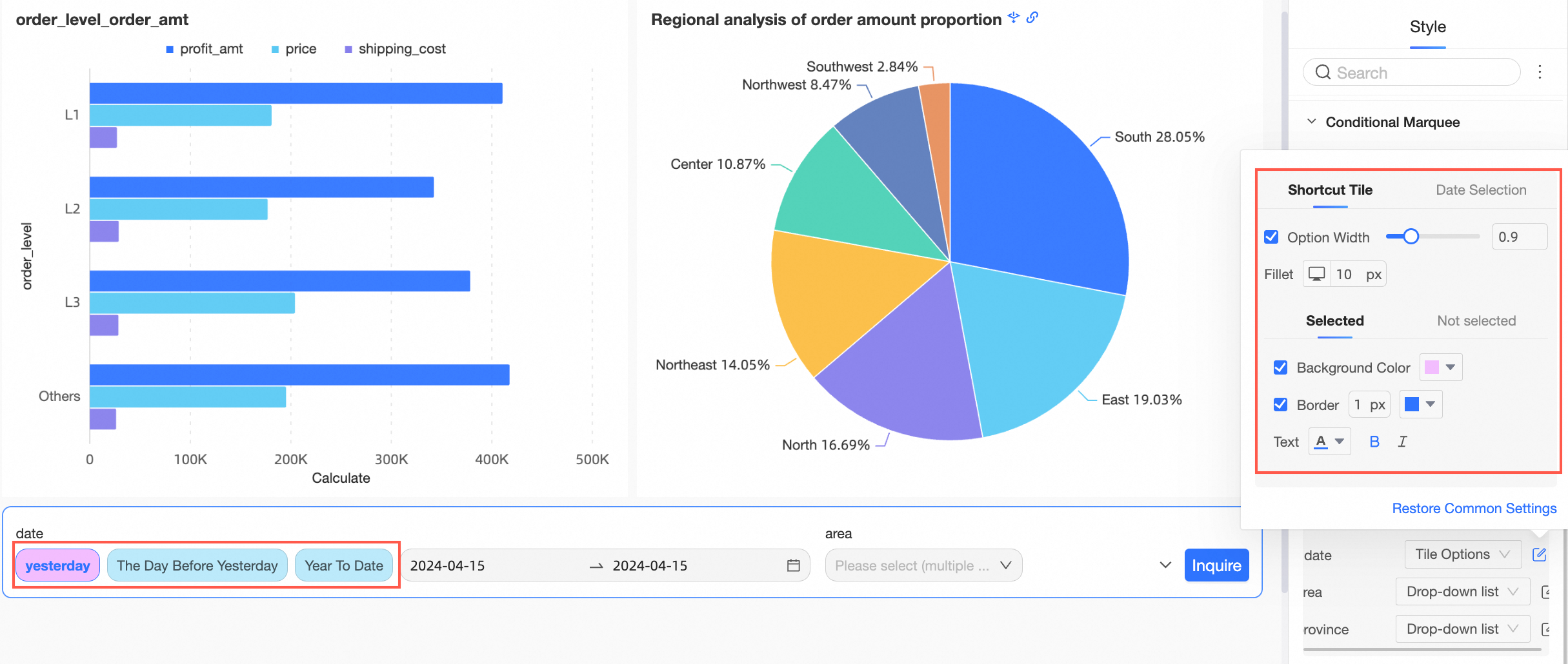
When the display type is a date picker and Shortcut Range is enabled, you can choose to display the shortcut ranges as a drop-down list or tiled options.
NoteThe tiled button style is available only when there are five or fewer shortcut range options.
-
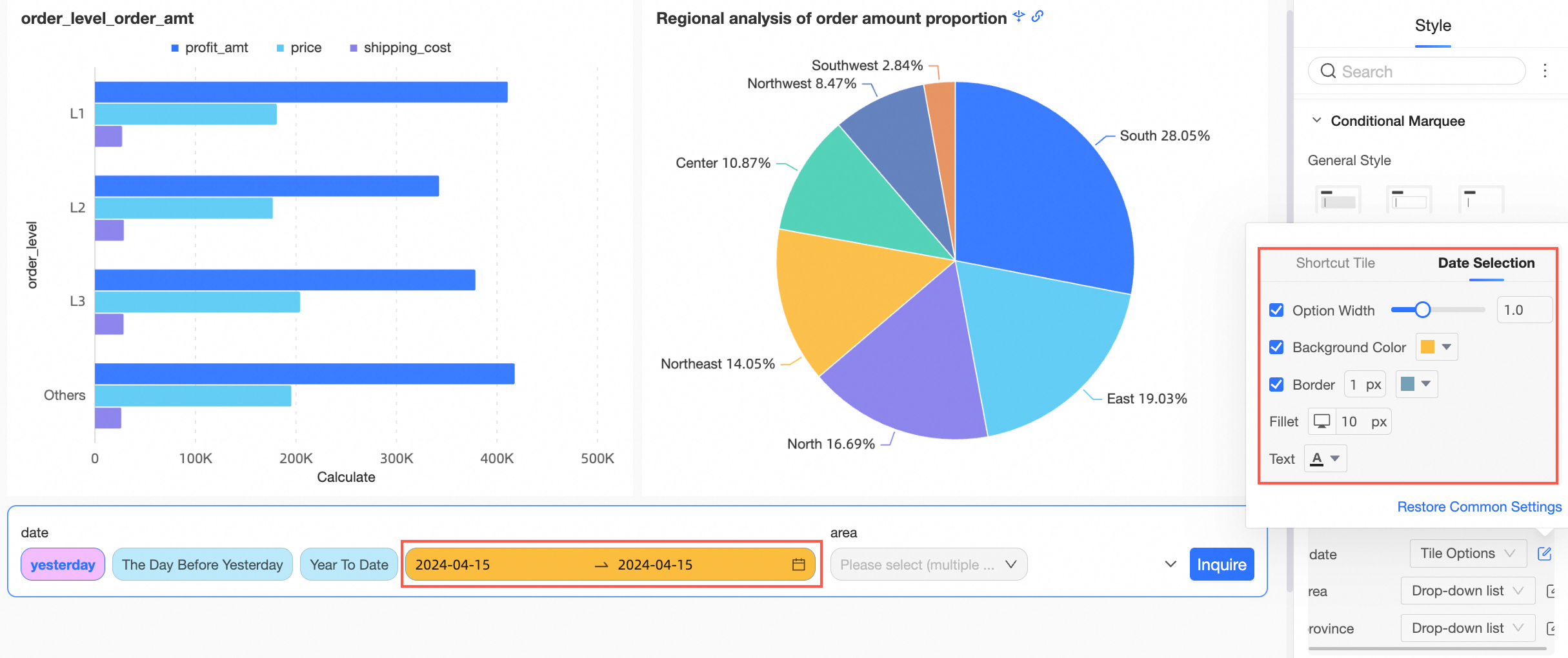
For the drop-down list, you can configure the style of the Entire Box.
-
For tiled options, you can configure the styles for the Shortcut Range Tiling and the date picker.
-
Shortcut Range Tiling
-
Date Picker
-
-
-
-
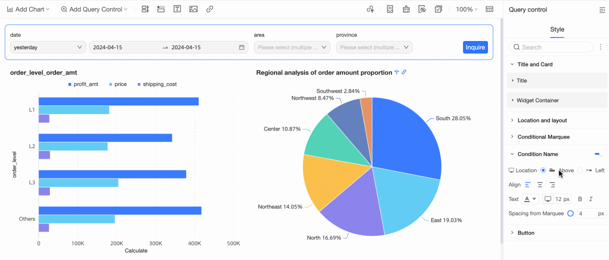
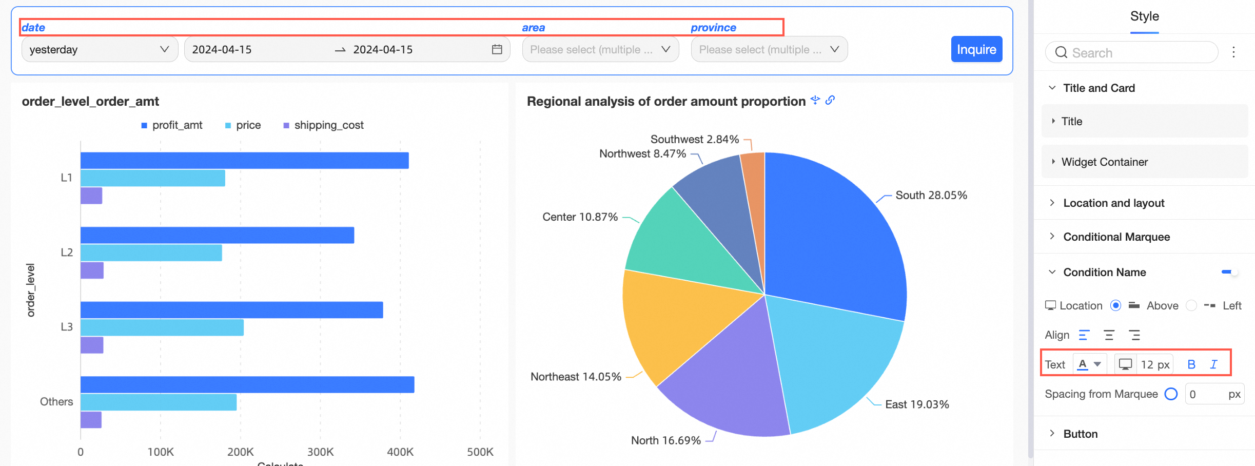
You can choose whether to show the Condition Name and configure its Position, Text style, and Spacing with Box.
Parameter
Description
Position
You can set the condition name's position to Above or Left. When set to Above, you can use left, center, or right alignment.
Text
You can configure the text style for the condition name.
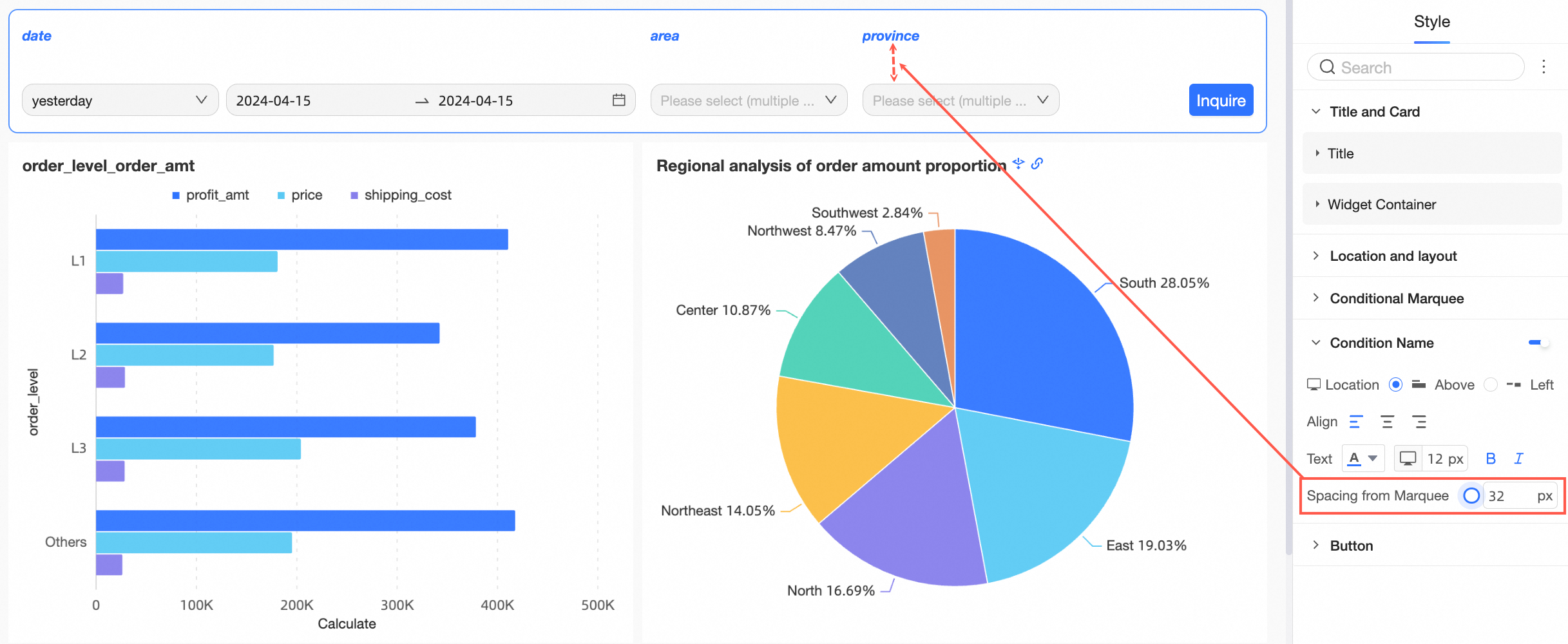
Spacing with box
You can adjust the Spacing with Box.
-
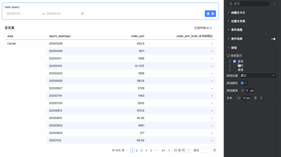
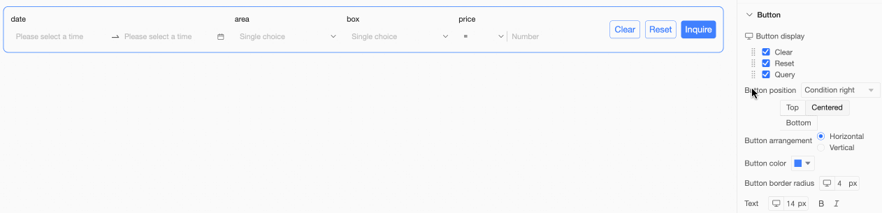
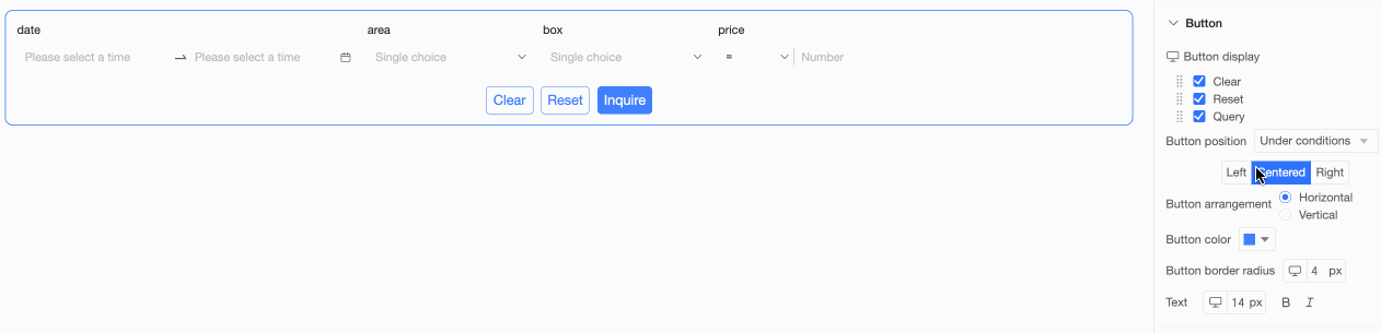
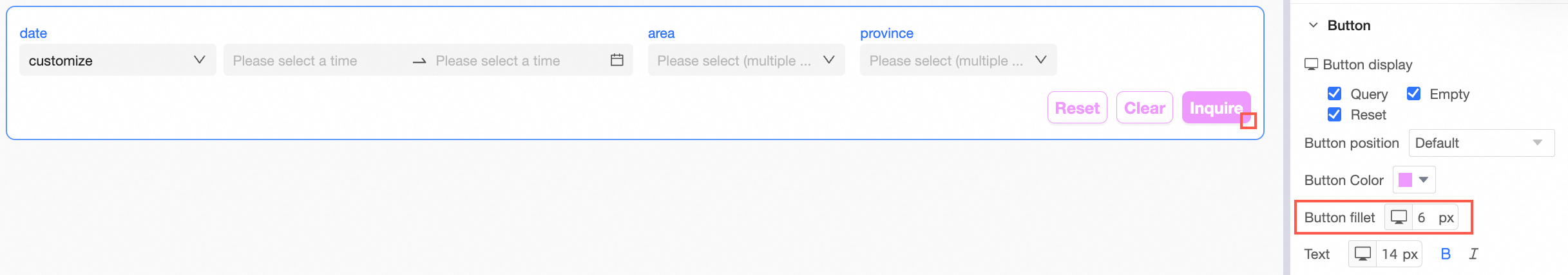
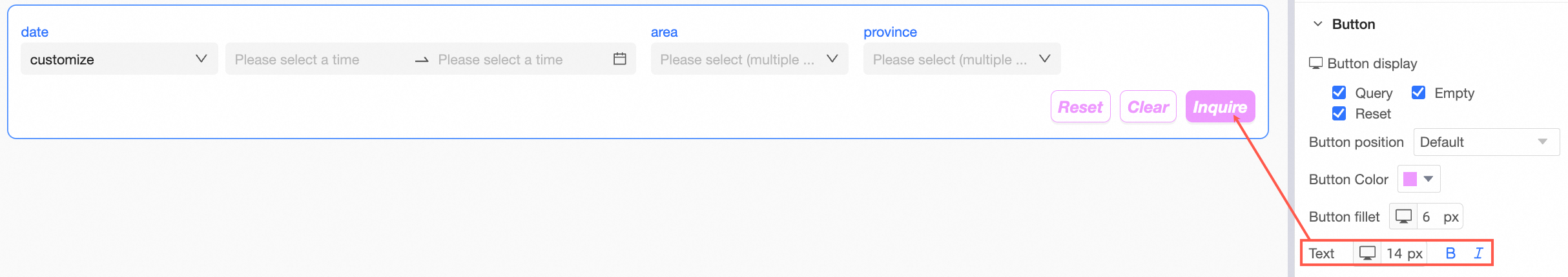
In the Button section, you can configure Button Display, Button Position, Button Color, button rounded corners, and Text styles.
Parameter
Description
Button display
Note-
The Reset and Clear buttons are visible only if you enable them in the Button Display settings.
-
Reset: Restores query conditions to their configured default values.
-
Clear: Clears all values currently selected in the query conditions.
-
-
If Control A cascades to Control B, Control A is the parent of Control B. If you reset or clear Control A, Control B is also reset or cleared. However, resetting or clearing Control B does not affect Control A.
-
If you hide the Query button, queries run automatically when you change a condition value.
Drag the
icon on the left to reorder the buttons.Button position
Choose Default, Right of Conditions, Below Conditions, or Follow Conditions.
-
Right of Conditions
Align buttons to the Top, Center, or Bottom, and set the Button Arrangement to Horizontal or Vertical.
-
Below Conditions
Set the button alignment to Left, Center, or Right, and set the Button Arrangement to Horizontal or Vertical.
-
Follow Conditions
Button color
You can set the Button Color.
Button rounded corners
You can set the button rounded corners.
Text
You can configure the text style for the button.
-

 icon on the left to reorder the buttons.
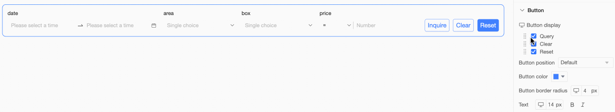


Mobile style settings
-
In Title and Card, configure the Title and Component Container.
Parameter
Description
Title
-
You can show or hide the Title and configure its style.
-
You can set a separator line.
Component Container
You can configure Custom Background Fill (①), rounded corners (②), and card inner spacing (③).
-
-
In Position and Layout, configure the following settings.
Parameter
Description
Position on page
You can choose Default or Pin to Top. When pinned, the control remains at the top of the page as you scroll.
Condition position in container
Choose left-aligned, center-aligned, or right-aligned.
Condition spacing
Adjust the Condition Spacing.
-
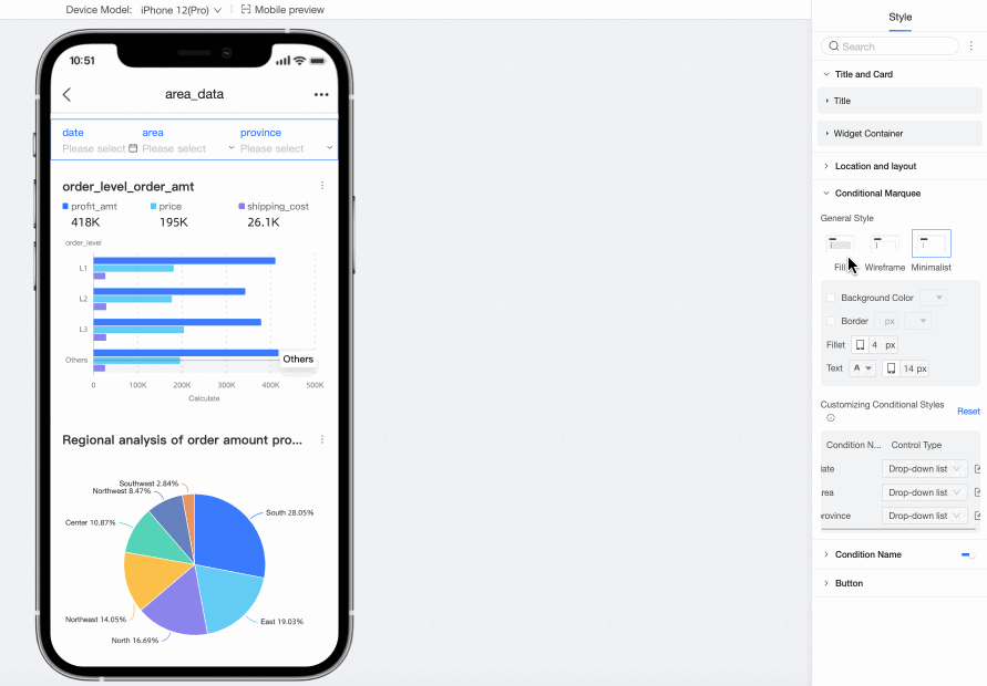
In Condition Box, configure the following settings.
Parameter
Description
Box style
The available box styles are Fill, Line, and Minimal.
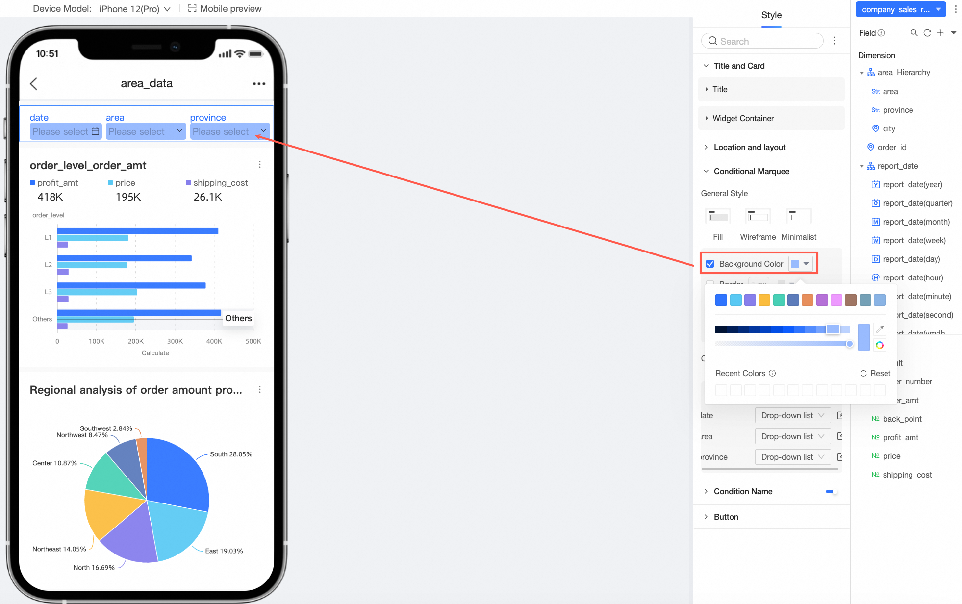
Background color
You can set the background color of the condition box.
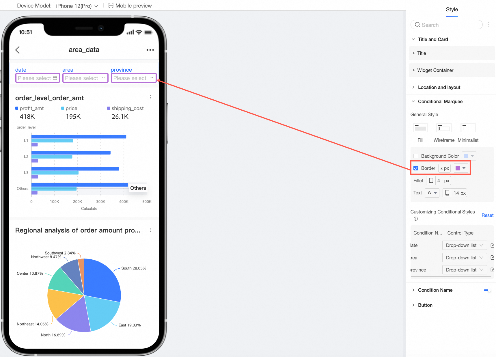
Border
You can set the width and color of the condition box border.
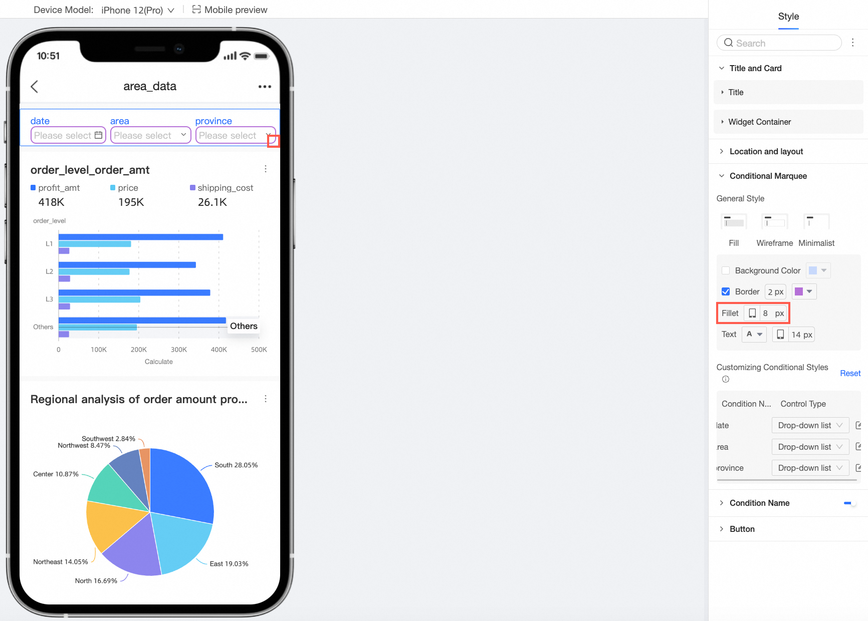
Rounded corners
You can adjust the rounded corners of the condition box.
Text
You can set the text color and font size for the condition box.
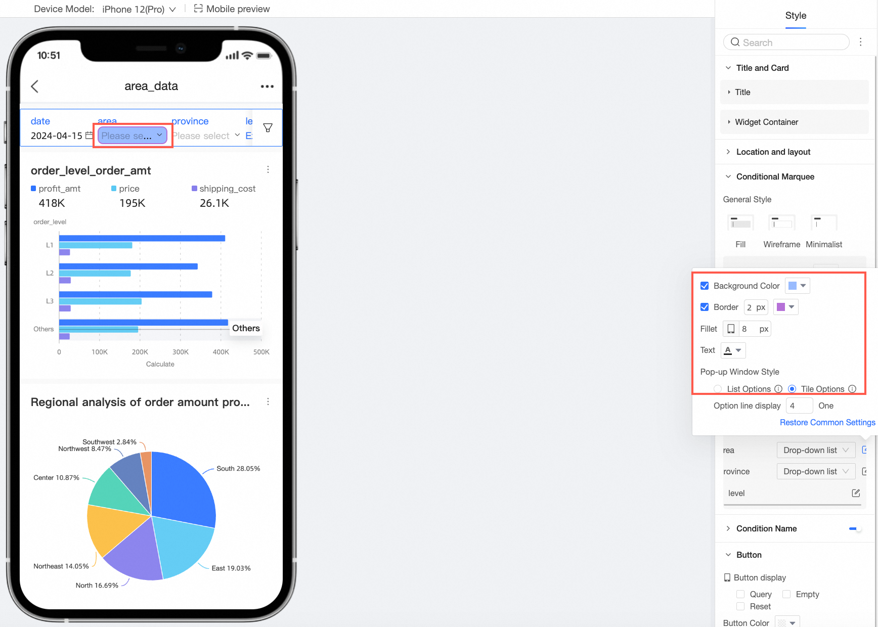
Customize condition style
Apply more specific styles to individual query conditions.
NoteIf a condition's style is customized, it overrides the general styles configured above. Select reset to restore the default styles.
-
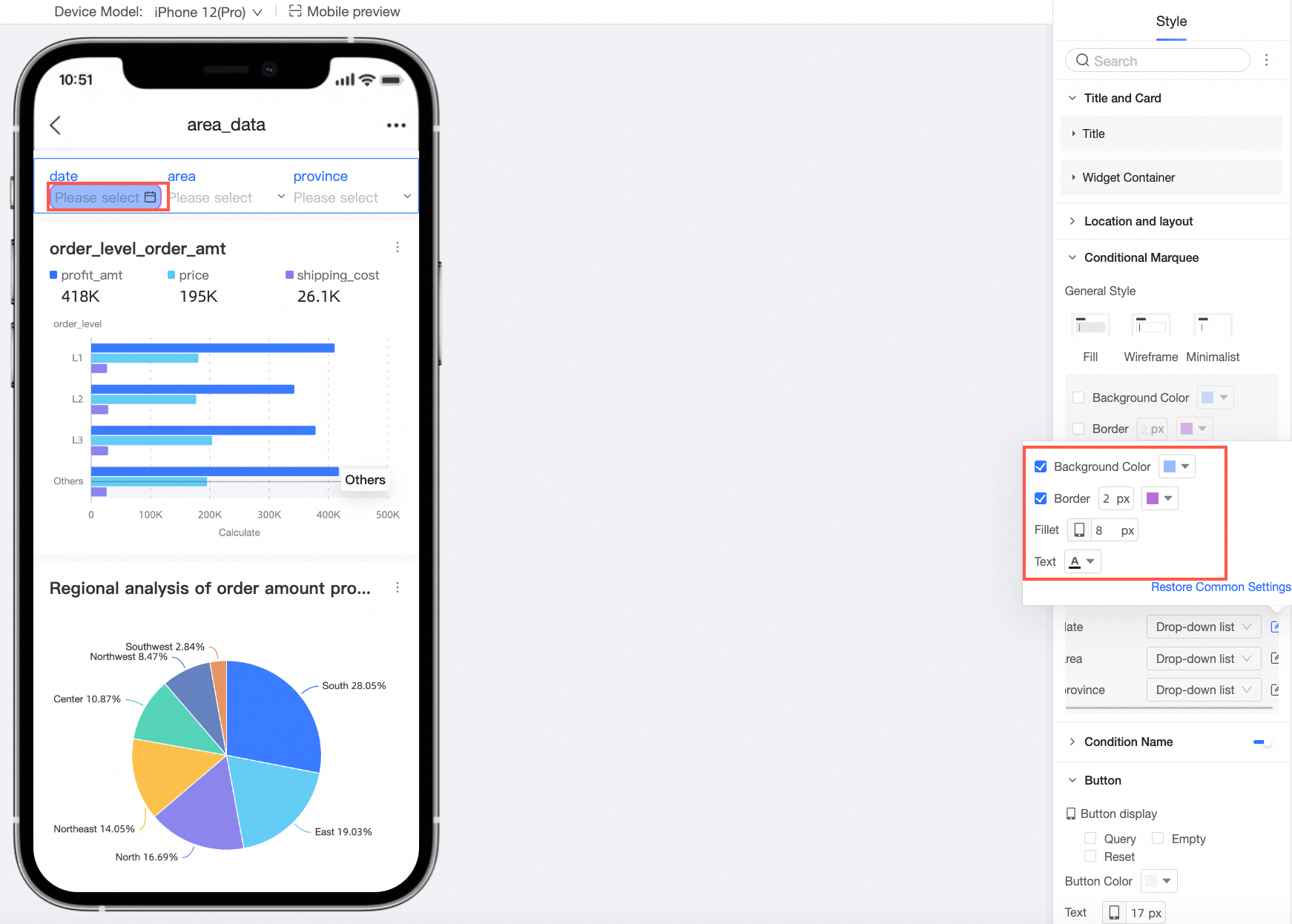
Drop-down list
-
You can configure the background color, border, rounded corners, and text style for the condition.
-
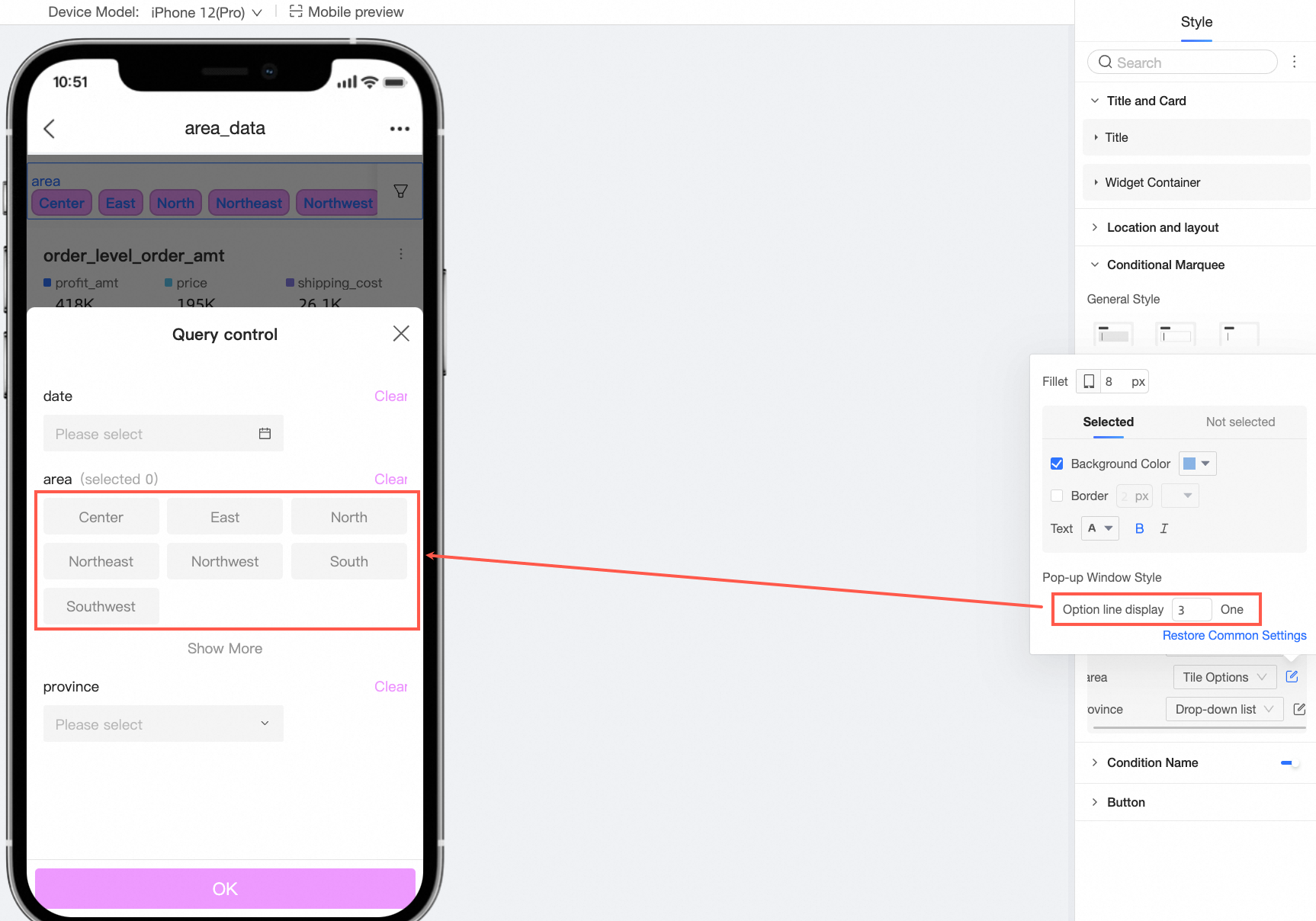
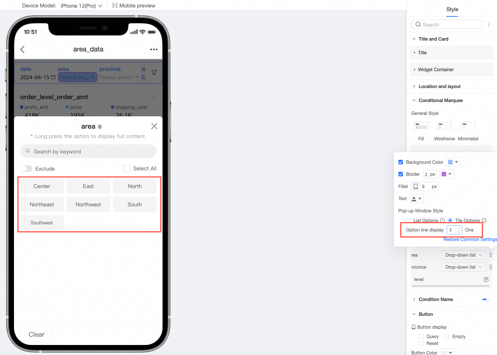
Set the drop-down option style to List Options or Tiled Options and configure the number of columns or items per row.
-
-
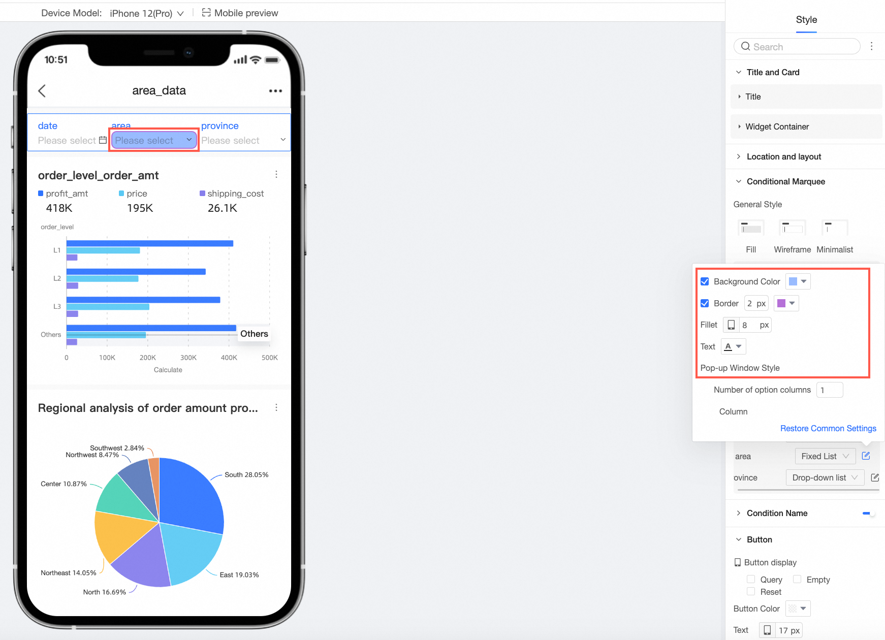
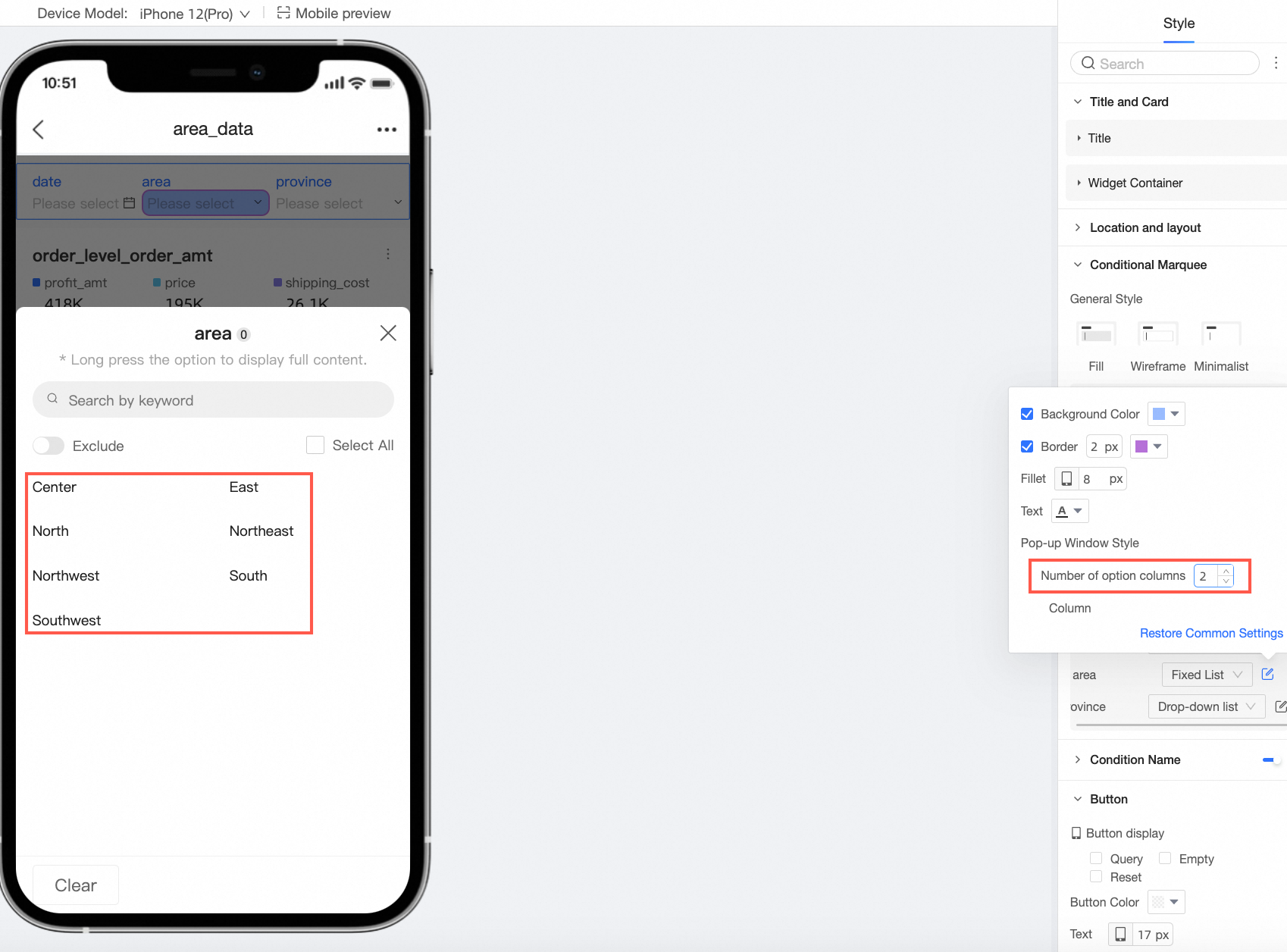
Tiled options
-
You can configure rounded corners, and styles for the selected and unselected states.
-
Set the number of options to display per row.
-
-
Fixed list
-
You can configure the background color, border, rounded corners, and text styles.
-
Set the number of columns.
-
-
Date picker
-
When Shortcut Range is enabled for a date condition, you can choose between a drop-down list and tiled options.
-
For a drop-down list, you can configure the background color, border, rounded corners, and text style.
-
For tiled options, you can configure the styles for the Shortcut Range Tiling and the date picker.
NoteThe tiled button style is available only when there are five or fewer shortcut range options.
-
For Shortcut Range Tiling, you can configure the rounded corners and the styles for the selected and unselected states.
-
For the date picker, you can configure the background color, border, rounded corners, and text style.
-
-
-
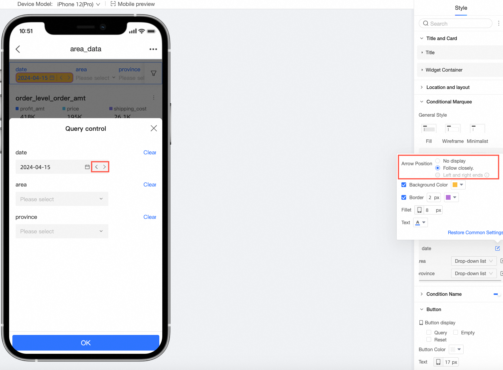
When the date selection type is Single Date (e.g., a single year, day, month, or week) or the range type is Starts From or Ends At, you can configure the Arrow Position.
-
-
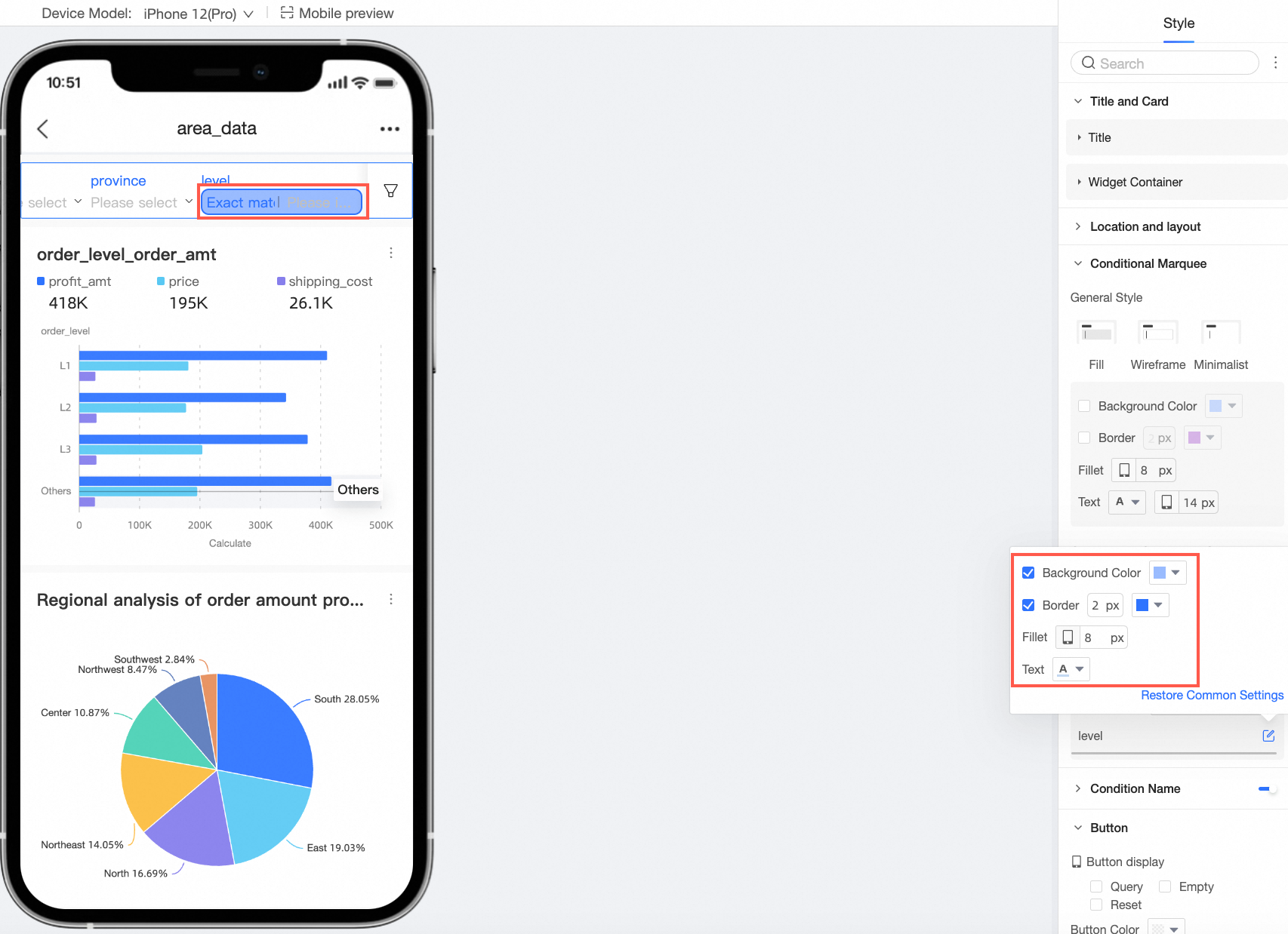
Input Box
For text and numeric input boxes, you can configure the background color, border, rounded corners, and text style.
-
Drop-down tree
-
You can configure the background color, border, rounded corners, and text styles.
-
Set the number of columns.
-
-
-
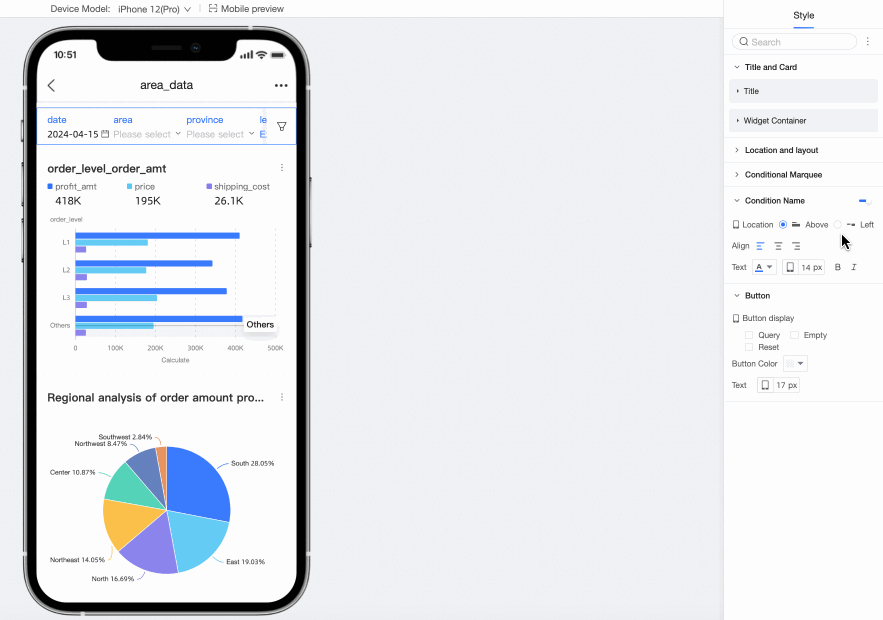
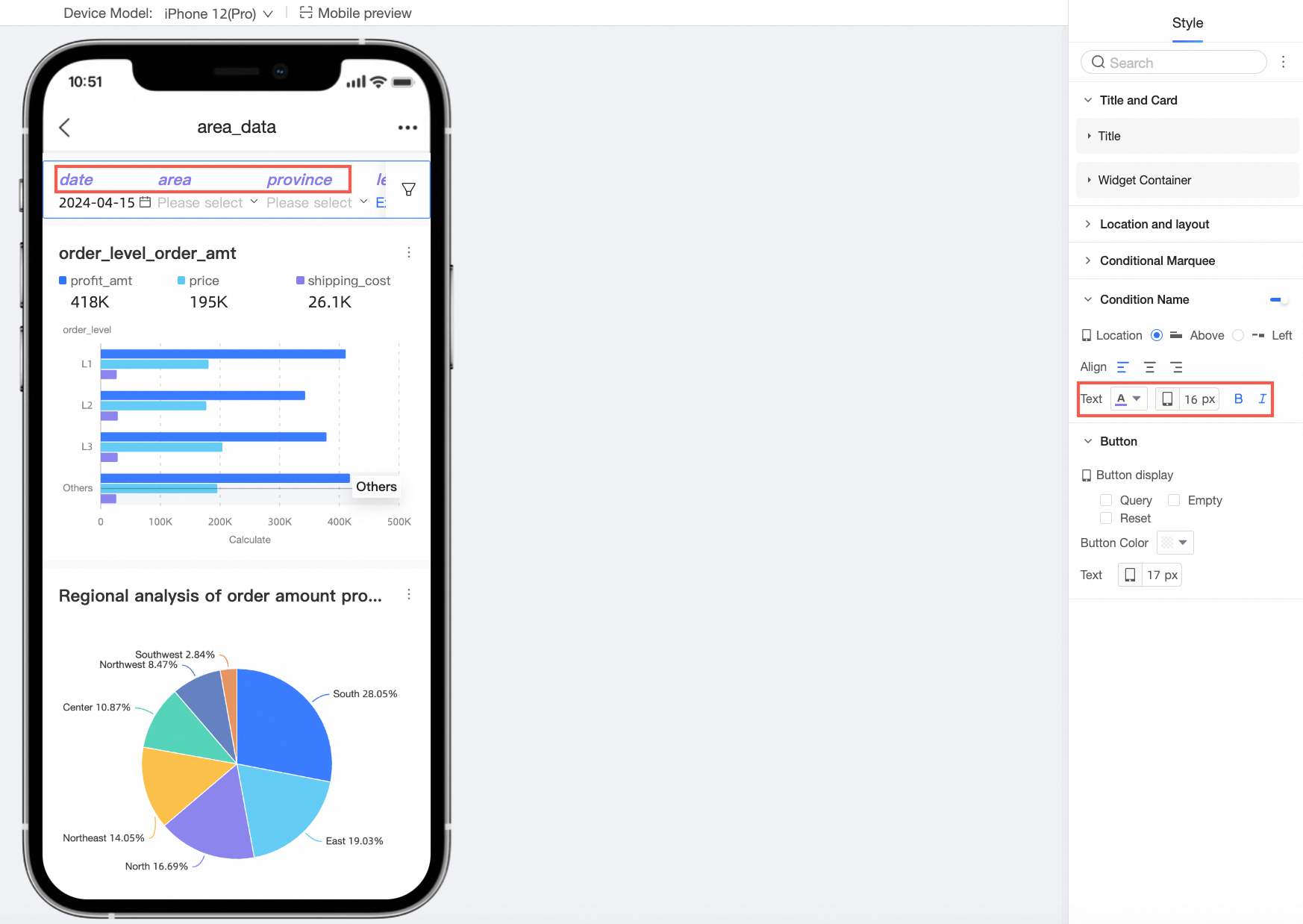
You can choose whether to show the Condition Name and configure its Position, Text style, and Spacing with Box.
Parameter
Description
Position
You can set the condition name's position to Above or Left. When set to Above, you can use left, center, or right alignment.
Text
You can configure the text style for the condition name.
-
In the Button section, you can configure Button Display, Button Color, and Text font size.