The date and time control lets you input or select date and time values.
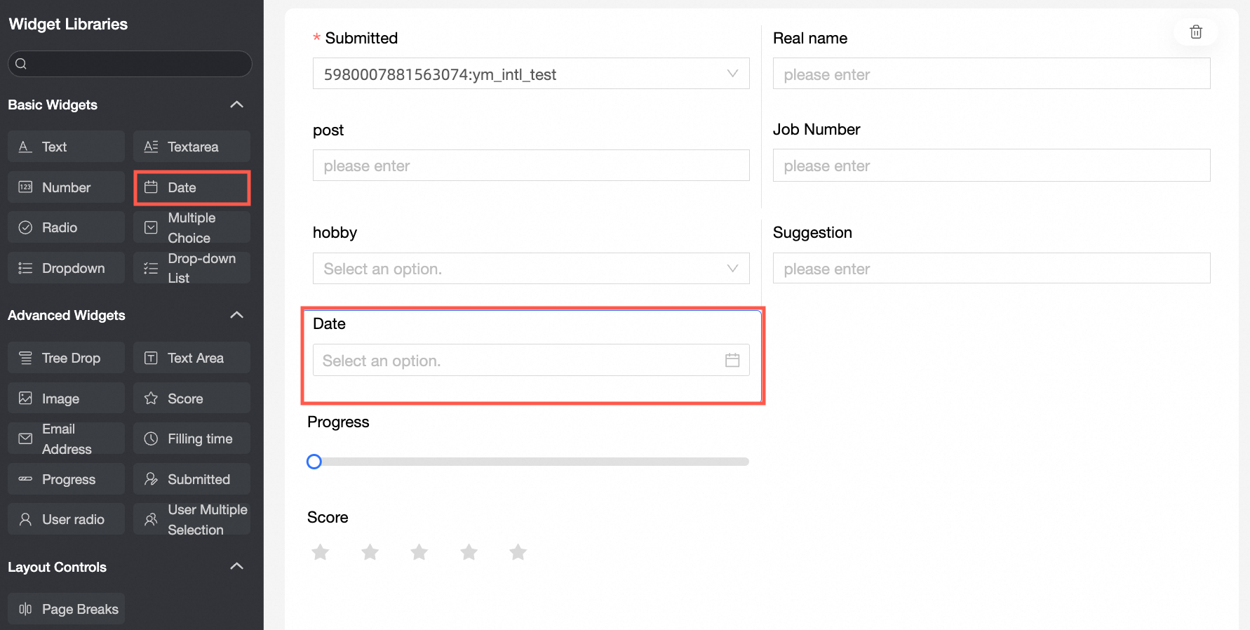
Use cases
Use the date and time control for date-related information, such as a date of birth or questionnaire submission date.
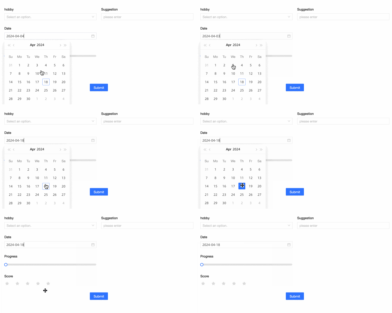
Preview
Control configuration
Basic settings
Parameter | Description |
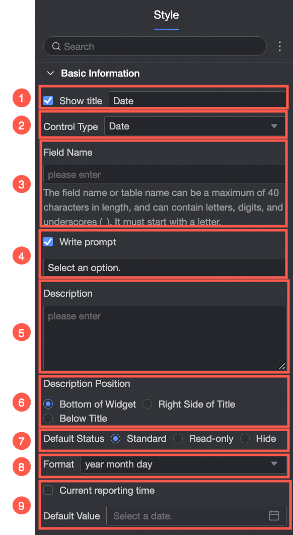
| ① Display title: Shows or hides the control's title. This title is also used as the column name for submitted data. |
② Control type: Lets you change the control to another type, such as a basic or advanced control. | |
③ Field name: Sets the corresponding field name in the data table generated from submissions. Note A field name or table name must start with a letter and can contain letters, digits, and underscores (_). The maximum length is 40 characters. | |
④ Placeholder: Text that appears in the control when it is empty, such as "Please enter a value". | |
⑤ Description: Specifies a custom description for the control. | |
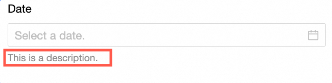
⑥ Description position: Sets where the description appears. Options are Bottom of control, Right of title, and Below title. The following image shows an example of a description at the bottom of the control:
| |
⑦ Default state: Sets the control's initial state. Options are Normal, Read-only, and Hidden. | |
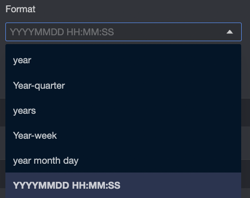
⑧ Format: Sets the display format for the date and time. Six formats are available.
| |
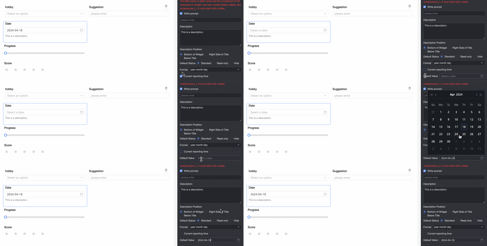
⑨ Default value: Sets the initial value of the control. If you select Current submission time, the control populates with the user's local time.
|
Validation
Parameter | Description |
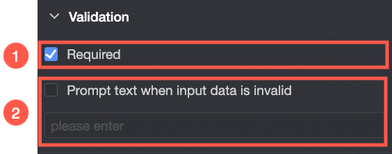
| ① Required: Makes the control a required field. |
② Error message: The custom message to display when validation fails. This option is available only when a validation rule is active. For example, if this field is Required and left empty, this message is displayed. |
Style
Parameter | Description |
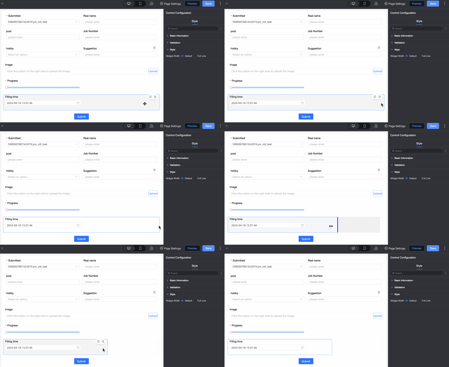
| Control width: Sets the control's width to default or full width. Note On the data entry page, you can also manually adjust the control's width by dragging its border.
|