Date Selection
A date selection is an interactive widget that lets you customize the size, color, text style, and query conditions of a date picker. You can use it with other widgets to filter and display data in visual charts.
Prerequisites
A data dashboard is created. For more information, see Create a Data Visualization Screen.
Effect

Add a Date Selection
On the dashboard edit page, click Interactive in the top navigation bar to add a date selection. 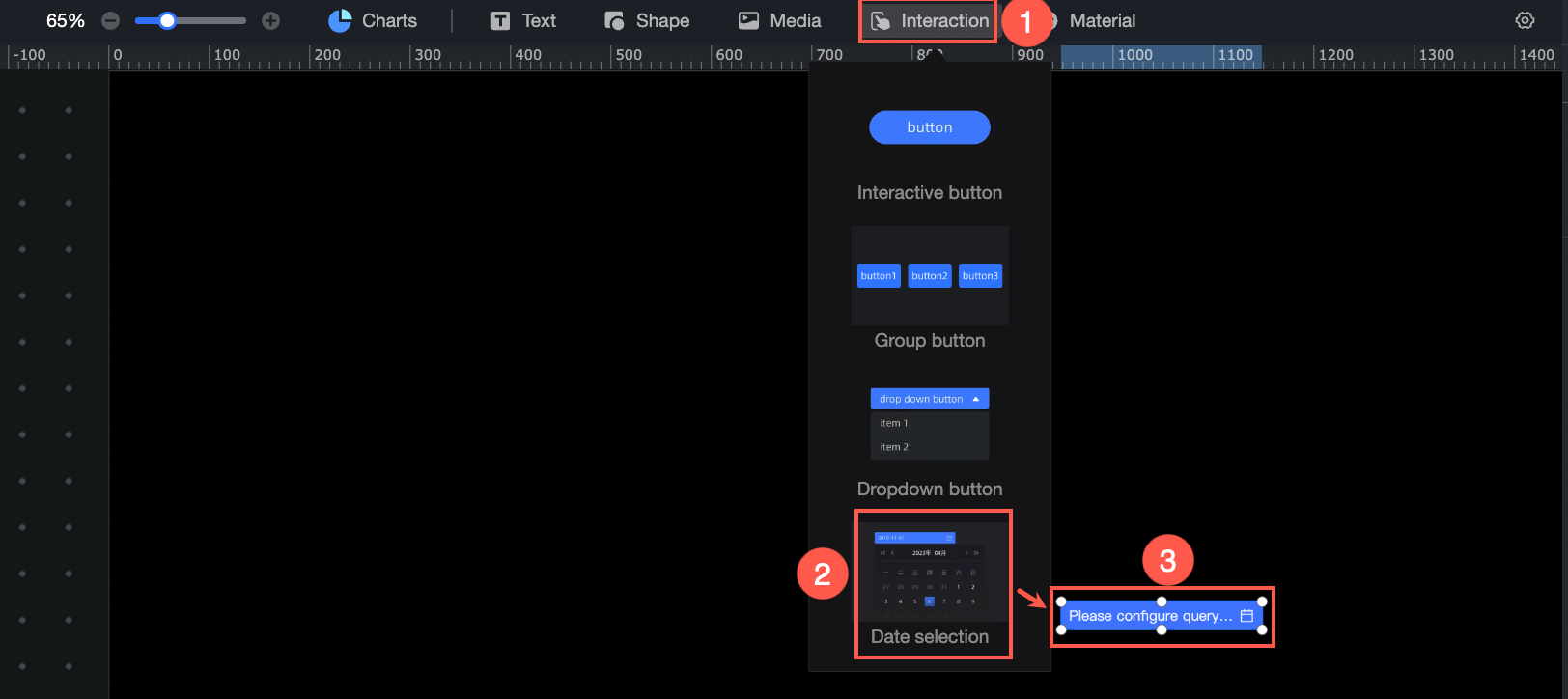
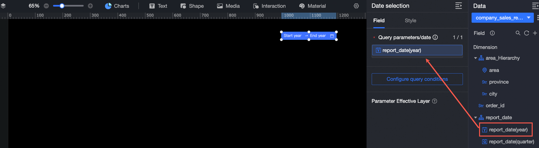
Data Configuration
In the data configuration section, you can configure query parameters, configure query conditions, and bind parameters to effective layers.
Configure Query Parameters
Drag a date field from a dataset to the date selection. The supported date granularities are year, quarter, month, or day. Only one dimension can be used.
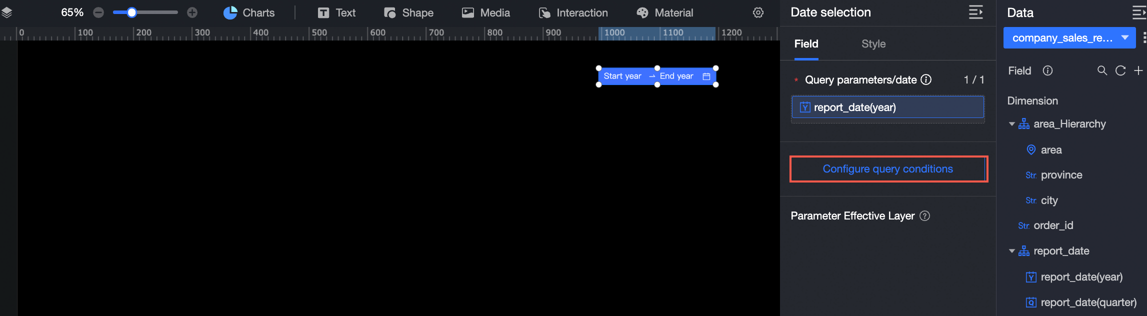
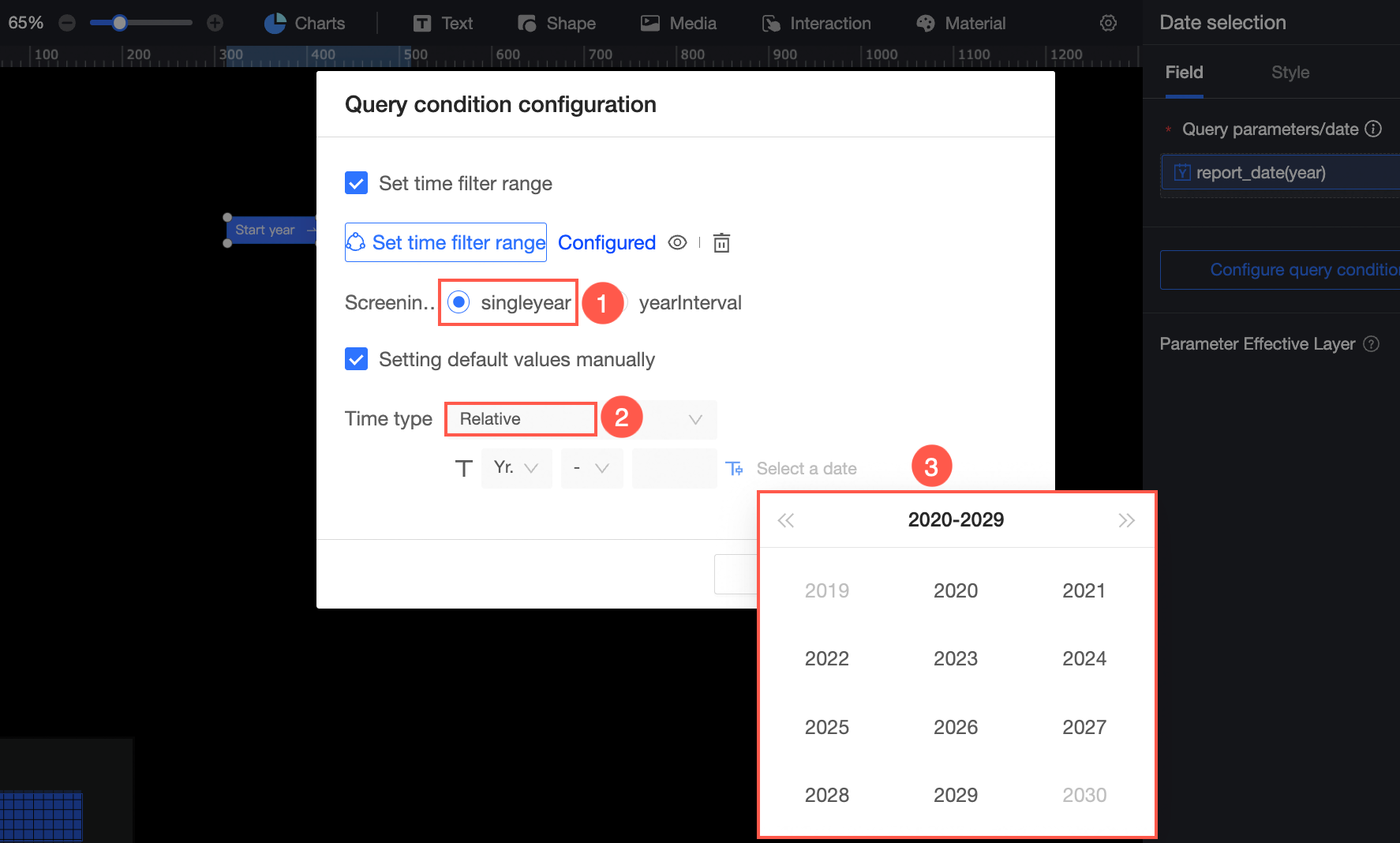
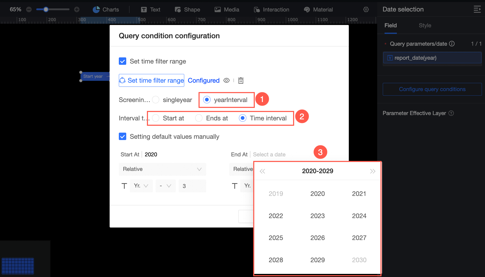
Configure Query Conditions
You can configure Time Range, Filter Method, and Default Value as shown below:
-
Set Time Filter Range: You can specify a time range to filter. You can select Start At, End At, or Time Interval. The following example shows how to set the time interval to 2020 to 2023.
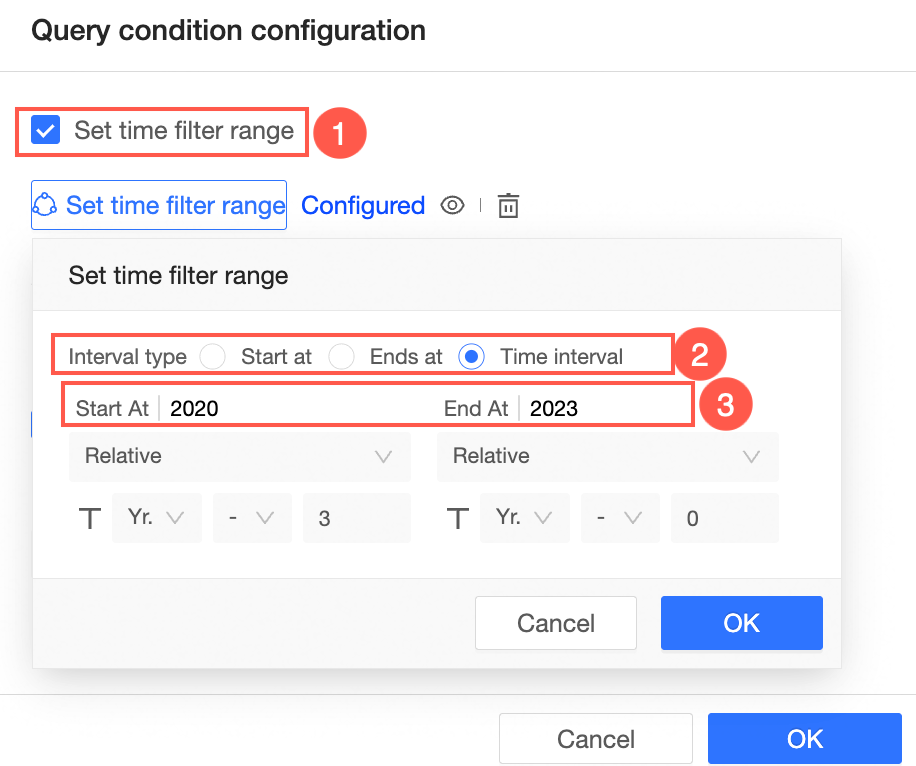 When you click the date selection, the time range that can be selected is from 2020 to 2023. The configuration effect is as follows:
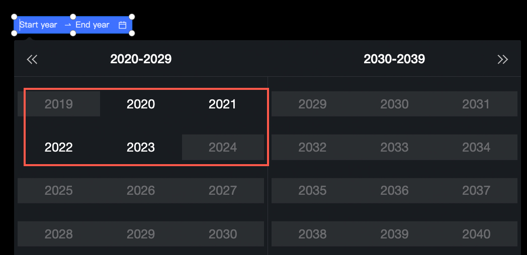
-
Filter By: You can specify a time range or a time interval.
-
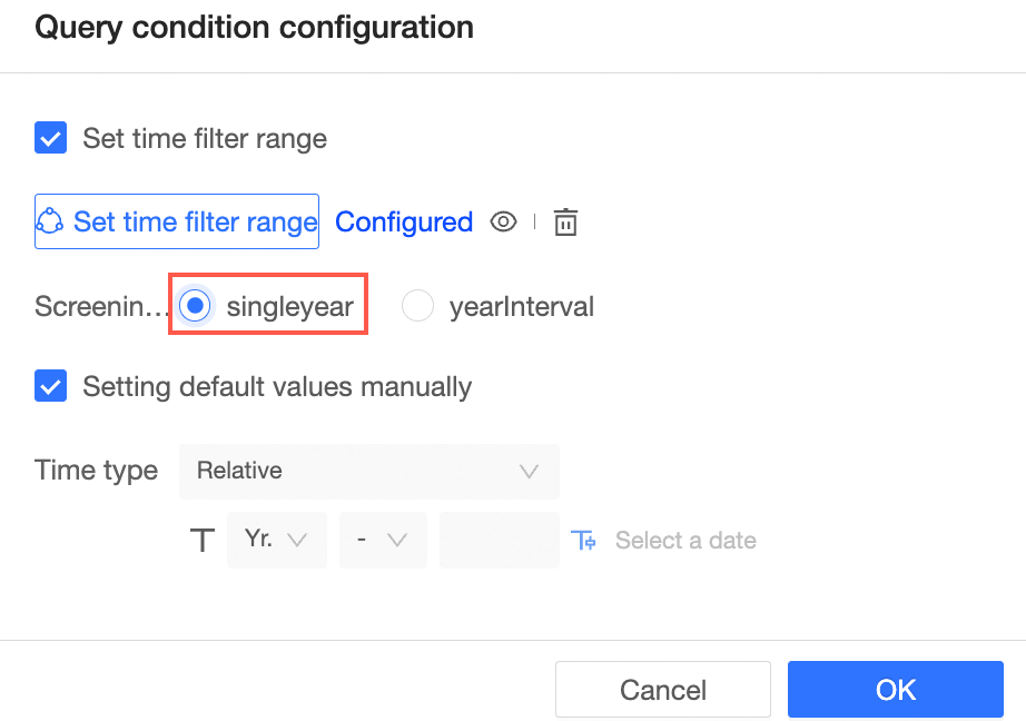
Single time:
-
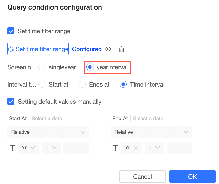
yearInterval (Start at, End at, and Time Interval are supported. Shortcut Interval is not supported.)
-
-
Default value:
-
Single Time:
-
yearInterval:
-
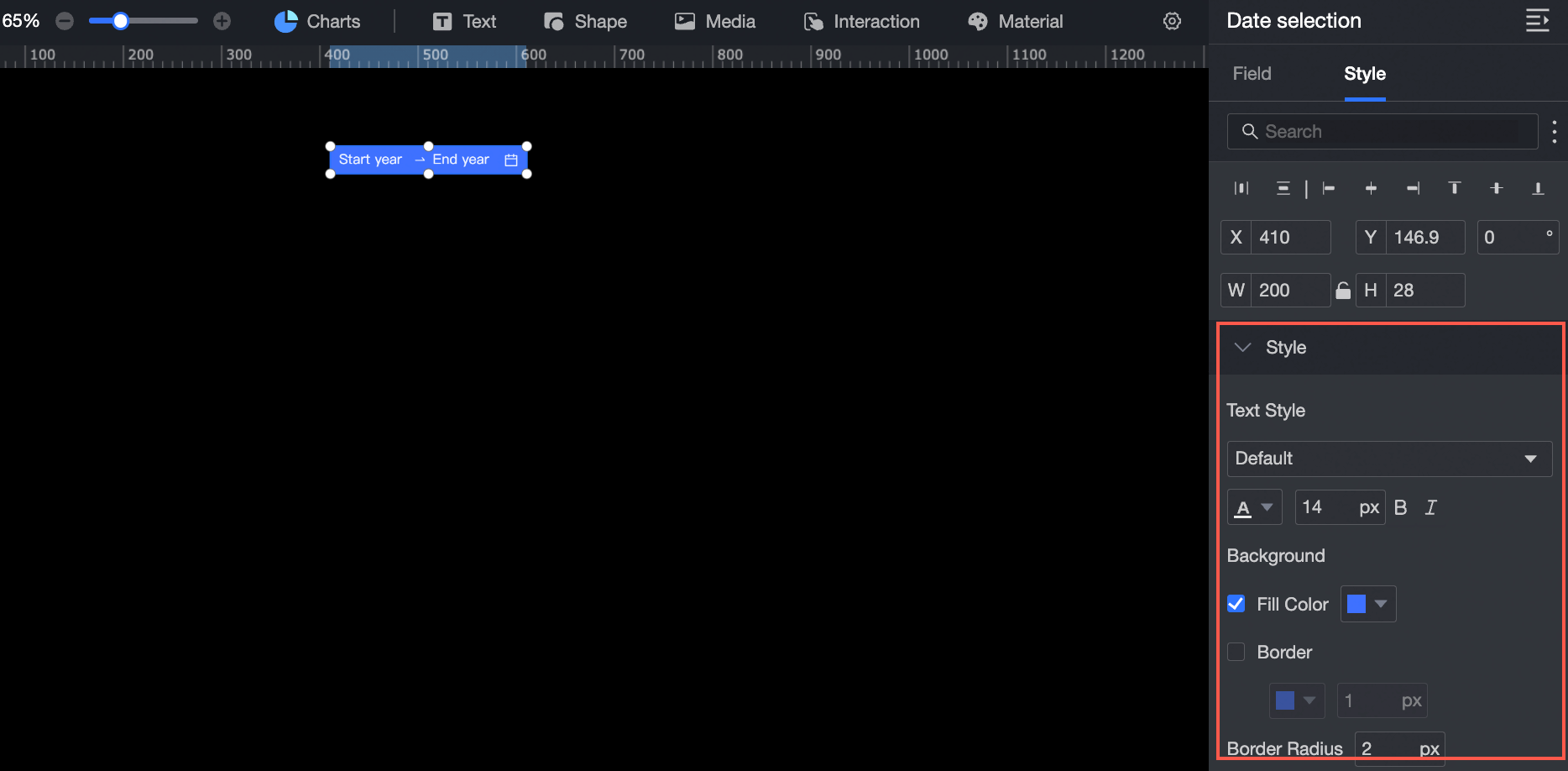
Style Settings
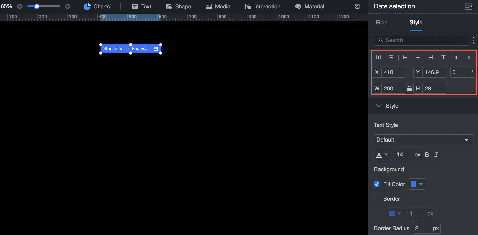
Location and Size
Configure the following layout properties:
-
Alignment: Set left, center, or right alignment.
-
Position: Set the X and Y values to move the widget relative to the upper-left corner.
-
Rotation: Set the rotation angle.
-
Size: Set W and H to adjust the width and height.
-
Lock: Prevent the widget from being moved or resized.
Text Style
Configure the following text and appearance properties:
-
Font: Set the font family, color, size, bold, and italic properties.
-
Background: Set the background fill color.
-
Border: Set the border style, color, and width.
-
Corner radius: Set the border corner radius.