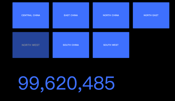
A group button is an interactive widget that lets you customize the color, size, label content, and background of a list in various states. You can pair a group button with other widgets to display configured content in a visual chart. This topic uses the interaction between a group button and a ticker board as an example.
Prerequisites
-
A visualization screen is created. For more information, see Create a Data Visualization Screen.
-
The ticker board widget is added. For more information, see Ticker Board.
Effect
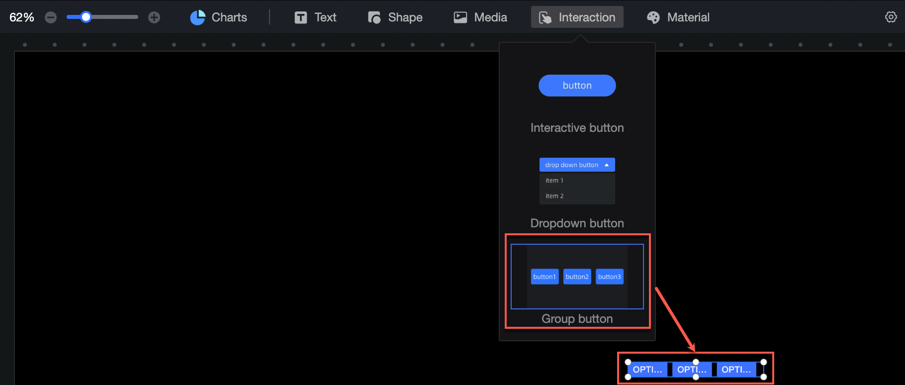
Add a group button control
-
On the dashboard edit page, click Interaction in the top navigation bar to add a group button control.
-
Click Select Dataset and follow the instructions in the following figure to add data as the parameter source and bind the layer controlled by the parameter. The updated interaction diagram is as follows:
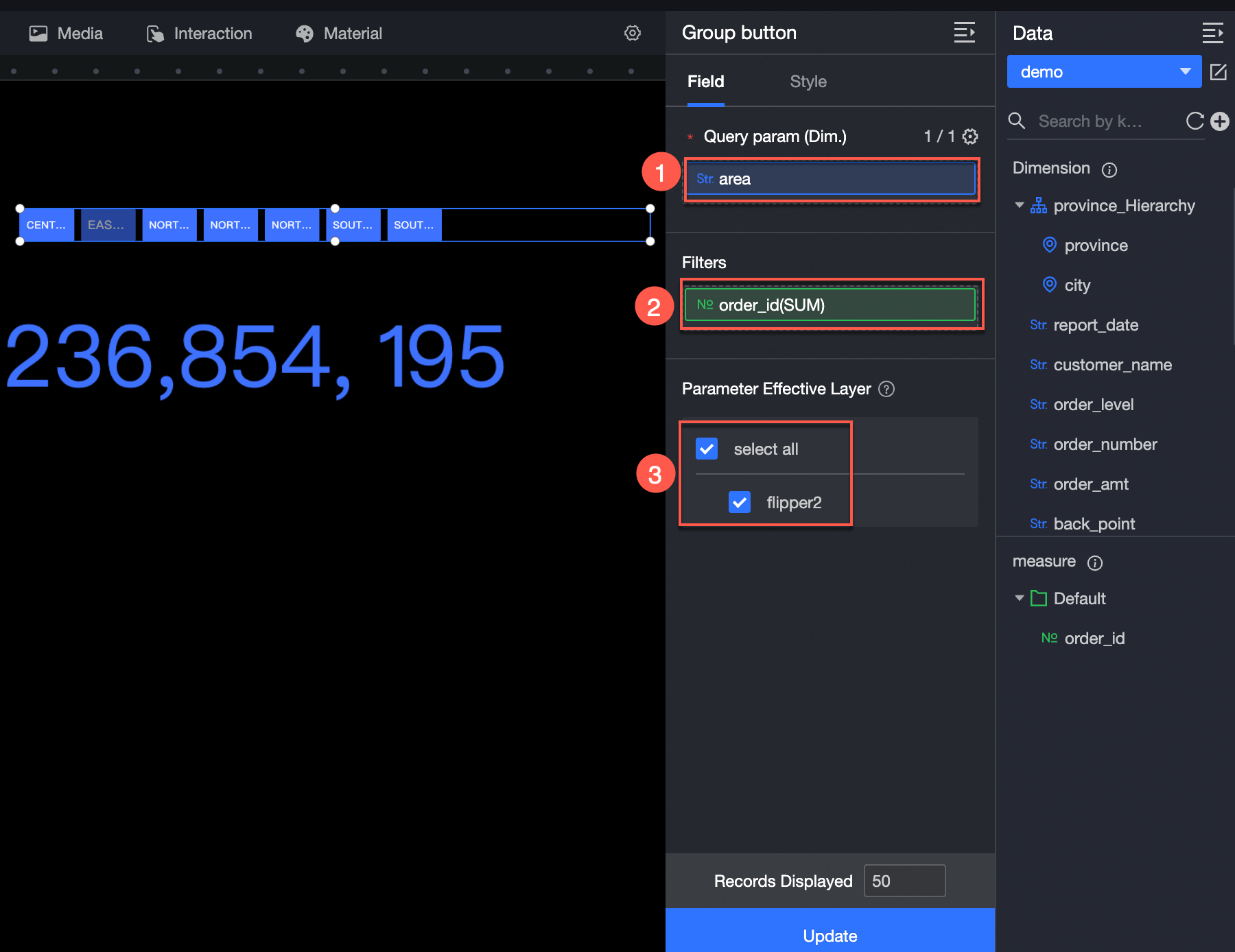
The following data operations are also available: 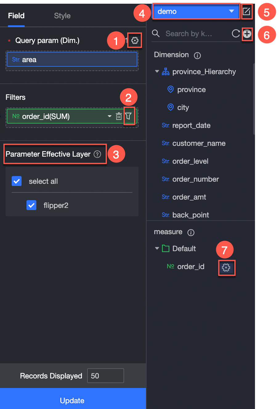
-
Configure multiple field formats.(①) For more information, see Configure multiple field formats.
-
Configure field filtering.(②) For more information, see Filter data.
-
Add an interactive component (③).
-
Switch a dataset.(④) For more information, see Switch a dataset.
-
Edit a dataset. (⑤)For more information, see Edit a dataset.
-
Create a calculated field and a grouping dimension. (⑥) For more information, see Create a calculated field and Create a grouping dimension.
-
Copy fields.(⑦) For more information, see Copy to Dimension.
Group Button Style Configuration
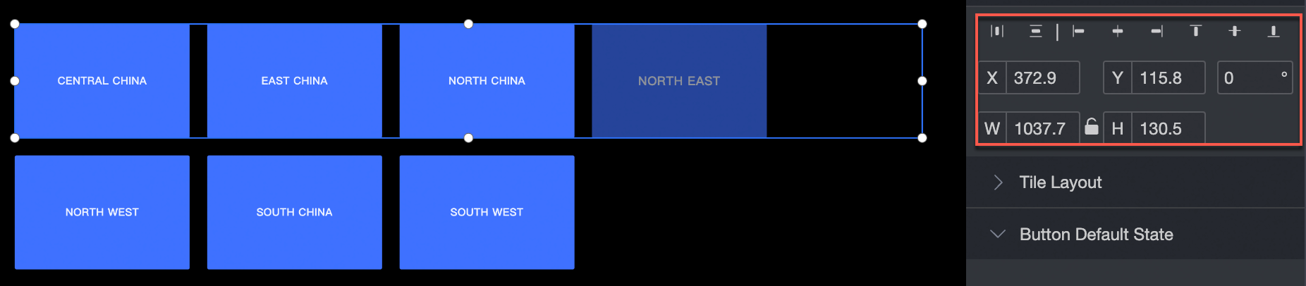
Location and size
Configure the following location and size settings:
-
Alignment: left, center, or right.
-
Position: set the X and Y values, using the upper-left corner as the origin.
-
Rotation angle: set the rotation angle of the widget.
-
Size: set the W and H values to adjust the width and height.
-
Lock: prevents further changes to the size and position of the widget.
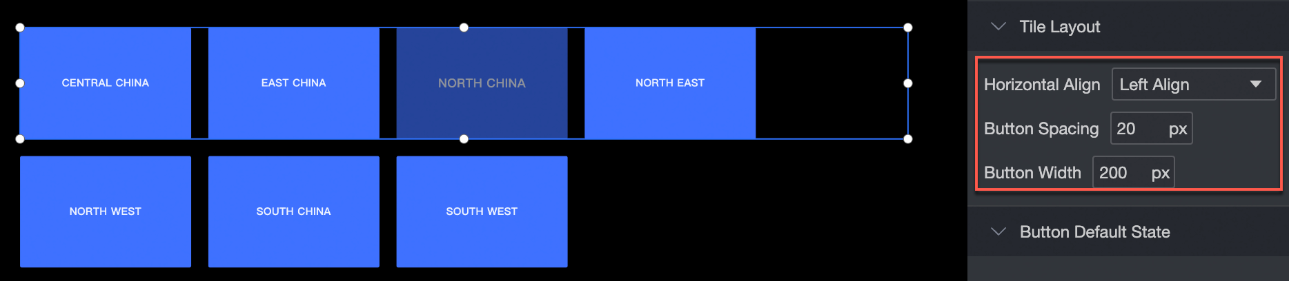
Tile Layout
Configure the following tile layout settings:
-
Horizontal alignment: left, center, or right.
-
Button layout: adjust the spacing and width of buttons.
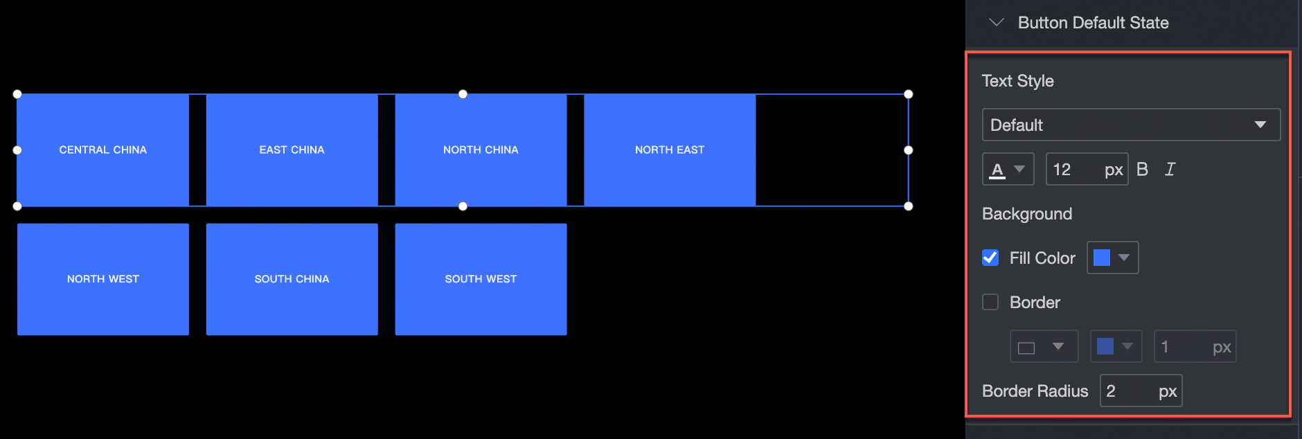
Default button state
Configure the following default button style settings:
-
Font style: set the font, color, font size, bold, and italic properties.
-
Background: set the background fill color.
-
Border: set the border style, color, and width.
-
Corner radius: set the corner radius of the border.
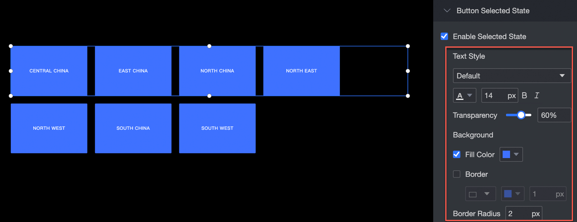
Selected Status
Configure the following selected button style settings:
-
Font style: set the font, color, font size, bold, and italic properties.
-
Background: set the background fill color.
-
Border: set the border style, color, and width.
-
Corner radius: set the corner radius of the border.
Carousel playback is supported.
Configure the carousel rotation and time interval for the group button. 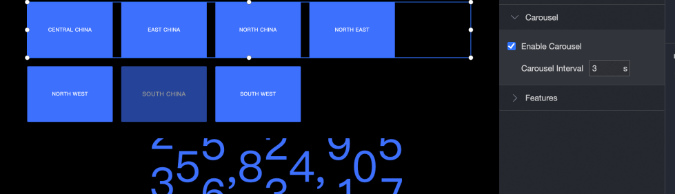
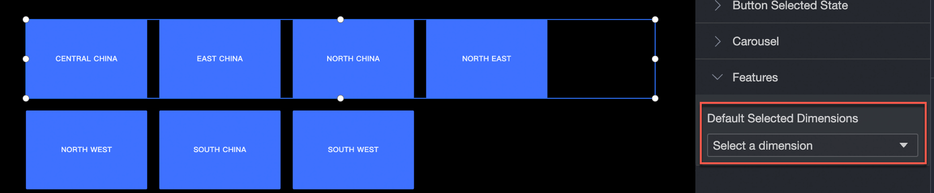
Feature
Set the dimension value for the group button.