This document describes the APIs for the embedded JS SDK.
Feature parameter
The embedded JS SDK provides the following main feature configuration interfaces: src, feature, events, and action.
Parameter | Description | Required | Example |
Defines the source of the embedded page and its parameters. | Yes | Sets the dashboard editing page as the embedded page. | |
Configures display properties of the embedded page, such as the visibility of its components or the text it displays. | No | Hides the header of the embedded Quick BI page. | |
Specifies event listeners for the embedded page. Supported events are triggered before page redirection and after chart rendering. | No | Listens for the redirection from the dashboard editing page to the dashboard list. | |
Enables the host system to trigger actions on the embedded page. Supported actions include route redirection, updating embedded features, and scrolling the page. | No | Redirects the embedded Quick BI page to a new page. |
src
Defines the source for an embedded page. Its type is EmbedSrcUnion. The following table describes its parameters.
Parameter | Type | Required | Description |
src.page |
| Yes | In Quick BI, each works page and each tab on a list page can be considered a route. Examples include the dashboard preview page, the dashboard edit page, and the workbench dashboard list page. This parameter specifies the route key for the page to embed. For example, to embed a dashboard preview page, set |
src.origin |
| Yes | The |
src.search |
| No | The query parameters for the embedded Quick BI page. For example, the workspace page requires a workspace ID, specified as |
src.pathParams |
| No | Only a few pages require path parameters when you embed Quick BI pages. For example, the works ID for the data entry edit page and preview page is passed as a path parameter, so you need to set |
Sample code
<EmbedComponent
      src={
        origin: 'xxx',  // The host for accessing Quick BI
        page: EmbedRouteKey.dashboardEdit,  // The EmbedRouteKey for the dashboard edit page
        // Query parameters for the Quick BI dashboard page
        search: {
          workspaceId: 'xxx',  // Workspace ID
          id: 'xxx',  // Works ID
        }
      }
    />
Feature
An embedded feature is a configuration that temporarily controls display properties, such as UI component visibility and display text. For example, you can hide a page header. This configuration is of type EmbedFeatureIntersect and has a three-level structure: routing > feature module > feature configuration item. The key at the routing level is EmbedRouteKey, which defines the feature's scope. The following code shows an example.
feature: {
  [routing key]: {
    [functional module]: {
      [feature configuration key]: value
    }
  }
}
Some features use a two-layer structure: routing > feature configuration item. This structure controls whether the module for the corresponding routing is displayed, as shown in the sample code below.
feature: {
  [routing key]: {
    [feature configuration key]: value
  }
}
You can configure features for multiple routes simultaneously. The table below lists the route parameters.
Route key | Description |
Controls the root page. | |
Controls the workspace page. | |
Controls the work platform page. | |
Controls the monitoring and alert management page. | |
Controls the dashboard edit page. | |
Controls the workbook edit page. | |
Controls the data screen edit page. | |
Controls the ad-hoc analysis edit page. | |
Controls the self-service data retrieval edit page. | |
Controls the data entry edit page. | |
Controls the data preparation edit page. | |
Controls the dataset edit page. | |
Controls the workbook data entry approval page. | |
Controls the dashboard view page. | |
Controls the dashboard public view page. | |
Controls the subscription management page. | |
Controls the subscription task page. | |
Controls the send history page. | |
Controls the organization management page. | |
Controls the member management page. | |
Controls the user group management page. | |
Controls the user tag management page. | |
Controls the user tag page. | |
Controls the tag management page. | |
Controls the role management page. | |
Controls the Copilot page. | |
Controls the Copilot Q&A page. | |
Controls the Copilot Report page. | |
Controls the Copilot Report page. |
Sample code
<EmbedComponent
  feature={{
    [EmbedRouteKey.homeRoot]: {
      // workbench...
    },
    [EmbedRouteKey.dashboardEdit]: {
      // dashboard edit page...
    },
    // ...
  }}
/>
EmbedRouteKey.homeRoot
As the root page for Home, homeRoot's feature configurations apply to all its child pages. For example, hiding the header on the homeRoot page also hides it on all child pages, such as the workPlatform workbench, workspace workspace, templateRoot template marketplace, view My Dashboard, subscriptionManage subscription management, and monitorManage monitoring and alerts. The scope of this property is as follows.
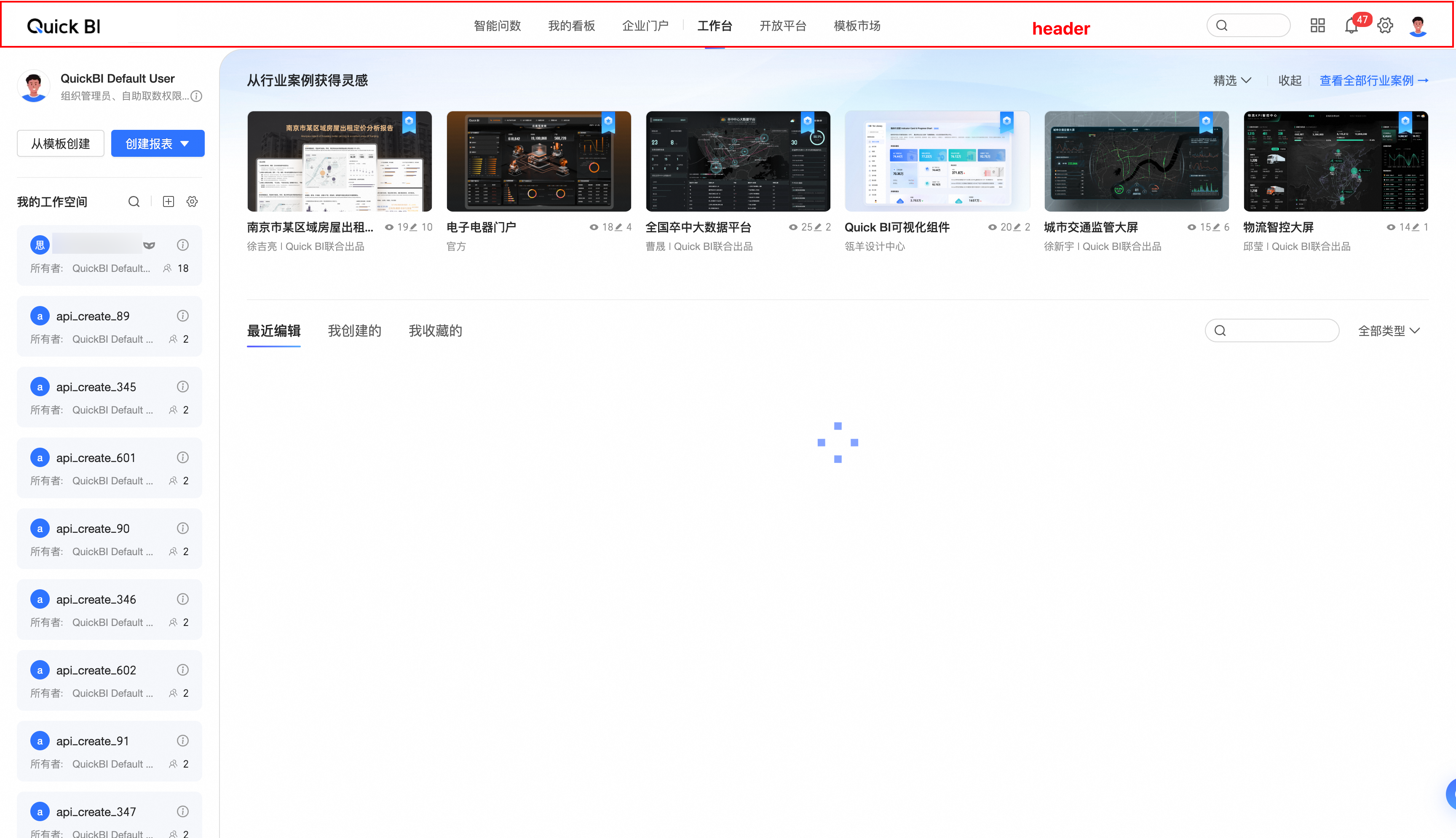
header: Settings for the home page header.
header.show
type:
booleandefault value:
truedescription: Shows or hides the header navigation on the home page.
EmbedRouteKey.workspace
The control scope for each attribute in the workspace feature configuration is as follows.
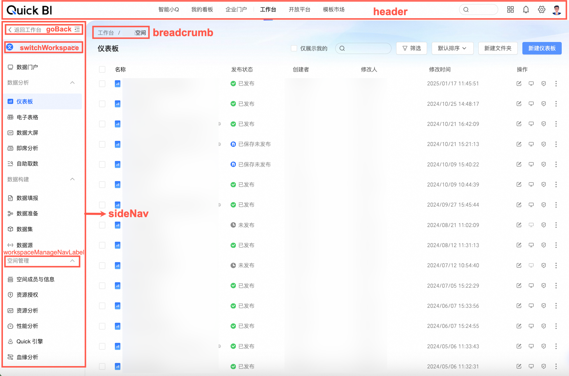
header: Configures the workspace header.
header.show
Type:
booleanDefault:
trueDescription: Shows or hides the workspace header.
goBack: Configures the 'Back to Workbench' feature.
goBack.show
Type:
booleanDefault:
trueDescription: Shows or hides the 'Back to Workbench' control.
goBack.text
Type:
stringDefault:
'Back to Workbench'Description: Specifies the text for the 'Back to Workbench' control.
switchWorkspace: Configures the workspace switching feature.
switchWorkspace.show
Type:
booleanDefault:
trueDescription: Shows or hides the workspace switching control.
breadcrumb: Configures the workspace breadcrumb.
breadcrumb.show
Type:
booleanDefault:
trueDescription: Shows or hides the breadcrumb.
workspaceManageNavLabel: Configures the 'Space Management' navigation label.
workspaceManageNavLabel.text
Type:
stringDefault:
'Space Management'Description: Specifies the text for the 'Space Management' navigation label.
sideNav: Configures the workspace side navigation.
sideNav.show
Type:
booleanDefault:
trueDescription: Shows or hides the side navigation.
EmbedRouteKey.workPlatform
The attributes in the workbench feature configuration control the following.

userInfo: Configures the user information feature on the workbench page.
userInfo.show
Type:
booleanDefault:
trueDescription: Controls whether the user information is displayed.
myWorkSpace: Configures the My Workspace feature on the workbench page.
myWorkSpace.text
Type:
stringDefault:
'My Workspace'Description: Specifies the text for the My Workspace section.
EmbedRouteKey.monitorManage
This section describes the feature configuration for the Monitoring and Alarm Management page and the scope of each attribute.
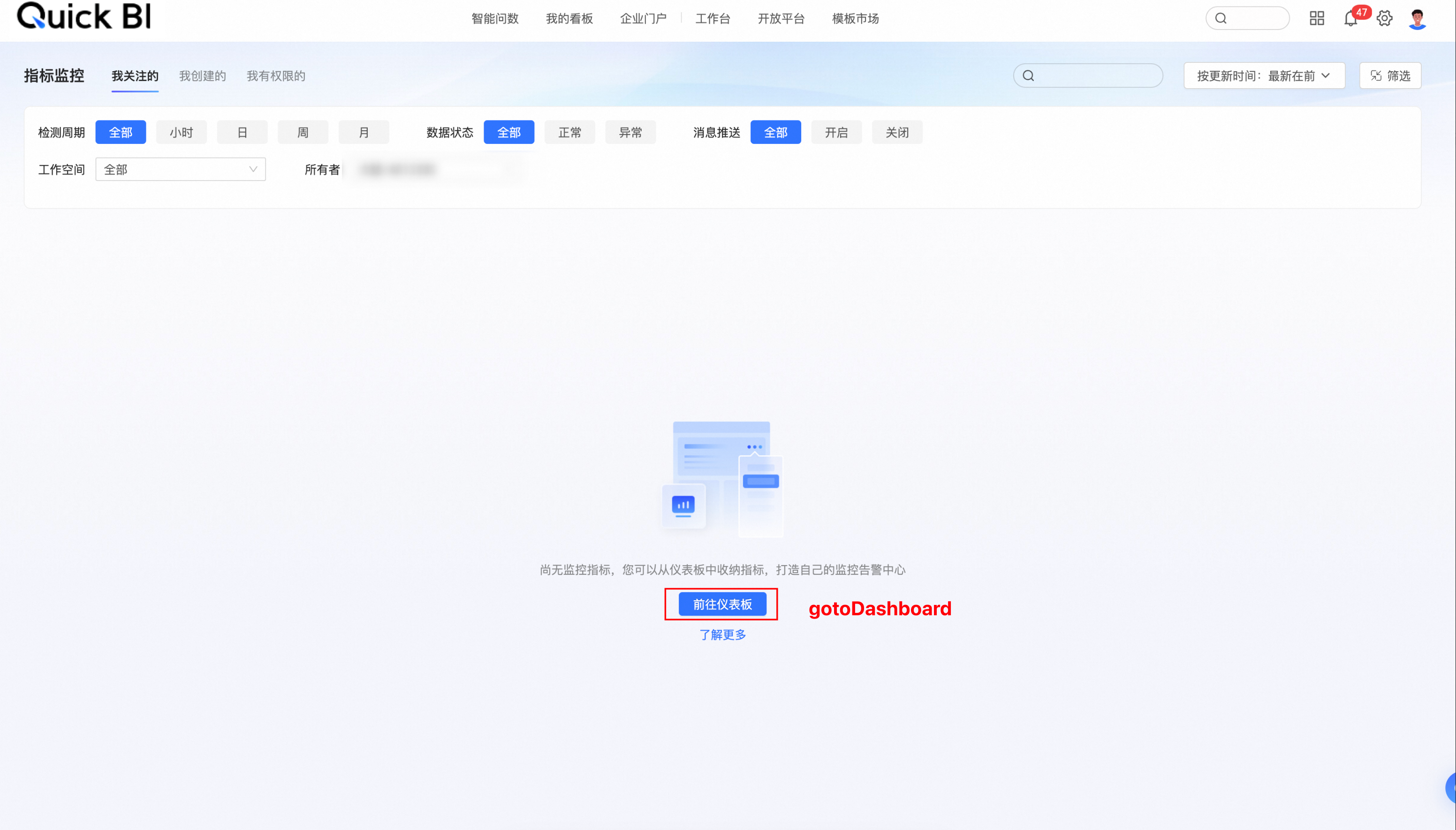
gotoDashboard: Configures the "Go to dashboard" button on the monitoring and alerting management page.
gotoDashboard.show
type:
booleandefault value:
truedescription: Specifies whether to display the "Go to dashboard" button.
EmbedRouteKey.dashboardEdit
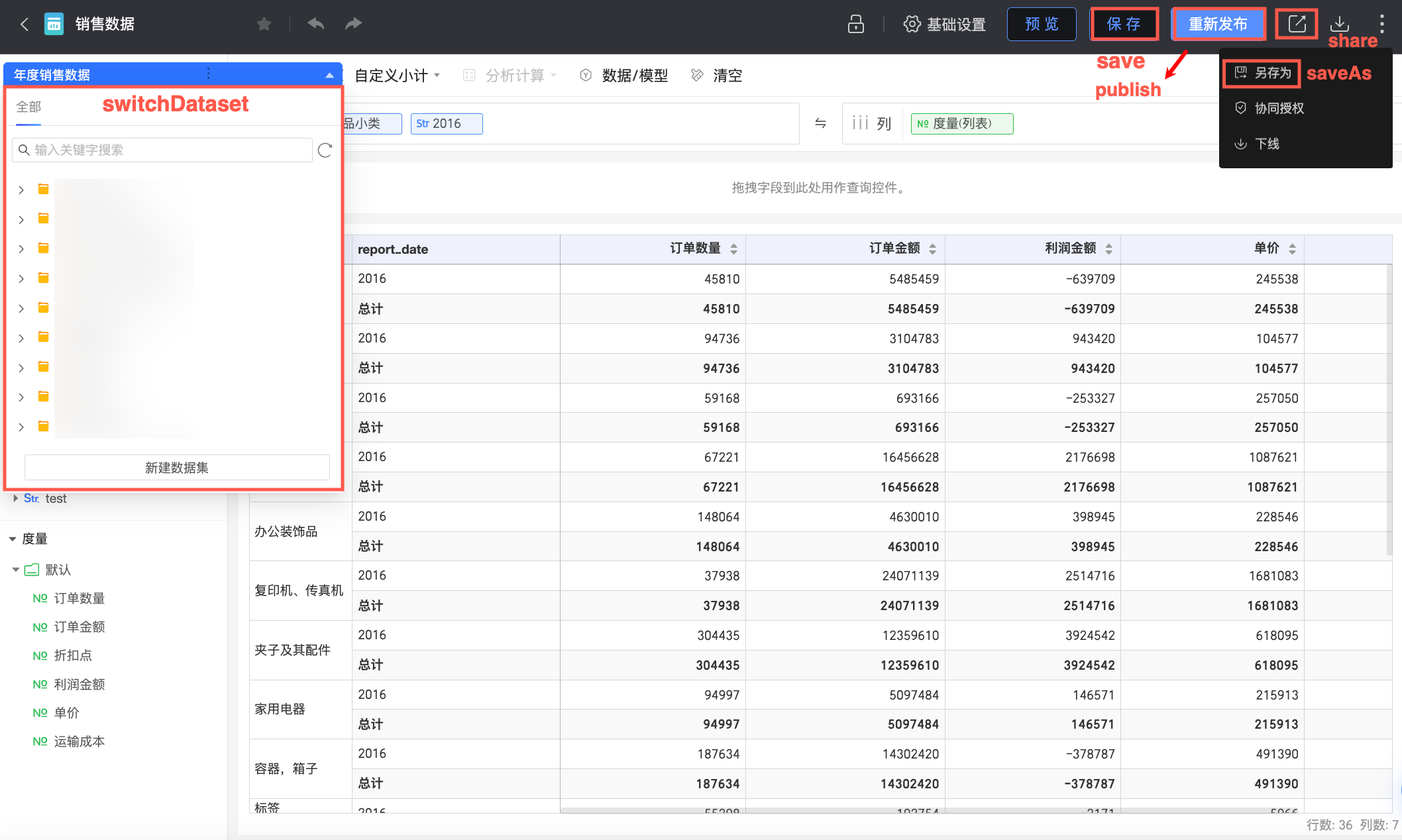
The following properties configure the features on the dashboard edit page.
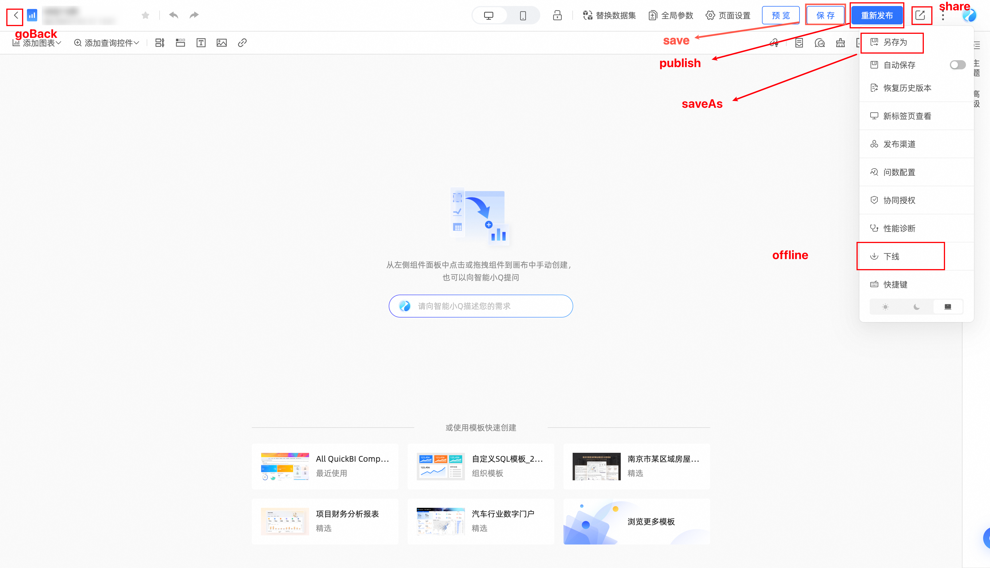
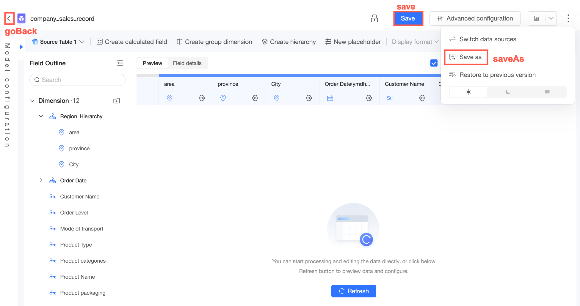
goBack: Configuration for the Go Back button.
goBack.show
Type:
booleanDefault:
trueDescription: Shows or hides the Go Back button.
publish: Configuration for the Publish button.
publish.show
Type:
booleanDefault:
trueDescription: Shows or hides the Publish button.
saveAs: Configuration for the Save As button.
saveAs.group
Type:
'state' | 'menu'Default:
'menu'Description: Controls the group for the Save As button. A value of
'menu'places it in the more menu, while'state'places it in the save and publish status area.
saveAs.order
Type:
numberDefault: -1
Description: Controls the order of the Save As button within its button group.
saveAs.type
Type:
'default' | 'primary'Default: 'default'
Description: Controls the style of the Save As button. This setting applies only when
saveAs.groupis set to'state'.
share: Configuration for the Share button.
share.show
Type:
booleanDefault:
trueDescription: Shows or hides the Share button.
offline: Configuration for the Offline button.
offline.show
Type:
booleanDefault:
trueDescription: Shows or hides the Offline button.
save: Configuration for the Save button.
save.show
Type:
booleanDefault:
trueDescription: Shows or hides the Save button.
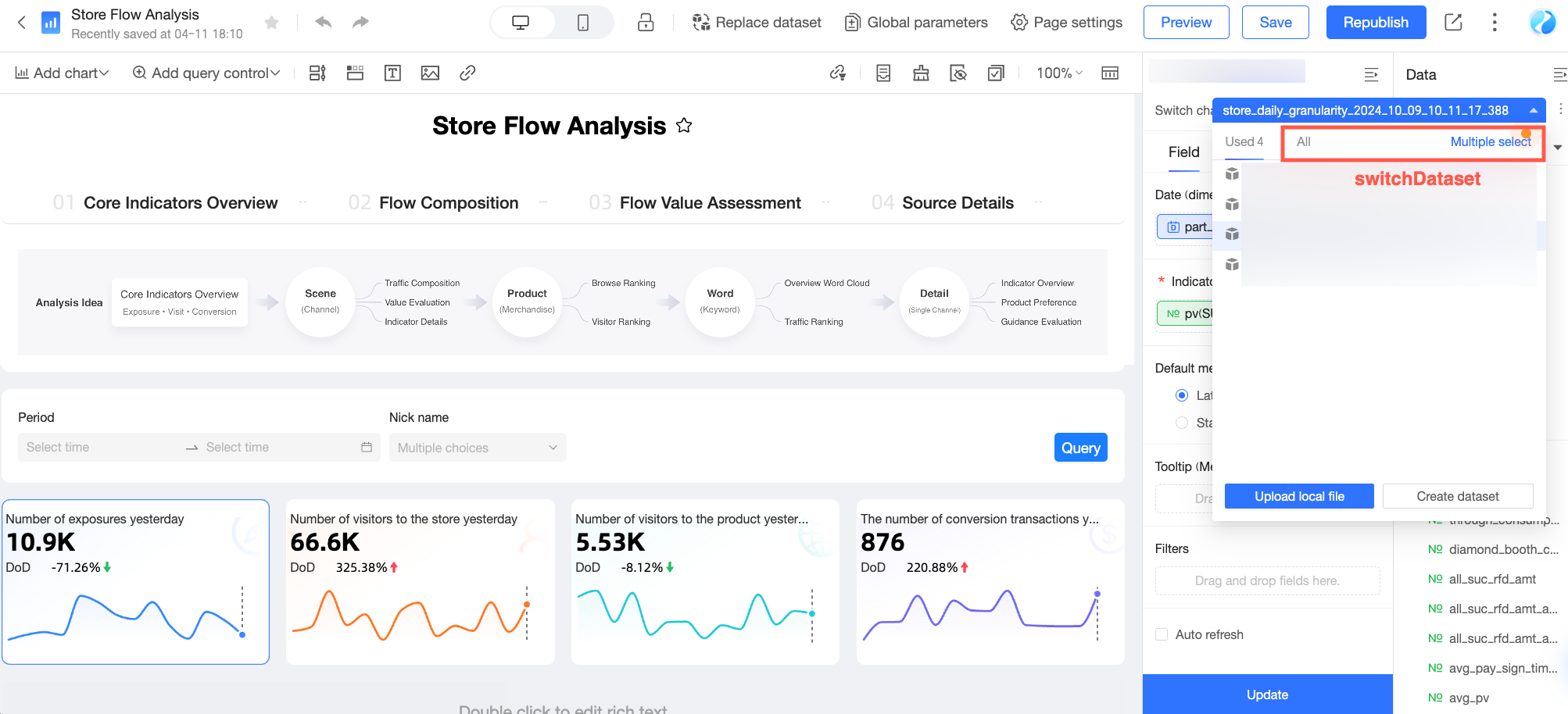
switchDataset: Configuration for the switch dataset feature.
switchDataset.disabled
Type:
booleanDefault:
falseDescription: Specifies whether to disable the switch dataset feature on the dashboard edit page.

EmbedRouteKey.workbookEdit
The following properties configure the features of the spreadsheet edit page.
goBack: Configures the back button.
goBack.show
Type:
booleanDefault value:
trueDescription: Shows or hides the back button.
publish: Configures the publish button.
publish.show
Type:
booleanDefault value:
trueDescription: Shows or hides the publish button.
saveAs: Configures the save as button.
saveAs.group
Type:
'state' | 'menu'Default value:
'menu'Description: Specifies the location of the save as button. A value of
'menu'places the button in the more menu, and'state'places it in the save and publish status area.
saveAs.order
Type:
numberDefault value: -1
Description: Specifies the display order of the save as button within its group.
saveAs.type
Type:
'default' | 'primary'Default value: 'default'
Description: Specifies the style of the save as button. This property only applies if the group is
'state'.
offline: Configures the unpublish button.
offline.show
Type:
booleanDefault value:
trueDescription: Shows or hides the unpublish button.
save: Configures the save button.
save.show
Type:
booleanDefault value:
trueDescription: Shows or hides the save button.
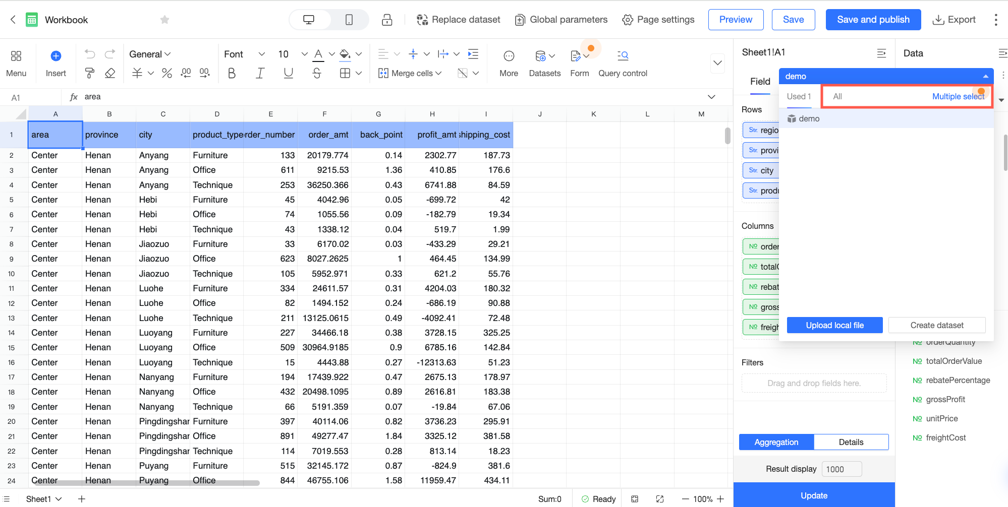
switchDataset: Configures the switch dataset button.
switchDataset.disabled
Type:
booleanDefault value:
falseDescription: Specifies whether to disable the switch dataset button on the spreadsheet edit page.
EmbedRouteKey.screenEdit
This topic describes the properties for feature configuration on the dashboard editing page.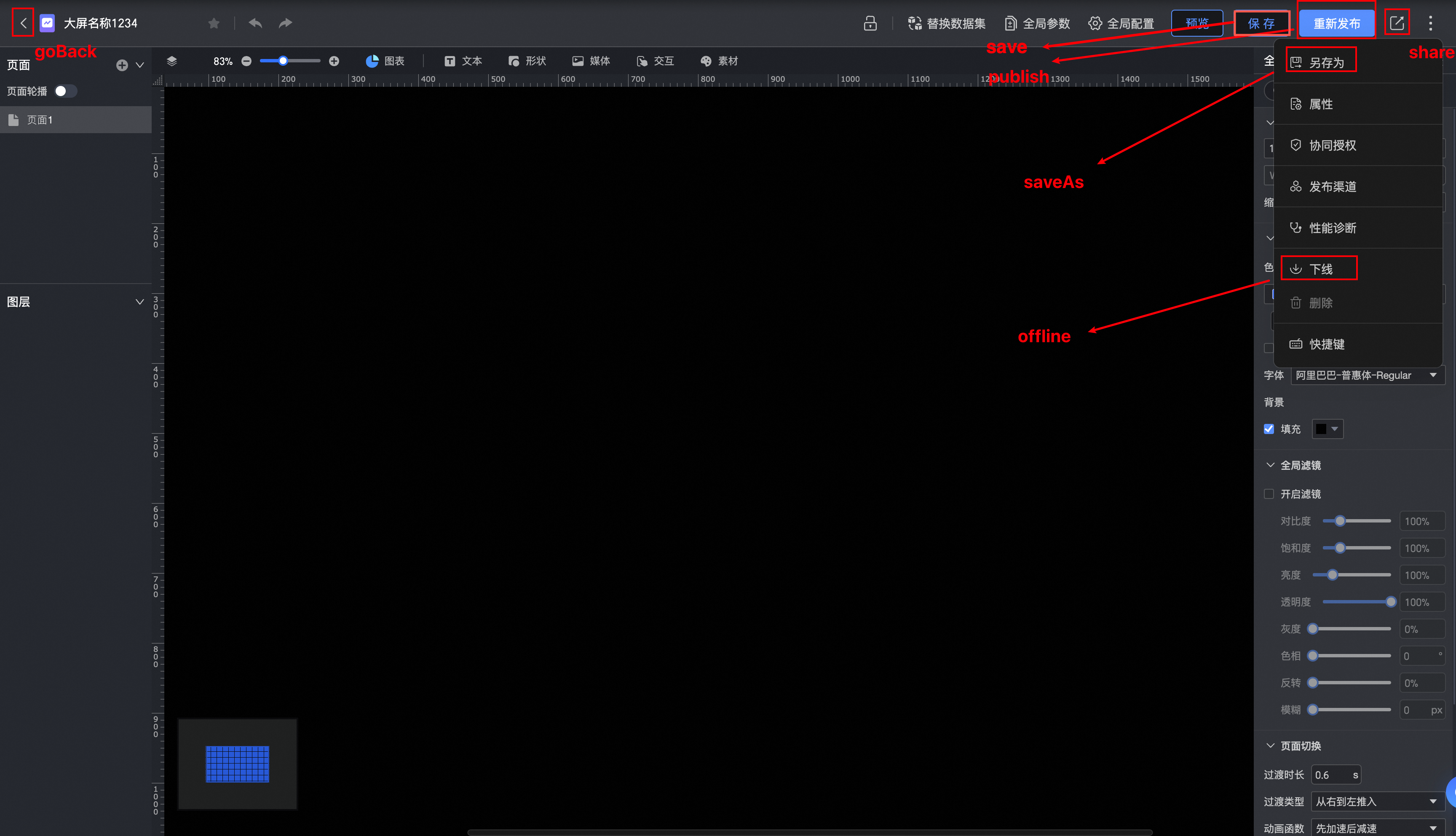
goBack: Configures the Back button properties.
goBack.show
Type:
booleanDefault value:
trueDescription: Shows or hides the Back button.
publish: Configures the Publish button properties.
publish.show
Type:
booleanDefault value:
trueDescription: Shows or hides the Publish button.
saveAs: Configures the Save As button properties.
saveAs.group
Type:
'state' | 'menu'Default value:
'menu'Description: Specifies the location of the Save As button. A value of
'menu'places the button in the More menu, while'state'places it in the save/publish status area.
saveAs.order
Type:
numberDefault value: -1
Description: Specifies the display order of the Save As button within its button group.
saveAs.type
Type:
'default' | 'primary'Default value: 'default'
Description: Specifies the style of the Save As button. This property applies only when the button belongs to the
'state'group.
share: Configures the Share button properties.
share.show
Type:
booleanDefault value:
trueDescription: Shows or hides the Share button.
offline: Configures the Offline button properties.
offline.show
Type:
booleanDefault value:
trueDescription: Shows or hides the Offline button.
save: Configures the Save button properties.
save.show
Type:
booleanDefault value:
trueDescription: Shows or hides the Save button.
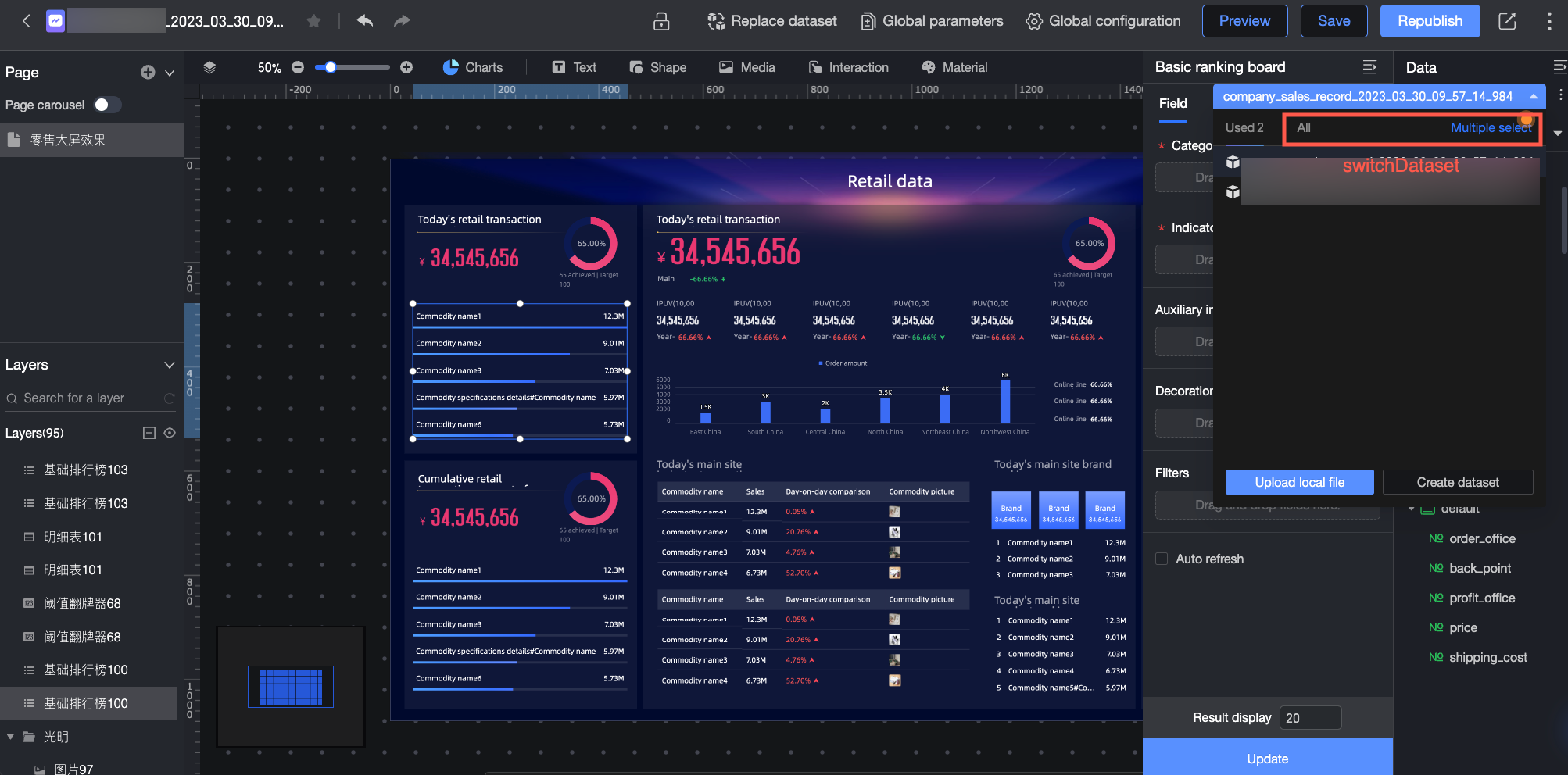
switchDataset: Configures the switch dataset feature.
switchDataset.disabled
Type:
booleanDefault value:
falseDescription: Specifies whether to disable the switch dataset feature on the dashboard editing page.
EmbedRouteKey.analysisEdit
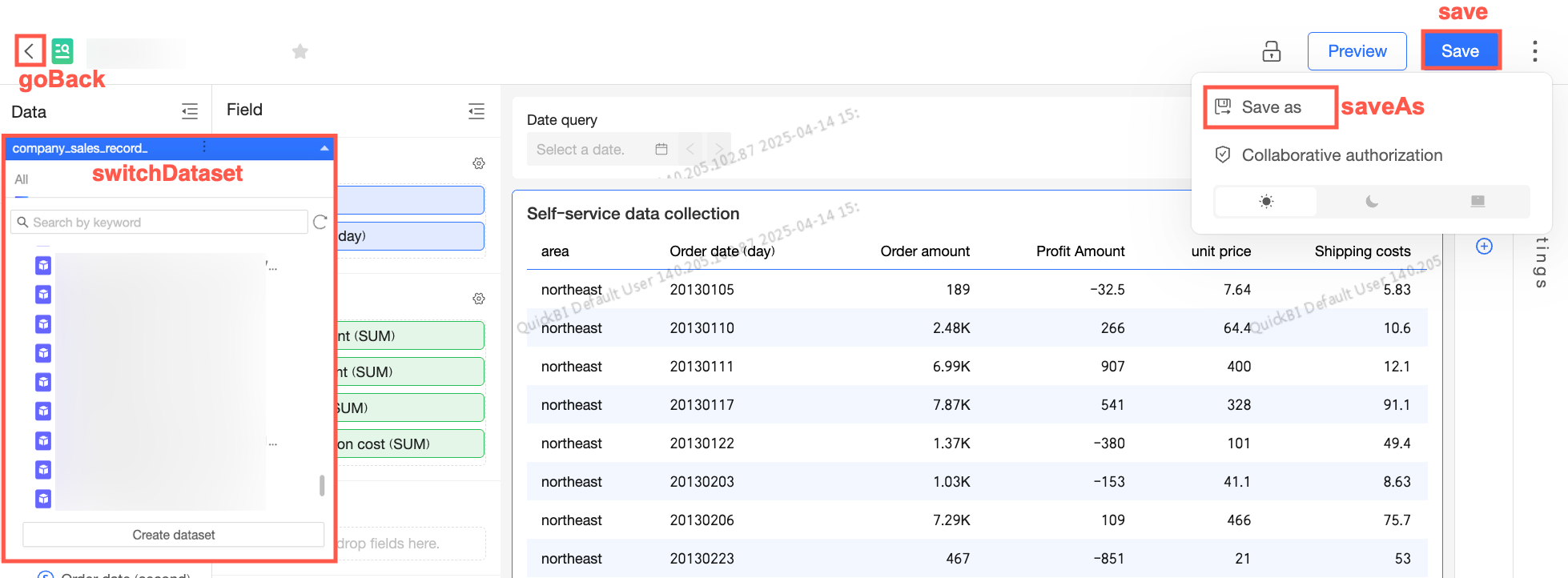
The following properties configure features on the ad-hoc analysis edit page.
goBack: Configures the back button.
goBack.show
Type:
booleanDefault value:
trueDescription: Shows or hides the back button.
publish: Configures the publish button.
publish.show
Type:
booleanDefault value:
trueDescription: Shows or hides the publish button.
saveAs: Configures the save as button.
saveAs.group
Type:
'state' | 'menu'Default value:
'menu'Description: Specifies the group for the save as button. A value of
'menu'places the button in the more menu, while'state'places it in the save and publish status area.
saveAs.order
Type:
numberDefault value: -1
Description: Controls the order of the save as button within the button group.
saveAs.type
Type:
'default' | 'primary'Default value: 'default'
Description: Controls the style of the save as button. This property applies only when the button is in the
'state'group.
save: Configures the save button.
save.show
Type:
booleanDefault value:
trueDescription: Shows or hides the save button.
switchDataset: Configures the switch dataset feature.
switchDataset.disabled
Type:
booleanDefault value:
falseDescription: Enables or disables the switch dataset feature on the ad hoc analysis edit page.
EmbedRouteKey.downloadEdit
This topic describes the feature configuration and the controls for attributes on the self-service data retrieval edit page.
goBack: Configures the back button.
goBack.show
Type:
booleanDefault:
trueDescription: Specifies whether the back button is displayed.
saveAs: Configures the save as button.
saveAs.group
Type:
'state' | 'menu'Default:
'menu'Description: Specifies the group that contains the save as button. A value of
'menu'places it in the more menu, and'state'places it in the save and publish status area.
saveAs.order
Type:
numberDefault: -1
Description: Sets the display order of the save as button within its button group.
saveAs.type
Type:
'default' | 'primary'Default: 'default'
Description: Sets the style of the save as button. This property only takes effect when
saveAs.groupis set to'state'.
save: Configures the save button.
save.show
Type:
booleanDefault:
trueDescription: Specifies whether the save button is displayed.
switchDataset: Configures the switch dataset functionality.
switchDataset.disabled
Type:
booleanDefault:
falseDescription: Specifies whether the switch dataset functionality is disabled on the self-service data retrieval edit page.
EmbedRouteKey.formEdit
This section details the feature configuration for the data entry edit page and the scope of its attributes.
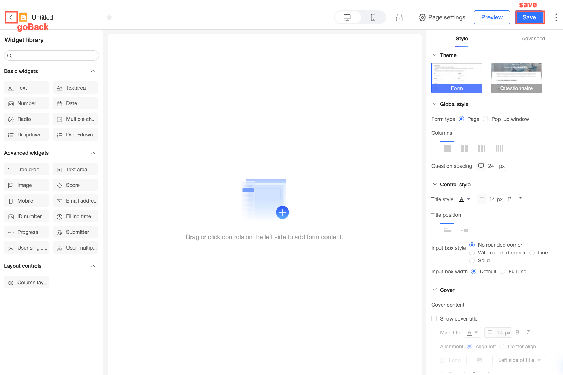
goBack: Settings for the back button.
goBack.show
Type:
booleanDefault value:
trueDescription: Specifies whether to display the back button.
save: Settings for the save button.
save.show
Type:
booleanDefault value:
trueDescription: Specifies whether to display the save button.
EmbedRouteKey.etlEdit
The feature configuration on the data preparation edit page controls the scope of each property as follows.
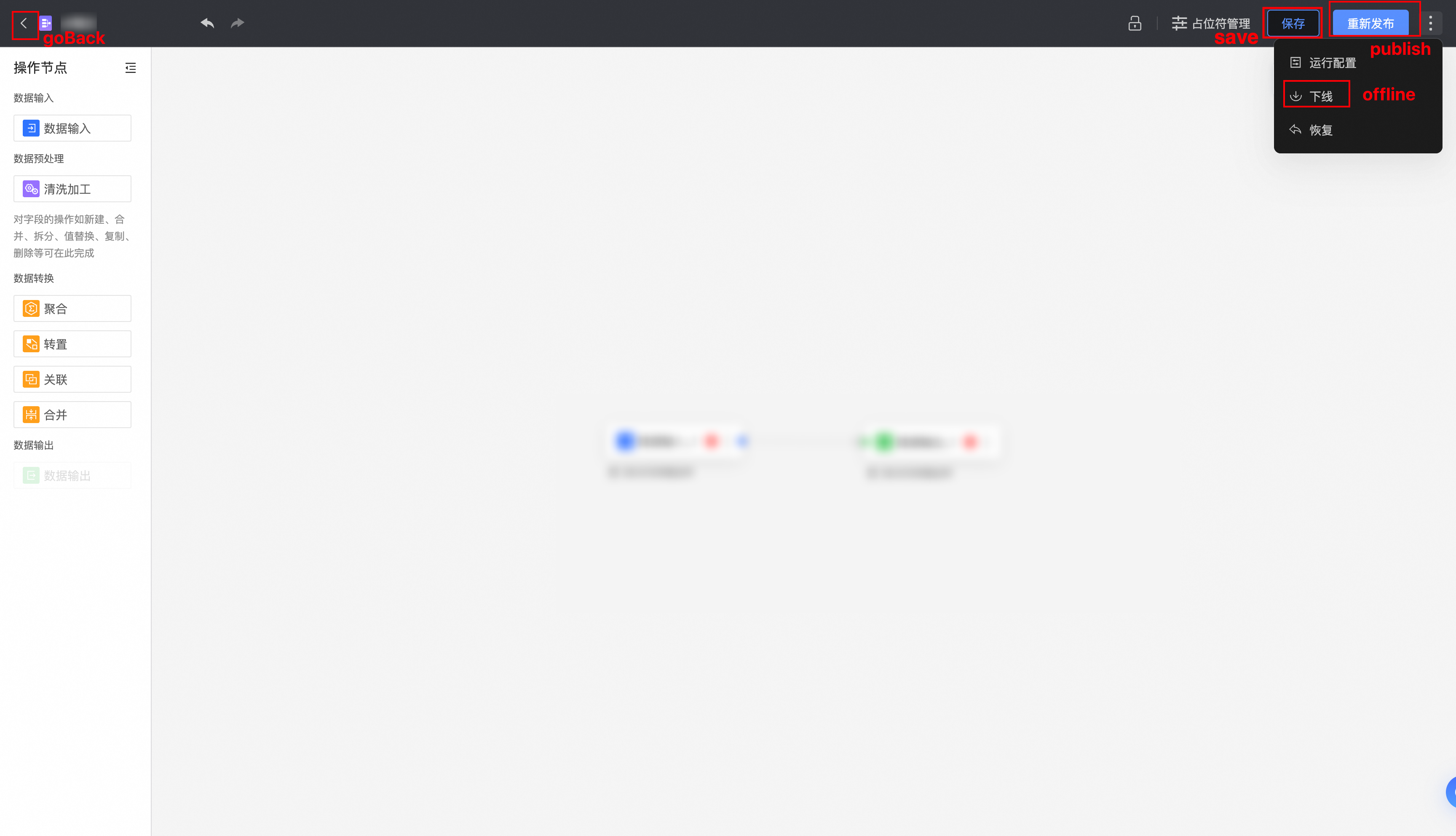
goBack: Settings for the back button.
goBack.show
Type:
booleanDefault:
trueDescription: Shows or hides the back button.
publish: Settings for the publish button.
publish.show
Type:
booleanDefault:
trueDescription: Shows or hides the publish button.
offline: Settings for the unpublish button.
offline.show
Type:
booleanDefault:
trueDescription: Shows or hides the unpublish button.
save: Settings for the save button.
save.show
Type:
booleanDefault:
trueDescription: Shows or hides the save button.
EmbedRouteKey.datasetEdit
On the dataset edit page, the feature configuration properties are as follows.
goBack: Back button settings.
goBack.show
Type:
booleanDefault value:
trueDescription: Specifies whether to display the back button.
saveAs: Save as button settings.
saveAs.group
Type:
'state' | 'menu'Default value:
'menu'Description: Specifies the location of the save as button. A value of
'menu'places the button in the more menu, while'state'places it in the save and publish status area.
saveAs.order
Type:
numberDefault value: -1
Description: Specifies the display order of the save as button within its button group.
saveAs.type
Type:
'default' | 'primary'Default value: 'default'
Description: Specifies the style of the save as button. This property applies only when the button is in the
'state'group.
save: Save button settings.
save.show
Type:
booleanDefault value:
trueDescription: Specifies whether to display the save button.
EmbedRouteKey.workbookFormTask
The following attributes configure the features on the spreadsheet approval page.
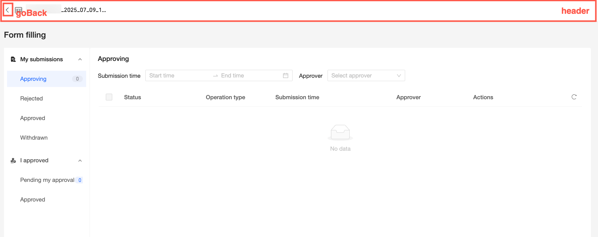
header: Settings for the header on the spreadsheet approval page.
header.show
type:
booleandefault value:
truedescription: Shows or hides the page header navigation.
goBack: Settings for the back button.
goBack.show
type:
booleandefault value:
truedescription: Shows or hides the back button.
EmbedRouteKey.dashboardView/EmbedRouteKey.dashboardPublicView
The feature configurations and property settings for the dashboard preview page (dashboardView) and the dashboard public page (dashboardPublicView) are as follows.
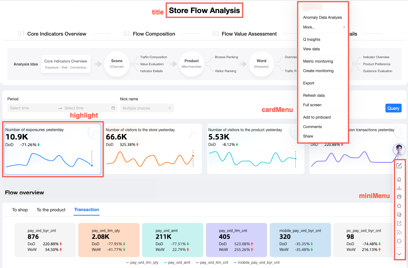
title: Configures the dashboard title.
title.show
type:
booleandefault value:
falsedescription: Shows or hides the dashboard title. By default, the title is hidden when the dashboard is embedded.
miniMenu: Configures the dashboard's mini menu.
miniMenu.show
type:
booleandefault value:
truedescription: Shows or hides the dashboard's mini menu.
cardMenu: Configures the chart card menu.
cardMenu.show
type:
booleandefault value:
truedescription: Shows or hides the chart card menu.
highlight: Configures the card highlight feature.
highlight.componentIds
type:
string[]description: The IDs of the cards to highlight.
NoteYou can get componentIds from the Query the data lineage of a data product open API or the page's /api/v2/dashboard endpoint.
EmbedRouteKey.subscriptionManage
The feature configuration on the subscription management page controls the following attributes.
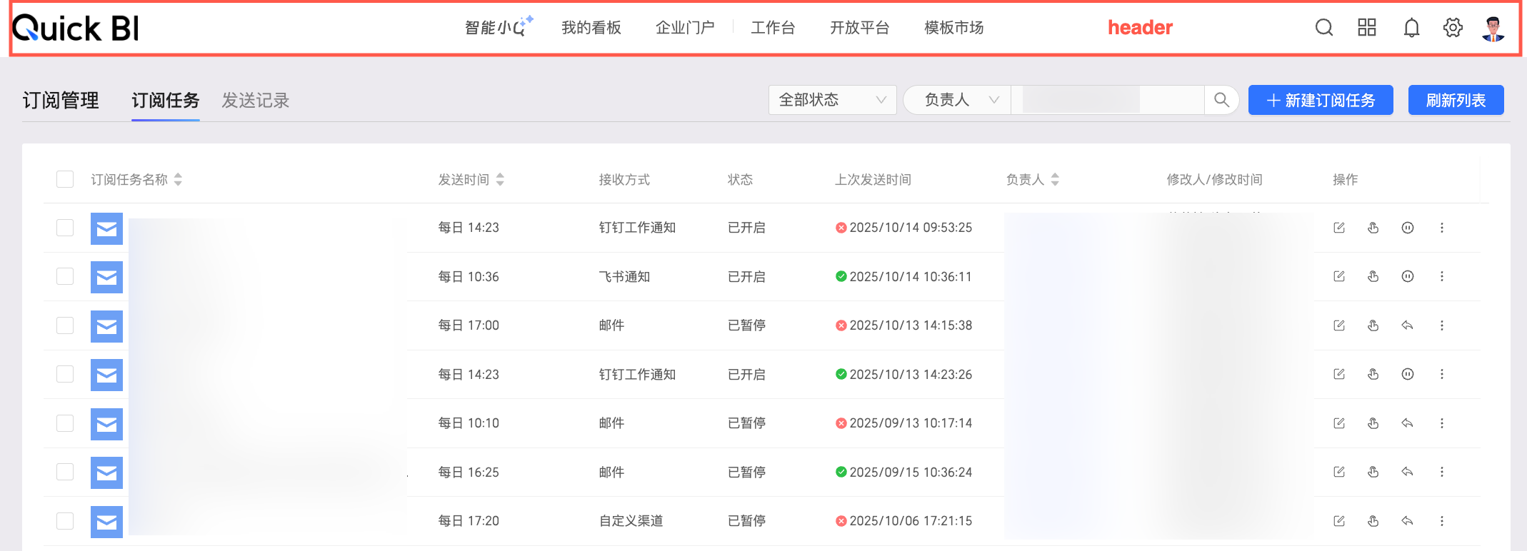
header: Configures the header of the subscription management page.
header.show
type:
booleandefault value:
truedescription: Specifies whether to display the header of the subscription management page. This property takes precedence over EmbedRouteKey.homeRoot.show.
EmbedRouteKey.subscriptionTask
The feature configuration on the subscription task page includes the following properties.
show
type:
booleanDefault value:
truedescription: This second-level property controls whether the subscription task page is displayed.
EmbedRouteKey.sendRecord
The configuration of the send log page feature has the following properties.
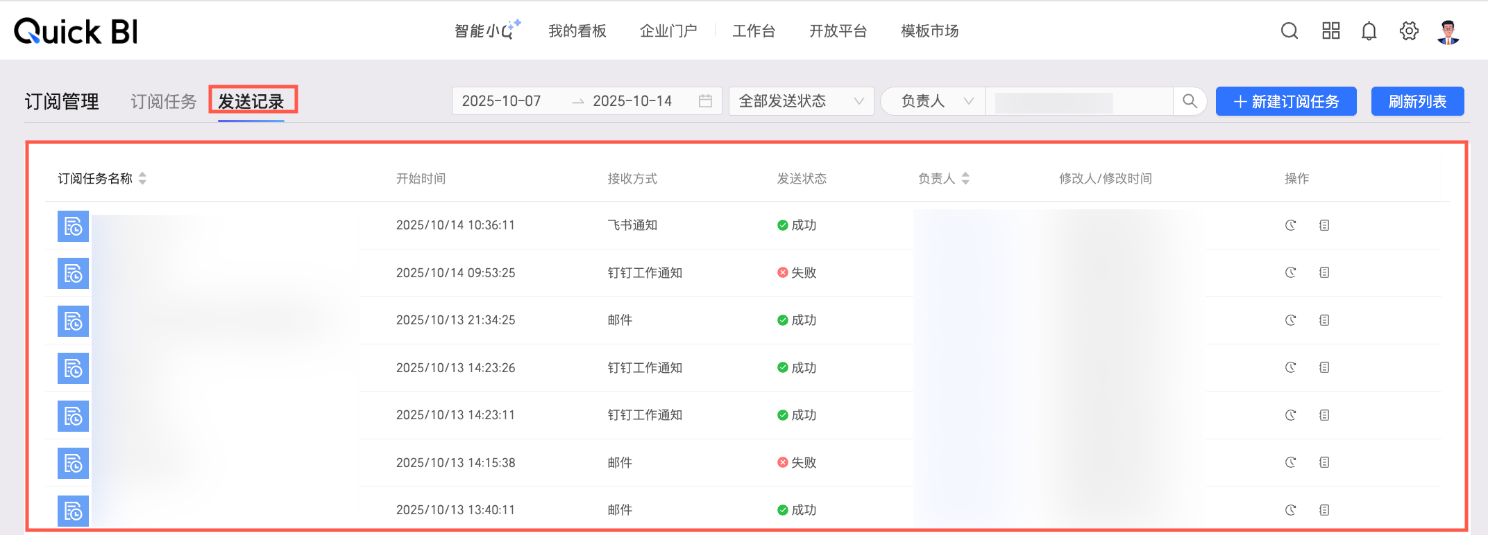
show
type:
booleandefault value:
truedescription: Controls the visibility of the send log page.
EmbedRouteKey.orgAdmin
This topic describes the features of the organization management page and the scope of each attribute.

header: Configures the header of the organization management page.
header.show
Type:
booleanDefault value:
trueDescription: Specifies whether to display the header of the organization management page. This property has a higher priority than EmbedRouteKey.homeRoot.show.
sideNav: Configures the side navigation of the organization management page.
sideNav.show
Type:
booleanDefault value:
trueDescription: Specifies whether to display the side navigation of the organization management page.
EmbedRouteKey.userMemberManage
The member management page has the following features.
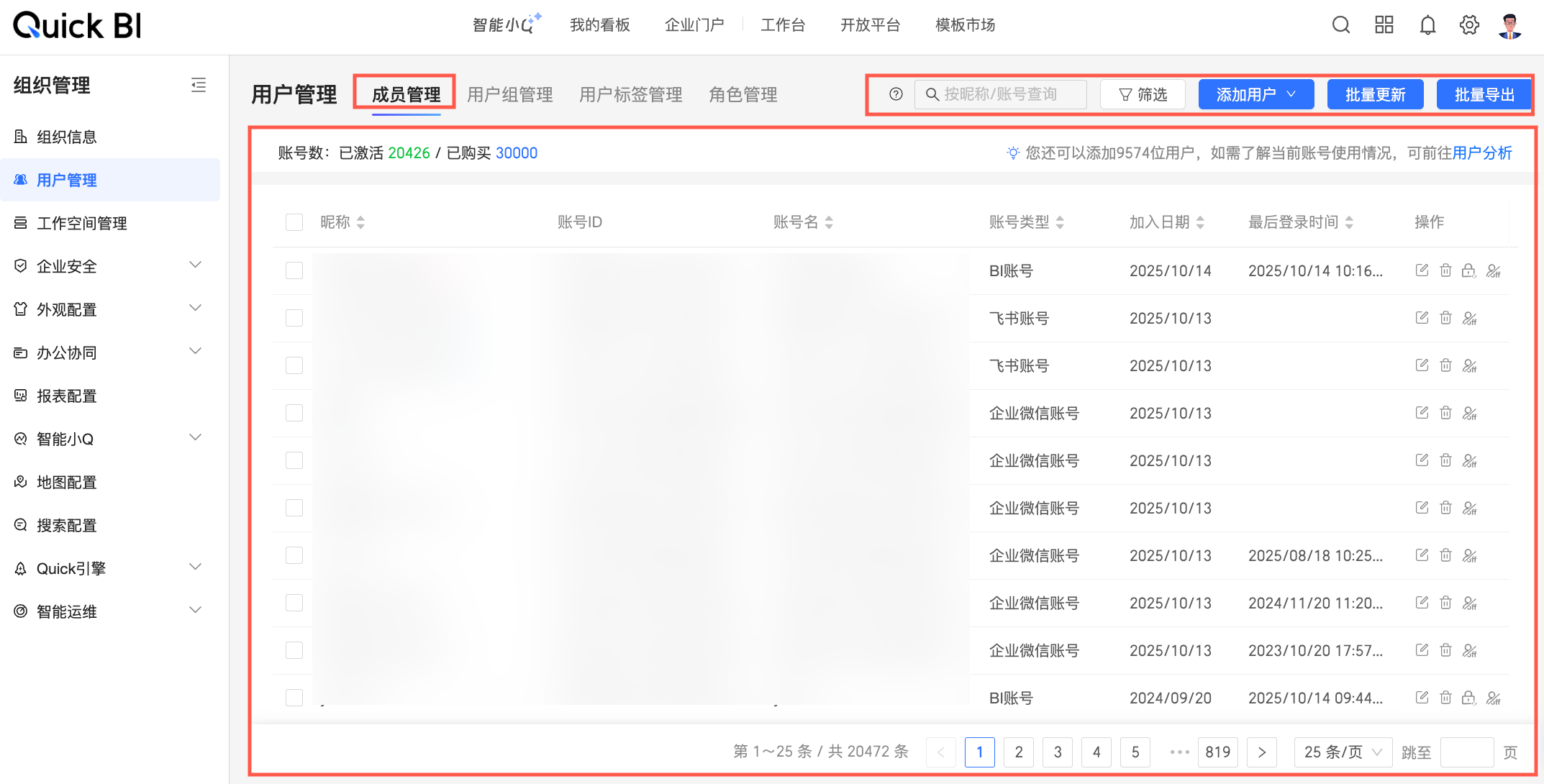
show
type:
booleandefault value:
truedescription: This two-tier feature shows or hides the member management page.
EmbedRouteKey.userGroupManage
The user group management page has the following features.
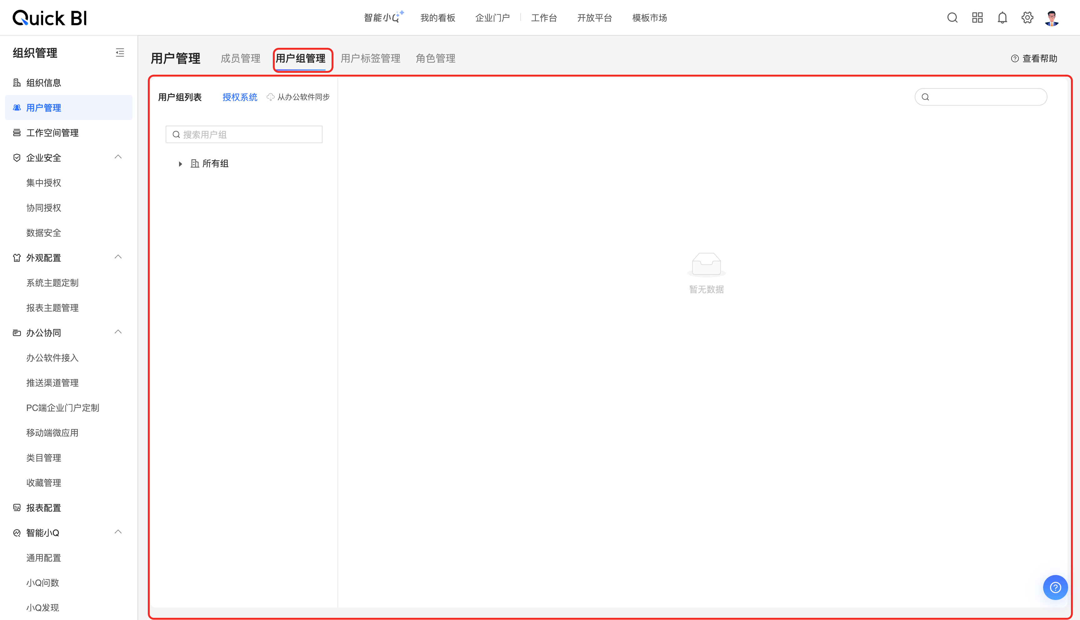
show
Type:
booleanDefault value:
trueDescription: Shows or hides the user group management page.
EmbedRouteKey.userTagManage
The User Tag Management page has the following features.
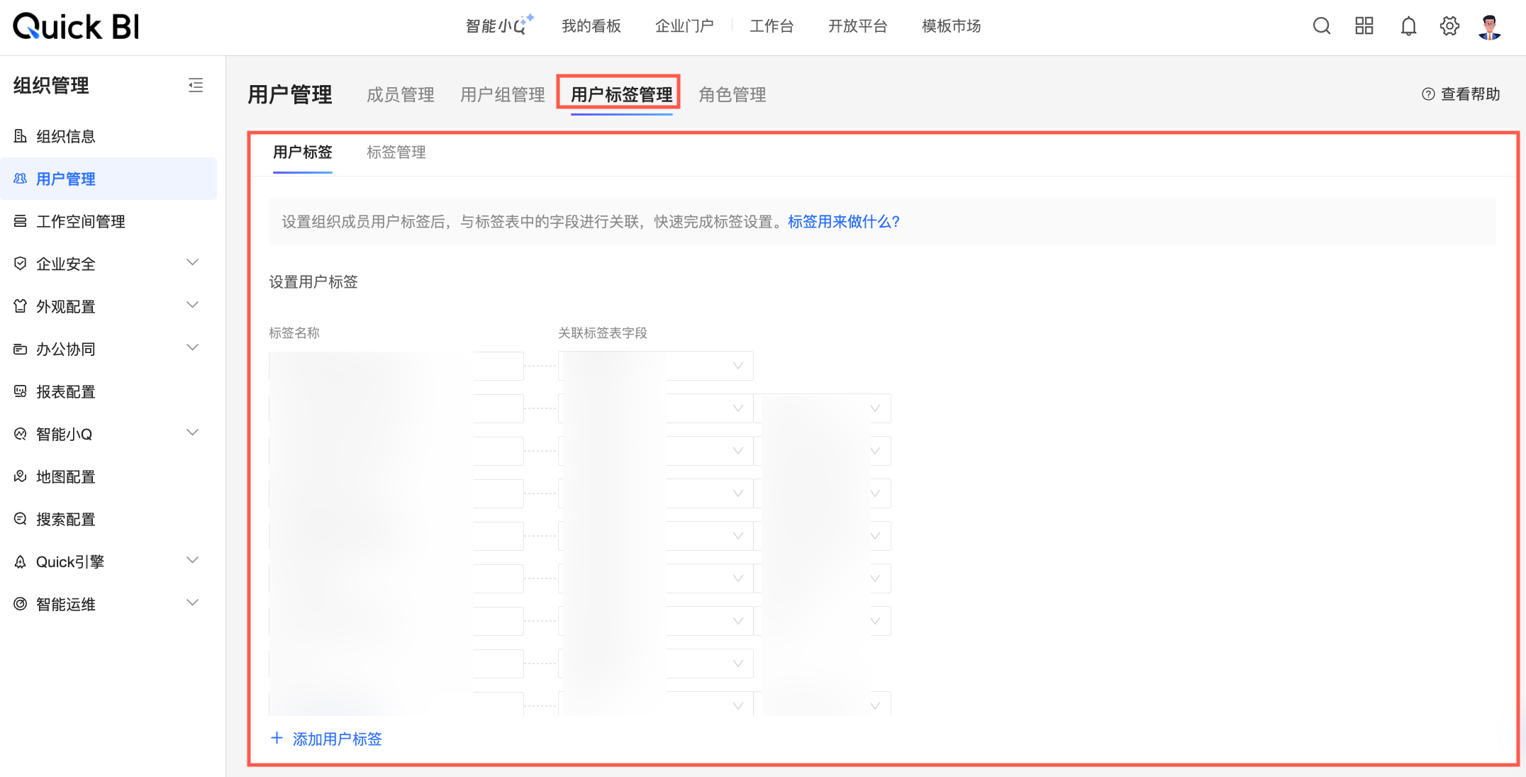
show
Type:
booleanDefault value:
trueDescription: This two-tier property shows or hides the user tag management page.
EmbedRouteKey.userTagDetailManage
The user tag page includes the following properties.
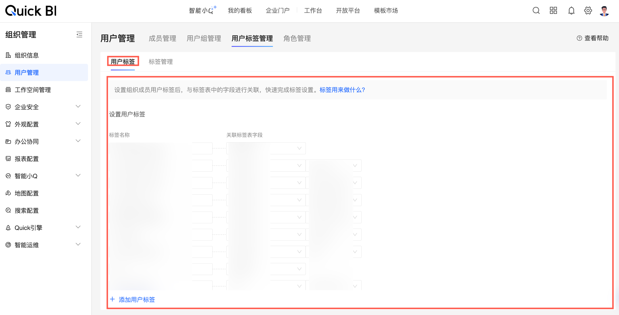
show
Type:
booleanDefault:
trueDescription: Controls whether the user tag page is displayed. This is a second-level feature.
EmbedRouteKey.tagManage
The tag management page offers the following features.
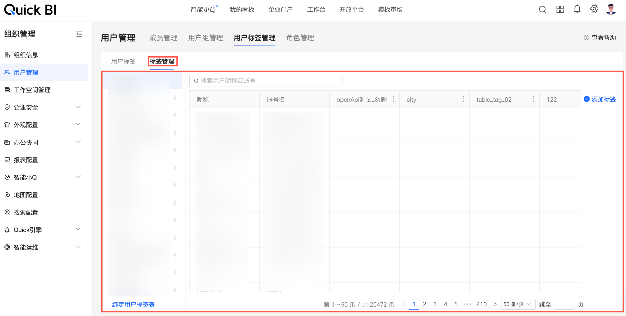
show
type:
booleandefault value:
truedescription: A two-level property that toggles the visibility of the tag management page.
EmbedRouteKey.userRoleManage
The Role Management page has the following properties.
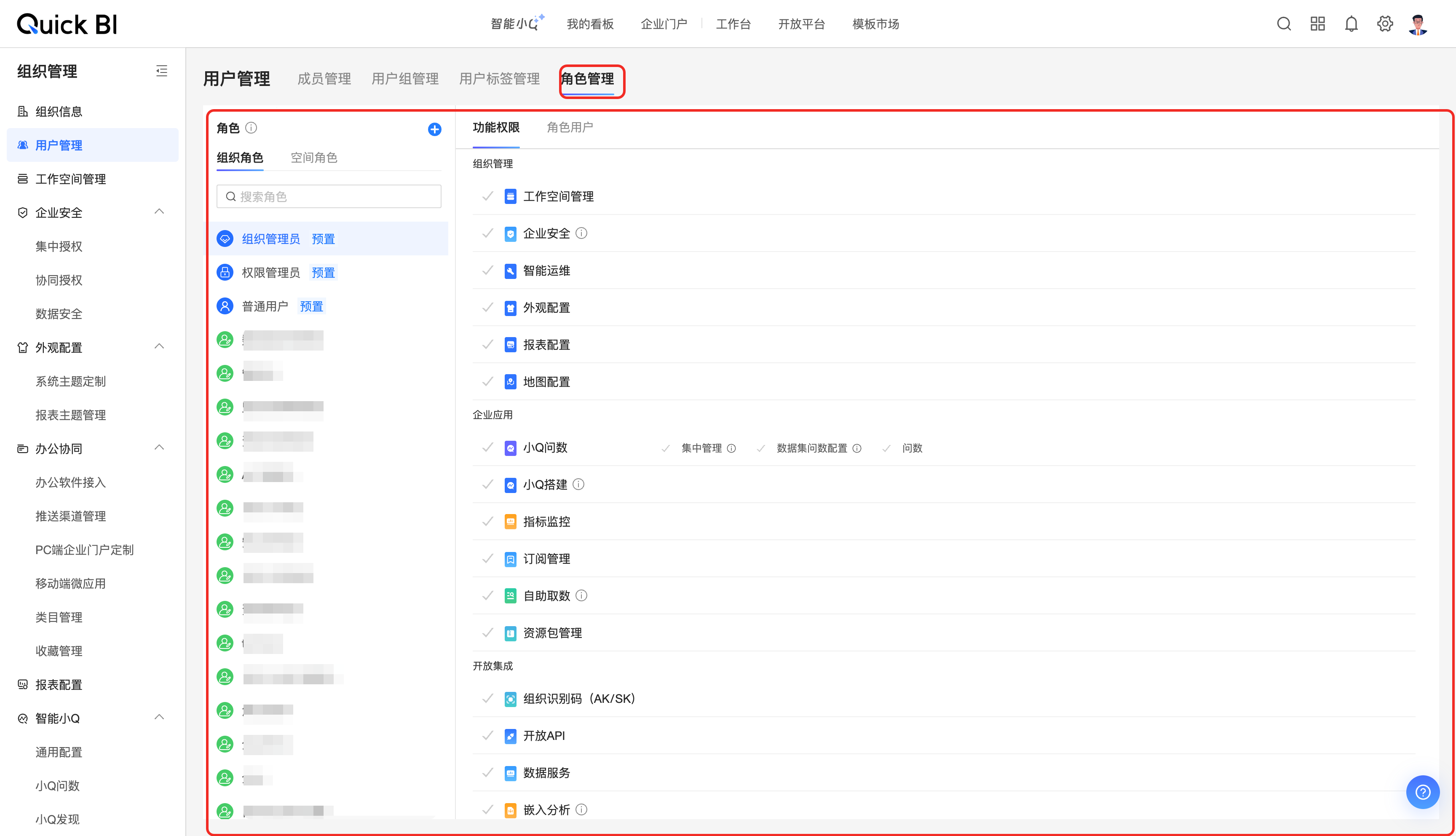
show
type:
booleandefault value:
truedescription: Specifies whether to display the role management page.
EmbedRouteKey.copilotPage
The Intelligent Advisor page has the following properties.
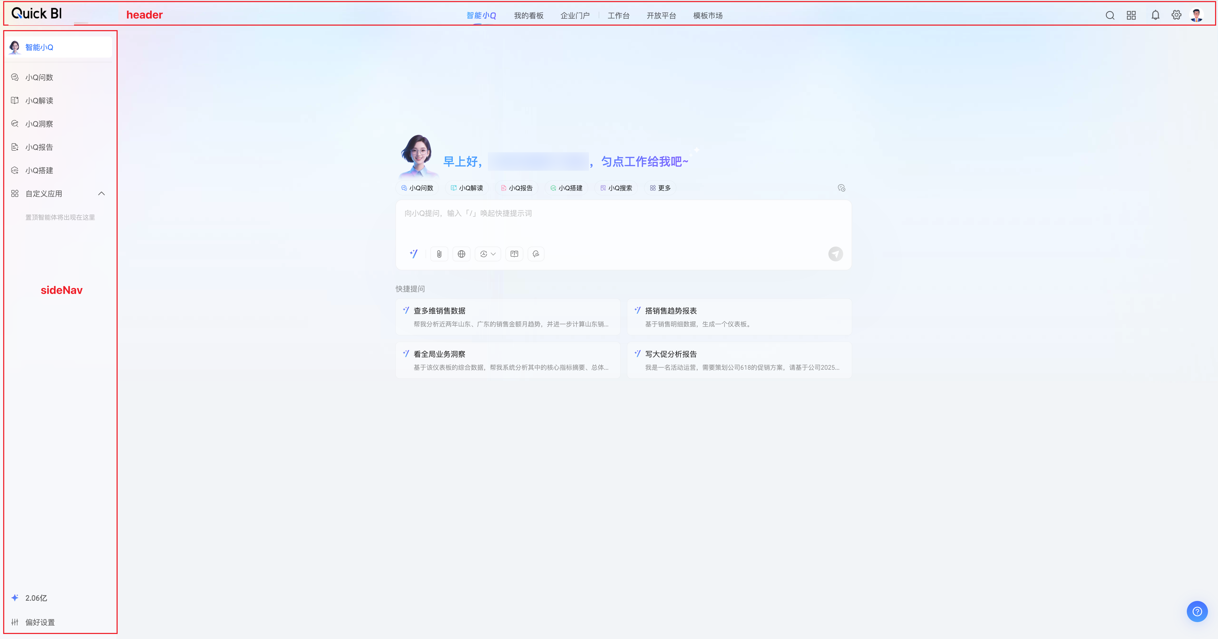
header: Configures the page header.
header.show
Type:
booleanDefault:
trueDescription: Shows or hides the page header. This property has a higher priority than
EmbedRouteKey.homeRoot.header.show.
sideNav: Configures the side navigation.
sideNav.show
Type:
booleanDefault:
trueDescription: Shows or hides the side navigation.
theme: Configures the page theme.
theme.primaryColor
Type:
stringDefault:
#2F66FFDescription: Sets the page's primary color.
theme.chartColorSeries
Type:
string[]Default: [
'#4080FF',
'#3DC8DC',
'#A191F2',
'#FFB77A',
'#7C7CA6',
'#33CC99',
'#217CCC',
'#FF80AA',
'#008770',
'#D1876F',
'#4798B3',
'#C896FA']
Description: Sets the color series for charts.
EmbedRouteKey.copilotPageQChat
The Ask Q page inherits all features from EmbedRouteKey.copilotPage with higher precedence and includes additional properties.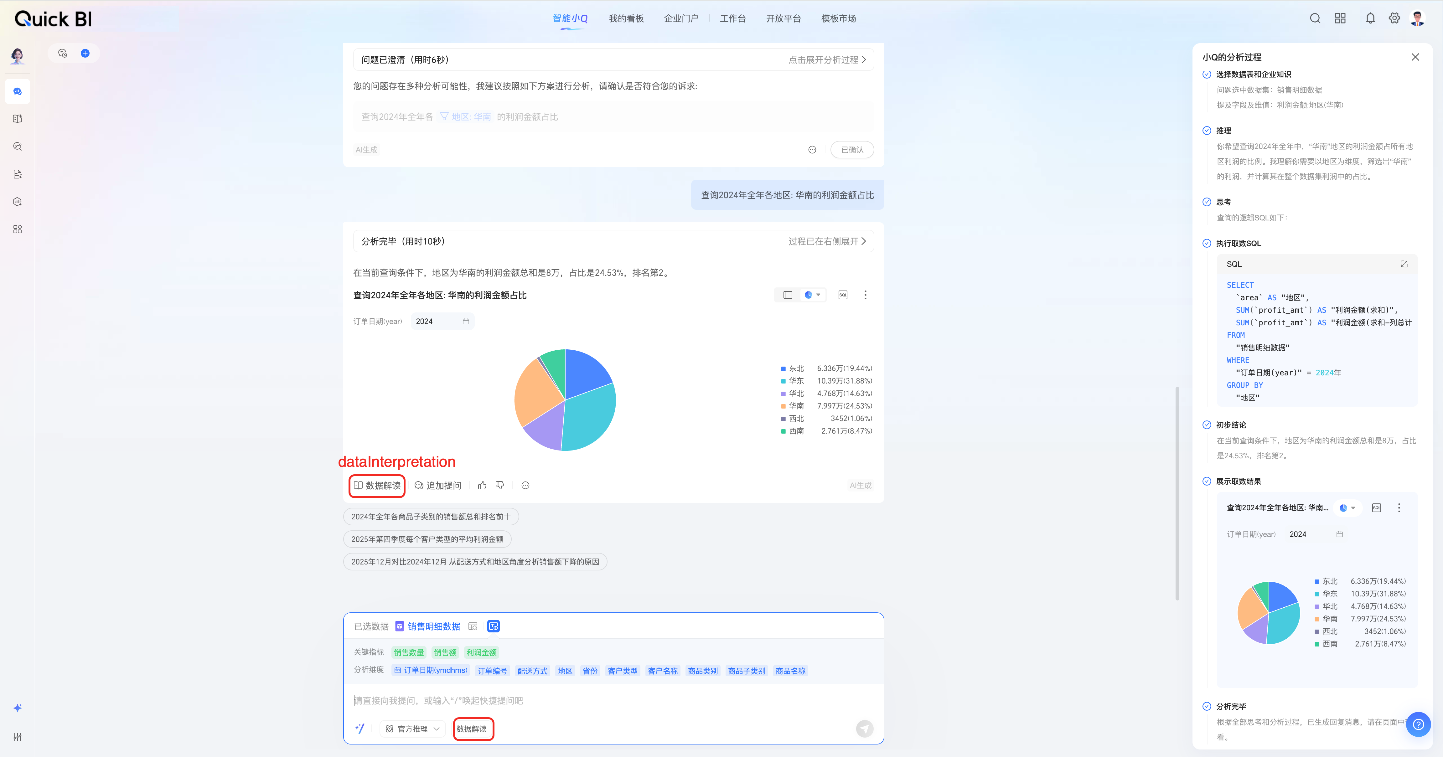
dataInterpretation: Settings for the data interpretation feature in Intelligent Query.
dataInterpretation.show
type:
booleandefault value:
truedescription: Shows or hides the data interpretation feature on the Intelligent Query page.
EmbedRouteKey.copilotPageQReport
The Copilot report page includes all the features of EmbedRouteKey.copilotPage and has a higher priority.
EmbedRouteKey.wordAgentEdit
The Q Report edit page has the following properties.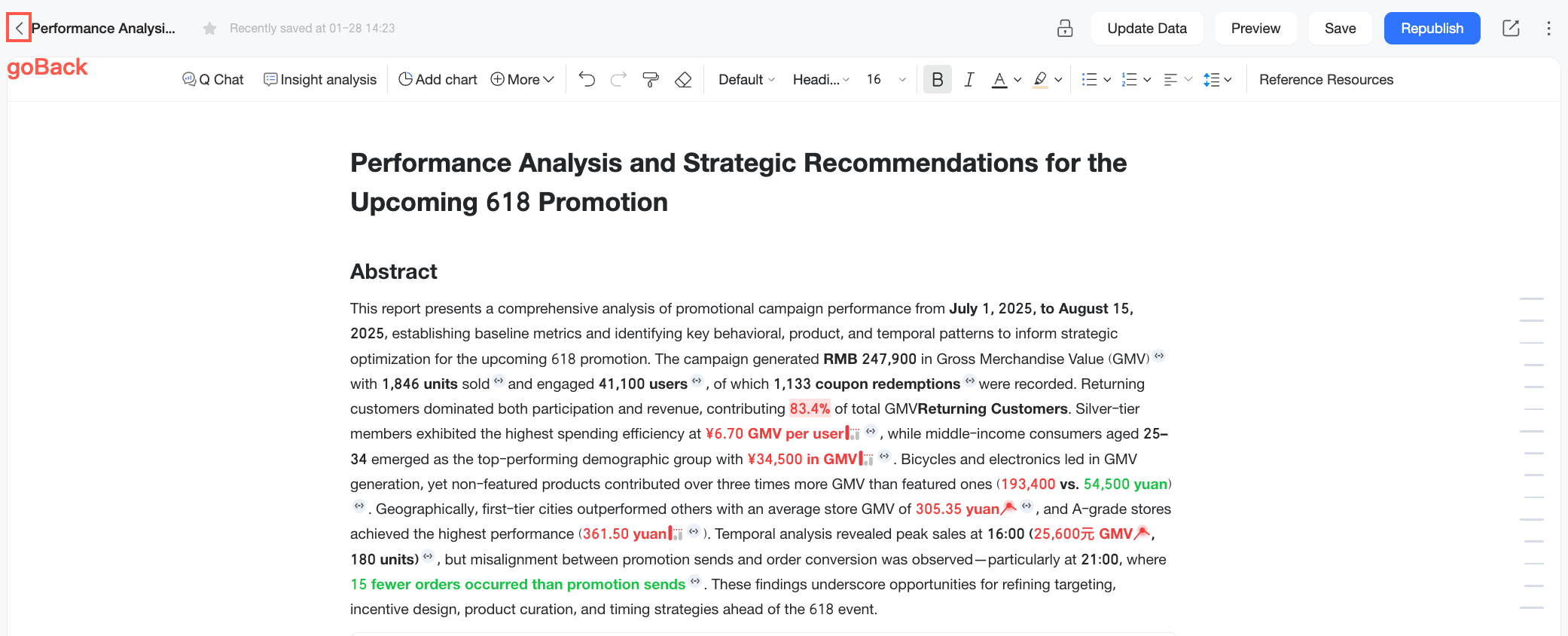
goBack: Settings for the back button on the Q Report.
goBack.show
type:
booleandefault value:
truedescription: Shows or hides the back button on the Q Report edit page.
Events
An object for configuring listeners for events on the embedded page. The host system can bind to these events to capture user actions and respond accordingly.
The following events are currently available:
Event name | Description |
Before page change event | Fires before the embedded Quick BI page navigates to a new page. This allows you to listen for all in-app navigation, such as from a dashboard list page to a dashboard edit page. |
After component rendered event | Fires after a chart is rendered on pages like the dashboard preview or edit page. For example, on a dashboard preview page, Quick BI uses lazy loading for performance. As you scroll down, this event is triggered for each chart that appears in the viewport and finishes rendering. |
before-page-change-event
Description: Fires before the embedded Quick BI page navigates to a new page, such as from a dashboard list page to a dashboard edit page.
The event callback receives a parameter of type EmbedEventBeforePageChange.
type EmbedEventBeforePageChange = {
  type: EmbedEventType['before-page-change-event'],
  payload: {
    src: EmbedSrcUnion,
    target: '_blank' | '_self'
  }
}event.payload.src: Information about the destination page. For details, see src.event.payload.target: Specifies how the page is opened._blankopens the page in a new window, and_selfopens it in the current embedded frame.
return: When the event callback function returns false, it prevents Quick BI's default navigation logic. The sample code is as follows.
embedClient.on(EmbedEventType['before-page-change-event'], async (event: EmbedEventBeforePageChange) => {
  // Block navigation to a new page
  if (event.payload.target === '_blank') {
    return false;
  }
})
after-component-rendered-event
Description: Fires after a chart is rendered on pages such as the dashboard preview or edit page. For example, on a dashboard preview page, Quick BI uses lazy loading for performance. As you scroll down, this event is triggered for each chart that appears in the viewport and finishes rendering.
The event callback receives a parameter of type EmbedEventAfterComponentRendered.
type EmbedEventAfterComponentRendered = {
  type: EmbedEventType['after-component-rendered-event'],
  payload: ComponentProps
}
The payload contains information about the chart and the page.
export interface ComponentProps {
  status?: 'success' | 'error';
  error?:
    | ComponentError
    | ComponentConfigError
    | ComponentNoPermissionError
    | ComponentDataMaskError
    | ComponentNoDataError
    | ComponentRenderError;
  pageConfig?: ComponentPageConfig;
  id: string;
  data: DataCell[][];
  dataConfig: AreaModel[];
  viewConfig: ComponentPropsViewConfig;
  advancedConfig: object;
  globalConfig: ComponentPropsGlobalConfig;
  cubeConfig?: ComponentPropsCubeConfig[];
  sql?: string[];
}
status
Indicates whether the chart rendered successfully (
success) or encountered an error (error).error
Details about the error if
statusiserror.ComponentErroris the default for unknown errors. The possible error types are as follows./** Defaults to 'ComponentError', indicating an unknown error. */ export interface ComponentError<T extends string = 'ComponentError'> { /** The error name, used for type checking. */ name: T; /** The error message. */ message?: string; } /** Chart configuration error. */ export type ComponentConfigError = ComponentError<'ComponentConfigError'>; /** Permission error. */ export type ComponentNoPermissionError = ComponentError<'ComponentNoPermissionError'>; /** Data masking error. */ export type ComponentDataMaskError = ComponentError<'ComponentDataMaskError'>; /** No data error. */ export type ComponentNoDataError = ComponentError<'ComponentNoDataError'>; /** Rendering error. */ export type ComponentRenderError = ComponentError<'ComponentRenderError'>;pageConfig
Information about the page where the chart is located.
interface CustomEventPageConfig {
  /** The workspace ID of the page. */
  workspaceId: string;
  /** The page ID. */
  id: string;
  /** The page mode. Can be 'preview', 'edit', 'snapshot' (for dashboards and spreadsheets only), or 'public' (for data screens). */
  mode: 'preview' | 'edit' | 'snapshot' | 'public';
  /** The current device. */
  device: 'pc' | 'mobile';
  /** The current visitor's ID. */
  userId: string;
  /** The current visitor's username. */
  userName: string;
  /** The current visitor's nickname. */
  nickName?: string;
  /** The ID of the page creator. */
  ownerUserId: string;
  /** The username of the page creator. */
  ownerUserName: string;
  /** The page title. */
  title: string;
  /** The page type. */
  pageType: 'dashboard' | 'webExcel' | 'screen' | 'offline' | 'analysis';
}
id
The instance ID of the chart.
data
The rendering data for the chart, structured as a two-dimensional array.
interface DataCell { fieldId: string; originValue: string; value: string; geoInfo?: object; }fieldId: The data field ID, which corresponds one-to-one with the ID indataConfig.originValue: The original data value.value: The formatted data value for display.geoInfo: The geographic information for a dimension field.
dataConfig
The data field configuration in the chart's data panel.
interface AreaModel { areaType: 'row' | 'column' | 'drill' | 'filter'; fields: FieldModel[]; }areaType: The area in the data panel where the field is placed. Possible values are:row: A dimension field.column: A measure field.drill: A drill-down field.filter: A filter field.
fields: An array of fields within this area.interface FieldModel { /** Unique ID. */ fieldId: string; /** Field name. */ fieldName: string; /** Display name. */ showName: string; /** Indicates whether this is a calculated field. */ isCalc?: boolean; /** Example: 'calc' */ skin?: string; /** Value type. */ valueType?: FieldValueType; /** Field type: dimension or measure. */ fieldType: FieldCommonType; /** Aggregation method. */ aggregation?: FieldAggregation | string; /** [Quick BI-specific] Data rendering format. Currently, 'imageUrl' is used for rendering images in crosstabs and leaderboards. */ displayType?: 'imageUrl' | ''; /** [Quick BI-specific] Dataset format configuration, such as '#,##0.00%'. */ rawFormat?: string; /** [Quick BI-specific] Dataset dimension type, such as TimeRegionInBackend. This needs to be migrated to prevent circular dependencies. */ dimGranularity?: any; /** Final format configuration. (Note: In Quick BI, this is currently in styleConfig, and this field is not used.) */ /** This must first be unified at the product level. */ format?: QbiFormatModel | FbiFormatModel; /** Sort order. */ order?: FieldOrder; /** Advanced calculation, such as year-over-year or month-to-year. */ advancedCalculation?: 'year-to-year' | 'month-to-year'; /** The set of filter conditions for the current chart. */ complexFilter: { limitNum: number; filter: any; }; // The true unique identifier for the field. uuid: string; /** Special extended information for different chart fields. */ extends?: FieldModelExtends; }
viewConfig
Configuration from the chart's style panel.
interface ComponentPropsViewConfig { caption?: string; chartColorSeries?: { key: string; name: string; colors: string[]; }; chartSkin?: { key: 'black' | 'default'; }; title?: { show: boolean; viceName?: string; color?: string; showLink?: boolean; link?: string; linkName?: string; }; fieldSettingMap?: { [fieldId: string]: ComponentPropsFieldSettingConfig }; width?: number; height?: number; [key: string]: any; }caption: The main title of the chart.title: The chart's title configuration.title.show: Whether to show the main title and remarks.title.viceName: The remarks for the main title.title.color: The color of the main title.title.showLink: Whether to display the hyperlink.title.link: The URL of the hyperlink.title.linkName: The text of the hyperlink.
chartColorSeries: The dashboard's theme color series.chartColorSeries.key: The key of the theme color series.chartColorSeries.name: The name of the theme color series.chartColorSeries.colors: An array of 10 color strings that make up the theme.
chartSkin: The dashboard skin.
chartSkin.key: The key for the dashboard skin.default: The light theme.black: The dark theme.fieldSettingMap: Contains display settings for individual fields, such as aliases and data display formats.interface ComponentPropsFieldSettingConfig { aliasName: string; numberFormat: NumberFormat; [key: string]: any; }height: The custom height of the chart.width: The custom width of the chart.
globalConfig
Reserved for future use.
advancedConfig
Reserved for future use.
cubeConfig
The dataset configuration for the chart.
interface ComponentPropsCubeConfig {
  /** The dataset ID. */
  cubeId: string;
  /** The dataset name. */
  cubeName: string;
}
sql
The SQL queries used to generate the chart data, provided as an array of strings.
Action
An action is a configuration object that allows the host system to programmatically trigger behaviors on the embedded page, such as page navigation or feature updates.
The following actions are available: embedNavigate, setEmbedFeature, and scrollToComponentById.
enum EmbedActionType {
  /** Navigates to a route. */
  embedNavigate = 'embedNavigate',
  /** Updates an embedded feature. */
  setEmbedFeature = 'setEmbedFeature',
}

/** An action to programmatically trigger a route navigation. */
type EmbedActionNavigate = {
  type: EmbedActionType.embedNavigate;
  payload: {
    src: EmbedSrcUnion;
  }
}

/** An action to programmatically update features. */
type EmbedActionSetFeature = {
  type: EmbedActionType.setEmbedFeature;
  payload: EmbedFeatureIntersect;
}
embedNavigate
Navigates the embedded page to a specified route.
payload.src: The source information of the target route. For details, see src.type EmbedActionNavigate = { type: EmbedActionType.embedNavigate; payload: { src: EmbedSrcUnion; } }Example
// Navigates to the dashboard edit page.
embedClient.dispatch({
  type: EmbedActionType.embedNavigate,
  payload: {
    src: {
      origin: 'https://bi.aliyun.com',
      page: EmbedRouteKey.dashboardEdit,
      search: {
        workspaceId: 'xx',
        id: 'xx'
      },
    },
  },
});
setEmbedFeature
Updates the embedded feature configuration on the embedded page.
payload: The embedded feature configuration for various pages. For details, see feature.type EmbedActionSetFeature = { type: EmbedActionType.setEmbedFeature; payload: EmbedFeatureIntersect; }Example
embedClient.dispatch({
  type: EmbedActionType.setEmbedFeature,
  payload: {
    // Hides the Back button on the dashboard edit page.
    [EmbedRouteKey.dashboardEdit]: {
      goBack: {
        show: goBack,
      },
    },
  },
});
scrollToComponentById
Scrolls the embedded page to a specified chart component on a dashboard preview or public page.
payloadpayload.id: The ID of the card to scroll to.payload.position: The position of the card after scrolling.
type EmbedActionScrollToComponentById = {
  type: EmbedActionType.scrollToComponentById,
  payload: {
    id: string;
    position: 'start' | 'center' | 'end' | 'nearest'
  }
}
Example
embedClient.dispatch({
  type: EmbedActionType.scrollToComponentById,
  payload: {
    // Scrolls the dashboard preview page to the component with this ID.
    id: 'scroll to this component id',
    // The card will be centered on the screen after scrolling.
    position: 'center',
  },
});
Development methods
How you configure an embedded page's source, features, and other settings with the JS SDK depends on your development environment. For example, in a vanilla JavaScript environment (without a framework), you create a client instance using the EmbedClient class. In a React or Vue environment, you configure the embed source by rendering the EmbedComponent component.
This section explains how to use the EmbedClient class and the EmbedComponent component to customize an embedded page.
EmbedClient
You can use the following methods of the EmbedClient class to customize your embedded page.
Method | Description |
Creates a new client instance. | |
Renders the client instance to a specified DOM container. | |
Destroys the client instance and removes the embedded page. | |
Dispatches an action to the embedded page. | |
Registers an event listener for a specific embed event. | |
Unregisters an event listener for a specific embed event. |
constructor
Creates a new client instance.
Type:
(src: EmbedSrcUnion, option?: Partial<PostMessengerParam>) => voidParameters
src: The embed source, which specifies the page to embed. For more information, see src.option: Client configuration options.option.connectTimeout: The client connection timeout in milliseconds.option.messageTimeout: The message timeout in milliseconds.
Sample code
const embedClient = new EmbedClient({
  src: {
    origin: 'https://bi.aliyun.com',
    page: EmbedRouterKey.dashboardView,
  },
  option: { connectTimeout: 5000 }
});
render
Renders the client instance to a specified DOM container.
Type:
(container: HTMLIframeElement) => HTMLIFrameElementParameter
container: The DOM element in which to render the embedded page.
Sample code
embedClient.render(document.getElementById('embed-container'));
destroy
Destroys the client instance and removes the embedded page.
Type:
() => voidSample code
embedClient.destroy();
dispatch
Dispatches an action to the embedded page.
Type:
(action: EmbedAction) => Promise<T>Parameter
action: The embed action to dispatch. For more information, see action.
Sample code
// Hide the Back button on the dashboard edit page
embedClient.dispatch({
  type: EmbedActionType.setEmbedFeature,
  payload: {
    [EmbedRouteKey.dashboardEdit]: {
      goBack: {
        show: goBack,
      },
    },
  },
});
on
Registers an event listener for a specific embed event.
Type:
on(eventType: EmbedEventType, listener: (event: T) => Promise<T>)Parameters
eventType: The event type,EmbedEventType.listener: The callback function for the event. This function can be asynchronous. Its parameters and return values depend on the event type. For more information, see events.
Sample code
// Before-page-change event handler
async handler(event: EmbedEventBeforePageChange) => {
  return false;
}

// Register the event listener
embedClient.on(EmbedEventType['before-page-change-event'], handler);
off
Unregisters an event listener for a specific embed event.
Type:
off(eventType: EmbedEventType, listener).Parameters
eventType: The event type,EmbedEventType.listener: The callback function to unregister. This must be the same function reference that was passed to on.
Sample code
async function handler(payload) {}

// Unregister the event listener
embedClient.off(EmbedEventType['before-page-change-event'], handler);
EmbedComponent
In React or Vue frameworks, you can embed a page by rendering the EmbedComponent component. The properties (props) of this component are of the types shown below. Updating these properties automatically triggers the component to update and render the latest page.
interface EmbedComponentCommonProps {
  /** The class name for the container. */
  className?: string;
  /** The styles for the container. */
  style?: CSSProperties;
  /** The embed source information. */
  src: EmbedSrcUnion;
  /** The initial embedded feature configuration. */
  feature?: EmbedFeatureIntersect;
  /** The initial embedded event listeners. */
  events?: EmbedEventListenerUnion;
}
The following table describes these properties.
Parameter | Type | Required | Description |
props.className |
| No | The class name for the embedded component's container. |
props.style |
| No | The CSS styles for the embedded component's container. |
props.src |
| Yes | The embed source for the Quick BI page. For more information, see src. |
props.feature |
| No | The initial feature configuration for the embedded page. For more information, see feature. |
props.events |
| No | The initial event listeners for the embedded page. For more information, see events. |
Reference
To learn how to use the embedded SDK, refer to the code example.