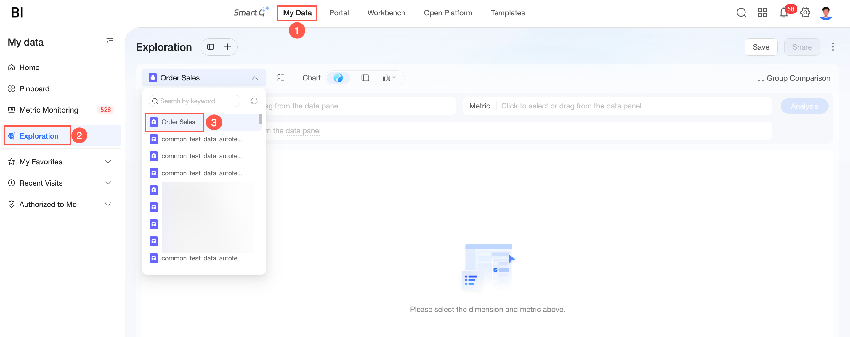
Exploratory Analysis is a lightweight, real-time data exploration tool for business users. This topic walks through four progressive scenarios that demonstrate how to move from high-level trends to actionable insights.
Background
Business Pain Points
-
For business users, report metrics and dimensions are fixed and cannot support flexible, in-depth analysis. Fine-grained analysis often requires manually downloading data from multiple reports and merging tables in Excel—a tedious and inefficient process.
-
For data analysts, constantly changing business requests create a cycle of ad-hoc data extraction with long response times, delaying decisions and preventing focus on higher-value analysis.
Solution
Exploratory Analysis breaks free from the fixed perspectives of traditional dashboards. Business users can quickly start exploring data with low barriers, driving enterprise-wide data democratization.
Features
Exploratory Analysis provides an instant, flexible analysis experience—no technical background required.
-
Flexible Multidimensional Exploration: Freely combine dimensions and measures through drag-and-drop to meet evolving analytical needs.
-
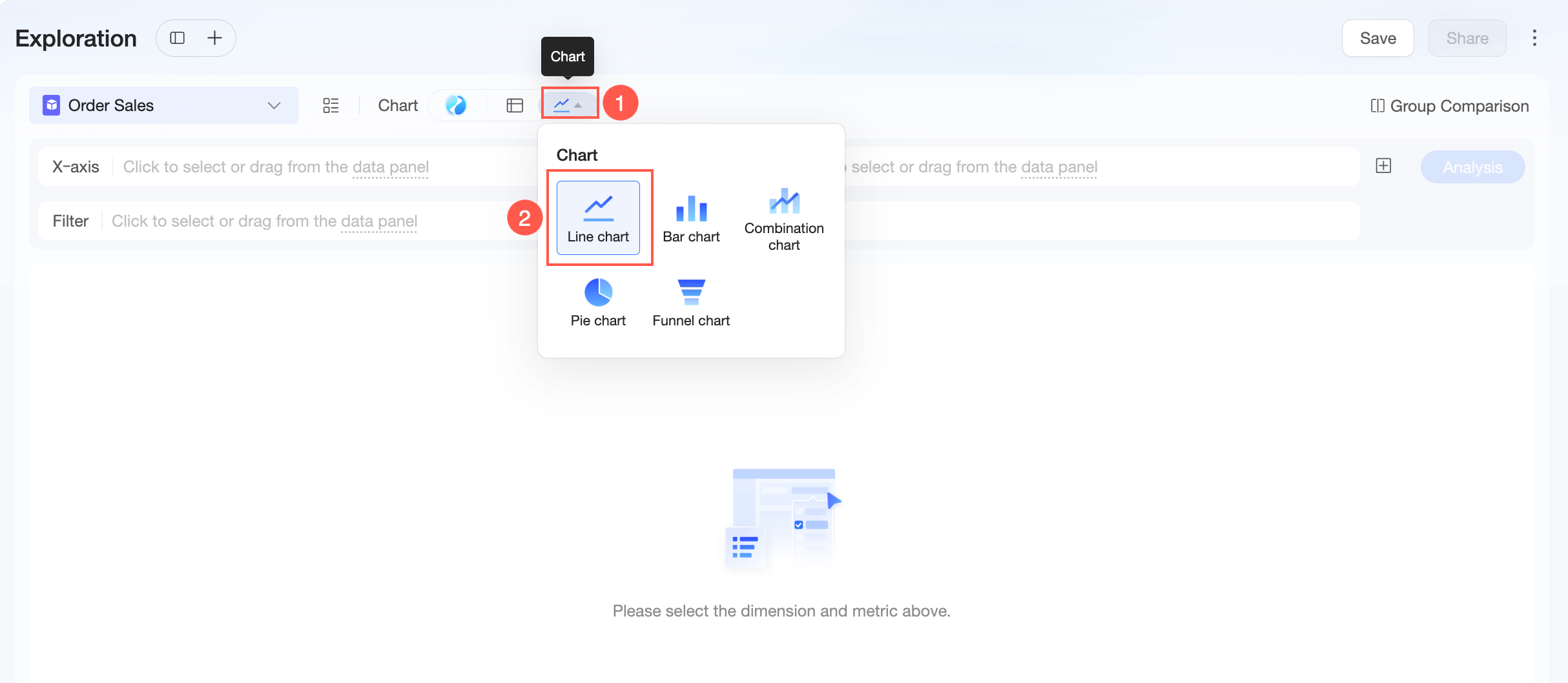
Intelligent Chart Recommendations: Automatically recommends or lets you switch among tables, bar charts, line charts, pie charts, funnel charts, and combo charts to find the best visualization.
-
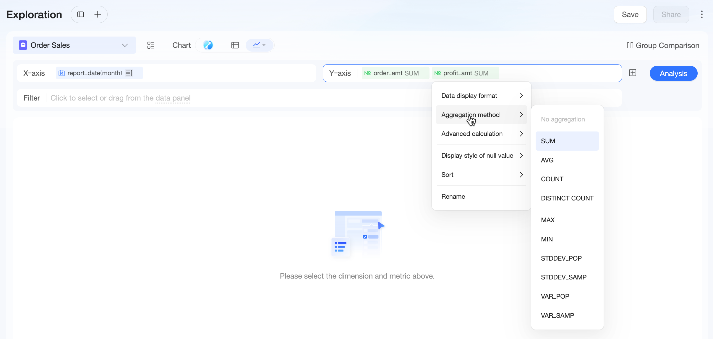
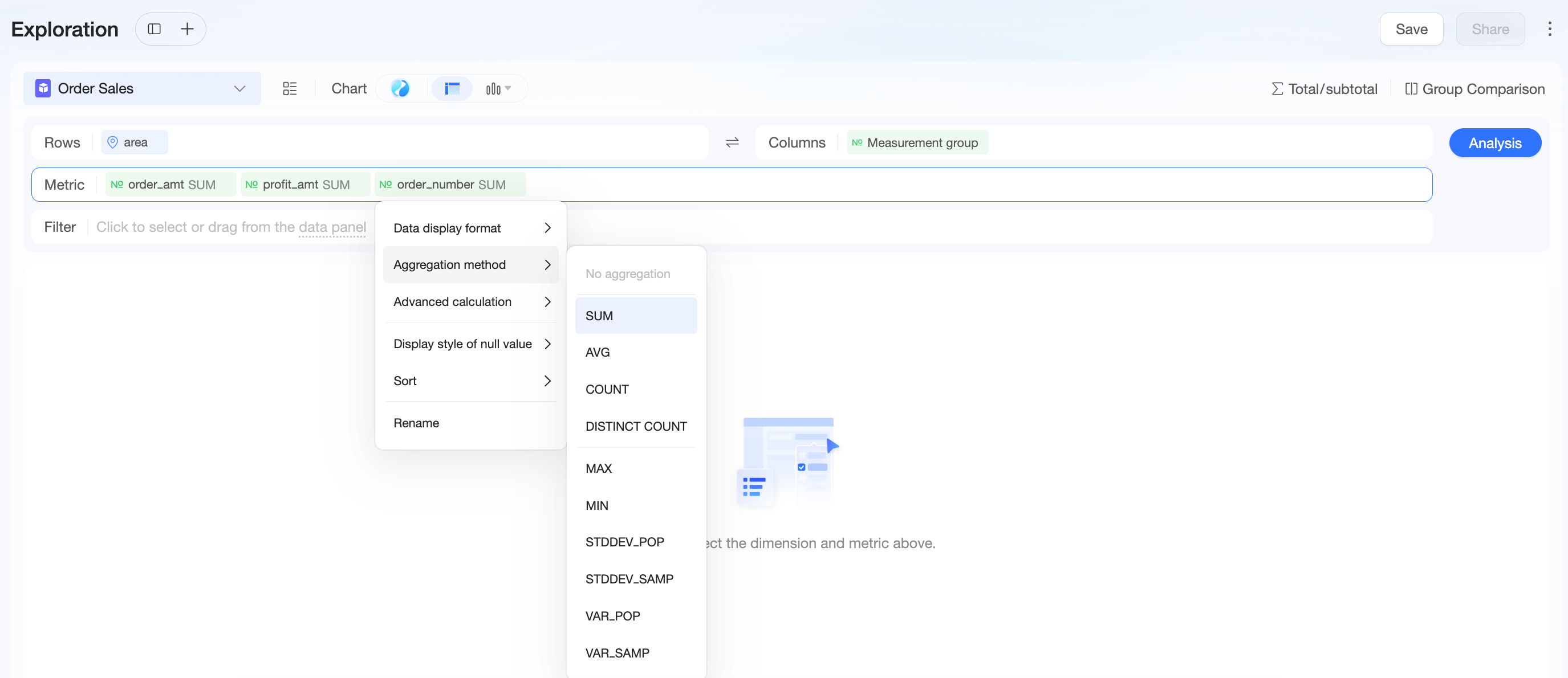
Powerful Quick Calculations: Built-in aggregation methods—such as sum, average, and distinct count—let you perform period-over-period, percentage, and cumulative calculations with one click. No complex formulas needed.
-
Deep Analytical Capabilities: Compare groups across campaign periods or user segments, and use custom drill-downs to move from high-level data to granular details.
-
Easy Sharing and Collaboration: Export and share results with one click to DingTalk, WeCom, or Lark to accelerate team decision-making.
Scenario Examples
The following four scenarios progress from a macro business view down to actionable insights, demonstrating how exploratory analysis drives concrete business decisions.
Scenario 1: From Overall Trends to Anomaly Detection—Identifying Divergence Between GMV and Gross Profit
Business Question
The business team needs a quick overview of year-over-year trends in GMV and gross profit to assess overall business health.
Analysis Path
|
Procedure |
Example |
|
Step 1: Gain macro insight and detect anomalies |
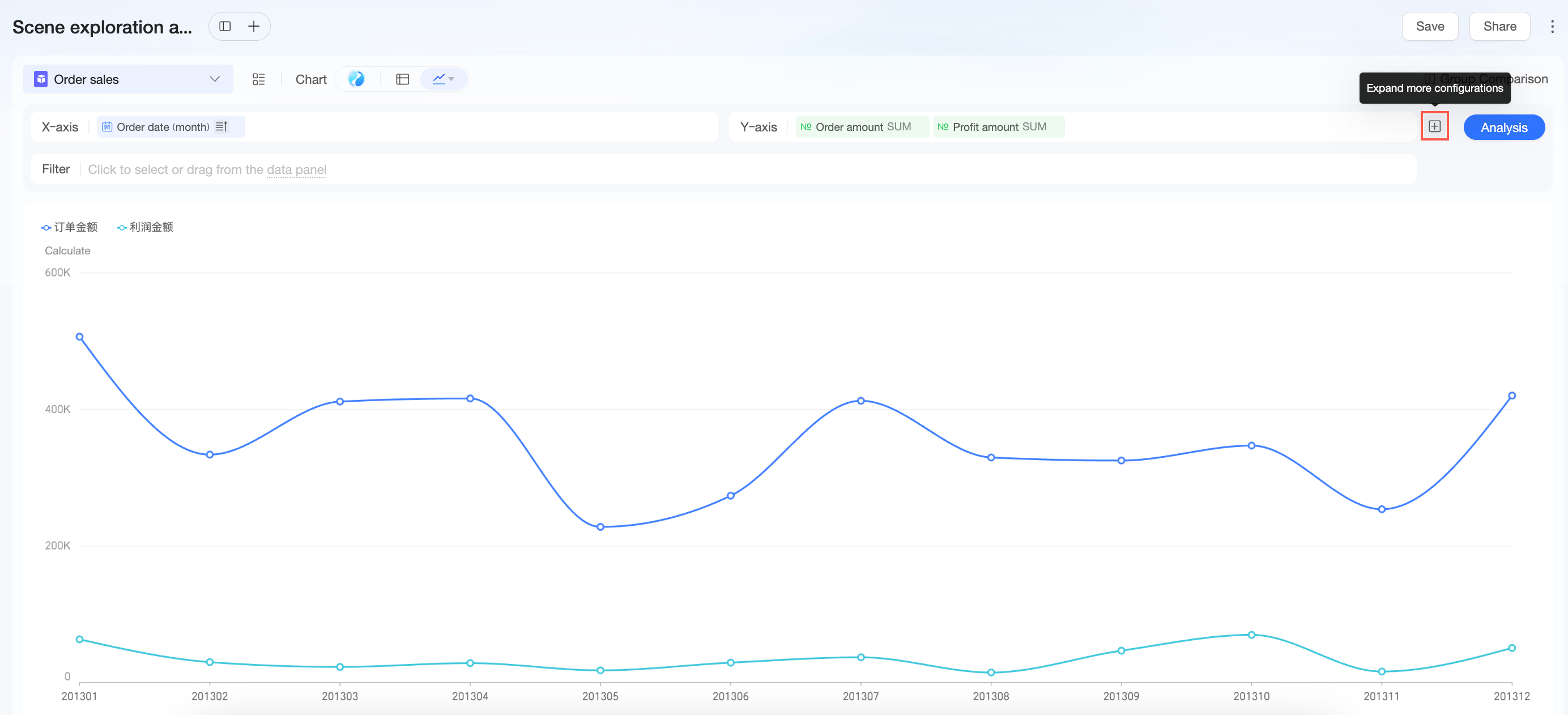
The chart shows that during the March promotion, order amount rose while profit declined. What is eroding gross profit behind GMV growth? The next steps drill down to identify the root cause. |
|
Step 2: Segment by channel to narrow scope |
|
|
Step 3: Drill down layer by layer to identify problematic categories |
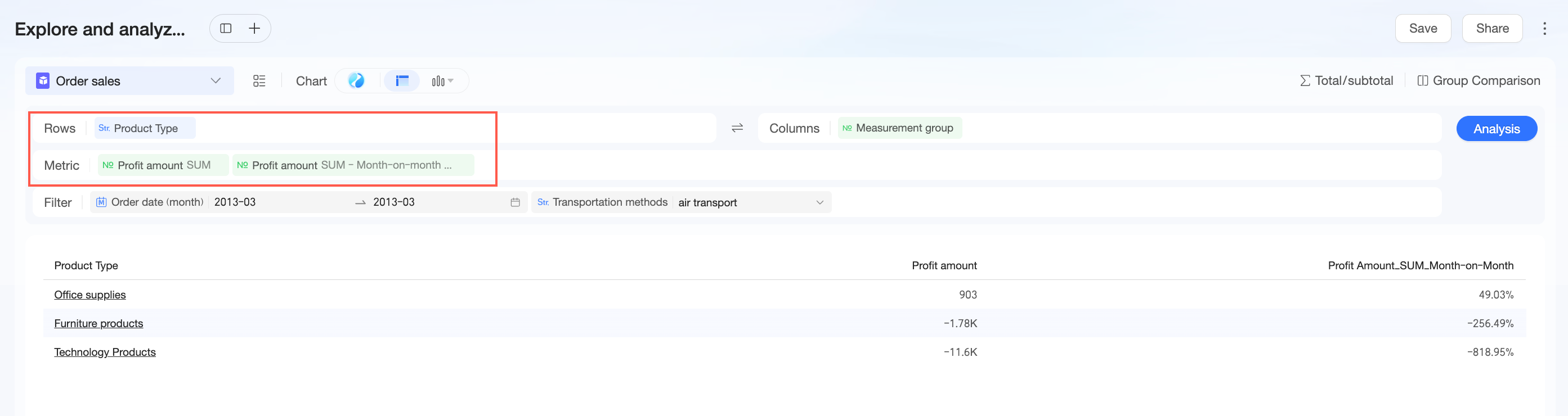
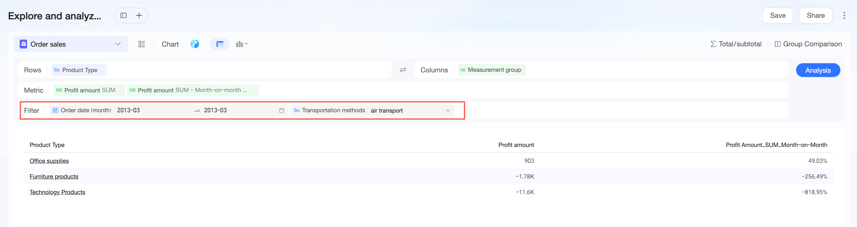
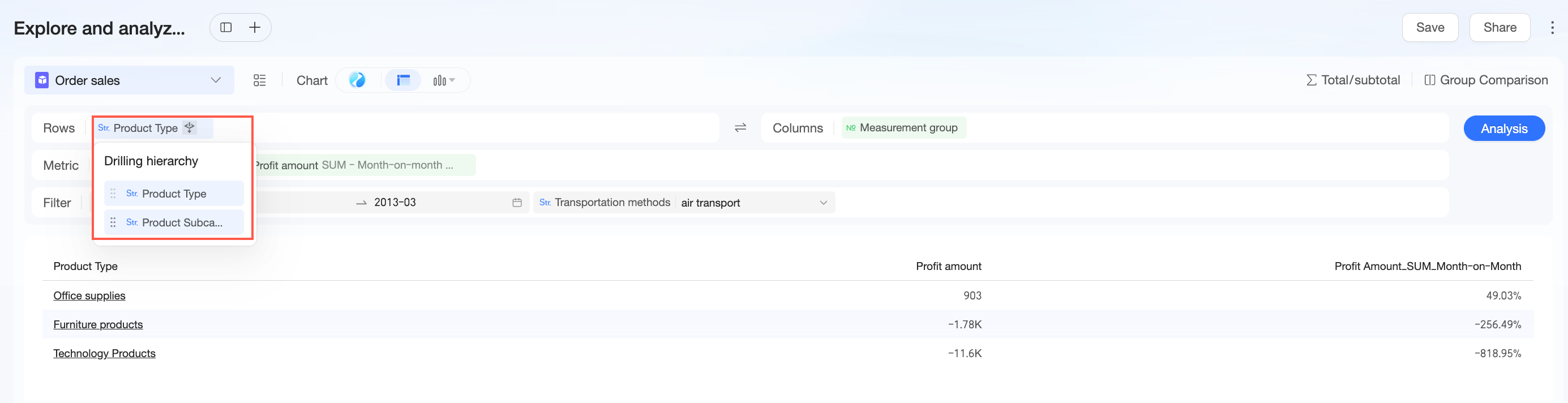
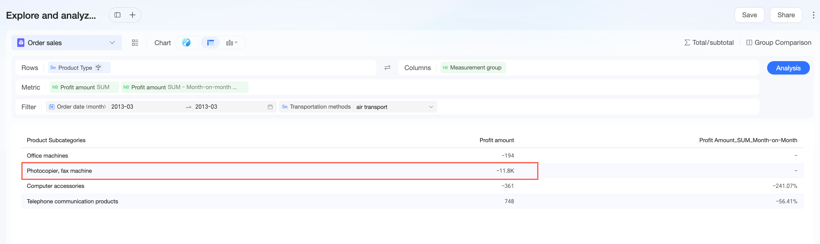
Through layered drill-down and month-over-month calculations, the root cause is identified: the decline in air freight profit in March was driven by significant losses in the “Copiers & Fax Machines” subcategory under “Technology Products.” Next, trace specific Order IDs to review loss-making orders and collaborate with product and operations teams to resolve the issue. |
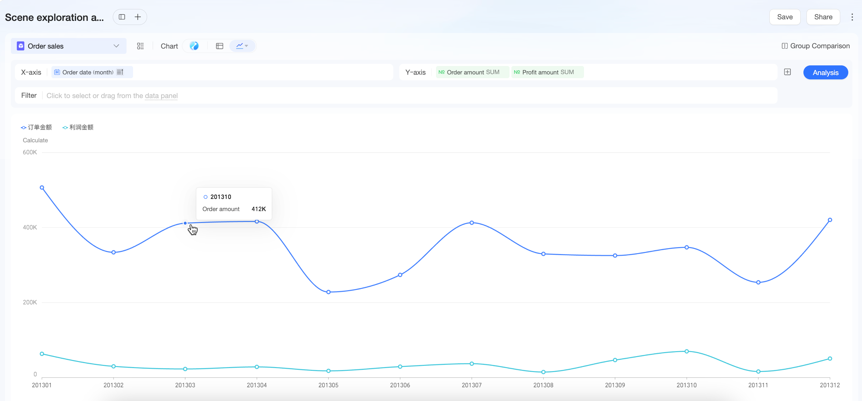
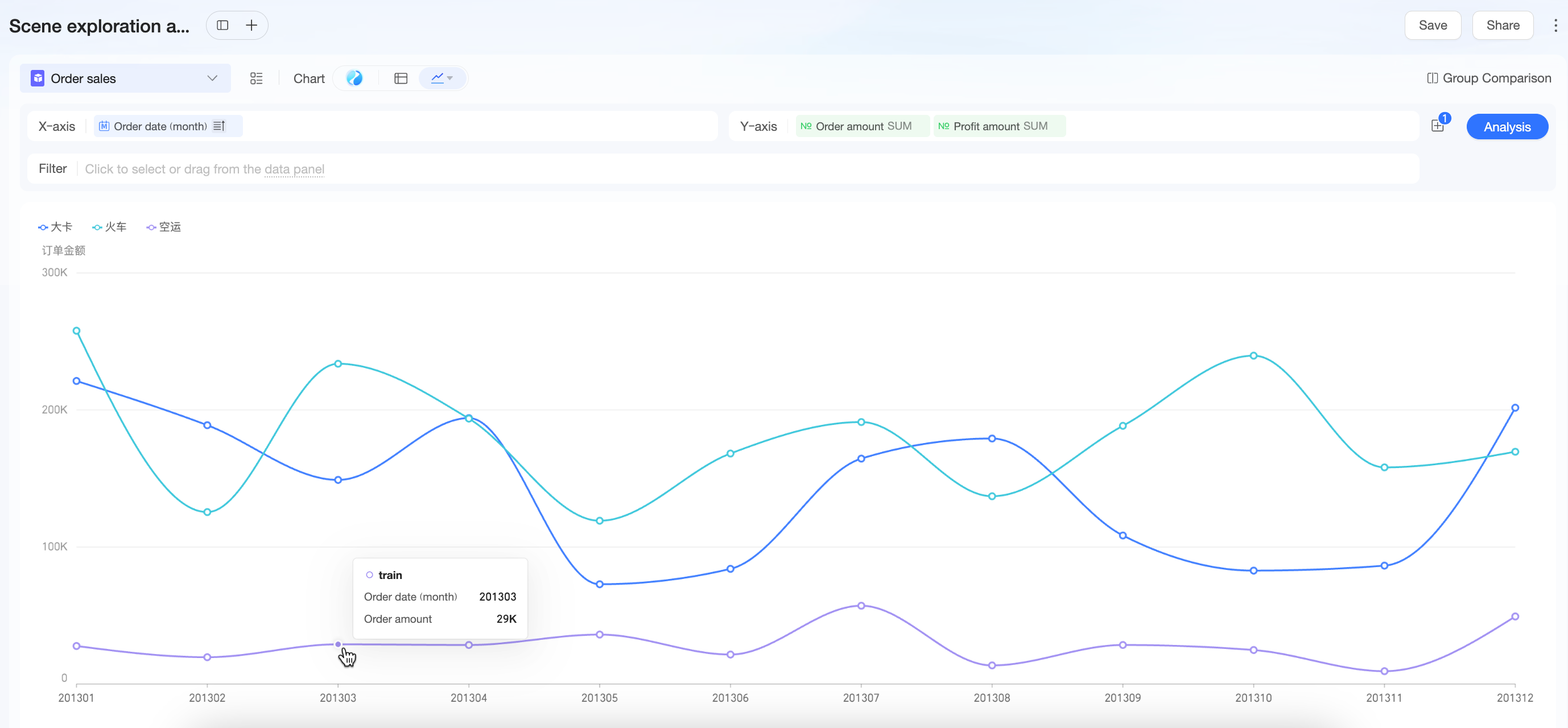 The chart suggests that air freight’s gross profit declined in March, dragging down overall performance.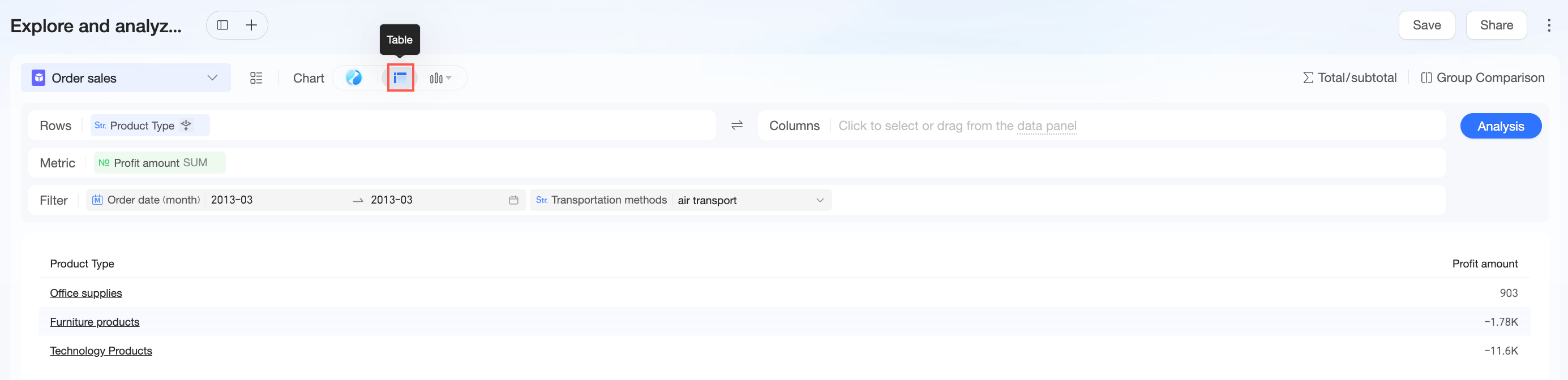
Scenario 2: Post-Campaign Review—Compare Key Metrics Before, During, and After a Promotion
Business Question
The sales team just concluded a major promotion in Week 11 of March (March 16–22) and wants a rapid review of regional campaign performance to inform strategy for the upcoming 618 sales event.
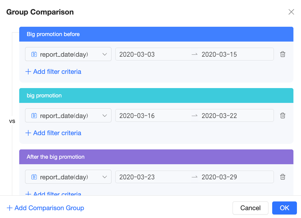
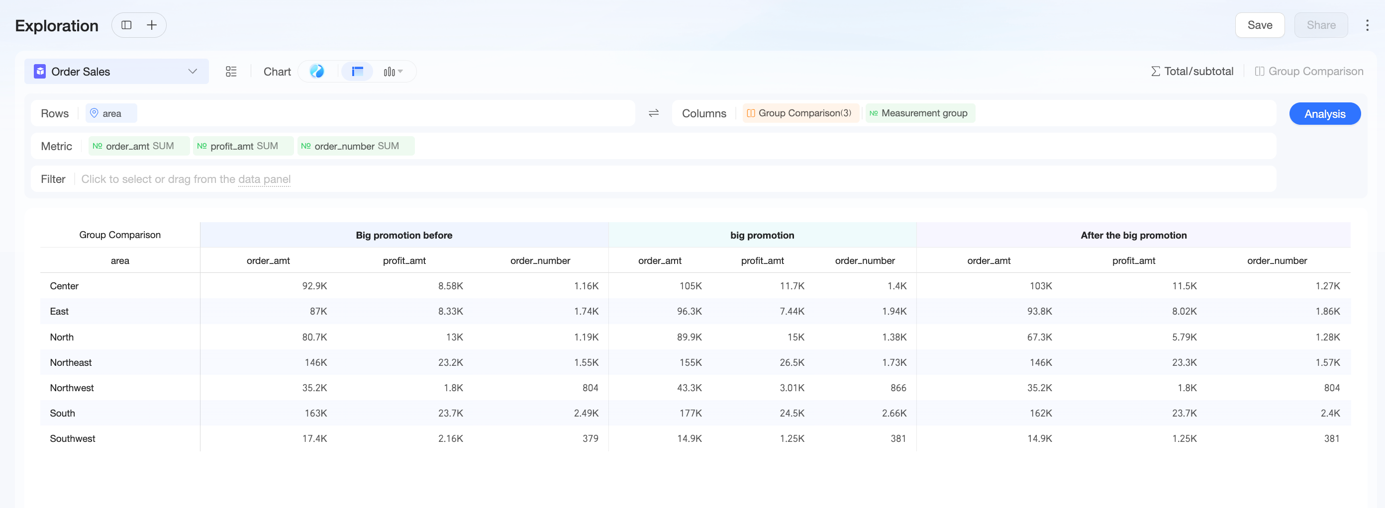
The classic approach is time-based group comparison: compare key metrics—GMV, gross profit, and order volume—across “Pre-Promotion,” “During Promotion,” and “Post-Promotion” phases to quantify incremental gains and assess lasting effects.
Analysis Path
|
Procedure |
Example |
|
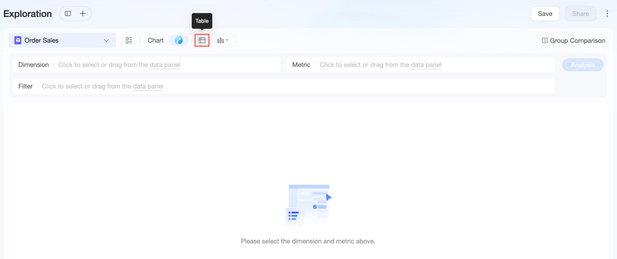
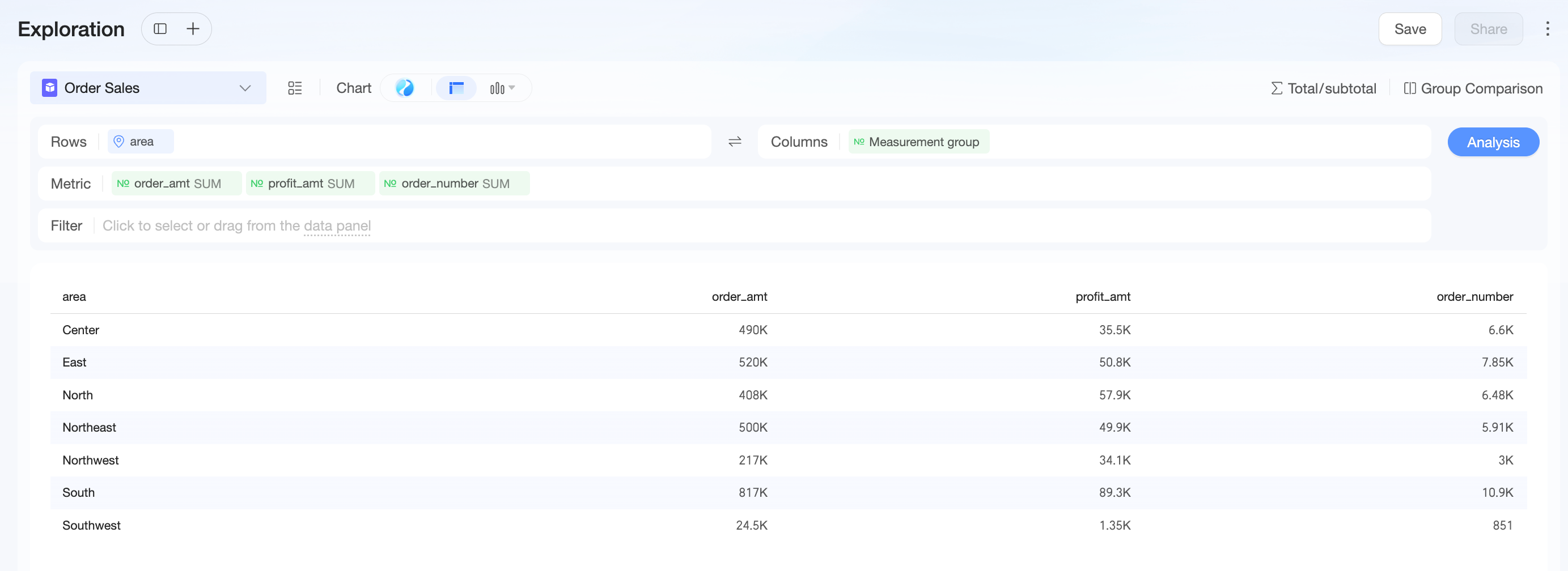
Step 1: View business metrics by region |
|
|
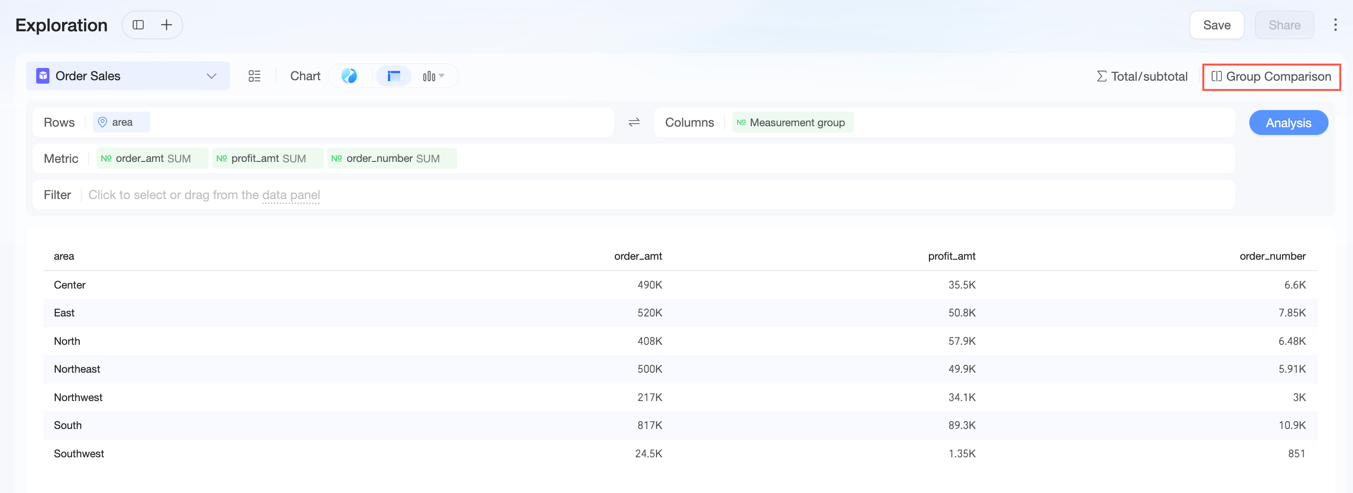
Step 2: Define comparison periods |
Group comparison reveals that GMV and gross profit across all regions peaked during the promotion, confirming strong traffic and conversion. However, metrics dropped to pre-promotion levels within one week, indicating the traffic boost did not translate into lasting retention. For the 618 promotion, design strategies to lock in customers and encourage repeat purchases. |
Scenario 3: A/B Test Analysis—Quantify the Impact of Different Strategies
Business Question
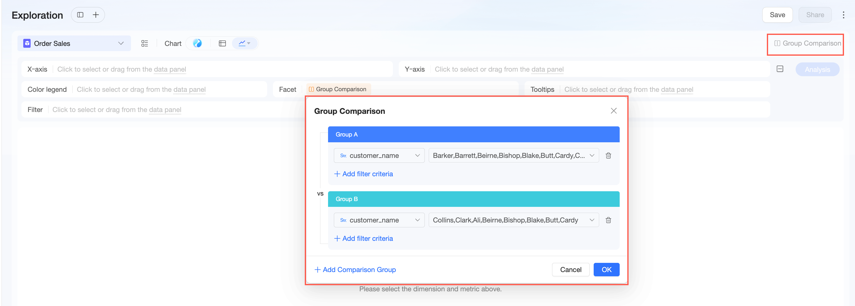
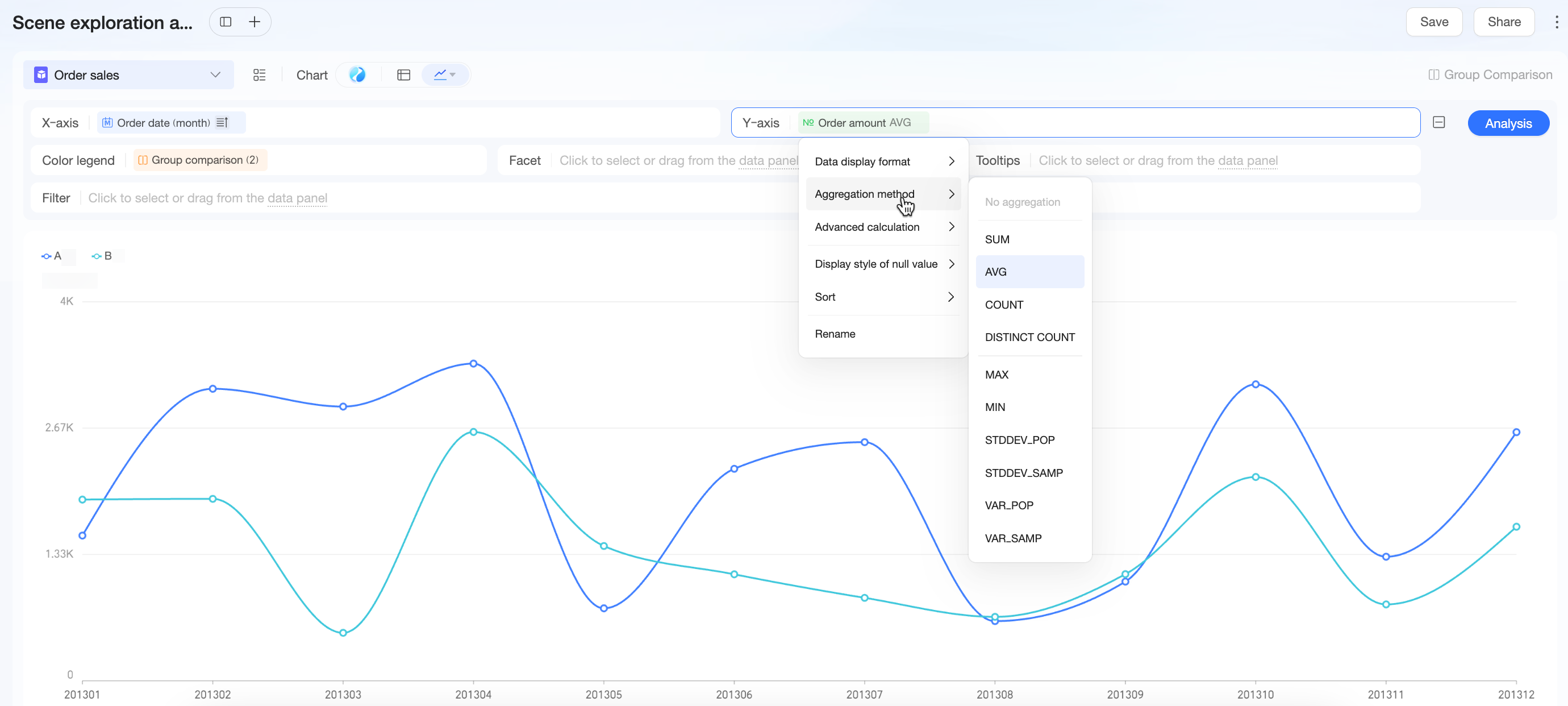
The R&D team launched a new “Recommended for You” algorithm (Group A) and wants to compare it against the old algorithm (Group B) to determine whether the new version increases user transaction value.
Analysis Path
|
Procedure |
Example |
|
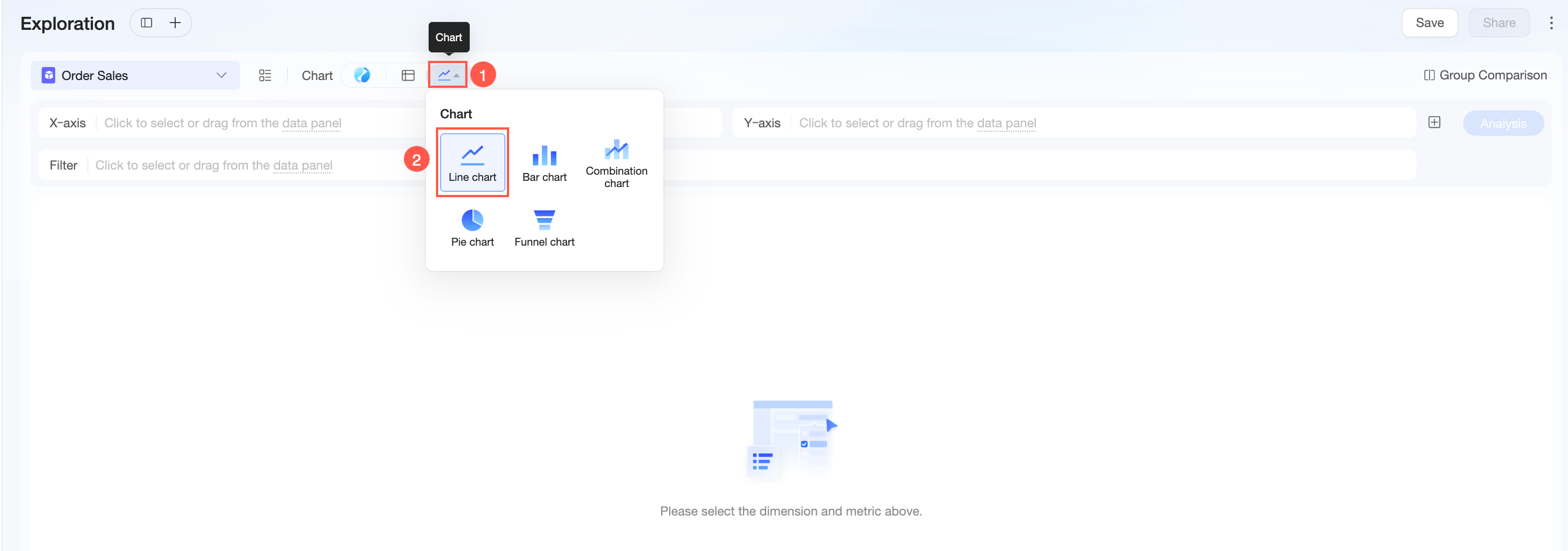
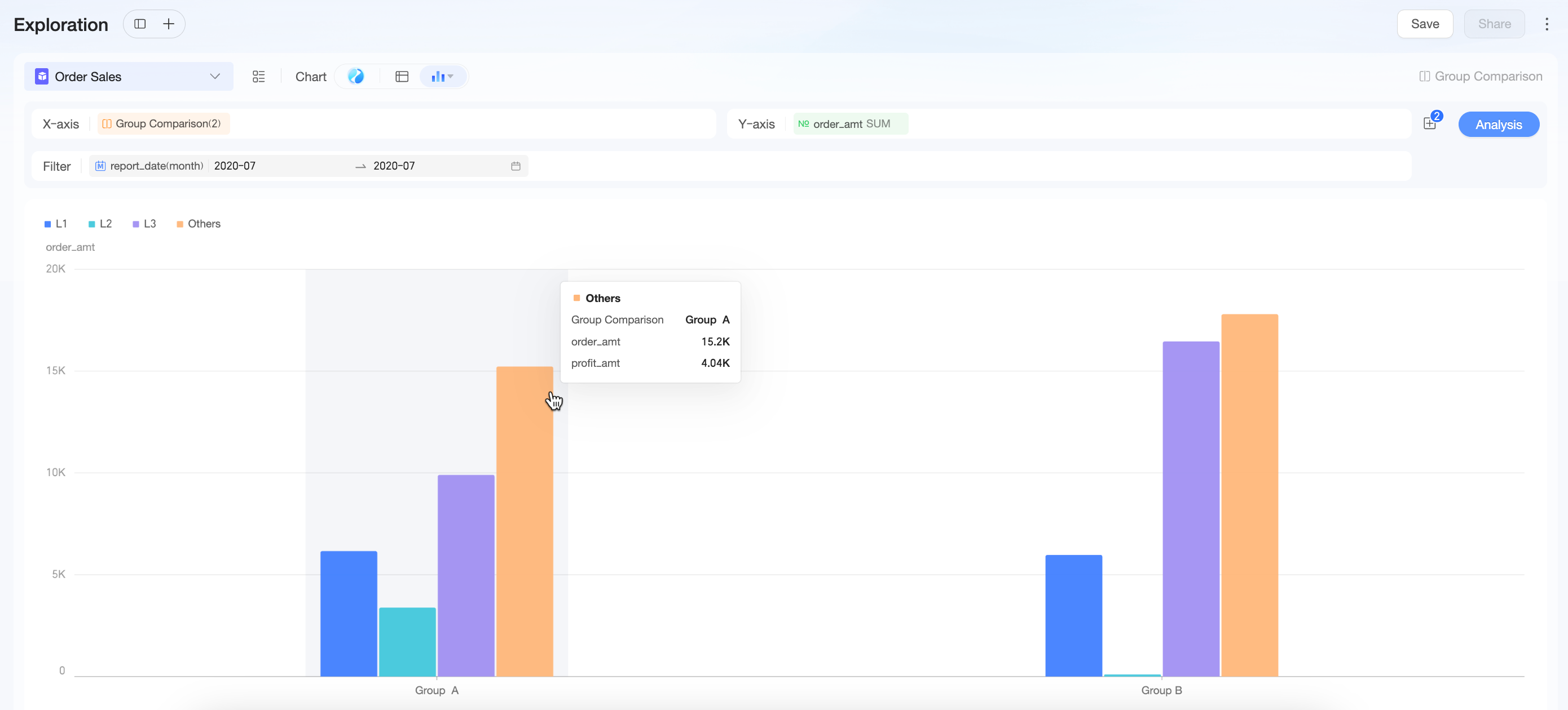
Step 1: Create A/B groups |
|
|
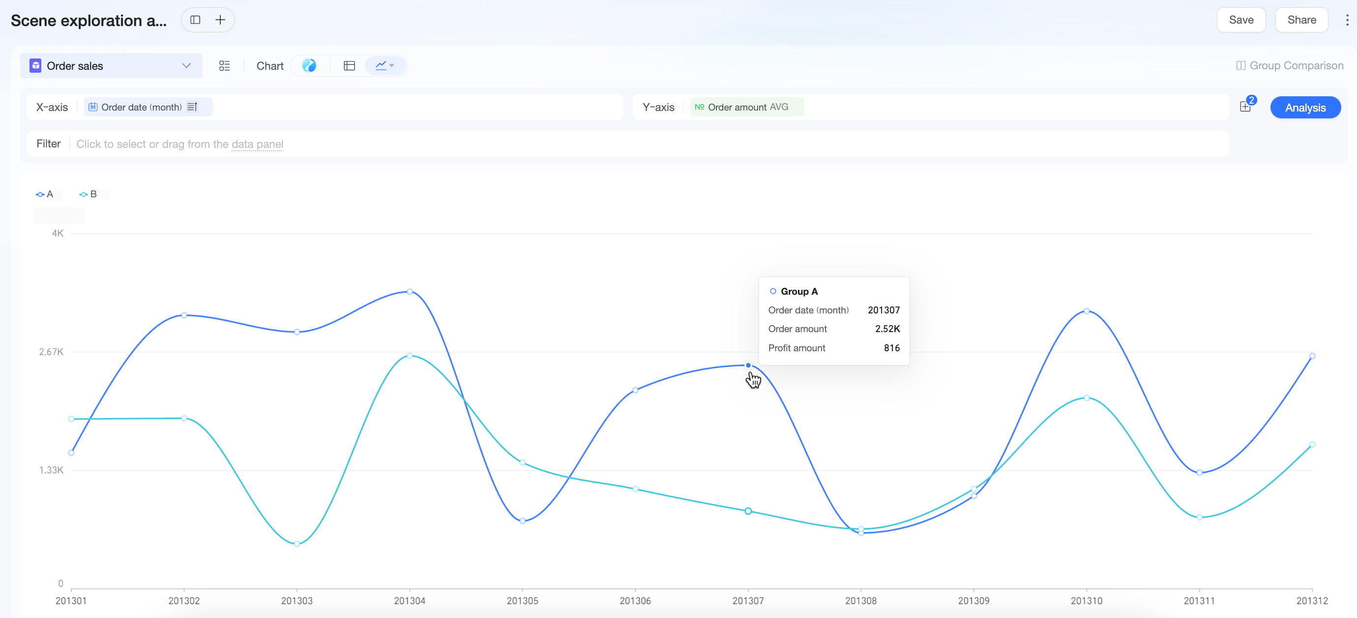
Step 2: Compare average revenue per user (ARPU) trends |
|
|
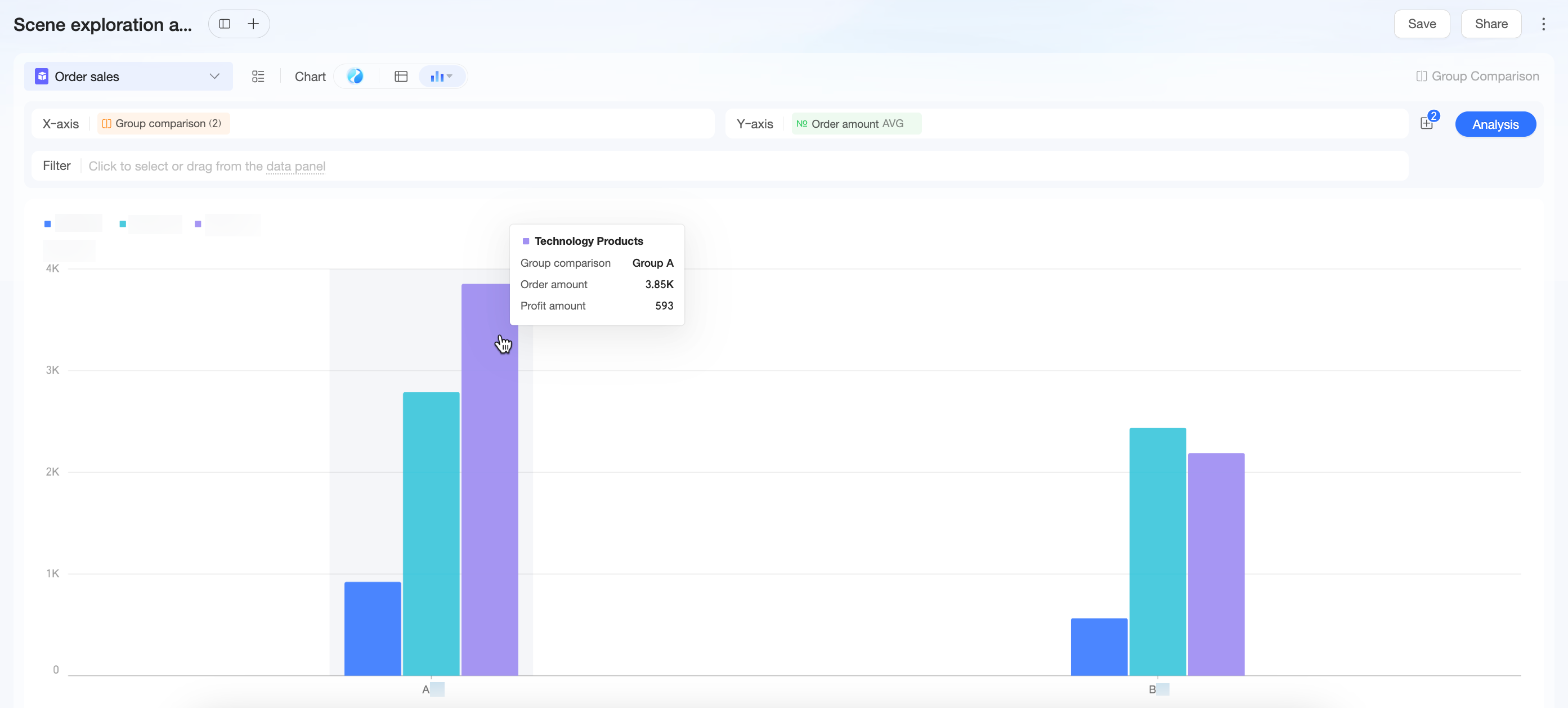
Step 3: Drill down to identify causes |
Group A shows significantly higher ARPU than Group B. Drill-down reveals this gain comes mainly from VIP Customers who increased spending on Technology Products—indicating the new algorithm excels at recommending high-ticket items to high-value users. |
Scenario 4: Customer Value Analysis—Custom Segments and Metrics to Understand Profit Contribution
Business Question
In Scenario 3, high-ticket customers positively impacted revenue during the promotion. Now dig deeper: Does profit come from many low-value orders or a few high-value ones? How do users with different spending power differ in purchasing behavior and profit contribution?
Analysis Path
|
Procedure |
Example |
|
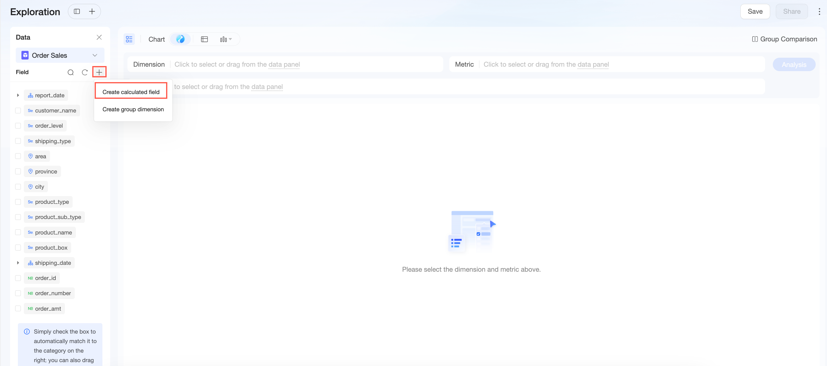
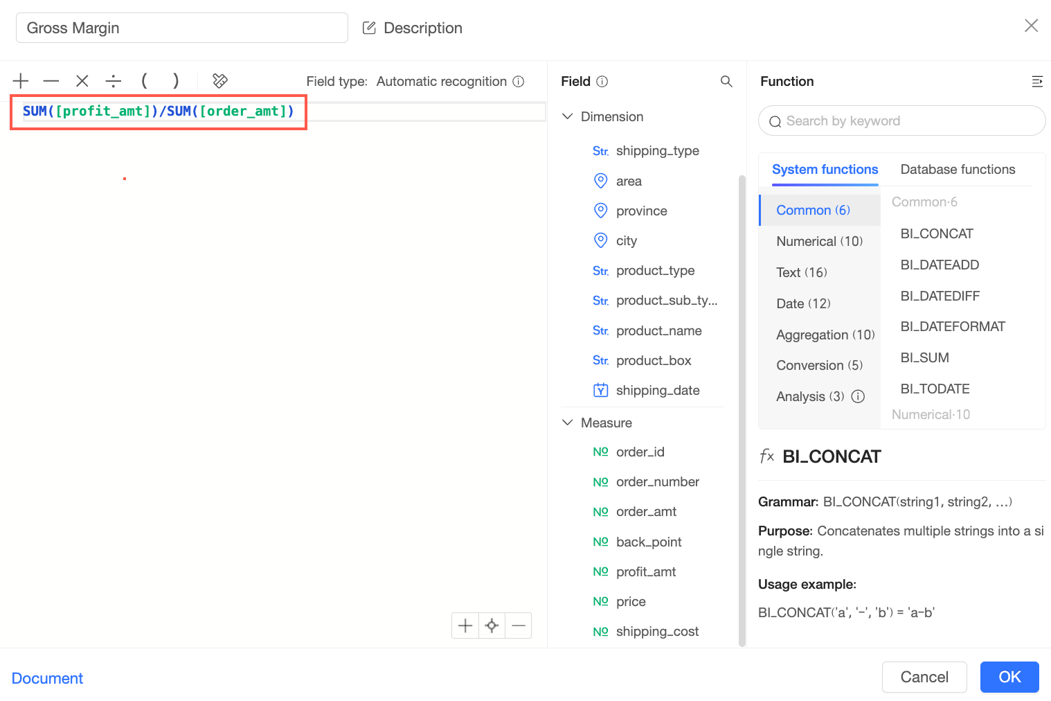
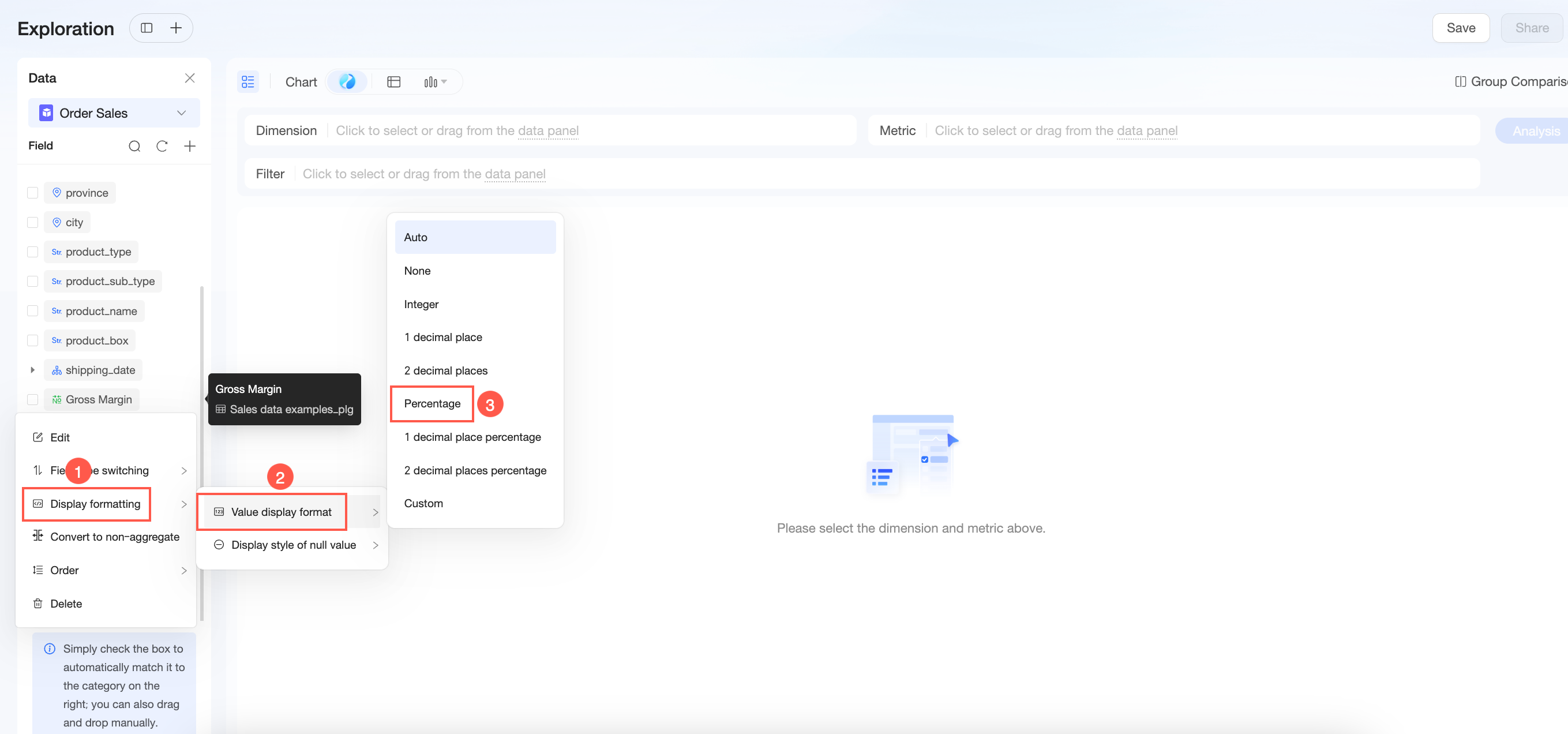
Step 1: Define a metric (gross margin ratio) |
|
|
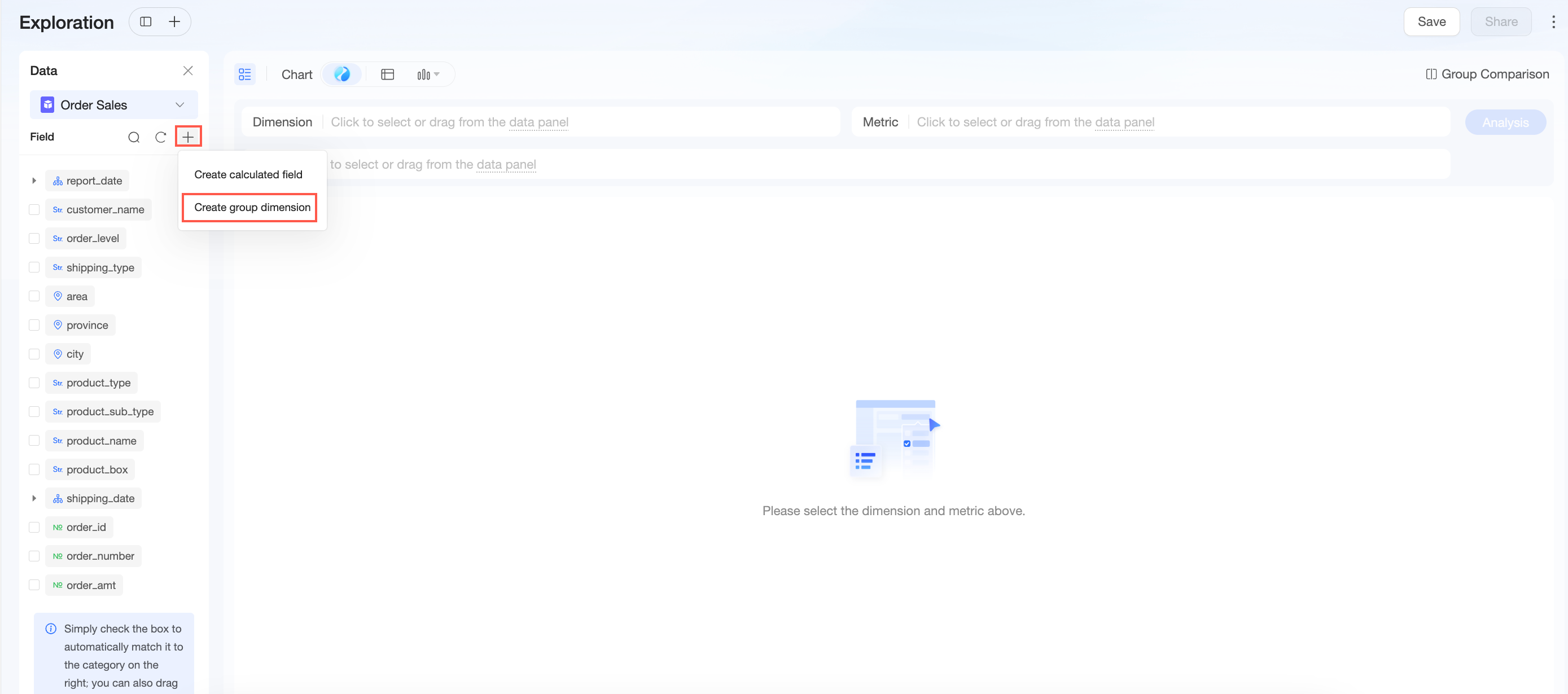
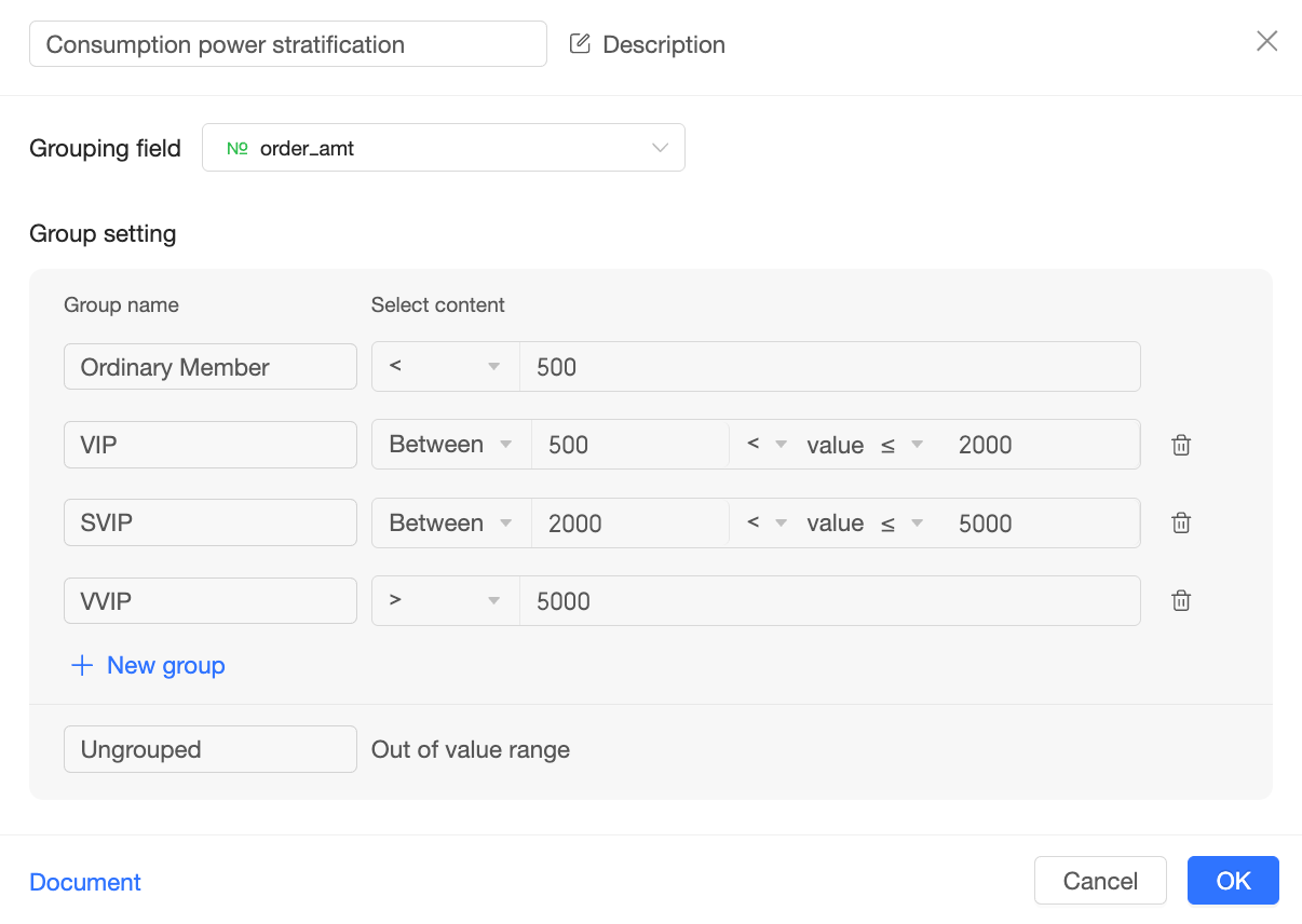
Step 2: Define core analysis dimension (spending power tiers) |
|
|
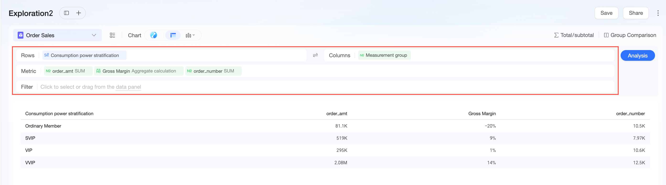
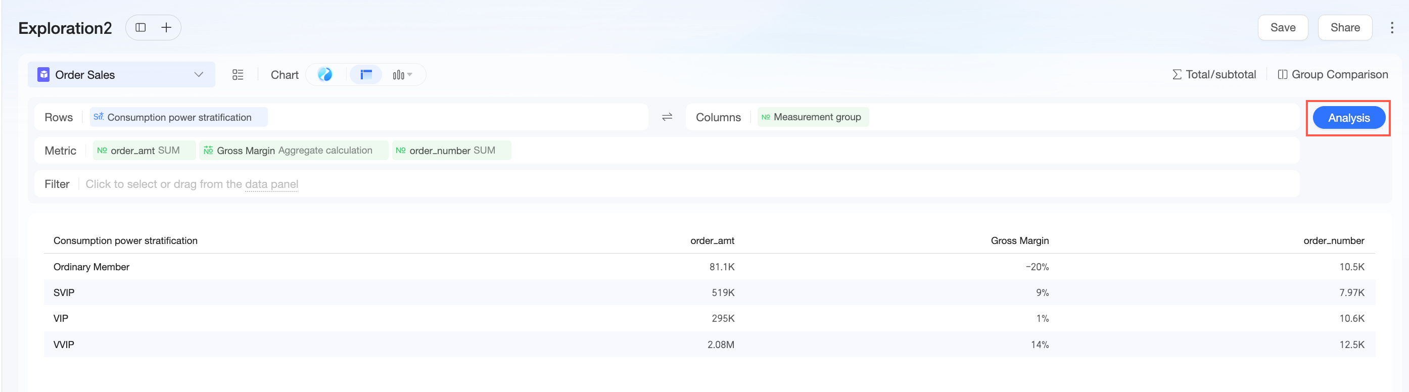
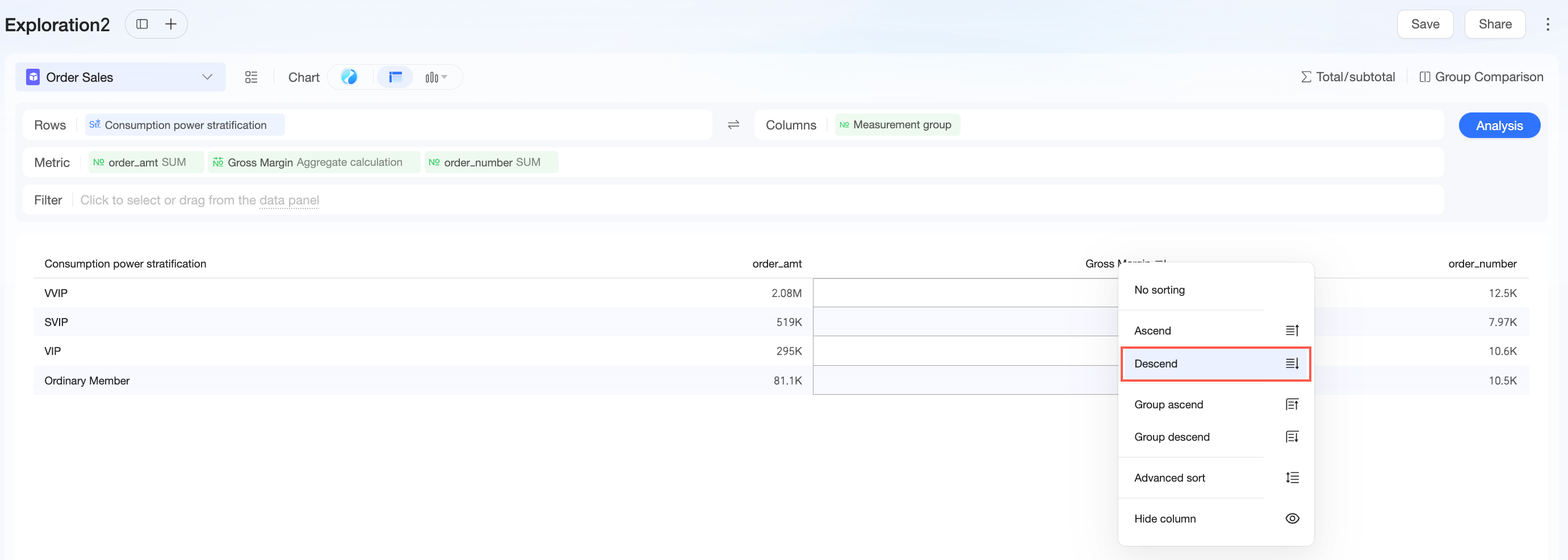
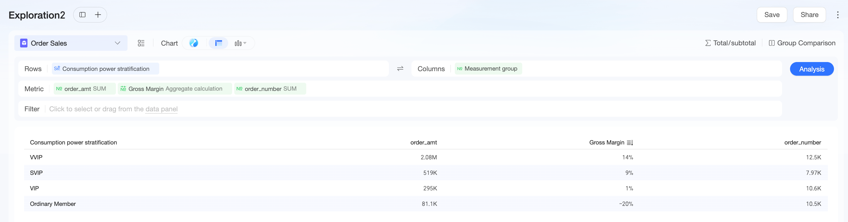
Step 3: Configure chart and generate analysis |
The chart shows that while Regular Members generate the most orders, VVIP users—despite far fewer orders—contribute over half of GMV, reflecting a high-value-user-driven model. The Regular Members tier has a negative gross margin, suggesting heavy subsidies were used to attract traffic orders. Next steps: optimize subsidy strategies by designing precise incentives for VIP users and high-ticket products to strengthen the core business while improving profitability. |