Advanced control type | Configuration |
Tree select Preview Control Configuration
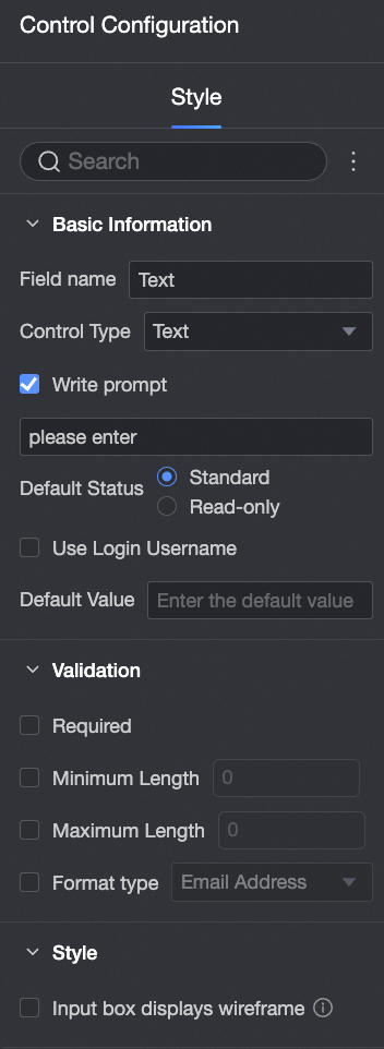
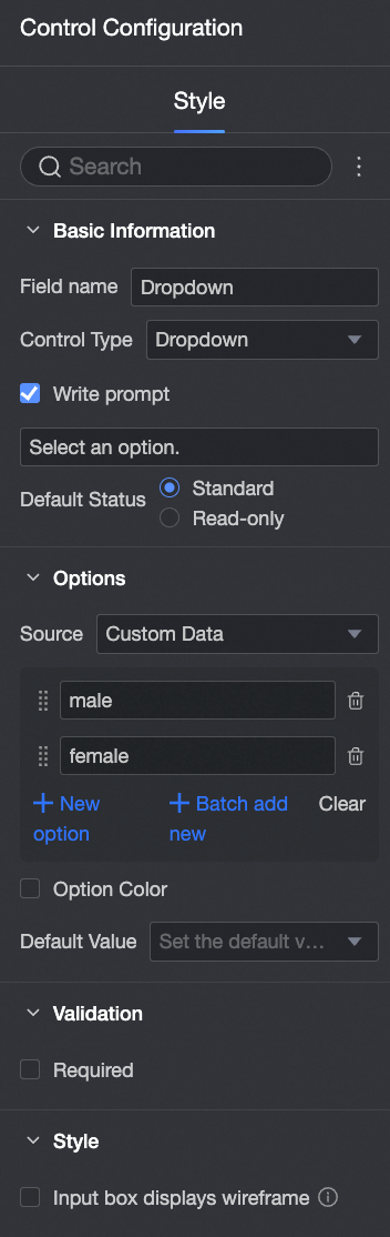
| Basic information: Field Name: Customize the field name. Control Type: Switch to other control types. Placeholder Text: Customize the placeholder text displayed in the input field. Default Status: Select read-only to make the control non-editable.
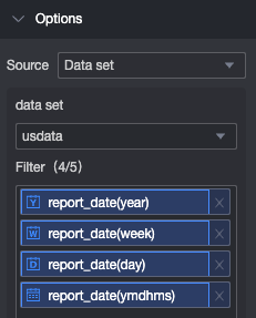
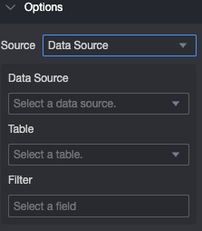
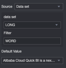
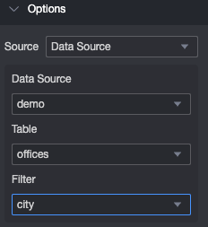
Options Select Dataset as the source, then choose a dataset and up to five data fields that you can access. Select Data Source as the source, then choose a data source, data table, and cascading fields that you can access.
Validation Required: Makes the control required. Invalid Input Message: This message appears only when a validation rule is triggered. For example, if you enable the Required option and a user does not select a value, this message appears.
Style
|
Image upload Preview Control Configuration
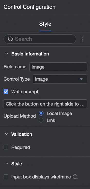
| Basic information: Field Name: Customize the field name. Control Type: Switch to other control types. Placeholder Text: Customize the placeholder text displayed in the input field. Upload Method: You can select either Local Image or Link.
Validation Required: Makes the control required. Invalid Input Message: This message appears only when a validation rule is triggered. For example, if you enable the Required option and a user does not provide an image, this message appears.
Style
|
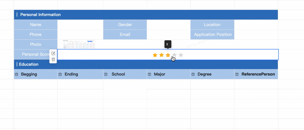
Rating Preview
Control Configuration
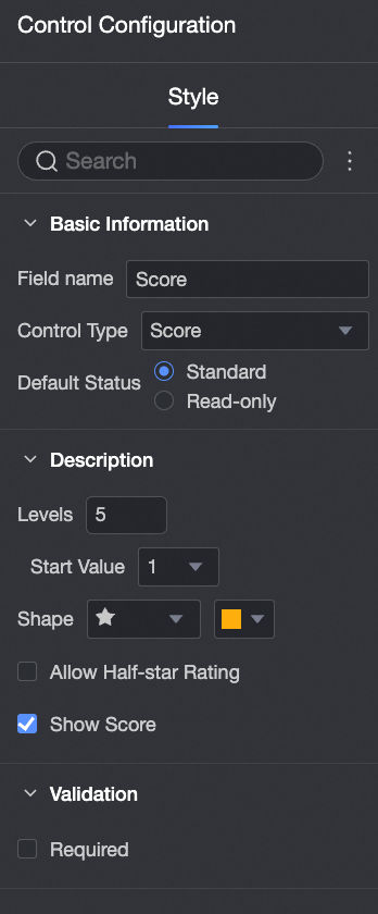
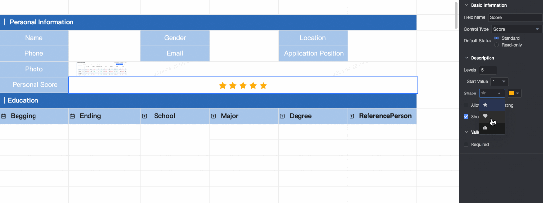
| Basic information: Field Name: Customize the field name. Control Type: Switch to other control types. Default Status: Select read-only to make the control non-editable.
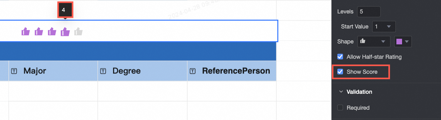
Content Levels: Set the number of rating levels (up to 10). Start Value: Set the start value to 0 or 1. Set the Shape and Color of the rating icons. Allow half-star: Allow half-star ratings. Show score: Display the numeric score.
Validation Required: Makes the control required. Invalid Input Message: This message appears only when a validation rule is triggered. For example, if you enable the Required option and a user does not provide a rating, this message appears.
|
Mobile number Preview
Control Configuration
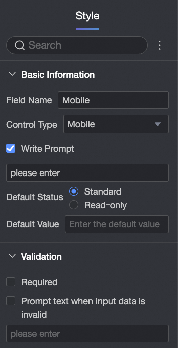
| Basic information: Field Name: Customize the field name. Defaults to "Mobile Number". Control Type: Switch to other control types. Placeholder Text: Customize the placeholder text displayed in the input field. Default Status: Select read-only to make the control non-editable. Default Value: Set a default value for the control.
Validation: Required: Makes the control required. Invalid Input Message: This message appears only when a validation rule is triggered. For example, if you enable the Required option and a user does not enter a value, this message appears.
Style:
|
Email Preview
Control Configuration
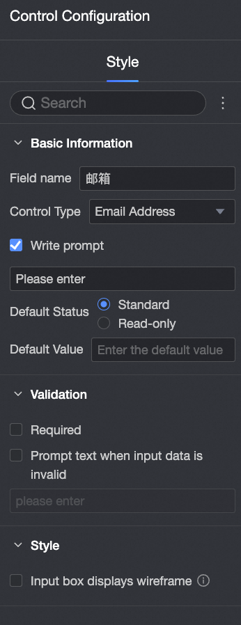
| Basic information: Field Name: Customize the field name. Defaults to "Email". Control Type: Switch to other control types. Placeholder Text: Customize the placeholder text displayed in the input field. Default Status: Select read-only to make the control non-editable. Default Value: Set a default value for the control.
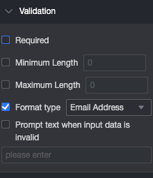
Validation: Required: Makes the control required. Invalid Input Message: This message appears only when a validation rule is triggered. For example, if you enable the Required option and a user does not enter a value, this message appears.
Style:
|
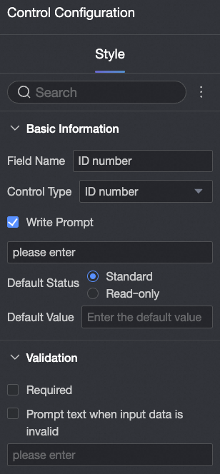
ID card number Preview
Control Configuration
| Basic information: Field Name: Customize the field name. Defaults to "ID Card Number". Control Type: Switch to other control types. Placeholder Text: Customize the placeholder text displayed in the input field. Default Status: Select read-only to make the control non-editable. Default Value: Set a default value for the control.
Validation: Required: Makes the control required. Invalid Input Message: This message appears only when a validation rule is triggered. For example, if you enable the Required option and a user does not enter a value, this message appears.
Style:
|
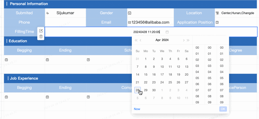
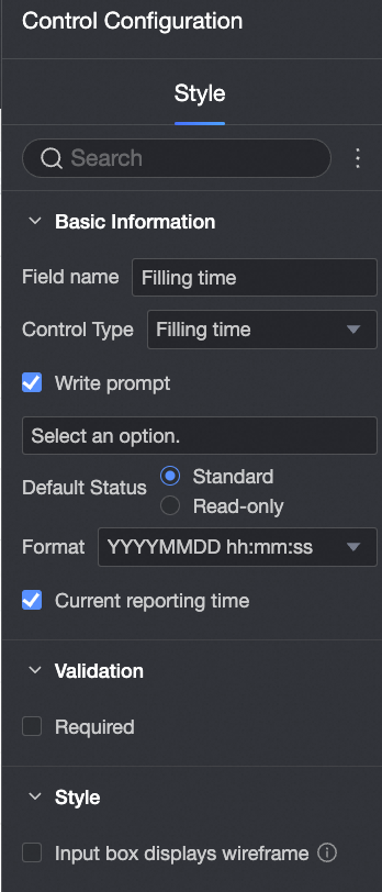
Submission time Use this control to automatically record the submission time. Preview
Control Configuration
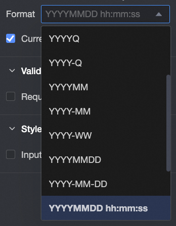
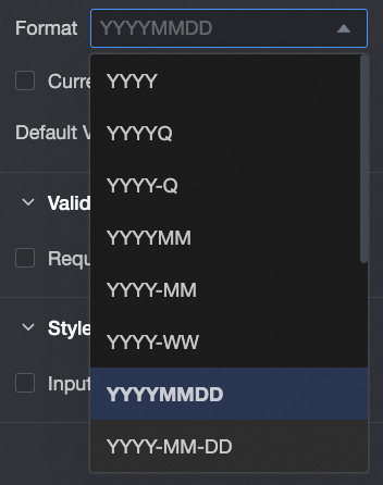
| Basic information: Field Name: Customize the field name. Defaults to "Submission time". Control Type: Switch to other control types. Placeholder Text: Customize the placeholder text displayed in the input field. Default Status: Select read-only to make the control non-editable. Format: You can select formats such as Year, YearQuarter, Year-Quarter, YearMonth, YYYY-MM, Year-Week, YearMonthDay, YYYY-MM-DD, YearMonthDayHourMinuteSecond, and YYYY-MM-DD-HH-mm-ss.
Current Submission Time: Selected by default. When selected, the control displays the current submission time.
Validation: Required: Makes the control required. Invalid Input Message: This message appears only when a validation rule is triggered. For example, if you enable the Required option and a user does not enter a value, this message appears.
Style:
|
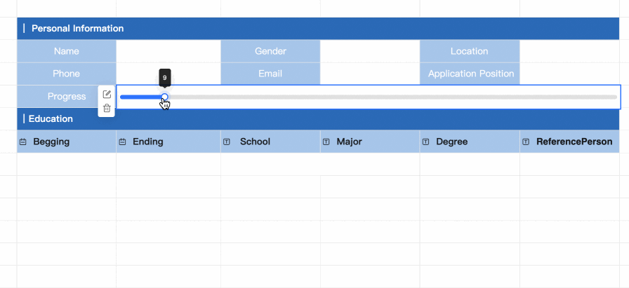
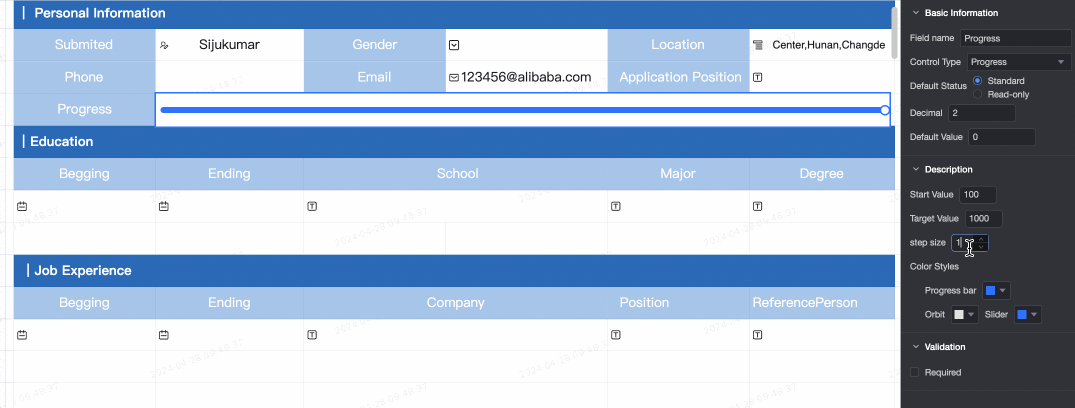
Progress bar Preview
Control Configuration
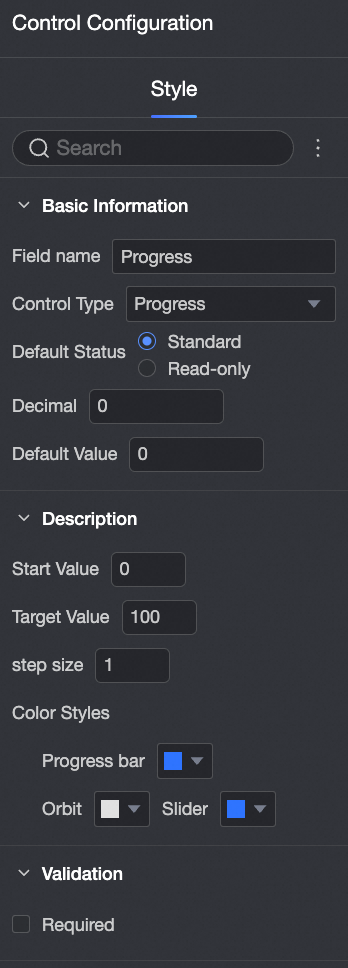
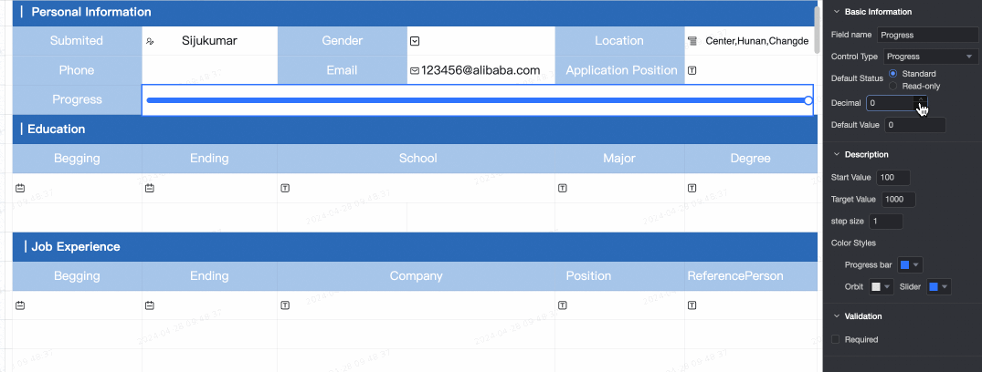
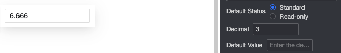
| Basic information: Field Name: Customize the field name. Control Type: Switch to other control types. Default Status: Select read-only to make the control non-editable. Decimal Places: Customize the number of decimal places for the progress bar value. Default Value: Set the default value for the progress bar. The default is 0.
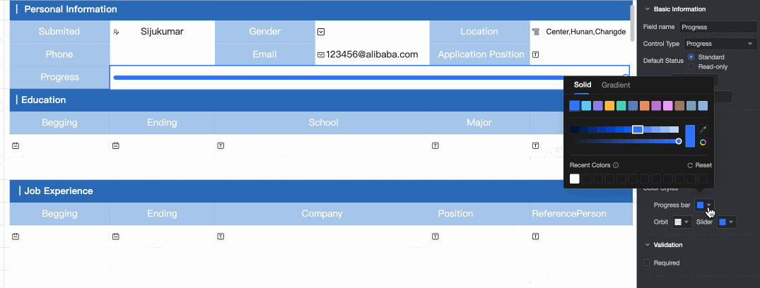
Content Start Value: Set the start value, which must be lower than the target value. Defaults to 0. Target Value: Set the target value, which must be higher than the start value. Defaults to 100. Step: Set the increment value for each update of the progress bar. The default is 1. Color Style: Customize the colors for the progress bar, track, and slider.
Validation Required: Makes the control required. Invalid Input Message: This message appears only when a validation rule is triggered. For example, if you enable the Required option and a user does not provide a value, this message appears.
|
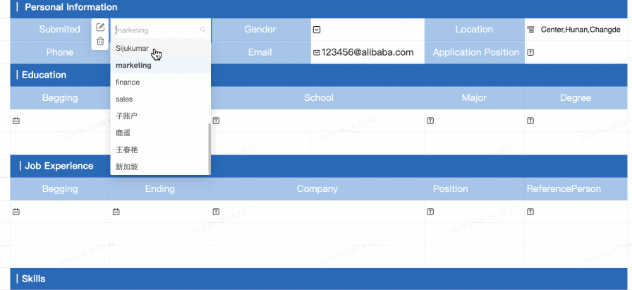
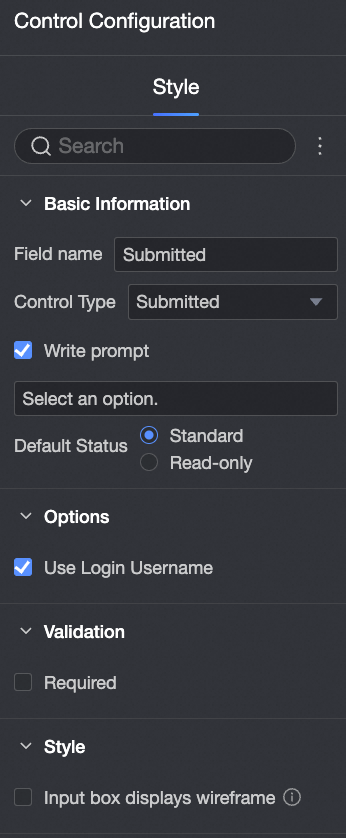
Submitter Use this control to automatically record the submitter's name. Preview
Control Configuration
| Basic information: Field Name: Customize the field name. Defaults to "Submitter". Control Type: Switch to other control types. Placeholder Text: Customize the placeholder text displayed in the input field. Default Status: Select read-only to make the control non-editable.
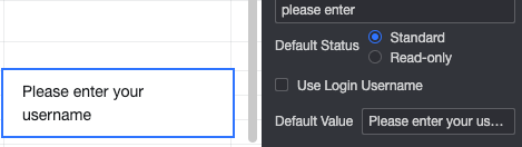
Option configuration: Use login username: Selected by default. When selected, the control displays the current user's login username. Default value: If you do not select Use logon username, you can specify the Default value.
Validation: Required: Makes the control required. Invalid Input Message: This message appears only when a validation rule is triggered. For example, if you enable the Required option and a user does not enter a value, this message appears.
Style:
|
User single-select Preview
Control Configuration
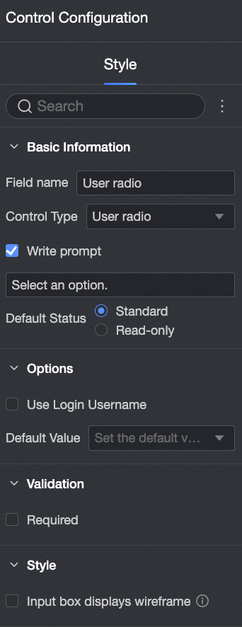
| Basic information: Field Name: Customize the field name. Defaults to "User Single-select". Control Type: Switch to other control types. Placeholder Text: Customize the placeholder text displayed in the input field. Default Status: Select read-only to make the control non-editable.
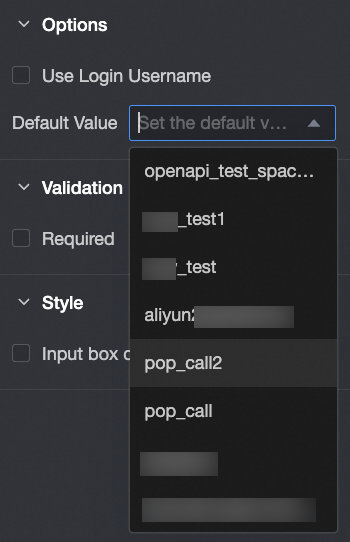
Option configuration: Use login username: If selected, the control displays the current user's login username. Default Value: Set a default value for the control.
Validation: Required: Makes the control required. Invalid Input Message: This message appears only when a validation rule is triggered. For example, if you enable the Required option and a user does not enter a value, this message appears.
Style:
|
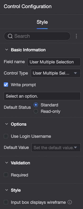
User multi-select Preview
Control Configuration
| Basic information: Field Name: Customize the field name. Defaults to "User Multi-select". Control Type: Switch to other control types. Placeholder Text: Customize the placeholder text displayed in the input field. Default Status: Select read-only to make the control non-editable.
Option configuration: Use login username: If selected, the control displays the current user's login username. Default Value: Set a default value for the control.
Validation: Required: Makes the control required. Invalid Input Message: This message appears only when a validation rule is triggered. For example, if you enable the Required option and a user does not enter a value, this message appears.
Style:
|
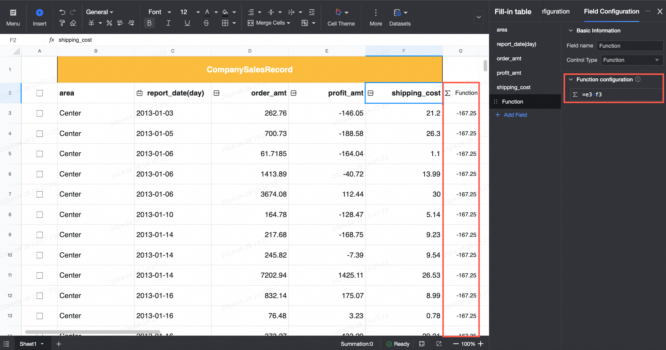
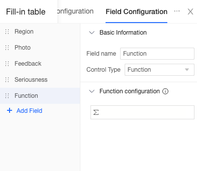
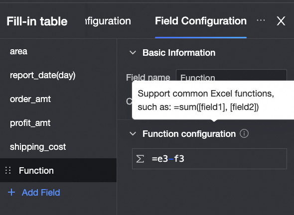
Function Preview Control Configuration
| Basic information Function configuration The Function control supports Excel-compatible functions. You can reference fields from the data entry form or from datasets by using the [FieldName] syntax. For more information, see Functions supported by spreadsheets.
|


 icon to drag and reorder options. Click the
  icon to delete an option.
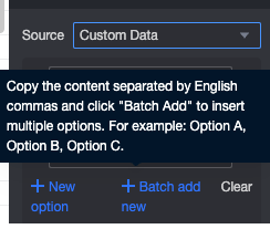


 icon and customize the format under Date Display Format.