Configure a statistical chart with multiple queries
A statistical chart supports multiple query statements, allowing you to combine several single-value metrics into one chart and customize settings for each field individually.
Prerequisites
-
Log data is collected. For more information, see Collect text logs from servers.
-
An index is created. For more information, see Create indexes.
-
A dashboard is created. For more information, see Create a dashboard quickly.
Overview
-
Query and analyze data : Calculate the unique visitors (UV) and page views (PV) for a webpage in the Log Service console.
-
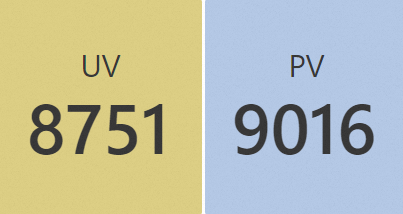
Configure a statistical chart with multiple queries : Add a statistical chart to display both
UVandPVdata, set the background color forUVto orange andPVto blue, and then add the chart to the target dashboard.
Step 1: Query and analyze data
Log on to the Simple Log Service console. In the Projects section, click the project you want.

-
In the left-side navigation pane, click Log Storage. In the Logstores list, click the target Logstore.
-
Enter the following query statements and click Search & Analyze to view the logs.
-
Calculate the UV value.
status < 400 | SELECT approx_distinct(client_ip) AS UV -
Calculate the PV value.
status < 400 | SELECT count(*) AS PV
-
Step 2: Configure a statistical chart with multiple queries
1. Add a statistical chart
In the left-side navigation pane, choose . From the Dashboard list, click the target dashboard. In the upper-right corner of the dashboard, click Edit. In edit mode, click .
2. Configure multiple queries
On the right side of the page, go to and select the statistical chart  . Set the time range, Logstore, and query statements, and then click Apply to preview the chart.
-
: Select the UV field from query A.
-
: Select the PV field from query B.
Set the time range to 15min (Last 15 Minutes) and select the website_log Logstore. For Query A, enter status < 400 | SELECT approx_distinct(client_ip) AS UV. For Query B, enter status < 400 | SELECT count(*) AS PV. Click Apply to display both UV and PV results in the statistical chart.
3. Configure colors
On the right side of the page, click the Field Configuration tab and customize the colors for each query. For more information, see Statistical chart.
-
In the A section, configure the visualization settings for query A results. Set the color to orange.
-
In the B section, configure the visualization settings for query B results. Set the color to blue.
In the Standard Configurations section, set the color for each group from the Color Scheme drop-down list. Select Solid as the scheme type.
4. Save the chart and dashboard
-
In the upper-right corner of the chart editing page, click OK.
-
In the upper-right corner of the dashboard editing page, click Save.