This topic describes the chart styles of audio components and the meaning of each configuration items.
Chart style
Audio is a type of media component. It supports custom audio URLs, audio playback settings, and volume settings. It supports audio in the mp4 format. You can add an audio player to a visual application to play your audio. 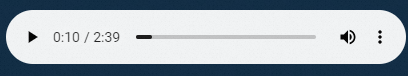
Settings
Search Configuration: Click Search Configuration in the upper-right corner of the Configuration panel. In the Search Configuration panel, enter the name of the configuration items that you want to search for to quickly locate the configuration items. Fuzzy match is supported. For more information, see Search for asset configurations.
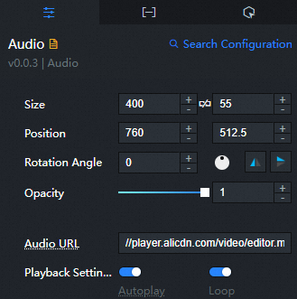
Size: indicates the size of a widget, including its pixel width and height. You can click the
 icon to lock the aspect ratio of the widget and modify the width and height of the widget in equal proportion. Click again to unlock. The aspect ratio is not limited after unlocking.
 Position: the position of a widget, which is indicated by pixel X and Y coordinates. X-coordinate indicates the pixel distance between the upper-left corner of the widget and the left border of the canvas. Y-coordinate indicates the pixel distance between the upper-left corner of the widget and the upper border of the canvas.
Rotation Angle: the angle of a rotation that uses the center point of a widget as the rotation point. The unit is degrees (°). You can use one of the following methods to control the rotation angle of a widget:
Directly enter the degrees in the Rotation Angle spin box or click the plus sign (+) or minus sign (-) to increase or decrease the value in the Rotation Angle spin box.
Drag the
 black dot in the icon to control the rotation angle of the widget.
 Click the
 icon to flip the widget style.
 Click the
 icon to flip the widget style.
Opacity: Valid values: 0 to 1. If this parameter is set to 0, the widget is hidden. If this parameter is set to 1, the widget is completely displayed. Default value: 1.
Audio URL: We recommend that you use an audio URL in the MP4 format, such as // player.alicdn.com/video/editor.mp4. You can also configure the audio URL in the Data panel.
Playback Settings: Set the playback style of the audio.
Parameter
description
Auto Play
If you turn on the switch, the audio content can be automatically played on the preview or publish page.
NoteDue to browser protocol restrictions, audio is automatically played only when your component interacts.
Loop the video
Turn on the switch. On the Preview or Publish page, after the audio is played, play it again.
Playback Speed
The playback speed of the audio. Unit: times.
Hyperlink
You can customize the settings to which second the audio is played.
Volume Settings: If you turn on the switch, the audio is muted. If you turn off the switch, you can set the playback volume in %.
Download: Turn on the switch. On the Preview or Publish page, you can click More in the Actions column to download the audio.
 icon to flip the widget style.
 Data panel
source :(Optional) Configure the address of the audio resource, which is the same as the configuration of the audio link in the configuration items panel. If you configure both parameters, this parameter takes effect in priority.
Interaction tab
This widget does not support interaction events.
Configure interactions in Blueprint Editor
In Canvas Editor, right-click a widget in the Layer panel and select Add to Blueprint Editor.
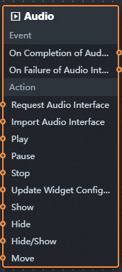
Click the
icon in the upper-left corner. In Blueprint Editor, click the Audio component in the Import Nodes pane. You can view the parameters in the canvas, as shown in the following figure.
Events
Events
Description
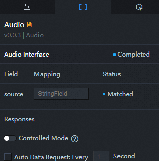
When the audio interface request is completed
The event is triggered with the processed JSON data after a data interface request is responded and processed by a filter. For more information about specific data examples, see the Data Response Result section of the Data tab in the right-side configuration panel of the canvas editor.
When the audio port request fails
The event that is returned when a data interface request fails (such as network problems or interface errors) and is processed by the filter. The event also throws the processed JSON data. For more information about specific data examples, see the Data Response Result section of the Data tab in the right-side configuration panel of the canvas editor.
Action
Action
Description
Request Audio Interface
This action is performed to request the server data again. The data sent by an upstream data processing node or layer node is used as a parameter. For example, if the API data source is
https://api.testand the data passed to the request audio interface is{ id: '1'}, the final request interface ishttps://api.test?id=1.Import Audio Interface
After data of a widget is processed in accordance with its drawing format, the widget is imported for redrawing. You do not need to request server data again. For more information about specific data examples, see the Data Response Result section of the Data tab in the right-side configuration panel of the canvas editor.
Start the playback
Start playing audio without parameters.
Pause the playback
Pause audio playback without parameters.
End playback
Ends audio playback without parameters.
Update component configurations
Style configurations of widgets are dynamically updated. Before this action is executed, you must click the widget in Canvas Editor, click the Settings tab in the right-side panel, and click Copy Configurations to... to obtain widget configurations. After that, change the style field for the data processing node in Blueprint Editor.
Display
Displays the widget. The following example shows the reference data.
return {
  "animationType": "",
  "animationDuration": 1000,
  "animationEasing": "linear"
};
Hide
The following example shows how to hide a widget.
return {
  "animationType": "",
  "animationDuration": 1000,
  "animationEasing": "linear"
};
Switch to the implicit state
Specifies whether to show or hide a widget. The following example shows the reference data.
return {
  "animationIn": {
    "animationType": "",
    "animationDuration": 1000,
    "animationEasing": "linear"
  },
  "animationOut": {
    "animationType": "",
    "animationDuration": 1000,
    "animationEasing": "linear"
  }
};
China Mobile
Move a widget to a specified location. The following example shows the reference data.
return {
  // The positioning type. to indicates absolute positioning, whereas by indicates relative positioning. The default value is to.
  "positionType": "to",
  // The location, which is indicated by the x and y coordinates.
  "attr": {
    "x": 0,
    "y": 0
  },
  // The animation type.
  "animation": {
    "enable": false,
    // The duration in which animation is displayed.
    "animationDuration": 1000,
    // The animation curve, which can be set to linear|easeInOutQuad|easeInOutExpo.
    "animationEasing": "linear"
  }
};
 icon in the upper-left corner.