Model Loader
The Model Loader is a layer in 3D City Builder that is used to create models. It supports independent style configurations, such as general, animation, and interaction styles. This topic describes the configuration items for the Model Loader.
In the layer list on the left of the scene editor, click the Model Loader layer and configure the style and data of the Model Loader layer on the configuration panel.
If the Model Loader is not in the layer list, you need to add the Model Loader layer. For more information, see Add a sub-widget.
Style panel
Avoid adding multiple model loaders to prevent page stuttering or slow loading caused by high performance overhead.
-
Search Configuration: To quickly find a specific configuration item, click on the Configuration panel in the upper right corner and enter the item's name in the Search Configuration field. The system utilizes a fuzzy match to assist in locating items. For more information, see search configuration items.
General
Parameter
Description
Shade Settings
Turn on the switch to enable shade effects for the loaded model. Turn off the switch to disable shade settings.
Depth Test
Turn on the switch to enable depth testing for the loaded model. Turn off the switch to disable depth testing.
NoteIf depth testing is enabled, the object may be blocked by objects behind it.
Show Wireframe
Turn on the switch to show the wireframe of the loaded model. Turn off the switch to hide the wireframe.
Opacity
Sets the opacity coefficient for the loaded model. The value ranges from 0 to 1.
Height Offset
The offset value of the loaded model's height from the ground plane. The value ranges from -300 to 5000.
Light Effect Settings
Drag the slider to set the luminous intensity of the loaded model. The value ranges from 0 to 1.
Animation
Parameter
Description
Play Animation
Turn on the switch to play the model animation. Turn off the switch to stop the animation.
Loop Mode
Sets the loop mode for the model animation. Options include Repeat Playback, Single Playback, and Reverse Playback.
Animation Speed
Drag the slider to set the animation speed for the loaded model. The value ranges from -1.5 to 1.5.
Scanlight Animation
Turn on the switch to set the scanlight animation style.
Frontier Type: Sets the frontier type for the scanlight animation, including planar and curved types.
Scan Axis: When the frontier type is set to Planar, the scan axis options include the X, Y, and Z axes.
Positive/Negative Direction: Sets the direction of the scanlight animation, including positive and negative directions.
Color: Sets the color of the scanlight animation. For more information, see Color picker to change the color.
Scanlight Length: Drag the slider to set the length ratio of the scanlight animation. The value ranges from 0.01 to 1.
Scanlight Speed: Drag the slider to set the speed ratio of the scanlight animation. The value ranges from 0 to 0.05.
Model Expand
Click the
 or
or  icon on the right to add or delete a model expand style. Click the
  or
or  icon to configure multiple model expand styles. Click the
  icon to copy the currently selected model expand style and add a new one with the same configuration.
Face ID: Enter the name of the object in the model to expand.
Offset: Drag the slider to set the offset for the object to be expanded.
Offset Direction: Sets the offset direction for the object to be expanded on the x-axis, y-axis, and z-axis.
Duration: Drag the slider to set the duration of the model expansion animation.
Interaction: Configure the interaction style for the Model Loader.
Parameter
Description
Mouse Interaction
Turn on the switch to enable mouse-controlled interaction. Turn off the switch to disable it.
Click Area
Sets the area option for clicking the loaded model. Options include clicking a Part or the Whole of the model.
Click Color
The color of the selected object when you click the loaded model.
Data panel
Field |
Description |
url |
The URL address for the model to be loaded by the Model Loader. |
position |
Model position settings. |
rotation |
Model rotation settings. |
scale |
Model scaling settings. |
encrypted |
Specifies whether the model is encrypted. |
Configuration Item |
Description |
Controlled Mode |
Turn on the switch to prevent the widget from requesting data upon initialization. Data is requested only through a callback ID or a method configured in the blueprint editor. Turn off the switch to allow automatic data update requests. The switch is off by default. |
Automatic Update Request |
Select this option to enable dynamic polling and manually set the polling frequency. If you clear this option, data is not updated automatically. You must manually refresh the page or trigger data update requests using the blueprint editor or callback ID events. |
Data Source |
Click Configure Data Source. In the Set Data Source panel, you can modify the data source type and data query code, preview the data source return results, and view the data response. |
Data Result |
Displays the response result of a data request. When the data source changes, click the |
 icon on the right to view the real-time data response.
You can also use the layer data API as a block data API to configure more data source types in the data dashboard or to interact with data from common chart widgets. For more information, see One-click generation of block APIs.
If you created your 3D City Builder project in Spatial Data Project mode and the project contains data primitive layer content, you can use the Spatial Build Data Source to obtain spatial map data when you configure the data panel in the scene editor. The steps are as follows:
In the layer configuration panel, select the Data tab. Click the Data Source Type drop-down list at the bottom of the panel and select Spatial Build Data Source.
From the Data Project drop-down list at the bottom of the panel, select an existing data project from the spatial build platform.
After you select a data project, select a matching dataset from the Dataset drop-down list.
NoteIf no configurable data types are available for the Data Project and Dataset configuration items, click Go to Spatial Build Platform to Manage Data in the panel to configure data in the spatial build platform. For more information, see Overview of spatial data management.
Blueprint interaction
In the layer list on the left of the Scene Editor page, click the
 icon to the right of Model Loader.
Click the
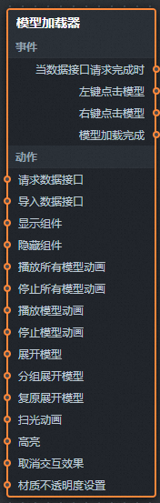
icon in the upper-left corner of the page.On the Blueprint Editor configuration page, click the Model Loader layer in the import node bar to display its configuration parameters on the canvas, as shown in the following figure.
Events
Event
Description
When the data API request is complete
An event that is triggered after the data API request returns a response and the response is processed by a filter. The processed data in JSON format is also returned. For a data example, see the Data Response Result area on the Data tab of the widget's configuration panel on the right of the canvas editor.
Left-click the Model
An event that is triggered when you left-click the model. It returns the clicked object, object name, and object instance ID.
Right-click the model
An event that is triggered when you right-click the model. It returns the clicked object, object name, and object instance ID.
Model Loading Complete
An event that is triggered when the model is loaded. It returns data of the object type.
Actions
Action
Description
Request Data API
Requests data from the server again. Data from an input data processing node or a layer node is used as a parameter. For example, if the Model Loader is configured with an API data source of
https://api.testand the data passed to the Request Data API action is{ id: '1'}, the final requested API ishttps://api.test?id=1.Import Data API
After you process data into the format required by the component, you can import the component to redraw it. This action means you do not need to request server-side data again. For specific data examples, see the Data Response Result area on the Data tab of the configuration panel, which is to the right of the component in the canvas editor.
Show Widget
Shows the widget. No parameters are required.
Hide Component
Hides the widget. No parameters are required.
Play All Model Animations
Plays all model animations. No parameters are required.
Stop All Model Animations
Stops all model animations. No parameters are required.
Play Model Animation
Plays a specified model animation by its name.
Stop Model Animation
Stops a specified model animation by its name.
Expand Model
Expands the model. The action receives data of the object type, which includes the model group ID, offset, offset direction, and duration fields.
Expand Model by Group
Expands the model by group. The action receives data of the array type, which includes the model group ID, offset, offset direction, and duration fields.
Restore Expanded Model
Restores the expanded model. No parameters are required.
Scanlight Animation
Updates the scanlight animation configuration. The action receives data of the object type. The following is a data example.
{
  "enable": false,   // Enables or disables the scanlight animation. Default value: false.
  "frontier": 1,     // The frontier type. Default value: 1.
  "axisType": 1,     // The scan axis. Default value: 1.
  "direction": 1,    // The scan direction. Default value: 1.
  "color": "#6699ff",// The scanlight color.
  "length": 0.05,    // The scanlight length.
  "speed": 0.05      // The scanlight speed.
}
Highlight
Highlights a specified object and its sub-objects in the model. The action receives data of the object type. The following is a data example.
{
  "id": "",// The object name.
  "color": "#ff0000",// The highlight color.
  "opacity": 1// The opacity.
}
Cancel Interaction Effect
Cancels the interaction effect. No parameters are required.
Material Opacity Settings
Configures the material opacity. The action receives data of the object type. The following is a data example.
{
  "id": [],// The model group ID.
  "opacity": 0// The opacity.
}
 icon to the right of Model Loader.
 icon in the upper-left corner of the page.