Drag, scale, rotate, and arrange widgets on the canvas. Use keyboard shortcuts for common actions, batch-configure multiple widgets at once, and group widgets into carousel containers for animated display.
Prerequisites
A data dashboard has been created. You can create a dashboard by using a template, using a blank canvas, or using AI generation.
Enter the canvas editor
Access the DataV console.
-
On the Workbench page, in the Data Dashboard area, hover over the destination dashboard and click Edit to open the canvas editor.
On this page, you can perform operations such as basic operations, batch configuration, group operations, and using carousel containers as needed.
Basic features
|
Operation |
Description |
|
Drag |
In the Widget Library on the left, select one or more widgets, and then press and hold the left mouse button to drag them.
|
|
Scale |
Select one or more widgets. Move your mouse pointer over the bounding box of the widgets. When the scaling icon appears, press and hold the left mouse button and drag. |
|
Rotate |
Select one or more widgets. Move your mouse pointer to the white dot near the top border of the widgets. When the rotation icon appears, press and hold the left mouse button to rotate the widgets. |
|
Lock widget |
For more information, see Layer management. |
|
Move widget layer position |
On the data dashboard canvas or in the layer list, right-click a widget. On the shortcut menu, select Bring to Front, Send to Back, Bring Forward, or Send Backward. |
|
Generate iterator |
For more information, see Layer management. |
|
Enter Blueprint Editor |
Enter the Blueprint Editor to locate the current widget node and use low-code editing to implement complex interaction effects. |
|
Hide widget |
For more information, see Layer management. |
|
Rename widget |
For more information, see Layer management. |
|
Copy ID |
Copy the current widget ID to quickly search for the widget in the canvas editor and the Blueprint Editor. |
|
Copy Component |
For more information, see Layer management. |
|
Delete widget |
For more information, see Layer management. |
|
Favorite widget |
For more information, see Layer management. |
|
Thumbnail |
Use the thumbnail in the lower-left corner of the canvas to adjust widget layout.
|
|
Keyboard shortcuts |
Canvas keyboard shortcuts
|

 icon in the lower-left corner of the canvas to show or hide the thumbnail.
Batch configuration
|
Operation |
Description |
|
Batch configuration |
After you select multiple widgets, configure them in batches in the right-side panel.
|


Group operations
|
Operation |
Description |
|
Group operation |
Note
If you need the carousel feature, click Use Carousel Container. For more information, see Use a carousel container. |
 in the upper right corner of the panel to enter the name of the configuration item you wish to locate in the search field. The system supports fuzzy matching. For more information, see
  icon to flip the component horizontally.
 icon to flip the component vertically.
 icon to enable the 3D transform feature for the group.
Use a carousel container
A carousel container groups multiple widgets in a fixed area and cycles through them with animation effects such as sliding and flipping. Use carousel containers when screen space is limited but you need to display a large amount of data.
Create a carousel container
Enter the canvas editor. Select all the widgets you want to include in the carousel. Right-click any of the selected widgets and choose Use Carousel Container to create the container. After creation, the widgets in the container are displayed as a single unit.
-
You can create multiple carousel containers on a data dashboard, but each widget can be added to only one carousel container.
-
If you no longer need a carousel container, right-click it and select Ungroup Carousel Container. The widgets in the container will revert to their independent state.
Configure a carousel container
Click a carousel container to configure its settings in the right-side panel, including basic styles, interaction occurrences, and global variables.
-
Style configuration
In the Style panel, configure animation effects, background color, carousel duration, and other settings. The configuration items are described in the following table.
NoteYou can also click the
 icon to search for configuration items by keyword. The search supports fuzzy matching. For more information, see Search for configuration items.
Configuration Item
Description
Figure
Global configuration
Defines the widget's position, transparency, and interaction passthrough in the data dashboard.
-
Opacity: The smaller the value, the more transparent the widget. The value ranges from 0 to
1. -
Interaction Passthrough: If you turn this on, mouse events pass through the widget. This is useful when many widgets are on the dashboard and you need to interact with widgets in lower layers.
Carousel style configuration
Defines the animation effects for the carousel:
-
Quick Style: Quickly switch the carousel style. Styles such as slide, fade in/out, and flip are supported.
-
Animation Configuration: Configure the carousel style, the arrangement of widgets in the container (horizontal or vertical), and the carousel duration in milliseconds (ms).
Basic style configuration
Defines the background, margins, number of visible items, number of items per slide, widget spacing, carousel direction, centering effect, and shadow effect for the carousel container.
-
Background: You can change the background color or upload a local image as the background.
-
Padding and Margin: Set the distance from the currently displayed widget to the top, bottom, left, and right borders of the carousel container.
-
Visible Items: The number of widgets visible in the carousel container at the same time.
NoteThis takes effect only when the carousel style is set to Slide or Showcase.
-
Items per Slide: The number of widgets in each slide.
NoteThis is typically used when Visible Items is greater than 1. It takes effect only when the carousel style is set to Slide or Showcase.
-
Spacing: The distance between two widgets in the carousel container.
NoteThis takes effect only when the carousel style is set to Slide or Showcase.
Autoplay and parallax
Defines the display and parallax effects for autoplay:
-
Delay: The interval between two transition effects during autoplay, in ms. This can be considered the display duration for one widget.
-
Pause on Hover: If you enable this feature, autoplay pauses when you hover the mouse pointer over the carousel container.
-
Parallax: Configure the opacity of the widgets in the carousel container and their scaling ratio relative to the container.
Other
Click the corresponding button to quickly start, pause, or cancel (ungroup) the carousel container.
-
-
Advanced configuration
In the Advanced panel, configure interactions and data transfer between the carousel container and other widgets. The configuration items are described in the following table.
Configuration Item
Description
Illustration
Interaction occurrences
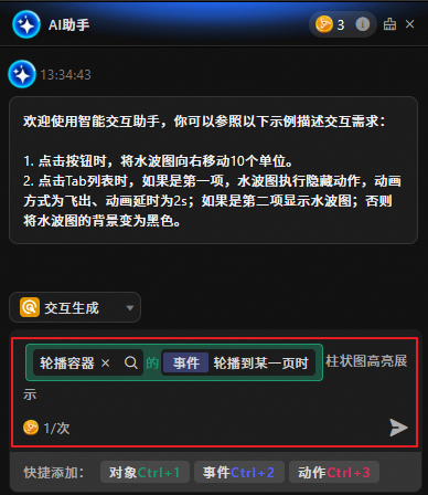
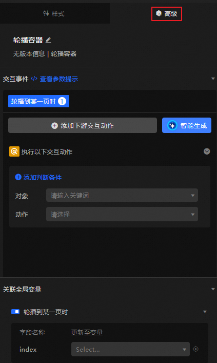
Define interaction configurations with other widgets, global variables, and tool nodes (such as Websocket nodes) to enable filter interactions between different objects. Click Add Downstream Interaction Action to define the interaction actions. You can also configure the judgment conditions required to trigger the action.
You can also click Generate with AI and describe your interaction requirements in natural language to generate interaction occurrences with AI assistance.
Global variables
Associate global parameters in the carousel container to pass parameters between widgets for interaction.
Click the
icon to enable the corresponding instruction and associate the required global variable with it. When The Carousel Scrolls To A Page, a temporary variable is emitted. By default, the value of the indexfield of the carousel container is emitted.
 icon to search for configuration items by keyword. The search supports fuzzy matching. For more information, see


 icon to enable the corresponding instruction and associate the required