The Network Dashboard analyzes gateway network requests in real time. It provides transmission metrics—such as total request duration, failure rate, and TCP connection duration—and shows the geographic distribution of this data.
To view Network Dashboard data, follow these steps:
Log in to the console, go to Products & Services > mPaaS, and then select an app.
In the left navigation pane, choose Performance Monitoring > Network Analysis. At the top of the page, select a platform, app version, and time range to filter the network request data.
On the Network Dashboard tab, select either Client Gateway or mPaaS Gateway to view its data.
Click Customize Columns in the upper-right corner of the Metric Details area, select the monitoring metrics you want to display, and then confirm. The selected metrics appear as cards on the page.
The Network Dashboard includes three sections: Metric details, Geographic distribution of metric data, and Top 5 regions by metric.
Metric details
This section displays detailed data for network monitoring metrics based on the selected platform, app version, and time range. You can switch between the mPaaS Gateway and Client Gateway tabs to view data for different gateway types. To export the analysis report, click Export in the upper-right corner to download the report as an Excel file.
Click a metric card. The chart below shows the data trend for that metric over the specified period, including the average, 95th percentile, and a scatter chart. Hover over the chart to view specific data points.
Average: A line chart that shows the trend of the metric's average value over the specified time period.
95th percentile: A line chart that shows the trend of the metric's 95th percentile value over the specified time period. The system calculates this value by sorting 100 data points in ascending order and selecting the 95th value. Therefore, if there are fewer than 100 data points, the chart may not appear.
Scatter chart: Displays outlier data points for the current metric to help diagnose network issues. It shows details for the top 100 outliers. Click a data point to view its related information. Click More Details to go to the network diagnostics page and view the results.
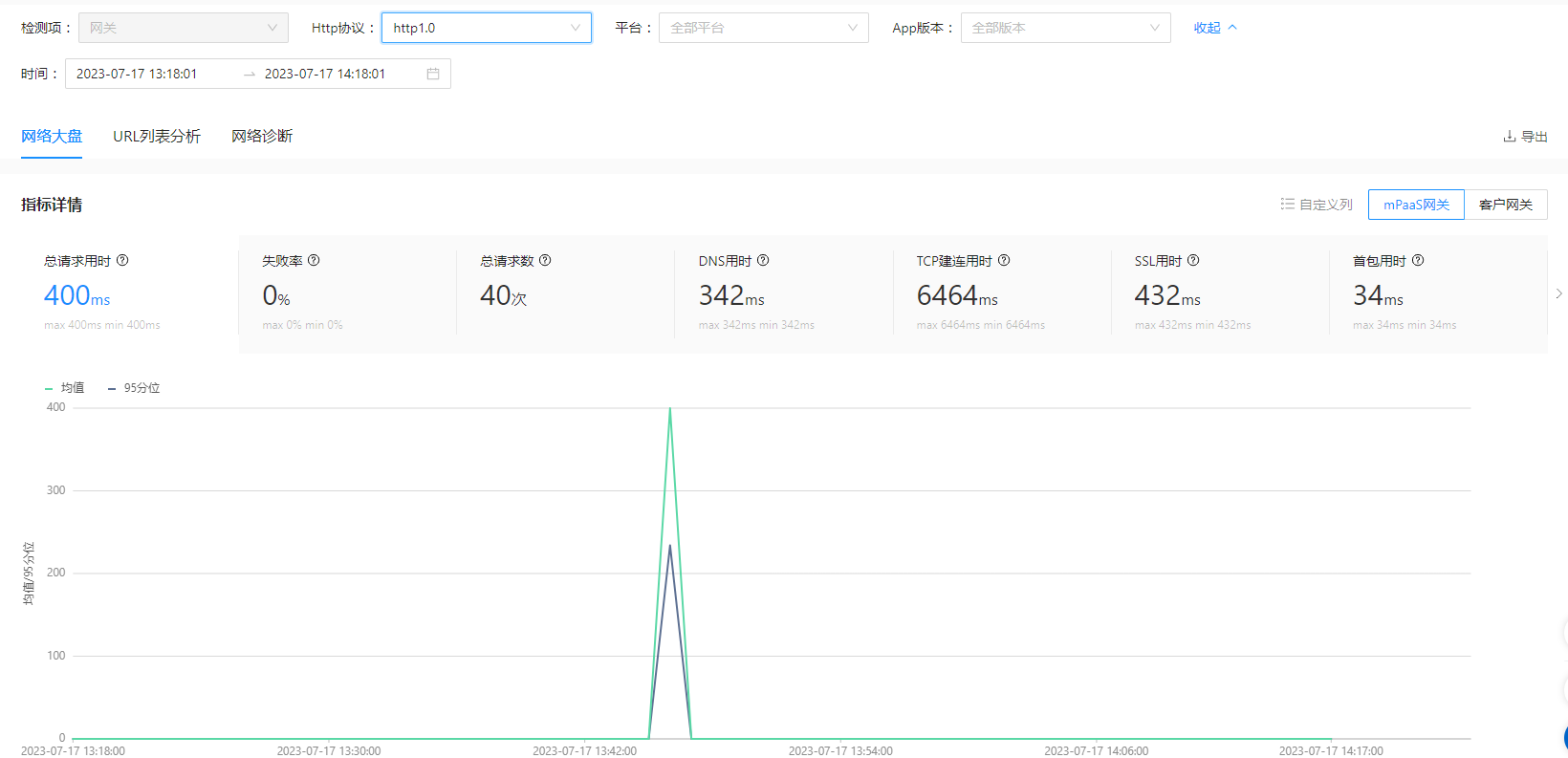
The following table describes each metric.
Metric | Description |
Total request duration | The time from initiating a request to receiving the last data packet, measured in milliseconds (ms). |
Failure rate | The ratio of failed requests. Calculated as: Failure Rate = Number of Failed Requests / Total Requests. |
Total requests | The total number of requests initiated by the client. |
DNS duration | The elapsed time from when a request is initiated to when DNS resolution completes, in ms. |
TCP connection duration | The time it takes to establish a TCP connection after DNS resolution completes, measured in milliseconds (ms). |
SSL duration | The time it takes to complete the SSL handshake after the TCP connection is established, measured in milliseconds (ms). |
Time to first byte (TTFB) | The time from initiating a request to receiving the first data packet from the server, measured in milliseconds (ms). |
Transmission duration | The time from receiving the first data packet to receiving the last data packet, in ms. |
Average download speed | The average speed for downloading resource files, measured in KB/s. Average Download Speed = Bytes Downloaded / Transmission Duration |
With HTTP/2.0, the gateway establishes a connection when the underlying network library initializes, not when a request is made. Therefore, individual RPC requests do not have separate connection times.
The console hides the DNS duration, TCP connection duration, SSL duration, and time to first byte (TTFB) metrics.Geographic distribution of metrics
This section analyzes the geographic distribution of network metrics in two views: Global Network and China Network. It displays data from different regions based on the mobile device's location for the selected metric over the specified time period. For example, if you selected the "SSL duration" metric card, this map shows the "Geographic Distribution of SSL Duration".
By default, the map shows the global distribution. You can switch between the Global and China views. Hovering over a region on the map displays the aggregated data for that region.
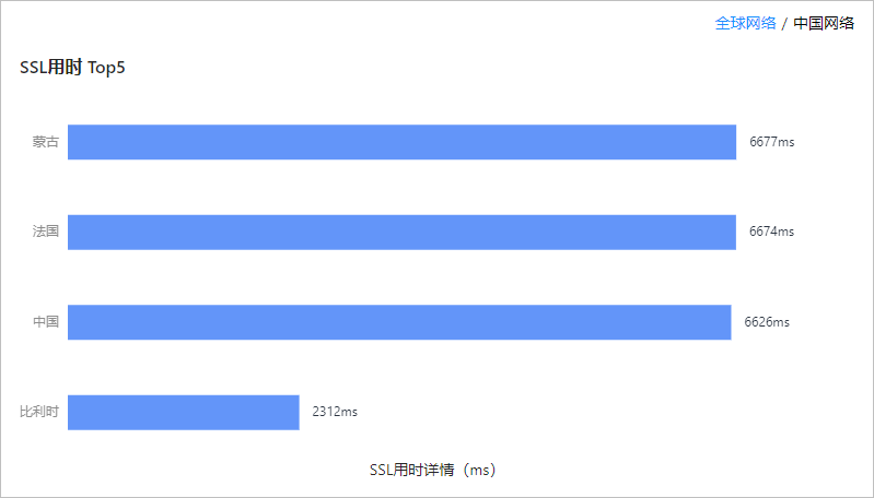
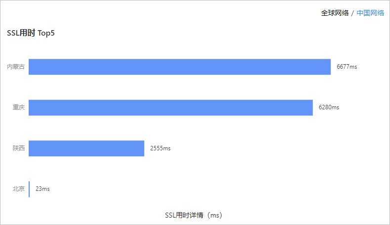
Top 5 regions by metric
This section displays the five regions with the highest metric values, sorted in descending order. You can view this data in two views: Global Network and China Network. Selecting Global Network displays data by country, while selecting China Network displays data by provincial-level administrative regions.
For example, if you previously selected the "SSL duration" metric card, this section displays a bar chart titled "Top 5 by SSL Duration".