Navigation helps users find their way around your pages. It tells users where they are, where they can go, and how to return. mPaaS mini programs provide navigation components such as navigation bars, segmented controls, and tab bars.
Navigation bar
To display your pages to users, embed them in the mPaaS mini program navigation framework. The navigation bar inherits directly from the client, and you cannot customize its content. Define the navigation paths between pages to ensure the navigation system works correctly.
The mPaaS mini program navigation bar has three areas: navigation, title, and action.
Navigation area
The navigation area controls the page flow. It appears differently on iOS and Android clients, as shown in the following figure.
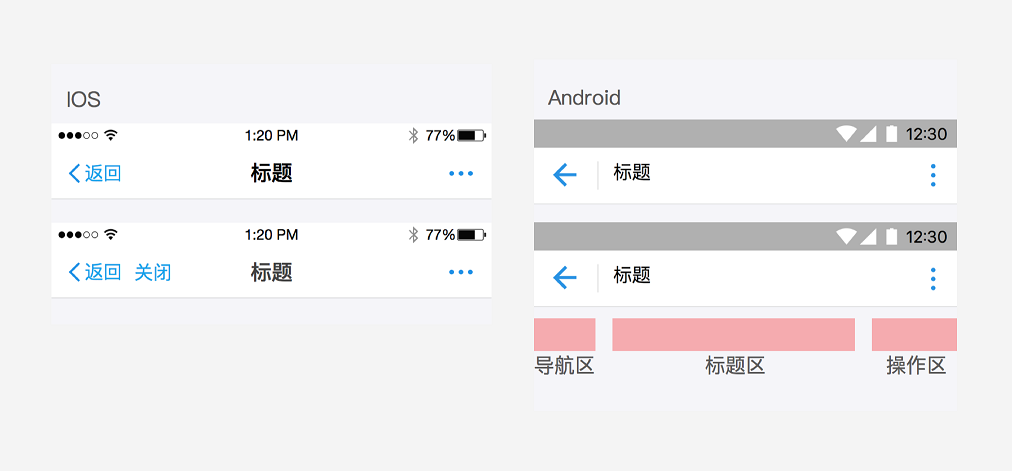
The navigation area usually has only one action: return to the previous page. When a user navigates more than three levels deep into your pages, both the Back and Close buttons are displayed. Clicking Close exits the current page and returns to the mPaaS mini program.
Title area
Define a title for each page. The title text is displayed in a fixed area. Text that is too long is truncated. If you do not set a title, the name of your service or application is displayed by default.
Action area
By default, the action area displays a More icon. Clicking the icon opens the action menu. You can also customize the action area. You can define up to two icon buttons or one text button with up to two characters.
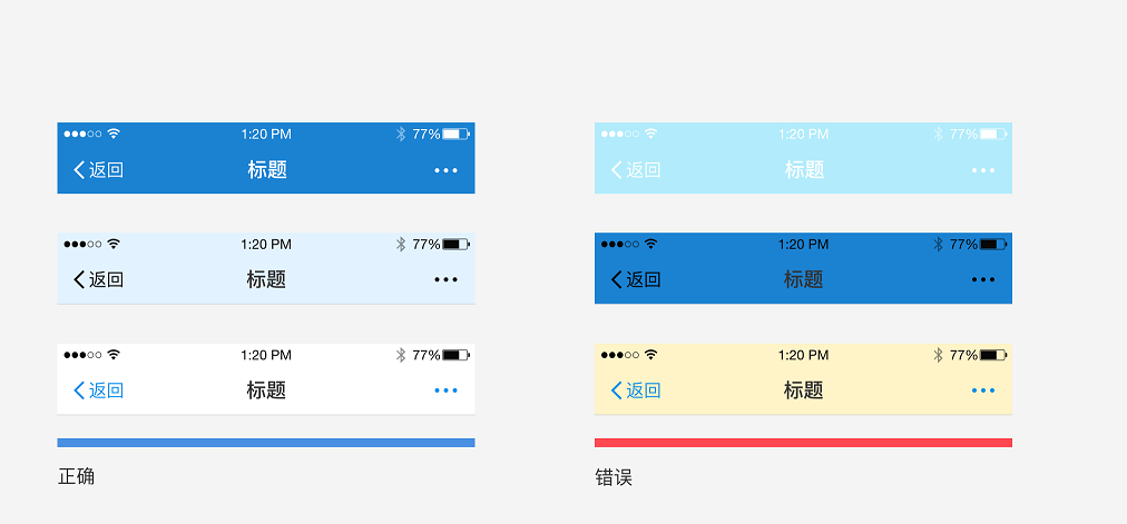
Custom colors
The mPaaS mini program navigation bar supports basic background color customization. When you select a color, ensure it is accessible and compatible with the three sets of main navigation bar icons that mPaaS provides. The title color automatically changes to white or black to contrast with the background color. For examples, see the following color schemes:
Segmented control
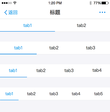
A segmented control usually appears at the top of a page or within the page content. It lets users quickly switch between different content sections.
Design principles:
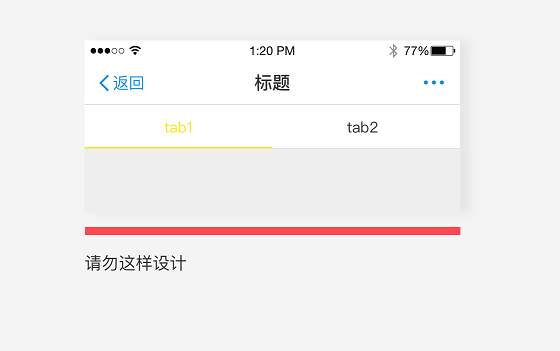
Highlight the current selection to show users their location. Set a maximum of five segments. If you have more than five, users can scroll to see the additional segments.
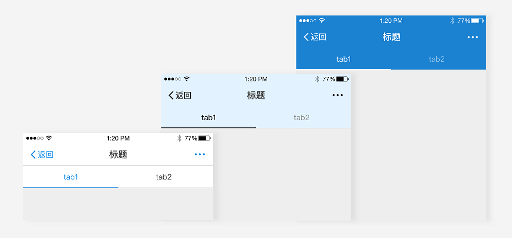
You can customize the color of a segmented control at the top of the page. When you choose a custom color, ensure the tabs are accessible, visible, and interactive.
Bad example:
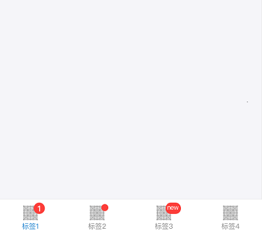
Tab bar
Use a tab bar to organize pages that are on the same level of your information architecture. This flattens the hierarchy and helps users discover more content.
The tab bar is at the bottom of the page. It lets users quickly switch between different pages.
Design principles:
Use a maximum of five tabs. If you have more than five tabs, make the last tab a More tab. This tab should open a page that lists the additional navigation options.
You can customize the tab bar icons and text. However, you cannot change the color. You must use the standard link color provided by the mPaaS mini program.
When a user taps a tab, switch the content in the current view. Do not open a new page.