This topic describes the radio component.
radio-group
A group of radio components.
Property name | Type | Default | Description | Minimum version |
|---|---|---|---|---|
onChange | EventHandle | - | Triggered when the selected item changes. | - |
name | String | - | The name of the component. It is used to get data when a form is submitted. | - |
radio
A single radio button.
Property Name | Type | Default | Description | Minimum version |
|---|---|---|---|---|
value | String | - | The value of the component. This value is included in the change event when the radio is selected. | - |
checked | Boolean | false | Currently selected | - |
disabled | Boolean | false | Specifies whether to disable the radio. | - |
color | String | - | The color of the radio. The value can be an English color name, such as blue, or a hexadecimal color code, such as #0000FF. |
Figure
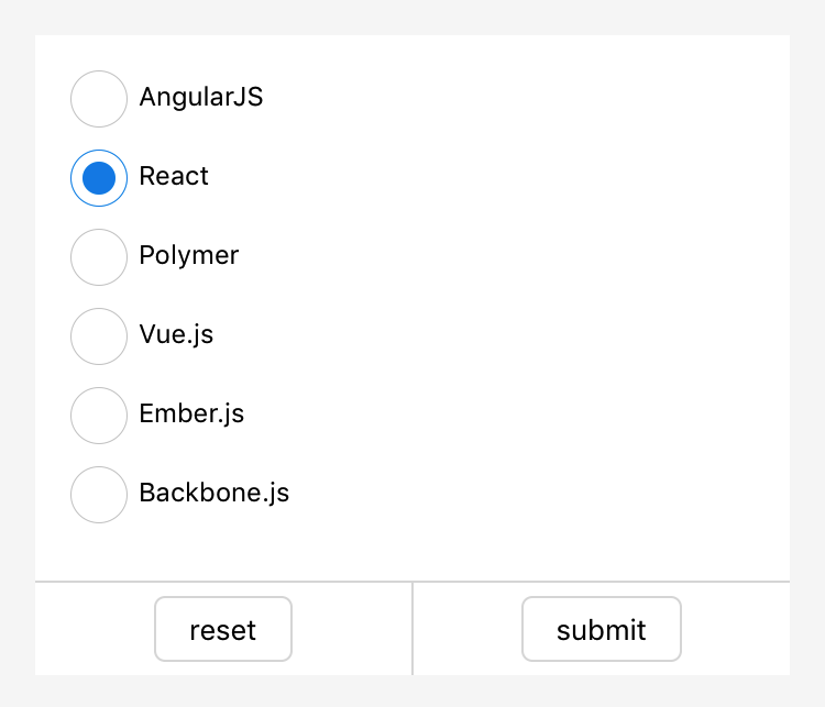
Sample code
<radio-group class="radio-group" onChange="radioChange">
  <label class="radio" a:for="{{items}}">
    <radio value="{{item.name}}" checked="{{item.checked}}"/>{{item.value}}
  </label>
</radio-group>
Page({
data: {
items: [
{name: 'angular', value: 'AngularJS'},
{name: 'react', value: 'React', checked: true},
{name: 'polymer', value: 'Polymer'},
{name: 'vue', value: 'Vue.js'},
{name: 'ember', value: 'Ember.js'},
{name: 'backbone', value: 'Backbone.js'},
]
},
radioChange: function(e) {
console.log('The framework you selected is: ', e.detail.value)
}
})该文章对您有帮助吗?