Bubble Chart
A bubble chart uses bubble position and size in a two-dimensional coordinate system to visualize the relationship between multiple variables. You can add data to a bubble chart and customize its style.
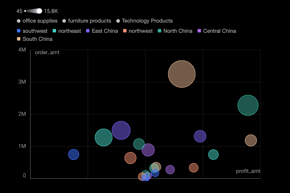
Example
Configure Data
-
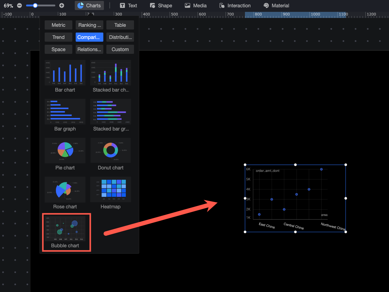
In the Charts section of the component library, find the bubble chart and drag it onto the canvas.
-
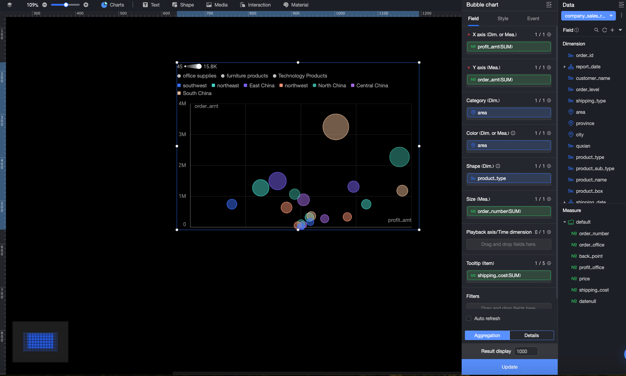
In the Data panel, select a dataset. Then, on the Fields tab, configure the chart's fields as described below.
Field
Description
X-axis/Dimension or Measure
Defines the data for the X-axis. You can use a dimension or measure field.
In the example, the Order Amount field determines the position of each bubble on the X-axis.
Y-axis/Measure
Defines the data for the Y-axis. Only measure fields are supported. The X-axis and Y-axis together determine the position of each bubble.
In the example, the Profit Amount field determines the position of each bubble on the Y-axis.
Category/Dimension
Groups data by the selected dimension, allowing you to compare the distribution of different categories.
In the example, the Region field groups the data by region.
Color/Dimension or Measure
Defines the field that determines bubble color. You can add a dimension or a measure field. Customize bubble colors in the Plotting Area > Color Scheme section of the Style tab.
NoteThis field is configurable only when the Category/Dimension placeholder contains a field.
-
When using a dimension field, each value is assigned a unique color. For example, if you add a region field, bubbles for the Northeast region might be blue.
-
When using a measure field, the color indicates the value's trend. For example, if you add an order quantity field, the bubble color varies from light to dark based on the number of orders.
In the example, the Region field is used, so different bubble colors represent different regions.
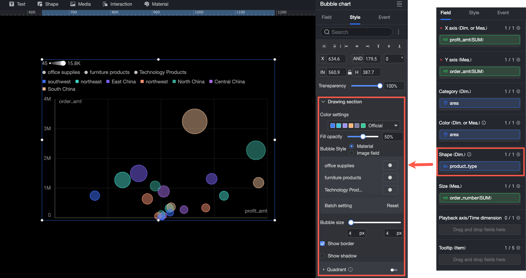
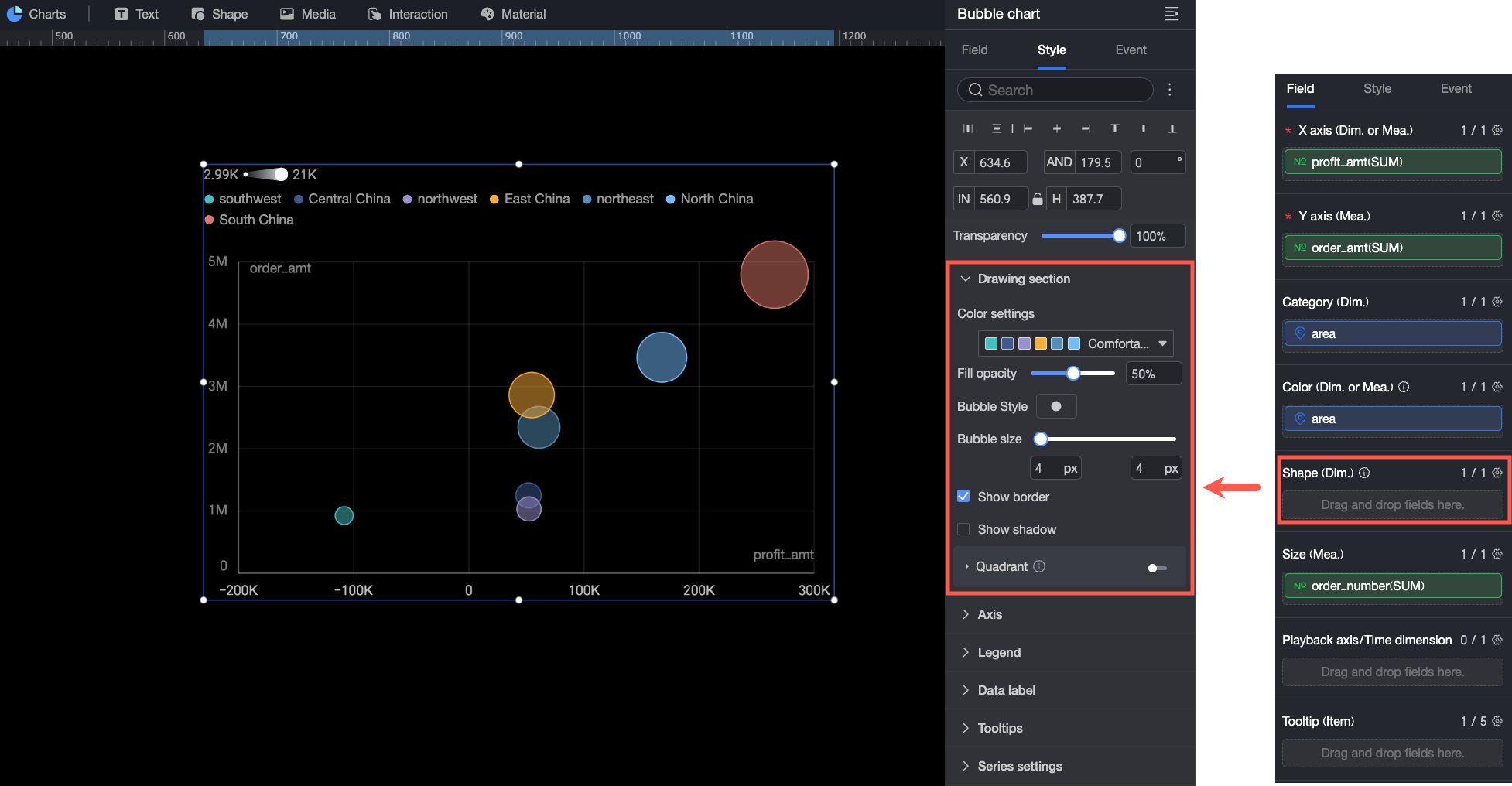
Shape/Dimension
Specifies the field that determines the bubble shape. Only dimension fields are supported. You can customize the bubble shapes in the Plotting Area > Bubble Style section on the Style tab.
NoteThis field is configurable only when the Category/Dimension placeholder contains a field.
In the example, the Product Type field is used, so different bubble shapes represent different product types.
Size/Measure
Specifies the field that determines the bubble size. Only measure fields are supported. The system scales bubbles based on their measure values.
In the example, the Order Quantity field determines the bubble size.
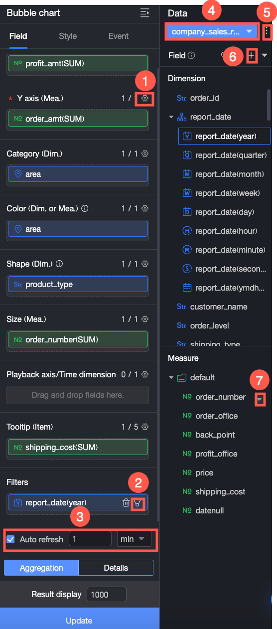
Playback Axis/Time Dimension
If your data includes time-based information, you can add a time field here to create an animated bubble chart that evolves over time.
This is not used in the example.
Tooltip/Measure
When a report viewer hovers over a bubble, a tooltip appears with more details about that data point, such as the specific value of a measure. You can configure which measures to display in the tooltip.
In the example, the Shipping Cost field is added, so the tooltip displays the shipping cost for that data point.
You can also perform the following data operations:
-
Batch Set Field Formats (①). For details, see Configure field styles in batches.
-
Filter Data (②). For details, see Filter data.
-
Schedule Refresh (③). For details, see Schedule data refresh.
-
Switch Dataset (④). For details, see Switch datasets.
-
Edit Dataset (⑤). For details, see Edit datasets.
-
Process data (⑥). For details, see Create a calculated field, Create a new grouped dimension, and Placeholder.
-
Duplicate fields (⑦). For details, see Duplicate a field as a dimension.
-
Configure Style
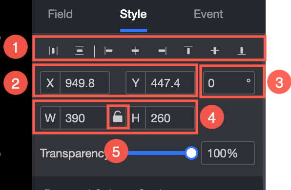
Position and Size
Configure the following component settings:
-
Alignment (①): Set the component's horizontal alignment. Options include left, center, and right.
-
Position (②): Set the X and Y coordinates to position the component relative to the top-left corner of the canvas.
-
Angle (③): Set the rotation angle.
-
Size (④): Set the width (W) and height (H).
-
Lock (⑤): Lock the component to prevent resizing.
-
Opacity (⑥): Set the component's transparency.
Plotting Area
In the Plotting Area, configure the Color Scheme, Bubble Style, and Quadrant. The available settings depend on the fields in the Data panel.
-
If you add a field to the Shape/Dimension area, the following settings become available:
Parameter
Description
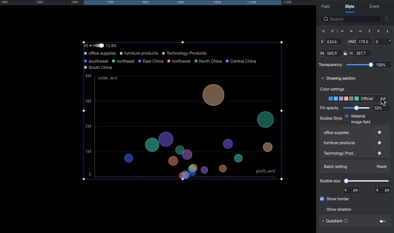
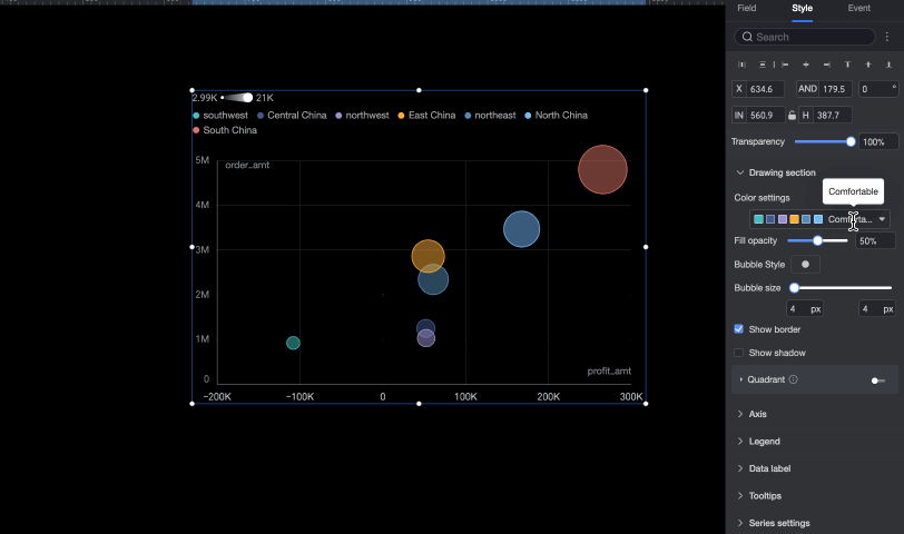
Color Scheme
Sets the overall color palette for the bubbles. You can select a built-in theme and customize the color for individual dimension values.
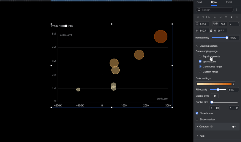
When you configure a metric field in the Color/Dimension or Metric area, you need to set the Data Mapping Range and Color Scheme for the Metric.
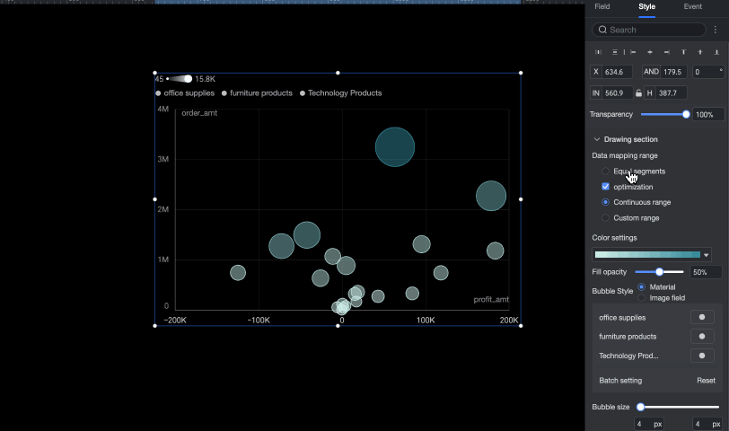
Fill Opacity
Sets the opacity of the bubbles.
Bubble Style
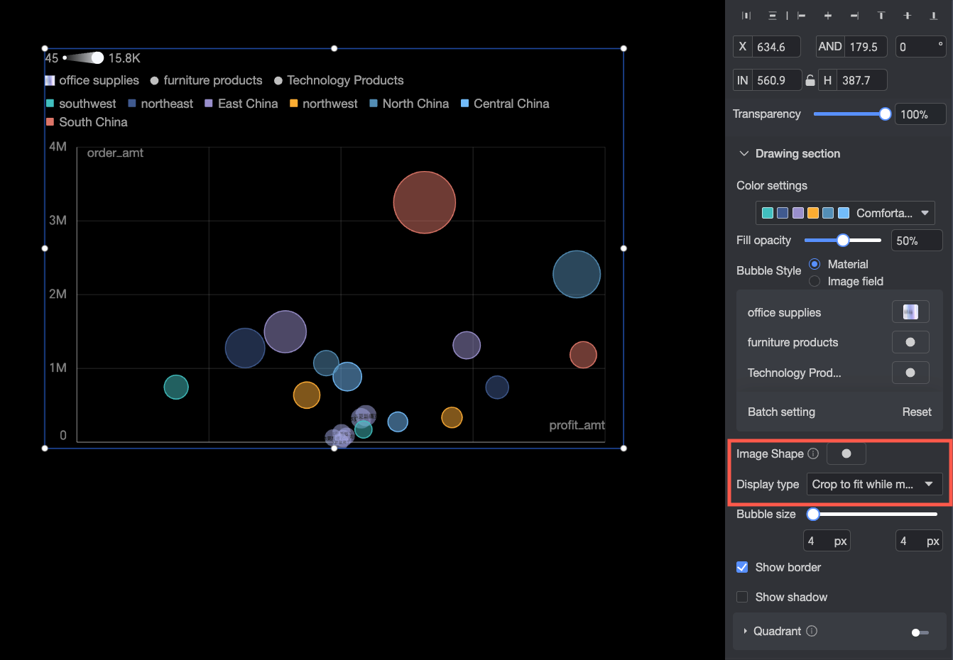
Sets the shape style for the bubbles. You can choose from shapes or use an image field.
-
Shape: Assigns a different shape to each dimension value. You can use built-in shapes or upload custom images.
-
Image field: Selects an image field from the dataset to populate the content. The Image field option is available only when the dataset contains a field of the image type (
 ).
).
When you upload a custom image or use an image field, you can also configure the image's shape and display mode.
Bubble Size
Sets the minimum and maximum size for the bubbles.
Show Border
Shows or hides bubble borders.
Show Shadow
Shows or hides bubble shadows.
Quadrant
The Quadrant feature is available when both the X-axis and Y-axis are mapped to measure fields.
-
-
If the Shape/Dimension area is empty, the following settings are available:
Parameter
Description
Color Scheme
Sets the overall color palette for the bubbles. You can select a built-in theme and customize the color for individual dimension values.
When you configure a metric field in the Color/Dimension or Metric area, you must set the Data Mapping Range and Color Scheme for the Metric.
Fill Opacity
Sets the opacity of the bubbles.
Bubble Style
Sets the shape style for all bubbles in the chart. You can use built-in icons or upload custom images. When you upload a custom image, you can also configure its Shape and display mode.
Bubble Size
Sets the minimum and maximum size for the bubbles.
Show Border
Shows or hides the border of the bubbles.
Show Shadow
Shows or hides the shadow of the bubbles.
Quadrant
You can enable the Quadrant function when both the X-axis and Y-axis fields are measure fields.
Axes
In the Axis area, configure the following settings.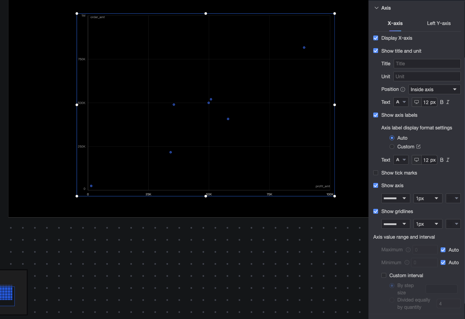
|
Name |
Parameter |
Description |
|
X-axis |
Show X-axis |
Shows or hides the X-axis. |
|
Show Title and Unit |
Controls whether the axis title and unit are displayed on the X-axis. |
|
|
Show Axis Label |
Shows or hides the X-axis labels. If visible, you can configure the following:
|
|
|
Show Tick Line |
Shows or hides the tick lines on the X-axis. |
|
|
Show Axis Line |
Shows or hides the axis line. You can configure its style, width, and color. |
|
|
Show Grid Line |
Shows or hides the grid lines for the X-axis. You can configure their style, width, and color. |
|
|
Axis Range and Interval |
Sets the value range (maximum and minimum) and the interval between ticks on the X-axis.
|
|
|
Left Y-axis |
Show Left Y-axis |
Shows or hides the left Y-axis. |
|
Show Title and Unit |
You can set the position of the Axis Title and Unit to Outside the axis or Above the axis. |
|
|
Show Axis Label |
Shows or hides the labels on the left Y-axis. If shown, you can set the Axis Label Display Format and Text Style. The format can be set to Auto or Custom.
|
|
|
Show Tick Line |
Shows or hides the tick lines on the left Y-axis. |
|
|
Show Axis Line |
Shows or hides the axis line. You can configure its style, width, and color. |
|
|
Show Grid Line |
Shows or hides the grid lines for the axis. You can configure their style, width, and color. |
|
|
Axis Range and Interval |
Sets the value range (maximum and minimum) and the interval between ticks on the left Y-axis.
|
 icon to open the Data Display Format Settings dialog box and configure the format. For more information, see
 Legend
In the Legend section, configure the legend's content, position, and text style.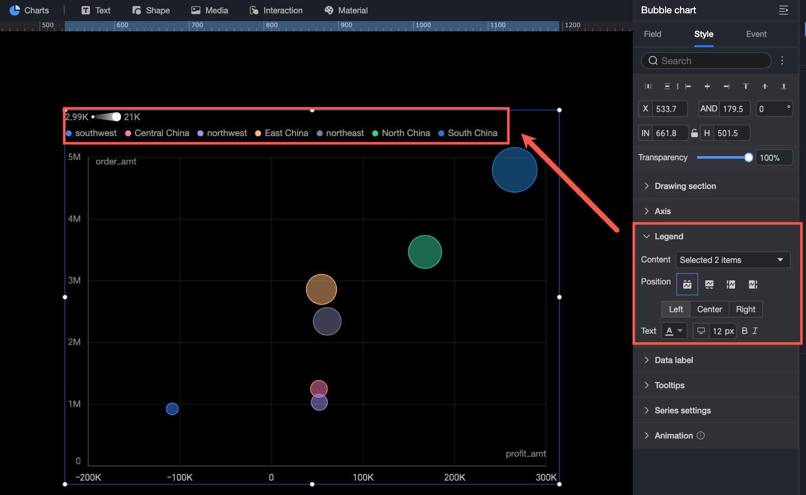
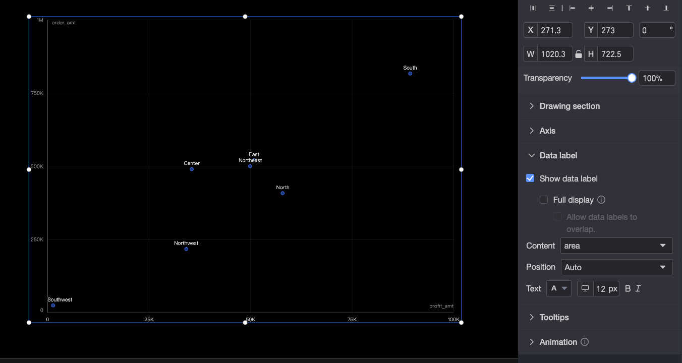
Data Labels
In the Data Labels section, configure the following settings:
-
Show Data Labels: Shows or hides the data labels in the chart.
-
Show All Labels: Displays all data labels. The system automatically adjusts label positions to prevent overlap. Labels that extend beyond the chart area may be hidden. When all labels are shown, you can also enable Allow Labels to Overlap.
-
Content: Specifies the content displayed in data labels.
-
Position: When no field is added to the Playback Axis/Time Dimension, you can set the position of the data labels.
-
Text: Configures the data label text style, including font color and size.
Tooltip
When a report viewer hovers over a bubble, a tooltip appears automatically. Configure the tooltip's background color and text style here.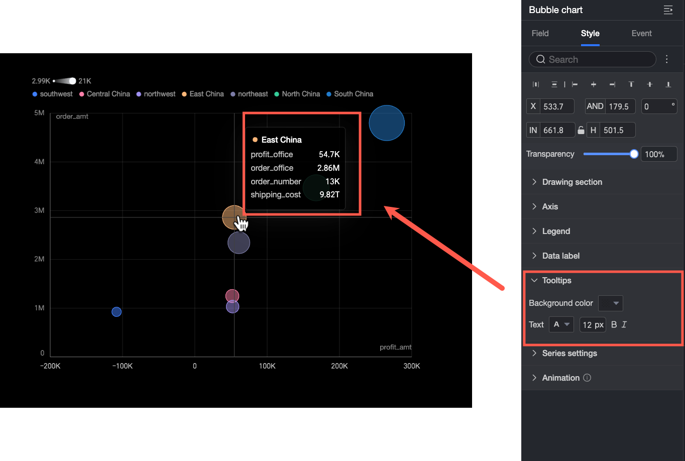
The fields displayed in the tooltip are configured in the Tooltip/Measure placeholder on the Fields tab.
Series Settings
In the Series Settings section, customize the display style for each data series.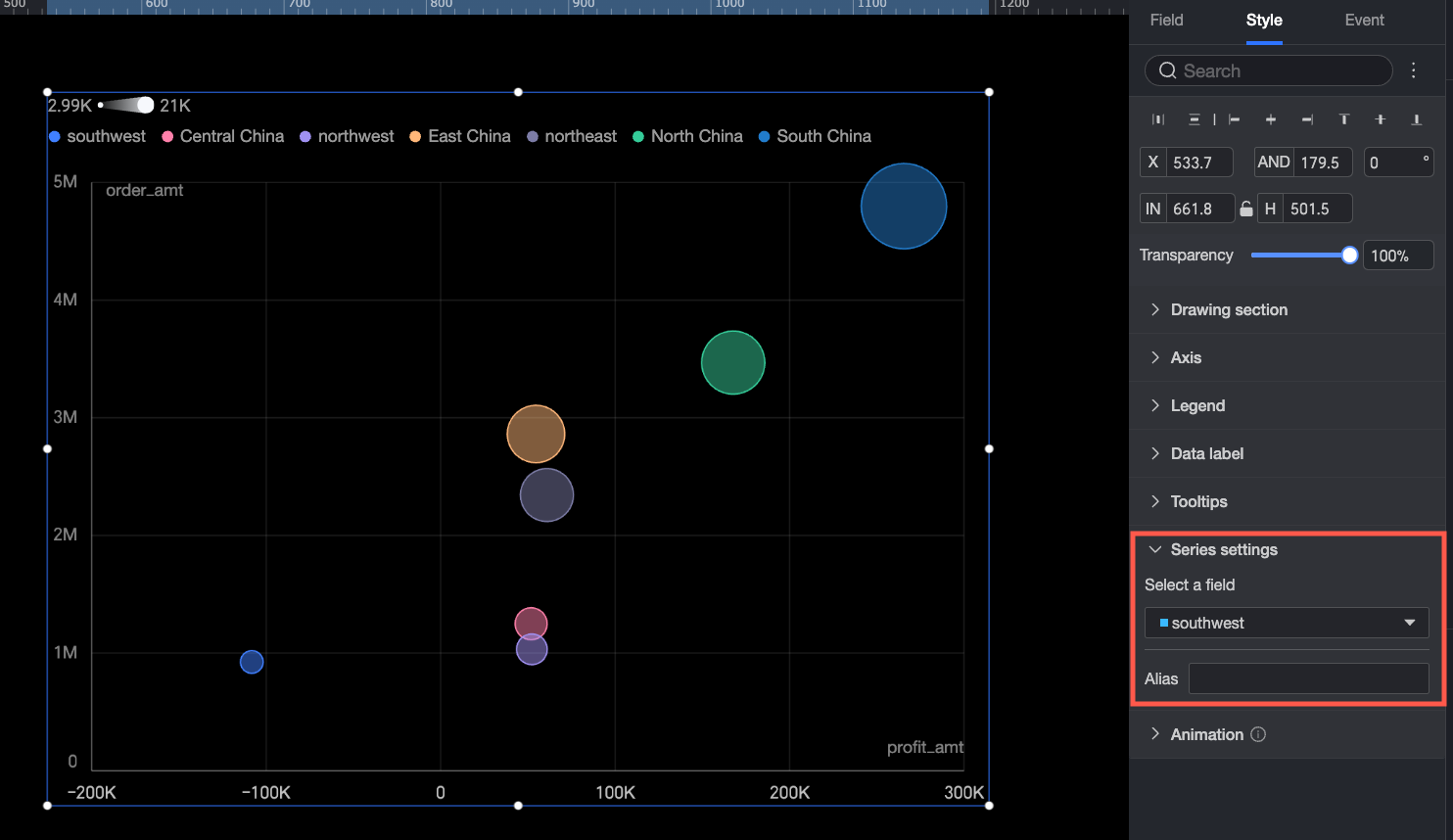
Animation
When the Player/Time Dimension section on the Fields tab contains a time field, configure the Player in the Auxiliary Display area: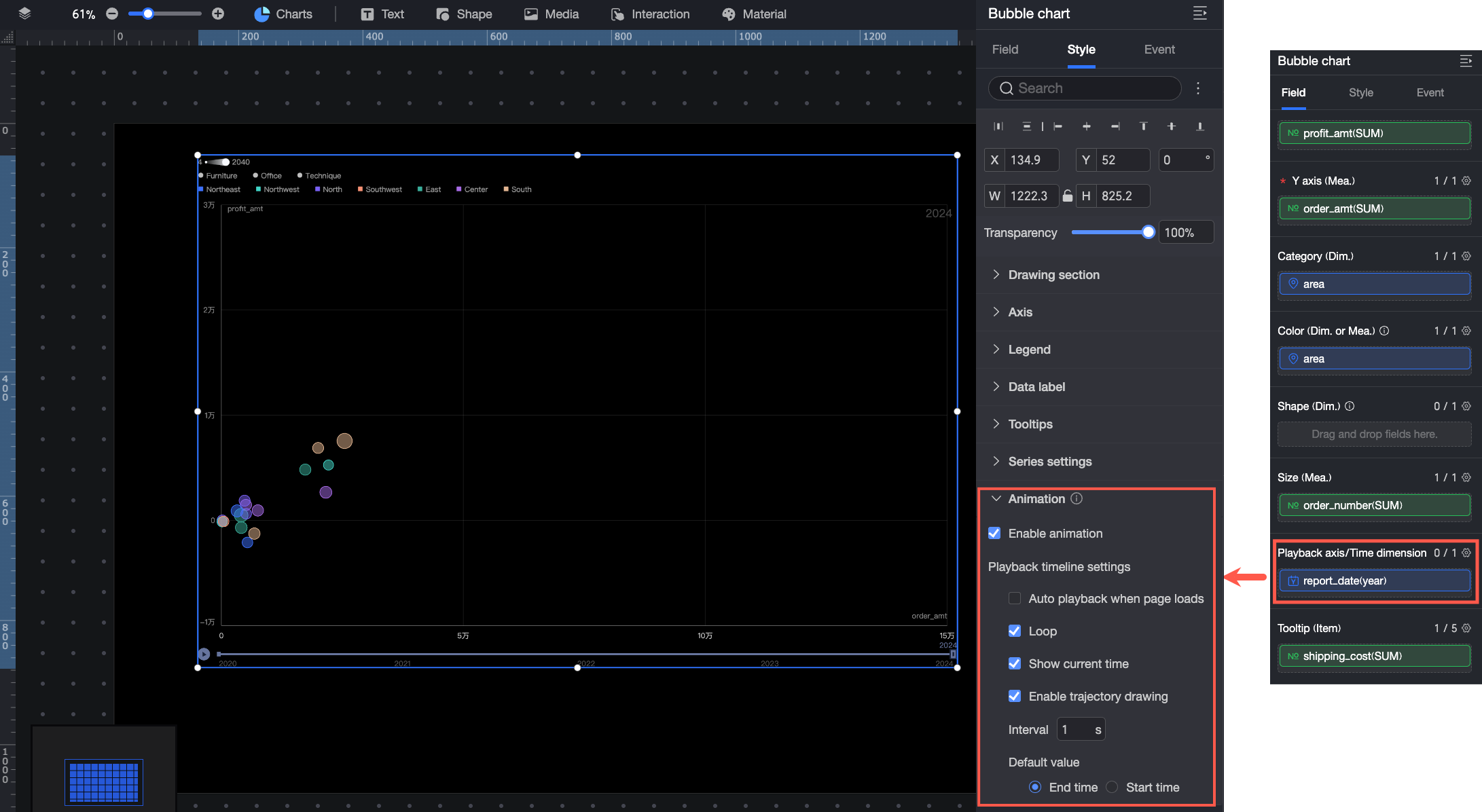
-
If you select Automatically play on page load, the chart automatically plays once when the report is loaded.
-
Select Loop playback to play the chart in a loop.
-
Select Display Current Time Value to display the corresponding time during chart playback.
-
Enable Trajectory: Draws a trajectory path for a bubble when you click it during playback.