A heatmap shows correlations between dimensions and is useful for models such as market basket analysis. This topic describes how to add data to a heatmap and configure its style.
Prerequisites
You have created a data dashboard. For more information, see Create a data dashboard.
Chart overview
Use cases
Heatmaps are well-suited for models such as market basket analysis.
Features
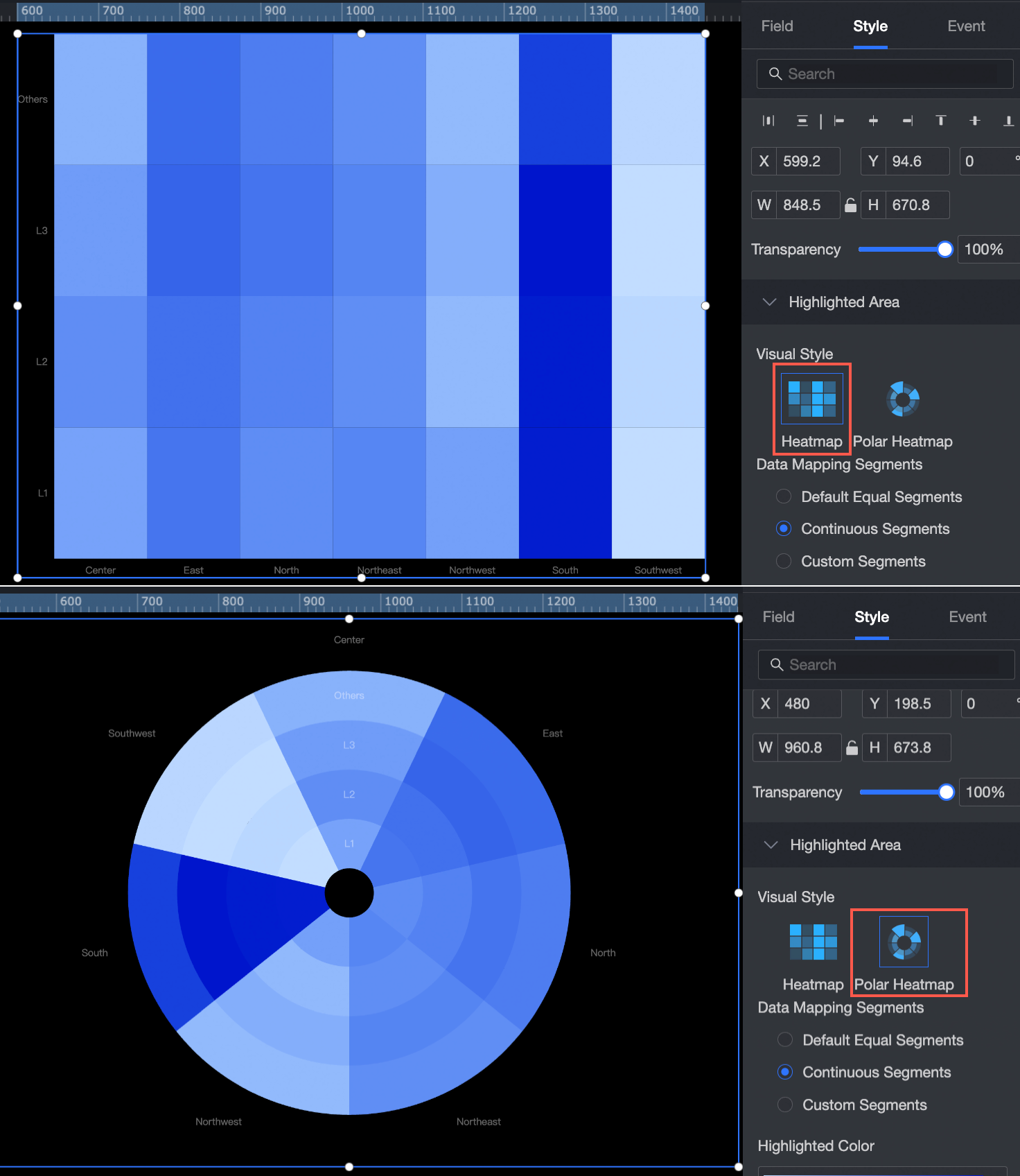
Visualization styles: You can configure both standard and polar heatmap styles.
Example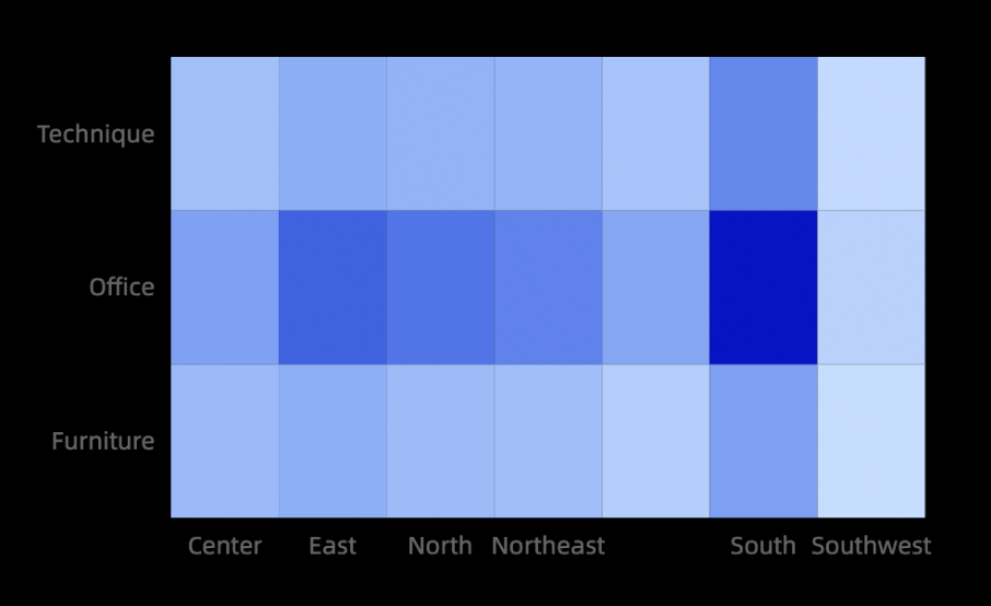
Configure chart fields
In the component library, find the heatmap component and drag it to the canvas.
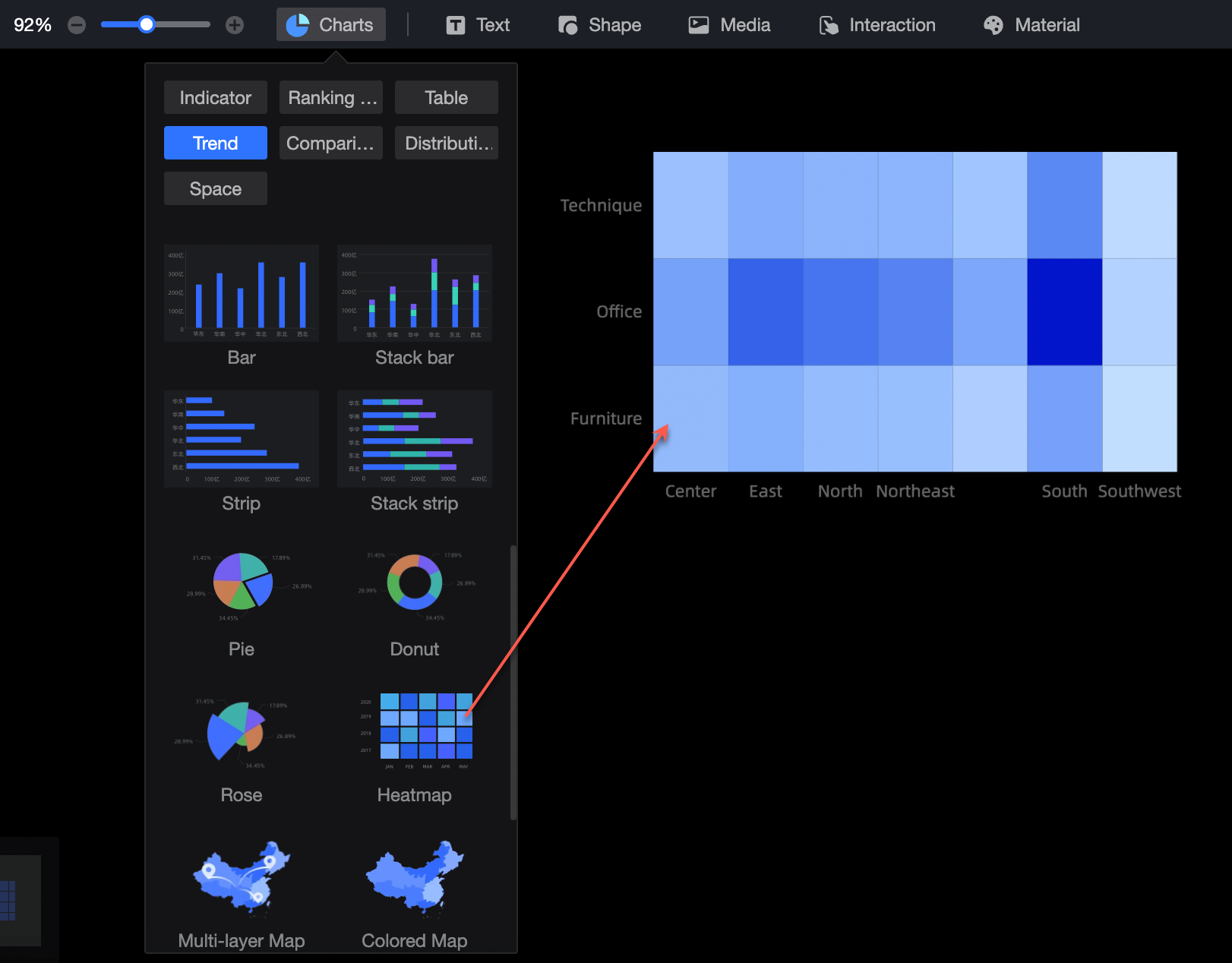
Click Select a dataset and choose a dataset for analysis.
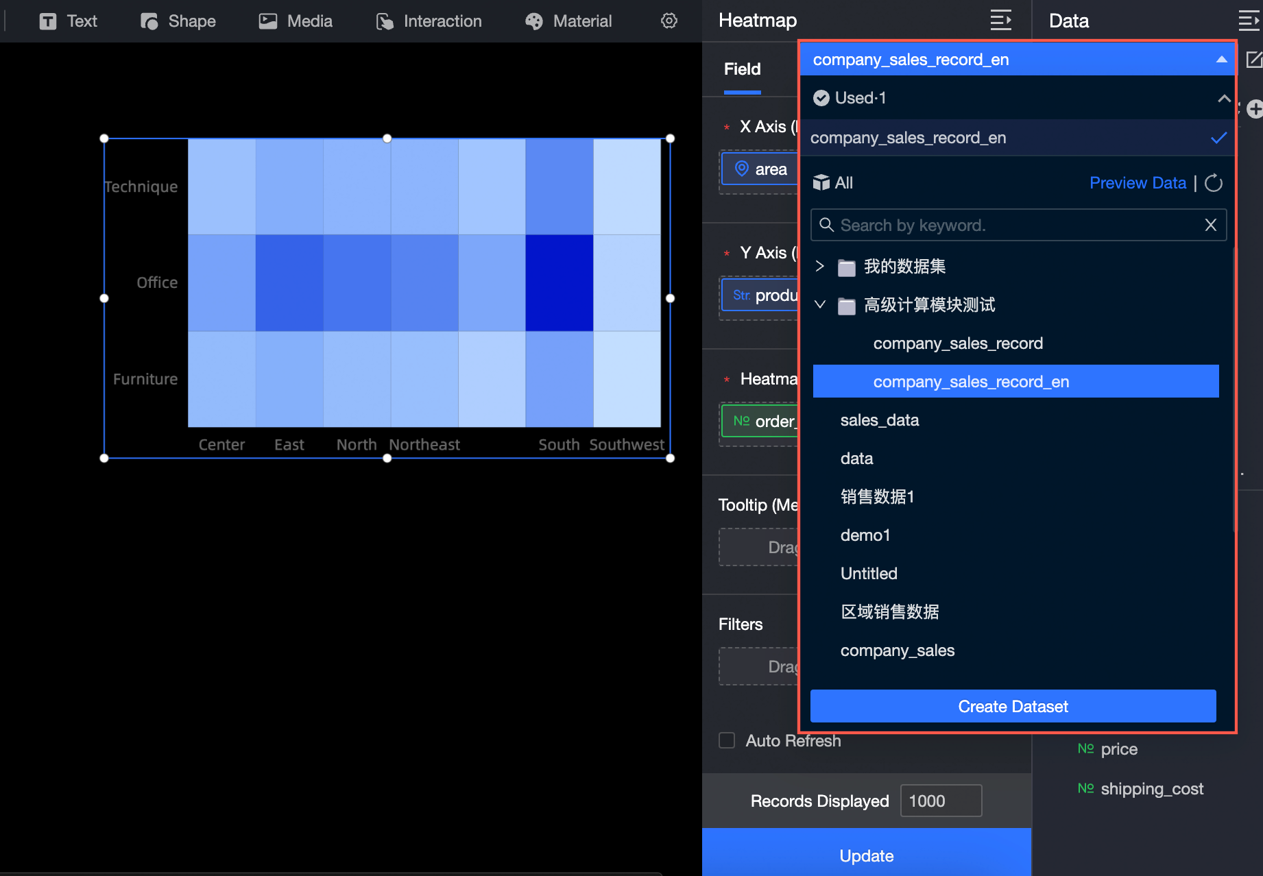
You can also select Create Dataset or Upload Local File.
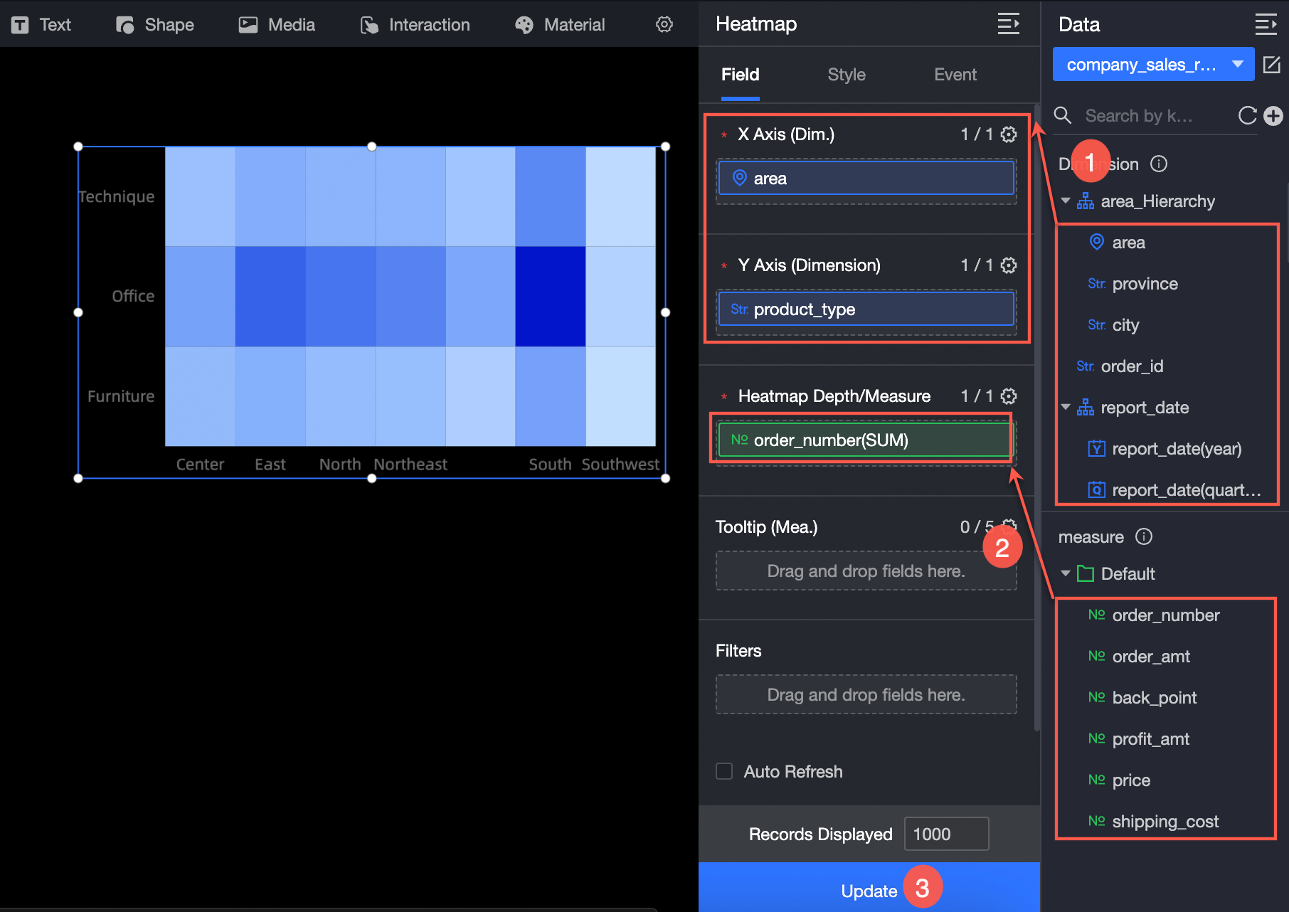
On the Fields tab to the right of the chart, select the dimension and measure fields.
From the dimension list, double-click or drag the Province field to the x-axis/dimension field well.
From the dimension list, double-click or drag the Product Type field to the y-axis/dimension field well.
From the measure list, double-click or drag the Order Amount field to the Heat depth/measure field well.
Click Update to refresh the chart.
(Optional) To view data for specific provinces, set a filter.
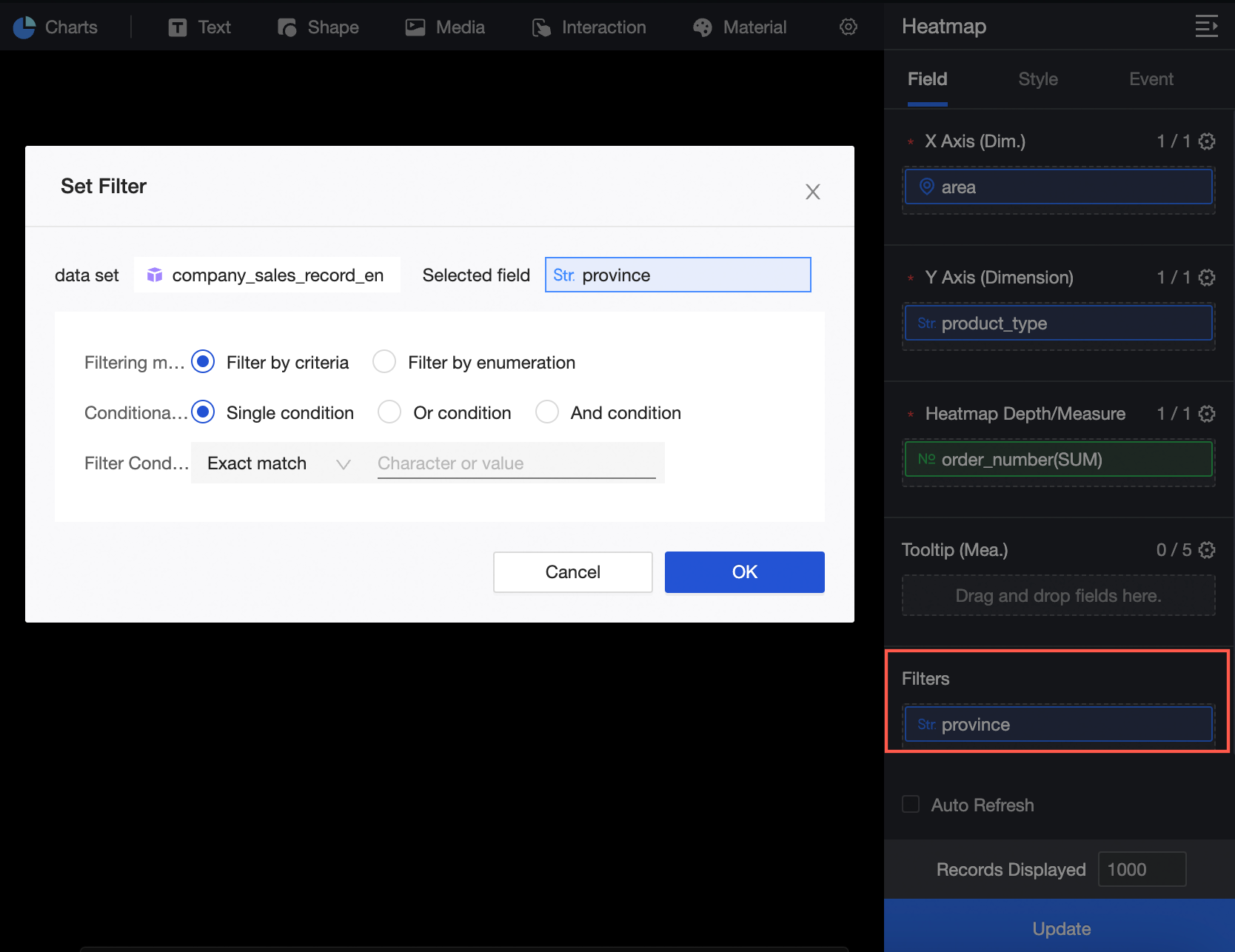
For more information about field filtering, see Field filtering.
Auto-refresh
Enable this option to refresh chart data automatically. For example, setting the duration to 5 minutes causes the chart to refresh every 5 minutes.
Configure chart styles
This section describes the style settings for the chart. For information about common chart style settings, see Configure chart styles.
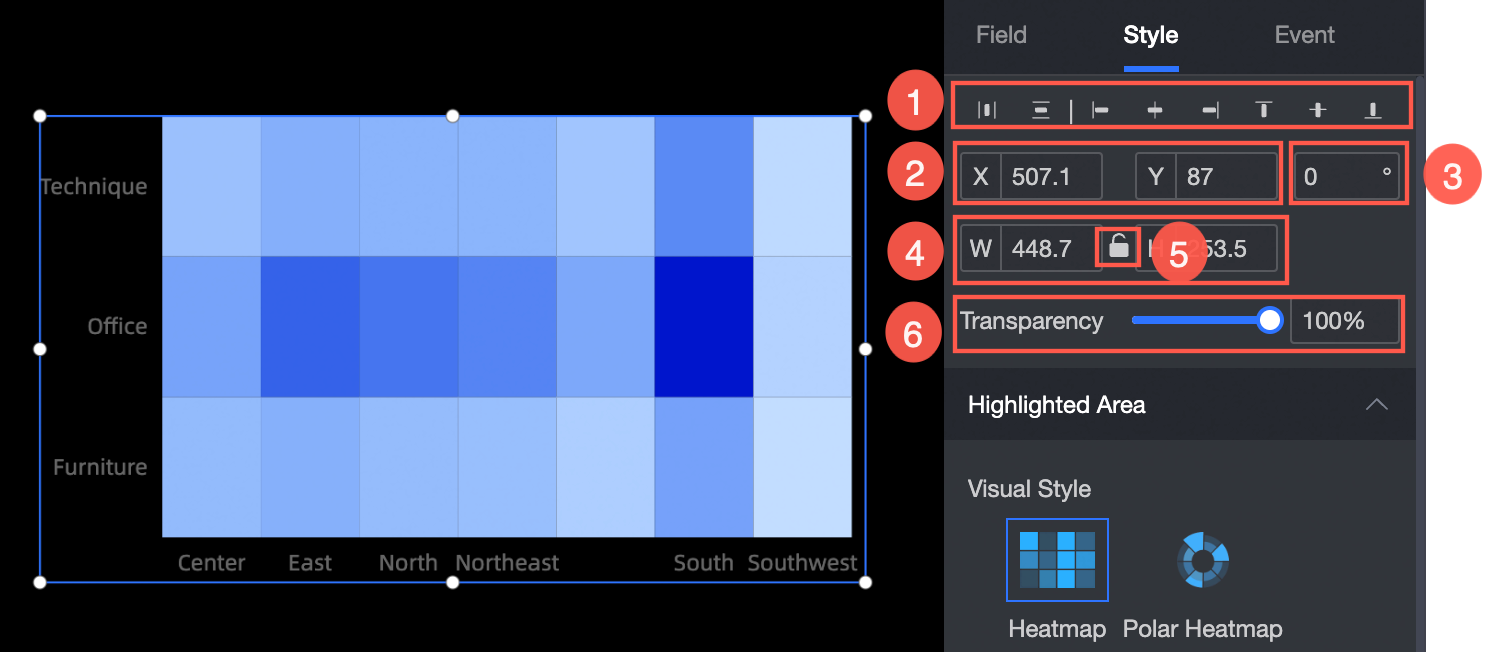
In the Position, size, and opacity section, configure the following settings:
① Align the component: Options include left, center, and right alignment.
② Adjust the component's position: Set the X and Y coordinates relative to the top-left corner.
③ Adjust the component's angle: Set a rotation value.
④ Adjust the component's size: Set the W (width) and H (height) values.
⑤ Lock the component: Prevents changes to the component's size or position.
⑥ Set the opacity: Set a value from 0% to 100%.

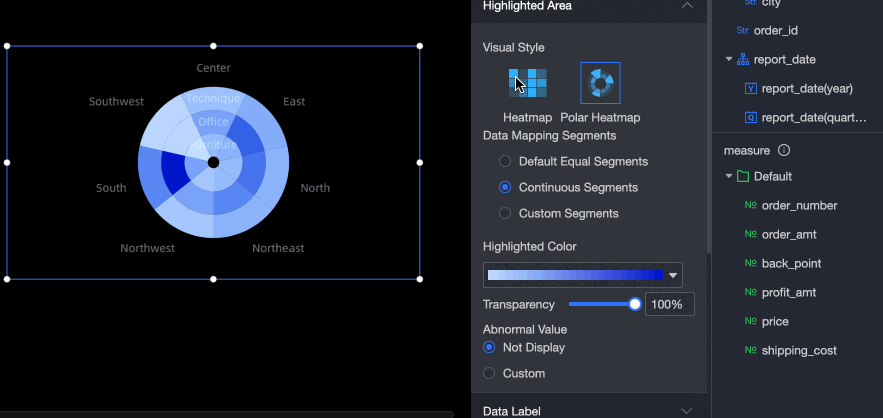
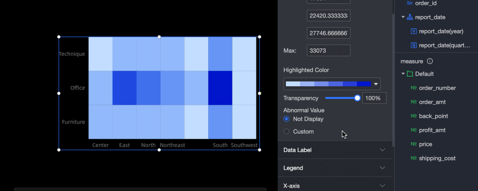
In the Heat area section, configure the visualization style, data mapping range, heat color, and opacity.
Parameter
Description
Visualization style
Supports two styles: standard heatmap and polar heatmap.
Data mapping range
Supports Equal Interval, Continuous Interval, and Custom Interval.
Equal Interval
Configure 2 to 10 intervals.
Continuous Interval
This is the default interval type.
Custom Interval
Configure 2 to 10 intervals.
Define intervals using absolute values or percentages, and set minimum and maximum values.
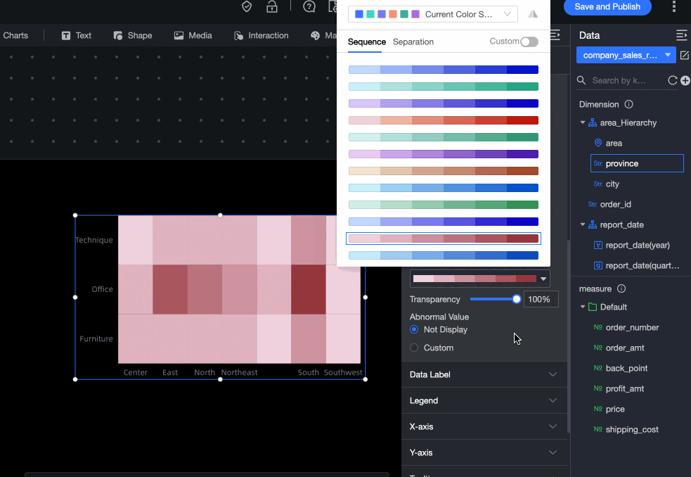
Heat color
Supports Sequential Gradient and Diverging Gradient.
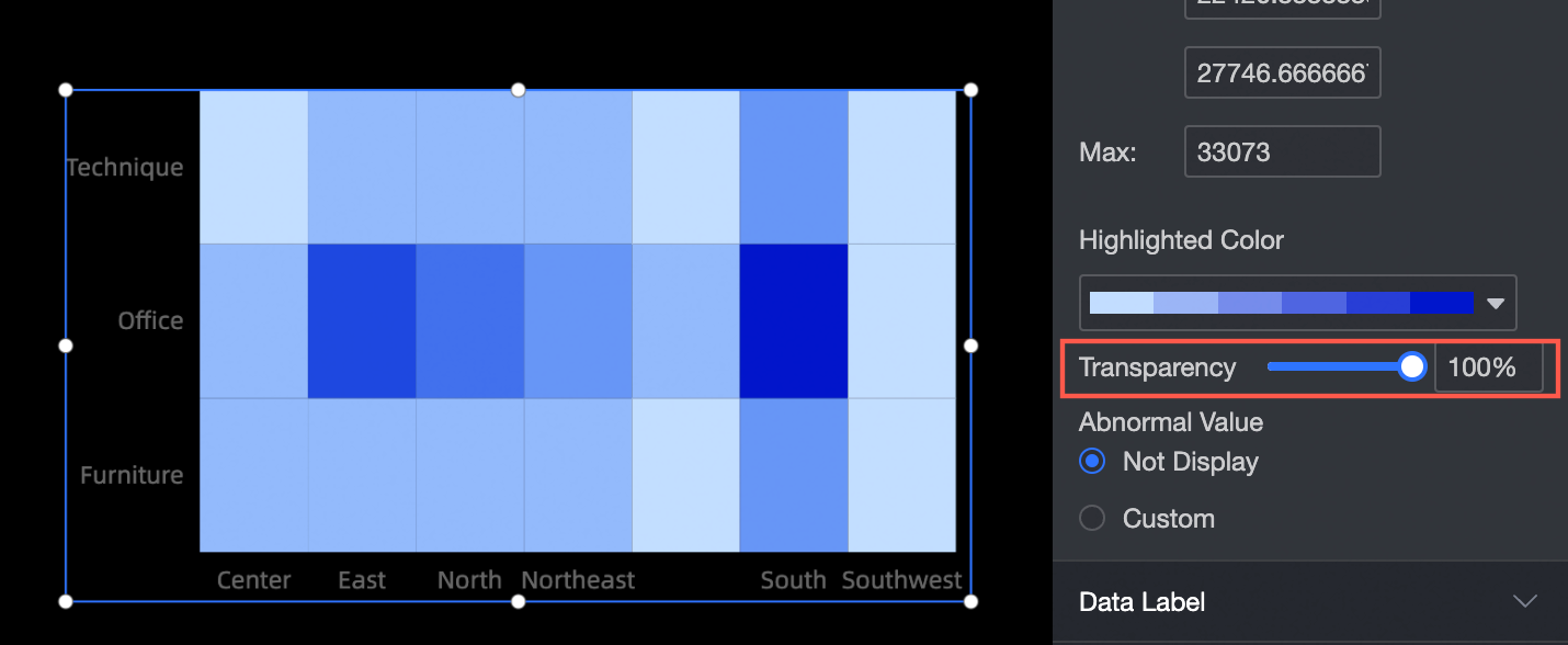
Opacity
Set a value from 0% to 100%.
Outlier handling
Choose to hide outliers or customize their display.
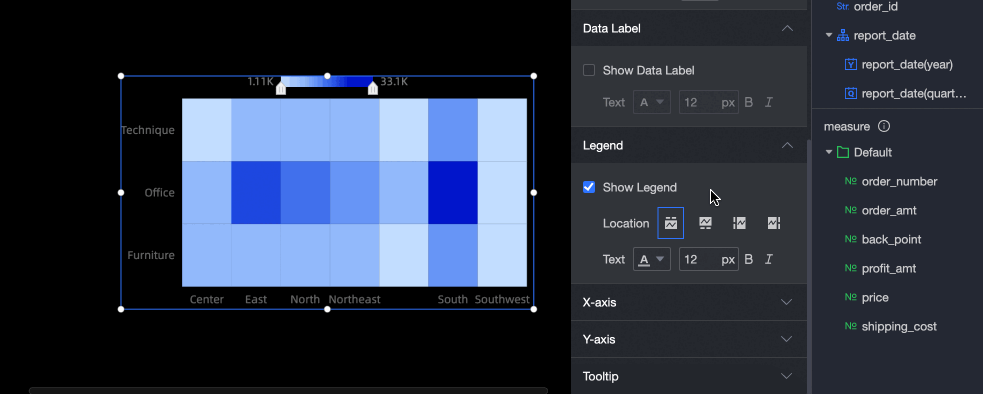
In the Data label section, specify whether to show data labels.
In the legend section, configure the position and format of the legend.
In the x-axis and y-axis sections, configure the axis styles.
Name
Option
Description
X-axis
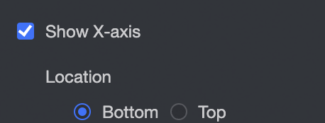
Show x-axis
Show or hide the x-axis and set its position to the top or bottom.
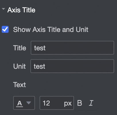
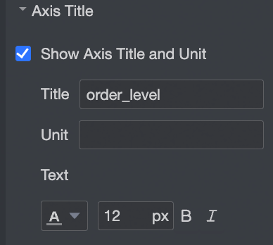
Axis title
Show or hide the axis title and unit. Configure the title, unit, and text style.
Axis line
Show or hide the x-axis line.
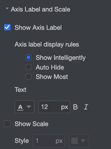
Axis label and tick
Show or hide labels on the x-axis, and configure the Axis label display rule and Text style.
Show or hide tick marks on the x-axis.
Y-axis
Show y-axis
Show or hide the y-axis.
Axis title
Show or hide the axis title and unit. Configure the title, unit, and text style.
Axis line
Show or hide the y-axis line.
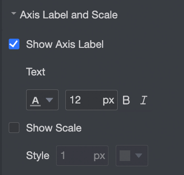
Axis label and tick
Show or hide axis labels and tick marks on the y-axis.
Configure chart events
Type | Name | Configuration | Description |
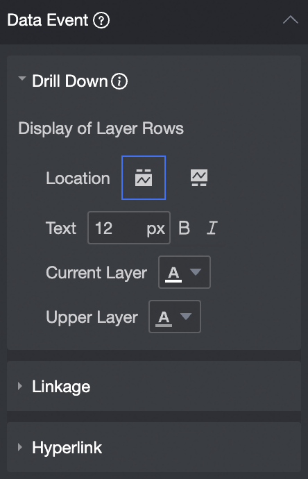
Data events | Drill down |
| Use drill down to analyze a dimension at different levels. Clicking the field changes the hierarchy and analysis granularity. For more information, see Configure drill down. |
Linkage | When your analysis data is spread across multiple charts, use chart linkage to connect them for coordinated analysis. For more information, see Configure linkage. | ||
Redirection | When your analysis requires data from multiple data dashboards, use redirection to link them. Redirection options include Parameter jump and External link. For more information, see Linkage, drill down, and redirection. | ||
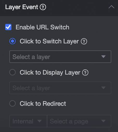
Layer events | Enable URL Redirect |
| In Layer events, you can choose Enable URL redirect, Click to pop-up layer, or Click to jump to page. For more information, see Configure click events. |